
Causal Inference:
The Mixtape.
Buy the print version today:
Buy the print version today:
\[ % Define terms \newcommand{\Card}{\text{Card }} \DeclareMathOperator*{\cov}{cov} \DeclareMathOperator*{\var}{var} \DeclareMathOperator{\Var}{Var\,} \DeclareMathOperator{\Cov}{Cov\,} \DeclareMathOperator{\Prob}{Prob} \newcommand{\independent}{\perp \!\!\! \perp} \DeclareMathOperator{\Post}{Post} \DeclareMathOperator{\Pre}{Pre} \DeclareMathOperator{\Mid}{\,\vert\,} \DeclareMathOperator{\post}{post} \DeclareMathOperator{\pre}{pre} \]
The first appearance of the synthetic control estimator was a 2003 article where it was used to estimate the impact of terrorism on economic activity (Abadie and Gardeazabal 2003). Since that publication, it has become very popular—particularly after the release of an R and Stata package coinciding with Abadie, Diamond, and Hainmueller (2010). A Google Scholar search for the words “synthetic control” and “Abadie” yielded over 3,500 hits at the time of writing. The estimator has been so influential that Athey and Imbens (2017) said it was “arguably the most important innovation in the policy evaluation literature in the last 15 years” (p.3).
To understand the reasons you might use synthetic control, let’s back up to the broader idea of the comparative case study. In qualitative case studies, such as Alexis de Tocqueville’s classic Democracy in America, the goal is to reason inductively about the causal effect of events or characteristics of a single unit on some outcome using logic and historical analysis. But it may not give a very satisfactory answer to these causal questions because sometimes qualitative comparative case studies lack an explicit counterfactual. As such, we are usually left with description and speculation about the causal pathways connecting various events to outcomes.
Quantitative comparative case studies are more explicitly causal designs. They usually are natural experiments and are applied to only a single unit, such as a single school, firm, state, or country. These kinds of quantitative comparative case studies compare the evolution of an aggregate outcome with either some single other outcome, or as is more often the case, a chosen set of similar units that serve as a control group.
As Athey and Imbens (2017) point out, one of the most important contributions to quantitative comparative case studies is the synthetic control model. The synthetic control model was developed in Abadie and Gardeazabal (2003) in a study of terrorism’s effect on aggregate income, which was then elaborated on in a more exhaustive treatment (Abadie, Diamond, and Hainmueller 2010). Synthetic controls models optimally choose a set of weights which when applied to a group of corresponding units produce an optimally estimated counterfactual to the unit that received the treatment. This counterfactual, called the “synthetic unit,” serves to outline what would have happened to the aggregate treated unit had the treatment never occurred. It is a powerful, yet surprisingly simple, generalization of the difference-in-differences strategy. We will discuss it with a motivating example—the paper on the famous Mariel boatlift by Card (1990).
Labor economists have debated the effect of immigration on local labor-market conditions for many years (Card and Peri 2016). Do inflows of immigrants depress wages and the employment of natives in local labor-markets? For Card (1990), this was an empirical question, and he used a natural experiment to evaluate it.
In 1980, Fidel Castro announced that anyone wishing to leave Cuba could do so. With Castro’s support, Cuban Americans helped arrange the Mariel boatlift, a mass exodus from Cuba’s Mariel Harbor to the United States (primarily Miami) between April and October 1980. Approximately 125,000 Cubans emigrated to Florida over six months. The emigration stopped only because Cuba and the US mutually agreed to end it. The event increased the Miami labor force by 7%, largely by depositing a record number of low-skilled workers into a relatively small geographic area.
Card saw this as an ideal natural experiment. It was arguably an exogenous shift in the labor-supply curve, which would allow him to determine if wages fell and employment increased, consistent with a simple competitive labor-market model. He used individual-level data on unemployment from the Current Population Survey for Miami and chose four comparison cities (Atlanta, Los Angeles, Houston, and Tampa–St. Petersburg). The choice of these four cities is delegated to a footnote in which Card argues that they were similar based on demographics and economic conditions. Card estimated a simple DD model and found, surprisingly, no effect on wages or native unemployment. He argued that Miami’s labor-market was capable of absorbing the surge in labor supply because of similar surges two decades earlier.
The paper was very controversial, probably not so much because he attempted to answer empirically an important question in labor economics using a natural experiment, but rather because the result violated conventional wisdom. It would not be the last word on the subject, and I don’t take a stand on this question; rather, I introduce it to highlight a few characteristics of the study. Notably, a recent study replicated Card’s paper using synthetic control and found similar results (Peri and Yasenov 2018).
Card’s study was a comparative case study that had strengths and weaknesses. The policy intervention occurred at an aggregate level, for which aggregate data was available. But the problems with the study were that the selection of the control group was ad hoc and subjective. Second, the standard errors reflect sampling variance as opposed to uncertainty about the ability of the control group to reproduce the counterfactual of interest. Abadie and Gardeazabal (2003) and Abadie, Diamond, and Hainmueller (2010) introduced the synthetic control estimator as a way of addressing both issues simultaneously.
Abadie and Gardeazabal (2003) method uses a weighted average of units in the donor pool to model the counterfactual. The method is based on the observation that, when the units of analysis are a few aggregate units, a combination of comparison units (the “synthetic control”) often does a better job of reproducing characteristics of a treated unit than using a single comparison unit alone. The comparison unit, therefore, in this method is selected to be the weighted average of all comparison units that best resemble the characteristics of the treated unit(s) in the pre-treatment period.
Abadie, Diamond, and Hainmueller (2010) argue that this method has many distinct advantages over regression-based methods. For one, the method precludes extrapolation. It uses instead interpolation, because the estimated causal effect is always based on a comparison between some outcome in a given year and a counterfactual in the same year. That is, it uses as its counterfactual a convex hull of control group units, and thus the counterfactual is based on where data actually is, as opposed to extrapolating beyond the support of the data, which can occur in extreme situations with regression (King and Zeng 2006).
A second advantage has to do with processing of the data. The construction of the counterfactual does not require access to the post-treatment outcomes during the design phase of the study, unlike regression. The advantage here is that it helps the researcher avoid “peeking” at the results while specifying the model. Care and honesty must still be used, as it’s just as easy to look at the outcomes during the design phase as it is to not, but the point is that it is hypothetically possible to focus just on design, and not estimation, with this method (Rubin 2007, 2008).
Another advantage, which is oftentimes a reason people will object to a study, is that the weights that are chosen make explicit what each unit is contributing to the counterfactual. Now this is in many ways a strict advantage, except when it comes to defending those weights in a seminar. Because someone can see that Idaho is contributing 0.3 to your modeling of Florida, they are now able to argue that it’s absurd to think Idaho is anything like Florida. But contrast this with regression, which also weights the data, but does so blindly. The only reason no one objects to what regression produces as a weight is that they cannot see the weights. They are implicit rather than explicit. So I see this explicit production of weights as a distinct advantage because it makes synthetic control more transparent than regression-based designs (even if will likely require fights with the audience and reader that you wouldn’t have had otherwise).
A fourth advantage, which I think is often unappreciated, is that it bridges a gap between qualitative and quantitative types. Qualitative researchers are often the very ones focused on describing a single unit, such as a country or a prison (Perkinson 2010), in great detail. They are usually the experts on the histories surrounding those institutions. They are usually the ones doing comparative case studies in the first place. Synthetic control places a valuable tool into their hands which enables them to choose counterfactuals—a process that in principle can improve their work insofar as they are interested in evaluating some particular intervention.
Abadie, Diamond, and Hainmueller (2010) argue that synthetic control removes subjective researcher bias, but it turns out it is somewhat more complicated. The frontier of this method has grown considerably in recent years, along different margins, one of which is via the model-fitting exercise itself. Some new ways of trying to choose more principled models have appeared, particularly when efforts to fit the data with the synthetic control in the pre-treatment period are imperfect. Ferman and Pinto (2019) and Powell (2017), for instance, propose alternative solutions to this problem. Ferman and Pinto (2019) examine the properties of using de-trended data. They find that it can have advantages, and even dominate DD, in terms of bias and variance.
When there are transitory shocks, which is common in practice, the fit deteriorates, thus introducing bias. Powell (2017) provides a parametric solution, however, which cleverly exploits information in the procedure that may help reconstruct the treatment unit. Assume that Georgia receives some treatment but for whatever reason the convex hull assumption does not hold in the data (i.e., Georgia is unusual). Powell (2017) shows that if Georgia appears in the synthetic control for some other state, then it is possible to recover the treatment effect through a kind of backdoor procedure. Using the appearance of Georgia as a control in all the placebos can then be used to reconstruct the counterfactual.
But still there remain questions regarding the selection of the covariates that will be used for any matching. Through repeated iterations and changes to the matching formula, a person can potentially reintroduce bias through the endogenous selection of covariates used in a specification search. While the weights are optimally chosen to minimize some distance function, through the choice of the covariates themselves, the researcher can in principle select different weights. She just doesn’t have a lot of control over it, because ultimately the weights are optimal for a given set of covariates, but selecting models that suit one’s priors is still possible.
Ferman, Pinto, and Possebom (2020) addressed this gap in the literature by providing guidance on principled covariate selection. They consider a variety of commonly used synthetic control specifications (e.g., all pre-treatment outcome values, the first three quarters of the pre-treatment outcome values). They then run the randomization inference test to calculate empirical \(p\)-values. They find that the probability of falsely rejecting the null in at least one specification for a 5% significance test can be as high as 14% when there are pre-treatment periods. The possibilities for specification searching remain high even when the number of pre-treatment periods is large, too. They consider a sample with four hundred pre-treatment periods and still find a false-positive probability of around 13% that at least one specification was significant at the 5% level. Thus, even with a large number of pre-treatment periods, it is theoretically possible to “hack” the analysis in order to find statistical significance that suits one’s priors.
Given the broad discretion available to a researcher to search over countless specifications using covariates and pretreatment combinations, one might conclude that fewer time periods are better if for no other reason than that this limits the ability to conduct an endogenous specification search. Using Monte Carlo simulations, though, they find that models which use more pre-treatment outcome lags as predictors—consistent with statements made by Abadie, Diamond, and Hainmueller (2010) originally—do a better job controlling for unobserved confounders, whereas those which limit the number of pre-treatment outcome lags substantially misallocate more weights and should not be considered in synthetic control applications.
Thus, one of the main takeaways of Ferman, Pinto, and Possebom (2020) is that, despite the hope that synthetic control would remove subjective researcher bias by creating weights based on a data-driven optimization algorithm, this may be somewhat overstated in practice. Whereas it remains true that the weights are optimal in that they uniquely minimize the distance function, the point of Ferman, Pinto, and Possebom (2020) is to note that the distance function is still, at the end of the day, endogenously chosen by the researcher.
So, given this risk of presenting results that may be cherry picked, what should we do? Ferman, Pinto, and Possebom (2020) suggest presenting multiple results under a variety of commonly specified specifications. If it is regularly robust, the reader may have sufficient information to check this, as opposed to only seeing one specification which may be the cherry-picked result.
Let \(Y_{jt}\) be the outcome of interest for unit \(j\) of \(J+1\) aggregate units at time \(t\), and treatment group be \(j=1.\) The synthetic control estimator models the effect of the intervention at time \(T_0\) on the treatment group using a linear combination of optimally chosen units as a synthetic control. For the post-intervention period, the synthetic control estimator measures the causal effect as \(Y_{1t}- \sum_{j=2}^{J+1}w_j^*Y_{jt}\) where \(w_j^*\) is a vector of optimally chosen weights.
Matching variables, \(X_1\) and \(X_0,\) are chosen as predictors of post-intervention outcomes and must be unaffected by the intervention. The weights are chosen so as to minimize the norm, \(||X_1 - X_0W||\) subject to weight constraints. There are two weight constraints. First, let \(W=(w_2, \dots, w_{J+1})'\) with \(w_j \geq 0\) for \(j=2, \dots, J+1\). Second, let \(w_2 + \dots + w_{J+1}=1\). In words, no unit receives a negative weight, but can receive a zero weight.1 And the sum of all weights must equal one.
As I said, Abadie, Diamond, and Hainmueller (2010) consider
\[ \begin{align} ||X_1 - X_0W|| = \sqrt{(X_1 - X_0W)'V(X_1 - X_0W)} \end{align} \]
where \(V\) is some \((k \times k)\) symmetric and positive semidefinite matrix. Let \(X_{jm}\) be the value of the \(m\)th covariates for unit \(j\). Typically, \(V\) is diagonal with main diagonal \(v_1, \dots, v_k\). Then the synthetic control weights minimize: \[ \sum_{m=1}^k v_m \bigg(X_{1m} - \sum_{j=2}^{J+1}w_jX_{jm} \bigg)^2 \] where \(v_m\) is a weight that reflects the relative importance that we assign to the \(m\)th variable when we measure the discrepancy between the treated unit and the synthetic control.
The choice of \(V\), as should be seen by now, is important because \(W^*\) depends on one’s choice of \(V\). The synthetic control \(W^*(V)\) is meant to reproduce the behavior of the outcome variable for the treated unit in the absence of the treatment. Therefore, the weights \(v_1, \dots, v_k\) should reflect the predictive value of the covariates.
Abadie, Diamond, and Hainmueller (2010) suggests different choices of \(V\), but ultimately it appears from practice that most people choose a \(V\) that minimizes the mean squared prediction error: \[ \sum_{t=1}^{T_0} \bigg (Y_{1t} - \sum_{j=2}^{J+1}w_j^*(V)Y_{jt}\bigg )^2 \] What about unobserved factors? Comparative case studies are complicated by unmeasured factors affecting the outcome of interest as well as heterogeneity in the effect of observed and unobserved factors. Abadie, Diamond, and Hainmueller (2010) note that if the number of pre-intervention periods in the data is “large,” then matching on pre-intervention outcomes can allow us to control for the heterogeneous responses to multiple unobserved factors. The intuition here is that only units that are alike on unobservables and observables would follow a similar trajectory pre-treatment.
Abadie and Gardeazabal (2003) developed the synthetic control estimator so as to evaluate the impact that terrorism had on the Basque region in Spain. But Abadie, Diamond, and Hainmueller (2010) expound on the method by using a cigarette tax in California called Proposition 99. Their example uses a placebo-based method for inference, so let’s look more closely at their paper.
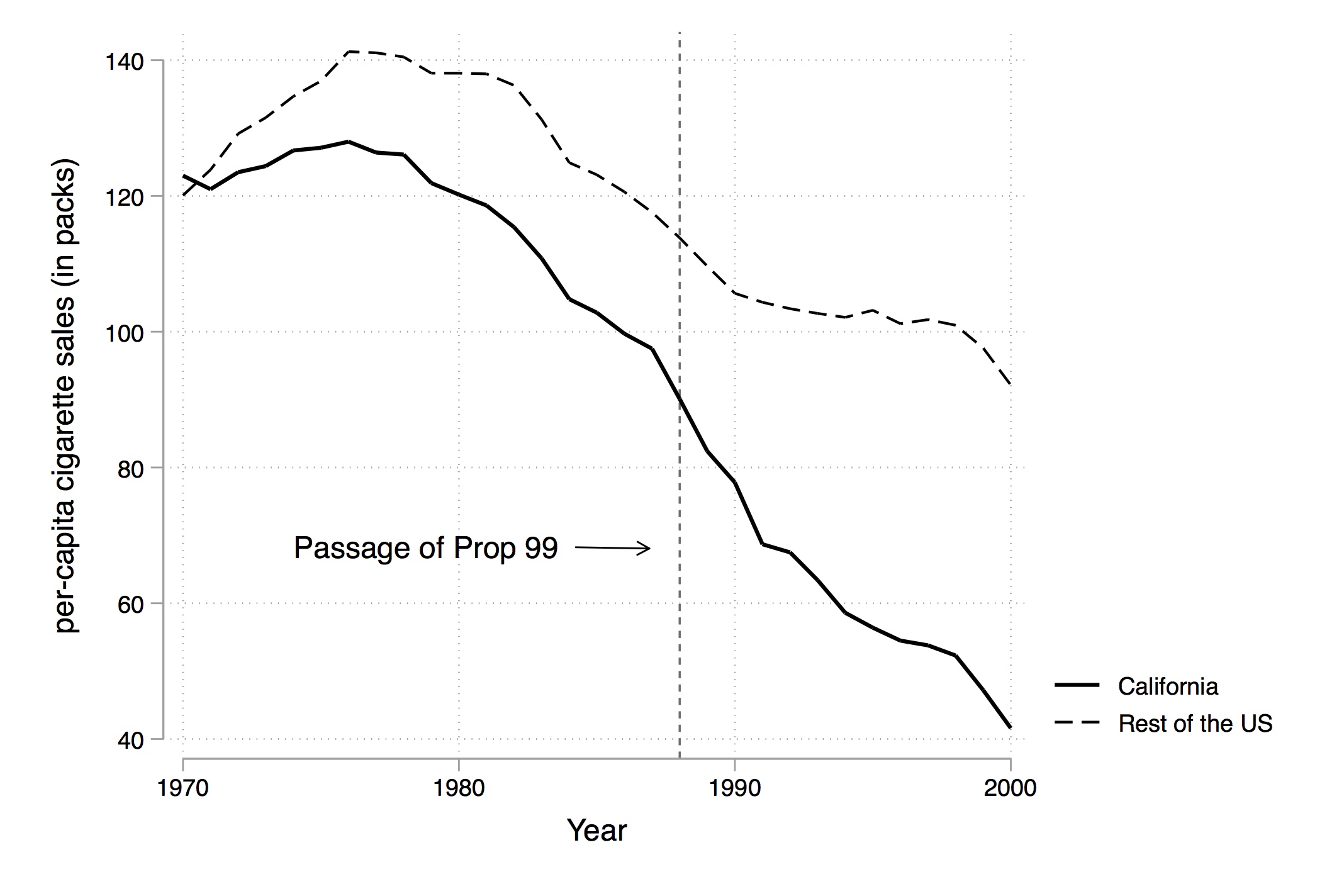
In 1988, California passed comprehensive tobacco control legislation called Proposition 99. Proposition 99 increased cigarette taxes by $0.25 a pack, spurred clean-air ordinances throughout the state, funded anti-smoking media campaigns, earmarked tax revenues to health and anti-smoking budgets, and produced more than $100 million a year in anti-tobacco projects. Other states had similar control programs, and they were dropped from their analysis.
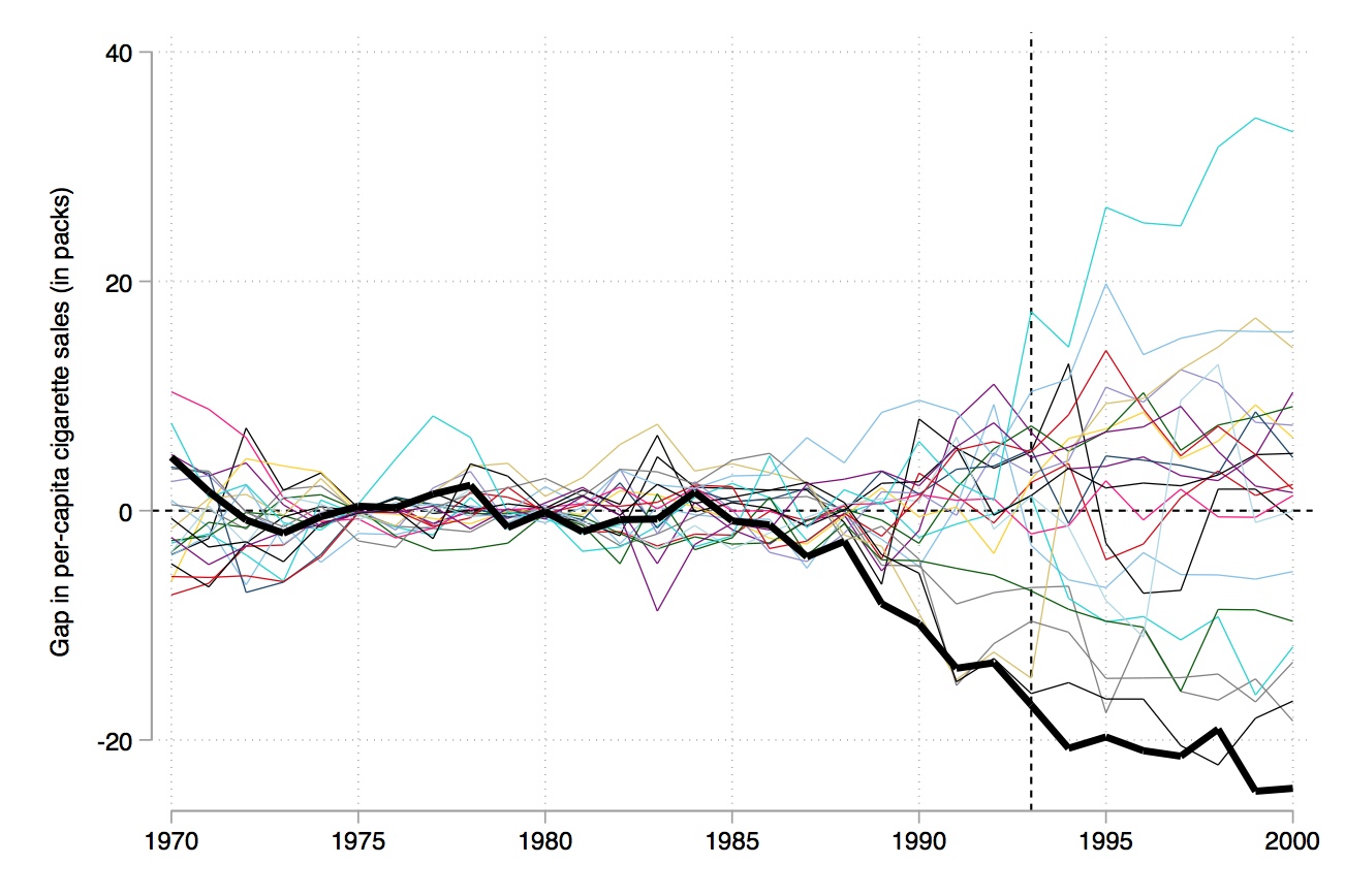
Figure 10.1 shows changes in cigarette sales for California and the rest of the United States annually from 1970 to 2000. As can be seen, cigarette sales fell after Proposition 99, but as they were already falling, it’s not clear if there was any effect—particularly since they were falling in the rest of the country at the same time.
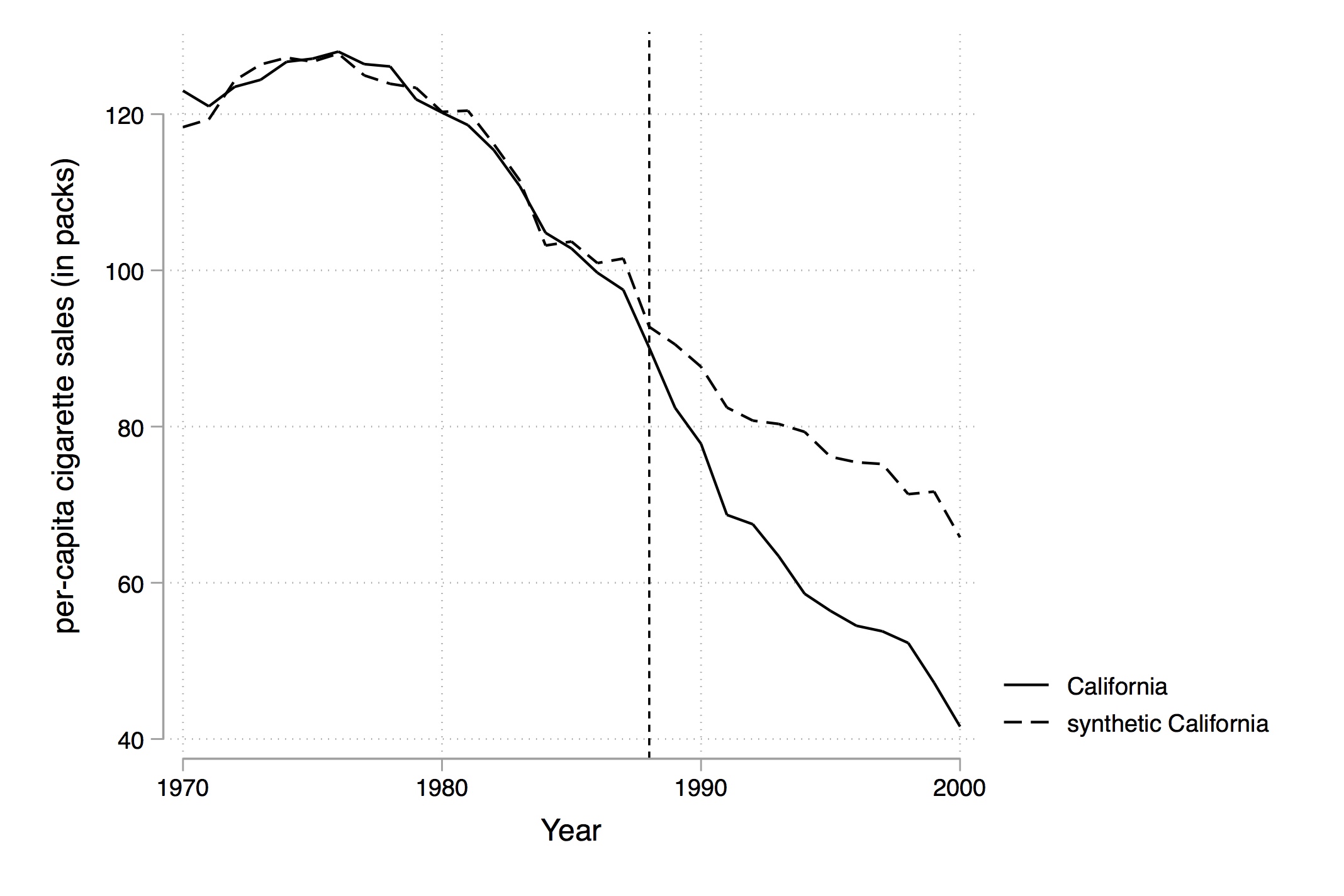
Using their method, though, they select an optimal set of weights that when applied to the rest of the country produces the figure shown in Figure 10.2. Notice that pre-treatment, this set of weights produces a nearly identical time path for California as the real California itself, but post-treatment the two series diverge. There appears at first glance to have been an effect of the program on cigarette sales.
The variables they used for their distance minimization are listed in Table 10.1. Notice that this analysis produces values for the treatment group and control group that facilitate a simple investigation of balance. This is not a technical test, as there is only one value per variable per treatment category, but it’s the best we can do with this method. And it appears that the variables used for matching are similar across the two groups, particularly for the lagged values.
| Variables | Real California | Synthetic Calif. | Avg. of 38 Control States |
| Ln(GDP per capita) | 10.08 | 9.86 | 9.86 |
| Percent aged 15–24 | 17.40 | 17.40 | 17.29 |
| Retail price | 89.42 | 89.41 | 87.27 |
| Beer consumption per capita | 24.28 | 24.20 | 23.75 |
| Cigarette sales per capita 1988 | 90.10 | 91.62 | 114.20 |
| Cigarette sales per capita 1980 | 120.20 | 120.43 | 136.58 |
| Cigarette sales per capita 1975 | 127.10 | 126.99 | 132.81 |
All variables except lagged cigarette sales are averaged for the 1980–1988 period. Beer consumption is averaged 1984–1988.
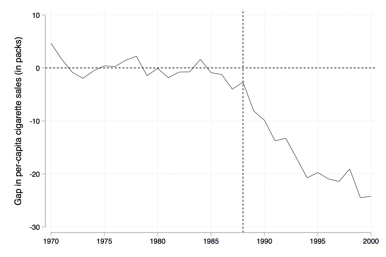
Like RDD, synthetic control is a picture-intensive estimator. Your estimator is basically a picture of two series which, if there is a causal effect, diverge from another post-treatment, but resemble each other pre-treatment. It is common to therefore see a picture just showing the difference between the two series (Figure 10.3).
But so far, we have only covered estimation. How do we determine whether the observed difference between the two series is a statistically significant difference? After all, we only have two observations per year. Maybe the divergence between the two series is nothing more than prediction error, and any model chosen would’ve done that, even if there was no treatment effect. Abadie, Diamond, and Hainmueller (2010) suggest that we use an old-fashioned method to construct exact \(p\)-values based on Fisher (1935). Firpo and Possebom (2018) call the null hypothesis used in this test the “no treatment effect whatsoever,” which is the most common null used in the literature. Whereas they propose an alternative null for inference, I will focus on the original null proposed by Abadie, Diamond, and Hainmueller (2010) for this exercise. As discussed in an earlier chapter, randomization inference assigns the treatment to every untreated unit, recalculates the model’s key coefficients, and collects them into a distribution which are then used for inference. Abadie, Diamond, and Hainmueller (2010) recommend calculating a set of root mean squared prediction error (RMSPE) values for the pre- and post-treatment period as the test statistic used for inference.2 We proceed as follows:
Iteratively apply the synthetic control method to each country/state in the donor pool and obtain a distribution of placebo effects.
Calculate the RMSPE for each placebo for the pre-treatment period: \[ RMSPE = \bigg (\dfrac{1}{T-T_0} \sum_{t=T_0+t}^T \bigg (Y_{1t} - \sum_{j=2}^{J+1} w_j^* Y_{jt} \bigg )^2 \bigg )^{\tfrac{1}{2}} \]
Calculate the RMSPE for each placebo for the post-treatment period (similar equation but for the post-treatment period).
Compute the ratio of the post- to pre-treatment RMSPE.
Sort this ratio in descending order from greatest to highest.
Calculate the treatment unit’s ratio in the distribution as \(p=\dfrac{RANK}{TOTAL}\).
In other words, what we want to know is whether California’s treatment effect is extreme, which is a relative concept compared to the donor pool’s own placebo ratios.
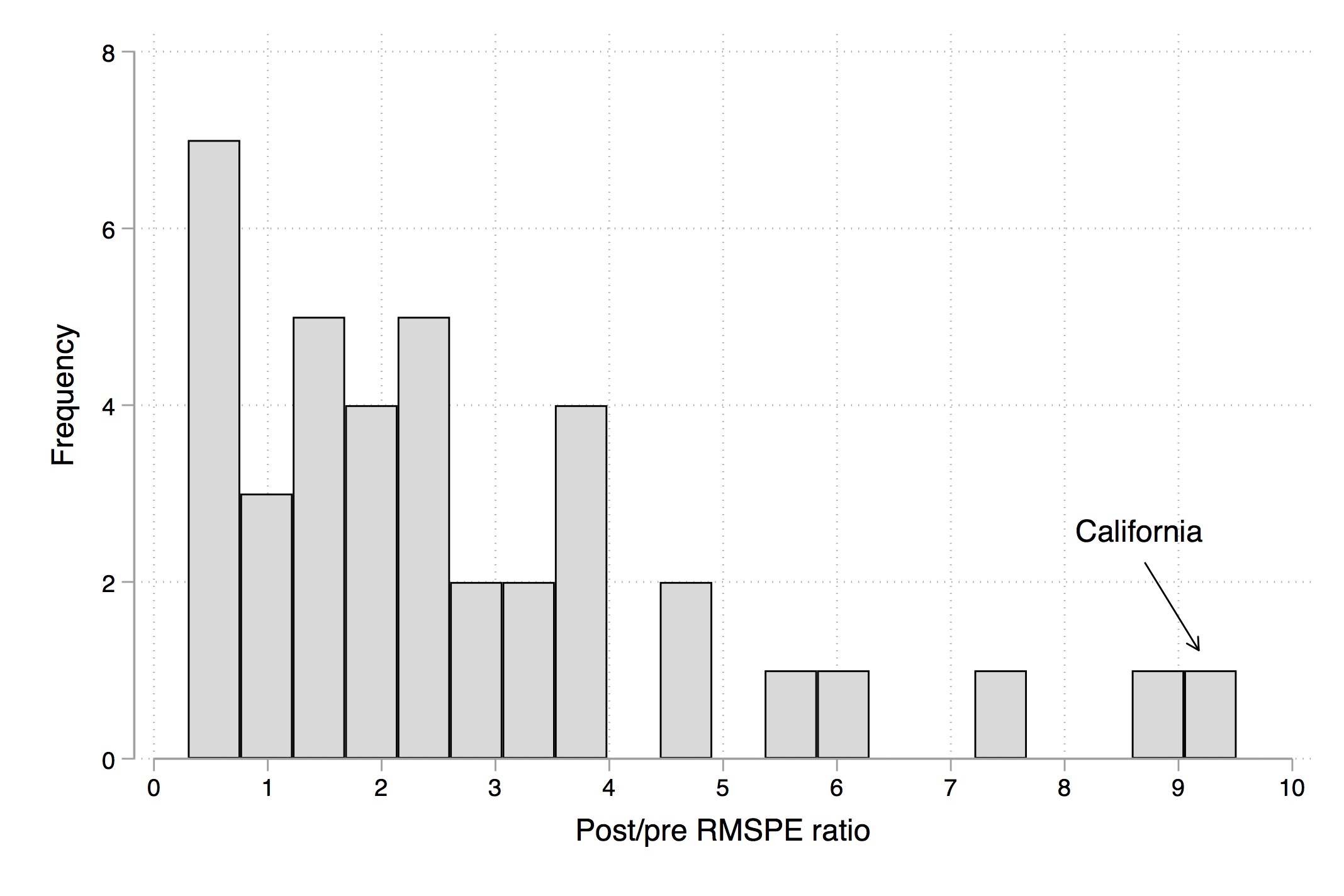
There are several different ways to represent this. The first is to overlay California with all the placebos using Stata twoway command, which I’ll show later. Figure 10.4 shows what this looks like. And I think you’ll agree, it tells a nice story. Clearly, California is in the tails of some distribution of treatment effects.
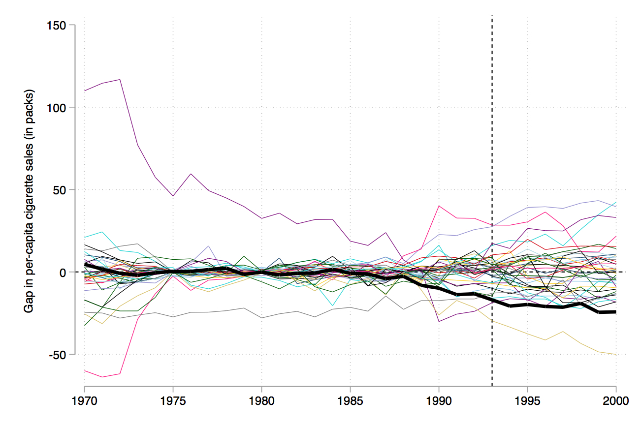
Abadie, Diamond, and Hainmueller (2010) recommend iteratively dropping the states whose pre-treatment RMSPE is considerably different than California’s because as you can see, they’re kind of blowing up the scale and making it hard to see what’s going on. They do this in several steps, but I’ll just skip to the last step (Figure 10.5). In this, they’ve dropped any state unit from the graph whose pre-treatment RMSPE is more than two times that of California’s. This therefore limits the picture to just units whose model fit, pre-treatment, was pretty good, like California’s.
But, ultimately, inference is based on those exact \(p\)-values. So the way we do this is we simply create a histogram of the ratios, and more or less mark the treatment group in the distribution so that the reader can see the exact \(p\)-value associated with the model. I produce that here in Figure 10.6.
As can be seen, California is ranked first out of thirty-eight state units.3 This gives an exact \(p\)-value of 0.026, which is less than the conventional 5% most journals want to (arbitrarily) see for statistical significance.
In Abadie, Diamond, and Hainmueller (2015), the authors studied the effect of the reunification of Germany on gross domestic product. One of the contributions this paper makes, though, is a recommendation for testing the validity of the estimator through a falsification exercise. To illustrate this, let me review the study. The 1990 reunification of Germany brought together East Germany and West Germany, which after years of separation had developed vastly different cultures, economies, and political systems. The authors were interested in evaluating the effect that that reunification had on economic output, but as with the smoking study, they thought that the countries were simply too dissimilar from any one country to make a compelling comparison group, so they used synthetic control to create a composite comparison group based on optimally chosen countries.
One of the things the authors do in this study is provide some guidance as to how to check whether the model you chose is a reasonable one. The authors specifically recommend rewinding time from the date of the treatment itself and estimating their model on an earlier (placebo) date. Since placebo dates should have no effect on output, that provides some assurances that any deviations found in 1990 might be due to structural breaks caused by the reunification itself. And in fact they don’t find any effect when using 1975 as a placebo date, suggesting that their model has good in and out of sample predictive properties.
We include this second paper primarily to illustrate that synthetic control methods are increasingly expected to pursue numerous falsification exercises in addition to simply estimating the causal effect itself. In this sense, researchers have pushed others to hold it to the same level of scrutiny and skepticism as they have with other methodologies such as RDD and IV. Authors using synthetic control must do more than merely run the synth command when doing comparative case studies. They must find the exact \(p\)-values through placebo-based inference, check for the quality of the pre-treatment fit, investigate the balance of the covariates used for matching, and check for the validity of the model through placebo estimation (e.g., rolling back the treatment date).
The project that you’ll be replicating here is a project I have been working on with several coauthors over the last few years.4 Here’s the backdrop.
In 1980, the Texas Department of Corrections (TDC) lost a major civil action lawsuit, Ruiz v. Estelle; Ruiz was the prisoner who brought the case, and Estelle was the warden. The case argued that TDC was engaging in unconstitutional practices related to overcrowding and other prison conditions. Texas lost the case, and as a result, was forced to enter into a series of settlements. To amend the issue of overcrowding, the courts placed constraints on the number of inmates who could be placed in cells. To ensure compliance, TDC was put under court supervision until 2003.
Given these constraints, the construction of new prisons was the only way that Texas could keep arresting as many people as its police departments wanted to without having to release those whom the TDC had already imprisoned. If it didn’t build more prisons, the state would be forced to increase the number of people to whom it granted parole. That is precisely what happened; following Ruiz v. Estelle, Texas used parole more intensively.
But then, in the late 1980s, Texas Governor Bill Clements began building prisons. Later, in 1993, Texas Governor Ann Richards began building even more prisons. Under Richards, state legislators approved $1 billion for prison construction, which would double the state’s ability to imprison people within three years. This can be seen in Figure 10.7.
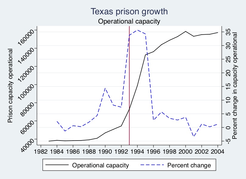
As can be seen, Clements’ prison capacity expansion projects were relatively small compared those by Richards. But Richards’s investments in “operational capacity,” or the ability to house prisoners, were gigantic. The number of prison beds available for the state to keep filling with prisoners grew more than 30% for three years, meaning that the number of prison beds more than doubled in just a short period of time.
What was the effect of building so many prisons? Just because prison capacity expands doesn’t mean incarceration will grow. But, among other reasons, because the state was intensively using paroles to handle the flow, that’s precisely what did happen. The analysis that follows will show the effect of this prison-building boom by the state of Texas on the incarceration of African American men.
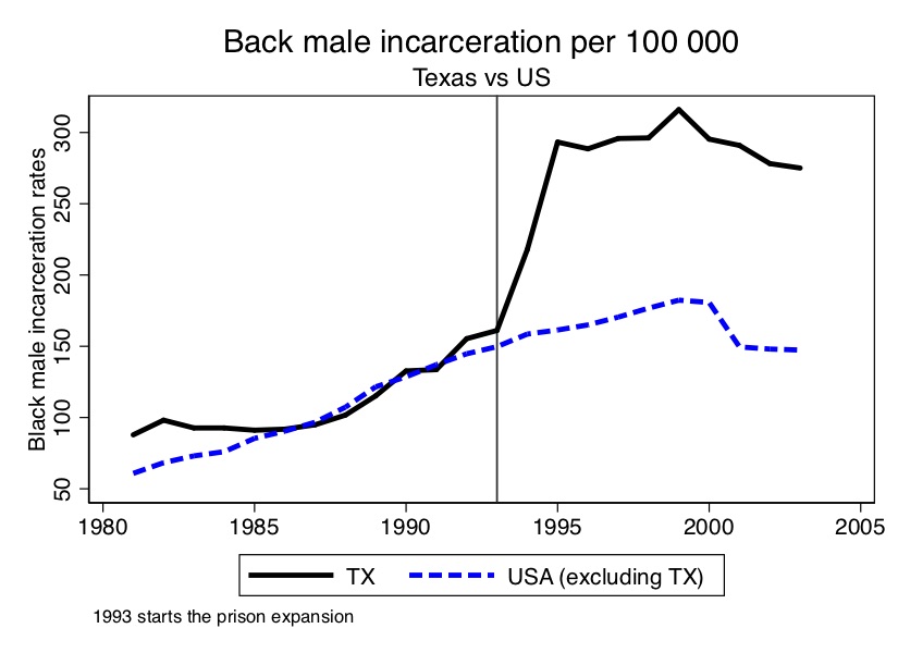
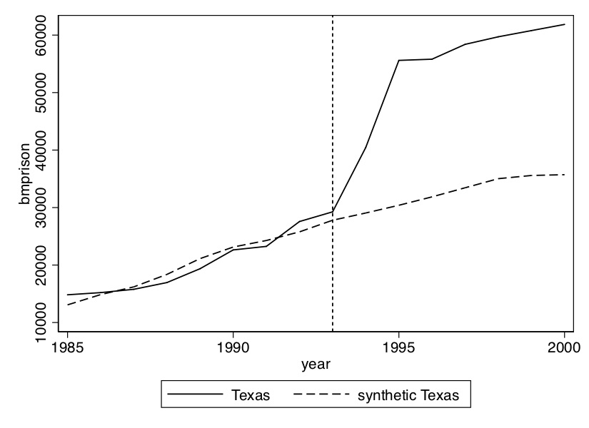
As you can see from Figure 10.8, the incarceration rate of black men doubled in only three years. Texas basically went from being a typical, modal state when it came to incarceration to one of the most severe in only a short period.
What we will now do is analyze the effect that the prison construction under Governor Ann Richards had on the incarceration of black men using synthetic control. The R file is much more straightforward than the synthetic control file, which is broken up into several parts. I have therefore posted to Github both a texassynth.do file that will run all of this seamlessly, as well as a “Read Me” document to help you understand the directories and subdirectories needed do this. Let’s begin.
The first step is to create the figure showing the effect of the 1993 prison construction on the incarceration of black men. I’ve chosen a set of covariates and pre-treatment outcome variables for the matching; I encourage you, though, to play around with different models. We can already see from Figure 10.8 that prior to 1993, Texas Black male incarceration were pretty similar to the rest of the country. What this is going to mean for our analysis is that we have every reason to believe that the convex hull likely exists in this application.
* Estimation 1: Texas model of black male prisoners (per capita)
use https://github.com/scunning1975/mixtape/raw/master/texas.dta, clear
ssc install synth
ssc install mat2txt
#delimit;
synth   bmprison
            bmprison(1990) bmprison(1992) bmprison(1991) bmprison(1988)
            alcohol(1990) aidscapita(1990) aidscapita(1991)
            income ur poverty black(1990) black(1991) black(1992)
            perc1519(1990)
            ,
        trunit(48) trperiod(1993) unitnames(state)
        mspeperiod(1985(1)1993) resultsperiod(1985(1)2000)
        keep(../data/synth/synth_bmprate.dta) replace fig;
        mat list e(V_matrix);
        #delimit cr
graph save Graph ../Figures/synth_tx.gph, replace}library(tidyverse)
library(haven)
library(Synth)
library(devtools)
library(SCtools)
read_data <- function(df)
{
full_path <- paste("https://github.com/scunning1975/mixtape/raw/master/",
df, sep = "")
df <- read_dta(full_path)
return(df)
}
texas <- read_data("texas.dta") %>%
as.data.frame(.)
dataprep_out <- dataprep(
foo = texas,
predictors = c("poverty", "income"),
predictors.op = "mean",
time.predictors.prior = 1985:1993,
special.predictors = list(
list("bmprison", c(1988, 1990:1992), "mean"),
list("alcohol", 1990, "mean"),
list("aidscapita", 1990:1991, "mean"),
list("black", 1990:1992, "mean"),
list("perc1519", 1990, "mean")),
dependent = "bmprison",
unit.variable = "statefip",
unit.names.variable = "state",
time.variable = "year",
treatment.identifier = 48,
controls.identifier = c(1,2,4:6,8:13,15:42,44:47,49:51,53:56),
time.optimize.ssr = 1985:1993,
time.plot = 1985:2000
)
synth_out <- synth(data.prep.obj = dataprep_out)
path.plot(synth_out, dataprep_out)import numpy as np
import pandas as pd
import statsmodels.api as sm
import statsmodels.formula.api as smf
from itertools import combinations
import plotnine as p
# read data
import ssl
ssl._create_default_https_context = ssl._create_unverified_context
def read_data(file):
return pd.read_stata("https://github.com/scunning1975/mixtape/raw/master/" + file)
texas = read_data("texas.dta")
from rpy2.robjects.packages import importr
from rpy2.robjects.conversion import localconverter
Synth = importr('Synth')
control_units = [1, 2, 4, 5, 6] + list(range(8, 14)) + list(range(15,43)) + list(range(44, 47)) + [49, 50, 51, 53,54,55,56]
robjects.globalenv['texas'] = texas
predictors = robjects.vectors.StrVector(['poverty', 'income'])
sp = robjects.vectors.ListVector({'1': ['bmprison', IntVector([1988, 1990, 1991, 1992]), 'mean'],
'2': ['alcohol', 1990, 'mean'],
'3': ['aidscapita', IntVector([1990, 1991]), 'mean'],
'4': ['black', IntVector([1990, 1991, 1992]), 'mean'],
'5': ['perc1519', 1990, 'mean']})
dataprep_out = Synth.dataprep(texas,
predictors = predictors,
predictors_op="mean",
time_predictors_prior=np.arange(1985, 1994),
special_predictors=sp,
dependent='bmprison',
unit_variable='statefip',
unit_names_variable='state',
time_variable='year',
treatment_identifier=48,
controls_identifier=control_units,
time_optimize_ssr=np.arange(1985, 1994),
time_plot=np.arange(1985, 2001))
synth_out = Synth.synth(data_prep_obj = dataprep_out)
weights = synth_out.rx['solution.w'][0]
ct_weights = pd.DataFrame({'ct_weights':weights.flatten(), 'statefip':control_units})
ct_weights.head()
texas = pd.merge(ct_weights, texas, how='right', on='statefip')
texas = texas.sort_values('year')
ct = texas.groupby('year').apply(lambda x : np.sum(x['ct_weights']*x['bmprison']))
treated = texas[texas.statefip==48]['bmprison'].values
years = texas.year.unique()
plt.plot(years, ct, linestyle='--', color='black', label='control')
plt.plot(years, treated, linestyle='-', color='black', label='treated')
plt.ylabel('bmprison')
plt.xlabel('Time')
plt.title('Synthetic Control Performance')Regarding the Stata syntax of this file: I personally prefer to make the delimiter a semicolon because I want to have all syntax for synth on the same screen. I’m more of a visual person, so that helps me. Next the synth syntax. The syntax goes like this: call synth, then call the outcome variable (bmprison), then the variables you want to match on. Notice that you can choose either to match on the entire pre-treatment average, or you can choose particular years. I choose both. Also recall that Abadie, Diamond, and Hainmueller (2010) notes the importance of controlling for pre-treatment outcomes to soak up the heterogeneity; I do that here as well. Once you’ve listed your covariates, you use a comma to move to Stata options. You first have to specify the treatment unit. The FIPS code for Texas is a 48, hence the 48. You then specify the treatment period, which is 1993. You list the period of time which will be used to minimize the mean squared prediction error, as well as what years to display. Stata will produce both a figure as well as a data set with information used to create the figure. It will also list the \(V\) matrix. Finally, I change the delimiter back to carriage return, and save the figure in the /Figures subdirectory. Let’s look at what these lines made (Figure 10.9).
* Plot the gap in predicted error
use ../data/synth/synth_bmprate.dta, clear
keep _Y_treated _Y_synthetic _time
drop if _time==.
rename _time year
rename _Y_treated  treat
rename _Y_synthetic counterfact
gen gap48=treat-counterfact
sort year
#delimit ;
twoway (line gap48 year,lp(solid)lw(vthin)lcolor(black)), yline(0, lpattern(shortdash) lcolor(black))
    xline(1993, lpattern(shortdash) lcolor(black)) xtitle("",si(medsmall)) xlabel(#10)
    ytitle("Gap in black male prisoner prediction error", size(medsmall)) legend(off);
    #delimit cr
save ../data/synth/synth_bmprate_48.dta, replace}gaps.plot(synth_out, dataprep_out)import numpy as np
import pandas as pd
import statsmodels.api as sm
import statsmodels.formula.api as smf
from itertools import combinations
import plotnine as p
# read data
import ssl
ssl._create_default_https_context = ssl._create_unverified_context
def read_data(file):
return pd.read_stata("https://github.com/scunning1975/mixtape/raw/master/" + file)
texas = read_data("texas.dta")
from rpy2.robjects.packages import importr
from rpy2.robjects.conversion import localconverter
Synth = importr('Synth')
control_units = [1, 2, 4, 5, 6] + list(range(8, 14)) + list(range(15,43)) + list(range(44, 47)) + [49, 50, 51, 53,54,55,56]
robjects.globalenv['texas'] = texas
predictors = robjects.vectors.StrVector(['poverty', 'income'])
sp = robjects.vectors.ListVector({'1': ['bmprison', IntVector([1988, 1990, 1991, 1992]), 'mean'],
'2': ['alcohol', 1990, 'mean'],
'3': ['aidscapita', IntVector([1990, 1991]), 'mean'],
'4': ['black', IntVector([1990, 1991, 1992]), 'mean'],
'5': ['perc1519', 1990, 'mean']})
dataprep_out = Synth.dataprep(texas,
predictors = predictors,
predictors_op="mean",
time_predictors_prior=np.arange(1985, 1994),
special_predictors=sp,
dependent='bmprison',
unit_variable='statefip',
unit_names_variable='state',
time_variable='year',
treatment_identifier=48,
controls_identifier=control_units,
time_optimize_ssr=np.arange(1985, 1994),
time_plot=np.arange(1985, 2001))
synth_out = Synth.synth(data_prep_obj = dataprep_out)
weights = synth_out.rx['solution.w'][0]
ct_weights = pd.DataFrame({'ct_weights':weights.flatten(), 'statefip':control_units})
ct_weights.head()
texas = pd.merge(ct_weights, texas, how='right', on='statefip')
texas = texas.sort_values('year')
ct = texas.groupby('year').apply(lambda x : np.sum(x['ct_weights']*x['bmprison']))
treated = texas[texas.statefip==48]['bmprison'].values
years = texas.year.unique()
ct_diff = treated - ct
plt.plot(years, np.zeros(len(years)), linestyle='--', color='black', label='control')
plt.plot(years, ct_diff, linestyle='-', color='black', label='treated')
plt.ylabel('bmprison')
plt.xlabel('Time')
plt.title('Treated - Control')This is the kind of outcome that you ideally want to have specifically, a very similar pre-treatment trend in the synthetic Texas group compared to the actual Texas group, and a divergence in the post-treatment period. We will now plot the gap between these two lines using our programming commands in the accompanying code.
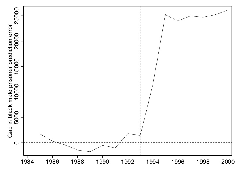
The figure that this makes is shown in Figure 10.10. It is essentially nothing more than the “gap” between Texas and synthetic Texas values, per year, in Figure 10.9.
And finally, we will show the weights used to construct the synthetic Texas.
| State name | Weights |
|---|---|
| California | 0.408 |
| Florida | 0.109 |
| Illinois | 0.36 |
| Louisiana | 0.122 |
Now that we have our estimates of the causal effect, we move into the calculation of the exact \(p\)-value, which will be based on assigning the treatment to every state and reestimating our model. Texas will always be thrown back into the donor pool each time. This next part will contain multiple Stata programs, but because of the efficiency of the R package, I will only produce one R program. So all exposition henceforth will focus on the Stata commands.
* Inference 1 placebo test
#delimit;
set more off;
use ../data/texas.dta, replace;
local statelist  1 2 4 5 6 8 9 10 11 12 13 15 16 17 18 20 21 22 23 24 25 26 27 28 29 30 31 32
    33 34 35 36 37 38 39 40 41 42 45 46 47 48 49 51 53 55;
foreach i of local statelist {;
synth   bmprison
        bmprison(1990) bmprison(1992) bmprison(1991) bmprison(1988)
        alcohol(1990) aidscapita(1990) aidscapita(1991)
        income ur poverty black(1990) black(1991) black(1992)
        perc1519(1990)
        ,
            trunit(`i') trperiod(1993) unitnames(state)
            mspeperiod(1985(1)1993) resultsperiod(1985(1)2000)
            keep(../data/synth/synth_bmprate_`i'.dta) replace;
            matrix state`i' = e(RMSPE); /* check the V matrix*/

foreach i of local statelist {;
matrix rownames state`i'=`i';
matlist state`i', names(rows);
};
#delimit crplacebos <- generate.placebos(dataprep_out, synth_out, Sigf.ipop = 3)
plot_placebos(placebos)
mspe.plot(placebos, discard.extreme = TRUE, mspe.limit = 1, plot.hist = TRUE)# Missing Python codeThis is a loop in which it will cycle through every state and estimate the model. It will then save data associated with each model into the ../data/synth/synth_bmcrate_‘i’.dta data file where ‘i’ is one of the state FIPS codes listed after local statelist. Now that we have each of these files, we can calculate the post-to-pre RMSPE.
local statelist  1 2 4 5 6 8 9 10 11 12 13 15 16 17 18 20 21 22 23 24 25 26 27 28 29 30 31 32
    33 34 35 36 37 38 39 40 41 42 45 46 47 48 49 51 53 55
 foreach i of local statelist {
    use ../data/synth/synth_bmprate_`i' ,clear
    keep _Y_treated _Y_synthetic _time
    drop if _time==.
    rename _time year
    rename _Y_treated  treat`i'
    rename _Y_synthetic counterfact`i'
    gen gap`i'=treat`i'-counterfact`i'
    sort year
    save ../data/synth/synth_gap_bmprate`i', replace
    }
use ../data/synth/synth_gap_bmprate48.dta, clear
sort year
save ../data/synth/placebo_bmprate48.dta, replace

foreach i of local statelist {
        merge year using ../data/synth/synth_gap_bmprate`i'
        drop _merge
        sort year
    save ../data/synth/placebo_bmprate.dta, replace
    }
Notice that this is going to first create the gap between the treatment state and the counterfactual state before merging each of them into a single data file.
** Inference 2: Estimate the pre- and post-RMSPE and calculate the ratio of the
*  post-pre RMSPE
set more off
local statelist  1 2 4 5 6 8 9 10 11 12 13 15 16 17 18 20 21 22 23 24 25 26 27 28 29 30 31 32
    33 34 35 36 37 38 39 40 41 42 45 46 47 48 49 51 53 55
foreach i of local statelist {

    use ../data/synth/synth_gap_bmprate`i', clear
    gen gap3=gap`i'*gap`i'
    egen postmean=mean(gap3) if year>1993
    egen premean=mean(gap3) if year<=1993
    gen rmspe=sqrt(premean) if year<=1993
    replace rmspe=sqrt(postmean) if year>1993
    gen ratio=rmspe/rmspe[_n-1] if 1994
    gen rmspe_post=sqrt(postmean) if year>1993
    gen rmspe_pre=rmspe[_n-1] if 1994
    mkmat rmspe_pre rmspe_post ratio if 1994, matrix (state`i')
In this part, we are calculating the post-RMSPE, the pre-RMSPE, and the ratio of the two. Once we have this information, we can compute a histogram. The following commands do that.
* show post/pre-expansion RMSPE ratio for all states, generate histogram
    foreach i of local statelist {
        matrix rownames state`i'=`i'
        matlist state`i', names(rows)
                                    }
#delimit ;
mat state=state1/state2/state4/state5/state6/state8/state9/state10/state11/state12/state13/state15/state16/state17/state18/state20/state21/state22/state23/state24/state25/state26/state27/state28/state29/state30/state31/state32/state33/state34/state35/state36/state37/state38/state39/state40/state41/state42/state45/state46/state47/state48/state49/state51/state53/state55;
#delimit cr
* ssc install mat2txt
    mat2txt, matrix(state) saving(../inference/rmspe_bmprate.txt) replace
    insheet using ../inference/rmspe_bmprate.txt, clear
    ren v1 state
    drop v5
    gsort -ratio
    gen rank=_n
    gen p=rank/46
    export excel using ../inference/rmspe_bmprate, firstrow(variables) replace
    import excel ../inference/rmspe_bmprate.xls, sheet("Sheet1") firstrow clear
    histogram ratio, bin(20) frequency fcolor(gs13) lcolor(black) ylabel(0(2)6)
    xtitle(Post/pre RMSPE ratio) xlabel(0(1)5)
* Show the post/pre RMSPE ratio for all states, generate the histogram.
    list rank p if state==48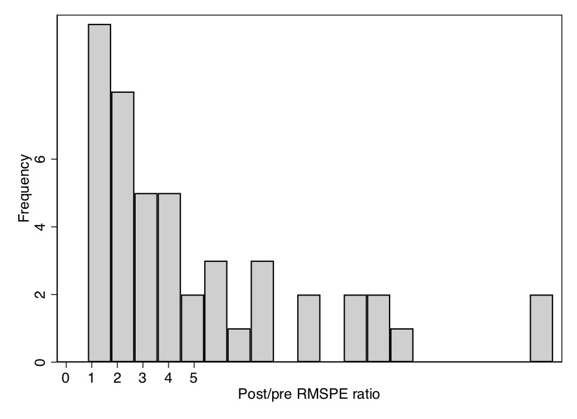
All the looping will take a few moments to run, but once it is done, it will produce a histogram of the distribution of ratios of post-RMSPE to pre-RMSPE. As you can see from the \(p\)-value, Texas has the second-highest ratio out of forty-six state units, giving it a \(p\)-value of 0.04. We can see that in Figure 10.11.
Notice that in addition to the figure, this created an Excel spreadsheet containing information on the pre-RMSPE, the post-RMSPE, the ratio, and the rank. We will want to use that again when we limit our display next to states whose pre-RMSPE are similar to that of Texas.
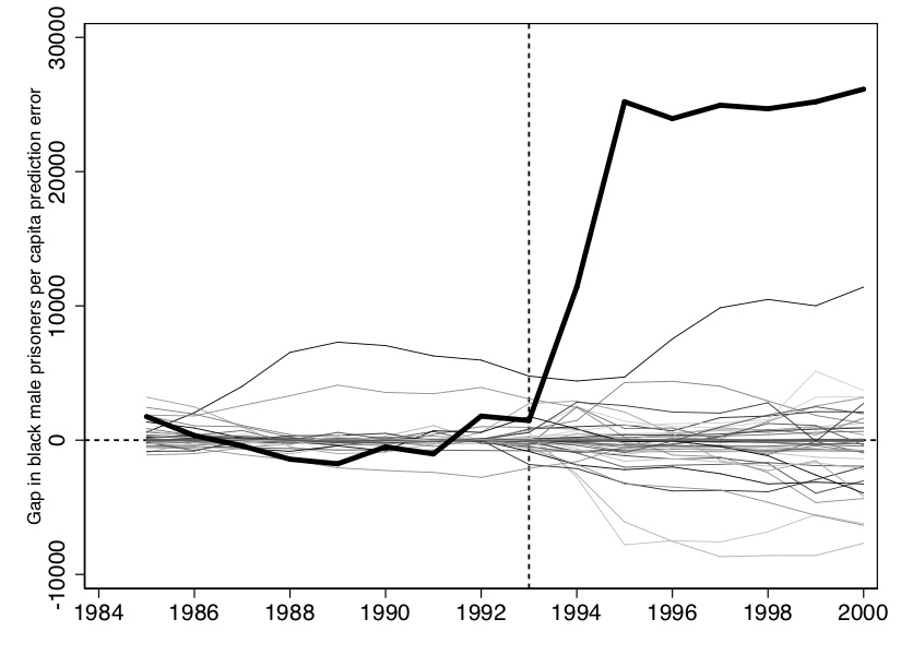
Now we want to create the characteristic placebo graph where all the state placebos are laid on top of Texas. To do that, we can use some simple syntax contained in the Stata code:
* Inference 3: all the placeboes on the same picture
use ../data/synth/placebo_bmprate.dta, replace
* Picture of the full sample, including outlier RSMPE
#delimit;
twoway
(line gap1 year ,lp(solid)lw(vthin))
(line gap2 year ,lp(solid)lw(vthin))
(line gap4 year ,lp(solid)lw(vthin))
(line gap5 year ,lp(solid)lw(vthin))
(line gap6 year ,lp(solid)lw(vthin))
(line gap8 year ,lp(solid)lw(vthin))
(line gap9 year ,lp(solid)lw(vthin))
(line gap10 year ,lp(solid)lw(vthin))
(line gap11 year ,lp(solid)lw(vthin))
(line gap12 year ,lp(solid)lw(vthin))
(line gap13 year ,lp(solid)lw(vthin))
(line gap15 year ,lp(solid)lw(vthin))
(line gap16 year ,lp(solid)lw(vthin))
(line gap17 year ,lp(solid)lw(vthin))
(line gap18 year ,lp(solid)lw(vthin))
(line gap20 year ,lp(solid)lw(vthin))
(line gap21 year ,lp(solid)lw(vthin))
(line gap22 year ,lp(solid)lw(vthin))
(line gap23 year ,lp(solid)lw(vthin))
(line gap24 year ,lp(solid)lw(vthin))
(line gap25 year ,lp(solid)lw(vthin))
(line gap26 year ,lp(solid)lw(vthin))
(line gap27 year ,lp(solid)lw(vthin))
(line gap28 year ,lp(solid)lw(vthin))
(line gap29 year ,lp(solid)lw(vthin))
(line gap30 year ,lp(solid)lw(vthin))
(line gap31 year ,lp(solid)lw(vthin))
(line gap32 year ,lp(solid)lw(vthin))
(line gap33 year ,lp(solid)lw(vthin))
(line gap34 year ,lp(solid)lw(vthin))
(line gap35 year ,lp(solid)lw(vthin))
(line gap36 year ,lp(solid)lw(vthin))
(line gap37 year ,lp(solid)lw(vthin))
(line gap38 year ,lp(solid)lw(vthin))
(line gap39 year ,lp(solid)lw(vthin))
(line gap40 year ,lp(solid)lw(vthin))
(line gap41 year ,lp(solid)lw(vthin))
(line gap42 year ,lp(solid)lw(vthin))
(line gap45 year ,lp(solid)lw(vthin))
(line gap46 year ,lp(solid)lw(vthin))
(line gap47 year ,lp(solid)lw(vthin))
(line gap49 year ,lp(solid)lw(vthin))
(line gap51 year ,lp(solid)lw(vthin))
(line gap53 year ,lp(solid)lw(vthin))
(line gap55 year ,lp(solid)lw(vthin))
(line gap48 year ,lp(solid)lw(thick)lcolor(black)), /*treatment unit, Texas*/
yline(0, lpattern(shortdash) lcolor(black)) xline(1993, lpattern(shortdash) lcolor(black))
xtitle("",si(small)) xlabel(#10) ytitle("Gap in black male prisoners prediction error", size(small))
    legend(off);
#delimit cr
Here we will only display the main picture with the placebos, though one could show several cuts of the data in which you drop states whose pre-treatment fit compared to Texas is rather poor.
Now that you have seen how to use this .do file to estimate a synthetic control model, you are ready to play around with the data yourself. All of this analysis so far has used black male (total counts) incarceration as the dependent variable, but perhaps the results would be different if we used black male incarceration. That information is contained in the data set. I would like for you to do your own analysis using the black male incarceration rate variable as the dependent variable. You will need to find a new model to fit this pattern, as it’s unlikely that the one we used for levels will do as good a job describing rates as it did levels. In addition, you should implement the placebo-date falsification exercise that we mentioned from Abadie, Diamond, and Hainmueller (2015). Choose 1989 as your treatment date and 1992 as the end of the sample, and check whether the same model shows the same treatment effect as you found when you used the correct year, 1993, as the treatment date. I encourage you to use these data and this file to learn the ins and outs of the procedure itself, as well as to think more deeply about what synthetic control is doing and how to best use it in research.
In conclusion, we have seen how to estimate synthetic control models in Stata. This model is currently an active area of research, and so I have decided to wait until subsequent editions to dive into the new material as many questions are unsettled. This chapter therefore is a good foundation for understanding the model and the practices around implementing it, including code in \(R\) and Stata to do so. I hope that you find this useful.
Buy the print version today:
See Doudchenko and Imbens (2016) for work relaxing the non-negativity constraint.↩︎
What we will do is simply reassign the treatment to each unit, putting California back into the donor pool each time, estimate the model for that “placebo,” and record information from each iteration.↩︎
Recall, they dropped several states who had similar legislation passed over this time period.↩︎
You can find one example of an unpublished manuscript here coauthored with Sam Kang: <www.scunning.com/files/mass_incarceration_and_drug_abuse.pdf>.↩︎