
Causal Inference:
The Mixtape.
Buy the print version today:
Buy the print version today:
\[ % Define terms \newcommand{\Card}{\text{Card }} \DeclareMathOperator*{\cov}{cov} \DeclareMathOperator*{\var}{var} \DeclareMathOperator{\Var}{Var\,} \DeclareMathOperator{\Cov}{Cov\,} \DeclareMathOperator{\Prob}{Prob} \newcommand{\independent}{\perp \!\!\! \perp} \DeclareMathOperator{\Post}{Post} \DeclareMathOperator{\Pre}{Pre} \DeclareMathOperator{\Mid}{\,\vert\,} \DeclareMathOperator{\post}{post} \DeclareMathOperator{\pre}{pre} \]
The difference-in-differences design is an early quasi-experimental identification strategy for estimating causal effects that predates the randomized experiment by roughly eighty-five years. It has become the single most popular research design in the quantitative social sciences, and as such, it merits careful study by researchers everywhere.1 In this chapter, I will explain this popular and important research design both in its simplest form, where a group of units is treated at the same time, and the more common form, where groups of units are treated at different points in time. My focus will be on the identifying assumptions needed for estimating treatment effects, including several practical tests and robustness exercises commonly performed, and I will point you to some of the work on difference-in-differences design (DD) being done at the frontier of research. I have included several replication exercises as well.
When thinking about situations in which a difference-in-differences design can be used, one usually tries to find an instance where a consequential treatment was given to some people or units but denied to others “haphazardly.” This is sometimes called a “natural experiment” because it is based on naturally occurring variation in some treatment variable that affects only some units over time. All good difference-in-differences designs are based on some kind of natural experiment. And one of the most interesting natural experiments was also one of the first difference-in-differences designs. This is the story of how John Snow convinced the world that cholera was transmitted by water, not air, using an ingenious natural experiment (Snow 1855).
Cholera is a vicious disease that attacks victims suddenly, with acute symptoms such as vomiting and diarrhea. In the nineteenth century, it was usually fatal. There were three main epidemics that hit London, and like a tornado, they cut a path of devastation through the city. Snow, a physician, watched as tens of thousands suffered and died from a mysterious plague. Doctors could not help the victims because they were mistaken about the mechanism that caused cholera to spread between people.
The majority medical opinion about cholera transmission at that time was miasma, which said diseases were spread by microscopic poisonous particles that infected people by floating through the air. These particles were thought to be inanimate, and because microscopes at that time had incredibly poor resolution, it would be years before microorganisms would be seen. Treatments, therefore, tended to be designed to stop poisonous dirt from spreading through the air. But tried and true methods like quarantining the sick were strangely ineffective at slowing down this plague.
John Snow worked in London during these epidemics. Originally, Snow—like everyone—accepted the miasma theory and tried many ingenious approaches based on the theory to block these airborne poisons from reaching other people. He went so far as to cover the sick with burlap bags, for instance, but the disease still spread. People kept getting sick and dying. Faced with the theory’s failure to explain cholera, he did what good scientists do—he changed his mind and began look for a new explanation.
Snow developed a novel theory about cholera in which the active agent was not an inanimate particle but was rather a living organism. This microorganism entered the body through food and drink, flowed through the alimentary canal where it multiplied and generated a poison that caused the body to expel water. With each evacuation, the organism passed out of the body and, importantly, flowed into England’s water supply. People unknowingly drank contaminated water from the Thames River, which caused them to contract cholera. As they did, they would evacuate with vomit and diarrhea, which would flow into the water supply again and again, leading to new infections across the city. This process repeated through a multiplier effect which was why cholera would hit the city in epidemic waves.
Snow’s years of observing the clinical course of the disease led him to question the usefulness of miasma to explain cholera. While these were what we would call “anecdote,” the numerous observations and imperfect studies nonetheless shaped his thinking. Here’s just a few of the observations which puzzled him. He noticed that cholera transmission tended to follow human commerce. A sailor on a ship from a cholera-free country who arrived at a cholera-stricken port would only get sick after landing or taking on supplies; he would not get sick if he remained docked. Cholera hit the poorest communities worst, and those people were the very same people who lived in the most crowded housing with the worst hygiene. He might find two apartment buildings next to one another, one would be heavily hit with cholera, but strangely the other one wouldn’t. He then noticed that the first building would be contaminated by runoff from privies but the water supply in the second building was cleaner. While these observations weren’t impossible to reconcile with miasma, they were definitely unusual and didn’t seem obviously consistent with miasmis.
Snow tucked away more and more anecdotal evidence like these. But, while this evidence raised some doubts in his mind, he was not convinced. He needed a smoking gun if he were to eliminate all doubt that cholera was spread by water, not air. But where would he find that evidence? More importantly, what would evidence like that evenlook like?
Let’s imagine the following thought experiment. If Snow was a dictator with unlimited wealth and power, how could he test his theory that cholera is waterborne? One thing he could do is flip a coin over each household member—heads you drink from the contaminated Thames, tails you drink from some uncontaminated source. Once the assignments had been made, Snow could simply compare cholera mortality between the two groups. If those who drank the clean water were less likely to contract cholera, then this would suggest that cholera was waterborne.
Knowledge that physical randomization could be used to identify causal effects was still eighty-five years away. But there were other issues besides ignorance that kept Snow from physical randomization. Experiments like the one I just described are also impractical, infeasible, and maybe even unethical—which is why social scientists so often rely on natural experiments that mimic important elements of randomized experiments. But what natural experiment was there? Snow needed to find a situation where uncontaminated water had been distributed to a large number of people as if by random chance, and then calculate the difference between those those who did and did not drink contaminated water. Furthermore, the contaminated water would need to be allocated to people in ways that were unrelated to the ordinary determinants of cholera mortality, such as hygiene and poverty, implying a degree of balance on covariates between the groups. And then he remembered—a potential natural experiment in London a year earlier had reallocated clean water to citizens of London. Could this work?
In the 1800s, several water companies served different areas of the city. Some neighborhoods were even served by more than one company. They took their water from the Thames, which had been polluted by victims’ evacuations via runoff. But in 1849, the Lambeth water company had moved its intake pipes upstream higher up the Thames, above the main sewage discharge point, thus giving its customers uncontaminated water. They did this to obtain cleaner water, but it had the added benefit of being too high up the Thames to be infected with cholera from the runoff. Snow seized on this opportunity. He realized that it had given him a natural experiment that would allow him to test his hypothesis that cholera was waterborne by comparing the households. If his theory was right, then the Lambeth houses should have lower cholera death rates than some other set of households whose water was infected with runoff—what we might call today the explicit counterfactual. He found his explicit counterfactual in the Southwark and Vauxhall Waterworks Company.
Unlike Lambeth, the Southwark and Vauxhall Waterworks Company had not moved their intake point upstream, and Snow spent an entire book documenting similarities between the two companies’ households. For instance, sometimes their service cut an irregular path through neighborhoods and houses such that the households on either side were very similar; the only difference being they drank different water with different levels of contamination from runoff. Insofar as the kinds of people that each company serviced were observationally equivalent, then perhaps they were similar on the relevant unobservables as well.
Snow meticulously collected data on household enrollment in water supply companies, going door to door asking household heads the name of their utility company. Sometimes these individuals didn’t know, though, so he used a saline test to determine the source himself (Coleman 2019). He matched those data with the city’s data on the cholera death rates at the household level. It was in many ways as advanced as any study we might see today for how he carefully collected, prepared, and linked a variety of data sources to show the relationship between water purity and mortality. But he also displayed scientific ingenuity for how he carefully framed the research question and how long he remained skeptical until the research design’s results convinced him otherwise. After combining everthing, he was able to generate extremely persuasive evidence that influenced policymakers in the city.2
Snow wrote up all of his analysis in a manuscript entitled On the Mode of Communication of Cholera (Snow 1855). Snow’s main evidence was striking, and I will discuss results based on Table XII and Table IX (not shown) in Table 9.1. The main difference between my version and his version of Table XII is that I will use his data to estimate a treatment effect using difference-in-differences.
| Company name | 1849 | 1854 |
|---|---|---|
| Southwark and Vauxhall | 135 | 147 |
| Lambeth | 85 | 19 |
In 1849, there were 135 cases of cholera per 10,000 households at Southwark and Vauxhall and 85 for Lambeth. But in 1854, there were 147 per 100,000 in Southwark and Vauxhall, whereas Lambeth’s cholera cases per 10,000 households fell to 19.
While Snow did not explicitly calculate the difference-in-differences, the ability to do so was there (Coleman 2019). If we difference Lambeth’s 1854 value from its 1849 value, followed by the same after and before differencing for Southwark and Vauxhall, we can calculate an estimate of the ATT equaling 78 fewer deaths per 10,000. While Snow would go on to produce evidence showing cholera deaths were concentrated around a pump on Broad Street contaminated with cholera, he allegedly considered the simple difference-in-differences the more convincing test of his hypothesis.
The importance of the work Snow undertook to understand the causes of cholera in London cannot be overstated. It not only lifted our ability to estimate causal effects with observational data, it advanced science and ultimately saved lives. Of Snow’s work on the cause of cholera transmission, Freedman (1991) states:
The force of Snow’s argument results from the clarity of the prior reasoning, the bringing together of many different lines of evidence, and the amount of shoe leather Snow was willing to use to get the data. Snow did some brilliant detective work on nonexperimental data. What is impressive is not the statistical technique but the handling of the scientific issues. He made steady progress from shrewd observation through case studies to analyze ecological data. In the end, he found and analyzed a natural experiment. (p.298)
Let’s look at this example using some tables, which hopefully will help give you an idea of the intuition behind DD, as well as some of its identifying assumptions.3 Assume that the intervention is clean water, which I’ll write as \(D\), and our objective is to estimate \(D\)’s causal effect on cholera deaths. Let cholera deaths be represented by the variable \(Y\). Can we identify the causal effect of D if we just compare the post-treatment 1854 Lambeth cholera death values to that of the 1854 Southwark and Vauxhall values? This is in many ways an obvious choice, and in fact, it is one of the more common naive approaches to causal inference. After all, we have a control group, don’t we? Why can’t we just compare a treatment group to a control group? Let’s look and see.
One of the things we immediately must remember is that the simple difference in outcomes, which is all we are doing here, only collapsed to the ATE if the treatment had been randomized. But it is never randomized in the real world where most choices if not all choices made by real people is endogenous to potential outcomes. Let’s represent now the differences between Lambeth and Southwark and Vauxhall with fixed level differences, or fixed effects, represented by \(L\) and \(SV\). Both are unobserved, unique to each company, and fixed over time. What these fixed effects mean is that even if Lambeth hadn’t changed its water source there, would still be something determining cholera deaths, which is just the time-invariant unique differences between the two companies as it relates to cholera deathsin 1854.
| Company | Outcome |
|---|---|
| Lambeth | \(Y=L + D\) |
| Southwark and Vauxhall | \(Y=SV\) |
When we make a simple comparison between Lambeth and Southwark and Vauxhall, we get an estimated causal effect equalling \(D+(L-SV)\). Notice the second term, \(L-SV\). We’ve seen this before. It’s the selection bias we found from the decomposition of the simple difference in outcomes from earlier in the book.
Okay, so say we realize that we cannot simply make cross-sectional comparisons between two units because of selection bias. Surely, though, we can compare a unit to itself? This is sometimes called an interrupted time series. Let’s consider that simple before-and-after difference for Lambeth now.
| Company | Time | Outcome |
|---|---|---|
| Lambeth | Before | \(Y=L\) |
| After | \(Y=L + (T + D)\) |
While this procedure successfully eliminates the Lambeth fixed effect (unlike the cross-sectional difference), it doesn’t give me an unbiased estimate of \(D\) because differences can’t eliminate the natural changes in the cholera deaths over time. Recall, these events were oscillating in waves. I can’t compare Lambeth before and after (\(T+D\)) because of \(T\), which is an omitted variable.
The intuition of the DD strategy is remarkably simple: combine these two simpler approaches so the selection bias and the effect of time are, in turns, eliminated. Let’s look at it in the followingtable.
| Companies | Time | Outcome | \(D_1\) | \(D_2\) |
|---|---|---|---|---|
| Lambeth | Before | \(Y=L\) | ||
| After | \(Y=L + T + D\) | \(T+D\) | ||
| \(D\) | ||||
| Southwark and Vauxhall | Before | \(Y=SV\) | ||
| After | \(Y=SV + T\) | \(T\) |
The first difference, \(D_1\), does the simple before-and-after difference. This ultimately eliminates the unit-specific fixed effects. Then, once those differences are made, we difference the differences (hence the name) to get the unbiased estimate of \(D\).
But there’s a a key assumption with a DD design, and that assumption is discernible even in this table. We are assuming that there is no time-variant company specific unobservables. Nothing unobserved in Lambeth households that is changing between these two periods that also determines cholera deaths. This is equivalent to assuming that \(T\) is the same for all units. And we call this the parallel trends assumption. We will discuss this assumption repeatedly as the chapter proceeds, as it is the most important assumption in the design’s engine. If you can buy off on the parallel trends assumption, then DD will identify the causal effect.
DD is a powerful, yet amazingly simple design. Using repeated observations on a treatment and control unit (usually several units), we can eliminate the unobserved heterogeneity to provide a credible estimate of the average treatment effect on the treated (ATT) by transforming the data in very specific ways. But when and why does this process yield the correct answer? Turns out, there is more to it than meets the eye. And it is imperative on the front end that you understand what’s under the hood so that you can avoid conceptual errors about this design.
The cholera case is a particular kind of DD design that Goodman-Bacon (2019) calls the \(2\times 2\) DD design. The \(2\times 2\) DD design has a treatment group \(k\) and untreated group \(U\). There is a pre-period for the treatment group, \(\pre(k)\); a post-period for the treatment group, \(\post(k)\); a pre-treatment period for the untreated group, \(\pre(U)\); and a post-period for the untreated group, \(\post(U)\) So: \[ \widehat{\delta}^{2\times 2}_{kU} = \bigg ( \overline{y}_k^{\post(k)} - \overline{y}_k^{\pre(k)} \bigg ) - \bigg ( \overline{y}_U^{\post(k)} - \overline{y}_U^{\pre(k)} \bigg ) \] where \(\widehat{\delta}_{kU}\) is the estimated ATT for group \(k\), and \(\overline{y}\) is the sample mean for that particular group in a particular time period. The first paragraph differences the treatment group, \(k\), after minus before, the second paragraph differences the untreated group, \(U\), after minus before. And once those quantities are obtained, we difference the second term from the first.
But this is simply the mechanics of calculations. What exactly is this estimated parameter mapping onto? To understand that, we must convert these sample averages into conditional expectations of potential outcomes. But that is easy to do when working with sample averages, as we will see here. First let’s rewrite this as a conditional expectation. \[ \widehat{\delta}^{2\times 2}_{kU} = \bigg(E\big[Y_k \Mid \Post\big] - E\big[Y_k \Mid\Pre\big]\bigg)- \bigg(E\big[Y_U \Mid \Post\big] - E\big[Y_U \Mid \Pre\big]\bigg) \]
Now let’s use the switching equation, which transforms historical quantities of \(Y\) into potential outcomes. As we’ve done before, we’ll do a little trick where we add zero to the right-hand side so that we can use those terms to help illustrate something important. \[ \begin{align} &\widehat{\delta}^{2\times 2}_{kU} = \bigg ( \underbrace{E\big[Y^1_k \Mid \Post\big] - E\big[Y^0_k \Mid \Pre\big] \bigg ) - \bigg(E\big[Y^0_U \Mid \Post\big] - E\big[ Y^0_U \Mid\Pre\big]}_{\text{Switching equation}} \bigg) \\ &+ \underbrace{E\big[Y_k^0 \Mid\Post\big] - E\big[Y^0_k \Mid \Post\big]}_{\text{Adding zero}} \end{align} \]
Now we simply rearrange these terms to get the decomposition of the \(2\times 2\) DD in terms of conditional expected potential outcomes. \[ \begin{align} &\widehat{\delta}^{2\times 2}_{kU} = \underbrace{E\big[Y^1_k \Mid\Post\big] - E\big[Y^0_k \Mid \Post\big]}_{\text{ATT}} \\ &+\Big[\underbrace{E\big[Y^0_k \Mid \Post\big] - E\big[Y^0_k \Mid\Pre\big] \Big] - \Big[E\big[Y^0_U \Mid\Post\big] - E\big[Y_U^0 \Mid\Pre\big] }_{\text{Non-parallel trends bias in $2\times 2$ case}} \Big] \end{align} \]
Now, let’s study this last term closely. This simple \(2\times 2\) difference-in-differences will isolate the ATT (the first term) if and only if the second term zeroes out. But why would this second term be zero? It would equal zero if the first difference involving the treatment group, \(k\), equaled the second difference involving the untreated group, \(U\).
But notice the term in the second line. Notice anything strange about it? The object of interest is \(Y^0\), which is some outcome in a world without the treatment. But it’s the post period, and in the post period, \(Y=Y^1\) not \(Y^0\) by the switching equation. Thus, the first term is counterfactual. And as we’ve said over and over, counterfactuals are not observable. This bottom line is often called the parallel trends assumption and it is by definition untestable since we cannot observe this counterfactual conditional expectation. We will return to this again, but for now I simply present it for your consideration.
Now I’d like to talk about more explicit economic content, and the minimum wage is as good a topic as any. The modern use of DD was brought into the social sciences through esteemed labor economist Orley Ashenfelter (1978). His study was no doubt influential to his advisee, David Card, arguably the greatest labor economist of his generation. Card would go on to use the method in several pioneering studies, such as Card (1990). But I will focus on one in particular—his now-classic minimum wage study (Card and Krueger 1994).
Card and Krueger (1994) is an infamous study both because of its use of an explicit counterfactual for estimation, and because the study challenges many people’s common beliefs about the negative effects of the minimum wage. It lionized a massive back-and-forth minimum-wage literature that continues to this day.4 So controversial was this study that James Buchanan, the Nobel Prize winner, called those influenced by Card and Krueger (1994) “camp following whores” in a letter to the editor of the Wall Street Journal (Buchanan 1996).5
Suppose you are interested in the effect of minimum wages on employment. Theoretically, you might expect that in competitive labor markets, an increase in the minimum wage would move us up a downward-sloping demand curve, causing employment to fall. But in labor markets characterized by monopsony, minimum wages can increase employment. Therefore, there are strong theoretical reasons to believe that the effect of the minimum wage on employment is ultimately an empirical question depending on many local contextual factors. This is where Card and Krueger (1994) entered. Could they uncover whether minimum wages were ultimately harmful or helpful in some local economy?
It’s always useful to start these questions with a simple thought experiment: if you had a billion dollars, complete discretion and could run a randomized experiment, how would you test whether minimum wages increased or decreased employment? You might go across the hundreds of local labor markets in the United States and flip a coin—heads, you raise the minimum wage; tails, you keep it at the status quo. As we’ve done before, these kinds of thought experiments are useful for clarifying both the research design and the causal question.
Lacking a randomized experiment, Card and Krueger (1994) decided on a next-best solution by comparing two neighboring states before and after a minimum-wage increase. It was essentially the same strategy that Snow used in his cholera study and a strategy that economists continue to use, in one form or another, to this day (Dube, Lester, and Reich 2010).
New Jersey was set to experience an increase in the state minimum wage from $4.25 to $5.05 in November 1992, but neighboring Pennsylvania’s minimum wage was staying at $4.25. Realizing they had an opportunity to evaluate the effect of the minimum-wage increase by comparing the two states before and after, they fielded a survey of about four hundred fast-food restaurants in both states—once in February 1992 (before) and again in November (after). The responses from this survey were then used to measure the outcomes they cared about (i.e., employment). As we saw with Snow, we see again here that shoe leather is as important as any statistical technique in causal inference.
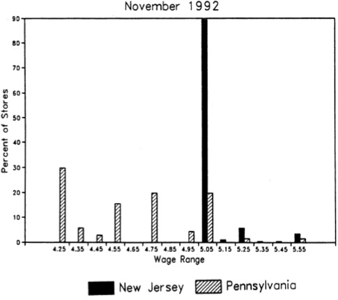
Let’s look at whether the minimum-wage hike in New Jersey in fact raised the minimum wage by examining the distribution of wages in the fast food stores they surveyed. Figure 9.1 shows the distribution of wages in November 1992 after the minimum-wage hike. As can be seen, the minimum-wage hike was binding, evidenced by the mass of wages at the minimum wage in New Jersey.
As a caveat, notice how effective this is at convincing the reader that the minimum wage in New Jersey was binding. This piece of data visualization is not a trivial, or even optional, strategy to be taken in studies such as this. Even John Snow presented carefully designed maps of the distribution of cholera deaths throughout London. Beautiful pictures displaying the “first stage” effect of the intervention on the treatment are crucial in the rhetoric of causal inference, and few have done it as well as Card and Krueger.
Let’s remind ourselves what we’re after—the average causal effect of the minimum-wage hike on employment, or the ATT. Using our decomposition of the \(2\times 2\) DD from earlier, we can write it out as: \[ \begin{align} &\widehat{\delta}^{2\times 2}_{NJ,PA} = \underbrace{E\big[Y^1_{NJ} \Mid\Post\big] - E\big[Y^0_{NJ} \Mid\Post\big]}_{\text{ATT}} \\ &+ \Big[\underbrace{E\big[Y^0_{NJ} \Mid \Post\big] - E\big[Y^0_{NJ} \Mid \Pre\big] \Big]-\Big[E\big[Y^0_{PA} \Mid\Post\big] - E\big[Y_{PA}^0 \Mid\Pre\big] }_{\text{Non-parallel trends bias}} \Big] \end{align} \]
Again, we see the key assumption: the parallel-trends assumption, which is represented by the first difference in the second line. Insofar as parallel trends holds in this situation, then the second term goes to zero, and the \(2\times 2\) DD collapses to the ATT.
The \(2\times 2\) DD requires differencing employment in NJ and PA, then differencing those first differences. This set of steps estimates the true ATT so long as the parallel-trends bias is zero. When that is true, \(\widehat{\delta}^{2\times 2}\) is equal to \(\delta^{ATT}\). If this bottom line is not zero, though, then simple \(2\times 2\) suffers from unknown bias—could bias it upwards, could bias it downwards, could flip the sign entirely. Table 9.2 shows the results of this exercise from Card and Krueger (1994).
| Stores by State | |||
| Dependent Variable | PA | NJ | NJ – PA |
| FTW before | 23.3 | 20.44 | \(-2.89\) |
| (1.35) | (0.51) | (1.44) | |
| FTE after | 21.147 | 21.03 | \(-0.14\) |
| (0.94) | (0.52) | (1.07) | |
| Change in mean FTE | \(-2.16\) | 0.59 | 2.76 |
| (1.25) | (0.54) | (1.36) |
Standard errors in parentheses.
Here you see the result that surprised many people. Card and Krueger (1994) estimate an ATT of +2.76 additional mean full-time-equivalent employment, as opposed to some negative value which would be consistent with competitive input markets. Herein we get Buchanan’s frustration with the paper, which is based mainly on a particular model he had in mind, rather than a criticism of the research design the authors used.
While differences in sample averages will identify the ATT under the parallel assumption, we may want to use multivariate regression instead. For instance, if you need to avoid omitted variable bias through controlling for endogenous covariates that vary over time, then you may want to use regression. Such strategies are another way of saying that you will need to close some known critical backdoor. Another reason for the equation is that by controlling for more appropriate covariates, you can reduce residual variance and improve the precision of your DD estimate.
Using the switching equation, and assuming a constant state fixed effect and time fixed effect, we can write out a simple regression model estimating the causal effect of the minimum wage on employment, \(Y\). This simple \(2\times 2\) is estimated with the following equation: \[ Y_{its} = \alpha + \gamma NJ_s + \lambda D_t + \delta (NJ \times D)_{st} + \varepsilon_{its} \] NJ is a dummy equal to 1 if the observation is from NJ, and \(D\) is a dummy equal to 1 if the observation is from November (the post period). This equation takes the following values, which I will list in order according to setting the dummies equal to one and/or zero:
PA Pre: \(\alpha\)
PA Post: \(\alpha + \lambda\)
NJ Pre: \(\alpha + \gamma\)
NJ Post: \(\alpha+\gamma +\lambda+\delta\)
We can visualize the \(2\times 2\) DD parameter in Figure 9.2.
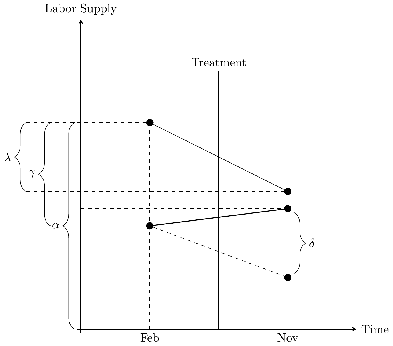
Now before we hammer the parallel trends assumption for the billionth time, I wanted to point something out here which is a bit subtle. But do you see the \(\delta\) parameter floating in the air above the November line in the Figure 55? This is the difference between a counterfactual level of employment (the bottom black circle in November on the negatively sloped dashed line) and the actual level of employment (the above black circle in November on the positively sloped solid line) for New Jersey. It is therefore the ATT, because the ATT is equal to \[ \delta=E[Y^1_{NJ,\Post}] - E[Y^0_{NJ,\Post}] \] wherein the first is observed (because \(Y=Y^1\) in the post period) and the latter is unobserved for the same reason.
Now here’s the kicker: OLS will always estimate that \(\delta\) line even if the counterfactual slope had been something else. That’s because OLS uses Pennsylvania’s change over time to project a point starting at New Jersey’s pre-treatment value. When OLS has filled in that missing amount, the parameter estimate is equal to the difference between the observed post-treatment value and that projected value based on the slope of Pennsylvania regardless of whether that Pennsylvania slope was the correct benchmark for measuring New Jersey’s counterfactual slope. OLS always estimates an effect size using the slope of the untreated group as the counterfactual, regardless of whether that slope is in fact the correct one.
But, see what happens when Pennsylvania’s slope is equal to New Jersey’s counterfactual slope? Then that Pennsylvania slope used in regression will mechanically estimate the ATT. In other words, only when the Pennsylvania slope is the counterfactual slope for New Jersey will OLS coincidentally identify that true effect. Let’s see that here in Figure 9.3.
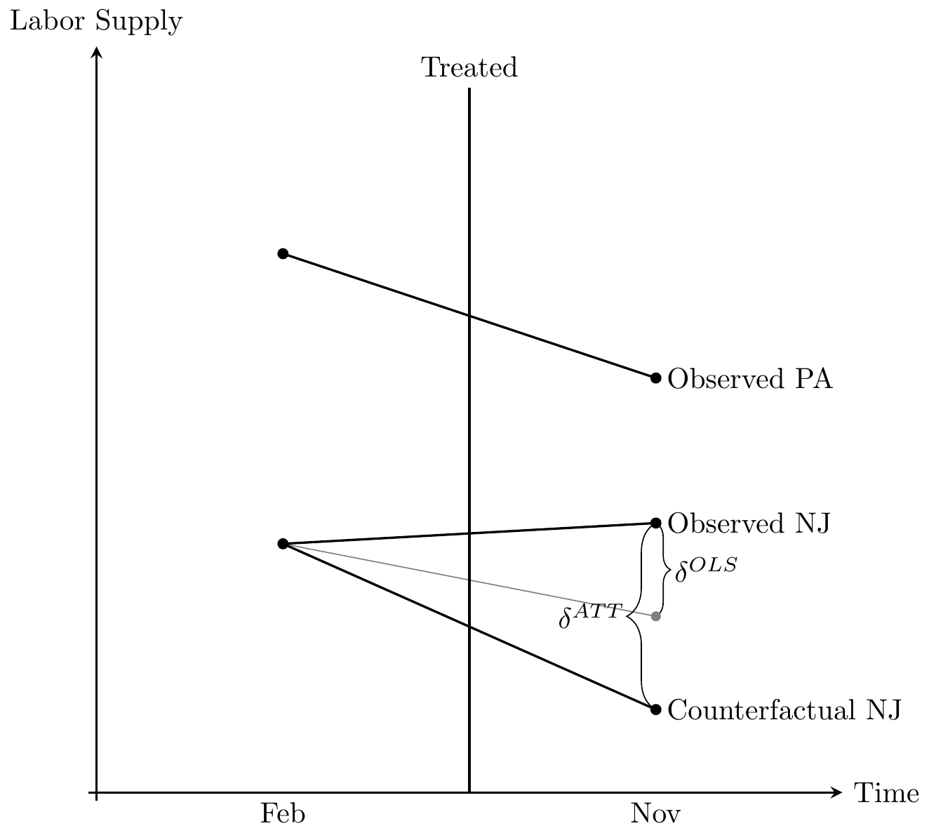
Notice the two \(\delta\) listed: on the left is the true parameter \(\delta^{ATT}\). On the right is the one estimated by OLS, \(\widehat{\delta}^{OLS}\). The falling solid line is the observed Pennsylvania change, whereas the falling solid line labeled “observed NJ” is the change in observed employment for New Jersey between the two periods.
The true causal effect, \(\delta^{ATT}\), is the line from the “observed NJ” point and the “counterfactual NJ” point. But OLS does not estimate this line. Instead, OLS uses the falling Pennsylvania line to draw a parallel line from the February NJ point, which is shown in thin gray. And OLS simply estimates the vertical line from the observed NJ point to the post NJ point, which as can be seen underestimates the true causaleffect.
Here we see the importance of the parallel trends assumption. The only situation under which the OLS estimate equals the ATT is when the counterfactual NJ just coincidentally lined up with the gray OLS line, which is a line parallel to the slope of the Pennsylvania line. Herein lies the source of understandable skepticism of many who have been paying attention: why should we base estimation on this belief in a coincidence? After all, this is a counterfactual trend, and therefore it is unobserved, given it never occurred. Maybe the counterfactual would’ve been the gray line, but maybe it would’ve been some other unknown line. It could’ve been anything—we just don’t know.
This is why I like to tell people that the parallel trends assumption is actually just a restatement of the strict exogeneity assumption we discussed in the panel chapter. What we are saying when we appeal to parallel trends is that we have found a control group who approximates the traveling path of the treatment group and that the treatment is not endogenous. If it is endogenous, then parallel trends is always violated because in counterfactual the treatment group would’ve diverged anyway, regardless of the treatment.
Before we see the number of tests that economists have devised to provide some reasonable confidence in the belief of the parallel trends, I’d like to quickly talk about standard errors in a DD design.
Many studies employing DD strategies use data from many years—not just one pre-treatment and one post-treatment period like Card and Krueger (1994). The variables of interest in many of these setups only vary at a group level, such as the state, and outcome variables are often serially correlated. In Card and Krueger (1994), it is very likely for instance that employment in each state is not only correlated within the state but also serially correlated. Bertrand, Duflo, and Mullainathan (2004) point out that the conventional standard errors often severely understate the standard deviation of the estimators, and so standard errors are biased downward, “too small,” and therefore overreject the null hypothesis. Bertrand, Duflo, and Mullainathan (2004) propose the following solutions:
Block bootstrapping standard errors.
Aggregating the data into one pre and one post period.
Clustering standard errors at the group level.
If the block is a state, then you simply sample states with replacement for bootstrapping. Block bootstrap is straightforward and only requires a little programming involving loops and storing the estimates. As the mechanics are similar to that of randomization inference, I leave it to the reader to think about how they might tackle this.
This approach ignores the time-series dimensions altogether, and if there is only one pre and post period and one untreated group, it’s as simple as it sounds. You simply average the groups into one pre and post period, and conduct difference-in-differences on those aggregated. But if you have differential timing, it’s a bit unusual because you will need to partial out state and year fixed effects before turning the analysis into an analysis involving residualization. Essentially, for those common situations where you have multiple treatment time periods (which we discuss later in greater detail), you would regress the outcome onto panel unit and time fixed effects and any covariates. You’d then obtain the residuals for only the treatment group. You then divide the residuals only into a pre and post period; you are essentially at this point ignoring the never-treated groups. And then you regress the residuals on the after dummy. It’s a strange procedure, and does not recover the original point estimate, so I focus instead on the third.
Correct treatment of standard errors sometimes makes the number of groups very small: in Card and Krueger (1994), the number of groups is only two. More common than not, researchers will use the third option (clustering the standard errors by group). I have only one time seen someone do all three of these; it’s rare though. Most people will present just the clustering solution—most likely because it requires minimal programming.
For clustering, there is no programming required, as most software packages allow for it already. You simply adjust standard errors by clustering at the group level, as we discussed in the earlier chapter, or the level of treatment. For state-level panels, that would mean clustering at the state level, which allows for arbitrary serial correlation in errors within a state over time. This is the most common solution employed.
Inference in a panel setting is independently an interesting area. When the number of clusters is small, then simple solutions like clustering the standard errors no longer suffice because of a growing false positive problem. In the extreme case with only one treatment unit, the over-rejection rate at a significance of 5% can be as high as 80% in simulations even using the wild bootstrap technique which has been suggested for smaller numbers of clusters (Cameron, Gelbach, and Miller 2008; MacKinnon and Webb 2017). In such extreme cases where there is only one treatment group, I have preferred to use randomization inference following Buchmueller, DiNardo, and Valletta (2011).
Given the critical importance of the parallel trends assumption in identifying causal effects with the DD design, and given that one of the observations needed to evaluate the parallel-trends assumption is not available to the researcher, one might throw up their hands in despair. But economists are stubborn, and they have spent decades devising ways to test whether it’s reasonable to believe in parallel trends. We now discuss the obligatory test for any DD design—the event study. Let’s rewrite the decomposition of the \(2 \times 2\) DD again. \[ \begin{align} &\widehat{\delta}^{2\times 2}_{kU} = \underbrace{E\big[Y^1_{k} \Mid \Post\big] - E\big[Y^0_{k} \Mid \Post\big]}_{\text{ATT}} \\ &+\Big[\underbrace{E\big[Y^0_k \Mid \Post\big] - E\big[Y^0_k \Mid\Pre\big] \Big]-\Big[E\big[Y^0_U \Mid \Post\big] - E\big[Y_{U}^0 \Mid\Pre\big] }_{\text{Non-parallel trends bias}} \Big] \end{align} \]
We are interested in the first term, ATT, but it is contaminated by selection bias when the second term does not equal zero. Since evaluating the second term requires the counterfactual, \(E[Y^0_k \Mid Post]\), we are unable to do so directly. What economists typically do, instead, is compare placebo pre-treatment leads of the DD coefficient. If DD coefficients in the pre-treatment periods are statistically zero, then the difference-in-differences between treatment and control groups followed a similar trend prior to treatment. And here’s the rhetorical art of the design: if they had been similar before, then why wouldn’t they continue to be post-treatment?
But notice that this rhetoric is a kind of proof by assertion. Just because they were similar before does not logically require they be the same after. Assuming that the future is like the past is a form of the gambler’s fallacy called the “reverse position.” Just because a coin came up heads three times in a row does not mean it will come up heads the fourth time—not without further assumptions. Likewise, we are not obligated to believe that that counterfactual trends would be the same post-treatment because they had been similar pre-treatment without further assumptions about the predictive power of pre-treatment trends. But to make such assumptions is again to make untestable assumptions, and so we are back where we started.
One situation where parallel trends would be obviously violated is if the treatment itself was endogenous. In such a scenario, the assignment of the treatment status would be directly dependent on potential outcomes, and absent the treatment, potential outcomes would’ve changed regardless. Such traditional endogeneity requires more than merely lazy visualizations of parallel leads. While the test is important, technically pre-treatment similarities are neither necessary nor sufficient to guarantee parallel counterfactual trends (Kahn-Lang and Lang 2019). The assumption is not so easily proven. You can never stop being diligent in attempting to determine whether groups of units endogenously selected into treatment, the presence of omitted variable biases, various sources of selection bias, and open backdoor paths. When the structural error term in a dynamic regression model is uncorrelated with the treatment variable, you have strict exogeneity, and that is what gives you parallel trends, and that is what makes you able to make meaningful statements about your estimates.
Now with that pessimism out of the way, let’s discuss event study plots because though they are not direct tests of the parallel trends assumption, they have their place because they show that the two groups of units were comparable on dynamics in the pre-treatment period.6 Such conditional independence concepts have been used profitably throughout this book, and we do so again now.
Authors have tried showing the differences between treatment and control groups a few different ways. One way is to simply show the raw data, which you can do if you have a set of groups who received the treatment at the same point in time. Then you would just visually inspect whether the pre-treatment dynamics of the treatment group differed from that of the control group units.
But what if you do not have a single treatment date? What if instead you have differential timing wherein groups of units adopt the treatment at different points? Then the concept of pre-treatment becomes complex. If New Jersey raised its minimum wage in 1992 and New York raised its minimum wage in 1994, but Pennsylvania never raised its minimum wage, the pre-treatment period is defined for New Jersey (1991) and New York (1993), but not Pennsylvania. Thus, how do we go about testing for pre-treatment differences in that case? People have done it in a variety of ways.
One possibility is to plot the raw data, year by year, and simply eyeball. You would compare the treatment group with the never-treated, for instance, which might require a lot of graphs and may also be awkward looking. Cheng and Hoekstra (2013) took this route, and created a separate graph comparing treatment groups with an untreated group for each different year of treatment. The advantage is its transparent display of the raw unadjusted data. No funny business. The disadvantage of this several-fold. First, it may be cumbersome when the number of treatment groups is large, making it practically impossible. Second, it may not be beautiful. But third, this necessarily assumes that the only control group is the never-treated group, which in fact is not true given what Goodman-Bacon (2019) has shown. Any DD is a combination of a comparison between the treatment and the never treated, an early treated compared to a late treated, and a late treated compared to an early treated. Thus only showing the comparison with the never treated is actually a misleading presentation of the underlying mechanization of identification using an twoway fixed-effects model with differential timing.
Anderson, Hansen, and Rees (2013) took an alternative, creative approach to show the comparability of states with legalized medical marijuana and states without. As I said, the concept of a pre-treatment period for a control state is undefined when pre-treatment is always in reference to a specific treatment date which varies across groups. So, the authors construct a recentered time path of traffic fatality rates for the control states by assigning random treatment dates to all control counties and then plotting the average traffic fatality rates for each group in years leading up to treatment and beyond. This approach has a few advantages. First, it plots the raw data, rather than coefficients from a regression (as we will see next). Second, it plots that data against controls. But its weakness is that technically, the control series is not in fact true. It is chosen so as to give a comparison, but when regressions are eventually run, it will not be based on this series. But the main main shortcoming is that technically it is not displaying any of the control groups that will be used for estimation Goodman-Bacon (2019). It is not displaying a comparison between the treated and the never treated; it is not a comparison between the early and late treated; it is not a comparison between the late and early treated. While a creative attempt to evaluate the pre-treatment differences in leads, it does not in fact technically show that.
The current way in which authors evaluate the pre-treatment dynamics between a treatment and control group with differential timing is to estimate a regression model that includes treatment leads and lags. I find that it is always useful to teach these concepts in the context of an actual paper, so let’s review an interesting working paper by Miller et al. (2019).
A provocative new study by Miller et al. (2019) examined the expansion of Medicaid under the Affordable Care Act. They were primarily interested in the effect that this expansion had on population mortality. Earlier work had cast doubt on Medicaid’s effect on mortality (Finkelstein et al. 2012; Baicker et al. 2013), so revisiting the question with a larger sample size had value.
Like Snow before them, the authors link data sets on deaths with a large-scale federal survey data, thus showing that shoe leather often goes hand in hand with good design. They use these data to evaluate the causal impact of Medicaid enrollment on mortality using a DD design. Their focus is on the near-elderly adults in states with and without the Affordable Care Act Medicaid expansions and they find a 0.13-percentage-point decline in annual mortality, which is a 9.3% reduction over the sample mean, as a result of the ACA expansion. This effect is a result of a reduction in disease-related deaths and gets larger over time. Medicaid, in this estimation, saved a non-trivial number of lives.
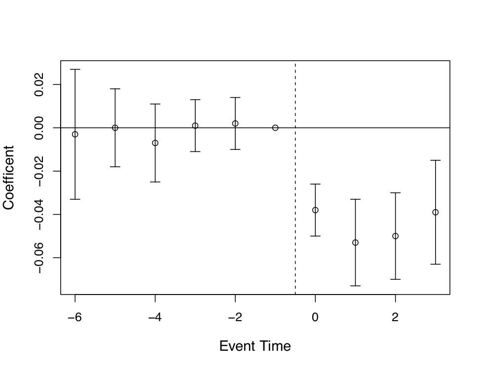
As with many contemporary DD designs, Miller et al. (2019) evaluate the pre-treatment leads instead of plotting the raw data by treatment and control. Post-estimation, they plotted regression coefficients with 95% confidence intervals on their treatment leads and lags. Including leads and lags into the DD model allowed the reader to check both the degree to which the post-treatment treatment effects were dynamic, and whether the two groups were comparable on outcome dynamics pre-treatment. Models like this one usually follow a form like: \[ Y_{its} = \gamma_s + \lambda_t + \sum_{\tau=-q}^{-1}\gamma_{\tau}D_{s\tau} + \sum_{\tau=0}^m\delta_{\tau}D_{s\tau}+x_{ist}+ \varepsilon_{ist} \] Treatment occurs in year 0. You include \(q\) leads or anticipatory effects and \(m\) lags or post-treatment effects.
Miller et al. (2019) produce four event studies that when taken together tell the main parts of the story of their paper. This is, quite frankly, the art of the rhetoric of causal inference—visualization of key estimates, such as “first stages” as well as outcomes and placebos. The event study plots are so powerfully persuasive, they will make you a bit jealous, since oftentimes yours won’t be nearly so nice. Let’s look at the first three. State expansion of Medicaid under the Affordable Care Act increased Medicaid eligibility (Figure 9.4), which is not altogether surprising. It also caused an increase in Medicaid coverage (Figure 9.5), and as a consequence reduced the percentage of the uninsured population (Figure 9.6). All three of these are simply showing that the ACA Medicaid expansion had “bite”—people enrolled and became insured.
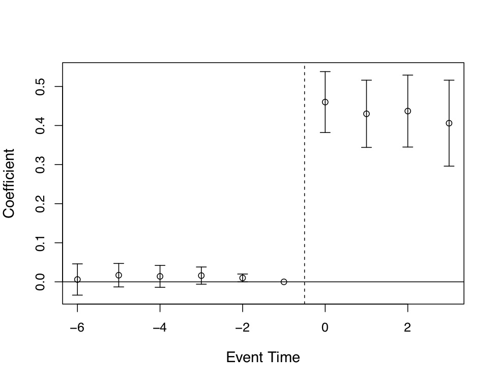
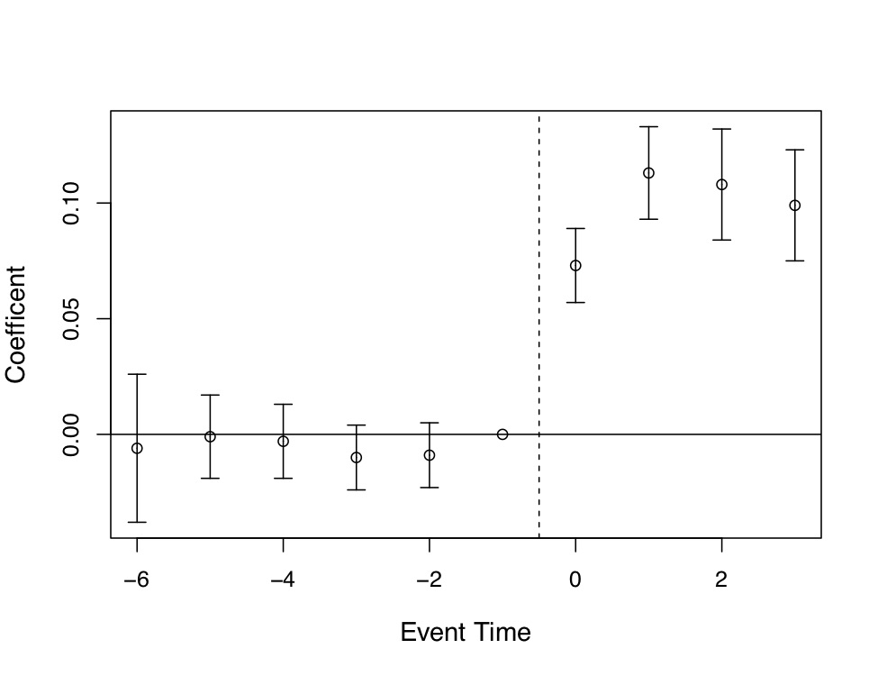
There are several features of these event studies that should catch your eye. First, look at Figure 9.4. The pre-treatment coefficients are nearly on the zero line itself. Not only are they nearly zero in their point estimate, but their standard errors are very small. This means these are very precisely estimated zero differences between individuals in the two groups of states prior to the expansion.
The second thing you see, though, is the elephant in the room. Post-treatment, the probability that someone becomes eligible for Medicaid immediately shoots up to 0.4 and while not as precise as the pre-treatment coefficients, the authors can rule out effects as low as 0.3 to 0.35. These are large increases in eligibility, and the fact that the coefficients prior to the treatment are basically zero, we find it easy to believe that the risen coefficients post-treatment were caused by the ACA’s expansion of Medicaid in states.
Of course, I would not be me if I did not say that technically the zeroes pre-treatment do not therefore mean that the post-treatment difference between counterfactual trends and observed trends are zero, but doesn’t it seem compelling when you see it? Doesn’t it compel you, just a little bit, that the changes in enrollment and insurance status were probably caused by the Medicaid expansion? I daresay a table of coefficients with leads, lags, and standard errors would probably not be as compelling even though it is the identical information. Also, it is only fair that the skeptic refuse these patterns with new evidence of what it is other than the Medicaid expansion. It is not enough to merely hand wave a criticism of omitted variable bias; the critic must be as engaged in this phenomenon as the authors themselves, which is how empiricists earn the right to critique someoneelse’s work.
Similar graphs are shown for coverage—prior to treatment, the two groups of individuals in treatment and control were similar with regards to their coverage and uninsured rate. But post-treatment, they diverge dramatically. Taken together, we have the “first stage,” which means we can see that the Medicaid expansion under the ACA had “bite.” Had the authors failed to find changes in eligibility, coverage, or uninsured rates, then any evidence from the secondary outcomes would have doubt built in. This is the reason it is so important that you examine the first stage (treatment’s effect on usage), as well as the second stage (treatment’s effect on the outcomes of interest).
But now let’s look at the main result—what effect did this have on population mortality itself? Recall, Miller et al. (2019) linked administrative death records with a large-scale federal survey. So they actually know who is on Medicaid and who is not. John Snow would be proud of this design, the meticulous collection of high-quality data, and all the shoeleather the authors showed.
This event study is presented in Figure 9.7. A graph like this is the contemporary heart and soul of a DD design, both because it conveys key information regarding the comparability of the treatment and control groups in their dynamics just prior to treatment, and because such strong data visualization of main effects are powerfully persuasive. It’s quite clear looking at it that there was no difference between the trending tendencies of the two sets of state prior to treatment, making the subsequent divergence all the more striking.
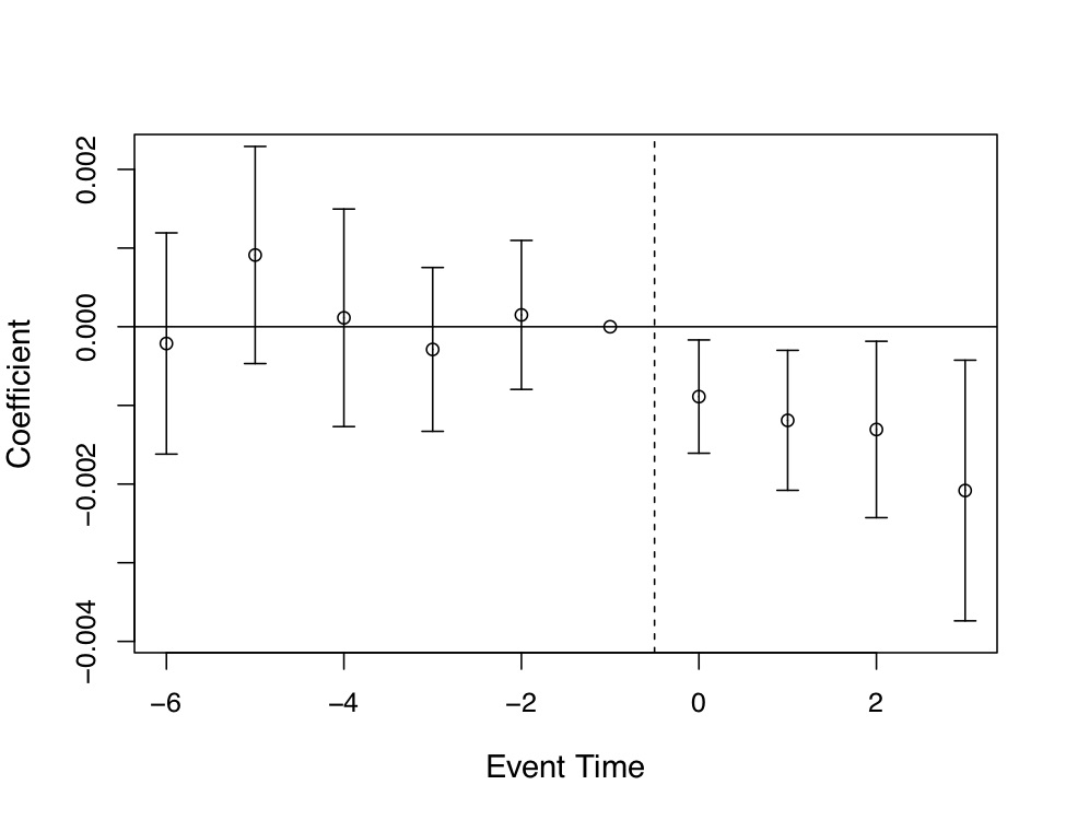
But a picture like this is only as important as the thing that it is studying, and it is worth summarizing what Miller et al. (2019) have revealed here. The expansion of ACA Medicaid led to large swaths of people becoming eligible for Medicaid. In turn, they enrolled in Medicaid, which caused the uninsured rate to drop considerably. The authors then find amazingly using linked administrative data on death records that the expansion of ACA Medicaid led to a 0.13 percentage point decline in annual mortality, which is a 9.3 percent reduction over the mean. They go on to try and understand the mechanism (another key feature of this high-quality study) by which such amazing effects may have occurred, and conclude that Medicaid caused near-elderly individuals to receive treatment for life-threatening illnesses. I suspect we will be hearing about this study for many years.
There are several tests of the validity of a DD strategy. I have already discussed one—comparability between treatment and control groups on observable pre-treatment dynamics. Next, I will discuss other credible ways to evaluate whether estimated causal effects are credible by emphasizing the use of placebo falsification.
The idea of placebo falsification is simple. Say that you are finding some negative effect of the minimum wage on low-wage employment. Is the hypothesis true if we find evidence in favor? Maybe, maybe not. Maybe what would really help, though, is if you had in mind an alternative hypothesis and then tried to test that alternative hypothesis. If you cannot reject the null on the alternative hypothesis, then it provides some credibility to your original analysis. For instance, maybe you are picking up something spurious, like cyclical factors or other unobservables not easily captured by a time or state fixed effects. So what can you do?
One candidate placebo falsification might simply be to use data for an alternative type of worker whose wages would not be affected by the binding minimum wage. For instance, minimum wages affect employment and earnings of low-wage workers as these are the workers who literally are hired based on the market wage. Without some serious general equilibrium gymnastics, the minimum wage should not affect the employment of higher wage workers, because the minimum wage is not binding on high wage workers. Since high- and low-wage workers are employed in very different sectors, they are unlikely to be substitutes. This reasoning might lead us to consider the possibility that higher wage workers might function as a placebo.
There are two ways you can go about incorporating this idea into our analysis. Many people like to be straightforward and simply fit the same DD design using high wage employment as the outcome. If the coefficient on minimum wages is zero when using high wage worker employment as the outcome, but the coefficient on minimum wages for low wage workers is negative, then we have provided stronger evidence that complements the earlier analysis we did when on the low wage workers. But there is another method that uses the within-state placebo for identification called the difference-in-differences-in-differences (“triple differences”). I will discuss that design now.
In our earlier analysis, we assumed that the only thing that happened to New Jersey after it passed the minimum wage was a common shock, \(T\), but what if there were state-specific time shocks such as \(NJ_t\) or \(PA_t\)? Then even DD cannot recover the treatment effect. Let’s see for ourselves using a modification of the simple minimum-wage table from earlier, which will include the within-state workers who hypothetically were untreated by the minimum wage—the “high-wage workers.”
| States | Group | Period | Outcomes | \(D_1\) | \(D_2\) | \(D_3\) |
|---|---|---|---|---|---|---|
| NJ | Low-wage workers | After | \(NJ_l+T+NJ_t+l_t+D\) | \(T+NJ_t+\) | \((l_t-h_t)+D\) | \(D\) |
| Before | \(NJ_l\) | \(l_t+D\) | ||||
| High-wage workers | After | \(NJ_h+T+NJ_t+h_t\) | \(T+NJ_t+h_t\) | |||
| Before | \(NJ_h\) | |||||
| PA | Low-wage workers | After | \(PA_l+T+PA_t+l_t\) | \(T+PA_t+l_t\) | \(l_t-h_t\) | |
| Before | \(PA_l\) | |||||
| High-wage workers | After | \(PA_h+T+PA_t+h_t\) | \(T+PA_t+h_t\) | |||
| Before | \(PA_h\) |
Before the minimum-wage increase, low- and high-wage employment in New Jersey is determined by a group-specific New Jersey fixed effect (e.g., \(NJ_h\)). The same is true for Pennsylvania. But after the minimum-wage hike, four things change in New Jersey: national trends cause employment to change by \(T\); New Jersey-specific time shocks change employment by \(NJ_t\); generic trends in low-wage workers change employment by \(l_t\); and the minimum-wage has some unknown effect \(D\). We have the same setup in Pennsylvania except there is no minimum wage, and Pennsylvania experiences its own time shocks.
Now if we take first differences for each set of states, we only eliminate the state fixed effect. The first difference estimate for New Jersey includes the minimum-wage effect, \(D\), but is also hopelessly contaminated by confounders (i.e., \(T+NJ_t+l_t\)). So we take a second difference for each state, and doing so, we eliminate two of the confounders: \(T\) disappears and \(NJ_t\) disappears. But while this DD strategy has eliminated several confounders, it has also introduced new ones (i.e., \((l_t-h_t)\)). This is the final source of selection bias that triple differences are designed to resolve. But, by differencing Pennsylvania’s second difference from New Jersey, the \((l_t-h_t)\) is deleted and the minimum-wage effect is isolated.
Now, this solution is not without its own set of unique parallel-trends assumptions. But one of the parallel trends here I’d like you to see is the \(l_t-h_t\) term. This parallel trends assumption states that the effect can be isolated if the gap between high- and low-wage employment would’ve evolved similarly in the treatment state counterfactual as it did in the historical control states. And we should probably provide some credible evidence that this is true with leads and lags in an event study as before.
The triple differences design was first introduced by Gruber (1994) in a study of state-level policies providing maternity benefits. I present his main results in Table 9.3. Notice that he uses as his treatment group married women of childbearing age in treatment and control states, but he also uses a set of placebo units (older women and single men 20–40) as within-state controls. He then goes through the differences in means to get the difference-in-differences for each set of groups, after which he calculates the DDD as the difference between these two difference-in-differences.
| Location/year | Pre-law | Post-law | Difference |
|---|---|---|---|
| A. Treatment: Married women, 20-40yo | |||
| Experimental states | 1.547 | 1.513 | \(-0.034\) |
| (0.012) | (0.012) | (0.017) | |
| Control states | 1.369 | 1.397 | 0.028 |
| (0.010) | (0.010) | (0.014) | |
| Difference | 0.178 | 0.116 | |
| (0.016) | (0.015) | ||
| Difference-in-difference | −0.062 | ||
| (0.022) | |||
| B. Control: Over 40 and Single Males 20-40 | |||
| Experimental states | 1.759 | 1.748 | \(-0.011\) |
| (0.007) | (0.007) | (0.010) | |
| Control states | 1.630 | 1.627 | \(-0.003\) |
| (0.007) | (0.007) | (0.010) | |
| Difference | 1.09 | 1.21 | |
| (0.010) | (0.010) | ||
| Difference-in-difference | -0.008 | ||
| (0.014) | |||
| DDD | -0.054 | ||
| (0.026) |
Standard errors in parentheses.
Ideally when you do a DDD estimate, the causal effect estimate will come from changes in the treatment units, not changes in the control units. That’s precisely what we see in Gruber (1994): the action comes from changes in the married women age 20–40 (\(-0.062\)); there’s little movement among the placebo units \((-0.008)\). Thus when we calculate the DDD, we know that most of that calculation is coming from the first DD, and not so much from the second. We emphasize this because DDD is really just another falsification exercise, and just as we would expect no effect had we done the DD on this placebo group, we hope that our DDD estimate is also based on negligible effects among the control group.
What we have done up to now is show how to use sample analogs and simple differences in means to estimate the treatment effect using DDD. But we can also use regression to control for additional covariates that perhaps are necessary to close backdoor paths and so forth. What does that regression equation look like? Both the regression itself, and the data structure upon which the regression is based, are complicated because of the stacking of different groups and the sheer number of interactions involved. Estimating a DDD model requires estimating the following regression: \[ \begin{align} Y_{ijt} &= \alpha + \psi X_{ijt} + \beta_1 \tau_t + \beta_2 \delta_j + \beta_3 D_i + \beta_4(\delta \times \tau)_{jt} \\ & +\beta_5(\tau \times D)_{ti} + \beta_6(\delta \times D)_{ij} + \beta_7(\delta \times \tau \times D)_{ijt}+ \varepsilon_{ijt} \end{align} \] where the parameter of interest is \(\beta_7\). First, notice the additional subscript, \(j\). This \(j\) indexes whether it’s the main category of interest (e.g., low-wage employment) or the within-state comparison group (e.g., high-wage employment). This requires a stacking of the data into a panel structure by group, as well as state. Second, the DDD model requires that you include all possible interactions across the group dummy \(\delta_j\), the post-treatment dummy \(\tau_t\) and the treatment state dummy \(D_i\). The regression must include each dummy independently, each individual interaction, and the triple differences interaction. One of these will be dropped due to multicollinearity, but I include them in the equation so that you can visualize all the factors used in the product of these terms.
Now that we know a little about the DD design, it would probably be beneficial to replicate a paper. And since the DDD requires reshaping panel data multiple times, that makes working through a detailed replication even more important. The study we will be replicating is Cunningham and Cornwell (2013), one of my first publications and the third chapter of my dissertation. Buckle up, as this will be a bit of a roller-coaster ride.
Gruber, Levine, and Staiger (1999) was the beginning of what would become a controversial literature in reproductive health. They wanted to know the characteristics of the marginal child aborted had that child reached their teen years. The authors found that the marginal counterfactual child aborted was 60% more likely to grow up in a single-parent household, 50% more likely to live in poverty, and 45% more likely to be a welfare recipient. Clearly there were strong selection effects related to early abortion whereby it selected on families with fewer resources.
Their finding about the marginal child led John Donohue and Steven Levitt to wonder if there might be far-reaching effects of abortion legalization given the strong selection associated with its usage in the early 1970s. In Donohue and Levitt (2001), the authors argued that they had found evidence that abortion legalization had also led to massive declines in crime rates. Their interpretation of the results was that abortion legalization had reduced crime by removing high-risk individuals from a birth cohort, and as that cohort aged, those counterfactual crimes disappeared. Levitt (2004) attributed as much as 10% of the decline in crime between 1991 and 2001 to abortion legalization in the 1970s.
This study was, not surprisingly, incredibly controversial—some of it warranted but some unwarranted. For instance, some attacked the paper on ethical grounds and argued the paper was revitalizing the pseudoscience of eugenics. But Levitt was careful to focus only on the scientific issues and causal effects and did not offer policy advice based on his own private views, whatever those may be.
But some of the criticism the authors received was legitimate precisely because it centered on the research design and execution itself. Joyce (2004), Joyce (2009), and Foote and Goetz (2008) disputed the abortion-crime findings—some through replication exercises using different data, some with different research designs, and some through the discovery of key coding errors and erroneous variable construction.
One study in particular challenged the whole enterprise of estimating longrun improvements due to abortion legalization. For instance, Ted Joyce, an expert on reproductive health, cast doubt on the abortion-crime hypothesis using a DDD design (Joyce 2009). In addition to challenging Donohue and Levitt (2001), Joyce also threw down a gauntlet. He argued that if abortion legalization had such extreme negative selection as claimed by by Gruber, Levine, and Staiger (1999) and Donohue and Levitt (2001), then it shouldn’t show up just in crime. It should show up everywhere. Joyce writes:
If abortion lowers homicide rates by 20–30%, then it is likely to have affected an entire spectrum of outcomes associated with well-being: infant health, child development, schooling, earnings and marital status. Similarly, the policy implications are broader than abortion. Other interventions that affect fertility control and that lead to fewer unwanted births—contraception or sexual abstinence—have huge potential payoffs. In short, a causal relationship between legalized abortion and crime has such significant ramifications for social policy and at the same time is so controversial, that further assessment of the identifying assumptions and their robustness to alternative strategies is warranted. (p.112)
Cunningham and Cornwell (2013) took up Joyce’s challenge. Our study estimated the effects of abortion legalization on long-term gonorrhea incidence. Why gonorrhea? For one, single-parent households are a risk factor that lead to earlier sexual activity and unprotected sex, and Levine et al. (1999) found that abortion legalization caused teen childbearing to fall by 12%. Other risky outcomes had been found by numerous authors. Charles and Stephens (2006) reported that children exposed in utero to a legalized abortion regime were less likely to use illegal substances, which is correlated with risky sexual behavior.
My research design differed from Donohue and Levitt (2001) in that they used state-level lagged values of an abortion ratio, whereas I used difference-in-differences. My design exploited the early repeal of abortion in five states in 1970 and compared those states to the states that were legalized under Roe v. Wade in 1973. To do this, I needed cohort-specific data on gonorrhea incidence by state and year, but as those data are not collected by the CDC, I had to settle for second best. That second best was the CDC’s gonorrhea data broken into five-year age categories (e.g., age 15–19, age 20–24). But this might still be useful because even with aggregate data, it might be possible to test the model I had in mind.
To understand this next part, which I consider the best part of my study, you must first accept a basic view of science that good theories make very specific falsifiable hypotheses. The more specific the hypothesis, the more convincing the theory, because if we find evidence exactly where the theory predicts, a Bayesian is likely to update her beliefs towards accepting the theory’s credibility. Let me illustrate what I mean with a brief detour involving Albert Einstein’s theory of relativity.
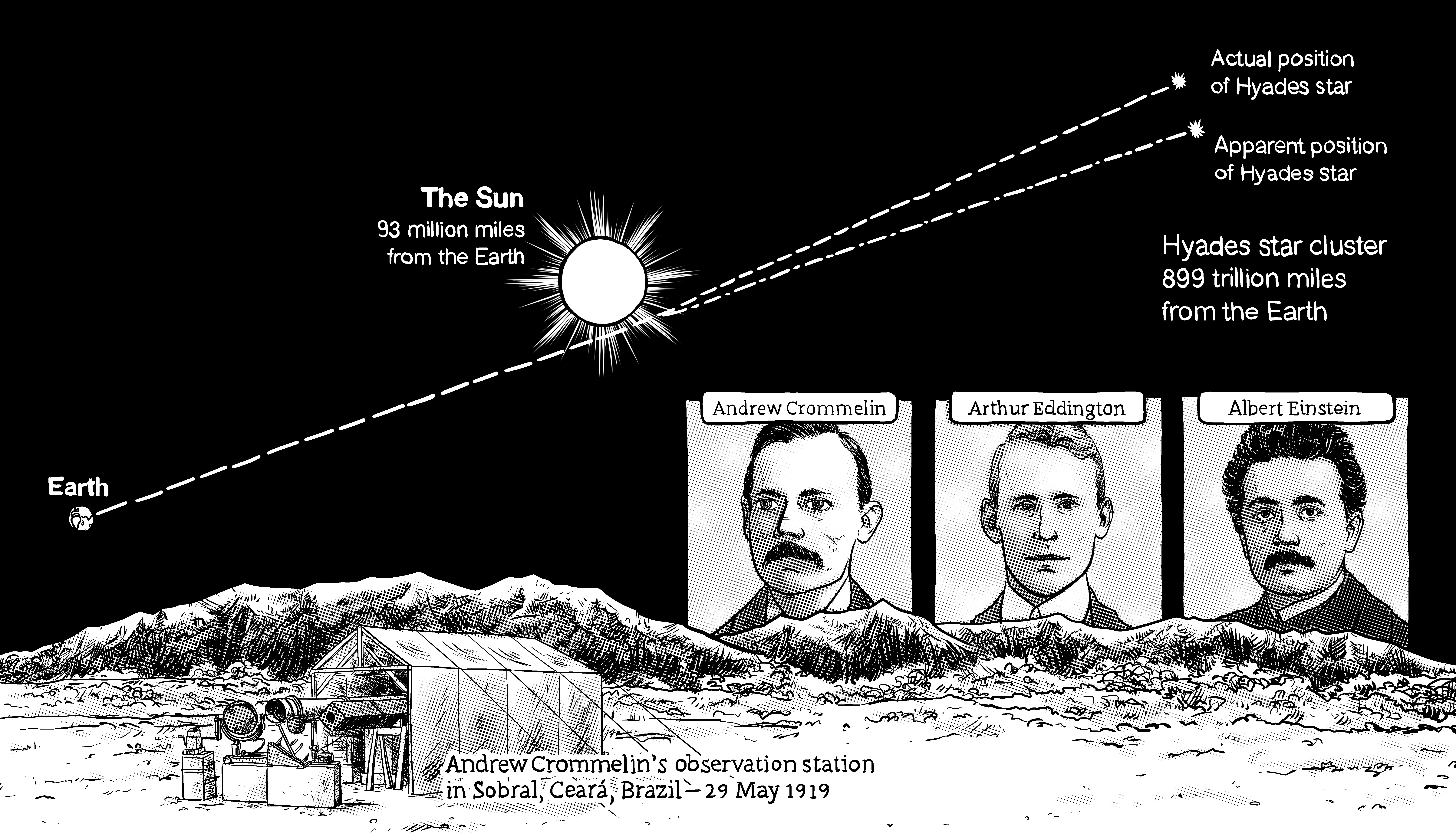
Einstein’s theory made several falsifiable hypotheses. One of them involved a precise prediction of the warping of light as it moved past a large object, such as a star. The problem was that testing this theory involved observing distance between stars at night and comparing it to measurements made during the day as the starlight moved past the sun. Problem was, the sun is too bright in the daytime to see the stars, so those critical measurements can’t be made. But Andrew Crommelin and Arthur Eddington realized the measurements could be made using an ingenious natural experiment. That natural experiment was an eclipse. They shipped telescopes to different parts of the world under the eclipse’s path so that they had multiple chances to make the measurements. They decided to measure the distances of a large cluster of stars passing by the sun when it was dark and then immediately during an eclipse (Figure 9.8). That test was over a decade after Einstein’s work was first published (Coles 2019). Think about it for a second—Einstein’s theory by deduction is making predictions about phenomena that no one had ever really observed before. If this phenomena turned out to exist, then how couldn’t the Bayesian update her beliefs and accept that the theory was credible? Incredibly, Einstein was right—just as he predicted, the apparent position of these stars shifted when moving around the sun. Incredible!
So what does that have to do with my study of abortion legalization and gonorrhea? The theory of abortion legalization having strong selection effects on cohorts makes very specific predictions about the shape of observed treatment effects. And if we found evidence for that shape, we’d be forced to take the theory seriously. So what what were these unusual yet testable predictions exactly?
The testable prediction from the staggered adoption of abortion legalization concerned the age-year-state profile of gonorrhea. The early repeal of abortion by five states three years before the rest of the country predicts lower incidence among 15- to 19-year-olds in the repeal states only during the 1986–1992 period relative to their Roe counterparts as the treated cohorts aged. That’s not really all that special a prediction though. Maybe something happens in those same states fifteen to nineteen years later that isn’t controlled for, for instance. What else?
The abortion legalization theory also predicted the shape of the observed treatment effects in this particular staggered adoption. Specifically, we should observe nonlinear treatment effects. These treatment effects should be increasingly negative from 1986 to 1989, plateau from 1989 to 1991, then gradually dissipate until 1992. In other words, the abortion legalization hypothesis predicts a parabolic treatment effect as treated cohorts move through the age distribution. All coefficients on the DD coefficients beyond 1992 should be zero and/or statistically insignificant.
I illustrate these predictions in Figure 9.9. The top horizontal axis shows the year of the panel, the vertical axis shows the age in calendar years, and the cells show the cohort for a given person of a certain age in that given year. For instance, consider a 15-year-old in 1985. She was born in 1970. A 15-year-old in 1986 was born in 1971. A 15-year-old in 1987 was born in 1972, and so forth. I mark the cohorts who were treated by either repeal or Roe in different shades of gray.
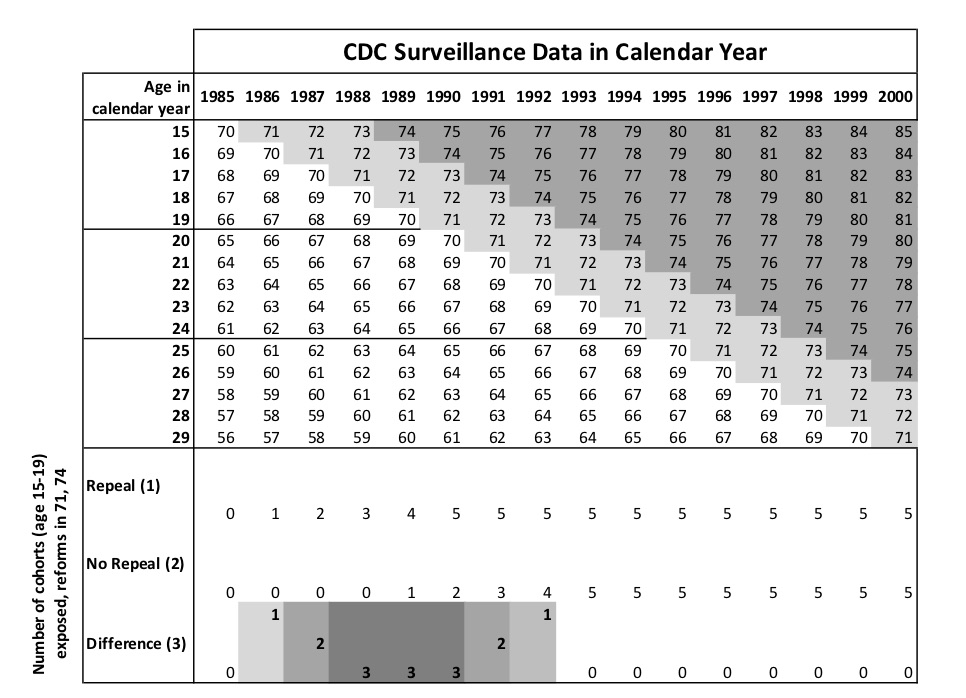
The theoretical predictions of the staggered rollout is shown at the bottom of Figure 9.9. In 1986, only one cohort (the 1971 cohort) was treated and only in the repeal states. Therefore, we should see small declines in gonorrhea incidence among 15-year-olds in 1986 relative to Roe states. In 1987, two cohorts in our data are treated in the repeal states relative to Roe, so we should see larger effects in absolute value than we saw in 1986. But from 1988 to 1991, we should at most see only three net treated cohorts in the repeal states because starting in 1988, the Roe state cohorts enter and begin erasing those differences. Starting in 1992, the effects should get smaller in absolute value until 1992, beyond which there should be no difference between repeal and Roe states.
It is interesting that something so simple as a staggered policy rollout should provide two testable hypotheses that together can provide some insight into whether there is credibility to the negative selection in abortion legalization story. If we cannot find evidence for a negative parabola during this specific, narrow window, then the abortion legalization hypothesis has one more nail in its coffin.
A simple graphic for gonorrhea incidence among black 15- to 19-year-olds can help illustrate our findings. Remember, a picture is worth a thousand words, and whether it’s RDD or DD, it’s helpful to show pictures like these to prepare the reader for the table after table of regression coefficients. So notice what the raw data looks like in Figure 9.10.
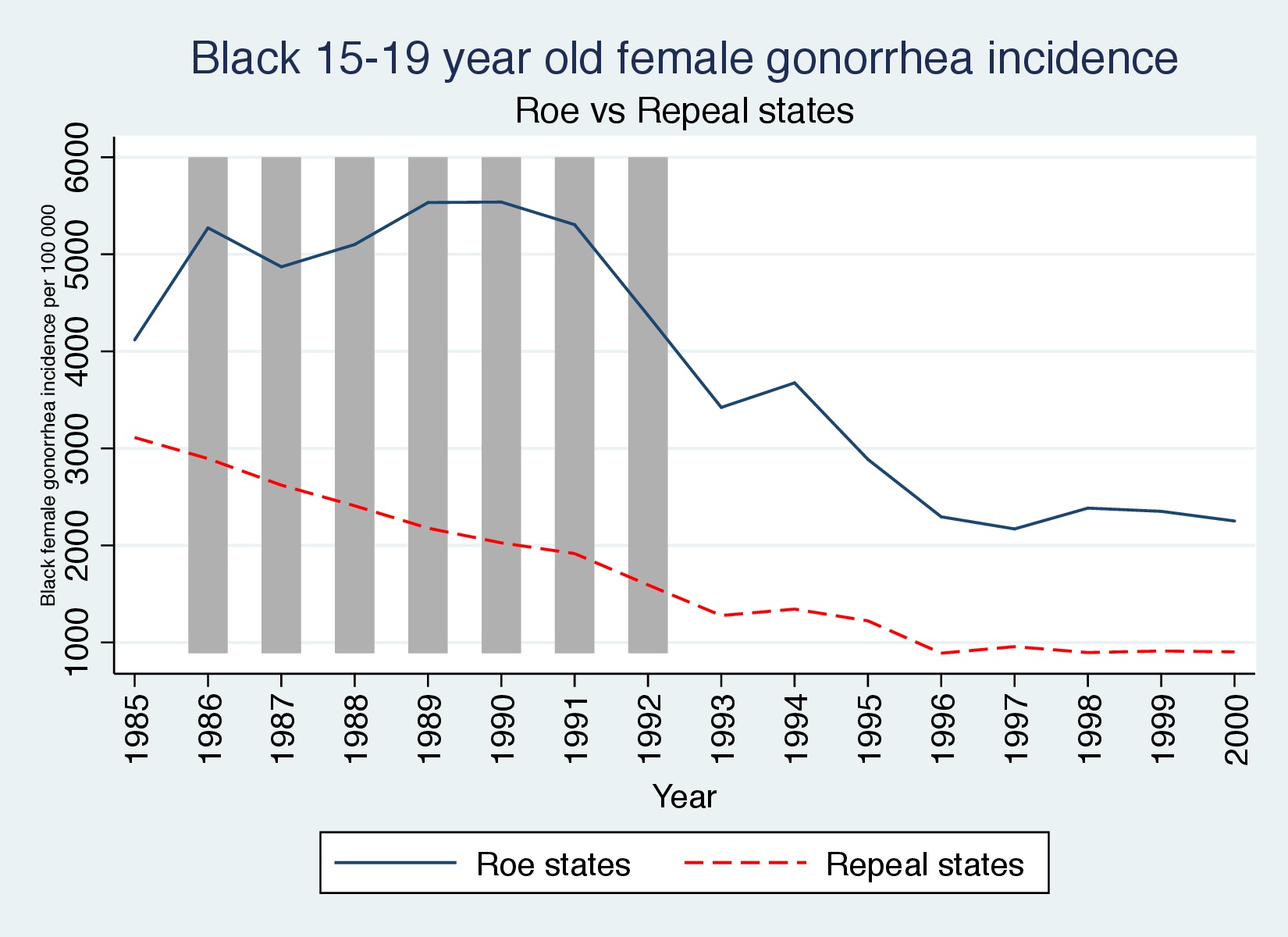
First let’s look at the raw data. I have shaded the years corresponding to the window where we expect to find effects. In Figure 9.10, we see the dynamics that will ultimately be picked up in the regression coefficients—the Roe states experienced a large and sustained gonorrhea epidemic that only waned once the treated cohorts emerged and overtook the entire data series.
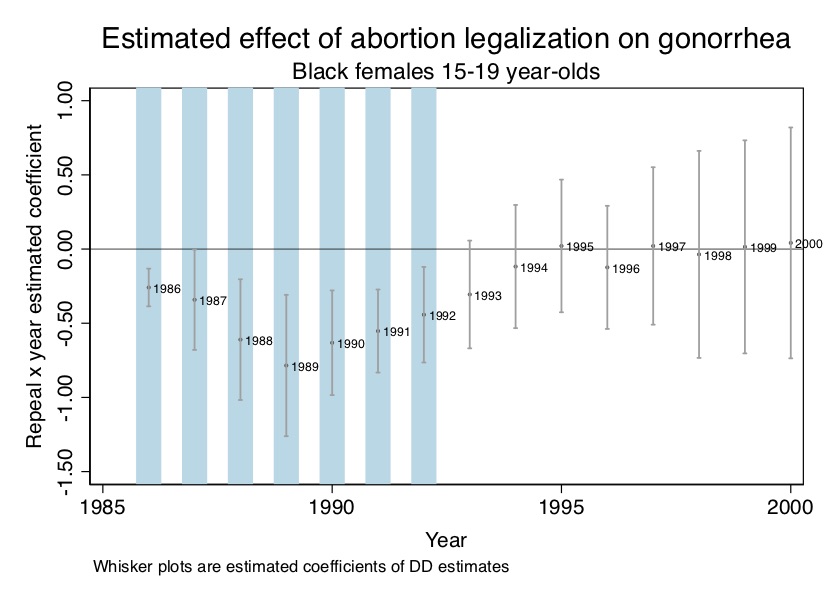
Now let’s look at regression coefficients. Our estimating equation is as follows: \[ Y_{st} =\beta_1Repeals +\beta_2 DT_t +\beta_{3t} Repeal_s \times DT_t +X_{st} \psi+\alpha_{s}DS_s + \varepsilon_{st} \] where \(Y\) is the log number of new gonorrhea cases for 15- to 19-year-olds (per 100,000 of the population); Repeal\(_s\) equals 1 if the state legalized abortion prior to Roe; \(DT_t\) is a year dummy; \(DS_s\) is a state dummy; \(t\) is a time trend; \(X\) is a matrix of covariates. In the paper, I sometimes included state-specific linear trends, but for this analysis, I present the simpler model. Finally, \(\varepsilon_{st}\) is a structural error term assumed to be conditionally independent of the regressors. All standard errors, furthermore, were clustered at the state level allowing for arbitrary serial correlation.
I present the plotted coefficients from this regression for simplicity (and because pictures can be so powerful) in Figure 9.11. As can be seen in Figure 9.11, there is a negative effect during the window where Roe has not fully caught up, and that negative effect forms a parabola—just as our theory predicted.
* DD estimate of 15-19 year olds in repeal states vs Roe states
use https://github.com/scunning1975/mixtape/raw/master/abortion.dta, clear
xi: reg lnr i.repeal*i.year i.fip acc ir pi alcohol crack poverty income ur if bf15==1 [aweight=totpop], cluster(fip)

* ssc install parmest, replace

parmest, label for(estimate min95 max95 %8.2f) li(parm label estimate min95 max95) saving(bf15_DD.dta, replace)

use ./bf15_DD.dta, replace

keep in 17/31

gen     year=1986 in 1
replace year=1987 in 2
replace year=1988 in 3
replace year=1989 in 4
replace year=1990 in 5
replace year=1991 in 6
replace year=1992 in 7
replace year=1993 in 8
replace year=1994 in 9
replace year=1995 in 10
replace year=1996 in 11
replace year=1997 in 12
replace year=1998 in 13
replace year=1999 in 14
replace year=2000 in 15

sort year

twoway (scatter estimate year, mlabel(year) mlabsize(vsmall) msize(tiny)) (rcap min95 max95 year, msize(vsmall)), ytitle(Repeal x year estimated coefficient) yscale(titlegap(2)) yline(0, lwidth(vvvthin) lcolor(black)) xtitle(Year) xline(1986 1987 1988 1989 1990 1991 1992, lwidth(vvvthick) lpattern(solid) lcolor(ltblue)) xscale(titlegap(2)) title(Estimated effect of abortion legalization on gonorrhea) subtitle(Black females 15-19 year-olds) note(Whisker plots are estimated coefficients of DD estimator from Column b of Table 2.) legend(off)#-- DD estimate of 15-19 year olds in repeal states vs Roe states
library(tidyverse)
library(haven)
library(estimatr)
read_data <- function(df)
{
full_path <- paste("https://github.com/scunning1975/mixtape/raw/master/",
df, sep = "")
df <- read_dta(full_path)
return(df)
}
abortion <- read_data("abortion.dta") %>%
mutate(
repeal = as_factor(repeal),
year = as_factor(year),
fip = as_factor(fip),
fa = as_factor(fa),
)
reg <- abortion %>%
filter(bf15 == 1) %>%
lm_robust(lnr ~ repeal*year + fip + acc + ir + pi + alcohol+ crack + poverty+ income+ ur,
data = ., weights = totpop, clusters = fip)
abortion_plot <- tibble(
sd = reg[[2]][76:90],
mean = reg[[1]][76:90],
year = c(1986:2000))
abortion_plot %>%
ggplot(aes(x = year, y = mean)) +
geom_rect(aes(xmin=1986, xmax=1992, ymin=-Inf, ymax=Inf), fill = "cyan", alpha = 0.01)+
geom_point()+
geom_text(aes(label = year), hjust=-0.002, vjust = -0.03)+
geom_hline(yintercept = 0) +
geom_errorbar(aes(ymin = mean - sd*1.96, ymax = mean + sd*1.96), width = 0.2,
position = position_dodge(0.05))import numpy as np
import pandas as pd
import statsmodels.api as sm
import statsmodels.formula.api as smf
from itertools import combinations
import plotnine as p
# read data
import ssl
ssl._create_default_https_context = ssl._create_unverified_context
def read_data(file):
return pd.read_stata("https://github.com/scunning1975/mixtape/raw/master/" + file)
abortion = read_data('abortion.dta')
abortion = abortion[~pd.isnull(abortion.lnr)]
abortion_bf15 = abortion[abortion.bf15==1]
formula = (
"lnr ~ C(repeal)*C(year) + C(fip)"
" + acc + ir + pi + alcohol + crack + poverty + income + ur"
)
reg = (
smf
.wls(formula, data=abortion_bf15, weights=abortion_bf15.totpop.values)
.fit(
cov_type='cluster',
cov_kwds={'groups': abortion_bf15.fip.values},
method='pinv')
)
reg.summary()
abortion_plot = pd.DataFrame(
{
'sd': reg.bse['C(repeal)[T.1.0]:C(year)[T.1986.0]':'C(repeal)[T.1.0]:C(year)[T.2000.0]'],
'mean': reg.params['C(repeal)[T.1.0]:C(year)[T.1986.0]':'C(repeal)[T.1.0]:C(year)[T.2000.0]'],
'year': np.arange(1986, 2001)
})
abortion_plot['lb'] = abortion_plot['mean'] - abortion_plot['sd']*1.96
abortion_plot['ub'] = abortion_plot['mean'] + abortion_plot['sd']*1.96
(
p.ggplot(abortion_plot, p.aes(x = 'year', y = 'mean')) +
p.geom_rect(p.aes(xmin=1985, xmax=1992, ymin=-np.inf, ymax=np.inf), fill="cyan", alpha = 0.01) +
p.geom_point() +
p.geom_text(p.aes(label = 'year'), ha='right') +
p.geom_hline(yintercept = 0) +
p.geom_errorbar(p.aes(ymin = 'lb', ymax = 'ub'), width = 0.2,
position = p.position_dodge(0.05)) +
p.labs(title= "Estimated effect of abortion legalization on gonorrhea")
)
Now, a lot of people might be done, but if you are reading this book, you have revealed that you are not like a lot of people. Credibly identified causal effects requires both finding effects, and ruling out alternative explanations. This is necessary because the fundamental problem of causal inference keeps us blind to the truth. But one way to alleviate some of that doubt is through rigorous placebo analysis. Here I present evidence from a triple difference in which an untreated cohort is used as a within-state control.
We chose the 25- to 29-year-olds in the same states as within-state comparison groups instead of 20- to 24-year-olds after a lot of thought. Our reasoning was that we needed an age group that was close enough to capture common trends but far enough so as not to violate SUTVA. Since 15- to 19-year-olds were more likely than 25- to 29-year-olds to have sex with 20- to 24-year-olds, we chose the slightly older group as the within-stage control. But there’s a trade-off here. Choose a group too close and you get SUTVA violations. Choose a group too far and they no longer can credibly soak up the heterogeneities you’re worried about. The estimating equation for thisregression is: \[ \begin{align} Y_{ast} &=\beta_1\text{~Repeal}_s + \beta_2DT_t + \beta_{3t}\text{~Repeal}_s\cdot DT_t +\delta_1\,DA + \delta_2\text{~Repeal}_s\cdot DA \\ &+ \delta_{3t}\,DA\cdot DT_t + \delta_{4t}\text{~Repeal}_s\cdot DA \cdot DT_t + X_{st}\xi + \alpha_{1s}DS_s + \alpha_{2s}DS_s\cdot DA \\ &+ \gamma_1\,t + \gamma_{2s}DS_s\cdot t + \gamma_3\,DA\cdot t+ \gamma_{4s}DS_s\cdot DA \cdot t + \epsilon_{ast}, \end{align} \] where the DDD parameter we are estimating is \(\delta_{4t}\)—the full interaction. In case this wasn’t obvious, there are 7 separate dummies because our DDD parameter has all three interactions. Thus since there are eight combinations, we had to drop one as the omitted group, and control separately for the other seven. Here we present the table of coefficients. Note that the effect should be concentrated only among the treatment years as before, and second, it should form a parabola. The results are presented in Figure 9.12.
use https://github.com/scunning1975/mixtape/raw/master/abortion.dta, clear

* DDD estimate for 15-19 year olds vs. 25-29 year olds in repeal vs Roe states
gen yr=(repeal) & (younger==1)
gen wm=(wht==1) & (male==1)
gen wf=(wht==1) & (male==0)
gen bm=(wht==0) & (male==1)
gen bf=(wht==0) & (male==0)
char year[omit] 1985
char repeal[omit] 0
char younger[omit] 0
char fip[omit] 1
char fa[omit] 0
char yr[omit] 0
xi: reg lnr i.repeal*i.year i.younger*i.repeal i.younger*i.year i.yr*i.year i.fip*t acc pi ir alcohol crack  poverty income ur if bf==1 & (age==15 | age==25) [aweight=totpop], cluster(fip)

parmest, label for(estimate min95 max95 %8.2f) li(parm label estimate min95 max95) saving(bf15_DDD.dta, replace)

use ./bf15_DDD.dta, replace

keep in 82/96

gen     year=1986 in 1
replace year=1987 in 2
replace year=1988 in 3
replace year=1989 in 4
replace year=1990 in 5
replace year=1991 in 6
replace year=1992 in 7
replace year=1993 in 8
replace year=1994 in 9
replace year=1995 in 10
replace year=1996 in 11
replace year=1997 in 12
replace year=1998 in 13
replace year=1999 in 14
replace year=2000 in 15

sort year

twoway (scatter estimate year, mlabel(year) mlabsize(vsmall) msize(tiny)) (rcap min95 max95 year, msize(vsmall)), ytitle(Repeal x 20-24yo x year estimated coefficient) yscale(titlegap(2)) yline(0, lwidth(vvvthin) lcolor(black)) xtitle(Year) xline(1986 1987 1988 1989 1990 1991 1992, lwidth(vvvthick) lpattern(solid) lcolor(ltblue)) xscale(titlegap(2)) title(Estimated effect of abortion legalization on gonorrhea) subtitle(Black females 15-19 year-olds) note(Whisker plots are estimated coefficients of DDD estimator from Column b of Table 2.) legend(off)library(tidyverse)
library(haven)
library(estimatr)
read_data <- function(df)
{
full_path <- paste("https://github.com/scunning1975/mixtape/raw/master/",
df, sep = "")
df <- read_dta(full_path)
return(df)
}
abortion <- read_data("abortion.dta") %>%
mutate(
repeal = as_factor(repeal),
year = as_factor(year),
fip = as_factor(fip),
fa = as_factor(fa),
younger = as_factor(younger),
yr = as_factor(case_when(repeal == 1 & younger == 1 ~ 1, TRUE ~ 0)),
wm = as_factor(case_when(wht == 1 & male == 1 ~ 1, TRUE ~ 0)),
wf = as_factor(case_when(wht == 1 & male == 0 ~ 1, TRUE ~ 0)),
bm = as_factor(case_when(wht == 0 & male == 1 ~ 1, TRUE ~ 0)),
bf = as_factor(case_when(wht == 0 & male == 0 ~ 1, TRUE ~ 0))
) %>%
filter(bf == 1 & (age == 15 | age == 25))
regddd <- lm_robust(lnr ~ repeal*year + younger*repeal + younger*year + yr*year + fip*t + acc + ir + pi + alcohol + crack + poverty + income + ur,
data = abortion, weights = totpop, clusters = fip)
abortion_plot <- tibble(
sd = regddd$std.error[110:124],
mean = regddd$coefficients[110:124],
year = c(1986:2000))
abortion_plot %>%
ggplot(aes(x = year, y = mean)) +
geom_rect(aes(xmin=1986, xmax=1992, ymin=-Inf, ymax=Inf), fill = "cyan", alpha = 0.01)+
geom_point()+
geom_text(aes(label = year), hjust=-0.002, vjust = -0.03)+
geom_hline(yintercept = 0) +
geom_errorbar(aes(ymin = mean-sd*1.96, ymax = mean+sd*1.96), width = 0.2,
position = position_dodge(0.05))import numpy as np
import pandas as pd
import statsmodels.api as sm
import statsmodels.formula.api as smf
from itertools import combinations
import plotnine as p
# read data
import ssl
ssl._create_default_https_context = ssl._create_unverified_context
def read_data(file):
return pd.read_stata("https://github.com/scunning1975/mixtape/raw/master/" + file)
abortion = read_data('abortion.dta')
abortion = abortion[~pd.isnull(abortion.lnr)]
abortion['yr'] = 0
abortion.loc[(abortion.younger==1) & (abortion.repeal==1), 'yr'] = 1
abortion['wm'] = 0
abortion.loc[(abortion.wht==1) & (abortion.male==1), 'wm'] = 1
abortion['wf'] = 0
abortion.loc[(abortion.wht==1) & (abortion.male==0), 'wf'] = 1
abortion['bm'] = 0
abortion.loc[(abortion.wht==0) & (abortion.male==1), 'bm'] = 1
abortion['bf'] = 0
abortion.loc[(abortion.wht==0) & (abortion.male==0), 'bf'] = 1
abortion_filt = abortion[(abortion.bf==1) & (abortion.age.isin([15,25]))]
reg = (
smf
.wls("""lnr ~ C(repeal)*C(year) + C(younger)*C(repeal) + C(younger)*C(year) +
C(yr)*C(year) + C(fip)*t + acc + ir + pi + alcohol + crack + poverty + income + ur""",
data=abortion_filt, weights=abortion_filt.totpop.values)
.fit(
cov_type='cluster',
cov_kwds={'groups': abortion_filt.fip.values},
method='pinv')
)
abortion_plot = pd.DataFrame({'sd': reg.bse['C(yr)[T.1]:C(year)[T.1986.0]':'C(yr)[T.1]:C(year)[T.2000.0]'],
'mean': reg.params['C(yr)[T.1]:C(year)[T.1986.0]':'C(yr)[T.1]:C(year)[T.2000.0]'],
'year':np.arange(1986, 2001)})
abortion_plot['lb'] = abortion_plot['mean'] - abortion_plot['sd']*1.96
abortion_plot['ub'] = abortion_plot['mean'] + abortion_plot['sd']*1.96
p.ggplot(abortion_plot, p.aes(x = 'year', y = 'mean')) + p.geom_rect(p.aes(xmin=1986, xmax=1991, ymin=-np.inf, ymax=np.inf), fill = "cyan", alpha = 0.01)+ p.geom_point()+ p.geom_text(p.aes(label = 'year'), ha='right')+ p.geom_hline(yintercept = 0) + p.geom_errorbar(p.aes(ymin = 'lb', ymax = 'ub'), width = 0.2,
position = p.position_dodge(0.05)) +\
p.labs(title= "Estimated effect of abortion legalization on gonorrhea")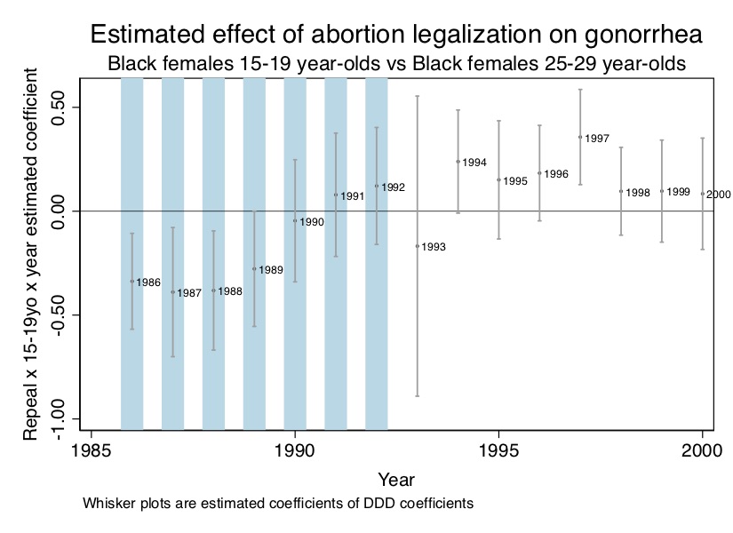
Here we see the prediction start to break down. Though there are negative effects for years 1986 to 1990, the 1991 and 1992 coefficients are positive, which is not consistent with our hypothesis. Furthermore, only the first four coefficients are statistically significant. Nevertheless, given the demanding nature of DDD, perhaps this is a small victory in favor of Gruber, Levine, and Staiger (1999) and Donohue and Levitt (2001). Perhaps the theory that abortion legalization had strong selection effects on cohorts has some validity.
Putting aside whether you believe the results, it is still valuable to replicate the results based on this staggered design. Recall that I said the DDD design requires stacking the data, which may seem like a bit of a black box, so I’d like to examine these data now.7
The second line estimates the regression equation. The dynamic DD coefficients are captured by the repeal-year interactions. These are the coefficients we used to create box plots in Figure 9.11. You can check these yourself.
Note, for simplicity, I only estimated this for the black females (bf15==1) but you could estimate for the black males (bm15==1), white females (wf15==1), or white males (wm15==1). We do all four in the paper, but here we only focus on the black females aged 15–19 because the purpose of this section is to help you understand the estimation. I encourage you to play around with this model to see how robust the effects are in your mind using only this linear estimation.
But now I want to show you the code for estimating a triple difference model. Some reshaping had to be done behind the scenes for this data structure, but it would take too long to post that here. For now, I will simply produce the commands that produce the black female result, and I encourage you to explore the panel data structure so as to familiarize yourself with the way in which the data are organized.
Notice that some of these were already interactions (e.g., yr), which was my way to compactly include all of the interactions. I did this primarily to give myself more control over what variables I was using. But I encourage you to study the data structure itself so that when you need to estimate your own DDD, you’ll have a good handle on what form the data must be in in order to execute so many interactions.
The US experience with abortion legalization predicted a parabola from 1986 to 1992 for 15- to 19-year-olds, and using a DD design, that’s what I found. I also estimated the effect using a DDD design, and while the effects weren’t as pretty as what I found with DD, there appeared to be something going on in the general vicinity of where the model predicted. So boom goes the dynamite, right? Can’t we be done finally? Not quite.
Whereas my original study stopped there, I would like to go a little farther. The reason can be seen in the following Figure 9.13. This is a modified version of Figure 9.9, with the main difference being I have created a new parabola for the 20- to 24-year-olds.
Look carefully at Figure 9.13. Insofar as the early 1970s cohorts were treated in utero with abortion legalization, then we should see not just a parabola for the 15- to 19-year-olds for 1986 to 1992 but also for the 20- to 24-year-olds for years 1991 to 1997 as the cohorts continuedto age.8
use https://github.com/scunning1975/mixtape/raw/master/abortion.dta, clear

* Second DD model for 20-24 year old black females
char year[omit] 1985
xi: reg lnr i.repeal*i.year i.fip acc ir pi alcohol crack poverty income ur if (race==2 & sex==2 & age==20) [aweight=totpop], cluster(fip) library(tidyverse)
library(haven)
library(estimatr)
read_data <- function(df)
{
full_path <- paste("https://github.com/scunning1975/mixtape/raw/master/",
df, sep = "")
df <- read_dta(full_path)
return(df)
}
abortion <- read_data("abortion.dta") %>%
mutate(
repeal = as_factor(repeal),
year = as_factor(year),
fip = as_factor(fip),
fa = as_factor(fa),
)
reg <- abortion %>%
filter(race == 2 & sex == 2 & age == 20) %>%
lm_robust(lnr ~ repeal*year + fip + acc + ir + pi + alcohol+ crack + poverty+ income+ ur,
data = ., weights = totpop, clusters = fip)import numpy as np
import pandas as pd
import statsmodels.api as sm
import statsmodels.formula.api as smf
from itertools import combinations
import plotnine as p
# read data
import ssl
ssl._create_default_https_context = ssl._create_unverified_context
def read_data(file):
return pd.read_stata("https://github.com/scunning1975/mixtape/raw/master/" + file)
abortion = read_data('abortion.dta')
abortion = abortion[~pd.isnull(abortion.lnr)]
abortion_filt = abortion[(abortion.race == 2) & (abortion.sex == 2) & (abortion.age == 20)]
regdd = (
smf
.wls("""lnr ~ C(repeal)*C(year) + C(fip) + acc + ir + pi + alcohol+ crack + poverty+ income+ ur""",
data=abortion_filt, weights=abortion_filt.totpop.values)
.fit(
cov_type='cluster',
cov_kwds={'groups': abortion_filt.fip.values},
method='pinv')
)
regdd.summary()I did not examine the 20- to 24-year-old cohort when I first wrote this paper because at that time I doubted that the selection effects for risky sex would persist into adulthood given that youth display considerable risk-taking behavior. But with time come new perspectives, and these days I don’t have strong priors that the selection effects would necessarily vanish after teenage years. So I’d like to conduct that additional analysis here and now for the first time. Let’s estimate the same DD model as before, only for Black females aged 20–24.
As before, we will focus just on the coefficient plots. We show that in Figure 9.14. There are a couple of things about this regression output that are troubling. First, there is a negative parabola showing up where there wasn’t necessarily one predicted—the 1986–1992 period. Note that is the period where only the 15- to 19-year-olds were the treated cohorts, suggesting that our 15- to 19-year-old analysis was picking up something other than abortion legalization. But that was also the justification for using DDD, as clearly something else is going on in the repeal versus Roe states during those years that we cannot adequately control for with our controls and fixed effects.
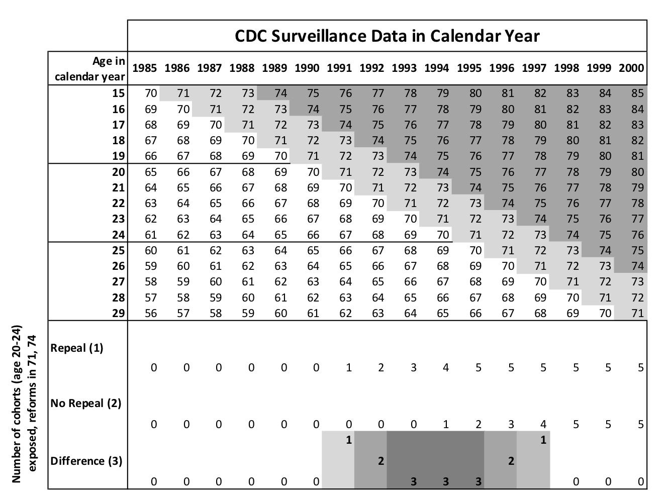
The second thing to notice is that there is no parabola in the treatment window for the treatment cohort. The effect sizes are negative in the beginning, but shrink in absolute value when they should be growing. In fact, the 1991 to 1997 period is one of convergence to zero, not divergence between these two sets of states.
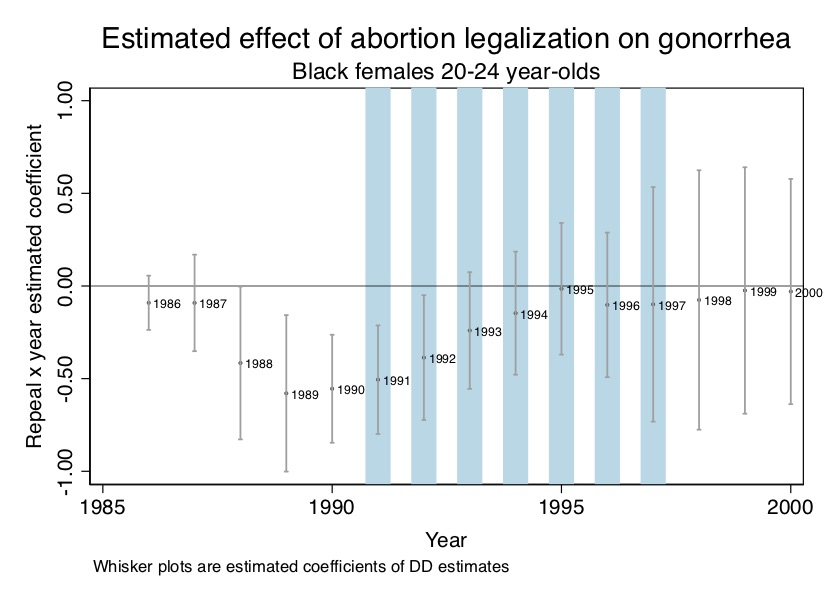
But as before, maybe there are strong trending unobservables for all groups masking the abortion legalization effect. To check, let’s use my DDD strategy with the 25- to 29-year-olds as the within-state control group. We can implement this by using the Stata code, abortion_ddd2.do and abortion_ddd2.R.
use https://github.com/scunning1975/mixtape/raw/master/abortion.dta, clear

* Second DDD model for 20-24 year olds vs 25-29 year olds black females in repeal vs Roe states
gen younger2 = 0
replace younger2 = 1 if age == 20
gen yr2=(repeal==1) & (younger2==1)
gen wm=(wht==1) & (male==1)
gen wf=(wht==1) & (male==0)
gen bm=(wht==0) & (male==1)
gen bf=(wht==0) & (male==0)
char year[omit] 1985
char repeal[omit] 0
char younger2[omit] 0
char fip[omit] 1
char fa[omit] 0
char yr2[omit] 0
xi: reg lnr i.repeal*i.year i.younger2*i.repeal i.younger2*i.year i.yr2*i.year i.fip*t acc pi ir alcohol crack poverty income ur if bf==1 & (age==20 | age==25) [aweight=totpop], cluster(fip) library(tidyverse)
library(haven)
library(estimatr)
read_data <- function(df)
{
full_path <- paste("https://github.com/scunning1975/mixtape/raw/master/",
df, sep = "")
df <- read_dta(full_path)
return(df)
}
abortion <- read_data("abortion.dta") %>%
mutate(
repeal = as_factor(repeal),
year = as_factor(year),
fip = as_factor(fip),
fa = as_factor(fa),
younger2 = case_when(age == 20 ~ 1, TRUE ~ 0),
yr2 = as_factor(case_when(repeal == 1 & younger2 == 1 ~ 1, TRUE ~ 0)),
wm = as_factor(case_when(wht == 1 & male == 1 ~ 1, TRUE ~ 0)),
wf = as_factor(case_when(wht == 1 & male == 0 ~ 1, TRUE ~ 0)),
bm = as_factor(case_when(wht == 0 & male == 1 ~ 1, TRUE ~ 0)),
bf = as_factor(case_when(wht == 0 & male == 0 ~ 1, TRUE ~ 0))
)
regddd <- abortion %>%
filter(bf == 1 & (age == 20 | age ==25)) %>%
lm_robust(lnr ~ repeal*year + acc + ir + pi + alcohol + crack + poverty + income + ur,
data = ., weights = totpop, clusters = fip)import numpy as np
import pandas as pd
import statsmodels.api as sm
import statsmodels.formula.api as smf
from itertools import combinations
import plotnine as p
# read data
import ssl
ssl._create_default_https_context = ssl._create_unverified_context
def read_data(file):
return pd.read_stata("https://github.com/scunning1975/mixtape/raw/master/" + file)
abortion = read_data('abortion.dta')
abortion = abortion[~pd.isnull(abortion.lnr)]
abortion_filt = abortion[(abortion.race == 2) & (abortion.sex == 2) & (abortion.age == 20)]
regdd = (
smf
.wls("""lnr ~ C(repeal)*C(year) + C(fip) + acc + ir + pi + alcohol+ crack + poverty+ income+ ur""",
data=abortion_filt, weights=abortion_filt.totpop.values)
.fit(
cov_type='cluster',
cov_kwds={'groups': abortion_filt.fip.values},
method='pinv')
)
regdd.summary()Figure 9.15 shows the DDD estimated coefficients for the treated cohort relative to a slightly older 25- to 29-year-old cohort. It’s possible that the 25- to 29-year-old cohort is too close in age to function as a satisfactory within-state control; if those age 20–24 have sex with those who are age 25–29, for instance, then SUTVA is violated. There are other age groups, though, that you can try in place of the 25- to 29-year-olds, and I encourage you to do it for both the experience and the insights you might gleam.
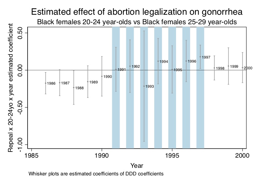
But let’s back up and remember the big picture. The abortion legalization hypothesis made a series of predictions about where negative parabolic treatment effects should appear in the data. And while we found some initial support, when we exploited more of those predictions, the results fell apart. A fair interpretation of this exercise is that our analysis does not support the abortion legalization hypothesis. Figure 9.15 shows several point estimates at nearly zero, and standard errors so large as to include both positive and negative values for these interactions.
I included this analysis because I wanted to show you the power of a theory with numerous unusual yet testable predictions. Imagine for a moment if a parabola had showed up for all age groups in precisely the years predicted by the theory. Wouldn’t we have to update our priors about the abortion legalization selection hypothesis? With predictions so narrow, what else could be causing it? It’s precisely because the predictions are so specific, though, that we are able to reject the abortion legalization hypothesis, at least for gonorrhea.
Since the fundamental problem of causal inference blocks our direct observation of causal effects, we rely on many direct and indirect pieces of evidence to establish credible causality. And as I said in the previous section on DDD, one of those indirect pieces of evidence is placebo analysis. The reasoning goes that if we find, using our preferred research design, effects where there shouldn’t be, then maybe our original findings weren’t credible in the first place. Using placebo analysis within your own work has become an essential part of empirical work for this reason.
But another use of placebo analysis is to evaluate the credibility of popular estimation strategies themselves. This kind of use helps improve a literature by uncovering flaws in a research design which can then help stimulate the creation of stronger methods and models. Let’s take two exemplary studies that accomplished this well: Auld and Grootendorst (2004) and Cohen-Cole and Fletcher (2008).
To say that the G. S. Becker and Murphy (1988) “rational addiction” model has been influential would be an understatement. It has over 4,000 cites and has become one of the most common frameworks in health economics. It created a cottage industry of empirical studies that persists to this day. Alcohol, tobacco, gambling, even sports, have all been found to be “rationally addictive” commodities and activities using various empirical approaches.
But some researchers cautioned the research community about these empirical studies. Rogeberg (2004) critiqued the theory on its own grounds, but I’d like to focus on the empirical studies based on the theory. Rather than talk about any specific paper, I’d like to provide a quote from Melberg (2008), who surveyed researchers who had written on rational addiction:
A majority of our respondents believe the literature is a success story that demonstrates the power of economic reasoning. At the same time, they also believe the empirical evidence is weak, and they disagree both on the type of evidence that would validate the theory and the policy implications. Taken together, this points to an interesting gap. On the one hand, most of the respondents claim that the theory has valuable real world implications. On the other hand, they do not believe the theory has received empiricalsupport. (p.1)
Rational addiction should be held to the same empirical standards as in theory. The strength of the model has always been based on the economic reasoning, which economists obviously find compelling. But were the empirical designs flawed? How could we know?
Auld and Grootendorst (2004) is not a test of the rational addiction model. On the contrary, it is an “anti-test” of the empirical rational addiction models common at the time. Their goal was not to evaluate the theoretical rational addiction model, in other words, but rather the empirical rational addiction models themselves. How do they do this? Auld and Grootendorst (2004) used the empirical rational addiction model to evaluate commodities that could not plausibly be considered addictive, such as eggs, milk, orange, and apples. They found that the empirical rational addiction model implied milk was extremely addictive, perhaps one of the most addictive commodities studied.9 Is it credible to believe that eggs and milk are “rationally addictive” or is it more likely the research designs used to evaluate the rational addiction model were flawed? Auld and Grootendorst (2004) study cast doubt on the empirical rational addiction model, not the theory.
Another problematic literature was the peer-effects literature. Estimating peer effects is notoriously hard. Manski (1993) said that the deep endogeneity of social interactions made the identification of peer effects difficult and possibly even impossible. He called this problem the “mirroring” problem. If “birds of a feather flock together,” then identifying peer effects in observational settings may just be impossible due to the profound endogeneities at play.
Several studies found significant network effects on outcomes like obesity, smoking, alcohol use, and happiness. This led many researchers to conclude that these kinds of risk behaviors were “contagious” through peer effects (Christakis and Fowler 2007). But these studies did not exploit randomized social groups. The peer groups were purely endogenous. Cohen-Cole and Fletcher (2008) showed using similar models and data that even attributes that couldn’t be transmitted between peers—acne, height, and headaches—appeared “contagious” in observational data using the Christakis and Fowler (2007) model for estimation. Note, Cohen-Cole and Fletcher (2008) does not reject the idea of theoretical contagions. Rather, they point out that the Manski critique should guide peer effect analysis if social interactions are endogenous. They provide evidence for this indirectly using placebo analysis.10
DD can be applied to repeated cross-sections, as well as panel data. But one of the risks of working with the repeated cross-sections is that unlike panel data (e.g., individual-level panel data), repeated cross-sections run the risk of compositional changes. Hong (2013) used repeated cross-sectional data from the Consumer Expenditure Survey (CEX) containing music expenditure and internet use for a random sample of households. The author’s study exploited the emergence and immense popularity of Napster, the first file-sharing software widely used by Internet users, in June 1999 as a natural experiment. The study compared Internet users and Internet non-users before and after the emergence of Napster. At first glance, they found that as Internet diffusion increased from 1996 to 2001, spending on music for Internet users fell faster than that for non-Internet users. This was initially evidence that Napster was responsible for the decline, until this was investigated more carefully.
But when we look at Table 9.4, we see evidence of compositional changes. While music expenditure fell over the treatment period, the demographics of the two groups also changed over this period. For instance, the age of Internet users grew while income fell. If older people are less likely to buy music in the first place, then this could independently explain some of the decline. This kind of compositional change is a like an omitted variable bias built into the sample itself caused by time-variant unobservables. Diffusion of the Internet appears to be related to changing samples as younger music fans are early adopters. Identification of causal effects would need for the treatment itself to be exogenous to such changes in the composition.
| Year | 1997 | 1998 | 1999 | |||
| Internet user | Non-user | Internet user | Non-user | Internet user | Non-user | |
| Average expenditure | ||||||
| Recorded music | $25.73 | $10.90 | $24.18 | $9.97 | $20.92 | $9.37 |
| Entertainment | $195.03 | $96.71 | $193.38 | $84.92 | $182.42 | $80.19 |
| Zero expenditure | ||||||
| Recorded music | 0.56 | 0.79 | 0.60 | 0.80 | 0.64 | 0.81 |
| Entertainment | 0.08 | 0.32 | 0.09 | 0.35 | 0.14 | 0.39 |
| Demographics | ||||||
| Age | 40.2 | 49.0 | 42.3 | 49.0 | 44.1 | 49.4 |
| Income | $52,887 | $30,459 | $51,995 | $26,189 | $49,970 | $26,649 |
| High school graduate | 0.18 | 0.31 | 0.17 | 0.32 | 0.21 | 0.32 |
| Some college | 0.37 | 0.28 | 0.35 | 0.27 | 0.34 | 0.27 |
| College grad | 0.43 | 0.21 | 0.45 | 0.21 | 0.42 | 0.20 |
| Manager | 0.16 | 0.08 | 0.16 | 0.08 | 0.14 | 0.08 |
Sample means from the Consumer Expenditure Survey.
There are a few other caveats I’d like to make before moving on. First, it is important to remember the concepts we learned in the early DAG chapter. In choosing covariates in a DD design, you must resist the temptation to simply load the regression up with a kitchen sink of regressors. You should resist if only because in so doing, you may inadvertently include a collider, and if a collider is conditioned on, it introduces strange patterns that may mislead you and your audience. There is unfortunately no way forward except, again, deep institutional familiarity with both the factors that determined treatment assignment on the ground, as well as economic theory itself. Second, another issue I skipped over entirely is the question of how the outcome is modeled. Very little thought if any is given to how exactly we should model some outcome. Just to take one example, should we use the log or the levels themselves? Should we use the quartic root? Should we use rates? These, it turns out, are critically important because for many of them, the parallel trends assumption needed for identification will not be achieved—even though it will be achieved under some other unknown transformation. It is for this reason that you can think of many DD designs as having a parametric element because you must make strong commitments about the functional form itself. I cannot provide guidance to you on this, except that maybe using the pre-treatment leads as a way of finding parallelism could be a useful guide.
Buy the print version today:
I have a bumper sticker on my car that says “I love Federalism (for the natural experiments)” (Figure 9.16). I made these bumper stickers for my students to be funny, and to illustrate that the United States is a never-ending laboratory. Because of state federalism, each US state has been given considerable discretion to govern itself with policies and reforms. Yet, because it is a union of states, US researchers have access to many data sets that have been harmonized across states, making it even more useful for causal inference.

Goodman-Bacon (2019) calls the staggered assignment of treatments across geographic units over time the “differential timing” of treatment. What he means is unlike the simple \(2\times 2\) that we discussed earlier (e.g., New Jersey and Pennsylvania), where treatment units were all treated at the same time, the more common situation is one where geographic units receive treatments at different points in time. And this happens in the United States because each area (state, municipality) will adopt a policy when it wants to, for its own reasons. As a result, the adoption of some treatment will tend to be differentially timed across units.
This introduction of differential timing means there are basically two types of DD designs. There is the \(2\times 2\) DD we’ve been discussing wherein a single unit or a group of units all receive some treatment at the same point in time, like Snow’s cholera study or Card and Krueger (1994). And then there is the DD with differential timing in which groups receive treatment at different points in time, like Cheng and Hoekstra (2013). We have a very good understanding of the \(2\times 2\) design, how it works, why it works, when it works, and when it does not work. But we did not until Goodman-Bacon (2019) have as good an understanding of the DD design with differential timing. So let’s get down to business and discuss that now by reminding ourselves of the \(2\times 2\) DD that we introduced earlier. \[ \begin{align} \widehat{\delta}^{2\times 2}_{kU} = \bigg(\overline{y}_k^{\text{post}(k)} - \overline{y}_k^{\text{pre}(k)} \bigg) - \bigg(\overline{y}_U^{\text{post}(k)} - \overline{y}_U^{\text{pre}(k)} \bigg ) \end{align} \] where \(k\) is the treatment group, \(U\) is the never-treated group, and everything else is self-explanatory. Since this involves sample means, we can calculate the differences manually. Or we can estimate it with the following regression: \[ \begin{align} y_{it} =\beta D_{i}+\tau \Post_{t}+\delta (D_i \times \Post_t)+X_{it}+\varepsilon_{it} \end{align} \]
But a more common situation you’ll encounter will be a DD design with differential timing. And while the decomposition is a bit complicated, the regression equation itself is straightforward: \[ \begin{align} y_{it} =\alpha_0 + \delta D_{it} + X_{it} + \alpha_i + \alpha_t + \epsilon_{it} \end{align} \] When researchers estimate this regression these days, they usually use the linear fixed-effects model that I discussed in the previous panel chapter. These linear panel models have gotten the nickname “twoway fixed effects” because they include both time fixed effects and unit fixed effects. Since this is such a popular estimator, it’s important we understand exactly what it is doing and what is it not.
Goodman-Bacon (2019) provides a helpful decomposition of the twoway fixed effects estimate of \(\widehat{\delta}\). Given this is the go-to model for implementing differential timing designs, I have found his decomposition useful. But as there are some other decompositions of twoway fixed effects estimators, such as another important paper by Chaisemartin and D’Haultfœuille (2019), I’ll call it the Bacon decomposition for the sake of branding.
The punchline of the Bacon decomposition theorem is that the twoway fixed effects estimator is a weighted average of all potential \(2\times 2\) DD estimates where weights are both based on group sizes and variance in treatment. Under the assumption of variance weighted common trends (VWCT) and time invariant treatment effects, the variance weighted ATT is a weighted average of all possible ATTs. And under more restrictive assumptions, that estimate perfectly matches the ATT. But that is not true when there are time-varying treatment effects, as time-varying treatment effects in a differential timing design estimated with twoway fixed effects can generate a bias. As such, twoway fixed-effects models may be severely biased, which is echoed in Chaisemartin and D’Haultfœuille (2019).
To make this concrete, let’s start with a simple example. Assume in this design that there are three groups: an early treatment group \((k)\), a group treated later \((l)\), and a group that is never treated \((U)\). Groups \(k\) and \(l\) are similar in that they are both treated but they differ in that \(k\) is treated earlier than \(l\).
Let’s say there are 5 periods, and \(k\) is treated in period 2. Then it spends 80% of its time under treatment, or 0.8. But let’s say \(l\) is treated in period 4. Then it spends 40% of its time treated, or 0.4. I represent this time spent in treatment for a group as \(\overline{D}_k = 0.8\) and \(\overline{D}_l = 0.4\). This is important, because the length of time a group spends in treatment determines its treatment variance, which in turn affects the weight that \(2\times 2\) plays in the final adding up of the DD parameter itself. And rather than write out \(2\times 2\) DD estimator every time, we will just represent each \(2\times 2\) as \(\widehat{\delta}_{ab}^{2\times 2,j}\) where \(a\) and \(b\) are the treatment groups, and \(j\) is the index notation for any treatment group. Thus if we wanted to know the \(2\times 2\) for group \(k\) compared to group \(U\), we would write \(\widehat{\delta}_{kU}^{2\times 2,k}\) or, maybe to save space, just \(\widehat{\delta}_{kU}^{k}\).
So, let’s get started. First, in a single differential timing design, how many \(2\times 2\)s are there anyway? Turns out there are a lot. To see, let’s make a toy example. Let’s say there are three timing groups (\(a\), \(b\), and \(c\)) and one untreated group \((U)\). Then there are 9 \(2\times 2\) DDs. They are:
| a to b | b to a | c to a |
| a to c | b to c | c to b |
| a to U | b to U | c to U |
See how it works? Okay, then let’s return to our simpler example where there are two timing groups \(k\) and \(l\) and one never-treated group. Groups \(k\) and \(l\) will get treated at time periods \(t^*_k\) and \(t^*_l\). The earlier period before anyone is treated will be called the “pre” period, the period between \(k\) and \(l\) treated is called the “mid” period, and the period after \(l\) is treated is called the “post” period. This will be much easier to understand with some simple graphs. Let’s look at Figure 9.17. Recall the definition of a \(2\times 2\) DD is \[ \widehat{\delta}^{2\times 2}_{kU} = \bigg (\overline{y}_k^{\text{post}(k)} - \overline{y}_k^{\text{pre}(k)} \bigg ) - \bigg (\overline{y}_U^{\text{post}(k)} - \overline{y}_U^{\text{pre}(k)} \bigg ) \] where \(k\) and \(U\) are just place-holders for any of the groups used in a \(2\times 2\).
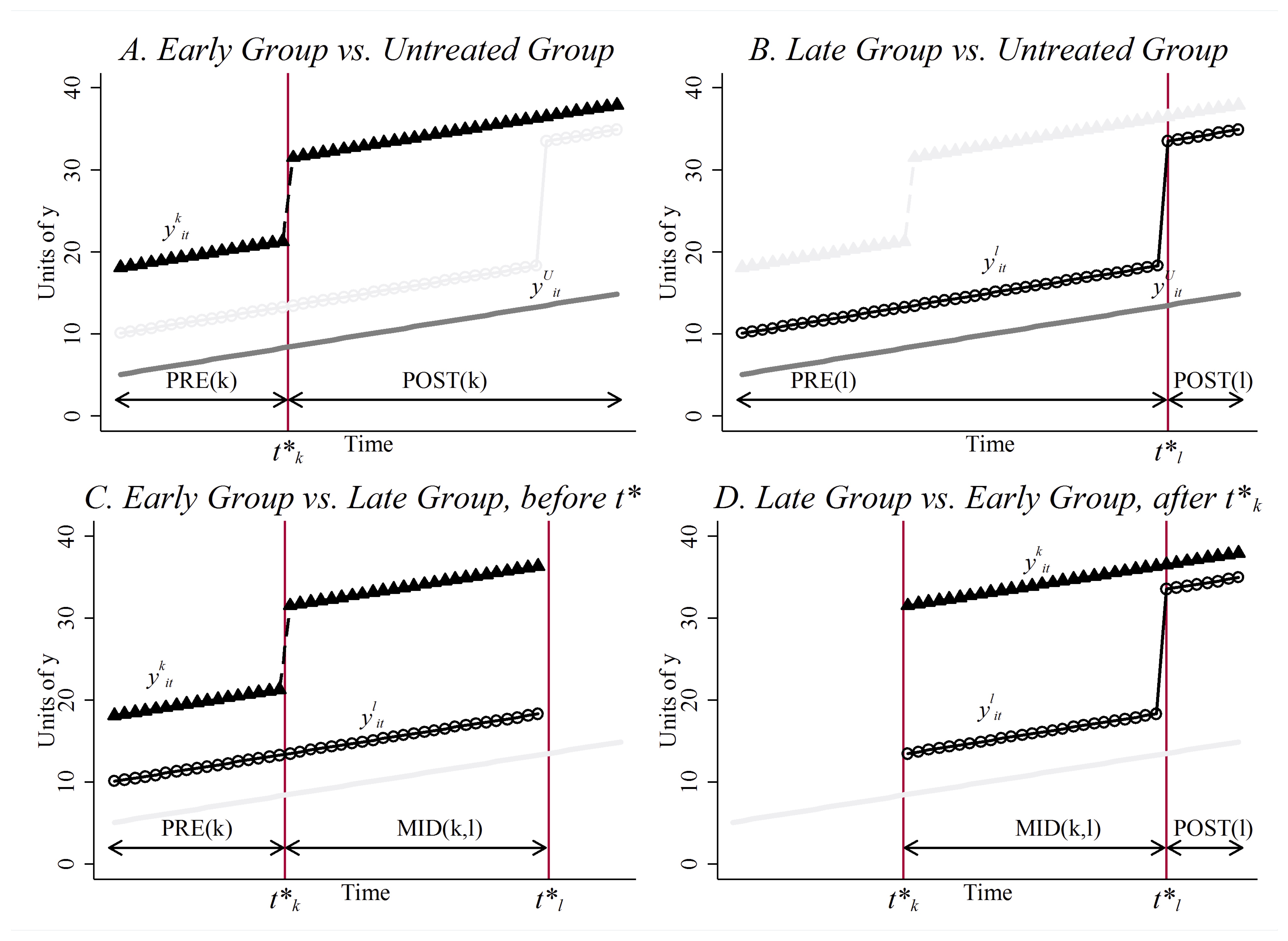
Substituting the information in each of the four panels of Figure 9.17 into the equation will enable you to calculate what each specific \(2\times 2\) is. But we can really just summarize these into three really important \(2\times 2\)s, which are: \[ \begin{align} \widehat{\delta}^{2\times 2}_{kU} &=\bigg ( \overline{y}_k^{\text{post}(k)} - \overline{y}_k^{\text{pre}(k)} \bigg ) - \bigg ( \overline{y}_U^{\text{post}(k)} - \overline{y}_U^{\text{pre}(k)} \bigg ) \\ \widehat{\delta}^{2\times 2}_{kl} &=\bigg ( \overline{y}_k^{mid(k,l)} - \overline{y}_k^{\text{pre}(k)} \bigg ) - \bigg ( \overline{y}_l^{mid(k,l)} - \overline{y}_l^{\text{pre}(k)} \bigg ) \\ \widehat{\delta}^{2\times 2}_{lk} &=\bigg ( \overline{y}_l^{\text{post}(l)} - \overline{y}_l^{mid(k,l)} \bigg ) - \bigg ( \overline{y}_k^{\text{post}(l)} - \overline{y}_k^{mid(k,l)} \bigg ) \end{align} \] where the first \(2\times 2\) is any timing group compared to the untreated group (\(k\) or \(l\)), the second is a group compared to the yet-to-be-treated timing group, and the last is the eventually-treated group compared to the already-treated controls.
With this notation in mind, the DD parameter estimate can be decomposed as follows: \(\widehat{\delta}^{DD}\) \[ \begin{align} \widehat{\delta}^{DD} = \sum_{k \neq U} s_{kU}\widehat{\delta}_{kU}^{2\times 2} + \sum_{k \neq U} \sum_{l>k} s_{kl} \bigg [ \mu_{kl}\widehat{\delta}_{kl}^{2\times 2,k} + (1-\mu_{kl}) \widehat{\delta}_{kl}^{2\times 2,l} \bigg] \end{align} \] where the first \(2\times 2\) is the \(k\) compared to \(U\) and the \(l\) compared to \(U\) (combined to make the equation shorter).11 So what are these weights exactly? \[ \begin{align} s_{ku} &=\dfrac{ n_k n_u \overline{D}_k (1- \overline{D}_k ) }{ \widehat{Var} ( \tilde{D}_{it} )} \\ s_{kl} &=\dfrac{ n_k n_l (\overline{D}_k - \overline{D}_{l} ) ( 1- ( \overline{D}_k - \overline{D}_{l} )) }{\widehat{Var}(\tilde{D}_{it})} \\ \mu_{kl} &=\dfrac{1 - \overline{D}_k }{1 - ( \overline{D}_k - \overline{D}_{l} )} \end{align} \] where \(n\) refers to sample sizes, \(\overline{D}_k (1- \overline{D}_k )\) \((\overline{D}_k - \overline{D}_{l} ) ( 1- ( \overline{D}_k - \overline{D}_{l} ))\) expressions refer to variance of treatment, and the final equation is the same for two timing groups.12
Two things immediately pop out of these weights that I’d like to bring to your attention. First, notice how “group” variation matters, as opposed to unit-level variation. The Bacon decomposition shows that it’s group variation that twoway fixed effects is using to calculate that parameter you’re seeking. The more states that adopted a law at the same time, the bigger they influence that final aggregate estimate itself.
The other thing that matters in these weights is within-group treatment variance. To appreciate the subtlety of what’s implied, ask yourself—how long does a group have to be treated in order to maximize its treatment variance? Define \(X=D(1-D)=D-D^2\), take the derivative of \(V\) with respect to \(\overline{D}\), set \(\dfrac{d V}{d \overline{D}}\) equal to zero, and solve for \(\overline{D}*\). Treatment variance is maximized when \(\overline{D}=0.5\). Let’s look at three values of \(\overline{D}\) to illustrate this. \[\begin{gather} \overline{D}=0.1; 0.1 \times 0.9 = 0.09 \\ \overline{D}=0.4; 0.4 \times 0.6 =0.24 \\ \overline{D}=0.5; 0.5 \times 0.5 = 0.25\end{gather}\] So what are we learning from this, exactly? Well, what we are learning is that being treated in the middle of the panel actually directly influences the numerical value you get when twoway fixed effects are used to estimate the ATT. That therefore means lengthening or shortening the panel can actually change the point estimate purely by changing group treatment variance and nothing more. Isn’t that kind of strange though? What criteria would we even use to determine the best length?
But what about the “treated on treated weights,” or the \(s_{kl}\) weight. That doesn’t have a \(\overline{D}(1-\overline{D})\) expression. Rather, it has a \((\overline{D}_k - \overline{D}_l)(1-(\overline{D}_k - \overline{D}_l)\) expression. So the “middle” isn’t super clear. That’s because it isn’t the middle of treatment for a single group, but rather it’s the middle of the panel for the difference in treatment variance. For instance, let’s say \(k\) spends 67% of time treated and \(l\) spends 15% of time treated. Then \(\overline{D}_k - \overline{D}_l = 0.52\) and therefore \(0.52 \times 0.48 = 0.2496\), which as we showed is very nearly the max value of the variance as is possible (e.g., 0.25). Think about this for a moment—twoway fixed effects with differential timing weights the \(2 \times 2\)s comparing the two ultimate treatment groups more if the gap in treatment time is close to 0.5.
Up to now, we just showed what was inside the DD parameter estimate when using twoway fixed effects: it was nothing more than an “adding up” of all possible \(2\times 2\)s weighted by group shares and treatment variance. But that only tells us what DD is numerically; it does not tell us whether the parameter estimate maps onto a meaningful average treatment effect. To do that, we need to take those sample averages and then use the switching equations replace them with potential outcomes. This is key to moving from numbers to estimates of causal effects.
Bacon’s decomposition theorem expresses the DD coefficient in terms of sample average, making it straightforward to substitute with potential outcomes using a modified switching equation. With a little creative manipulation, this will be revelatory. First, let’s define any year-specific ATT as \[ \begin{align} ATT_k(\tau)=E\big[Y^1_{it}-Y^0_{it} \Mid k, t=\tau\big] \end{align} \] Next, let’s define it over a time window \(W\) (e.g., a post-treatment window) \[ \begin{align} ATT_k(\tau)=E\big[Y^1_{it}-Y^0_{it} \Mid k,\tau\in W\big] \end{align} \] Finally, let’s define differences in average potential outcomes overtime as: \[ \begin{align} \Delta Y^h_k(W_1,W_0) = E\big[Y^h_{it} \Mid k, W_1\big]- E\big[Y^h_{it} \Mid k, W_0\big] \end{align} \] for \(h=0\) (i.e., \(Y^0\)) or \(h=1\) (i.e., \(Y^1\))
With trends, differences in mean potential outcomes is non-zero. You can see that in Figure 9.18.
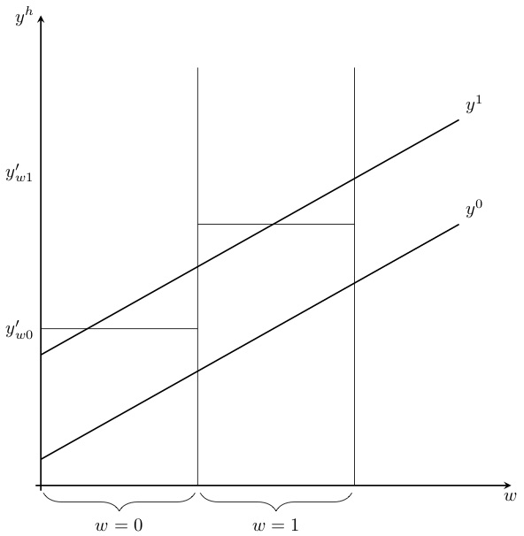
We’ll return to this, but I just wanted to point it out to you so that it would be concrete in your mind when we return to it later.
We can move now from the \(2\times 2\)s that we decomposed earlier directly into the ATT, which is ultimately the main thing we want to know. We covered this earlier in the chapter, but review it again here to maintain progress on my argument. I will first write down the \(2\times 2\) expression, use the switching equation to introduce potential outcome notation, and through a little manipulation, find some ATT expression. \[ \begin{align} \widehat{\delta}^{2\times 2}_{kU} &=\bigg (E\big[Y_j \Mid\Post\big]- E\big[Y_j \Mid\Pre\big] \bigg ) - \bigg( E\big[Y_u \Mid\Post\big]- E\big[Y_u \Mid \Pre\big]\bigg)\\ &=\bigg ( \underbrace{E\big[Y^1_j \Mid\Post\big] - E\big[Y^0_j] \Mid\Pre\big]\bigg)- \bigg(E\big[Y^0_u \Mid\Post\big]- E\big[Y^0_u \Mid\Pre\big]}_{\text{Switching equation}} \bigg)\\ &+ \underbrace{E\big[Y_j^0 \Mid\Post\big] - E\big[Y^0_j \Mid\Post\big]}_{\text{Adding zero}}\\ &=\underbrace{E\big[Y^1_j \Mid\Post\big] - E\big[Y^0_j \Mid\Post\big]}_{\text{ATT}} \\ &+\bigg [ \underbrace{E\big[Y^0_j \Mid\Post\big] - E\big[Y^0_j \Mid\Pre\big]\bigg]- \bigg [E\big[Y^0_U \Mid\Post\big] - E\big[Y_U^0 \Mid\Pre\big] }_{\text{Non-parallel trends bias in $2\times 2$ case}} \bigg ] \end{align} \] This can be rewritten even more compactly as: \[ \begin{align} \widehat{\delta}^{2\times 2}_{kU} = ATT_{\Post,j} + \underbrace{\Delta Y^0_{\Post,\Pre,j} - \Delta Y^0_{\Post,\Pre, U}}_{\text{Selection bias!}} \end{align} \] The \(2\times 2\) DD can be expressed as the sum of the ATT itself plus a parallel trends assumption, and without parallel trends, the estimator is biased. Ask yourself—which of these two differences in the parallel trends assumption is counterfactual, \(\Delta Y^0_{\Post,\Pre,j}\) or \(\Delta Y^0_{\Post,\Pre, U}\)? Which one is observed, in other words, and which one is not observed? Look and see if you can figure it out from this drawing in Figure 9.19.
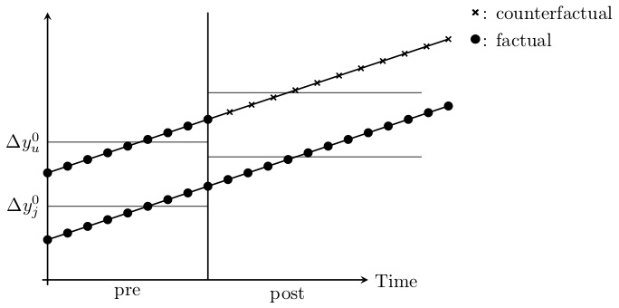
Only if these are parallel—the counterfactual trend and the observable trend—does the selection bias term zero out and ATT is identified. But let’s keep looking within the decomposition, as we aren’t done. The other two \(2\times 2\)s need to be defined since they appear in Bacon’s decomposition also. And they are: \[ \begin{align} \widehat{\delta}^{2\times 2}_{kU} &= ATT_k{\Post} + \Delta Y^0_k(\Post(k),\Pre(k)) - \Delta Y^0_U(\Post(k),\Pre) \\ \widehat{\delta}^{2\times 2}_{kl} &= ATT_k(MID) + \Delta Y^0_k(MID,\Pre) - \Delta Y^0_l(MID, \Pre) \end{align} \] These look the same because you’re always comparing the treated unit with an untreated unit (though in the second case it’s just that they haven’t been treated yet).
But what about the \(2\times 2\) that compared the late groups to the already-treated earlier groups? With a lot of substitutions like we did we get: \[ \begin{align} \widehat{\delta}^{2\times 2}_{lk} &= ATT_{l,\Post(l)} \nonumber \\ &+ \underbrace{\Delta Y^0_l(\Post(l),MID) - \Delta Y^0_k (\Post(l), MID)}_{\text{Parallel-trends bias}} \nonumber \\ & - \underbrace{(ATT_k(\Post) - ATT_k(Mid))}_{\text{Heterogeneity in time bias!}} \end{align} \] I find it interesting our earlier decomposition of the simple difference in means into \(ATE\) \(+\) selection bias \(+\) heterogeneity treatment effects bias resembles the decomposition of the late to early \(2\times 2\) DD.
The first line is the \(ATT\) that we desperately hope to identify. The selection bias zeroes out insofar as \(Y^0\) for \(k\) and \(l\) has the same parallel trends from \(mid\) to \(post\) period. And the treatment effects bias in the third line zeroes out so long as there are constant treatment effects for a group over time. But if there is heterogeneity in time for a group, then the two \(ATT\) terms will not be the same, and therefore will not zero out.
But we can sign the bias if we are willing to assume monotonicity, which means the \(mid\) term is smaller in absolute value than the \(post\) term. Under monotonicity, the interior of the parentheses in the third line is positive, and therefore the bias is negative. For positive ATT, this will bias the effects towards zero, and for negative ATT, it will cause the estimated ATT to become even more negative.
Let’s pause and collect these terms. The decomposition formula for DD is: \[ \begin{align} \widehat{\delta}^{DD} = \sum_{k \neq U} s_{kU}\widehat{\delta}_{kU}^{2\times 2} + \sum_{k \neq U} \sum_{l>k} s_{kl} \bigg[ \mu_{kl}\widehat{\delta}_{kl}^{2\times 2,k} + (1-\mu_{kl}) \widehat{\delta}_{kl}^{2\times 2,l} \bigg] \end{align} \] We will substitute the following three expressions into that formula. \[ \begin{align} \widehat{\delta}_{kU}^{2\times 2} &= ATT_k(\Post)+\Delta Y_l^0(\Post,\Pre)- \Delta Y_U^0(\Post,\Pre) \\ \widehat{\delta}_{kl}^{2\times 2,k} &=ATT_k( \Mid)+\Delta Y_l^0( \Mid,\Pre)-\Delta Y_l^0( \Mid, \Pre) \\ \widehat{\delta}^{2\times 2,l}_{lk} &=ATT_{l}\Post(l)+\Delta Y^0_l(\Post(l), \Mid)-\Delta Y^0_k (\Post(l), \Mid) \\ &- (ATT_k(\Post)-ATT_k( \Mid)) \end{align} \] Substituting all three terms into the decomposition formula is a bit overwhelming, so let’s simplify the notation. The estimated DD parameter is equal to: \[p\lim\widehat{\delta}^{DD}_{n\to\infty} = VWATT + VWCT - \Delta ATT\] In the next few sections, I discuss each individual element of this expression.
We begin by discussing the variance weighted average treatment effect on the treatment group, or \(VWATT\). Its unpacked expression is: \[ \begin{align} VWATT &=\sum_{k\neq U}\sigma_{kU}ATT_k(\Post(k)) \\ &+\sum_{k \neq U} \sum_{l>k} \sigma_{kl} \bigg [ \mu_{kl} ATT_k ( \Mid)+ (1-\mu_{kl}) ATT_{l} (POST(l)) \bigg ] \end{align} \] where \(\sigma\) is like \(s\), only population terms not samples. Notice that the VWATT simply contains the three ATTs identified above, each of which was weighted by the weights contained in the decomposition formula. While these weights sum to one, that weighting is irrelevant if the ATT are identical.13
When I learned that the DD coefficient was a weighted average of all individual \(2\times 2\)s, I was not terribly surprised. I may not have intuitively known that the weights were based on group shares and treatment variance, but I figured it was probably a weighted average nonetheless. I did not have that same experience, though, when I worked through the other two terms. I now turn to the other two terms: the VWCT and the \(\Delta ATT\).
VWCT stands for variance weighted common trends. This is just the collection of non-parallel-trends biases we previously wrote out, but notice—identification requires variance weighted common trends to hold, which is actually a bit weaker than we thought before with identical trends. You get this with identical trends, but what Goodman-Bacon (2019) shows us is that technically you don’t need identical trends because the weights can make it hold even if we don’t have exact parallel trends. Unfortunately, this is a bit of a pain to write out, but since it’s important, I will. \[ \begin{align} VWCT &= \sum_{k \neq U} \sigma_{kU} \bigg [ \Delta Y_k^0(\Post(k),\Pre) - \Delta Y_U^0(\Post(k),\Pre) \bigg ] \nonumber \\ &+ \sum_{k \neq U} \sum_{l>k} \sigma_{kl} \bigg [ \mu_{kl} \{ \Delta Y^0_k(Mid,\Pre(k)) - \Delta Y_l^0( \Mid,\Pre(k))\} \nonumber \\ &+(1-\mu_{kl}) \{ \Delta Y^0_l(\Post(l), \Mid) - \Delta Y^0_k(\Post(l), \Mid) \} \bigg ] \end{align} \] Notice that the VWCT term simply collects all the non-parallel-trend biases from the three \(2\times 2\)s. One of the novelties, though, is that the non-parallel-trend biases are also weighted by the same weights used in the VATT.
This is actually a new insight. On the one hand, there are a lot of terms we need to be zero. On the other hand, it’s ironically a weaker identifying assumption strictly identical common trends as the weights can technically correct for unequal trends. VWCT will zero out with exact parallel trends and in those situations where the weights adjust the trends to zero out. This is good news (sort of).
When we decomposed the simple difference in mean outcomes into the sum of the ATE, selection bias, and heterogeneous treatment effects bias, it really wasn’t a huge headache. That was because if the ATT differed from the ATU, then the simple difference in mean outcomes became the sum of ATT and selection bias, which was still an interesting parameter. But in the Bacon decomposition, ATT heterogeneity over time introduces bias that is not so benign. Let’s look at what happens when there is time-variant within-group treatment effects. \[ \begin{align} \Delta ATT = \sum_{k \neq U} \sum_{l>k} (1 - \mu_{kl}) \Big[ ATT_k(\Post(l) - ATT_k( \Mid)) \Big] \end{align} \] Heterogeneity in the ATT has two interpretations: you can have heterogeneous treatment effects across groups, and you can have heterogeneous treatment effects within groups over time. The \(\Delta ATT\) is concerned with the latter only. The first case would be heterogeneity across units but not within groups. When there is heterogeneity across groups, then the VWATT is simply the average over group-specific ATTs weighted by a function of sample shares and treatment variance. There is no bias from this kind of heterogeneity.14
But it’s the second case—when \(ATT\) is constant across units but heterogeneous within groups over time—that things get a little worrisome. Time-varying treatment effects, even if they are identical across units, generate cross-group heterogeneity because of the differing post-treatment windows, and the fact that earlier-treated groups are serving as controls for later-treated groups. Let’s consider a case where the counterfactual outcomes are identical, but the treatment effect is a linear break in the trend (Figure 9.20). For instance, \(Y^1_{it} = Y^0_{it} + \theta (t-t^*_1+1)\) similar to Meer and West (2016).
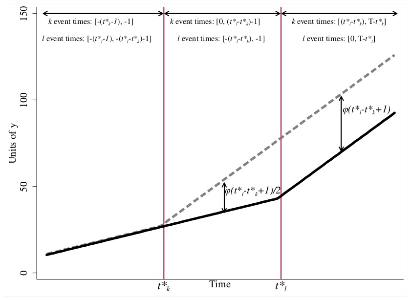
Notice how the first \(2\times 2\) uses the later group as its control in the middle period, but in the late period, the later-treated group is using the earlier treated as its control. When is this a problem?
It’s a problem if there are a lot of those \(2\times 2\)s or if their weights are large. If they are negligible portions of the estimate, then even if it exists, then given their weights are small (as group shares are also an important piece of the weighting not just the variance in treatment) the bias may be small. But let’s say that doesn’t hold. Then what is going on? The effect is biased because the control group is experiencing a trend in outcomes (e.g., heterogeneous treatment effects), and this bias feeds through to the later \(2\times 2\) according to the size of the weights, \((1-\mu_{kl})\). We will need to correct for this if our plan is to stick with the twoway fixed effects estimator.
Now it’s time to use what we’ve learned. Let’s look at an interesting and important paper by Cheng and Hoekstra (2013) to both learn more about a DD paper and replicate it using event studies and the Bacon decomposition.
Cheng and Hoekstra (2013) evaluated the impact that a gun reform had on violence and to illustrate various principles and practices regarding differential timing. I’d like to discuss those principles in the context of this paper. This next section will discuss, extend, and replicate various parts of this study.
Trayvon Benjamin Martin was a 17-year-old African-American young man when George Zimmerman shot and killed him in Sanford, Florida, on February 26, 2012. Martin was walking home alone from a convenience store when Zimmerman spotted him, followed him from a distance, and reported him to the police. He said he found Martin’s behavior “suspicious,” and though police officers urged Zimmerman to stay back, Zimmerman stalked and eventually provoked Martin. An altercation occurred and Zimmerman fatally shot Martin. Zimmerman claimed self-defense and was nonetheless charged with Martin’s death. A jury acquitted him of second-degree murder and of manslaughter.
Zimmerman’s actions were interpreted by the jury to be legal because in 2005, Florida reformed when and where lethal self-defense could be used. Whereas once lethal self-defense was only legal inside the home, a new law, “Stand Your Ground,” had extended that right to other public places. Between 2000 and 2010, twenty-one states explicitly expanded the castle-doctrine statute by extending the places outside the home where lethal force could be legally used.15 These states had removed a long-standing tradition in the common law that placed the duty to retreat from danger on the victim. After these reforms, though, victims no longer had a duty to retreat in public places if they felt threatened; they could retaliate in lethal self-defense.
Other changes were also made. In some states, individuals who used lethal force outside the home were assumed to be reasonably afraid. Thus, a prosecutor would have to prove fear was not reasonable, allegedly an almost impossible task. Civil liability for those acting under these expansions was also removed. As civil liability is a lower threshold of guilt than criminal guilt, this effectively removed the remaining constraint that might keep someone from using lethal force outside the home.
From an economic perspective, these reforms lowered the cost of killing someone. One could use lethal self-defense in situations from which they had previously been barred. And as there was no civil liability, the expected cost of killing someone was now lower. Thus, insofar as people are sensitive to incentives, then depending on the elasticities of lethal self-defense with respect to cost, we expect an increase in lethal violence for the marginal victim. The reforms may have, in other words, caused homicides to rise.
One can divide lethal force into true and false positives. The true positive use of lethal force would be those situations in which, had the person not used lethal force, he or she would have been murdered. Thus, the true positive case of lethal force is simply a transfer of one life (the offender) for another (the defender). This is tragic, but official statistics would not record an net increase in homicides relative to the counterfactual—only which person had been killed. But a false positive causes a net increase in homicides relative to the counterfactual. Some arguments can escalate unnecessarily, and yet under common law, the duty to retreat would have defused the situation before it spilled over into lethal force. Now, though, under these castle-doctrine reforms, that safety valve is removed, and thus a killing occurs that would not have in counterfactual, leading to a net increase in homicides.
But that is not the only possible impact of the reforms—deterrence of violence is also a possibility under these reforms. In Lott and Mustard (1997), the authors found that concealed-carry laws reduced violence. They suggested this was caused by deterrence—thinking someone may be carrying a concealed weapon, the rational criminal is deterred from committing a crime. Deterrence dates back to G. Becker (1968) and Jeremy Bentham before him. Expanding the arenas where lethal force could be used could also deter crime. Since this theoretical possibility depends crucially on key elasticities, which may in fact be zero, deterrence from expanding where guns can be used to kill someone is ultimately an empirical question.
Cheng and Hoekstra (2013) chose a difference-in-differences design for their project where the castle doctrine law was the treatment and timing was differential across states. Their estimatingequation was \[ Y_{it}=\alpha + \delta D_{it} + \gamma X_{it} + \sigma_i + \tau_t + \varepsilon_{it} \] where \(D_{it}\) is the treatment parameter. They estimated this equation using a standard twoway fixed effects model as well as count models. Ordinarily, the treatment parameter will be a 0 or 1, but in Cheng and Hoekstra (2013), it’s a variable ranging from 0 to 1, because some states get the law change mid-year. So if they got the law in July, then \(D_{it}\) equals 0 before the year of adoption, 0.5 in the year of adoption and 1 thereafter. The \(X_{it}\) variable included a particular kind of control that they called “region-by-year fixed effects,” which was a vector of dummies for the census region to which the state belonged interacted with each year fixed effect. This was done so that explicit counterfactuals were forced to come from within the same census region.16 As the results are not dramatically different between their twoway fixed effects and count models, I will tend to emphasize results from the twoway fixed effects.
The data they used is somewhat standard in crime studies. They used the FBI Uniform Crime Reports Summary Part I files from 2000 to 2010. The FBI Uniform Crime Reports is a harmonized data set on eight “index” crimes collected from voluntarily participating police agencies across the country. Participation is high and the data goes back many decades, making it attractive for many contemporary questions regarding the crime policy. Crimes were converted into rates, or “offenses per 100,000 population.”
Cheng and Hoekstra (2013) rhetorically open their study with a series of simple placebos to check whether the reforms were spuriously correlated with crime trends more generally. Since oftentimes many crimes are correlated because of unobserved factors, this has some appeal, as it rules out the possibility that the laws were simply being adopted in areas where crime rates were already rising. For their falsifications they chose motor vehicle thefts and larcenies, neither of which, they reasoned, should be credibly connected to lowering the cost of using lethal force in public.
There are so many regression coefficients in Table 9.5 because applied microeconomists like to report results under increasingly restrictive models. In this case, each column is a new regression with additional controls such as additional fixed-effects specifications, time-varying controls, a one-year lead to check on the pre-treatment differences in outcomes, and state-specific trends. As you can see, many of these coefficients are very small, and because they are small, even large standard errors yield a range of estimates that are still not very large.
Next they look at what they consider to be crimes that might be deterred if policy created a credible threat of lethal retaliation in public: burglary, robbery, and aggravated assault.
Insofar as castle doctrine has a deterrence effect, then we would expect a negative effect of the law on offenses. But all of the regressions shown in Table 9.6 are actually positive, and very few are significant even still. So the authors conclude they cannot detect any deterrence—which does not mean it didn’t happen; just that they cannot reject the null for large effects.
Now they move to their main results, which is interesting because it’s much more common for authors to lead with their main results. But the rhetoric of this paper is somewhat original in that respect. By this point, the reader has seen a lot of null effects from the laws and may be wondering, “What’s going on? This law isn’t spurious and isn’t causing deterrence. Why am I reading this paper?”
The first thing the authors did was show a series of figures showing the raw data on homicides for treatment and control states. This is always a challenge when working with differential timing, though. For instance, approximately twenty states adopted a castle-doctrine law from 2005 to 2010, but not at the same time. So how are you going to show this visually? What is the pre-treatment period, for instance, for the control group when there is differential timing? If one state adopts
| OLS – Weighted by State Population | ||||||
|---|---|---|---|---|---|---|
| (1) | (2) | (3) | (4) | (5) | (6) | |
| Panel A. Larceny | ||||||
| Log(Larceny Rate) | ||||||
| Castle Doctrine | 0.00300 | \(-0.00600\) | \(-0.00910\) | \(-0.0858\) | \(-0.00401\) | \(-0.00284\) |
| Law | (0.0161) | (0.0147) | (0.0139) | (0.0139) | (0.0128) | (0.0180) |
| 0 to 2 years before adoption of castle doctrine law | 0.00112 | |||||
| (0.0105) | ||||||
| Observation | 550 | 550 | 550 | 550 | 550 | 550 |
| Panel B. Motor | ||||||
| Log(Motor Vehicle Theft Rate) | ||||||
| Castle Doctrine | 0.0517 | \(-0.0389\) | \(-0.0252\) | \(-0.0294\) | \(-0.0165\) | \(-0.00708\) |
| Law | (0.0563) | (0.448) | (0.0396) | (0.0469) | (0.0354) | (0.0372) |
| 0 to 2 years before adoption of castle doctrine law | \(-0.00896\) | |||||
| (0.0216) | ||||||
| Observation | 550 | 550 | 550 | 550 | 550 | 550 |
| State and year fixed effects | Yes | Yes | Yes | Yes | Yes | Yes |
| Region-by-year fixed effects | Yes | Yes | Yes | Yes | Yes | |
| Time-varying controls | Yes | Yes | Yes | Yes | ||
| Controls for larceny or motor theft | Yes | |||||
| State-specific linear time trends | Yes |
Each column in each panel represents a separate regression. The unit of observation is state-year. Robust standard errors are clustered at the state level. Time-varying controls include policing and incarceration rates, welfare and public assistance spending, median income, poverty rate, unemployment rate, and demographics. \(^{*}\) Significant at the 10 percent level. \(^{**}\) Significant at the 5 percent level. \(^{***}\) Significant at the 1 percent level.
| OLS – Weighted by State Population | ||||||
|---|---|---|---|---|---|---|
| (1) | (2) | (3) | (4) | (5) | (6) | |
| Panel A. Burglary | ||||||
| Log(Burglary Rate) | ||||||
| Castle-doctrine law | 0.0780\(^{***}\) | 0.0290 | 0.0223 | 0.0181 | 0.0327\(^*\) | 0.0237 |
| 0 to 2 years before adoption of castle-doctrine law | (0.0255) | (0.0236) | (0.0223) | (0.0265) | (0.0165) | (0.0207) |
| \(-0.009606\) | ||||||
| (0.0133) | ||||||
| Panel B. Robbery | ||||||
| Log(Robery Rate) | ||||||
| Castle-doctrine law | 0.0408 | 0.0344 | 0.0262 | 0.0197 | 0.0376\(^{**}\) | 0.0515\(^*\) |
| (0.0254) | (0.0224) | (0.0229) | (0.0257) | (0.0181) | (0.0274) | |
| 0 to 2 years before adoption of castle-doctrine law | \(-0.0138\) | |||||
| (0.0153) | ||||||
| Panel C. Aggravated | ||||||
| Log(Aggrevated Assault Rate) | ||||||
| Castle-doctrine law | 0.0434 | 0.0397 | 0.0372 | 0.0330 | 0.0424 | 0.0414 |
| (0.0387) | (0.0407) | (0.0319) | (0.0367) | (0.0291) | (0.0285) | |
| 0 to 2 years before adoption of castle-doctrine law | \(-0.00897\) | |||||
| (0.0216) | ||||||
| Observation | 550 | 550 | 550 | 550 | 550 | 550 |
| State and year fixed effects | Yes | Yes | Yes | Yes | Yes | Yes |
| Region-by-year fixed effects | Yes | Yes | Yes | Yes | Yes | |
| Time-varying controls | Yes | Yes | Yes | Yes | ||
| Controls for larceny or motor theft | Yes | |||||
| State-specific linear time trends | Yes |
Each column in each panel represents a separate regression. The unit of observation is state-year. Robust standard errors are clustered at the state level. Time-varying controls include policing and incarceration rates, welfare and public assistance spending, median income, poverty rate, unemployment rate, and demographics. \(^{*}\) Significant at the 10 percent level. \(^{**}\) Significant at the 5 percent level. \(^{***}\) Significant at the 1 percent level.
in 2005, but another in 2006, then what precisely is the pre- and post-treatment for the control group? So that’s a bit of a challenge, and yet if you stick with our guiding principle that causal inference studies desperately need data visualization of the main effects, your job is to solve it with creativity and honesty to make beautiful figures. Cheng and Hoekstra (2013) could’ve presented regression coefficients on leads and lags, as that is very commonly done, but knowing these authors firsthand, their preference is to give the reader pictures of the raw data to be as transparent as possible. Therefore, they showed multiple figures where each figure was a “treatment group” compared to all the “never-treated” units. Figure 9.21 shows the Florida case.
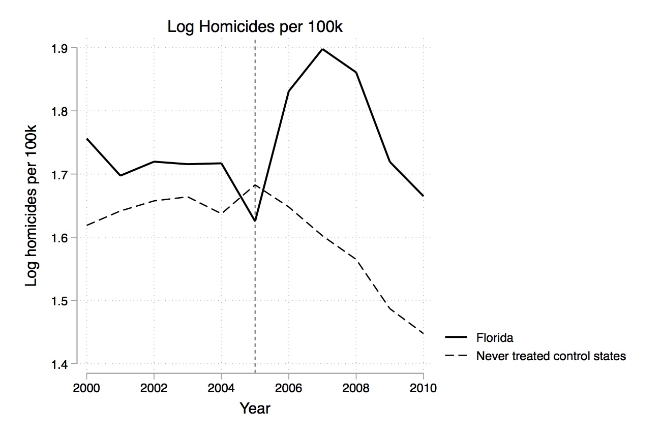
Notice that before the passage of the law, the offenses are fairly flat for treatment and control. Obviously, as I’ve emphasized, this is not a direct test of the parallel-trends assumption. Parallel trends in the pre-treatment period are neither necessary nor sufficient. The identifying assumption, recall, is that of variance-weighted common trends, which are entirely based on parallel counterfactual trends, not pre-treatment trends. But researchers use parallel pre-treatment trends like a hunch that the counterfactual trends would have been parallel. In one sense, parallel pre-treatment rules out some obvious spurious factors that we should be worried about, such as the law adoption happening around the timing of a change, even if that’s simply nothing more than seemingly spurious factors like rising homicides. But that’s clearly not happening here—homicides weren’t diverging from controls pre-treatment. They were following a similar trajectory before Florida passed its law and only then did the trends converge. Notice that after 2005, which is when the law occurs, there’s a sizable jump in homicides. There are additional figures like this, but they all have this set up—they show a treatment group over time compared to the same “never-treated” group.
| Panel A. Homicide | Log(Homicide Rates) | |||||
| OLS–Weights | 1 | 2 | 3 | 4 | 5 | 6 |
| Castle Doctrine Law | 0.0801\(^{**}\) | 0.0946\(^{***}\) | 0.0937\(^{***}\) | 0.0955\(^{**}\) | 0.0985\(^{***}\) | 0.100\(^{**}\) |
| (0.0342) | (0.0279) | (0.0290) | (0.0367) | (0.0299) | (0.0388) | |
| 0 to 2 years before adoption of castle doctrine law | 0.00398 | |||||
| (0.0222) | ||||||
| Observation | 550 | 550 | 550 | 550 | 550 | 550 |
| State and Year Fixed Effects | Yes | Yes | Yes | Yes | Yes | Yes |
| Region-by-year Fixed | Yes | Yes | Yes | Yes | Yes | |
| Effects | ||||||
| Time-Varying Controls | Yes | Yes | Yes | Yes | ||
| Controls for Larceny or Motor Theft | Yes | |||||
| State-specific Linear Time Trends | Yes |
Each column in each panel represents a separate regression. The unit of observation is state-year. Robust standard errors are clustered at the state level. Time-varying controls include policing and incarceration rates, welfare and public assistance spending, median income, poverty rate, unemployment rate, and demographics. \(^{**}\) Significant at the 5 percent level. \(^{***}\) Significant at the 1 percent level.
Insofar as the cost of committing lethal force has fallen, then we expect to see more of it, which implies a positive coefficient on the estimated \(\delta\) term assuming the heterogeneity bias we discussed earlier doesn’t cause the twoway fixed effects estimated coefficient to flip signs. It should be different from zero both statistically and in a meaningful magnitude. They present four separate types of specifications—three using OLS, one using negative binomial. But I will only report the weighted OLS regressions for the sake of space.
There’s a lot of information in Table 9.7, so let’s be sure not to get lost. First, all coefficients are positive and similar in magnitude—between 8% and 10% increases in homicides. Second, three of the four panels are almost entirely significant. It appears that the bulk of their evidence suggests the castle-doctrine statute caused an increase in homicides around 8%.
Not satisfied, the authors implemented a kind of randomization inference-based test. Specifically, they moved the eleven-year panel back in time covering 1960–2009 and estimated forty placebo “effects” of passing castle doctrine one to forty years earlier. When they did this, they found that the average effect from this exercise was essentially zero. Those results are summarized here. It appears there is something statistically unusual about the actual treatment profile compared to the placebo profiles, because the actual profile yields effect sizes larger than all but one case in any of the placebo regressions run.
| Method | Average estimate | Estimates larger than actual estimate |
|---|---|---|
| Weighted OLS | \(-0.003\) | 0/40 |
| Unweighted OLS | 0.001 | 1/40 |
| Negative binomial | 0.001 | 0/40 |
Cheng and Hoekstra (2013) found no evidence that castle-doctrine laws deter violent offenses, but they did find that it increased homicides. An 8% net increase in homicide rates translates to around six hundred additional homicides per year across the twenty-one adopting states. Thinking back to to the killing of Trayvon Martin by George Zimmerman, one is left to wonder whether Trayvon might still be alive had Florida not passed Stand Your Ground. This kind of counterfactual reasoning can drive you crazy, because it is unanswerable—we simply don’t know, cannot know, and never will know the answer to counterfactual questions. The fundamental problem of causal inference states that we need to know what would have happened that fateful night without Stand Your Ground and compare that with what happened with Stand Your Ground to know what can and cannot be placed at the feet of that law. What we do know is that under certain assumptions related to the DD design, homicides were on net around 8%–10% higher than they would’ve been when compared against explicit counterfactuals. And while that doesn’t answer every question, it suggests that a nontrivial number of deaths can be blamed on laws similar to Stand Your Ground.
Now that we’ve discussed Cheng and Hoekstra (2013), I want to replicate it, or at least do some work on their data set to illustrate certain things that we’ve discussed, like event studies and the Bacon decomposition. This analysis will be slightly different from what they did, though, because their policy variable was on the interval \([0,1]\) rather than being a pure dummy. That’s because they carefully defined their policy variable according to the month in which the law was passed (e.g., June) divided by a total of 12 months. So if a state passed the last in June, then they would assign a 0.5 in the first year, and a 1 thereafter. While there’s nothing wrong with that approach, I am going to use a dummy because it makes the event studies a bit easier to visualize, and the Bacon decomposition only works with dummy policy variables.
First, I will replicate his main homicide results from Panel A, column 6, of Figure 9.21.
use https://github.com/scunning1975/mixtape/raw/master/castle.dta, clear
set scheme cleanplots
* ssc install bacondecomp

* define global macros
global crime1 jhcitizen_c jhpolice_c murder homicide  robbery assault burglary larceny motor robbery_gun_r
global demo blackm_15_24 whitem_15_24 blackm_25_44 whitem_25_44 //demographics
global lintrend trend_1-trend_51 //state linear trend
global region r20001-r20104  //region-quarter fixed effects
global exocrime l_larceny l_motor // exogenous crime rates
global spending l_exp_subsidy l_exp_pubwelfare
global xvar l_police unemployrt poverty l_income l_prisoner l_lagprisoner $demo $spending

label variable post "Year of treatment"
xi: xtreg l_homicide i.year $region $xvar $lintrend post [aweight=popwt], fe vce(cluster sid)library(bacondecomp)
library(tidyverse)
library(haven)
library(lfe)
read_data <- function(df)
{
full_path <- paste("https://github.com/scunning1975/mixtape/raw/master/",
df, sep = "")
df <- read_dta(full_path)
return(df)
}
castle <- read_data("castle.dta")
#--- global variables
crime1 <- c("jhcitizen_c", "jhpolice_c",
"murder", "homicide",
"robbery", "assault", "burglary",
"larceny", "motor", "robbery_gun_r")
demo <- c("emo", "blackm_15_24", "whitem_15_24",
"blackm_25_44", "whitem_25_44")
# variables dropped to prevent colinearity
dropped_vars <- c("r20004", "r20014",
"r20024", "r20034",
"r20044", "r20054",
"r20064", "r20074",
"r20084", "r20094",
"r20101", "r20102", "r20103",
"r20104", "trend_9", "trend_46",
"trend_49", "trend_50", "trend_51"
)
lintrend <- castle %>%
select(starts_with("trend")) %>%
colnames %>%
# remove due to colinearity
subset(.,! . %in% dropped_vars)
region <- castle %>%
select(starts_with("r20")) %>%
colnames %>%
# remove due to colinearity
subset(.,! . %in% dropped_vars)
exocrime <- c("l_lacerny", "l_motor")
spending <- c("l_exp_subsidy", "l_exp_pubwelfare")
xvar <- c(
"blackm_15_24", "whitem_15_24", "blackm_25_44", "whitem_25_44",
"l_exp_subsidy", "l_exp_pubwelfare",
"l_police", "unemployrt", "poverty",
"l_income", "l_prisoner", "l_lagprisoner"
)
law <- c("cdl")
dd_formula <- as.formula(
paste("l_homicide ~ ",
paste(
paste(xvar, collapse = " + "),
paste(region, collapse = " + "),
paste(lintrend, collapse = " + "),
paste("post", collapse = " + "), sep = " + "),
"| year + sid | 0 | sid"
)
)
#Fixed effect regression using post as treatment variable
dd_reg <- felm(dd_formula, weights = castle$popwt, data = castle)
summary(dd_reg)import numpy as np
import pandas as pd
import statsmodels.api as sm
import statsmodels.formula.api as smf
from itertools import combinations
import plotnine as p
# read data
import ssl
ssl._create_default_https_context = ssl._create_unverified_context
def read_data(file):
return pd.read_stata("https://github.com/scunning1975/mixtape/raw/master/" + file)
castle = read_data('castle.dta')
crime1 = ("jhcitizen_c", "jhpolice_c",
"murder", "homicide",
"robbery", "assault", "burglary",
"larceny", "motor", "robbery_gun_r")
demo = ("emo", "blackm_15_24", "whitem_15_24",
"blackm_25_44", "whitem_25_44")
# variables dropped to prevent colinearity
dropped_vars = ("r20004", "r20014",
"r20024", "r20034",
"r20044", "r20054",
"r20064", "r20074",
"r20084", "r20094",
"r20101", "r20102", "r20103",
"r20104", "trend_9", "trend_46",
"trend_49", "trend_50", "trend_51")
cols = pd.Series(castle.columns)
trend_cols = set(cols[cols.str.contains('^trend')])
lintrend = castle[trend_cols - set(dropped_vars)]
region = set(cols[cols.str.contains('^r20')])
lintrend = set(cols[cols.str.contains('^trend')])
exocrime = ("l_lacerny", "l_motor")
spending = ("l_exp_subsidy", "l_exp_pubwelfare")
xvar = (
"blackm_15_24", "whitem_15_24", "blackm_25_44", "whitem_25_44",
"l_exp_subsidy", "l_exp_pubwelfare",
"l_police", "unemployrt", "poverty",
"l_income", "l_prisoner", "l_lagprisoner"
)
law = ("cdl")
dd_formula = "l_homicide ~ {} + {} + {} + post + C(year) + C(sid)".format(
"+".join(xvar),
"+".join(region),
"+".join(lintrend))
#Fixed effect regression using post as treatment variable
dd_reg = smf.wls(dd_formula,
data = castle, weights = castle['popwt']).fit(cov_type='cluster', cov_kwds={'groups':castle['sid']})
dd_reg.summary()Here we see the main result that castle doctrine expansions led to an approximately 10% increase in homicides. And if we use the post-dummy, which is essentially equal to 0 unless the state had fully covered castle doctrine expansions, then the effect is more like 7.6%.
But now, I’d like to go beyond their study to implement an event study. First, we need to define pre-treatment leads and lags. To do this, we use a “time_til” variable, which is the number of years until or after the state received the treatment. Using this variable, we then create the leads (which will be the years prior to treatment) and lags (the years post-treatment).
* Event study regression with the year of treatment (lag0) as the omitted category.
xi: xtreg l_homicide i.year $region lead9 lead8 lead7 lead6 lead5 lead4 lead3 lead2 lead1 lag1-lag5 [aweight=popwt], fe vce(cluster sid)castle <- castle %>%
mutate(
time_til = year - treatment_date,
lead1 = case_when(time_til == -1 ~ 1, TRUE ~ 0),
lead2 = case_when(time_til == -2 ~ 1, TRUE ~ 0),
lead3 = case_when(time_til == -3 ~ 1, TRUE ~ 0),
lead4 = case_when(time_til == -4 ~ 1, TRUE ~ 0),
lead5 = case_when(time_til == -5 ~ 1, TRUE ~ 0),
lead6 = case_when(time_til == -6 ~ 1, TRUE ~ 0),
lead7 = case_when(time_til == -7 ~ 1, TRUE ~ 0),
lead8 = case_when(time_til == -8 ~ 1, TRUE ~ 0),
lead9 = case_when(time_til == -9 ~ 1, TRUE ~ 0),
lag0 = case_when(time_til == 0 ~ 1, TRUE ~ 0),
lag1 = case_when(time_til == 1 ~ 1, TRUE ~ 0),
lag2 = case_when(time_til == 2 ~ 1, TRUE ~ 0),
lag3 = case_when(time_til == 3 ~ 1, TRUE ~ 0),
lag4 = case_when(time_til == 4 ~ 1, TRUE ~ 0),
lag5 = case_when(time_til == 5 ~ 1, TRUE ~ 0)
)
event_study_formula <- as.formula(
paste("l_homicide ~ + ",
paste(
paste(region, collapse = " + "),
paste(paste("lead", 1:9, sep = ""), collapse = " + "),
paste(paste("lag", 1:5, sep = ""), collapse = " + "), sep = " + "),
"| year + state | 0 | sid"
),
)
event_study_reg <- felm(event_study_formula, weights = castle$popwt, data = castle)
summary(event_study_reg)import numpy as np
import pandas as pd
import statsmodels.api as sm
import statsmodels.formula.api as smf
from itertools import combinations
import plotnine as p
# read data
import ssl
ssl._create_default_https_context = ssl._create_unverified_context
def read_data(file):
return pd.read_stata("https://github.com/scunning1975/mixtape/raw/master/" + file)
castle['time_til'] = castle['year'] - castle['treatment_date']
castle['lead1'] = castle['time_til'] == -1
castle['lead2'] = castle['time_til'] == -2
castle['lead3'] = castle['time_til'] == -3
castle['lead4'] = castle['time_til'] == -4
castle['lead5'] = castle['time_til'] == -5
castle['lead6'] = castle['time_til'] == -6
castle['lead7'] = castle['time_til'] == -7
castle['lead8'] = castle['time_til'] == -8
castle['lead9'] = castle['time_til'] == -9
castle['lag0'] = castle['time_til'] == 0
castle['lag1'] = castle['time_til'] == 1
castle['lag2'] = castle['time_til'] == 2
castle['lag3'] = castle['time_til'] == 3
castle['lag4'] = castle['time_til'] == 4
castle['lag5'] = castle['time_til'] == 5
formula = "l_homicide ~ r20001 + r20002 + r20003 + r20011 + r20012 + r20013 + r20021 + r20022 + r20023 + r20031 + r20032 + r20033 + r20041 + r20042 + r20043 + r20051 + r20052 + r20053 + r20061 + r20062 + r20063 + r20071 + r20072 + r20073 + r20081 + r20082 + r20083 + r20091 + r20092 + r20093 + lead1 + lead2 + lead3 + lead4 + lead5 + lead6 + lead7 + lead8 + lead9 + lag1 + lag2 + lag3 + lag4 + lag5 + C(year) + C(state)"
event_study_formula = smf.wls(formula,
data = castle, weights = castle['popwt']).fit(cov_type='cluster', cov_kwds={'groups':castle['sid']})
event_study_formula.summary()Our omitted category is the year of treatment, so all coefficients are with respect to that year. You can see from the coefficients on the leads that they are not statistically different from zero prior to treatment, except for leads 8 and 9, which may be because there are only three states with eight years prior to treatment, and one state with nine years prior to treatment. But in the years prior to treatment, leads 1 to 6 are equal to zero and statistically insignificant, although they do technically have large confidence intervals. The lags, on the other hand, are all positive and not too dissimilar from one another except for lag 5, which is around 17%.
Now it is customary to plot these event studies, so let’s do that now. I am going to show you an easy way and a longer way to do this. The longer way gives you ultimately more control over what exactly you want the event study to look like, but for a fast and dirty method, the easier way will suffice. For the easier way, you will need to install a program in Stata called coefplot, written by Ben Jann, author of estout.17
* Plot the coefficients using coefplot
* ssc install coefplot

coefplot, keep(lead9 lead8 lead7 lead6 lead5 lead4 lead3 lead2 lead1 lag1 lag2 lag3 lag4 lag5) xlabel(, angle(vertical)) yline(0) xline(9.5) vertical msymbol(D) mfcolor(white) ciopts(lwidth(*3) lcolor(*.6)) mlabel format(%9.3f) mlabposition(12) mlabgap(*2) title(Log Murder Rate) # order of the coefficients for the plot
plot_order <- c("lead9", "lead8", "lead7",
"lead6", "lead5", "lead4", "lead3",
"lead2", "lead1", "lag1",
"lag2", "lag3", "lag4", "lag5")
# grab the clustered standard errors
# and average coefficient estimates
# from the regression, label them accordingly
# add a zero'th lag for plotting purposes
leadslags_plot <- tibble(
sd = c(event_study_reg$cse[plot_order], 0),
mean = c(coef(event_study_reg)[plot_order], 0),
label = c(-9,-8,-7,-6, -5, -4, -3, -2, -1, 1,2,3,4,5, 0)
)
# This version has a point-range at each
# estimated lead or lag
# comes down to stylistic preference at the
# end of the day!
leadslags_plot %>%
ggplot(aes(x = label, y = mean,
ymin = mean-1.96*sd,
ymax = mean+1.96*sd)) +
geom_hline(yintercept = 0.0769, color = "red") +
geom_pointrange() +
theme_minimal() +
xlab("Years before and after castle doctrine expansion") +
ylab("log(Homicide Rate)") +
geom_hline(yintercept = 0,
linetype = "dashed") +
geom_vline(xintercept = 0,
linetype = "dashed")
# This version includes
# an interval that traces the confidence intervals
# of your coefficients
leadslags_plot %>%
ggplot(aes(x = label, y = mean,
ymin = mean-1.96*sd,
ymax = mean+1.96*sd)) +
# this creates a red horizontal line
geom_hline(yintercept = 0.0769, color = "red") +
geom_line() +
geom_point() +
geom_ribbon(alpha = 0.2) +
theme_minimal() +
# Important to have informative axes labels!
xlab("Years before and after castle doctrine expansion") +
ylab("log(Homicide Rate)") +
geom_hline(yintercept = 0) +
geom_vline(xintercept = 0)import numpy as np
import pandas as pd
import statsmodels.api as sm
import statsmodels.formula.api as smf
from itertools import combinations
import plotnine as p
# read data
import ssl
ssl._create_default_https_context = ssl._create_unverified_context
def read_data(file):
return pd.read_stata("https://github.com/scunning1975/mixtape/raw/master/" + file)
castle['time_til'] = castle['year'] - castle['treatment_date']
castle['lead1'] = castle['time_til'] == -1
castle['lead2'] = castle['time_til'] == -2
castle['lead3'] = castle['time_til'] == -3
castle['lead4'] = castle['time_til'] == -4
castle['lead5'] = castle['time_til'] == -5
castle['lead6'] = castle['time_til'] == -6
castle['lead7'] = castle['time_til'] == -7
castle['lead8'] = castle['time_til'] == -8
castle['lead9'] = castle['time_til'] == -9
castle['lag0'] = castle['time_til'] == 0
castle['lag1'] = castle['time_til'] == 1
castle['lag2'] = castle['time_til'] == 2
castle['lag3'] = castle['time_til'] == 3
castle['lag4'] = castle['time_til'] == 4
castle['lag5'] = castle['time_til'] == 5
formula = "l_homicide ~ r20001 + r20002 + r20003 + r20011 + r20012 + r20013 + r20021 + r20022 + r20023 + r20031 + r20032 + r20033 + r20041 + r20042 + r20043 + r20051 + r20052 + r20053 + r20061 + r20062 + r20063 + r20071 + r20072 + r20073 + r20081 + r20082 + r20083 + r20091 + r20092 + r20093 + lead1 + lead2 + lead3 + lead4 + lead5 + lead6 + lead7 + lead8 + lead9 + lag1 + lag2 + lag3 + lag4 + lag5 + C(year) + C(state)"
event_study_formula = smf.wls(formula,
data = castle, weights = castle['popwt']).fit(cov_type='cluster', cov_kwds={'groups':castle['sid']})
leads = ['lead9[T.True]', 'lead8[T.True]', 'lead7[T.True]', 'lead6[T.True]', 'lead5[T.True]', 'lead4[T.True]', 'lead3[T.True]', 'lead2[T.True]', 'lead1[T.True]']
lags = ['lag1[T.True]', 'lag2[T.True]', 'lag3[T.True]', 'lag4[T.True]', 'lag5[T.True]']
leadslags_plot = pd.DataFrame({
'sd' : np.concatenate([np.sqrt(np.diag(event_study_formula.cov_params().loc[leads][leads])), np.array([0]), np.sqrt(np.diag(event_study_formula.cov_params().loc[lags][lags]))]),
'mean': np.concatenate([event_study_formula.params[leads], np.array([0]), event_study_formula.params[lags]]),
'label': np.arange(-9, 6)})
leadslags_plot['lb'] = leadslags_plot['mean'] - leadslags_plot['sd']*1.96
leadslags_plot['ub'] = leadslags_plot['mean'] + leadslags_plot['sd']*1.96
# This version has a point-range at each estimated lead or lag
# comes down to stylistic preference at the end of the day!
p.ggplot(leadslags_plot, p.aes(x = 'label', y = 'mean',
ymin = 'lb',
ymax = 'ub')) +\
p.geom_hline(yintercept = 0.0769, color = "red") +\
p.geom_pointrange() +\
p.theme_minimal() +\
p.xlab("Years before and after castle doctrine expansion") +\
p.ylab("log(Homicide Rate)") +\
p.geom_hline(yintercept = 0,
linetype = "dashed") +\
p.geom_vline(xintercept = 0,
linetype = "dashed")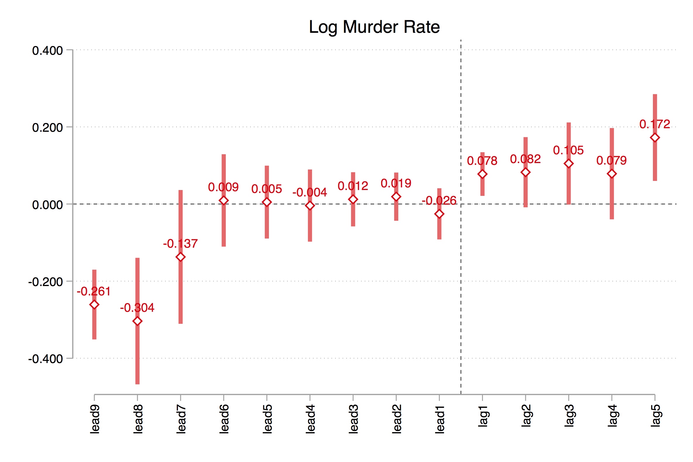
Let’s look now at what this command created. As you can see in Figure 9.22, eight to nine years prior to treatment, treatment states have significantly lower levels of homicides, but as there are so few states that even have these values (one with \(-9\) and three with \(-8\)), we may want to disregard the relevance of these negative effects if for no other reason than that there are so few units in the dummy and we know from earlier that that can lead to very high overrejection rates (MacKinnon and Webb 2017). Instead, notice that for the six years prior to treatment, there is virtually no difference between the treatment states and the control states.
But, after the year of treatment, that changes. Log murders begin rising, which is consistent with our post dummy that imposed zeros on all pre-treatment leads and required that the average effect post-treatment be a constant.
I promised to show you how to make this graph in a way that gave more flexibility, but you should be warned, this is a bit more cumbersome.
xi: xtreg l_homicide  i.year $region $xvar $lintrend post [aweight=popwt], fe vce(cluster sid)

local DDL = _b[post]
local DD : display %03.2f _b[post]
local DDSE : display %03.2f _se[post]
local DD1 = -0.10

xi: xtreg l_homicide  i.year $region lead9 lead8 lead7 lead6 lead5 lead4 lead3 lead2 lead1 lag1-lag5 [aweight=popwt], fe vce(cluster sid)

outreg2 using "./eventstudy_levels.xls", replace keep(lead9 lead8 lead7 lead6 lead5 lead4 lead3 lead2 lead1 lag1-lag5) noparen noaster addstat(DD, `DD', DDSE, `DDSE')


*Pull in the ES Coefs
xmluse "./eventstudy_levels.xls", clear cells(A3:B32) first
replace VARIABLES = subinstr(VARIABLES,"lead","",.)
replace VARIABLES = subinstr(VARIABLES,"lag","",.)
quietly destring _all, replace ignore(",")
replace VARIABLES = -9 in 2
replace VARIABLES = -8 in 4
replace VARIABLES = -7 in 6
replace VARIABLES = -6 in 8
replace VARIABLES = -5 in 10
replace VARIABLES = -4 in 12
replace VARIABLES = -3 in 14
replace VARIABLES = -2 in 16
replace VARIABLES = -1 in 18
replace VARIABLES = 1 in 20
replace VARIABLES = 2 in 22
replace VARIABLES = 3 in 24
replace VARIABLES = 4 in 26
replace VARIABLES = 5 in 28
drop in 1
compress
quietly destring _all, replace ignore(",")
compress


ren VARIABLES exp
gen b = exp<.
replace exp = -9 in 2
replace exp = -8 in 4
replace exp = -7 in 6
replace exp = -6 in 8
replace exp = -5 in 10
replace exp = -4 in 12
replace exp = -3 in 14
replace exp = -2 in 16
replace exp = -1 in 18
replace exp = 1 in 20
replace exp = 2 in 22
replace exp = 3 in 24
replace exp = 4 in 26
replace exp = 5 in 28

* Expand the dataset by one more observation so as to include the comparison year
local obs =_N+1
set obs `obs'
for var _all: replace X = 0 in `obs'
replace b = 1 in `obs'
replace exp = 0 in `obs'
keep exp l_homicide b
set obs 30
foreach x of varlist exp l_homicide b {
    replace `x'=0 in 30
    }
reshape wide l_homicide, i(exp) j(b)


* Create the confidence intervals
cap drop *lb* *ub*
gen lb = l_homicide1 - 1.96*l_homicide0
gen ub = l_homicide1 + 1.96*l_homicide0


* Create the picture
set scheme s2color
#delimit ;
twoway (scatter l_homicide1 ub lb exp ,
        lpattern(solid dash dash dot dot solid solid)
        lcolor(gray gray gray red blue)
        lwidth(thick medium medium medium medium thick thick)
        msymbol(i i i i i i i i i i i i i i i) msize(medlarge medlarge)
        mcolor(gray black gray gray red blue)
        c(l l l l l l l l l l l l l l l)
        cmissing(n n n n n n n n n n n n n n n n)
        xline(0, lcolor(black) lpattern(solid))
        yline(0, lcolor(black))
        xlabel(-9 -8 -7 -6 -5 -4 -3 -2 -1 0 1 2 3 4 5 , labsize(medium))
        ylabel(, nogrid labsize(medium))
        xsize(7.5) ysize(5.5)
        legend(off)
        xtitle("Years before and after castle doctrine expansion", size(medium))
        ytitle("Log Murders ", size(medium))
        graphregion(fcolor(white) color(white) icolor(white) margin(zero))
        yline(`DDL', lcolor(red) lwidth(thick)) text(`DD1' -0.10 "DD Coefficient = `DD' (s.e. = `DDSE')")
        )
        ;

#delimit cr;# This version includes
# an interval that traces the confidence intervals
# of your coefficients
leadslags_plot %>%
ggplot(aes(x = label, y = mean,
ymin = mean-1.96*sd,
ymax = mean+1.96*sd)) +
# this creates a red horizontal line
geom_hline(yintercept = 0.0769, color = "red") +
geom_line() +
geom_point() +
geom_ribbon(alpha = 0.2) +
theme_minimal() +
# Important to have informative axes labels!
xlab("Years before and after castle doctrine expansion") +
ylab("log(Homicide Rate)") +
geom_hline(yintercept = 0) +
geom_vline(xintercept = 0)# This version has a point-range at each estimated lead or lag
# comes down to stylistic preference at the end of the day!
p.ggplot(leadslags_plot, p.aes(x = 'label', y = 'mean',
ymin = 'lb',
ymax = 'ub')) +\
p.geom_hline(yintercept = 0.0769, color = "red") +\
p.geom_line() +\
p.geom_point() +\
p.geom_ribbon(alpha = 0.2) +\
p.theme_minimal() +\
p.xlab("Years before and after castle doctrine expansion") +\
p.ylab("log(Homicide Rate)") +\
p.geom_hline(yintercept = 0,
linetype = "dashed") +\
p.geom_vline(xintercept = 0,
linetype = "dashed")You can see the figure that this creates in Figure 9.23. The difference between coefplot and this twoway command connects the event-study coefficients with lines, whereas coefplot displayed them as coefficients hanging in the air. Neither is right or wrong; I merely wanted you to see the differences for your own sake and to have code that you might experiment with and adapt to your own needs.
But the thing about this graph is that the leads are imbalanced. There’s only one state, for instance, in the ninth lead, and there’s only three in the eighth lead. So I’d like you to do two modifications to this. First, I’d like you to replace the sixth lead so that it is now equal to leads 6–9. In other words, we will force these late adopters to have the same coefficient as those with six years until treatment. When you do that, you should get Figure 9.24.
Next, let’s balance the event study by dropping the states who only show up in the seventh, eighth, and ninth leads.18 When you do this, you should get Figure 9.25.
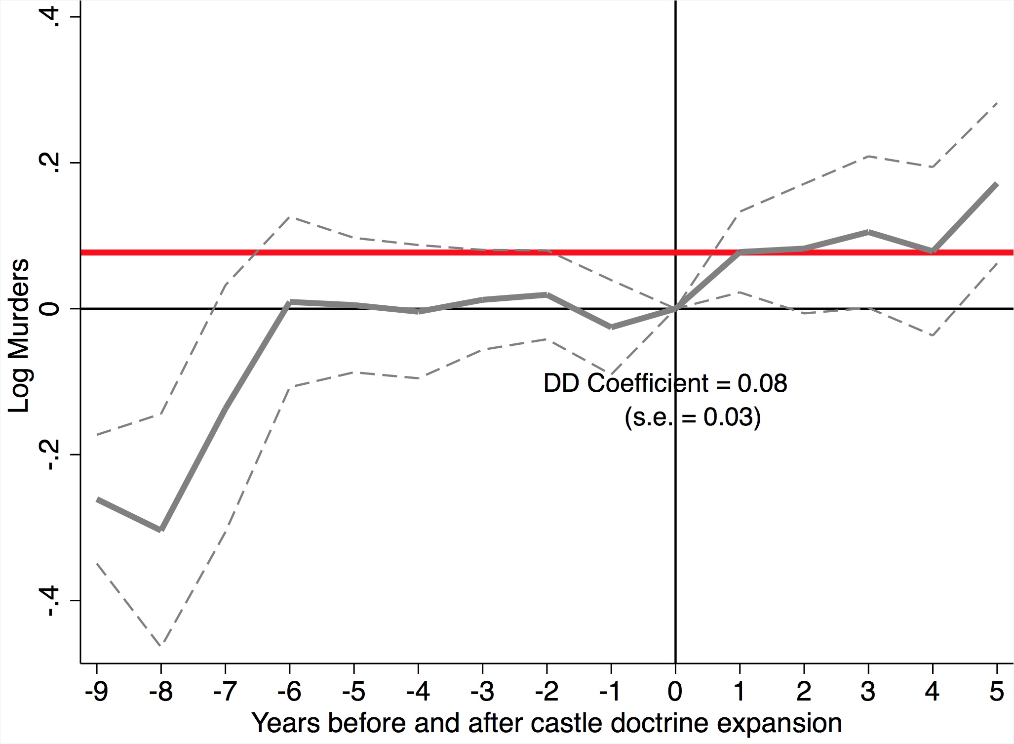
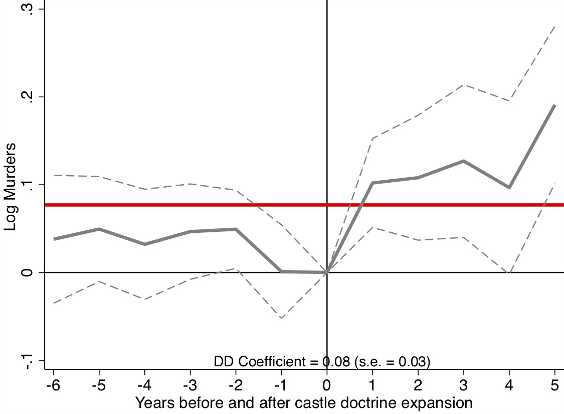
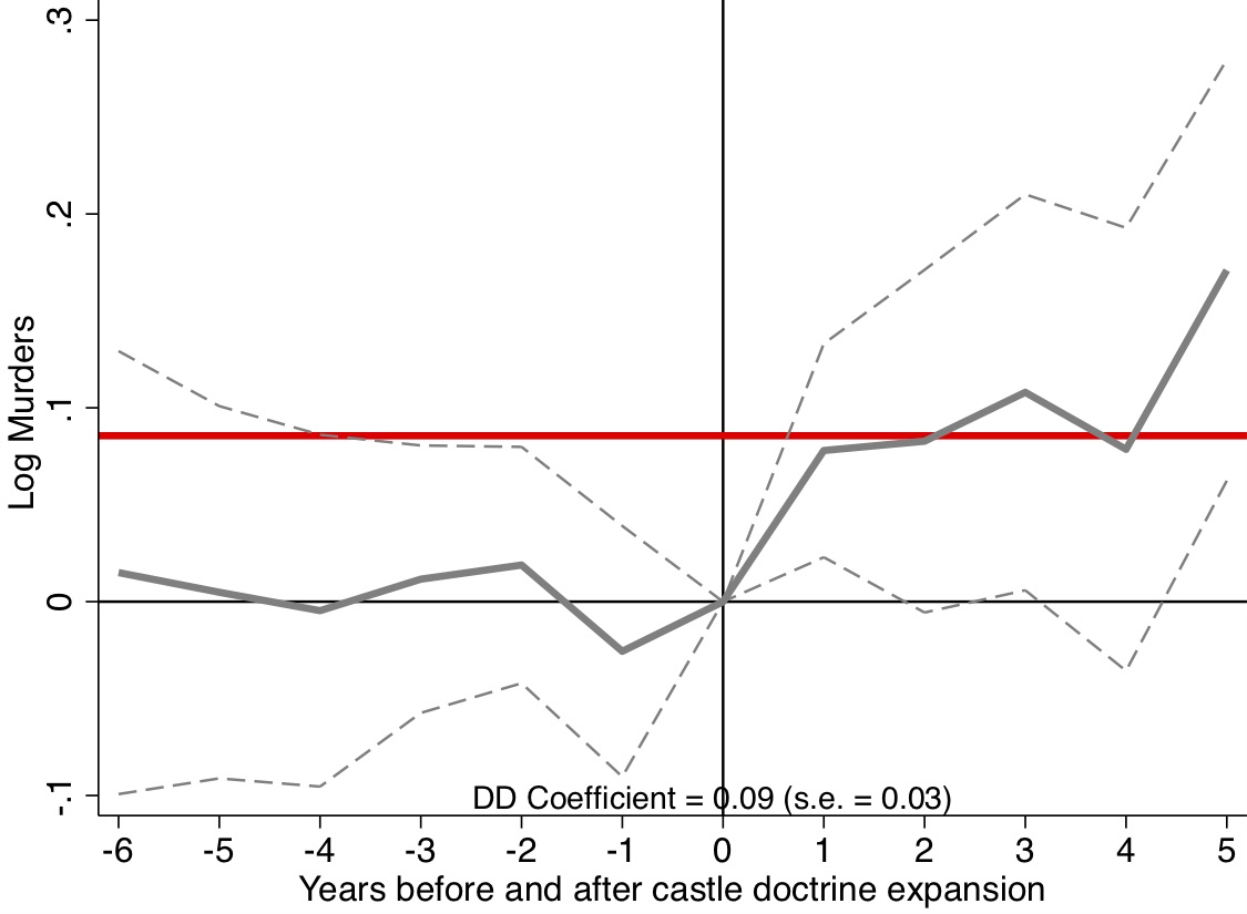
If nothing else, exploring these different specifications and cuts of the data can help you understand just how confident you should be that prior to treatment, treatment and control states genuinely were pretty similar. And if they weren’t similar, it behooves the researcher to at minimum provide some insight to others as to why the treatment and control groups were dissimilar in levels. Because after all—if they were different in levels, then it’s entirely plausible they would be different in their counterfactual trends too because why else are they different in the first place (Kahn-Lang and Lang 2019).
Recall that we run into trouble using the twoway fixed-effects model in a DD framework insofar as there are heterogeneous treatment effects over time. But the problem here only occurs with those \(2\times 2\)s that use late-treated units compared to early-treated units. If there are few such cases, then the issue is much less problematic depending on the magnitudes of the weights and the size of the DD coefficients themselves. What we are now going to do is simply evaluate the frequency with which this issue occurs using the Bacon decomposition. Recall that the Bacon decomposition decomposes the twoway fixed effects estimator of the DD parameter into weighted averages of individual \(2\times 2\)s across the four types of \(2\times 2\)s possible. The Bacon decomposition uses a binary treatment variable, so we will reestimate the effect of castle-doctrine statutes on logged homicide rates by coding a state as “treated” if any portion of the year it had a castle-doctrine amendment. We will work with the special case of no covariates for simplicity, though note that the decomposition works with the inclusion of covariates as well (Goodman-Bacon 2019). Stata users will need to download -ddtiming- from Thomas Goldring’s website, which I’ve included in the first line.
First, let’s estimate the actual model itself using a post dummy equaling one if the state was covered by a castle-doctrine statute that year. Here we find a smaller effect than many of Cheng and Hoekstra’s estimates because we do not include their state-year interaction fixed effects strategy among other things. But this is just for illustrative purposes, so let’s move to the Bacon decomposition itself. We can decompose the parameter estimate into the three different types of \(2\times 2\)s, which I’ve reproduced in Table 9.8
| Dependent Variable | Log(homicide rate) |
|---|---|
| Castle-doctrine law | 0.069 |
| (0.034) |
| DD Comparison | ||
|---|---|---|
| Earlier T vs. Later C | 0.077 | \(-0.029\) |
| Later T vs. Earlier C | 0.024 | 0.046 |
| T vs. Never treated | 0.899 | 0.078 |
Taking these weights, let’s just double check that they do indeed add up to the regression estimate we just obtained using our twoway fixed-effects estimator.19 \[ \begin{align} di (0.077 * -0.029) + (0.024 * 0.046) + (0.899 * 0.078) = 0.069 \end{align} \]
That is our main estimate, and thus confirms what we’ve been building on, which is that the DD parameter estimate from a twoway fixed-effects estimator is simply a weighted average over the different types of \(2\times 2\)s in any differential design. Furthermore, we can see in the Bacon decomposition that most of the 0.069 parameter estimate is coming from comparing the treatment states to a group of never-treated states. The average DD estimate for that group is 0.078 with a weight of 0.899. So even though there is a later to early \(2\times 2\) in the mix, as there always will be with any differential timing, it is small in terms of influence and ultimately pulls down the estimate.
But let’s now visualize this as distributing the weights against the DD estimates, which is a useful exercise. The horizontal line in Figure 9.26 shows the average DD estimate we obtained from our fixed-effects regression of 0.069. But then what are these other graphics? Let’s review.
use https://github.com/scunning1975/mixtape/raw/master/castle.dta, clear
* ssc install bacondecomp

* define global macros
global crime1 jhcitizen_c jhpolice_c murder homicide  robbery assault burglary larceny motor robbery_gun_r
global demo blackm_15_24 whitem_15_24 blackm_25_44 whitem_25_44 //demographics
global lintrend trend_1-trend_51 //state linear trend
global region r20001-r20104  //region-quarter fixed effects
global exocrime l_larceny l_motor // exogenous crime rates
global spending l_exp_subsidy l_exp_pubwelfare
global xvar l_police unemployrt poverty l_income l_prisoner l_lagprisoner $demo $spending
global law cdl

* Bacon decomposition
net install ddtiming, from(https://tgoldring.com/code/)
areg l_homicide post i.year, a(sid) robust
ddtiming l_homicide post, i(sid) t(year)library(bacondecomp)
library(lfe)
df_bacon <- bacon(l_homicide ~ post,
data = castle, id_var = "state",
time_var = "year")
# Diff-in-diff estimate is the weighted average of
# individual 2x2 estimates
dd_estimate <- sum(df_bacon$estimate*df_bacon$weight)
# 2x2 Decomposition Plot
bacon_plot <- ggplot(data = df_bacon) +
geom_point(aes(x = weight, y = estimate,
color = type, shape = type), size = 2) +
xlab("Weight") +
ylab("2x2 DD Estimate") +
geom_hline(yintercept = dd_estimate, color = "red") +
theme_minimal() +
theme(
legend.title = element_blank(),
legend.background = element_rect(
fill="white", linetype="solid"),
legend.justification=c(1,1),
legend.position=c(1,1)
)
bacon_plot
# create formula
bacon_dd_formula <- as.formula(
'l_homicide ~ post | year + sid | 0 | sid')
# Simple diff-in-diff regression
bacon_dd_reg <- felm(formula = bacon_dd_formula, data = castle)
summary(bacon_dd_reg)
# Note that the estimate from earlier equals the
# coefficient on post
dd_estimateimport numpy as np
import pandas as pd
import statsmodels.api as sm
import statsmodels.formula.api as smf
from itertools import combinations
import plotnine as p
# read data
import ssl
ssl._create_default_https_context = ssl._create_unverified_context
def read_data(file):
return pd.read_stata("https://github.com/scunning1975/mixtape/raw/master/" + file)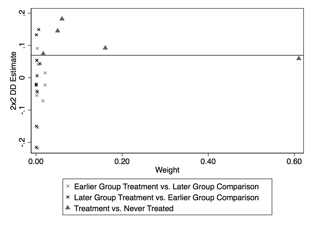
Each icon in the graphic represents a single \(2\times 2\) DD. The horizontal axis shows the weight itself, whereas the vertical axis shows the magnitude of that particular \(2\times 2\). Icons further to the right therefore will be more influential in the final average DD than those closer to zero.
There are three kinds of icons here: an early to late group comparison (represented with a light \(\times\)), a late to early (dark \(\times\)), and a treatment compared to a never-treated (dark triangle). You can see that the dark triangles are all above zero, meaning that each of these \(2\times 2\)s (which correspond to a particular set of states getting the treatment in the same year) is positive. Now they are spread out somewhat—two groups are on the horizontal line, but the rest are higher. What appears to be the case, though, is that the group with the largest weight is really pulling down the parameter estimate and bringing it closer to the 0.069 that we find in the regression.
The Bacon decomposition is an important phase in our understanding of the DD design when implemented using the twoway fixed effects linear model. Prior to this decomposition, we had only a metaphorical understanding of the necessary conditions for identifying causal effects using differential timing with a twoway fixed-effects estimator. We thought that since the \(2\times 2\) required parallel trends, that that “sort of” must be what’s going on with differential timing too. And we weren’t too far off—there is a version of parallel trends in the identifying assumptions of DD using twoway fixed effects with differential timing. But what Goodman-Bacon (2019) also showed is that the weights themselves drove the numerical estimates too, and that while some of it was intuitive (e.g., group shares being influential) others were not (e.g., variance in treatment being influential).
The Bacon decomposition also highlighted some of the unique challenges we face with differential timing. Perhaps no other problem is better highlighted in the diagnostics of the Bacon decomposition than the problematic “late to early” \(2\times 2\) for instance. Given any heterogeneity bias, the late to early \(2\times 2\) introduces biases even with variance weighted common trends holding! So, where to now?
From 2018 to 2020, there has been an explosion of work on the DD design. Much of it is unpublished, and there has yet to appear any real consensus among applied people as to how to handle it. Here I would like to outline what I believe could be a map as you attempt to navigate the future of DD. I have attempted to divide this new work into three categories: weighting, selective choice of “good” \(2 \times 2\)s, and matrix completion.
What we know now is that there are two fundamental problems with the DD design. First, there is the issue of weighting itself. The twoway fixed-effects estimator weights the individual \(2\times 2\)s in ways that do not make a ton of theoretical sense. For instance, why do we think that groups at the middle of the panel should be weighted more than those at the end? There’s no theoretical reason we should believe that. But as Goodman-Bacon (2019) revealed, that’s precisely what twoway fixed effects does. And this is weird because you can change your results simply by adding or subtracting years to the panel—not just because this changes the \(2\times 2\), but also because it changes the variance in treatment itself! So that’s weird.20
But this is not really the fatal problem, you might say, with twoway fixed-effects estimates of a DD design. The bigger issue was what we saw in the Bacon decomposition—you will inevitably use past treated units as controls for future treated units, or what I called the “late to early \(2\times 2\).” This happens both in the event study and in the designs modeling the average treatment effect with a dummy variable. Insofar as it takes more than one period for the treatment to be fully incorporated, then insofar as there’s substantial weight given to the late to early \(2\times 2\)s, the existence of heterogeneous treatment effects skews the parameter away from the ATT—maybe even flipping signs!21
Whereas the weird weighting associated with twoway fixed effects is an issue, it’s something you can at least check into because the Bacon decomposition allows you to separate out the \(2\times 2\) average DD values from their weights. Thus, if your results are changing by adding years because your underlying \(2\times 2\)s are changing, you simply need to investigate it in the Bacon decomposition. The weights and the \(2\times 2\)s, in other words, are things that can be directly calculated, which can be a source of insight into why twoway fixed effects estimator is finding what it finds.
But the second issue is a different beast altogether. And one way to think of the emerging literature is that many authors are attempting to solve the problem that some of these \(2\times 2\)s (e.g., the late to early \(2\times 2\)) are problematic. Insofar as they are problematic, can we improve over our static twoway fixed-effects model? Let’s take a few of these issues up with examples from the growing literature.
Another solution to the weird weighting twoway fixed-effects problem has been provided by Callaway and Sant’Anna (2019).22 Callaway and Sant’Anna (2019) approach the DD framework very differently than Goodman-Bacon (2019). Callaway and Sant’Anna (2019) use an approach that allows them to estimate what they call the group-time average treatment effect, which is just the ATT for a given group at any point in time. Assuming parallel trends conditional on time-invariant covariates and overlap in a propensity score, which I’ll discuss below, you can calculate group ATT by time (relative time like in an event study or absolute time). One unique part of these authors’ approach is that it is non-parametric as opposed to regression-based. For instance, under their identifying assumptions, their nonparametric estimator for a group ATT by time is: \[ \begin{align} ATT(g,t)=E\left[\left(\dfrac{G_g}{E[G_g]}- \dfrac{\dfrac{p_g(X)C}{1-p_g(X)}}{E \bigg [ \dfrac{p_g(X)C}{1-p_g(X)}\bigg]}\right) (Y_t-Y_{g-1})\right] \end{align} \] where the weights, \(p\), are propensity scores, \(G\) is a binary variable that is equal to 1 if an individual is first treated in period \(g\), and \(C\) is a binary variable equal to one for individuals in the control group. Notice there is no time index, so these \(C\) units are the never-treated group. If you’re still with me, you should find the weights straightforward. Take observations from the control group as well as group \(g\), and omit the other groups. Then weight up those observations from the control group that have characteristics similar to those frequently found in group \(g\) and weight down observations from the control group that have characteristics rarely found in group \(g\). This kind of reweighting procedure guarantees that the covariates of group \(g\) and the control group are balanced. You can see principles from earlier chapters making their way into this DD estimation—namely, balance on covariates to create exchangeable units on observables.
But because we are calculating group-specific ATT by time, you end up with a lot of treatment effect parameters. The authors address this by showing how one can take all of these treatment effects and collapse them into more interpretable parameters, such as a larger ATT. All of this is done without running a regression, and therefore avoids some of the unique issues created in doing so.
One simple solution might be to estimate your event-study model and simply take the mean over all lags using a linear combination of all point estimates (Borusyak and Jaravel 2018). Using this method, we in fact find considerably larger effects or nearly twice the size as we get from the simpler static twoway fixed-effects model. This is perhaps an improvement because weights can be large on the long-run effects due to large effects from group shares. So if you want a summary measure, it’s better to estimate the event study and then average them afterthe fact.
Another great example of a paper wrestling with the biases brought up by heterogeneous treatment effects is Sun and Abraham (2020). This paper is primarily motivated by problems created in event studies, but you can see some of the issues brought up in Goodman-Bacon (2019). In an event study with differential timing, as we discussed earlier, leads and lags are often used to measure dynamics in the treatment itself. But these can produce causally uninterpretable results because they will assign non-convex weights to cohort-specific treatment effects. Similar to Callaway and Sant’Anna (2019), they propose estimating a group-specific dynamic effect and from those calculate a group specific estimate.
The way I organize these papers in my mind is around the idea of heterogeneity in time, the use of twoway fixed effects, and differential timing. The theoretical insight from all these papers is the coefficients on the static twoway fixed-effects leads and lags will be unintelligible if there is heterogeneity in treatment effects over time. In this sense, we are back in the world that Goodman-Bacon (2019) revealed, in which heterogeneity treatment effect biases create real challenges for the DD design using twoway fixed effects.23
Their alternative is estimate a “saturated” model to ensure that the heterogeneous problem never occurs in the first place. The proposed alternative estimation technique is to use an interacted specification that is saturated in relative time indicators as well as cohort indicators. The treatment effect associated with this design is called the interaction-weighted estimator, and using it, the DD parameter is equivalent to the difference between the average change in outcomes for a given cohort in those periods prior to treatment and the average changes for those units that had not been treated at the time interval. Additionally, this method uses the never-treated units as controls, and thereby avoids the hairy problems noted in Goodman-Bacon (2019) when computing later to early \(2\times 2\)s.24
Another paper that attempts to circumvent the weirdness of the regression-based method when there are numerous late to early \(2\times 2\)s is Cengiz et al. (2019). This is bound to be a classic study in labor for its exhaustive search for detectable repercussions of the minimum wage on low-paying jobs. The authors ultimately find little evidence to support any concern, but how do they come to this conclusion?
Cengiz et al. (2019) take a careful approach by creating separate samples. The authors want to know the impact of minimum-wage changes on low-wage jobs across 138 state-level minimum-wage changes from 1979 to 2016. The authors in an appendix note the problems with aggregating individual DD estimates into a single parameter, and so tackle the problem incrementally by creating 138 separate data sets associated with a minimum-wage event. Each sample has both treatment groups and control groups, but not all units are used as controls. Rather, only units that were not treated within the sample window are allowed to be controls. Insofar as a control is not treated during the sample window associated with a treatment unit, it can be by this criteria used as a control. These 138 estimates are then stacked to calculate average treatment effects. This is an alternative method to the twoway fixed-effects DD estimator because it uses a more stringent criteria for whether a unit can be considered a control. This in turn circumvents the heterogeneity problems that Goodman-Bacon (2019) notes because Cengiz et al. (2019) essentially create 138 DD situations in which controls are always “never-treated” for the duration of time under consideration.
But the last methodology I will discuss that has emerged in the last couple of years is a radical departure from the regression-based methodology altogether. Rather than use a twoway fixed-effects estimator to estimate treatment effects with differential timing, Athey et al. (2018) propose a machine-learning-based methodology called “matrix completion” for panel data. The estimator is exotic and bears some resemblance to matching imputation and synthetic control. Given the growing popularity of placing machine learning at the service of causal inference, I suspect that once Stata code for matrix completion is introduced, we will see this procedure used more broadly.
Matrix completion for panel data is a machine-learning-based approach to causal inference when one is working explicitly with panel data and differential timing. The application of matrix completion to causal inference has some intuitive appeal given one of the ways that Rubin has framed causality is as a missing data problem. Thus, if we are missing the matrix of counterfactuals, we might explore whether this method from computer science could assist us in recovering it. Imagine we could create two matrices of potential outcomes: a matrix of \(Y^0\) potential outcomes for all panel units over time and \(Y^1\). Once treatment occurs, a unit switches from \(Y^0\) to \(Y^1\) under the switching equation, and therefore the missing data problem occurs. Missingness is simply another way of describing the fundamental problem of causal inference for there will never be a complete set of matrices enabling calculation of interesting treatment parameters given the switching equation only assigns one of them to reality.
Say we are interested in this treatment effect parameter: \[ \begin{align} \widehat{\delta_{ATT}} = \dfrac{1}{N_T} \sum \big(Y_{it}^1 - Z_{it}^0\big) \end{align} \] where \(Y^1\) are the observed outcomes in a panel unit at some post-treatment period, \(Z^0\) is the estimated missing elements of the \(Y^0\) matrix for the post-treatment period, and \(N_T\) is the number of treatment units. Matrix completion uses the observed elements of the matrix’s realized values to predict the missing elements of the \(Y^0\) matrix (missing due to being in the post-treatment period and therefore having switched from \(Y^0\) to \(Y^1\)).
Analytically, this imputation is done via something called regularization-based prediction. The objective in this approach is to optimally predict the missing elements by minimizing a convex function of the difference between the observed matrix of \(Y^0\) and the unknown complete matrix \(Z^0\) using nuclear norm regularization. Let \(\Omega\) denote the row and column indices \((i,j)\) of the observed entries of the outcomes, then the objective function can be written as \[ \begin{align} \widehat{Z^0}=\arg\min_{Z^0} \sum_{(i,j) \in \Omega} \dfrac{(Y^0_{it} - Z^0_{it})^2}{|\Omega|}+\Lambda ||Z^0|| \end{align} \] where \(||Z^0||\) is the nuclear norm (sum of singular values of \(Z0\)). The regularization parameter \(\Lambda\) is chosen using tenfold cross validation. Athey et al. (2018) show that this procedure outperforms other methods in terms of root mean squared prediction error.
Unfortunately, at present estimation using matrix completion is not available in Stata. R packages for it do exist, such as the gsynth package, but it has to be adapted for Stata users. And until it is created, I suspect adoption will lag.
America’s institutionalized state federalism provides a constantly evolving laboratory for applied researchers seeking to evaluate the causal effects of laws and other interventions. It has for this reason probably become one of the most popular forms of identification among American researchers, if not the most common. A Google search of the phrase “difference-in-differences” brought up 45,000 hits. It is arguably the most common methodology you will use—more than IV or matching or even RDD, despite RDD’s greater perceived credibility. There is simply a never-ending flow of quasi-experiments being created by our decentralized data-generating process in the United States made even more advantageous by so many federal agencies being responsible for data collection, thus ensuring improved data quality and consistency.
But, what we have learned in this chapter is that while there is a current set of identifying assumptions and practices associated with the DD design, differential timing does introduce some thorny challenges that have long been misunderstood. Much of the future of DD appears to be mounting solutions to problems we are coming to understand better, such as the odd weighting of regression itself and problematic \(2\times 2\) DDs that bias the aggregate ATT when heterogeneity in the treatment effects over time exists. Nevertheless, DD—and specifically, regression-based DD—is not going away. It is the single most popular design in the applied researcher’s toolkit and likely will be for many years to come. Thus it behooves the researcher to study this literature carefully so that they can better protect against various forms of bias.
Buy the print version today:
A simple search on Google Scholar for phrase “difference-in-differences” yields over forty thousand hits.↩︎
John Snow is one of my personal heroes. He had a stubborn commitment to the truth and was unpersuaded by low-quality causal evidence. That simultaneous skepticism and open-mindedness gave him the willingness to question common sense when common sense failed to provide satisfactory explanations.↩︎
You’ll sometimes see acronyms for difference-in-differences like DD, DiD, Diff-in-diff, or even, God forbid, DnD.↩︎
That literature is too extensive to cite here, but one can find reviews of a great deal of the contemporary literature on minimum wages in Neumark, Salas, and Wascher (2014) and Cengiz et al. (2019).↩︎
James Buchanan won the Nobel Prize for his pioneering work on the theory of public choice. He was not, though, a labor economist, and to my knowledge did not have experience estimating causal effects using explicit counterfactuals with observational data. A Google Scholar search for “James Buchanan minimum wage” returned only one hit, the previously mentioned Wall Street Journal letter to the editor. I consider his criticism to be ideologically motivated ad hominem and as such unhelpful in this debate.↩︎
Financial economics also has a procedure called the event study (Binder 1998), but the way that event study is often used in contemporary causal inference is nothing more than a difference-in-differences design where, instead of a single post-treatment dummy, you saturate a model with leads and lags based on the timing of treatment.↩︎
In the original Cunningham and Cornwell (2013), we estimated models with multi-way clustering correction, but the package for this in Stata is no longer supported. Therefore, we will estimate the same models as in Cunningham and Cornwell (2013) using cluster robust standard errors. In all prior analysis, I clustered the standard errors at the state level so as to maintain consistency with this code.↩︎
There is a third prediction on the 25- to 29-year-olds, but for the sake of space, I only focus on the 20- to 24-year-olds.↩︎
Milk is ironically my favorite drink, even over IPAs, so I am not persuaded by this anti-test.↩︎
Breakthroughs in identifying peer effects eventually emerged, but only from studies that serendipitously had randomized peer groups such as Sacerdote (2001), Lyle (2009), Carrell, Hoekstra, and West (2019), Kofoed and McGovney (2019), and several others. Many of these papers either used randomized roommates or randomized companies at military academies. Such natural experiments are rare opportunities for studying peer effects for their ability to overcome the mirror problem.↩︎
All of this decomposition comes from applying the Frisch-Waugh theorem to the underlying twoway fixed effects estimator.↩︎
A more recent version of Goodman-Bacon (2019) rewrites this weighting but they are numerically the same, and for these purposes, I prefer the weighting scheme discussed in an earlier version of the paper. See Goodman-Bacon (2019) for the equivalence between his two weighting descriptions.↩︎
Heterogeneity in ATT across \(k\) and \(l\) is not the source of any biases. Only heterogeneity over time for \(k\) or \(l\)’s ATT introduces bias. We will discuss this in more detail later.↩︎
Scattering the weights against the individual \(2\times 2\)s can help reveal if the overall coefficient is driven by a few different \(2\times 2\)s with large weights.↩︎
These laws are called castle-doctrine statutes because the home—where lethal self-defense had been protected—is considered one’s castle.↩︎
This would violate SUTVA insofar as gun violence spills over to a neighboring state when the own state passes a reform.↩︎
Ben Jann is a valuable contributor to the Stata community for creating several community ado packages, such as -estout- for making tables and -coefplot- for making pictures of regression coefficients.↩︎
Alex Bartik once recommended this to me.↩︎
This result is different from Cheng and Hoekstra’s because it does not include the region by year fixed effects. I exclude them for simplicity.↩︎
This is less an issue with event study designs because the variance of treatment indicator is the same for everyone.↩︎
In all seriousness, it is practically modal in applied papers that utilize a DD design to imagine that dynamic treatment effects are at least plausible ex ante, if not expected. This kind of “dynamic treatment effects” is usually believed as a realistic description of what we think could happen in any policy environment. As such, the biases associated with panel fixed effects model with twoway fixed effects is, to be blunt, scary. Rarely have I seen a study wherein the treatment was merely a one-period shift in size. Even in the Miller et al. (2019) paper, the effect of ACA-led Medicaid expansions was a gradual reduction in annual mortality over time. Figure 9.7 really is probably a typical kind of event study, not an exceptional one.↩︎
Sant’Anna has been particularly active in this area in producing elegant econometric solutions to some of these DD problems.↩︎
One improvement over the binary treatment approach to estimating the treatment effect is when using an event study, the variance of treatment issues are moot.↩︎
But in selecting only the never-treated as controls, the approach may have limited value for those situations where the number of units in the never-treated pool is extremely small.↩︎