I like to think of instrumental variables (IV) as the Justin Bieber of causal inference: unfairly maligned, poorly understood, very hard to imitate well, and yet bound to be remembered extremely well by future generations. IV won’t be remembered as being an unusually talented pop R&B crossover like Bieber will, but it will be remembered as one of the more innovative discoveries in causal inference, perhaps second only to the RCT.
This book is meant to be an introduction to instrumental variables in the causal inference tradition. I refer the reader to read Mogstad and Torgovitsky (2025) to go deeper on this material.
In this chapter, we will explore the intuition behind IV, starting with its core insight: the use of random variation from one variable to identify causal relationships between two other variables. We’ll then cover some fundamental calculations—a two-step ratio of covariances—before addressing classic challenges like the weak instrument problem. The chapter will also examine how heterogeneous treatment effects can change the interpretation of estimates obtained using IV. Finally, we will highlight compelling IV applications, offer practical tips for implementing IV in your own work, and conclude with a broader perspective on its continued relevance and evolution.
7.1 Thanksgiving Dinner and the Strangeness Principle
Finding valid instrumental variables is like finding a four leaf clover. It’s rare enough that when you find one, you should consider yourself lucky. But what makes an instrument valid? And how can we know?
Surprisingly, one of the best indicators isn’t a formal test or technical metric—it’s a gut reaction. A good instrument often feels weird when you hear someone share certain details about it. This gut reaction in which the instrument “feels strange” is, if anything, more like an informal “smell test” that even an intelligent layperson would experience when certain facts are presented to them. I call it the strangeness principle and it means this: if you tell an intelligent layperson that two variables are correlated—say, month of birth and lifetime earnings—they might instinctively ask, “Why on earth would those things be connected?” That baffled reaction is often a hallmark of a good instrument. Let me explain with a few stories.
William’s Strange Correlations Between Sex Ratios and Mother Work
Thanksgiving conversations at the dinner table can sometimes get a little weird.1 It’s a time of the year when family members come back home, to be together and celebrate a big meal. But as everyone has gone and left to become who they were meant to become, the return home can be a little unsettling from all the unexpected conversations.
I’d like you to travel with me to one such Thanksgiving dinner where you and your extended family are gathering together for your mom’s huge spread of turkey, dressing,2 green bean casserole, mashed potatoes and gravy, cranberry sauce, homemade rolls, and more. One by one your family and friends trickle in, each person bringing a dish they made with them.
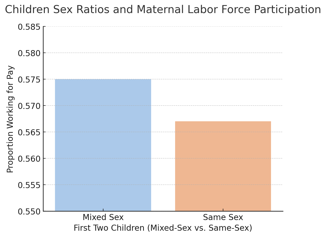
The kids sit at the kid table in the next room while you and about 12 of your family sit at the long table that seems like it only ever gets used for big events like this one. Everyone is commenting on the meals and once an opening reveals itself, your younger brother, William, who is four years into his PhD, excitedly pulls out a stack of papers showing a chart that he made for his dissertation (Figure 7.1).
I have been wanting to share with everyone this amazing picture I made! Yesterday, I was regressing maternal labor force participation onto characteristics of the family and found the most unusual thing. I found that if a woman’s first two children were of the same sex—as in both boys or both girls—then she was on average less likely to work in the labor market than if her first two children were a boy and a girl, and by almost a full percentage point! See here—look at this graph I made.
William had actually made more than two dozen copies of this graph, one for each member of the table. He even made copies for the kids at the kids’ table in the next room! Everyone stared at Figure 7.1 and looked up at him puzzled by the implication of the correlation he was showing them. Finally, your mom speaks up.
Figure 7.1: William’s strange correlations between children sex ratios and mother’s labor supply.
William, I’m afraid I don’t understand this picture. Are you saying that if the first two children in a family are the same sex, compared to if the first two children were boy and girl, that simply having two first kids being the same sex makes her stay at home rather than work for pay outside the home?
To which William says,
Yes, exactly. Figure 7.1 is showing that very thing. I am finding that when a woman’s first two kids are a boy, or the first two kids are a girl, then on average, mothers are less likely to work outside of the home for pay by almost an entire percentage point compared to mothers whose first two children are mixed. Isn’t that strange?!
Everyone looked back down at the graphs, curious. All the way from the youngest to the oldest, no one could understand why, conditional on having two kids, it would remotely matter whether those kids were the same sex or different sexes when mothers make their decisions to stay at home or work outside the home for pay.
Instrumental variables is all about strange correlations like these. The confusion that you and your family felt when seeing Figure 7.1 embodies the idea that good instruments will always feel strange at first.
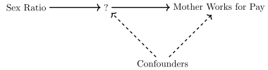
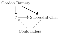
Figure 7.2: Sex ratios as an instrument for an unknown treatment variable.
Figure 7.2 shows a DAG that helps explain why good instruments often feel strange. In this diagram, we know the instrument, we know the outcome, and we might even suspect some confounders—even if we can’t measure them. But we don’t yet know what the treatment variable is. In its place, we have a question mark.
That missing link is the source of the strangeness. It’s not that the instrument is bizarre on its own—it’s that there’s no obvious, logical reason for it to be correlated with the outcome. Any intelligent layperson can see that having two boys or two girls isn’t inherently more burdensome than having one of each. So, why would sex ratios influence whether a mother works for pay? It just doesn’t make sense—until we learn what’s in that blank space.
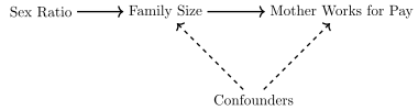
This example isn’t just about a quirky kid at Thanksgiving with his family. Rather, it’s based on a real and well-known result from Angrist and Evans (1998), who used the sex ratio of the first two children as an instrumental variable for family size in a study about family size’s effect on maternal labor supply. Look at this updated DAG in Figure 7.3 where instead of a question mark connecting sex ratios to maternal labor force participation, we insert family size.
Figure 7.3: Sex ratios as an instrument for family size.
This DAG argues that the reason that two boys or two girls cause women to participate less in the labor force than a boy and a girl isn’t because it’s directly relevant, but rather because having children with the same sex can cause, at least for those with preferences for a mixture of sexes among their children, the parents to attempt to have a third child in hopes that the next kid is the opposite sex of the first two. Put another way, sex ratios are valid instruments for family size because they directly affect family size, but are otherwise unrelated to maternal labor supply.
The strangeness principle in instrumental variables means that a valid instrument (e.g., sex ratios) neither directly causes the outcome (e.g., mothers working outside the home), nor is it correlated with things that do—except for the treatment. But because in a simple correlation between the outcome and the instrument, the treatment is not present, any statistical association will feel strange because it logically should not be there. Only when that missing piece in the chain is filled in, like Figure 7.3, does that feeling of strangeness disappear.
Jury Duty and Aunt Linda’s Fried Chicken
Your Aunt Linda never finished high school, never went to culinary school, and yet she runs one of the most celebrated restaurants in all of Nashville: Hot Jerk, a Jamaican-Southern fusion joint that somehow made jerk chicken the hottest reservation in town. And today, you’re one of the lucky ones because Aunt Linda brought her signature dish to Thanksgiving dinner: The Trenchtown Inferno. It’s buttermilk-brined, jerk-spiced fried chicken, served with plantain slaw and cornmeal festival biscuits, and there’s enough for everyone to have seconds.
Naturally, someone at the table asks her how she came up with the idea for Hot Jerk. Without missing a beat, Aunt Linda says:
Jury duty.
You blink. “I’m sorry, what?”
“Jury duty,” she says again, casually biting into a piece of Trenchtown Inferno like that explains everything. “I was elected jury foreman in a big case back in the early 2000s. They sequestered us in a hotel for three weeks—no TV, no phones, and no real plan for meals. The courthouse kitchen had this old cook who used to run a soul food place back in the day, and he was the only one who knew how to make anything decent.”
She pauses to dab some sauce off her chin.
Well, he needed help, and I volunteered. Figured I’d wash dishes or stir greens or something. But the man saw something in me. Started showing me how he made everything from his dry rub to his cabbage and saltfish. By the end of the trial, I wasn’t just cooking—I was learning. And I kept going back after court was over. We stayed in touch. A year later, we opened Hot Jerk together.
The table goes quiet. You’re just staring at her. “Wait … being jury foreman made you a chef?”
She smiles and says:
That’s the thing, baby. You never know the random things that change a person’s life. If I hadn’t been picked for that jury … if I hadn’t been made foreman … I don’t know where I’d be. But it sure wouldn’t be making food that sets people’s mouths on fire.
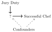
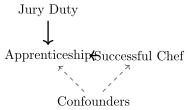
Aunt Linda’s success as a chef wasn’t directly caused by serving as a jury foreman—which is why we’re confused when she credits that seemingly irrelevant event. The actual cause was more familiar: she apprenticed with an excellent chef. And, had she told us that she was a successful chef because she apprenticed with an excellent chef, we would not have been surprised because apprenticeship is a well-worn path to culinary excellence. So, when she attributes her success to jury duty, we’re understandably puzzled—because, as intelligent people, we know there’s no direct link between jury service and becoming a celebrated chef (Figure 7.4 (a)). Only when we learn that jury duty led to the apprenticeship does the story make sense—and the strangeness of the correlation disappears (fig-iv_dag_linda_after).
(a) Before knowing about the apprenticeship
(b) After learning about the apprenticeship
Figure 7.4: Jury duty and Aunt Linda’s fried chicken: A strange correlation made clear.
Gordon Ramsay Is Not a Valid Instrument
After Aunt Linda’s story completes, another member of the family—Jacob—begins to tell his story.
My story’s kind of like Aunt Linda’s, honestly. I didn’t plan on being a chef either—it just happened. I got lucky and ended up working under Gordon Ramsay, but it wasn’t him that made me successful. He just lit the spark. Everything I’ve done since then—opening my place in Miami, building a brand—that was all me.
You look up from your plate. “Wait—you worked with Gordon Ramsay?”
Yeah, back in like 2018, I was a line cook on one of his shows. Total pressure cooker. But I learned a ton from him—how to stay focused, how to taste with discipline, how to run a kitchen. I took that inspiration, worked on myself for a few years, and now I run my own restaurant in Miami. It’s all about the hustle.
Your nephew, who has developed a finely tuned instrument-detection system after listening to these kinds of stories all day, raises an eyebrow.
So, let me get this straight—you worked with Gordon Ramsay, one of the most famous chefs in the world, and now you run your own place. And the cause of that success is … your hustle?
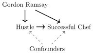
The whole table laughs, because the leap is just too much. The idea that Jacob’s success is solely due to the internal inspiration he absorbed from Ramsay is … unlikely. It’s not that he didn’t work hard—but the fact that he was connected to someone with the kind of cultural and financial capital Ramsay has breaks the exclusion restriction. Ramsay can directly affect the outcome. His name alone can bring in investors, media attention, partnerships, and early customers.
(a) Before knowing about working hard
(b) After learning about working hard
Figure 7.5: Gordon Ramsay is not a good instrument.
What makes this instrument invalid isn’t just that Ramsay inspired Jacob—it’s that he might’ve done a thousand other things too that directly caused the success. So, even if the “hustle” story sounds plausible, it’s impossible to isolate the effect. The strangeness principle is missing, because there’s nothing strange at all about someone working with Gordon Ramsay and then succeeding.
7.2 IV and the Wald Estimator
Instrumental variables can be understood in two contexts: one where the treatment has the same causal effect for everyone—homogeneous treatment effects—and another where effects vary across the population—heterogeneous treatment effects. This section focuses on the simpler case of homogeneous effects, where potential outcomes aren’t necessary. This allows for a clearer focus on calculations and the broader challenges instrumental variables aim to address. To motivate this section, I will introduce a simple DAG and regression model to illustrate the bias of OLS.
When OLS is Biased
We previously used the DAGs to explain the intuition, but now I want to use it to guide our construction of our most basic IV estimator, which is a simple ratio of two covariances, or what is often referred to as the Wald estimator (Wald 1940; Angrist 1991). To motivate the creation of this estimator, let’s start out with some terms and anillustrative DAG.
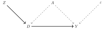
Assume a setting described by the DAG in Figure 7.6. This is a standard instrumental variables setup: the instrument, \(Z\), affects the outcome, \(Y\), only through its effect on the treatment variable, \(D\). To make this more concrete, let’s give these variables names and a story to go with the arrows.
Suppose we’re asking: “Does going to college increase earnings, or would those who went to college have earned more anyway, even if they hadn’t gone?” In this example, college education is represented by the binary variable \(D\), and earnings are denoted by \(Y\). The unobserved confounder—let’s say, ability—is labeled \(A\), and the error term \(\varepsilon\) captures everything else that affects earnings. The instrument \(Z\) might be something like proximity to a college, or changes in tuitionpolicy.
Figure 7.6: DAG illustrating causal relationships.
Since in the DAG, \(Z\) shifts college attendance, \(D\), but has no direct path to earnings, \(Y\), and is independent of both ability, \(A\), and the error term, \(\varepsilon\), then it is a valid instrument. But can we show this another way? Let’s now write down a regression model that might go with this DAG. Assume that the true model of earnings, then, is a function of schooling, \(D\), ability, \(A\), and random stuff uncorrelated witheither, \(\varepsilon\). \[
\begin{equation}
Y_i = \alpha + \delta D_i + \gamma A_i + \varepsilon_i
\label{eq:ols_longer}
\end{equation}
\tag{7.1}\] Since \(A\) is not in your dataset, you cannot estimate Equation 7.1. But you could estimate the one in Equation 7.2: \[
\begin{equation}
Y_i = \alpha + \delta D_i + \eta_i
\label{eq:ols_shorter}
\end{equation}
\tag{7.2}\] where \(\eta_i\) is a composite error term equal to \(\gamma A_i + \varepsilon_i\). So then, what we want to know is what does the coefficient on \(D\) mean in Equation 7.2 when estimated with OLS?
First, though, let me put some definitions down and an explanation of my notation. I will use the notation \(C(Y,D)\) to describe the covariance between two variables (\(Y\) and \(D\) in this case), and the notation \(V(D)\) as the variance of a variable (here \(D\)). Covariance is a linear operator equal to \(C(Y,D) = E[YD] - E[Y]E[D]\).3 And so, when we regress \(Y\) onto \(D\), the coefficient on \(D\) is equal to a scaled covariance: \[
\begin{eqnarray}
\widehat{\delta} &=& \dfrac{C(Y,D)}{V(D)} \nonumber \\
&=& \dfrac{E(YD) - E(Y)E(D)}{V(D)}
\end{eqnarray}
\tag{7.3}\] Now take our “long definition” of \(Y\) from Equation 7.1 and replace \(Y\) with it: \[
\begin{eqnarray}
\widehat{\delta} &=&\dfrac{E(YD) - E(Y)E(D)}{V(D)} \nonumber
\\
&=& \dfrac{E\big[\alpha D + D^2 \delta + \gamma DA + \varepsilon
D\big] - E(D)E\big[\alpha + \delta D + \gamma A +
\varepsilon\big]}{V(D)} \nonumber
\\
&=& \dfrac{ \delta E(D^2) - \delta E(D)^2 + \gamma E(AD) - \gamma
E(D)E(A) + E(\varepsilon D) - E(D)E(\varepsilon)}{V(D)} \nonumber
\\
&=& \dfrac{ \delta V(D) + \gamma C(D,A) + C(D,\varepsilon)}{V(D)} \nonumber
\\
&=& \delta + \dfrac{ \gamma C(D,A) + C(D,\varepsilon)}{V(D)} \nonumber
\\
&=& \delta + \gamma \dfrac{C(A,D)}{V(D)}
\label{eq:ols_bias}
\end{eqnarray}
\tag{7.4}\] where \(E(D^2) - E(D)^2\) is equal to its variance, \(V(D)\), and recall from the DAG, \(\varepsilon\) and \(D\) are independent of one another (no arrows connect except via a collider), and so \(C(D,\varepsilon)=0\). If \(\gamma>0\) and \(C(A,D)>0\), then \(\widehat{\delta}\), the coefficient on schooling, is upward biased. And that is probably the case given that it’s likely that ability and schooling are positively correlated. The bias of OLS in the shorter regression is therefore the second term, \(\gamma \frac{C(A,D)}{V(D)}\) and it’s a problem that we need to solve.4 So how does IV solve it?
Wald IV is the Ratio of Two Covariances
Remember Aunt Linda’s infamous fried chicken? At first, it seemed impossible that serving on a jury could launch her career as a celebrated chef—after all, jury duty has no obvious, direct effect on culinary success. But once we heard the full story, we realized jury duty led her to an apprenticeship—and that it was the apprenticeship, not jury duty itself, that caused her success. In other words, jury duty acted as an instrument for apprenticing because it was otherwise irrelevant to becoming a great chef.
When an instrument is valid, and its correlation with the outcome feels strange, that very strangeness can be used to our advantage. We can express it statistically, and doing so leads us to what’s known as the Wald estimator (Wald 1940; Angrist 1991).
So, let’s assume we have an instrument, \(Z\), like a tuition policy that randomly reduces the cost of college for some students. This tuition policy causes some people to attend college who otherwise wouldn’t have—but it doesn’t directly affect their future earnings, \(Y{\!}\), nor is it related to unobserved traits like ability. In that case, the instrument is seemingly irrelevant to \(Y{\!}\)—except through its effect on college attendance, \(D\).
If we had such an instrument, how could we use it to eliminate the bias we saw in Equation 7.4? Here’s an idea: what if we just stuck the instrument into its own covariance with \(Y\) and saw where that took us? That’s exactly what we’ll do next. Check out Equation 7.5. I’ve written out each step so you can follow the logic—it only uses the definition of covariance and a little bit of algebra. \[
\begin{eqnarray}
C(Y,Z) &=& C(\alpha + \delta D+\gamma A+\varepsilon, Z) \nonumber
\\
&=& E\big[(\alpha+\delta D+\gamma A+\varepsilon)Z\big]
- E(\alpha+\delta D+\gamma A+\varepsilon)E(Z) \nonumber
\\
&=&\big\{\alpha E(Z)- \alpha E(Z)\big\} + \delta \big\{E(DZ) -
E(D)E(Z)\big\} \nonumber\\
&&+ \gamma
\big\{E(AZ) - E(A)E(Z)\big\} +
\big\{E(\varepsilon Z) - E(\varepsilon)E(Z)\big\} \nonumber
\\
C(Y,Z) &=&\delta C(D,Z) + \gamma C(A,Z) + C(\varepsilon, Z)
\label{eq:iv_short}
\end{eqnarray}
\tag{7.5}\] So, check that out—the covariance of \(Y\) and \(Z\) is equal to the sum of three separate other covariances. That’s interesting because when we have a valid instrument like the one in our DAG, two of those covariances are zero due to statistical independence. For instance, in the DAG, there was no way to get from \(Z\) to \(A\) except via colliders, \(D\) or \(Y\). Recall that colliders make two variables independent and so \(Z \rightarrow D \leftarrow A\) and \(Z \rightarrow D \rightarrow Y \leftarrow A\). Both of those channels block \(Z\) and \(A\) making them independent, which implies their covariance is zero, \(C(Z,A)=0\) and \(C(Z,\varepsilon)=0\). That means both of those terms in Equation 7.5 are going to cancel out. So let’s do that: \[
\begin{eqnarray}
C(Y,Z) &=&\delta C(D,Z) + \gamma C(A,Z) + C(\varepsilon, Z) \nonumber \\
C(Y,Z) &=& \delta C(D,Z) + \gamma ( 0 ) + ( 0 ) \nonumber \\
C(Y,Z) &=&\delta C(D,Z)
\label{eq:iv_wald1}
\end{eqnarray}
\tag{7.6}\] Well, that got interesting fast. Simply taking the covariance between \(Y\) and \(Z\)—which, remember, is simply \(E(YZ) - E(Y)E(Z)\). So you could literally calculate that with a calculator, pencil, and paper. You’d just multiply, row by row in your spreadsheet, \(Z_i\) and \(Y_i\), take the column average, and then take the column average of \(Z\) and \(Y\) and multiply those two. In fact, I’ll do that in just a second to show you the calculation so you can see it, but in the meantime, let’s move on and note that the covariance between \(Z\) and \(Y\) is equal to the causal effect of education on earnings times the covariance between schooling and the instrumental variable.
Well, what if we just did this. What if we divided both sides by \(C(D,Z)\). I mean, it’s a free country, so let’s see what happens: \[
\begin{eqnarray}
C(Y,Z) &=&\delta C(D,Z) \nonumber \\
\frac{C(Y,Z)}{C(D,Z)} &=& \delta \frac{C(D,Z)}{C(D,Z)} \nonumber \\
\frac{C(Y,Z)}{C(D,Z)} &=& \delta
\label{eq:iv_wald2}
\end{eqnarray}
\tag{7.7}\] The ratio on the left is what I meant when I said that “Wald IV is the Ratio of Two Covariances” at the start of this subsection". It means that IV is the covariance of Z and Y scaled by another covariance of D and Z. Since these are just ultimately numbers, you’re going to calculate the numerator and divide by the denominator, and in a large enough sample, it would have a sampling distribution that on average was equal to the true effect of schooling on earnings. This ratio is also the Wald estimator, named after Abraham Wald (Wald 1940; Angrist 1991).
What Do “Reduced Form” and “First Stage” Mean?
The numerator in Equation 7.7 is called the “reduced form,” and the denominator is called the “first stage.” These are both IV jargon, and you’ll hear them a lot from now on. And the ratio is called the Wald estimator, which you also will probably hear a lot more now that you have heard it here.5\[
\begin{eqnarray}
\frac{C(Y,Z)}{C(D,Z)} &=& \delta \nonumber \\
\frac{\text{Reduced Form}}{\text{First Stage}} &=& \delta \nonumber \\
\widehat{\delta}_{Wald} &=& \dfrac{C(Y,Z)}{C(D,Z)} = \delta
\end{eqnarray}
\tag{7.8}\] The Wald estimator identifies \(\delta\) so long as \(C(A,Z)=0\) or \(\gamma=0\), and \(C(\varepsilon,Z)=0\), which is to say if the previous DAG is accurate in the first place. And that is, at the core, all that IV is, at least in the tradition of calculating IV via these two step procedures (Kolesar 2013).
Thus, the numerator of the Wald estimator is basically the “strange association” brought up at Thanksgiving between sex ratios and maternal labor supply, or jury duty and success as a chef. The strange association is not itself the reduced form; rather the strange association is the feeling we feel when hearing the reduced form and cannot figure out why there should be any connection there between the instrument and the outcome.
The “feeling” that a reduced form relationship between \(Z\) and \(Y\) is strange without knowing the treatment embodies two ideas called “exclusion” and “independence.” The exclusion restriction, more formally, means that the instrument cannot directly cause the outcome. So, even though they are correlated, the exclusion restriction means that the instrument did not cause the outcome, so the exclusion must be coming through some other channel than the direct effect. The independence assumption, which I’ll discuss more later, simply means that in addition to the instrument not causing the outcome directly, it is also independent of the confounders, \(A\), and the error term, \(\varepsilon\).
This is actually a nontrivial point, to be honest. The “reduced form” is nothing more than the covariance between \(Y\) and \(Z\). It does not itself mean that the instrument is valid or not—it simply is the calculation, and cannot in a true, statistical sense, tell you whether an instrument is valid. The numerator can always be calculated, but whether the instrument is valid is another matter. So try to keep those ideas separate as best you can.
Well, in that DAG, there are only three other ways. It could be that the instrument is correlated with the outcome in the reduced form because of its connection to \(D\), which we’ve already established if there is a first stage, it will be channeling through \(D\) to \(Y\) anyway. But there’s also \(A\) and \(\varepsilon\). And for our purposes, here’s what we will say those mean, but admittedly, you will often hear people lump \(A\) and \(\varepsilon\) into the same jargon. But I am going to separate them and say that \(Z\) is independent of \(A\) and \(\varepsilon\), as that is going to be the nomenclature we use later when we introduce heterogeneous treatment effects. So I’d prefer we get into the habit now.
The denominator of Equation 7.7, called the first stage, measures the statistical association between your instrument and the treatment variable. And, when the statistical relationship is strong, it will typically resolve the psychological confusion you felt when listening to someone document a strange association in the reduced form. But when the statistical relationship is weak, then it won’t.
So, to summarize, when exclusion, independence, and a nonzero first stage all hold in the way that I just described, then when you take the probability limit of the Wald estimator, it’s more or less equal to the true causal effect you’re after: \[
p\lim\ \widehat{\delta} = \delta
\tag{7.9}\] This is called “consistency.” It means that when the sample size grows to a very large number (technically infinity), then the IV coefficient will equal the true causal effect. In finite samples (i.e., the real world), it will differ and the degree to which it differs will be partly driven by the strength of that first stage term in the denominator, which I’ll explain later.
But I have good news and bad news.
The good news is that with a valid instrument, you can identify causal effects—even in messy situations with severe confounding. That’s the power of IV.
The bad news is that we can’t directly test whether an instrument satisfies the exclusion restriction, at least not without adding extra assumptions—many of which you’ll probably find unappealing. Arguments for an instrument’s validity are usually indirect. My own “strangeness principle” is one such argument. But it’s inherently subjective: what feels strange to me might seem perfectly reasonable to you, and vice versa.
That opens the door to disagreement, researcher bias, and publication bias. And for some, that’s just too high a hill to climb. They won’t touch IV—not because the logic is flawed, but because the uncertainty around exclusion is, for them, disqualifying.
The arguments used to justify an instrument are, in the end, largely narrative. Go back and read your favorite IV papers—you’ll notice that the case for exclusion almost always rests on a story. But there are good stories and bad stories. The good ones are grounded in a deep, realistic understanding of the treatment assignment process—an understanding that usually comes from shoe-leather and detective work, not just data.
A valid instrument should correspond to something in the real world that literally moves people into and out of treatment—just like coin flips or draft numbers do in natural experiments. And that’s the key insight: instruments are treatment assignment mechanisms. So as a first line of attack, the best instruments will almost always come from deep institutional knowledge of how the treatment is actually assigned.
One of the things I always recommend is to talk to real people in the real world. Ask them—in their own words—how some people ended up in the treatment and others didn’t. Don’t ask them to name an instrument; no one knows what that means, and chances are, they haven’t read this book. Don’t even ask them to name the variables that are doing the random pushing and pulling. Just listen. Be curious. Ask the people involved in the thing you’re studying to describe what happened—who got the treatment, who didn’t, and why. Go in without an agenda. Be polite. And listen.6
7.3 Two Stage Least Squares
Kolesar (2013) notes that there are broadly two types of instrumental variables: ones that use distance minimization like limited information maximum likelihood, often called LIML for short, and the more common ones that use “two steps” for estimation. In this section, we’ll explore the most commonly used two-step IV estimators called two stage least squares (2SLS). Let’s start by assuming the following two equations: \[
\begin{align*}
Y_i &= \alpha + \delta D_i + \varepsilon_i
\\
D_i &= \gamma + \beta Z_i + \epsilon_i
\end{align*}
\tag{7.10}\] where \(C(Z,\varepsilon)=0\) and \(\beta \neq 0\). The former assumption combines the exclusion restriction with the independence assumption whereas the second assumption is a nonzero first stage. Now using our IV expression, and using the result that \(\sum_{i=1}^n(x_i -\bar{x})=0\), we can write out the Wald IV estimator as: \[
\begin{align*}
\widehat{\delta}_{Wald} &= \dfrac{C(Y,Z)}{C(D,Z)}
\\
&= \dfrac{ \dfrac{1}{n} \sum_{i=1}^n (Z_i - \overline{Z})(Y_i -
\overline{Y}) }{ \dfrac{1}{n} \sum_{i=1}^n (Z_i - \overline{Z})
(D_i - \overline{D})}
\\
&=\dfrac{ \dfrac{1}{n} \sum_{i=1}^n (Z_i - \overline{Z})Y_i}{
\dfrac{1}{n} \sum_{i=1}^n (Z_i -\overline{Z})D_i}
\end{align*}
\tag{7.11}\] When we substitute the true model for \(Y\), we get the following: \[
\begin{align*}
\widehat{\delta}_{Wald} &=\dfrac{ \dfrac{1}{n} \sum_{i=1}^n (Z_i -
\overline{Z})\{\alpha + \delta D + \varepsilon \}}{\dfrac{1}{n}
\sum_{i=1}^n (Z_i - \overline{Z})D_i} \\
&=\delta + \dfrac{ \dfrac{1}{n} \sum_{i=1}^n (Z_i -
\overline{Z})\varepsilon_i}{ \dfrac{1}{n} \sum_{i=1}^n (Z_i -
\overline{Z})D_i }
\\
&=\delta + \text{``small if $n$ is large''}
\end{align*}
\tag{7.12}\] So, let’s return to our first description of \(\widehat{\delta}_{Wald}\) as the ratio of two covariances. With some simple algebraic manipulation, we get the following: \[
\begin{align*}
\widehat{\delta}_{Wald}&=\dfrac{ C(Y,Z)}{C(D,Z)}
\\
&=\dfrac{ C(Y,Z)}{C(D,Z)} \times \dfrac{ V(Z)}{V(Z)}
\\
&=\dfrac{ \dfrac{C(Z,Y)}{V(Z)} }{\dfrac{ C(Z,D)}{V(Z)}}
\end{align*}
\tag{7.13}\] where the denominator is equal to \(\widehat{\beta}\).7 We can rewrite \(\widehat{\beta}\) as: \[
\begin{align*}
\widehat{\beta} &= \dfrac{ C(Z,D)}{V(Z)}
\\
\widehat{\beta}V(Z) &=C(Z,D)
\end{align*}
\tag{7.14}\] Then we rewrite the Wald IV estimator and make a substitution: \[
\begin{align*}
\widehat{\delta}_{Wald} &=\dfrac{ C(Z,Y)}{C(Z,D)}
\\
&=\dfrac{\widehat{\beta}C(Z,Y)}{\widehat{\beta} C(Z,D)}
\\
&=\dfrac{ \widehat{\beta} C(Z,Y)}{\widehat{\beta}^2 V(Z)}
\\
\ &= \dfrac{C(\widehat{D},Y)}{V(\widehat{D})}
\\
\widehat{\delta}_{Wald} &= \dfrac{ C(\widehat{\beta}Z,Y)}{V(\widehat{\beta}Z)}
\end{align*}
\tag{7.15}\] Notice now what is inside the parentheses: \(\widehat{\beta}Z\), which are the fitted values of schooling from the first stage regression. We are no longer, in other words, using \(D\). Rather, we are using \(D\)’s fitted value, \(\widehat{D}\). That’s because, recall, we estimated this regression in the first stage: \[
\begin{eqnarray*}
D=\gamma + \beta Z + \epsilon
\end{eqnarray*}
\tag{7.16}\] We got this: \[
\begin{eqnarray}
\widehat{D}=\widehat{\gamma} + \widehat{\beta} Z
\label{eq:dhat}
\end{eqnarray}
\tag{7.17}\] And when we calculate both the variance of \(\widehat{D}\), and the covariance of \(\widehat{D}\) and \(Y\), the constant, \(\widehat{\gamma}\) drops out, leaving us with just \(C(\widehat{\beta}Z,Y)\) and \(V(\widehat{\beta}Z\)), respectively. Therefore we can replace \(\widehat{\beta}Z\) with \(\widehat{D}\) within both the covariance and the variance terms in Equation 7.17 to get 2SLS estimator, which is: \[
\begin{equation}
\widehat{\delta}_{2SLS} = \frac{ C(\widehat{D},Y)}{V(\widehat{D})}
\label{eq:2sls1}
\end{equation}
\tag{7.18}\] And so we see that in fact the Wald estimator without covariates is numerically identical to 2SLS.
I think seeing is believing, so let’s see it. In the following code, I estimated the Wald IV estimator and 2SLS in a total of four ways:
I manually calculated \(C(Y,Z)\) and \(C(D,Z)\) and then took the ratio (i.e., Wald).
I estimated the reduced form regression and first stage regression using OLS and then took the ratio of the coefficient on the instrument.
I estimated the first stage regression using OLS, took predicted values, then regressed the outcome onto the predicted treatment variable (i.e., 2SLS).
I used Stata’s ivregress and R’s AER package with ivreg and estimated it in one command.
The results are listed in Table 7.1. Notice that in all four, the answer is the same—0.1880626. Down to the last digit, it is identical. Why? Because as we showed, the Wald IV estimator is numerically identical to 2SLS and you can do both of them in multiple ways, but the answer is still the same.
# Load required packageslibrary(dplyr)library(haven)library(AER) # for 2SLS# Load the datacard <-read_dta("https://raw.github.com/scunning1975/mixtape/master/card.dta")# 1. Wald IV as a ratio of two covariances# Cov(Y,Z) = E[YZ] - E[Y]E[Z]mean_wage <-mean(card$lwage, na.rm =TRUE)mean_iv <-mean(card$nearc4, na.rm =TRUE)mean_educ <-mean(card$educ, na.rm =TRUE)yz_product <- mean_wage * mean_ivsz_product <- mean_educ * mean_ivmean_yz <-mean(card$lwage * card$nearc4, na.rm =TRUE)mean_sz <-mean(card$educ * card$nearc4, na.rm =TRUE)# Calculate covariancescov_yz <- mean_yz - yz_productcov_sz <- mean_sz - sz_product# Wald IV estimator (ratio of covariances)wald_iv1 <- cov_yz / cov_sz# 2. Wald IV as a ratio of two OLS regression coefficients# Reduced Formrf_model <-lm(lwage ~ nearc4, data = card)rf <-coef(rf_model)["nearc4"]# First Stagefs_model <-lm(educ ~ nearc4, data = card)fs <-coef(fs_model)["nearc4"]# Wald IV estimator (ratio of coefficients)wald_iv2 <- rf / fs# 3. Wald IV as Two-Stage Least Squares (manual)# First stagefs_model <-lm(educ ~ nearc4, data = card)card$shat <-predict(fs_model)# Second stagess_model <-lm(lwage ~ shat, data = card)wald_2sls1 <-coef(ss_model)["shat"]# 4. Wald IV using built-in 2SLSiv_model <-ivreg(lwage ~ educ | nearc4, data = card)wald_2sls2 <-coef(iv_model)["educ"]# Display resultslist(wald_iv1 = wald_iv1,wald_iv2 = wald_iv2,wald_2sls1 = wald_2sls1,wald_2sls2 = wald_2sls2)
Table 7.1: Estimation of Schooling’s Effect on Earnings Using Different IV Calculations
Wald: Ratio of covariances
Wald: Ratio of OLS coefficients
2SLS: Manual two stages
2SLS: IVREGRESS/AER
IV Estimate
0.1880626
0.1880626
0.1880626
0.1880626
The first column calculated two covariates manually and took the ratio. The second ran the reduced form and first stage regression and took the ratio. The third manually did 2SLS in two separate regressions, using fitted values in the second equation. The fourth used the ivregress command in Stata and the AER package in R.
I encourage you to go through those codes, and see with your own eyes that the calculations for Wald and 2SLS are numerically identical. But once you’re ready, let’s move on to the denominator in the Wald estimator—the first stage. Because what I want us to now see is what happens when the correlation between \(Z\) and \(D\) is very small, and secondly, how we can detect it.
7.4 Weak Instruments
For an instrument to help you estimate the causal effect of your treatment variable, it must shift units into (or out of) the treatment. This is because, consistent with the design principles we’ve been emphasizing, instruments act as the assignment mechanism by which units are allocated to treatment status. Think of instruments as functioning the same way coin flips do in a controlled experiment, or how unconfoundedness and running variables work—they’re all assignment mechanisms.
But here’s the catch: you can’t just assume that patients in a medical trial were randomly assigned the treatment. It has to be true. It’s the fact that treatment assignment was physically randomized that makes the medical trials such a straightforward causal inference problem to solve. In other words, there is a difference between the treatment assignment and the treatment assignment mechanism. And experiments are valid, not because you have a treatment and control group, but because you have a randomly assigned treatment and control group.
Well, the randomized experiment is actually a very helpful metaphor for thinking about instruments because in the same way that experiments must use physical randomization for simple comparison to yield estimates of average causal effects, instruments should as well. We don’t just assume that instruments are valid, in other words. The most convincing ones do not have weak appeals to “exogeneity"—rather, they have done the careful work of documenting that indeed, in the real world, it really did appear that random shocks were pushing people into and out of the treatment status. To illustrate this, let’s look at a classic paper by Angrist and Krueger (1991), which brought these issues to light in a particularly clear and memorable way.
Quarter of Birth and Compulsory Schooling
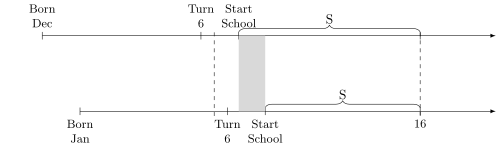
Their idea in the paper was to use a quirk in the US education system where children are assigned to grades based on their birthdays. For much of the 20th century, the cutoff date for starting first grade was December 31st. A child born on or before December 31st would start first grade, while one born on or after January 1st would wait a year and start in kindergarten. This created a neat, exogenous assignment: two kids born a day apart—December 31st and January 1st—would end up in different grades, purely by chance.
Now, at first glance, this might not seem relevant. After all, if both students stay in school long enough to graduate high school, this arbitrary start date wouldn’t affect whether they get a diploma—just when they get it. But here’s where it gets interesting. For much of the 20th century, US compulsory schooling laws required students to stay in school until they turned 16. After that, they were free to drop out. This created an opportunity for Angrist and Krueger to use the cutoff as an instrumental variable to explore the causal effects of education on long-run earnings.
Figure 7.7: Compulsory schooling start dates by birthdates. Solid rectangle is the additional schooling induced by quarter of birth timing.
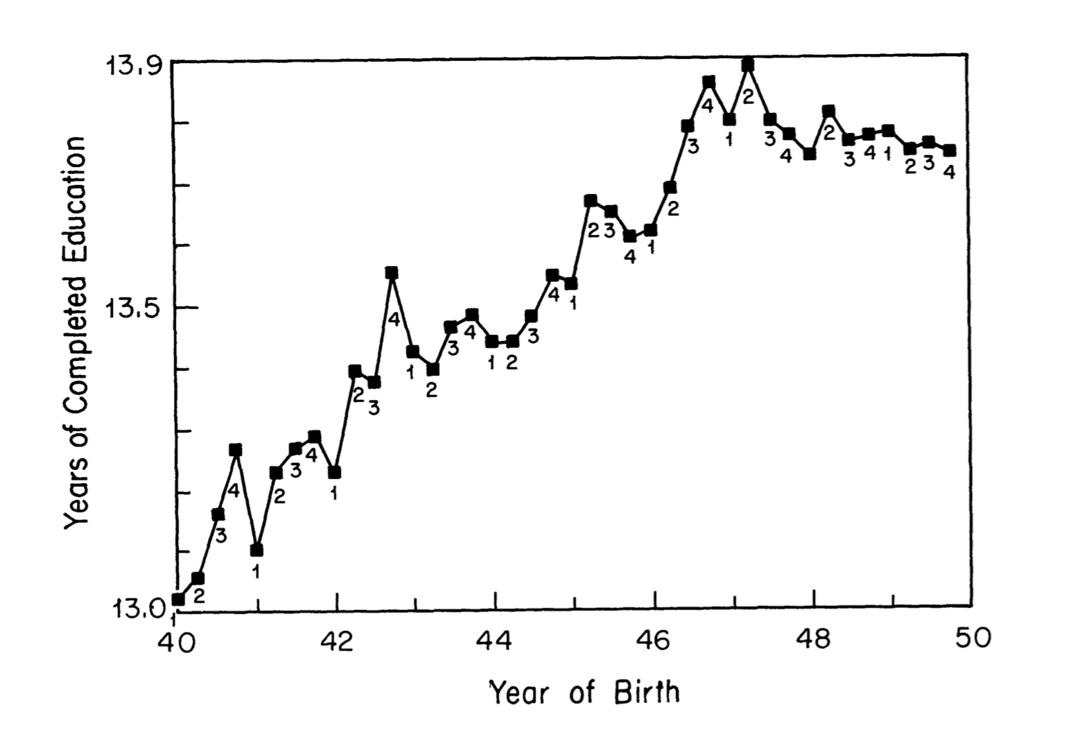
Figure 7.8 shows their instrumental variable in action. Notice how students born in December hit age 16 with slightly more schooling than those born in January. Many students continue past age 16, so the instrument doesn’t affect everyone. The fact that it only selects some kids will be something that we unravel later in the chapter, but for now, just focus on the fact that the instrument is creating quasi-random variation in schooling, and that additional amount is the region between the December and January start dates.
Figure 7.8: (Angrist and Krueger 1991), first stage relationship between quarter of birth and schooling.
Present Visualizations of Reduced Form and First Stage
It’s crucial to present visual representations of the first stage and reduced form relationships, and Angrist and Krueger (1991) does this masterfully. In fact, this paper taught me the importance of doing so. Figure 7.8 illustrates the first stage beautifully. The dots in the figure are grouped by quarter of birth: “1” represents those born in January, February, or March; “2” corresponds to April, May, and June; and so on. What’s striking is the clear pattern: dots labeled “4” and “3” tend to be higher on the graph, while “2” and “1” are clustered lower. This reflects the association between quarter of birth and additional schooling.
However, there’s another key takeaway. This association fades over time. By the time we reach cohorts born in 1947, the systematic relationship between quarter of birth and schooling has almost completely disappeared. Whatever factors drive this relationship seem to be more pronounced for older cohorts than for younger ones.
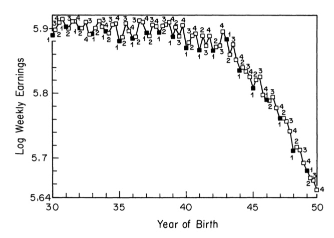
Figure 7.9: (Angrist and Krueger 1991), reduced form visualization of the relationship between quarter of birth and log weekly earnings.
Figure 7.9 shows the reduced form relationship between quarter of birth and log weekly earnings. If you squint a bit, you can see the pattern: along the jagged path, the higher points tend to be “3s” and “4s,” while the lower points tend to be “1s” and “2s.” It’s not perfect, but the correlation is there.
Okay, pause for a second. I need to say something here because it’s important. Do you see how Angrist and Krueger (1991) visually presented the Wald estimator? Figure 7.9 represents the numerator of the Wald estimator—the reduced form relationship between earnings (\(Y\)) and quarter of birth (\(Z\)). And Figure 7.8 shows the denominator—the first stage relationship between schooling (\(S\)) and quarter of birth.
As an aside, I suspect I learned the importance of presenting compelling visualizations of the Wald estimator from this article. In other words, the visualizations you want to present when estimating causal effects with IV are the reduced form and first stage correlations in the Wald estimator. You want to present those separately even if you’re going to ultimately estimate your model using 2SLS. Why? Well first of all, as we showed, Wald is 2SLS. But secondly, presenting visuals based on correlations between the outcome and the fitted treatment values is simply too opaque and potentially suspicious. Be transparent. Your job is to create clear pictures so that people with basic IV literacy can see the effect with their own eyes.
And let me take this even further. Some people are just naturally gifted at making pictures. You know who you are. My hunch is that if you’re great at making figures, you’re probably the same person whose house has the perfect paint colors, that one rug that ties the room together—you just have an instinct for how things work visually. If that’s you, lean into it. Own it. This is your superpower. You have to trust your gut that you know how to create the perfect Wald IV figure for your paper, and then make that figure. It’s a scarce talent to make truly beautiful figures that appropriately communicate the core elements of some causal research design or estimator. I wish I had that talent, but I don’t. So if you are reading this, and this sounds like you, I want to encourage you to make the superb figures for your projects that illustrate the principles for a design or estimator. And with IV, it’s the reduced form picture and the first stage picture you want tofocus on.
More Instruments, More Precision, But At What Price?
In their analysis, Angrist and Krueger used three dummy variables as instruments: one for the first quarter, one for the second quarter, and one for the third quarter. The fourth quarter is the omitted category—the group that tends to have the most schooling. Now, think about this: if you regressed years of schooling on those three dummies, what signs and magnitudes would you expect? Specifically, how would schooling for the first quarter compare to the fourth quarter? Let’s take a look at their first stage results in Table 7.2 and see if it matches your intuition.
Table 7.2 shows the first stage results from a regression of the following form:
Here, \(Z_i\) represents the dummies for the first three quarters of birth, and \(\pi_i\) are the coefficients for those dummies. As we might expect, the coefficients are all negative and statistically significant for both total years of education and the probability of being a high school graduate. This aligns with our intuition: students born earlier in the year tend to complete fewer years of schooling.
But once we look beyond groups bound by compulsory schooling, the effect becomes much weaker. For example, quarter of birth has no significant impact on years of schooling for students who have already finished high school, nor does it affect the probability of being a college graduate.
Now, let’s pause on those college nonresults. Why would quarter of birth predict high school graduation but not college completion? What would it mean if quarter of birth did predict not just high school completion but also college completion, postgraduate completion, and total years of schooling? Wouldn’t that suggest the instrument isn’t really capturing compulsory schooling laws? After all, compulsory schooling only binds students through high school—it has no bearing on education beyond that. If the instrument affected outcomes beyond high school, we’d have reason to doubt its validity. But here, it doesn’t, which makes the case for a true high school effect even moreconvincing.8
Table 7.3: Effect of Schooling on Wages Using OLS and 2SLS
Independent variable
OLS
2SLS
Years of schooling
0.0711
0.0891
(0.0003)
(0.0161)
9 Year-of-birth dummies
Yes
Yes
8 Region-of-residence dummies
No
No
Standard errors in parenthesis. First stage is quarter of birth dummies.
Angrist and Krueger (1991) decided to extend their original analysis by introducing more variation into their instrument. Their thinking was straightforward: by using additional instruments, they could generate more variation in predicted schooling, and with more variation in the right-hand-side variable, it should lead to more precise estimates. At the time, it was thought that adding instruments was a low cost way to increase power and therefore reduce standard errors by increasing variation in the fitted values of the treatment.
So, with that in mind, they interacted the three quarter-of-birth dummies with state and year-of-birth indicators, creating a total of 180 instruments. The idea was to allow the quarter-of-birth effect to vary flexibly by cohort and geography.
But this strategy had a downside. Many of the additional instruments were only weakly correlated with schooling—in some states, they explained almost none of the variation, and in some cohorts, the quarter-of-birth effect was barely present. We already saw hints of this in Figure 7.8, where the later cohorts showed less variation in schooling by birth quarter than the earlier ones.
So what happens when we increase the number of instruments, but most of them are weak? Concern about this issue had been building for some time, with important contributions from Nelson and Startz (1990), Buse (1992), and Bekker (1994). But it was the empirical critique by Bound, Jaeger, and Baker (1995)—focusing on the same compulsory schooling context as Angrist and Krueger (1991)—that brought the problem into sharper focus and helped crystallize what is now known as the “weak instruments” literature.
To clarify these ideas, let’s consider their first stage equation:
\[
S = Z' \pi + \eta
\tag{7.20}\] where \(S\) represents the endogenous regressor (such as schooling), \(Z\) is the instrument, \(\pi\) captures the coefficients of the instrument, and \(\eta\) is the first stage error term. Let’s start off by assuming that \(\varepsilon\) and \(\eta\) are correlated. Estimating the first equation by OLS would then lead to biased results, where the OLS bias is given by:
We will rename this ratio as \(\dfrac{\sigma_{\varepsilon \eta}}{\sigma^2_s}\). Bound, Jaeger, and Baker (1995) show that the bias of 2SLS centers on the previously defined OLS bias as the weakness of the instrument grows. Following Angrist and Pischke (2009), I’ll express that bias as a function of the first stage \(F\)-statistic:
\[
E\big[\widehat{\beta}_{2SLS}-\beta\big] \approx
\dfrac{\sigma_{\varepsilon \eta}}{\sigma_\eta^2} \dfrac{1}{F+1}
\tag{7.22}\] where \(F\) is the population analog of the \(F\)-statistic for the joint significance of the instruments in the first stage regression. If the first stage is weak (\(F \to 0\)), the bias of 2SLS approaches \(\dfrac{\sigma_{\varepsilon \eta}}{\sigma_\eta^2}\). But if the first stage is very strong (\(F \to \infty\)), the 2SLS bias goes to zero. So, since adding more weak instruments causes the first stage \(F\)-statistic to decrease, then many weak instruments causes the bias of 2SLS to increase.
Bound, Jaeger, and Baker (1995) explored this empirically, replicating Angrist and Krueger (1991) and conducting simulations. Table 7.4 shows what happens when controls are added. Notice that as controls are included, the \(F\)-statistic for the excludability of the instruments falls from 13.5 to 4.8 to 1.6. By the \(F\)-statistic, they are already encountering a weak instrument problem once the 30 quarter of birth \(\times\) year dummies are included. This makes sense, as we’ve seen that the relationship between quarter of birth and schooling diminishes for later cohorts.
Table 7.4: Effect of Completed Schooling on Men’s Log Weekly Wages
Independent variable
OLS
2SLS
OLS
2SLS
OLS
2SLS
Years of schooling
0.063 (0.000)
0.142 (0.033)
0.063 (0.000)
0.081 (0.016)
0.063 (0.000)
0.060 (0.029)
First stage F
13.5
4.8
1.6
Excluded instruments
Quarter of birth
Yes
Yes
Yes
Quarter of birth × year of birth
No
Yes
Yes
Number of excluded instruments
3
30
28
Standard errors in parenthesis. First stage is quarter of birth dummies.
Next, they added in the weak instruments—180 in total—as shown in Table 7.5. Here, we see that the problem persists. The instruments are weak, and as a result, the bias of the 2SLS coefficient remains close to the OLS bias.
Table 7.5: Effect of Completed Schooling on Men’s Log Weekly Wages Controlling for State of Birth
Independent variable
OLS
2SLS
OLS
2SLS
Years of schooling
0.063
0.083
0.063
0.081
(0.000)
(0.009)
(0.000)
(0.011)
First stage \(F\)
2.4
1.9
Excluded instruments
Quarter of birth
Yes
Yes
Quarter of birth \(\times\) year of birth
Yes
Yes
Quarter of birth \(\times\) state of birth
Yes
Yes
Number of excluded instruments
180
178
Standard errors in parenthesis.
But the intriguing part of the Bound, Jaeger, and Baker (1995) paper was their simulation. Interestingly, the idea for this was given to them by Alan Krueger himself, of all people. He had suggested it as a possible way to verify the claim that their results were driven by a many—weak—instruments problem. Here they describe what they did and found:
To illustrate that second-stage results do not give us any indication of the existence of quantitatively important finite-sample biases, we reestimated Table 1, columns (4) and (6) and Table 2, columns (2) and (4), using randomly generated information in place of the actual quarter of birth, following a suggestion by Alan Krueger. The means of the estimated standard errors reporting in the last row are quite close to the actual standard deviations of the 500 estimates for each model. … It is striking that the second-stage results reported in Table 3 look quite reasonable even with no information about educational attainment in the simulated instruments. They give no indication that the instruments were randomly generated. … On the other hand, the F statistics on the excluded instruments in the first-stage regressions are always near their expected value of essentially 1 and do give a clear indication that the estimates of the second-stage coefficients suffer from finite-sample biases. (Bound et al. [1995])
So, what can you do if you have weak instruments? Unfortunately, not a lot. You can use a just-identified model with your strongest IV. Second, you can use a limited information maximum likelihood estimator (LIML). LIML is approximately median unbiased for over-identified constant effects models. It shares the same asymptotic distribution as 2SLS under homogeneous treatment effects but provides a finite-sample bias reduction.
But, let me share my own opinion—which you can take with a grain of salt. If you have a weak instrument problem, then the only real solution for you is either to get stronger instruments or don’t do instrumental variables at all. But given that instruments are like four leaf clovers, you’d probably be using stronger instruments if you had them, which means you’re probably better off tackling your question another way.
How Should We Measure Weakness?
So how should we measure the strength—or weakness—of our instruments? As discussed in the previous section, the most common diagnostic has long been the first-stage \(F\)-statistic. Stock and Yogo (2005) famously proposed a threshold of 10, based on Monte Carlo simulations under homoskedasticity, and for years this “rule of thumb” became the standard.
But the literature has evolved. The number 10 is now widely seen as too low—especially in models with multiple endogenous regressors, heteroskedasticity, or non-normal errors. Researchers like Olea and Pflueger (2013) and survey articles by Andrews, Stock, and Sun (2019) and Keane and Neal (2022) have deepened our understanding of what weak instruments actually do. They don’t just bias point estimates in finite samples—they also distort inference: standard errors become too small, and t-tests can be misleading or underpowered, especially when endogeneity is strong.
To summarize the state of the art, Andrews, Stock, and Sun (2019) offer this critical insight:
In the leading case with a single endogenous regressor, we recommend that researchers judge instrument strength based on the effective \(F\)-statistic of Montiel Olea and Pflueger (2013). If there is a single instrument, we recommend reporting identification-robust Anderson-Rubin confidence intervals. These are effective regardless of the strength of the instruments and so should be reported regardless of the value of the first-stage \(F\). (Andrews, Stock, and Sun (2019))
If you’re unfamiliar with Anderson-Rubin (AR) confidence intervals, you’re not alone. They appear far less often in IV papers than the standard first-stage \(F\)-statistic. So what are they, and why are people reporting them?
The appeal of AR confidence intervals is simple: they remain valid even when instruments are weak. That’s because AR intervals reflect the true level of uncertainty. That means that if the instrument is strong, then the AR intervals are tight, but if the instrument is weak, then the interval expands—sometimes so much that it includes both positive and negative values leaving you without an ability to say much of anything. But that’s exactly the point: the AR interval is telling you that your instruments aren’t strong enough to learn much from your data.
Unlike standard IV intervals, AR intervals don’t require strong instruments to deliver valid inference. When instruments are weak, they don’t break—they’re just big, maybe even gigantic, and the bigger that confidence intervals get, the less certain you are about the causal effect. Methodologically, they differ from 2SLS intervals: instead of building a confidence interval around a point estimate, AR inverts a hypothesis test. For each possible value of the coefficient, it asks whether that value could plausibly explain the data. If not, it’s excluded.
Second, you should report the Montiel Olea and Pflueger effective F-statistic (Olea and Pflueger 2013). Unlike the classic \(F\)-statistic, their version accounts for heteroskedasticity and offers a more realistic measure of instrument strength. In just-identified models with a single instrument, this reduces to the robust F-statistic or the Kleibergen and Paap (2006) Wald test.
As Lee et al. (2022) and Keane and Neal (2022) emphasize, higher thresholds for F-statistics are now recommended. Lee et al. (2022) even suggests the first-stage F-statistic needs to be over 100. Keane and Neal (2022) also caution that even with strong instruments, conventional t-tests can over-reject the null when 2SLS estimates are biased toward OLS—another reason to rely on Anderson-Rubin intervals.
But then what should you do when you have multiple instruments? Well, the situation becomes more complex. Andrews, Stock, and Sun (2019) say of that situation the following: “Finally, if there are multiple instruments, the literature has not yet converged on a single procedure, but we recommend choosing from among the several available robust procedures that are efficient when the instruments are strong.”
So in summary—regarding weak instruments, your studies should report the Anderson-Rubin confidence intervals for robustness and use Olea and Pflueger (2013) effective \(F\)-statistic to assess instrument strength. And if you can, they should have the highest standards possible for your instrumental variables on both the margins of the strength of the first stage as well as the satisfying of independence and exclusion.
7.5 Local Average Treatment Effect (LATE)
Two rivers into causal inference
LATE Prologue
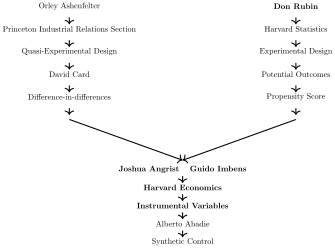
Recall that Joshua Angrist earned his PhD at Princeton in 1989, working in the Industrial Relations Section under the guidance of Orley Ashenfelter and David Card. His job market paper used instrumental variables, and after graduating, he took a position at Harvard. Just a year later, in 1990, he met Guido Imbens, a young econometrician recently hired from Brown University. Though Angrist and Imbens only overlapped at Harvard for a single year, it was a consequential one: together, they authored a landmark paper on instrumental variables, Imbens and Angrist (1994), that would eventually help earn them the Nobel Prize in Economics. The prize was shared with David Card, recognized for his own transformative contributions to labor economics and applied econometrics.9 To set the stage for that later work, it’s helpful to revisit the context in which Angrist was developing his thinking.
One chapter of Angrist’s dissertation investigated the long-term earnings effects of serving in the Vietnam War (Angrist 1990). Since military service was voluntary, simple comparisons between veterans and nonveterans were confounded by selection bias and heterogeneous treatment effects. Angrist addressed this with a clever solution: he used whether an individual’s draft lottery number was called as an instrument for military service. At the time, the US government used a randomized draft lottery to conscript young men into the Vietnam War. If your number was called, it wasn’t because you were eager to serve or deemed especially qualified—it was because your number happened to be drawn, like a ball in a bingo machine.
This physical randomization gave Angrist what he needed: plausibly exogenous variation in treatment assignment.
Models Cannot Perform Magic
One of the things that made Angrist (1990) so remarkable was that it used a real-world, physically randomized variable—draft lottery numbers—as the instrument.10 And if I may, I’d like to pause and reflect on the worldview Angrist seemed to embody, at least as it can be glimpsed from the outside.
At the time, the use of instrumental variables was often haphazard. Some researchers would go so far as to use IV without ever telling the reader what the instrument even was. There seemed to be a widespread belief that the statistical model alone was doing the causal work, rather than the treatment assignment mechanism underneath it.
Angrist’s approach was radical by comparison. He used a physical lottery—an actual randomizing device—as the instrument. He treated the instrument not as a statistical formality, but as a real-world assignment mechanism. And most importantly, he did not treat two stage least squares as magic. IV, in his view, could not create exogenous variation. That variation either existed or it didn’t. The model couldn’t summon it. It could only leverage it.
And that’s the heart of it: statistical models don’t generate randomness—they exploit it. IV is inert—dumb, even—unless that quasi-random variation is already present in the world.
What IV models do is take advantage of that real-world randomness, often hidden, buried inside the treatment variable itself. And since a valid instrument is finding the randomness buried inside the treatment variable, the formal modeling of that randomness that IV does helped identify the causal effects that are otherwise invisible and trapped inside the data too. The job of the researcher who is using instrumental variables isn’t to create that randomness with two stage least squares, but rather find that randomness in the world and use instrumental variables towards answering meaningful, policy-relevant questions.
Instruments are like lassos thrown at a galloping pegasus: with a steady arm, and a little luck, you might catch one before it flies away. And Angrist’s draft lottery numbers—literally shifting people into or out of military service—were about as close as you can get to catching a pegasus in the wild.
Identification at Infinity
So, with that in mind consider the following. In 1990, the same year that Angrist published his job market paper, another future Nobel Laureate and former Princeton grad, James Heckman, published a theoretical paper on instrumental variables. The empirical context was similar to the one that Angrist was studying in that it was a labor question surrounding a voluntary program that was therefore probably rife with endogeneity, namely union membership and wages. It was an old question among labor economists to ask whether union membership raised wages, or whether the observed wage premium was simply selection bias in disguise?
Heckman’s interest in the union wage premium was no doubt sincere, but it also motivated a deeper theoretical question about instrumental variables: under what conditions could IV, in theory, separate the causal effect of union status from unobserved confounding (J. Heckman 1990)? His analysis showed that IV could only identify average causal effects under very specific conditions, later described as “identification at infinity.” For this to work, the instrument \(Z\) would need to induce variation in union membership across nearly the entire population. The more extreme the values of \(Z\)—and the further it pushes individuals toward or away from treatment—the more you can learn about the average causal effect of a program.
But in most real-world settings, instruments simply don’t shift behavior nearly that much. In practical settings, most instruments fall far short of Heckman’s standard due to noncompliance—not everyone follows the “instructions” of the instrument. Even in Angrist (1990), the draft lottery didn’t compel service for everyone with a low number, nor exempt all those with a high one. So Heckman’s critique exposed a real limitation: unless an instrument can shift nearly the entire population into treatment, it cannot identify the average treatmenteffect.
Both Angrist (1990) and J. Heckman (1990) were published the same year. Heckman’s theoretical results seemed to undermine the most basic interpretation of Angrist’s findings as the average effect of military service on career earnings. But was that really the only interpretation available? The context itself seemed to glow with credibility: the US government was literally randomizing Americans into the military. How could a coin flip that sent people to war not reveal something causal about the effects of military service? Angrist’s natural experiment was too compelling to ignore—and yet Heckman’s critique was absolutely correct.
All of this was prologue to the work that Imbens and Angrist did on instrumental variables. They focused their attention on the fundamental problem raised by Heckman: if instruments rarely shift the entire population into treatment, and you need that to identify the average effect, then what exactly does IV identify? Under what conditions does it still have a causal interpretation, and what even is that interpretation? Their goal was to work backward—starting with the kind of real-world instrument Angrist had used—and figure out what, precisely, it was estimating when compliance was imperfect.
Potential Outcomes and Potential Treatment Status
To understand the contribution that Imbens and Angrist (1994) made to discussions about IV, consider this generalized scenario: there is some causal effect of military service on career earnings, we can express it using potential outcomes, and we do not require that everyone have the same response to military service. For some, the effects might be negative, for others positive, for still others it may have no effect at all. So before we dive into the novelty, let’s write down the definition of the individual treatment effect: \[
\delta_i = Y_i^1 - Y_i^0
\tag{7.23}\] Recall that in the potential outcomes framework, we remain agnostic about the size of the treatment effect for any individual. The subscript \(i\) is a reminder that treatment effects may differ across people. By allowing this kind of person-specific variation, we are working within what’s now called a framework of “unrestricted heterogeneous treatment effects” (Mogstad and Torgovitsky 2025). The move made by Imbens and Angrist (1994) was to extend the potential outcomes framework to the first stage and to relax some of the traditional assumptions associated with constant treatment effects.
Our focus now turns to two sources of variation: variation in treatment \(D\) and variation in the instrument \(Z\). With two arguments, the potential outcomes notation needs a slight adjustment. For example, we might write the potential outcome for individual \(i\) as \(Y_i(D_i = 0, Z_i = 1)\), which we can abbreviate as \(Y_i(0,1)\).
As a sidebar, it’s interesting to note how Imbens and Angrist themselves were still refining their thinking in the early versions of the paper. The first draft of what became the LATE paper didn’t use potential outcomes at all—it used a more traditional notation system called index functions. While they were able to derive the main results using that language, two colleagues, Gary Chamberlain and Don Rubin, encouraged them to switch to potential outcomes and introduce a new idea: potential treatment status. This small change did more than simplify notation. It arguably made the result more accessible—perhaps even helping to loosen the grip of traditional econometric formalism, since potential outcomes was still relatively rare in economics at the time, aside from early work like J. J. Heckman and Robb (1985) and Roy (1951) before them.
So, with this framework, they then introduced a change to the instrumental variable notation—potential treatment status—to distinguish between observed and potential treatment assignment. This refinement helps in explicitly modeling the role of the instrument (\(Z\)) in determining treatment (\(D\)). \[
\begin{align*}
D_i^1&=i\text{'s treatment status when }Z_i=1
\\
D_i^0&=i\text{'s treatment status when }Z_i=0
\end{align*}
\tag{7.24}\] That isn’t quite what it may look like—this isn’t just about having people in the treatment group and control group, like we’ve seen before. Instead, it’s saying that person \(i\) has a treatment status, \(D_i\), that depends on the value of the instrument. If the instrument is binary, then person \(i\) has two hypothetical treatment statuses: one if the instrument is “turned on” (\(Z_i = 1\)) and another if it’s “turned off” (\(Z_i = 0\)).
So, just as we talk about different potential outcomes associated with different treatments for the same person at the same moment in time, we now introduce different potential treatment statuses associated with different values of the instrument—even though, in practice, a person cannot simultaneously experience both \(Z_i = 1\) and \(Z_i = 0\).
Let’s make this concrete with the switching equation, now applied to the first stage. This gives us a compact way to describe the strange but essential multi-world relationship between instruments and treatment assignment. \[
\begin{eqnarray*}
D_i &=&D_i^0 + (D_i^1 - D_i^0)Z_i \\
&=&\pi_0 + \pi_1 Z_i + \phi_i
\end{eqnarray*}
\tag{7.25}\] where \(\pi_{0i}=E[D_i^0]\), \(\pi_{1i} = (D_i^1 - D_i^0)\) is the heterogeneous causal effect of the IV on \(D_i\), and \(E[\pi_{1i}]=\) the average causal effect of \(Z_i\) on \(D_i\).
Let’s now see how they put all this together into what they called the LATE theorem. I’ll now discuss the five assumptions of the LATE theorem that states the conditions under which IV will identify an average treatment effect, though it will not be the ATE that was the subject of J. Heckman (1990), as we’ll see.
LATE Theorem: SUTVA
To be concrete, I’ll motivate our discussion of Imbens and Angrist (1994) using Angrist (1990)’s study of Vietnam conscription and career earnings as a running example.
As before, invoking the potential outcomes framework also means invoking the stable unit treatment value assumption (SUTVA). For each individual \(i\), we define two potential treatment statuses: \(D_i^1\) and \(D_i^0\), corresponding to whether the instrument is “on” or “off.” Under SUTVA, we assume that person \(i\)’s potential treatment status—and their potential outcomes—depend only on their own instrument and treatment assignments, not on anyone else’s.
This is the standard “no spillovers” assumption, applied both to treatment and to the instrument: other people’s treatment assignments do not affect my potential outcomes, and other people’s instrument values do not affect my potential treatment or outcome.11
What might a violation of this assumption look like? Suppose I had no intention of volunteering to fight in the war, and I wasn’t drafted. But then my best friend was drafted—and because of that, I decided to enlist. Had he not been drafted, I wouldn’t have joined. In this case, my treatment status depends not only on my own draft number, but on someone else’s—violating SUTVA.12
LATE Theorem: Independence
Second, there is the independence assumption. We discussed this earlier, but we didn’t discuss it in the context of potential outcomes. The independence assumption is also sometimes called the “as good as random assignment” assumption. It states that the IV is independent of the potential outcomes and potential treatment assignments. Notationally, it is \[
\Big\{Y_i(D_i^1,1), Y_i(D_i^0,0),D_i^1,D_i^0\Big\} \independent Z_i
\tag{7.26}\] The independence assumption immediately gives a causal interpretation to the reduced form: \[
\begin{align*}
E\big[Y_i\mid Z_i=1\big]-E\big[Y_i\mid Z_i=0\big]&=
E\big[Y_i(D_i^1,1)\mid Z_i=1\mid]-
E\big[Y_i(D_i^0,0)\mid Z_i=0\big]
\\
&= E[Y_i(D_i^1,1)] - E[Y_i(D_i^0,0)]
\end{align*}
\tag{7.27}\] In other words, independence allows you to interpret the reduced form equation from earlier in the chapter as a causal effect. It’s just that the reduced form becomes the “average effect of the instrument on the outcome,” which may have nothing to do with the treatment’s effect on the outcome or may have everything to do with it. Independence, in other words, doesn’t specify the channel through which the instrument impacts the outcome, and if there are many downstream channels connecting it to the outcome, it may be both a causal effect and be borderline uninterpretable, or at least unhelpful for policy.
Let me give you an example. Suppose you regress a person’s career earnings, \(Y\), on their draft eligibility, \(Z\). If that coefficient is not zero, then you’ve learned something—but it’s a somewhat strange answer to a somewhat strange question: what is the average effect of being draft eligible on career earnings? That is not the same question as Angrist (1990) was asking. He wasn’t trying to figure out the effect of being draft eligible on earnings; he was trying to figure out the effect of military service on career earnings. And random instruments are not alone capable of giving you the answer to that question.
Now, you might think: “Well, if eligibility affects earnings, that must mean the effect flows through military service, right?” No, not necessarily. Maybe, in response to being drafted, some people enlist in the military. But, maybe other people go to graduate school to get a deferment. Maybe others move to Canada. What if—hypothetically—most people responded to draft eligibility by avoiding military service altogether? Randomized instruments would give you an average effect over all channels, not just the military service channel, and as such your answer can be both causal and comically unhelpful.
So independence allows us to interpret the reduced form equation as an average causal effect of the instrument on the outcome. It does not itself isolate the mechanism by which it changed the outcome without more assumptions.
The second thing implied by independence is that we can also interpret the first stage as a causal effect of \(Z_i\) on \(D_i\): \[
\begin{align*}
E\big[D_i\mid Z_i=1\big]-E\big[D_i\mid Z_i=0\big] &=
E\big[D_i^1\mid Z_i=1\big] - E\big[D_i^0\mid Z_i=0\big]
\\
&= E[D_i^1 - D_i^0]
\end{align*}
\tag{7.28}\] If I can offer my two cents—take it or leave it—my advice to myself and others is to adopt, as your default mindset, the idea that independence more or less means physical randomization. You can walk that back and appeal to something softer, like a vague notion of “exogeneity,” but in practice, I think exogeneity is often appealing precisely because it creates loopholes—loopholes that make IV analysis seem justifiable when, more than likely, it’s not.
Sometimes, your instrument really isn’t independent of potential outcomes or potential treatment status. And if that’s the case, then it’s not random. Which means it’s not exogenous. Which means you should not be using it as an instrumental variable in your research.
LATE Theorem: Exclusion
Third, there is the exclusion restriction. The exclusion restriction states that any effect of \(Z\) on \(Y\) must be via the effect of \(Z\) on \(D\). In other words, \(Y_i(D_i,Z_i)\) is a function of \(D_i\) only. Or formally: \[
Y_i(D_i,0) = Y_i(D_i,1)\quad \text{for $D=0,1$}
\tag{7.29}\]
Again, our Vietnam example. In the Vietnam draft lottery, an individual’s earnings potential as a veteran or a nonveteran are assumed to be the same regardless of draft eligibility status. The exclusion restriction would be violated if low lottery numbers affected schooling by people avoiding the draft. If this was the case, then the lottery number would be correlated with earnings for at least two cases. One, through the instrument’s effect on military service. And two, through the instrument’s effect on schooling. The implication of the exclusion restriction is that a random lottery number (independence) does not therefore imply that the exclusion restriction is satisfied. These are different assumptions.
LATE Theorem: Nonzero First Stage
Fourth is the first stage. IV designs require that \(Z\) be correlated with the endogenous variable such that \[
E[D_i^1 - D_i^0] \ne 0
\tag{7.30}\]
\(Z\) has to have some statistically significant effect on the average probability of treatment. An example would be having a low lottery number. Does it increase the average probability of military service? If so, then it satisfies the first stage requirement. Note: unlike independence and exclusion, the first stage is testable as it is based solely on \(D\) and \(Z\), both of which you have data on.
LATE Theorem: Monotonicity
And finally, the monotonicity assumption. This is only strange at first glance, but is actually quite intuitive. Monotonicity requires that the instrumental variable (weakly) operate in the same direction on all individual units. In other words, while the instrument may have no effect on some people, all those who are affected are affected in the same direction (i.e., positively or negatively, but not both). We write it out like this: \[
\text{Either $\pi_{1i} \geq 0$ for all $i$
or $\pi_{1i} \leq 0$ for all $i=1,\dots, N$}
\tag{7.31}\] What this means, using our military draft example, is that draft eligibility may have no effect on the probability of military service for some people, like patriots, but when it does have an effect, it shifts them all into service, or out of service, but not both. The reason that we have to make this assumption is that without monotonicity, IV estimators are not guaranteed to estimate a weighted average of the underlying causal effects of the affected group.
LATE Theorem
If all five assumptions are satisfied, then we have a valid IV strategy. But that being said, while valid, it is not doing what it was doing when we had homogeneous treatment effects. What, then, is the IV strategy estimating under heterogeneous treatment effects? Answer: the local average treatment effect (LATE) of \(D\) on \(Y\): \[
\begin{align*}
\delta_{IV,LATE} &=\dfrac{ \text{Effect of $Z$ on
$Y$}}{\text{Effect of $Z$ on $D$}}
\\
&=\dfrac{E\big[Y_i(D_i^1,1)-Y_i(D_i^0,0)\big]}{ E[D_i^1 - D_i^0]}
\\
&=E\big[(Y_i^1-Y_i^0)\mid D_i^1-D_i^0=1\big]
\end{align*}
\tag{7.32}\] The LATE parameter is the average causal effect of \(D\) on \(Y\) for those whose treatment status was changed by the instrument, \(Z\). We know that—notice the difference in the last line: \(D_i^1 - D_i^0\). So, for and only for those people for whom that is equal to 1, we calculate the difference in potential outcomes. Which means we are only averaging over treatment effects for whom \(D_{i}^{1}-D^{0}_{i}=1\). Hence, the parameter we are estimating is “local.”
How do we interpret Angrist’s estimated causal effect in his Vietnam draft project? Well, IV estimates the average effect of military service on earnings for the subpopulations who enrolled in military service because of the draft. These are specifically only those people, though, who would not have served otherwise. It doesn’t identify the causal effect on patriots who always serve, for instance, because \(D_i^1 - D_i^0 = 0\) for patriots. They always serve! \(D_i^1=1\)and\(D_i^0=1\) for patriots because they’re patriots! It also won’t tell us the effect of military service on those who were exempted from military service for medical reasons because for these people \(D_i^1=0\) and \(D_i^0=0\).13
The LATE framework has even more jargon, so let’s review it now. The LATE framework partitions the population of units with an instrument into potentially four mutually exclusive groups. Those groups are:
Compliers: This is the subpopulation whose treatment status is affected by the instrument in the correct direction. That is, \(D_i^1=1\) and \(D_i^0=0\).14
Defiers: This is the subpopulation whose treatment status is affected by the instrument in the wrong direction. That is, \(D_i^1=0\) and \(D_i^0=1\).15
Never-takers: This is the subpopulation of units that never take the treatment regardless of the value of the instrument. So, \(D_i^1=D_i^0=0\). They simply never take the treatment.16
Always-takers: This is the subpopulation of units that always take the treatment regardless of the value of the instrument. So, \(D_i^1=D_i^0=1\). They simply always take the instrument.17
As outlined above, with all five assumptions satisfied, IV estimates the average treatment effect for compliers, which is the parameter we’ve called the local average treatment effect. It’s local in the sense that it is average treatment effect to the compliers only.18 Contrast this with the traditional IV pedagogy with homogeneous treatment effects. In that situation, compliers have the same treatment effects as non-compliers, so the distinction is irrelevant. Without further assumptions, LATE is not informative about effects on never-takers or always-takers because the instrument does not affect their treatmentstatus.
Does this matter? Yes, absolutely. It matters because in most applications, we would be mostly interested in estimating the average treatment effect on the whole population, but that’s not usually possible with IV. In the case of Angrist (1990), you could argue that the LATE was exactly the correct policy parameter, since it’s a natural policy question to want to know what the effect of conscripted military service was. And that was ultimately what Angrist had studied—not the average effect of military service, but rather the effect of military service on the people who were pushed into or out of the military solely because of their draft number. But whether this is the policy parameter of interest is going to vary across studies andapplications.
Now that we have reviewed the basic idea and mechanics of instrumental variables, including some of the more important tests associated with it, let’s get our hands dirty with some data. We’ll work with a couple of datasets now to help you better understand how to implement 2SLS in real data.
7.6 College in the County Exercise
We will once again look at the returns to schooling, as it is such a historically popular topic for causal questions in labor economics. In this application, we will estimate a 2SLS model, calculate the first stage \(F\)-statistic, and compare the 2SLS results with the OLS results. I will keep it simple because my goal is to help the reader become familiarized with the procedure.
The data come from the NLS Young Men Cohort of the National Longitudinal Survey. This survey began in 1966 with 5,525 men aged 14—24 and followed up with them through 1981. The dataset includes various questions related to local labor markets. One of these asks whether the respondent lives in the same county as a four-year (or two-year) college.
Card (1995) is interested in estimating the following regression equation: \[
Y_i = \alpha + \delta S_i + \gamma X_i + \varepsilon_i
\tag{7.33}\] where \(Y\) is log earnings, \(S\) is years of schooling, \(X\) is a matrix of exogenous covariates, and \(\varepsilon\) is an error term that contains, among other things, unobserved ability. If \(\varepsilon\) contains ability, and ability is correlated with schooling, then \(C(S,\varepsilon) \neq 0\), meaning the OLS estimate of schooling will be biased. Card proposes an instrumental variables strategy to address this bias, using the presence of a four-year college in the respondent’s county as an instrument for schooling.
Why would the presence of a four-year college in one’s county increase schooling? The primary reason is that it lowers the cost of attendance by allowing students to live at home. This creates a group of compliers—individuals whose decision to attend college is influenced by the availability of a nearby institution. Some individuals will always attend college regardless of location, and others will never attend despite a college being nearby. But for the compliers, the presence of a local college lowers the marginal cost of attendance enough to change their decision. If this group primarily consists of individuals who are liquidity constrained, the estimates will capture the local average treatment effect (LATE) rather than the average treatment effect (ATE). In this case, the LATE may be particularly interesting, as it sheds light on the returns to schooling for a group of individuals for whom the cost of attendance is a significant barrier.
Here, we perform a simple analysis inspired by Card (1995). For this analysis, we implement IV diagnostics using the ivDiag R package, following the guidelines proposed in Lal et al. (2023), as well as weakivtest by Pflueger and Wang and twostepweakiv by Liyang Sun. To keep the focus on syntax, we will estimate the effect of schooling on wages using the presence of a four-year college in the county as an instrument, without including covariates as controls.
# Install and load required packageinstall.packages("ivDiag")library(ivDiag)library(haven)# Read the Card datacard <-read_dta("https://raw.github.com/scunning1975/mixtape/master/card.dta")# 1. Calculate the Olea-Pflueger effective F statisticeffF <-eff_F(data = card,Y ="lwage",D ="educ",Z ="nearc4",cl =NULL, # No clusteringweights =NULL) # No weights# 2. Perform Anderson-Rubin test with confidence intervalsar_results <-AR_test(data = card,Y ="lwage",D ="educ",Z ="nearc4",controls =NULL,CI =TRUE, # Calculate confidence intervalalpha =0.05) # 5% significance level# 3. For a complete analysis, you can use the omnibus function ivDiagiv_results <-ivDiag(data = card,Y ="lwage",D ="educ",Z ="nearc4",bootstrap =TRUE,run.AR =TRUE)# View resultsprint(effF) # Effective F statisticprint(ar_results) # AR test results and confidence interval# Plot the resultsplot_coef(iv_results)
Table 7.6 shows the results from this analysis. The estimated effect of college enrollment due to living in the same county as a four-year college is an 18.8% increase in wages. The effect is highly significant and the Anderson-Rubin confidence intervals range from 14.4% to 24.8%. The effective \(F\)-statistic is over 60. The first stage is large and statistically significant: people who live in a college county got 0.829 of a full year of additional schooling. And under independence, this is a causal effect.
Table 7.6: Instrumental Variable Estimates Using a Dummy for Living in the Same County as a 4-Year College as the Instrument
Estimated effect of schooling
0.188
(0.026)
[0.144, 0.248]
First stage
Schooling
College in the county instrument
0.829
(0.107)
Olea and Pflueger \(F\)-statistic
60.374
Obs
3,010
Robust standard errors are in parentheses, and Anderson-Rubin confidence intervals are in brackets in the top panel. The Olea and Pflueger effective \(F\)-statistic is reported in the bottom panel. Data source: NLSY from Card (1995).
Why would the return to schooling be so much larger for the compliers than for the general population? After all, if this were simply due to ability bias, we’d expect the 2SLS coefficient to be smaller than the OLS coefficient, since ability bias would inflate the OLS estimate. Yet we’re finding the opposite.
There are a couple of plausible explanations. First, it could be due to measurement error in schooling. Measurement error tends to bias coefficients towards zero, and 2SLS, by addressing this error, would recover the true value. However, this explanation seems unlikely here—people generally know how many years of schooling they’ve completed with reasonable accuracy.
This leads us to the second explanation: compliers may indeed have larger returns to schooling. But why would this be the case? Assuming the exclusion restriction holds, why would the returns for compliers exceed those for the general population?
The answer likely lies in the marginal costs of schooling. Compliers are individuals whose schooling decisions are influenced by the presence of a college in their county, often because it lowers the cost of attendance by allowing them to live at home. If the higher marginal cost of attending college is a barrier for these individuals, they may underinvest in education. This underinvestment could mean that the returns to additional schooling are especially high for them—they are the ones for whom the lowered cost unlocks significant benefits.
Still, this raises further questions: why would the marginal cost of attending college have such a disproportionate impact on these individuals? Could it reflect liquidity constraints, risk aversion, or other factors limiting their ability to invest in schooling? I’d be interested in hearing your thoughts on why this gap in returns might exist.
7.7 Five Common Distinct IV Designs
Instrumental variables is a strategy one can adopt when one has a good instrument, and so in that sense, it is a very general design that can be used in just about any context. But over the years, certain types of IV strategies have been used repeatedly so many times that they constitute their own designs. And from repetition and reflection, we have a better understanding of how these specific IV designs do and do not work. I’d like to now discuss five such popular designs: the lottery design, the judge fixed effects design, Bartik instruments, fuzzy RDD, and estimating the elasticity of demand.
Lotteries
Previously, we reviewed the use of IV in identifying causal effects when some regressor is endogenous in observational data. But one particular kind of IV application that you’ll see is its use in randomized trials. In many randomized trials, participation is voluntary among those randomly chosen to be in the treatment group. On the other hand, persons in the control group usually don’t have access to the treatment. Only those who are particularly likely to benefit from treatment therefore will probably take up treatment, which almost always leads to positive selection bias. If you just compare means between treated and untreated individuals using OLS, you will obtain biased treatment effects even for the randomized trial due to noncompliance. So a solution is to instrument for treatment with whether you were offered treatment and estimate the LATE. Thus even when treatment itself is randomly assigned, it is common for people to use a randomized lottery as an instrument for participation. For a modern example of this, see Baicker et al. (2013) who used the randomized lottery to be on Oregon’s Medicaid as an instrument for being on Medicaid. Let’s discuss the Oregon Medicaid studies now, as they are excellent illustrations of what I’m calling the lottery IV design.
What are the effects of expanding access to public health insurance for low income adults? Is it positive or negative? Is it large or small? Surprisingly, we have not historically had reliable estimates for these very basic questions because we lacked the kind of experiment needed to make claims one way or another. The limited existing evidence was suggestive with a lot of uncertainty. Observational studies are confounded by selection into health insurance, and the quasi-experimental evidence tended to only focus on the elderly and small children. There has been only one randomized experiment in a developed country and it was the RAND health insurance experiment in the 1970s. This was an important, expensive, ambitious experiment, but it only randomized cost-sharing—not coverage itself.
In the 2000s, Oregon chose to expand its Medicaid program for poor adults by making it more generous. Adults 19–64 with income less than 100% of the federal poverty line were eligible so long as they weren’t eligible for other similar programs. They also had to be uninsured for less than six months and a legal resident. The program was called the Oregon Health Plan Standard and it provided comprehensive coverage (but no dental or vision) and minimum cost-sharing. It was similar to other states in payments and management, and the program was closed to new enrollment in 2004.
The expansion is popularly known as the Oregon Medicaid Experiment because the state used a lottery to enroll volunteers. For five weeks, people were allowed to sign up for Medicaid. The state used heavy advertising to make the program salient. There were low barriers to signing up and no eligibility pre-screening. The state then randomly drew 30,000 people out of a list of 85,000, from March to October of 2008. Those selected were given a chance to apply. If they did apply, then their entire household was enrolled, so long as they returned the application within 45 days. Out of this original 30,000, only 10,000 people were enrolled.
A team of economists became involved with this project early on, out of which several influential papers were written. I’ll now discuss some of the main results from Finkelstein et al. (2012) and Baicker et al. (2013). The authors of these studies sought to study a broad range of outcomes that might be plausibly affected by health insurance—from financial outcomes, to healthcare utilization, to health outcomes. The data needed for these outcomes were meticulously collected from third parties. For instance, the pre-randomization demographic information was available from the lottery sign-up. The state administrative records on Medicaid enrollment were also collected, which became the primary measure of a first stage (i.e., insurance coverage). And outcomes were collected from administrative sources (e.g., hospital discharge, mortality, credit), mail surveys, and in-person survey and measurement (e.g., blood samples, BMI, detailed questionnaires).
The empirical framework in these studies is a straightforward IV design. Sometimes they estimated the reduced form, and sometimes they estimated the full 2SLS model. The two stages were: \[
\begin{align*}
\text{INSURANCE}_{ihj} &=
\delta_0+\delta_1\text{ LOTTERY}_{ih} +
X_{ih}\delta_2 + V_{ih}\delta_3 + \mu_{ihj}
\\
y_{ihj}&=\pi_0+\pi_1 I\widehat{\text{NSURANCE}}_{ih} + X_{ih}\pi_2
+ V_{ih}\pi_3 + v_{ihj}
\end{align*}
\tag{7.34}\] where the first equation is the first stage (insurance regressed onto the lottery outcome plus a bunch of covariates), and the second stage regresses individual level outcomes onto predicted insurance (plus all those controls). We already know that so long as the first stage is strong, then the \(F\)-statistic will be large, and the finite sample bias lessens.
The effects of winning the lottery had large effects on enrollment. We can see the results of the first stage in Table 7.7. They used different samples, but the effect sizes were similar. Winning the lottery raised the probability of being enrolled on Medicaid by 26%, and raised the number of months of being on Medicaid by 3.3 to 4 months.
Table 7.7: Effect of Lottery on Enrollment
Dependent variable
Full sample
Survey respondents
Ever on Medicaid
0.256
0.290
(0.004)
(0.007)
Ever on OHP Standard
0.264
0.302
(0.003)
(0.005)
Number of months on Medicaid
3.355
3.943
(0.045)
(0.09)
Standard errors in parenthesis.
Across the two papers, the authors looked at the effect of Medicaid’s health insurance coverage on a variety of outcomes including financial health, mortality, and healthcare utilization, but I will review only a few here. In Table 7.8 and other tables like it, the authors present two regression models: column 2 is the intent to treat (ITT) estimates, which is the reduced form model, and column 3 is the local average treatment effect estimate, which is our full instrumental variables specification. Interestingly, Medicaid increased the number of hospital admissions but had no effect on emergency room visits. The effect on emergency rooms, in fact, is not significant, but the effect on non-emergency room admissions is positive and significant. This is interesting because it appears that Medicaid is increasing hospital admission without putting additional strain on emergency rooms, which are often over-taxed resources as it is.
What other kinds of healthcare utilization are we observing in Medicaid enrollees? Let’s look at Table 7.9, which has five healthcare utilization outcomes. Again, I will focus on column 3, which is the LATE estimates. Medicaid enrollees were 34% more likely to have a usual place of care, 28% to have a personal doctor, 24% to complete their healthcare needs, 20% to get all needed prescriptions, and 14% to report satisfaction with the quality of their care.
Table 7.8: Effect of Medicaid on Hospital Admission
Dependent variable
ITT
LATE
Any hospital admission
0.5%
2.1%
Hospital admissions through ED
0.2%
0.7%
Hospital admissions not through ED
0.4%
1.6%
Hospital discharge data.
But Medicaid is not merely a way to increase access to healthcare; it also functions effectively as healthcare insurance in the event of catastrophic health events. One of the most widely circulated results of the experiment was the effect of Medicaid on financial outcomes. In Table 7.10 we see that one of the main effects was reduction in personal debt (by $390) and reducing debt going to debt collection. The authors also found reductions in out-of-pocket expenses, in borrowing money or skipping bills for medical care, and in refusing medical treatment due to medical debt.
Table 7.9: Effect of Medicaid on Healthcare Usage
Dependent variable
ITT
LATE
Have a usual place of care
9.9%
33.9%
Have a personal doctor
8.1%
28.0%
Got all needed healthcare
6.9%
23.9%
Got all needed prescriptions
5.6%
19.5%
Satisfied with quality of care
4.3%
14.2%
But the effect on health outcomes was a little unclear from this study. The authors find self-reported health outcomes to be improving, as well as a reduction in depression. They also find more healthy physical and mental health days. But the overall effects are small. Furthermore, they ultimately do not find that Medicaid had any effect on mortality—a result we will return to in the Difference-in-Differences chapter.
Table 7.10: Effect of Medicaid on Medical Spending
Dependent variable
ITT
LATE
Had a bankruptcy
0.2%
0.9%
Had a collection
\(-1.2\%\)
\(-4.8\%\)
Had a medical collection
\(-1.6\%\)
\(-6.4\%\)
Had non-medical collection
\(-0.5\%\)
\(-1.8\%\)
$ owed medical collection
\(-\$99\)
\(-\$390\)
Credit records.
In conclusion, we see a powerful use of IV in the assignment of lotteries to recipients. The lotteries function as instruments for treatment assignment, which can then be used to estimate some local average treatment effect. This is incredibly useful in experimental designs if only because humans often refuse to comply with their treatment assignment or even participate in the experiment altogether!
Table 7.11: Effect of Medicaid on Health
Dependent variable
ITT
LATE
Health good, very good, or excellent
3.9%
13.3%
Health stable or improving
3.3%
11.3%
Depression screen NEGATIVE
2.3%
7.8%
Healthy days (physical)
0.381
1.31
Healthy days (mental)
0.603
2.08
Judge Fixed Effects
A second IV design that has become extremely popular in recent years is something sometimes called the “judge fixed effects” design. You may also hear it called the “leniency design,” but because the applications so often involve judges, it seems the former name has stuck. A search on Google Scholar for the term yields over 70 hits with over 50 since 2018 alone.
The concept of the judge fixed effects design is that there exists: 1) a narrow pipeline through which all individuals must pass, 2) numerous randomly assigned decision-makers blocking the individuals’ passage who assign a treatment to the individuals, and 3) discretion among the decision-makers. When all three are there, you probably have the makings of a judge fixed effects design. The reason the method is often called the judge fixed effects design is because it has traditionally exploited a feature in American jurisprudence where jurisdictions will randomly assign judges to defendants. In Harris County, Texas, for instance, they used to use a bingo ball machine to assign defendants to one of dozens of courts (Mueller-Smith 2015).
The first paper to recognize that there were systematic differences in judge sentencing behavior was an old 1933 article by Gaudet, Harris, and John (1933). The authors were interested in better understanding what, other than guilt, determined the sentencing outcomes of defendants. They decided to focus on the judge himself, in part because judges were being randomly rotated to defendants. And since they were being rotated to defendants “by chance,” in a large sample, the characteristics of the defendants should’ve remained approximately the same across all judges. Any differences in sentencing outcomes, therefore, wouldn’t be because of the underlying charge or even the defendant’s guilt, but rather, something connected to the judgeherself.
Gaudet, Harris, and John (1933) documented considerable variation in imposed imprisonments across the judges in their sample, despite that these judges were, on average, seeing roughly the same groups of people with the expected guilt. One judge, for instance, imposed imprisonment in only 34% of his cases, but another judge’s was almost 60%. How could this happen under randomization? It must be that the judges have different standards of punishment, which would mean whoever got randomized to the judge that only imposes imprisonment a third of the time got lucky, because if they’d been assigned to the one who imposed almost two-thirds of the time, they would have had a much higher chance of being imprisoned for reasons that had nothing to do with their actual crime. Gaudet, Harris, and John (1933) write of this:
Perhaps the most interesting thing to be noticed in these graphs is the fact that the sentencing tendency of the judge seems to be fairly well determined before he sits on the bench. In other words what determines whether a judge will be severe or lenient is to be found in the environment to which the judge has been subjected previous to his becoming an administrator of sentences. (Gaudet, Harris, and John (1933))
But the main takeaway from this paper is that the authors were the first to discover that the leniency/severity of the judge, and not merely the defendant’s own guilt, apparently plays a significant role in the final determination of a case against the defendant. The authors write:
The authors wish to point out that these results tend to show that some of our previous studies in the fields of criminology and penology are based upon very unreliable evidence if our results are typical of sentencing tendencies. In other words, what type of sentence received by a prisoner may be either an indication of the seriousness of his crime or of the severity of the judge. (Gaudet, Harris, and John (1933))
The next mention of the explicit judge fixed effects design is in the Imbens and Angrist article decomposing IV into the LATE parameter using potential outcomes notation. At the conclusion of their article, they provide three examples of IV designs that may or may not fit the five identifying assumptions of IV that I discussed earlier. They write:
Example 2 (Administrative Screening): Suppose applicants for a social program are screened by two officials. The two officials are likely to have different admission rates, even if the stated admission criteria are identical. Since the identity of the official is probably immaterial to the response, it seems plausible that Condition 1 [independence] is satisfied. The instrument is binary so Condition 3 is trivially satisfied. However, Condition 2 [monotonicity] requires that if official \(A\) accepts applicants with probability \(P(0)\), and official B accepts people with probability \((P1)>P(0)\), official B must accept any applicant who would have been accepted by official \(A\). This is unlikely to hold if admission is based on a number of criteria. Therefore, in this example we cannot use Theorem 1 to identify a local average treatment effect nonparametrically despite the presence of an instrument satisfying Condition 1 [independence]. (Imbens and Angrist (1994))
While the first time we see the method used for any type of empirical identification is Waldfogel (1995), the first explicitly IV strategy is a paper 11 years later by Kling (2006) who used randomized judge assignment with judge propensities to instrument for incarceration length. He then linked defendants to employment and earnings records that he used to estimate the causal effect of incarceration on labor market outcomes. He ultimately finds no adverse effects on labor market consequences from longer sentences in the two states he considers.
The three main identifying assumptions that I think probably should be on the researcher’s mind when attempting to implement a judge fixed effects design are the independence assumption, exclusion restriction, and the monotonicity assumption. Let’s discuss them each at a time because in some scenarios, one of these may be more credible than the other.
The independence assumption seems to be satisfied in many cases because the administrators in question are literally being randomly assigned to individual cases. As such, our instrument—which is sometimes modeled as the average propensity of the judge excluding the case in question or simply as a series of judge fixed effects, which as I’ll mention in a moment turns out to be equivalent—easily passes the independence test. But it’s possible that strategic behavior on the part of the defendant in response to the strictness of the judge they were assigned can undermine the otherwise random assignment. Consider something that Gaudet, Harris, and John (1933) observed in their original study regarding the dynamics of the courtroom when randomly assigned a severe judge:
The individual tendencies in the sentencing tendencies of judges are evidently recognized by many who are accustomed to observe this sentencing. The authors have been told by several lawyers that some recidivists know the sentencing tendencies of judges so well that the accused will frequently attempt to choose which judge is to sentence them, and further, some lawyers say that they are frequently able to do this. It is said to be done in this way. If the prisoner sees that he is going to be sentenced by Judge X, whom he believes to be severe in his sentencing tendency, he will change his plea from “Guilty” to “Non Vult” or from “Non Vult” to “Not Guilty,” etc. His hope is that in this way the sentencing will be postponed and hence he will probably be sentenced by another judge. (Gaudet, Harris, and John (1933))
There are several approaches one can take to assessing independence. First, checking for balance on pretreatment covariates is an absolute must. Insofar as this is a randomized experiment, then all observable and unobservable characteristics will be distributed equally across the judges. While we cannot check for balance on unobservables, we can check for balance on observables. Most papers of which I am aware check for covariate balance, usually before doing any actual analysis.
Insofar as you suspect endogenous sorting, you might simply use the original assignment, not the final assignment, for identification. This is because in most cases, we will know the initial judge assignment was random. But this approach may not be feasible in many settings if initial judge or court assignment is not available. Nevertheless, endogenous sorting in response to the severity of the judge could undermine the design by introducing a separate mechanism by which the instrument impacts the final decision (via sorting into the lenient judge’s courtroom if possible), and the researcher should attempt to ascertain through conversations with administrators the degree to which this practically occurs in the data.
The violation of exclusion is more often the worry, though, and really should be evaluated on a case by case basis. For instance, in Dobbie, Goldin, and Yang (2018), the authors are focused on pretrial detention. But pretrial detention is determined by bail set by judges who do not themselves have any subsequent interaction with the next level’s randomized judge, and definitely don’t have any interaction with the defendant upon the judicial ruling and punishment rendered. So in this case, it does seem like Dobbie, Goldin, and Yang (2018) might have a more credible argument that exclusion holds.
But consider a situation where a defendant is randomly assigned a severe judge. In expectation, if the case goes to trial, the defendant faces a higher expected penalty even given a fixed probability of conviction across any judge, for no other reason than that the stricter judge will likely choose a harsher penalty and thus drive up the expected penalty. Facing this higher expected penalty, the defense attorney and defendant might decide to accept a lesser plea in response to the judge’s anticipated severity, which would violate exclusion since exclusion requires the instrument effect the outcome only through the judge’s decision (sentence).
But even if exclusion can be defended, in many situations monotonicity becomes the more difficult case to make for this design. It was explicitly monotonicity that made Imbens and Angrist (1994) skeptical that judge fixed effects could be used to identify the local average treatment effect. This is because the instrument is required to weakly operate the same across all defendants. Either a judge is strict or she isn’t, but she can’t be both in different circumstances. Yet humans are complex bundles of thoughts and experiences, and those biases may operate in nontransitive ways. For instance, a judge may be lenient, except when the defendant is black or if the offense is a drug charge, in which case they switch and become strict. Mueller-Smith (2015) attempted to overcome potential violations of exclusion and monotonicity through a parametric strategy of simultaneously instrumenting for all observed sentencing dimensions and thus allowing the instruments’ effect on sentencing outcomes to be heterogeneous in defendant traits and crime characteristics.
Formal solutions to querying the plausibility of these assumptions have appeared in recent years, though. Frandsen, Lefgren, and Leslie (2023) propose a test for exclusion and monotonicity based on relaxing the monotonicity assumption. This test requires that the average treatment effect among individuals who violate monotonicity be identical to the average treatment effect among some subset of individuals who satisfy it. Their test simultaneously tests for exclusion and monotonicity, so one cannot be sure which violation is driving the test’s result unless, theoretically, one rules out one of the two using a priori information. Their proposed test is based on two observations: that the average outcomes conditional on judge assignment should fit a continuous function of judge propensities, and secondly, the slope of that continuous function should be bounded in magnitude by the width of the outcome variable’s support. The test itself is relatively straightforward and simply requires examining whether observed outcomes averaged by judges are consistent with such a function. We can see a picture of what it looks like to pass this test in the top panel of Figure 7.11 versus the bottom panel that fails the test.
While the authors have made available code and documentation that can be used to implement this test,19 it is not currently available in R and therefore will not be reviewed here.
In this section, I’d like to accomplish two things. First, I’d like to review an interesting paper that examined how cash bail affected case outcomes (Stevenson 2018). As this is an important policy question, I felt it would be good to review this excellent study. But the second purpose of this section is to replicate her main results so that the reader can see exactly how to implement this instrumental variables strategy.
As with most judge fixed effects papers, Stevenson is working with administrative data for a large city. Large cities are probably the best context due to the large samples, which can help ameliorate the finite sample bias of IV. Fortunately, these data are often publicly available and need only be scraped from court records that are in many locations posted online. Stevenson (2018) focuses on Philadelphia where the natural experiment is the random assignment of bail judges (“magistrates”) who unsurprisingly differ widely in their propensity to set bail at affordable levels. In other words, bail judges differ systematically in the price they set for bail, and given a downward sloping demand curve, more severe judges setting expensive bails will see more defendants unable to pay their bail. As a result, they are forced to remain in detention prior to the trial.
Using a variety of IV estimators, Stevenson (2018) finds that an increase in randomized pretrial detention leads to a 13% increase in the likelihood of receiving a conviction. She argues that this is caused by an increase in guilty pleas among defendants who otherwise would have been acquitted or had their charges dropped—a particularly problematic mechanism identified if true. Pretrial detention also led to a 42% increase in the length of the incarceration sentence and a 41% increase in the amount of non-bail court fees owed. This provides support for a common claim made, which is that cash bail contributes to a cycle of poverty where defendants unable to pay their court fees end up trapped in the penal system through higher rates of guilt, higher court fees, and likely higher rates of reoffending (Dobbie, Goldin, and Yang 2018).
One might think that the judge fixed effects design is a “just identified” model because can’t we just use as our instrument the average strictness for each judge (excluding the defendant’s own case)? Then we have just one instrument for our one endogenous variable, and 2SLS seems like a likely candidate, right? After all, that one instrument would be unique to each individual because each individual would have a unique judge and a unique average strictness if average strictness was calculated as the mean of all judge sentencing excluding the individual under consideration.
The problem is that this is still just a high-dimension instrument. The correct specification is to use the actual judge fixed effects, and depending on your application you may have anywhere from eight (as in Stevenson’s case) to hundreds of judges. Insofar as some of these are weak, which they probably will be, you run into a typical kind of overidentification problem where, in finite samples, you begin moving the point estimates back to centering on the OLS bias as I discussed earlier. One solution may be to use machine learning methods in the first stage for instrument selection (Chernozhukov, Hansen, and Spindler 2015).
Stevenson’s data contains 331,971 observations and eight randomly assigned bail judges. Like many papers in the judge fixed effects literature, she uses the jackknife instrumental variables estimator (JIVE) (Angrist, Imbens, and Krueger 1999). While 2SLS is the most commonly used IV estimator in applied microeconomics applications, it suffers from finite sample problems when there are weak instruments and the use of many instruments as we showed with the discussion of Bound, Jaeger, and Baker (1995). Angrist, Imbens, and Krueger (1999) proposed an estimator that attempts to eliminate the finite-sample bias of 2SLS called JIVE. These aren’t perfect, as their distributions are larger than that of the 2SLS estimator, but they may have an advantage when there are several instruments, some of which are weak (as is likely to occur with judge fixed effects).
JIVE is popularly known as a “leave one out” estimator. Angrist, Imbens, and Krueger (1999) suggest using all observations in this estimator except for the \(i\) unit. This is the nice feature for judge fixed effects because ideally the instrument is the mean strictness of the judge in all other cases, excluding the particular defendant’s case. So JIVE is nice both for its handling of the finite sample bias, and for its construction of the theoretical instrument more generally. More robust versions of JIVE are more commonly used, such as the unbiased JIVE by Kolesar (2013), as it can handle both many instruments and many covariates better.
Given that the econometrics of judge fixed effects with its many instruments is potentially the frontier of econometrics, my goal here will be somewhat backwards looking. We will simply run through some simple exercises using JIVE so that you can see how historically researchers are estimating their models.
library(tidyverse)library(haven)library(estimatr)library(lfe)library(SteinIV)read_data <-function(df){ full_path <-paste("https://raw.github.com/scunning1975/mixtape/master/", df, sep ="") df <-read_dta(full_path)return(df)}judge <-read_data("judge_fe.dta")#grouped variable names from the data setjudge_pre <- judge %>%select(starts_with("judge_")) %>%colnames() %>%subset(., . !="judge_pre_8") %>%# remove one for colinearitypaste(., collapse =" + ")demo <- judge %>%select(black, age, male, white) %>%colnames() %>%paste(., collapse =" + ")off <- judge %>%select(fel, mis, sum, F1, F2, F3, M1, M2, M3, M) %>%colnames() %>%paste(., collapse =" + ")prior <- judge %>%select(priorCases, priorWI5, prior_felChar, prior_guilt, onePrior, threePriors) %>%colnames() %>%paste(., collapse =" + ")control2 <- judge %>%mutate(bailDate =as.numeric(bailDate)) %>%select(day, day2, bailDate, t1, t2, t3, t4, t5) %>%# all but one time period for colinearitycolnames() %>%paste(., collapse =" + ")#formulas used in the OLSmin_formula <-as.formula(paste("guilt ~ jail3 + ", control2))max_formula <-as.formula(paste("guilt ~ jail3 + possess + robbery + DUI1st + drugSell + aggAss", demo, prior, off, control2, sep =" + "))#max variables and min variablesmin_ols <-lm_robust(min_formula, data = judge)max_ols <-lm_robust(max_formula, data = judge)#--- Instrumental Variables Estimations#-- 2sls main results#- Min and Max Control formulasmin_formula <-as.formula(paste("guilt ~ ", control2, " | 0 | (jail3 ~ 0 +", judge_pre, ")"))max_formula <-as.formula(paste("guilt ~", demo, "+ possess +", prior, "+ robbery +", off, "+ DUI1st +", control2, "+ drugSell + aggAss | 0 | (jail3 ~ 0 +", judge_pre, ")"))#2sls for min and maxmin_iv <-felm(min_formula, data = judge)summary(min_iv)max_iv <-felm(max_formula, data = judge)summary(max_iv)#-- JIVE main results#- minimum controlsy <- judge %>%pull(guilt)X_min <- judge %>%mutate(bailDate =as.numeric(bailDate)) %>%select(jail3, day, day2, t1, t2, t3, t4, t5, bailDate) %>%model.matrix(data = .,~.)Z_min <- judge %>%mutate(bailDate =as.numeric(bailDate)) %>%select(-judge_pre_8) %>%select(starts_with("judge_pre"), day, day2, t1, t2, t3, t4, t5, bailDate) %>%model.matrix(data = .,~.)jive.est(y = y, X = X_min, Z = Z_min)#- maximum controlsX_max <- judge %>%mutate(bailDate =as.numeric(bailDate)) %>%select(jail3, white, age, male, black, possess, robbery, prior_guilt, prior_guilt, onePrior, priorWI5, prior_felChar, priorCases, DUI1st, drugSell, aggAss, fel, mis, sum, threePriors, F1, F2, F3, M, M1, M2, M3, day, day2, bailDate, t1, t2, t3, t4, t5) %>%model.matrix(data = .,~.)Z_max <- judge %>%mutate(bailDate =as.numeric(bailDate)) %>%select(-judge_pre_8) %>%select(starts_with("judge_pre"), white, age, male, black, possess, robbery, prior_guilt, prior_guilt, onePrior, priorWI5, prior_felChar, priorCases, DUI1st, drugSell, aggAss, fel, mis, sum, threePriors, F1, F2, F3, M, M1, M2, M3, day, day2, bailDate, t1, t2, t3, t4, t5) %>%model.matrix(data = .,~.)jive.est(y = y, X = X_max, Z = Z_max)
These results are, in my opinion, pretty interesting. Notice that if we just were to examine this using OLS, we’d conclude there was actually no connection between pretrial detention and a guilty plea. It was either zero using only time controls, or it raised the probability 3% with our more full set of controls (mainly demographic controls, prior offenses, and the characteristics of the offense itself). But, when we use IV with the binary judge fixed effects as instruments, the effects change a lot. We end up with estimates ranging from 15 to 21%, and of these probably we should be more focused on JIVE because of its advantages previously mentioned. You can examine the strength of the instruments yourself by regressing detention onto the binary instruments to see just how strong the instruments are, but they are very strong. All but two are statistically significant at the 1% level. Of the other two, one has a \(p\)-value of 0.076 and the other is weak \((p<0.25)\).
Table 7.12: OLS and IV Estimates of Detention on Guilty Plea
Model:
OLS
OLS
2SLS
2SLS
JIVE
JIVE
Detention
-0.001
0.029***
0.151**
0.186***
0.162**
0.212***
(0.002)
(0.002)
(0.065)
(0.064)
(0.070)
(0.076)
N
331,971
331,971
331,971
331,971
331,971
331,971
Mean guilt
0.49
0.49
0.49
0.49
0.49
0.49
First model includes controls for time; second model controls for characteristics of the defendant. Outcome is guilty plea. Heteroskedastic robust standard errors in parenthesis. * p\(<\)0.10, ** p\(<\)0.05, *** p\(<\)0.01
The judge fixed effects design is a very popular form of instrumental variables. It is used whenever there exists a wheel of randomly assigned decision-makers assigning a treatment of some kind to other people. Important questions and answers in the area of criminal justice have been examined using this design. When linked with external administrative data sources, researchers have been able to more carefully evaluate the causal effect of criminal justice interventions on long term outcomes. But the procedure has uniquely sensitive identifying assumptions related to independence, exclusion, and monotonicity that must be carefully contemplated before going forward with the design. Nevertheless, when those assumptions can be credibly defended, it is a powerful estimator of local average treatmenteffects.
Bartik Instruments
Bartik instruments, also known as shift-share instruments, were named after Timothy Bartik because of their use in a careful study of regional labor markets (Bartik 1991). Both Bartik’s book and the instrument received wider attention the following year with Blanchard and Katz (1992). It has been particularly influential in the areas of migration and trade, as well as labor, public, and several other fields. A simple search for the phrase “Bartik instrument” on Google Scholar reveals almost 500 cites at the time of this writing.
But just as Stigler’s law of eponymy promises (Stigler 1980), Bartik instruments do not originate with Bartik (1991). Goldsmith-Pinkham, Sorkin, and Swift (2020) notes that traces of it can be found as early as Perloff (1957), who showed that industry shares could be used to predict income levels. Freeman (1980) also used the change in industry composition as an instrument for labor demand. But due to Bartik’s careful empirical analysis using the instrument combined with his detailed exposition of the logic of how the national growth shares created variation in labor market demand in Appendix 4 of his book, the design has been named after him.
OLS estimates of the effect of employment growth rates on labor market outcomes are likely hopelessly biased since labor market outcomes are simultaneously determined by labor supply and labor demand. Bartik therefore suggested using IV to resolve the issue and in Appendix 4 describes the ideal instrument.
Obvious candidates for instruments are variables shifting MSA labor demand. In this book, only one type of demand shifter is used to form instrumental variables: the share effect from a shift-share analysis of each metropolitan area and year-to-year employment change. A shift-share analysis decomposes MSA growth into three components: a national growth component, which calculates what growth would have occurred if all industries in the MSA had grown at the all-industry national average; a share component, which calculates what extra growth would have occurred if each industry in the MSA had grown at that industry’s national average; and a shift component, which calculates the extra growth that occurs because industries grow at different rates locally than they do nationally. (Bartik [1991])
Summarizing all of this, the idea behind a Bartik instrument is to measure the change in a region’s labor demand due to changes in the national demand for different industries’ products.20 To make this concrete, let’s assume that we are interested in estimating the following wage equation: \[
\begin{eqnarray*}
Y_{l,t} = \alpha + \delta I_{l,t} + \rho X_{l,t} + \varepsilon_{l,t}
\end{eqnarray*}
\tag{7.35}\] where \(Y_{l,t}\) is log wages in location \(l\) (e.g., Detroit) in time period \(t\) (e.g., 2000) among native workers, \(I_{l,t}\) are immigration flows in region \(l\) at time period \(t\) and \(X_{l,t}\) are controls that include region and time fixed effects among other things. The parameter \(\delta\) as elsewhere is some average treatment effect of the immigration flows’ effect on native wages. The problem is that it is almost certainly the case that immigration flows are highly correlated with the disturbance term such as the time varying characteristics of location \(l\) (e.g., changing amenities) (Sharpe 2019).
The Bartik instrument is created by interacting initial “shares” of geographic regions, prior to the contemporaneous immigration flow, with national growth rates. The deviations of a region’s growth from the US national average are explained by deviations in the growth prediction variable from the US national average. And deviations of the growth prediction variables from the US national average are due to the shares because the national growth effect for any particular time period is the same for all regions. We can define the Bartik instrument as follows: \[
\begin{eqnarray*}
{B}_{l,t} = \sum_{k=1}^K z_{l,k,t^0} m_{k,t}
\end{eqnarray*}
\tag{7.36}\] where \(z_{l,k,t^0}\) are the “initial” \(t^0\) share of immigrants from source country \(k\) (e.g., Mexico) in location \(l\) (e.g., Detroit) and \(m_{k,t}\) is the change in immigration from country \(k\) (e.g., Mexico) into the US as a whole. The first term is the share variable and the second term is the shift variable. The predicted flow of immigrants, \({B}\), into destination \(l\) (e.g., Detroit) is then just a weighted average of the national inflow rates from each country in which weights depend on the initial distribution of immigrants.
Once we have constructed our instrument, we have a two stage least squares estimator that first regresses the endogenous \(I_{l,t}\) onto the controls and our Bartik instrument. Using the fitted values from that regression, we then regress \(Y_{l,t}\) onto \(\widehat{I}_{l,t}\) to recover the impact of immigration flows onto log wages.
I’d like to now turn to the identifying assumptions that are unique to this design. There are two perspectives as to what is needed to leverage a Bartik design to identify a causal effect, and they separately address the roles of the exogeneity of the shares versus the shifts. Which perspective you take will depend on the ex ante plausibility of certain assumptions I will discuss. They will also depend on different tools.
Goldsmith-Pinkham, Sorkin, and Swift (2020) explain the shares perspective. They show that while the shifts affect the strength of the first stage, it is actually the initial shares that provide the exogenous variation. They write that “the Bartik instrument is ‘equivalent’ to using local industry shares as instruments, and so the exogeneity condition should be interpreted in terms of the shares.” Insofar as a researcher’s application is exploiting differential exogenous exposure to common shocks, industry specific shocks, or a two-industry scenario, then it is likely that the source of exogeneity comes from the initial shares and not the shifts. This is a type of strict exogeneity assumption where the initial shares are exogenous conditional on observables, such as location fixed effects. What this means in practice is that the burden is on the researcher to argue why they believe the initial shares are indeed exogenous.
But, while exogenous shares are sufficient, it turns out they are not necessary for identification of causal effects. Temporal shocks may provide exogenous sources of variation. Borusyak, Hull, and Jaravel (2022) explain the shifts perspective. They show that exogenous independent shocks to many industries allow a Bartik design to identify causal effects regardless of whether the shares are exogenous so long as the shocks are uncorrelated with the bias of the shares. Otherwise, it may be the shock itself that is creating exogenous variation, in which case the focus on excludability moves away from the initial shares and more towards the national shocks themselves [Borusyak, Hull, and Jaravel (2022)]. The authors write:
Ultimately, the plausibility of our exogenous shocks framework, as with the alternative framework of Goldsmith-Pinkham, Sorkin, and Swift (2020) based on exogenous shares, depends on the shift-share IV application. We encourage practitioners to use shift-share instruments based on an a priori argument supporting the plausibility of either one of these approaches; various diagnostics and tests of the framework that is most suitable for the setting may then be applied. While [Borusyak, Hull, and Jaravel (2022)] develops such procedures for the “shocks” view, Goldsmith-Pinkham, Sorkin, and Swift (2020) provide different tools for the “shares” view. (Borusyak et al. [2022])
Insofar as we think about the initial shares as the instruments, and not the shocks, then we are in a world in which those initial shares are measuring differential exogenous exposures to some common shock. As the shares are equilibrium values, based on past labor supply and demand, it may be tough to justify why we should consider them exogenous to the structural unobserved determinants of some future labor market outcome. But it turns out that that is not the critical piece. A valid Bartik design can be valid even if the shares are correlated indirectly with the levels of the outcomes; they just can’t be correlated with the differential changes associated with the national shock itself, which is a subtle but distinct point.
One challenge with Bartik instruments is the sheer number of shifting values. For instance, there are almost 400 different industries in the United States. Multiplied over many time periods, the exclusion restriction becomes a bit challenging to defend. Goldsmith-Pinkham, Sorkin, and Swift (2020) provide several suggestions for evaluating the central identifying assumption in this design. For instance, if there is a preperiod, then ironically this design begins to resemble the difference-in-differences design that we will discuss in a subsequent chapter. In that case, we might test for placebos, pretrends, and so forth.
Another possibility is based on the observation that the Bartik instrument is simply a specific combination of many instruments. In that sense, it bears some resemblance to the judge fixed effects design from earlier in which the judge’s propensity was itself a specific combination of many binary fixed effects. With many instruments, other options become available. If the researcher is willing to assume a null of constant treatment effects, then overidentification tests are an option. But overidentification tests can fail if there is treatment heterogeneity as opposed to exclusion not holding. Similar to Borusyak, Hull, and Jaravel (2022), insofar as one is willing to assume cross-sectional heterogeneity in which treatment effects are constant within a location only, then Goldsmith-Pinkham, Sorkin, and Swift (2020) provides some diagnostic aids to help evaluate the plausibility of the design itself.
A second result in Goldsmith-Pinkham, Sorkin, and Swift (2020) is a decomposition of the Bartik estimator into a weighted combination of estimates where each share is an instrument. These weights, called Rotemberg weights, sum to one, and the authors note that higher valued weights indicate that those instruments are responsible for more of the identifying variation in the design itself. These weights provide insight into which of the shares get more weight in the overall estimate, which helps clarify which industry shares should be scrutinized. If regions with high weights pass some basic specification tests, then confidence in the overall identification strategy is more defensible.
Fuzzy RDD
In the sharp RDD, treatment was determined when \(X_i \geq c_0\). But that kind of deterministic assignment does not always happen. Sometimes there is a discontinuity, but it’s not entirely deterministic. It is nonetheless associated with a discontinuity in treatment assignment. When there is an increase in the probability of treatment assignment, we have a fuzzy RDD. The earlier paper by Hoekstra (2009) had this feature as did Angrist and Lavy (1999). The formal definition of a probabilistic treatment assignment is \[
\begin{equation}
\lim_{X_i\rightarrow{c_0}}
\Pr\big(D_i=1\mid X_i=c_0\big) \ne
\lim_{c_0 \leftarrow X_i}
\Pr\big(D_i=1\mid X_i=c_0\big)
\end{equation}
\tag{7.37}\] In other words, the conditional probability is discontinuous as \(X\) approaches \(c_0\) in the limit. A visualization of this is presented from Imbens and Lemieux (2008) in Figure 7.12:
Figure 7.12: Vertical axis is the probability of treatment for each value of the running variable.
The identifying assumptions are the same under fuzzy designs as they are under sharp designs: they are the continuity assumptions. For identification, we must assume that the conditional expectation of the potential outcomes (e.g., \(E[Y^0|X<c_0]\)) is changing smoothly through \(c_0\). What changes at \(c_0\) is the treatment assignment probability. An illustration of this identifying assumption is in Figure 7.13.
Figure 7.13: Potential and observed outcomes under a fuzzy design.
Estimating some average treatment effect under a fuzzy RDD is very similar to how we estimate a local average treatment effect with instrumental variables. I am covering instrumental variables in more detail later in the book, but for now, let me briefly tell you about estimation under fuzzy designs using IV. One can estimate it several ways. One simple way is a type of Wald estimator where you estimate some causal effect as the ratio of a reduced form difference in mean outcomes around the cutoff and a reduced form difference in mean treatment assignment around the cutoff. \[
\begin{equation}
\delta_{\text{Fuzzy RDD}} = \dfrac{\lim_{X \rightarrow c_0}
E\big[Y\mid X = c_0\big]-\lim_{X_0 \leftarrow X}
E\big[Y\mid X=c_0\big]}{\lim_{X \rightarrow c_0}
E\big[D\mid X=c_0\big]-\lim_{X_0 \leftarrow X}
E\big[D\mid X=c_0\big]}
\end{equation}
\tag{7.38}\] The assumptions for identification here are the same as with any instrumental variables design: all the caveats about exclusion restrictions, monotonicity, SUTVA, and the strength of the first stage.21
But one can also estimate the effect using a two stage least squares model or some similar appropriate model such as limited information maximum likelihood. Recall that there are now two events: the first event is when the running variable exceeds the cutoff and the second event is when a unit is placed in the treatment. Let \(Z_i\) be an indicator for when \(X\) exceeds \(c_0\). One can use both \(Z_i\) as well as the interaction terms as instruments for the treatment \(D_i\). If one uses only \(Z_i\) as an instrumental variable, then it is a “just identified” model, which usually has good finite sample properties.
Let’s look at a few of the regressions that are involved in this instrumental variables approach. There are three possible regressions: the first stage, the reduced form, and the second stage. Let’s look at them in order. In the just identified case (meaning only one instrument for one endogenous variable), the first stage would be: \[
D_i = \gamma_0 + \gamma_1X_i+\gamma_2X_i^2 + \dots + \gamma_pX_i^p +
\pi{Z}_i + \zeta_{1i}
\tag{7.39}\] where \(\pi\) is the causal effect of \(Z_i\) on the conditional probability of treatment. The fitted values from this regression would then be used in a second stage to be discussed below. We can also use both \(Z_i\) as well as the interaction terms as instruments for \(D_i\). If we used \(Z_i\) and all its interactions, the estimated first stage would be: \[
D_i= \gamma_{00} + \gamma_{01}\tilde{X}_i + \gamma_{02}\tilde{X}_i^2
+ \dots + \gamma_{0p}\tilde{X}_i^p
+ \pi Z_i + \gamma_1^*\tilde{X}_iZ_i + \gamma_2^* \tilde{X}_i Z_i +
\dots + \gamma_p^*Z_i + \zeta_{1i}
\tag{7.40}\] We would also construct analogous first stages for \(\tilde{X}_iD_i, \dots, \tilde{X}_i^pD_i\).
If we wanted to forgo estimating the full IV model, we might estimate the reduced form only. You’d be surprised how many applied empiricists prefer to simply report the reduced form and not the fully specified instrumental variables model. If you read Hoekstra (2009), for instance, he favored presenting the reduced form—that second figure, in fact, was a picture of the reduced form. The reduced form would regress the outcome \(Y\) onto the instrument and the running variable. The form of this fuzzy RDD reduced form is: \[
Y_i = \mu + \kappa_1X_i + \kappa_2X_i^2 + \dots + \kappa_pX_i^p +
\delta \pi Z_i + \zeta_{2i}
\tag{7.41}\]
As in the sharp RDD case, one can allow the smooth function to be different on both sides of the discontinuity by interacting \(Z_i\) with the running variable. The reduced form for this regression is: \[
\begin{align*}
Y_i&=\mu + \kappa_{01}X_i\tilde{X}_i +
\kappa_{02}X_i{}\tilde{X}_i^2 + \dots + \kappa_{0p}X_i{}\tilde{X}_i^p
\\
& + \delta \pi Z_i + \kappa_{01}X_i^*\tilde{X}_iZ_i +
\kappa_{02}X_i^* \tilde{X}_i Z_i + \dots + \kappa_{0p}X_i^*Z_i + \zeta_{1i}
\end{align*}
\tag{7.42}\]
But, let’s say you wanted to present the estimated effect of the treatment on some outcome. That requires estimating a first stage, using fitted values from that regression, and then estimating a second stage on those fitted values. This, and only this, will identify the causal effect of the treatment on the outcome of interest. The reduced form only estimates the causal effect of the instrument on the outcome. The second stage model with interaction terms would be the same as before: \[
\begin{align*}
Y_i &=\alpha + \beta_{01}\tilde{x}_i + \beta_{02}\tilde{x}_i^2 +
\dots + \beta_{0p}\tilde{x}_i^p
\\
& + \delta \widehat{D_i} + \beta_1^*\widehat{D_i}\tilde{x}_i +
\beta_2^*\widehat{D_i}\tilde{x}_i^2 + \dots +
\beta_p^*\widehat{D_i}\tilde{x}_i^p + \eta_i
\end{align*}
\tag{7.43}\] where \(\tilde{x}\) are now not only normalized with respect to \(c_0\) but are also fitted values obtained from the first stage regressions.
As Hahn, Todd, and Klaauw (2001) point out, one needs the same assumptions for identification as one needs with IV. As with other binary instrumental variables, the fuzzy RDD is estimating the local average treatment effect (LATE) (Imbens and Angrist 1994), which is the average treatment effect for the compliers. In RDD, the compliers are those whose treatment status changed as we moved the value of \(x_i\) from just to the left of \(c_0\) to just to the right of \(c_0\).
Elasticity of Demand
Instrumental variables was invented in the 1920s by Philip Wright in order to estimate something called the elasticity of demand. The elasticity of demand is basically measuring how responsive people are to changes when things get more expensive. Economic theory says that except for the kind of Giffen situations I discussed in the Potential Outcomes chapter (Jensen and Miller 2008), people will reduce their purchases. But by how much? By a lot? A little? Almost nothing? The size of that response is called the “elasticity of demand,” and if you know that number, it can make a big difference because it has a direct implication for governments setting taxes and firms trying to set profit maximizing prices.
Economists have historically had differing interests in these prices, but the notion that they were determined in markets in this stage of history was something economists basically sensed was probably right—way before they even had the famous supply and demand graph that looks like “scissors.” Those scissors graphs showed how price and quantity were determined. In the framing of this book, the equilibrium price and the equilibrium quantity would be the realized prices and quantities. They’re the ones we see.
But, the second thing that those scissors did was they showed that there were actually a massive number of possible prices and possible quantities. In fact, every point along the demand curve represents a potential price associated with a potential quantity. It’s just that those are fictional values because they could only ever emerge, according to the supply and demand model, if the supply and demand curves crossed at that point—otherwise they are unknown values.
Well, here’s the thing—the elasticity of demand is a particular calculation based on the potential price and potential quantity values along the demand curve, and you are only able to observe at most one of them at any point in time. And to make matters worse, all of the prices you ever do observe are actually just other equilibrium prices that do not necessarily trace out the demand curve.
Figure 7.14: Wright’s graphical demonstration of the identification problem. Adapted from (Wright 1928).
He knew that the prices he had in his dataset came from shifting supply and demand, so any correlation between price and quantity was not interpretable as a causal effect of price on quantity. Because after all, that’s what a demand curve is—it’s a causal function representing the causal effect of price on quantity.
Instrumental variables can be used to estimate these demand elasticities, but just like the things we discussed so far, these instruments must “feel strange.” They must in the real world literally be variables that affect the supply curve only, because what you’re trying to do with estimating the elasticity of demand is use variables that impacted the supply curve, but which are basically irrelevant otherwise to households buying things. And what’s nice is that we actually know from economic theory what those things are, at least hypothetically. And they’re shown in Table 7.13.
Table 7.13: Demand and Supply Shifters
#
Demand shifters
Supply shifters
1.
Household income
1. Input prices
2.
Prices of complements/substitutes
2. Technology
3.
Preferences
3. Prices of other goods that could be made with the same technology
4.
Buyers’ beliefs about future prices
4. Sellers’ beliefs about future prices
5.
Number of buyers in the market
5. Number of sellers in the market
If you are wanting to estimate the elasticity of demand, you need a variable in the supply shifter column that absolutely cannot be in the demand shifter column. Think about it—wouldn’t that satisfy our “strangeness principle” if the variable appeared only in the right column but was completely irrelevant to the left column? After all, the left column represents the ordinary determinants of demand.
So, let’s look at an example of this in practice. We are going to use data from Graddy (2006), which is a relatively well-known study that Katy Graddy, now a dean at Brandeis University in the United States, wrote when she was a PhD student at Princeton’s Department of Economics.22 She wanted to estimate the elasticity of demand for fish at the Fulton Fish Market, which was a huge fish market in New York City, on Fulton Street. It operated there for 150 years, but then in November 2005, they moved it to a different building. At the time that Graddy collected these data, it was one of the world’s largest fish markets—second only to the Tsukiji in Tokyo. Graddy hand collected these data every day by driving from New Jersey to New York City very early in the morning.
The market is interesting because of how different the fish are. I mean, it’s no surprise to anyone that’s ever seen a fish that they are highly different from one another. There were anywhere between 100 and 300 different varieties of fish sold at the market. There were over 15 different varieties of shrimp alone. And within each variety, there’s even more categories. There are, for instance, small fish, large fish, medium fish, fish just caught, fish that have been around a while. There’s so much heterogeneity, in fact, that customers often want to examine fish personally. You get the picture. This particular fish market functions like a two-sided platform matching buyers to sellers, and it is probably made more efficient by the thickness the market produces (Roth and Sotomayor 1990). It’s not surprising, therefore, that Graddy found the market such an interesting thing to study.
Let’s move to the data. I want us to estimate the price elasticity of demand for fish, which makes this problem much like the problem that Philip Wright faced in that price and quantity are determined simultaneously. The elasticity of demand is a sequence of quantity and price pairs, but with only one pair observed at a given point in time. In that sense, the demand curve is itself a sequence of potential outcomes (quantity) associated with different potential treatments (price). This means the demand curve is itself a real object, but mostly unobserved. Therefore, to trace out the elasticity, we need an instrument that is correlated with supply only. Graddy proposes a few of them, all of which have to do with the weather at sea in the days before the fish arrived to market.
# Install and load required packagesinstall.packages("ivDiag")install.packages("haven")install.packages("AER")install.packages("sandwich")install.packages("lmtest")library(ivDiag)library(haven)library(AER) # For instrumental variable regressionlibrary(sandwich) # For robust standard errorslibrary(lmtest) # For hypothesis tests and robust SEs# Read the Fulton Fish Market datafulton <-read_dta("https://github.com/scunning1975/mixtape/raw/master/Fulton.dta")# Label variables for clarity# q: Log quantity of whiting sold in pounds# p: Log average daily price per pound# Stormy: Instrument for p# Convert day-of-week variables to factorsfulton$Mon <-as.factor(fulton$Mon)fulton$Tue <-as.factor(fulton$Tue)fulton$Wed <-as.factor(fulton$Wed)fulton$Thu <-as.factor(fulton$Thu)# OLS regression with robust standard errorsols_model <-lm(q ~ p + Mon + Tue + Wed + Thu, data = fulton)ols_robust <-coeftest(ols_model, vcov =vcovHC(ols_model, type ="HC1"))cat("OLS Regression Results with Robust Standard Errors:\n")print(ols_robust)# 2SLS regression using 'Stormy' as an instrument for 'p'iv_formula <-as.formula("q ~ p + Mon + Tue + Wed + Thu | Stormy + Mon + Tue + Wed + Thu")iv_model <-ivreg(iv_formula, data = fulton)iv_robust <-coeftest(iv_model, vcov =vcovHC(iv_model, type ="HC1"))cat("\n2SLS Regression Results with Robust Standard Errors:\n")print(iv_robust)# First-stage regression: p ~ Stormy + controlsfirst_stage <-lm(p ~ Stormy + Mon + Tue + Wed + Thu, data = fulton)first_stage_robust <-coeftest(first_stage, vcov =vcovHC(first_stage, type ="HC1"))cat("\nFirst-Stage Regression Results:\n")print(first_stage_robust)# Calculate Olea-Pflueger effective F statisticeffF <-eff_F(data = fulton,Y ="q", # Dependent variableD ="p", # Endogenous variableZ ="Stormy", # Instrumentcl =NULL, # No clusteringweights =NULL) # No weightscat("\nOlea-Pflueger Effective F Statistic:\n")print(effF)# Perform Anderson-Rubin test with confidence intervalsar_results <-AR_test(data = fulton,Y ="q",D ="p",Z ="Stormy",controls =c("Mon", "Tue", "Wed", "Thu"),CI =TRUE, # Confidence intervalalpha =0.05) # 5% significance levelcat("\nAnderson-Rubin Test Results and Confidence Intervals:\n")print(ar_results)# Perform complete diagnostic analysis with ivDiagiv_results <-ivDiag(data = fulton,Y ="q",D ="p",Z ="Stormy",controls =c("Mon", "Tue", "Wed", "Thu"),bootstrap =TRUE,run.AR =TRUE)# Print and plot the resultscat("\nIV Diagnostics Results:\n")print(iv_results)plot_coef(iv_results)
The model we are interested in estimating is Equation 7.44. The coefficient on log price, \(\widehat{\delta}\), can be interpreted directly as an elasticity because the price has been logged and the outcome is also logged, and when you run that kind of regression, the coefficient on the logged right-hand side variable can be interpreted as an elasticity. \[
\begin{eqnarray}
log\text{ }Q = \alpha + \delta \text{ } log \text { }P + \gamma X +
\varepsilon
\label{eq:2sls_fish}
\end{eqnarray}
\tag{7.44}\] where \(Q\) is log quantity of whiting sold in pounds, \(P\) is log average daily price per pound, \(X\) are day of the week dummies, and \(\varepsilon\) is the structural error term. I estimate Equation 7.44 twice: first with OLS (the first column of Table 61) and then a second time with 2SLS (the second column). The instrument is called “Stormy” and is a dummy variable equal to 0 or 1, depending on whether the weather was bad at sea where fishermen were fishing for the last two days.
Table 7.14 presents the results from estimating this equation with OLS (first column) and 2SLS (second column), and the material in the bottom panel of the 2SLS column is our first stage information like the coefficient on our instrument in the first stage and the Olea and Pfleuger effective \(F\)-statistic. And the Anderson-Rubin confidence intervals are listed in brackets beneath the 2SLS coefficient and standard error in the top panel. Let’s look at how to interpret this output, and I also have code for you to see how it was done.
The OLS estimate of the elasticity of demand is \(-0.563\). It could’ve been anything given price is determined by how many sellers and how many buyers there are at the Fulton Fish Market on any given day. But when we use the storminess of the last two days as our instrument for price, we get a \(-1.119\) price elasticity of demand. A 10% increase in the price causes quantity to decrease by 9.6%. The instrument is strong \((F>22)\), the Anderson-Rubin confidence intervals that are robust to weak instruments do not overlap with zero, and according to the first stage, on days it was stormy, prices rose 34.6%.
Table 7.14: OLS and 2SLS Regressions of Log Quantity on Log Price with Stormy Instrument
Dependent variable
OLS
2SLS
Log(Price)
\(-0.563\)***
\(-1.119\)***
(0.152)
(0.431)
\([-2.186,\ -0.394]\)
First stage instrument
Stormy instrument
0.346***
(0.074)
Effective \(F\)-statistic
22.929
N
111
111
Robust standard errors in parentheses, and the Anderson-Rubin 95% confidence intervals in brackets. The Olea and Pfleuger effective \(F\)-statistic is reported below the robust standard error. Models control for day-of-week dummies. *\(p<0.10\), **\(p<0.05\), ***\(p<0.01\).
The interpretation of an elasticity is straightforward—if there’s a 10% increase in the price of whiting fish, our analysis says there’ll be a 11% decline in purchases of whiting fish by the pound. Since the reduction in purchases, in percentage terms, is larger in absolute value than the price increase itself, usually it implies that a fisherman could make more money lowering prices than either raising them or keeping them the same. But, can we make that deduction in this case if the elasticity was estimated with IV? Why or why not?
When interpreting the elasticity estimate through the lens of the LATE framework developed by Angrist and Imbens [(Imbens and Angrist 1994; Angrist, Imbens, and Rubin 1996)], interpretations change as do their usefulness for decision-making. In their 2000 paper, Angrist, Graddy, and Imbens [(Angrist, Graddy, and Imbens 2000)] extended this framework to demand elasticity, and what they uncovered should give us pause.
Here’s the thing: an IV estimate of the elasticity of demand is not a universal elasticity for everyone in the market. It’s a local elasticity, reflecting the behavior of that specific group whose decisions are swayed by the instrument. Our estimate of \(-1.119\) means that for the compliers, a 10% increase in price (due to stormy weather) causes an 11.1% decrease in the quantity of whiting fish purchased for compliers only. Everyone else—noncompliers—might behave differently, and we’re not learning about their behavior from this estimate. And, depending on the proportion of the population of whiting fish consumers who are compliers (to stormy weather induced increases in prices, mind you), we may be close to an average elasticity, or we may be far from it—just like had been the case with LATE in general.
But, to even feel confident that this estimate reflects the elasticity of demand for the compliers, we still need those core LATE assumptions to hold. Let’s walk through them carefully, only this time in this fishing context:
Nonzero first stage: First, our instrument—stormy weather—has to shift the price. This is the first stage of the IV process. If storms don’t meaningfully change prices, we’re in trouble because our instrument isn’t doing anything. In technical terms, we’d have a weak instrument problem. Luckily, in this case, we’ve checked that the first stage is strong, measured both in terms of the effective \(F\)-statistic and using the Anderson-Rubin confidence intervals, so that part does not appear to be a problem.
Independence: Here’s a tricky one: storms must be uncorrelated with anything that directly determines demand. Think about it—storms might change household preferences, like whether people want to cook fish at home or go out to eat. They might also affect consumer incomes (if fewer people are working on stormy days) or even future expectations about prices. If any of these are true, the instrument would directly influence demand, not just working through price, and thus be invalid.
Exclusion restriction: This says storms can’t directly affect demand for whiting fish. Imagine that storms churn up different types of fish, changing the mix of species at the market. If that happens, the storms are doing more than shifting price—they’re directly impacting what people want to buy. That would violate the exclusion restriction. We can’t wave this concern away—it’s something we’d need to think through carefully.
Monotonicity: Finally, storms must shift prices in one consistent direction. We cannot have flows into and out, canceling one another out, in response to the instrument. Either it has no effect or it has the effect. It can’t be that some people buy more fish on clear days, but less on stormy days, while others buy less fish on clear days, but more on stormy days. We need the instrument to push prices either in the same direction for everyone, or to have no effect.
When all these conditions hold, we can trust that the IV estimate is capturing the LATE elasticity for compliers.
Here’s where things get tough. Knowing the elasticity for compliers is interesting, but it might not be very helpful if you’re trying to make big decisions. Let’s say a firm wants to use this elasticity to set profit-maximizing prices. They learn that demand is elastic, meaning consumers are price-sensitive, so they think, “Great, let’s lower prices to sell more.” But hold on—how did we estimate that elasticity? Through stormy weather. And that stormy weather caused compliers to buy less whiting fish. But when the firm lowers its price, it won’t do so using storms! If they set prices manually, the elasticity they face might be completely different because it’s not the “instrument-induced” elasticity we measured.
This is the sobering reality of the LATE framework: it doesn’t tell us what we want to know; it tells us what we can learn given our instrument. And that’s not bad—it’s just the reality of instrument-variables. We can’t assume constant treatment effects across everyone in the market just because we’d like them to exist. That would be like me assuming my back won’t hurt when I stand up too fast. I wish I could assume that away, but I can’t. The LATE is like that too.
The IV estimate of \(-1.119\) tells us that for the compliers—a specific group influenced by stormy weather—a 10% price increase leads to an 11.1% decrease in demand. That’s valuable information, but we have to remember its limits. Non-compliers might behave differently, and the elasticity might not generalize to price changes driven by other factors. By situating the IV estimate within the LATE framework, we move away from oversimplified interpretations and toward a richer understanding of causal effects, even if it makes practical decision-making more challenging.
And that’s okay. Sometimes life doesn’t give us everything we want—but understanding what we’ve got is the first step to making it work.
7.8 Presenting Your IV Results
Now that we have reached the end, I thought it might be interesting to shift into talking about how you might go about presenting your instrumental variables estimates. This section will be focused on practical things such as pictures and tables, as well as ways of reasoning, that I hope will, if nothing else, provide you with a checklist and some broad strokes that could help you think how you want to help people follow the logic of your study.
The first thing you want to keep in mind is that your goal with IV is to make the findings as transparent as possible. We live in a complex world that gets more complex every day. We also live in a world in which quantitative social science is often viewed with disdain. There are reports of scientific failures that range from coding errors all the way to outright fraud. Think of this level of distrust almost like a blanket of smog and soot that has settled over where you live. People step outside for even an hour and their shirts are darkened and their throats are sore from coughing. That’s the context in which we currently live.
But it’s not merely the blanket of distrust that we are contending with; that alone would be a challenge. There’s also the fact that there are just so many studies in the world. There has never been so many quantitative studies as there are right now. It actually wasn’t always like that. In all of our academic fields, if you went back to the 1960s and 1970s, when quantitative work really began taking off riding on the backs of these massive mainframes and the availability of large survey datasets, there actually weren’t very many empirical papers. The syllabi in PhD coursework were actually much shorter than today in part because there just were fewer papers overall to even read.
That is not the case now. We are at a point where there are so many academic articles that it’s borderline impossible for any one person to read them all. That much I think we all can appreciate, but there’s another point I want to make and that is that when the number of papers produced grows, people reading them experience diminishing returns fairly quickly such that the novelty of each one wears off, and they may start taking shortcuts in reading them simply as a strategy for managing their time.
Your goal is to help your reader and audience stay engaged. Your goal is to make them not feel tricked. The problem with IV is that it has several untestable assumptions. On top of that, once people level up to understand what those assumptions are, they almost can’t help but treat challenging your IV estimator’s assumptions like it’s a sport. I don’t think it’s a bad faith engagement so much as it is that IV has an Achilles’ heel in that exclusion restriction we discussed. Defeating the LATE merely requires creating doubt in someone’s mind that exclusion holds. People have got to kick the tires on IV because a lot is riding on its validity, so you must be prepared for that. What I want to do is provide you with some suggestions about ways you might go about trying to explain your instrument.
Know Your Treatment Assignment Mechanism
I think the most important part of your project using IV is your authentic knowledge of precisely how it is that the instrument touched the treatment in the first place. You have to remember—the reason that the RCT is held in such high regard isn’t because the estimators are complicated or the statistical theory is particularly intricate. In fact the estimators are the simplest of any that we work with because they are simple differences in means. And once you map everything to potential outcomes, you can see precisely how randomization eliminates selection bias and heterogeneous treatment effects bias. So the actual efficacy of randomization has very little to do with its complexity, nor the programming prowess involved. The power of the RCT is in the fact that the treatment had been randomized in the real world—not by assumption, but in reality.
If it is the case, then, that physical randomization is what helps us interpret simple difference in mean outcomes as estimates of causal effects, then it can only raise the bar for us to do everything we can to be as certain as we can that the instrument did the same in the observational study. What I mean is that if the researcher in the lab running the randomized experiment took incredible care to ensure that the randomization had been done properly, those of us using IV must spend at least that much time just trying to determine that our study did the same.
To be honest, trying to understand the treatment assignment mechanism is maybe one of my favorite parts of causal inference. I love doing that, because it almost always involves calling someone up on the phone and asking them if I can take them out for coffee or tacos. That’s where I just listen to them tell me the story about how people were selected to participate in a program. I find it really romantic even to just be open-minded to whatever they’re going to say and listen. People may tell you that this is “anecdotal” to spend time trying to get to the bottom of the way in which an instrument actually assigned the treatment in the real world, but I would encourage them to reconsider. The empirical crisis in the 1970s in labor economics was probably in large part driven by this approach in which people just assumed the conditions of their model held without it being something true in reality.
So, I would encourage you to really spend time trying to understand the way in which this instrument of yours works. Ask yourself why you think it’s random? Why do you think it satisfies exclusion? Be your own worst critic. Don’t be afraid of the truth. Don’t be afraid of reality—if your instrument is not a good one, that’s great! That means you’ve moved that much closer to the answer because how much worse would it have been to stay even one second longer with a bad instrument in your hands. A bad instrument is like a wet noodle. It’s going to make a huge mess so better to just let it go as soon as possible so that it stops crowding out your time and creativity and skill going down the wrong path. Do everything you can to get to the bottom of how your treatment is being moved around by an instrument.
Make Beautiful Figures of Your Instrument
As we said earlier in this chapter, instrumental variables is the ratio of two covariances. Even when we estimate 2SLS, it’s related to that Wald estimator. What you want to therefore do is present to people the numerator and the denominator of that Wald estimator. Don’t show data visualization of the 2SLS coefficient itself, as that’s been processed already and people will be naturally distrustful at worst, and kind of indifferent at best, even if they can’t put their finger on why they are non-responsive. But Wald quantities are great because they’re the two parts of the IV estimate and when you can find great pictures of them, if nothing else those pictures at minimum explain the calculations that are going to go into that final 2SLS coefficient in your tables. Let me share a little from my research as I think the pictures Keith Finley and I made in our studies about foster care and methamphetamine were really beautiful and compelling.
The backdrop of this study is a couple of federal acts in the mid-1990s that created a shortage of key ingredients used to produce a particular kind of methamphetamine called d-methamphetamine, or d-meth for short. D-meth is a toxic and highly addictive stimulant. Some of the symptoms of meth abuse are increased energy and alertness, decreased appetite, intense euphoria, impaired judgment, and psychosis. And to produce d-meth, there is a known recipe that requires certain ingredients, one of which is called ephedrine. Ephedrine has a nearly identical twin called pseudoephedrine, and so long as you have one of these, as well as the other ingredients, you can produce d-meth. But if you do not have either ephedrine or pseudoephedrine, the other materials are worthless.
In 1995, Congress passed the Domestic Chemical Diversion Control Act, which provided safeguards by regulating the distribution of products that contained ephedrine as the only medicinal ingredient. But Congress left pseudoephedrine unregulated, creating a legal loophole that allowed illicit meth producers to switch from ephedrine to pseudoephedrine until Congress closed that loophole in the Comprehensive Methamphetamine Control Act of 1996. These two regulations caused a massive disruption in meth markets because they choked off the supply of those key inputs used in producing d-meth.
Figure 7.15: Ratio of median monthly expected retail prices of meth, heroin, and cocaine relative to their respective values in 1995, STRIDE 1995–1999 from (Cunningham and Finlay 2012).
Keith and I wrote several papers together about this particular kind of approach to addressing meth abuse—by targeting the supply side, not the demand side, through regulating legal inputs used in production. One of the datasets we acquired came from a freedom of information request with the DEA. The data we received from them was the universe of all undercover purchases and seizures of illicit drugs going back decades. Using those data, we constructed a national time series showing the price of a gram of pure meth, heroin, and cocaine. We then plotted each time series, relative to the median prices prior to these two interventions, from 1995 to 1999. These data were aggregated to the monthly level, and since the federal restrictions were going to function as our instrument for meth use, we simply wanted people to see with their own eyes the instrument. See the figure above.
Notice how we put on the same figure cocaine and heroin prices. Why did we do that? Well, we did that because the federal restrictions were only going to restrict ephedrine and pseudoephedrine. But, if they are confounded by something else that is also impacting drug markets, that “something else” would probably move around other drug prices; by showing all of them together, we kill two birds with one stone. We helped readers and audiences understand the larger narrative about ephedrine/pseudoephedrine shortages cascading through the meth markets to meth prices, and we helped them see with their own eyes that it was unlikely that some other drug market phenomenon was happening since whatever is going on is only affecting meth.
Make Beautiful Figures of Your First Stage
In this particular study (Cunningham and Finlay 2012), Keith and I were interested in the effect of parental meth abuse on child abuse, child neglect, and foster care admissions. Now what we are going to be doing in this study is using as our instrument the so-called “exogenous variation” in the relative price of meth from its baseline caused by those two interventions, which in the figure above is the varying prices during those brief windows where American drug manufacturers appeared to be dealing with shortages by severely diluting meth on the street, causing real prices to skyrocket. We had to then decide how we would visualize the narrative of the IV estimator—which in all honesty I think is the right word. You are trying to let simple pictures tell the IV story itself, and if people find it compelling, great. But, if they didn’t find it compelling, they almost certainly would’ve found your IV coefficients in a table noncompelling, if not more so. And that’s fine—it’s a free country. Our job is to tell true stories with data. But remember, you’re dealing with an exhausted audience who are awash in data. They are awash in studies. But figures will burst through.
So, after you’ve done what you can to best communicate the instrument’s variation with a beautiful figure, now you have to make two more beautiful figures. Those two figures are the first stage and the reduced form, and I’ll show you the first stage picture we made first. Remember that our study was about the effect of meth abuse on foster care, but that is not the picture you want to show because meth is endogenous. You want to instead show the effect of the instrument on meth; that’s the first stage. Here’s how we did it—we took our same time series plots as before, and simply kept the same windows as before where we had shown that the two interventions were raising meth prices. Our measures of drug abuse were coming from a separate dataset called the Treatment Episode Dataset or TEDS. It was the universe of everyone who received treatment for substance abuse from a facility that received federal funding (which is basically all of them). And the measure of drug abuse was self-reported substances used in the last “episode,” which might have been the night before they checked in. We included cocaine use and heroin use to see if there were spillovers to the other drugs. The picture for this is in Figure 7.16. You can see that during the first supply interdiction, meth use measured either as total mentions of meth before being admitted to a treatment facility (the top line) or self admissions (the bottom line), are both falling. Recall that this was when meth prices were skyrocketing. And when meth prices receded, meth admissions began ticking back up until the second intervention where they appeared to slightly fall, though admittedly this is weaker than the first.
Figure 7.16: Visual representation of the equivalent of the first stage from (Cunningham and Finlay 2012).
You can see that before we are even looking at any regression coefficients or tables of any numbers, we are simply showing a beautiful figure. You know it’s a beautiful figure if people want to look at it. That’s the goal, actually—make figures that tell the truth and that people want to look at. You want it to be that later after someone is finished reading your paper, they screenshot your figure and send it to someone else. They’ll only do that if the figure stands alone.
Make Beautiful Figures of Your Reduced Form
Next you want to make a beautiful figure visualizing the reduced form. Which one is the reduced form again? The reduced form is the “strange” association that didn’t seem to make sense without knowing the treatment variable. It would be like someone making a picture of the gender of a woman’s first two children and her willingness to work outside the home without ever telling you anything about family size. You want to find a way to make that clear—again the goal here being tell the truth with beautiful pictures, only this truth is about the reduced form. And remember, the reduced form is \(C(Y,Z)\).
Our project was about the effect of parental meth abuse on foster care. But again, that correlation won’t be visualized as it’s contaminated with bias. Rather, we want to show the correlation between the rising meth prices and foster care. If there is no relationship, then there is no relationship and your visualization will leave a person saying that. So in Figure 7.17, we graphically show that reduced form relationship. And it’s particularly striking—it at least appears like there is a sudden decline in foster care that happens in each window in which meth prices are rising. At baseline, just prior to when we could detect statistically significant increases in meth prices, foster care removals were around 8,000 in a month. Right after the real price of a pure gram of meth increased almost 500% from the median, the number of children removed from their homes and placed into foster care dropped down to 6,000 where it stayed until prices returned to normal. And while we don’t find that same large effect during the pseudoephedrine regulation, you can at least see for yourself that there is a noticeable break from trend.
Figure 7.17: (Cunningham and Finlay 2012) showing reduced form effect of interventions on children removed from families and placed into foster care.
Now, why would a federal regulation focused on ephedrine and pseudoephedrine have any relationship whatsoever with falling foster care? Imagine taking this picture to someone, and simply telling them that in 1995 Congress regulated ephedrine and in 1997 they regulated pseudoephedrine. And that’s all you said. The fact that their minds, despite being intelligent and maybe even being experts on the American foster care system, cannot really understand what ephedrine and pseudoephedrine could possibly have to do with the foster care system is why this becomes such a powerful figure. And when they have all three of them, the entire narrative of the study has just been told in three pictures.
It’s worth stopping and reflecting for a moment on the reduced form. Think back to Aunt Linda’s story about jury duty and the idea of a weird instrument. Why would rising retail prices of a gram of pure methamphetamine cause a child not to be placed in foster care? Prices don’t cause child abuse—they’re just nominal pieces of information in the world. The only way in which a higher price for meth could reduce foster care admissions is if parents reduced their consumption of methamphetamine, which in turn caused a reduction in harm to their children. This picture is a key piece of evidence for the reader that this is going on.
In Table 7.15, I reproduce our main results from my article with Keith. There are a few pieces of key information that all IV tables should have. First, there is the OLS regression. As the OLS regression suffers from endogeneity, we want the reader to see it so that they have something to compare the IV model to. Let’s focus on column 1 where the dependent variable is total entry into foster care. We find no effect, interestingly, of meth onto foster care when we estimate using OLS.
Table 7.15: Log Latest Entry into Foster Care
Covariates
Log latest entry into foster care
Log latest entry into child neglect
Log Latest entry into physical abuse
OLS
2SLS
OLS
2SLS
OLS
2SLS
Log self-referred Meth treatment rate
0.001 (0.02)
1.54*** (0.59)
0.03 (0.02)
1.03** (0.41)
0.04 (0.03)
1.49** (0.62)
Month-of-year fixed effects
Yes
Yes
Yes
Yes
Yes
Yes
State controls
Yes
Yes
Yes
Yes
Yes
Yes
State fixed effects
Yes
Yes
Yes
Yes
Yes
Yes
State linear time trends
Yes
Yes
Yes
Yes
Yes
Yes
First stage instrument Price deviation instrument
−0.0005*** (0.0001)
−0.0005*** (0.0001)
−0.0005*** (0.0001)
F-statistic for IV in first stage
17.60
17.60
17.60
N
1,343
1,343
1,343
1,343
Notes: Log latest entry into foster care is the natural log of the sum of all new foster care admissions by state, race, and month. Models use the natural log of the sum of all foster care exits by state, race, and month. The second outcome focuses only on those children classified as having been neglected, whereas the last focuses on those physically abused. use the natural log of the sum of all foster care exits by state, race and month. , , and denote statistical significance at the 1%, 5%, and 10% levels, respectively.
The second piece of information that one should report in a 2SLS table is the first stage itself. We report the first stage at the bottom of each even numbered column. As you can see, for each one unit deviation in price from its long-run trend, meth admissions into treatment (our proxy) fell by \(-0.0005\) log points. This is highly significant at the 1% level, but we check for the strength of the instrument using the effective \(F\)-statistic (Olea and Pflueger 2013).23 We have an \(F\)-statistic of 17.6, which suggests that our instrument is strong enough for identification.
Finally, the 2SLS estimate of the treatment effect itself. Notice, using only the exogenous variation in log meth admissions, and assuming the exclusion restriction holds in our model, we are able to isolate a causal effect of log meth admissions on log aggregate foster care admissions. As this is a log-log regression, we can interpret the coefficient as an elasticity. We find that a 10% increase in meth admissions for treatment appears to cause around a 15% increase in children removed from their homes and placed into foster care. This effect is both large and precise. And notice, it was not detectable otherwise (the coefficient was zero).
Why are they being removed? Our data (Adoption and Foster Care Analysis and Reporting System (AFCARS)) lists several channels: parental incarceration, child neglect, parental drug use, and physical abuse. Interestingly, we do not find any effect of parental drug use or parental incarceration, which is perhaps somewhat counterintuitive. Their signs are negative and their standard errors are large. Rather, we find effects of meth admissions on removals for physical abuse and neglect. Both are elastic (i.e., \(\delta >1\)).
What did we learn from this paper? Well, we learned two kinds of things. First, we learned how a contemporary piece of applied microeconomics goes about using instrumental variables to identify causal effects. We saw the kinds of graphical evidence mustered, the way in which knowledge about the natural experiment and the policies involved helped the authors argue for the exclusion restriction (since it cannot be tested), and the kind of evidence presented from 2SLS, including the first stage tests for weak instruments. Hopefully seeing a paper at this point was helpful. But, the second thing we learned concerned the actual study itself. We learned that for the group of meth users whose behavior was changed as a result of rising real prices of a gram of pure d-methamphetamine (i.e., the complier subpopulation), their meth use was causing child abuse and neglect that was so severe that it merited removing their children and placing those children into foster care. If you were only familiar with Dobkin and Nicosia (2009), who found no effect of meth on crime using county level data from California and only the 1997 ephedrine shock, you might incorrectly conclude that there are no social costs associated with meth abuse. But, while meth does not appear to cause crime in California, it does appear to harm the children of meth users and place strains on the foster care system.
7.9 Concluding Remarks
In conclusion, instrumental variables is a powerful design for identi-fying causal effects when your data suffer from selection on unob-servables. But even with that in mind, it has many limitations thathave in the contemporary period caused many applied researchers toeschew it. First, it only identifies the LATE under heterogeneous treatment effects, and that may or may not be a policy relevant variable.Its value ultimately depends on how closely the compliers’ average treatment effect resembles that of the other subpopulations’. Second, unlike RDD, which has only one main identifying assumption (the continuity assumption), IV has up to five assumptions! Thus, you can immediately see why people find IV estimation less credible—not because it fails to identify a causal effect, but rather because it’s harder and harder to imagine a pure instrument that satisfies all five conditions.
But all this is to say, IV is an important strategy and sometimes the opportunity to use it will come along, and you should be prepared for when that happens by understanding it and how to implement it in practice. And where can the best instruments be found? Angrist and Krueger (2001) note that the best instruments come from in-depth knowledge of the institutional details of some program or intervention. The things you spend your life studying will in time reveal good instruments. Rarely will you find them from simply downloading a new dataset, though. Intimate familiarity is how you find instrumental variables, and there is alas no shortcut to achieving that.
Andrews, Isaiah, James Stock, and Liyang Sun. 2019. “Weak Instruments in IV Regression: Theory and Practice.”Annual Review of Economics 11.
Angrist, Joshua D. 1990. “Lifetime Earnings and the Vietnam Era Draft Lottery: Evidence from Social Security Administrative Records.”American Economic Review 80 (3): 313–36.
———. 1991. “Grouped-Data Estimation and Testing in Simple Labor-Supply Models.”Journal of Econometrics 47 (2-3): 243–66.
Angrist, Joshua D., and William Evans. 1999. “Research in Labor Economics.” In, 18:75–113. Amsterdam: Elsevier.
Angrist, Joshua D., and William N. Evans. 1998. “Children and Their Parents’ Labor Supply: Evidence from Exogenous Variation in Family Size.”American Economic Review 88 (3): 450–77.
Angrist, Joshua D., Kathryn Graddy, and Guido W. Imbens. 2000. “The Interpretation of Instrumental Variables Estimators in Simultaneous Equations Models with an Application to the Demand for Fish.”The Review of Economic Studies 67 (3): 499–527.
Angrist, Joshua D., Guido W. Imbens, and Alan B. Krueger. 1999. “Jacknnife Instrumental Variables Estimation.”Journal of Applied Econometrics 14: 57–67.
Angrist, Joshua D., Guido W. Imbens, and Donald B. Rubin. 1996. “Identification of Causal Effects Using Instrumental Variables.”Journal of the American Statistical Association 87: 328–36.
Angrist, Joshua D., and Alan B. Krueger. 1991. “Does Compulsory School Attendance Affect Schooling and Earnings?”Quarterly Journal of Economics 106 (4): 979–1014.
———. 2001. “Instrumental Variables and the Search for Identification: From Supply and Demand to Natural Experiments.”Journal of Economic Perspectives 15 (4): 69–85.
Angrist, Joshua D., and Victor Lavy. 1999. “Using Maimonides’ Rule to Estimate the Effect of Class Size on Scholastic Achievement.”Quarterly Journal of Economics 114 (2): 533–75.
Angrist, Joshua D., and Jorn-Steffen Pischke. 2009. Mostly Harmless Econometrics. 1st ed. Princeton University Press.
Baicker, Katherine, Sarah L. Taubman, Heidi L. Allen, Mira Bernstein, Jonathan Gruber, Joseph Newhouse, Eric Schneider, Bill Wright, Alam Zaslavsky, and Amy Finkelstein. 2013. “The Oregon Experiment – Effects of Medicaid on Clinical Outcomes.”New England Journal of Medicine 368 (May): 1713–22.
Bartik, Timothy J. 1991. Who Benefits from State and Local Economic Development Policies? Kalamazoo, Michigan: W.E. Upjohn Institute for Employment Research.
Bekker, Paul A. 1994. “Alternative Approximations to the Distributions of Instrumental Variable Estimators.”Econometrica 62 (3): 657–81.
Blanchard, Olivier Jean, and Lawrence F. Katz. 1992. “Regional Evolutions.”Brookings Papers on Economic Activity 1: 1–75.
Borusyak, Kirill, Peter Hull, and Xavier Jaravel. 2022. “Quasi-Experimental Shift-Share Research Designs.”Review of Economic Studies 89 (1): 181–213.
Bound, John, David A. Jaeger, and Regina M. Baker. 1995. “Problems with Instrumental Variables Estimation When the Correlation Between the Instruments and the Endogenous Explanatory Variable Is Weak.”Journal of the American Statistical Association 90 (430).
Buse, Adolf. 1992. “The Bias of Instrumental Variables Estimator.”Econometrica 60 (1): 173–80.
Card, David. 1995. “Aspects of Labour Economics: Essays in Honour of John Vanderkamp.” In. University of Toronto Press.
Chernozhukov, Victor, Christian Hansen, and Martin Spindler. 2015. “Post-Selection and Post-Regularization Inference in Linear Models with Many Controls and Instruments.”American Economic Review: AEA Papers and Proceedings 105 (5): 486–90.
Cunningham, Scott, and Keith Finlay. 2012. “Parental Substance Abuse and Foster Care: Evidence from Two Methamphetamine Supply Shocks?”Economic Inquiry 51 (1): 764–82.
Dobbie, Will, Jaconb Goldin, and Crystal S. Yang. 2018. “The Effects of Pretrial Detention on Conviction, Future Crime, and Employment: Evidence from Randomly Assigned Judges.”American Economic Review 108 (2): 201–40.
Dobkin, Carlos, and Nancy Nicosia. 2009. “The War on Drugs: Methamphetamine, Public Health and Crime.”American Economic Review 99 (1): 324–49.
Finkelstein, Amy, Sarah Taubman, Bill Wright, Mira Bernstein, Jonathan Gruber, Joseph P. Newhouse, Heidi Allen, and Katherine Baicker. 2012. “The Oregon Health Insurance Experiment: Evidence from the First Year.”Quarterly Journal of Economics 127 (3): 1057–1106.
Frandsen, Brigham R., Lars J. Lefgren, and Emily C. Leslie. 2023. “Judging Judge Fixed Effects.”American Economic Review 113 (1): 253–77.
Freeman, Richard B. 1980. “An Empirical Analysis of the Fixed Coefficient ‘Manpower Requirement’ Mode, 1960-1970.”Journal of Human Resources 15 (2): 176–99.
Gaudet, Frederick J., George S. Harris, and Charles W. St. John. 1933. “Individual Differences in the Sentencing Tendencies of Judges.”Journal of Criminal Law and Criminology 23 (5): 811–18.
Goldsmith-Pinkham, Paul, Isaac Sorkin, and Henry Swift. 2020. “Bartik Instruments: What, When, Why, and How.”American Economic Review 110 (8): 2586–2624.
Graddy, Kathryn. 2006. “The Fulton Fish Market.”Journal of Economic Perspectives 20 (2): 207–20.
Hahn, Jinyong, Petra Todd, and Wilbert van der Klaauw. 2001. “Identification and Estimation of Treatment Effects with a Regression-Discontinuity Design.”Econometrica 69 (1): 201–9.
Han, Sukjin. 2024. “Mining Causality: AI-Assisted Search for Instrumental Variables.”
Heckman, James J., and Richard Robb. 1985. “Alternative Methods for Evaluating the Impact of Interventions: An Overview.”Journal of Econometrics 30 (1-2): 239–67.
Hoekstra, Mark. 2009. “The Effect of Attending the Flagship State University on Earnings: A Discontinuity-Based Approach.”Review of Economics and Statistics 91 (4): 717–24.
Huntington-Klein, Nick. 2020. “Instruments with Heterogenous Effects: Bias, Monotonicity, and Localness.”Journal of Causal Inference 8 (1): 182–208.
Imbens, Guido W., and Joshua D. Angrist. 1994. “Identification and Estimation of Local Average Treatment Effects.”Econometrica 62 (2): 467–75.
Imbens, Guido W., and Thomas Lemieux. 2008. “Regression Discontinuity Designs: A Guide to Practice.”Journal of Econometrics 142: 615–35.
Jensen, Robert T., and Nolan H. Miller. 2008. “Giffen Behavior and Subsistence Consumption.”American Economic Review 98 (4): 1553–77.
Keane, Michael, and Timothy Neal. 2022. “A Practical Guide to Weak Instruments.”
Kleibergen, Frank, and Richard Paap. 2006. “Generalized Reduced Rank Tests Using the Singular Value Decomposition.”Journal of Econometrics 133 (1): 97–126.
Kling, Jeffrey R. 2006. “Incarceration Length, Employment, and Earnings.”American Economic Review 96 (3): 863–76.
Kolesar, Michal. 2013. “Estimation in an Instrumental Variables Model with Treatment Effect Heterogeneity.”
Lal, Apoorva, Mackenzie William Lockhart, Yiqing Xu, and Ziwen Zu. 2023. “How Much Should We Trust Instrumental Variable Estimates in Political Science? Practical Advice Based on 67 Replicated Studies.”
Lee, David S., Justin McCrary, Marcelo J. Moreira, and Jack Porter. 2022. “Valid t-Ratio Inference for IV.”American Economic Review 112 (10): 3260–90.
Mogstad, Magne, and Alexander Torgovitsky. 2025. “Handbook of Labor Economics.” In. Elsevier.
Mueller-Smith, Michael. 2015. “The Criminal and Labor Market Impacts of Incarceration.”
Nelson, Charles R., and Richard Startz. 1990. “Some Further Results on the Exact Small Sample Properties of the Instrumental Variables Estimator.”Econometrica 58 (4): 967–76.
Olea, Jose Luis Montiel, and Carolin Pflueger. 2013. “A Robust Test for Weak Instruments.”Journal of Business and Economic Statistics 31 (3): 358–69.
Perloff, Harvey S. 1957. “Interrelations of State Income and Industrial Structure.”Review of Economics and Statistics 39 (2): 162–71.
Roth, Alvin E., and Marilda A. Oliveira Sotomayor. 1990. Two-Sided Matching: A Study in Game-Theoretic Modeling and Analysis. Econometric Society Monographs. Cambridge University Press.
Roy, A. D. 1951. “Some Thoughts on the Distribution of Earnings.”Oxford Economic Papers 3 (2): 135–46.
Sharpe, Jamie. 2019. “Re-Evaluating the Impact of Immigration on the US Rental Housing Market.”Journal of Urban Economics 111 (C): 14–34.
Stevenson, Megan T. 2018. “Distortion of Justice: How the Inability to Pay Bail Affects Case Outcomes.”The Journal of Law, Economics and Organization 34 (4): 511–42.
Stigler, Stephen M. 1980. “Stigler’s Law of Eponymy.”Transactions of the New York Academy of Sciences 39: 147–58.
Stock, James H., and Motohiro Yogo. 2005. “Testing for Weak Instruments in Linear IV Regression.” In Identification and Inference for Econometrics Models: Essays in Honor of Thomas Rothenberg, edited by Donald W. K. Andrews and James H. Stock. Cambridge University Press.
Wald, Abraham. 1940. “The Fitting of Straight Lines If Both Variables Are Subject to Error.”Annals of Mathematical Statistics 11 (3): 284–300.
Waldfogel, Joel. 1995. “The Selection Hypotehsis and the Relationship Between Trial and Plaintiff Victory.”Journal of Political Economy 103 (2): 229–60.
Wright, Phillip G. 1928. The Tariff on Animal and Vegetable Oils. The Macmillan Company.
For those readers who do not live in the United States, there is an annual holiday held at the end of November called Thanksgiving where you get together with family and loved ones, eat a ton of food, remember a story about the earliest days of European settlers surviving with the assistance of Native Americans, watch football, and fall asleep on the couch.↩︎
Stuffing is also sometimes called dressing, but not where I’m from and not in this story.↩︎
I like to say it like this. “The definition of covariance is the expectation of the product minus the product of the expectations.” It’s almost got a sing-song quality to it when you say it that way.↩︎
This decomposition—sometimes called the “omitted variable bias formula” (Angrist and Evans 1999)—shows how failing to account for ability when estimating the return to college biases the OLS coefficient upward.↩︎
You will also hear it regularly referred to as the \(ToT\), or “treatment on the treated.” As I think that phrase interferes with our larger conversation throughout the book regarding the average treatment effect on the treatment group or ATT, I am just going to call it the Wald estimator. But you’ll hear it both ways, and it’s easy to misinterpret what people mean since the phrases overlap a bit with one another.↩︎
Another idea is to use large language models like ChatGPT. Han (2024) suggests a set of prompts that use role-playing techniques to help generate plausible instruments. He reports finding these prompts especially helpful for creative brainstorming.↩︎
That is, \(D_i = \gamma + \beta Z_i + \epsilon_i\)↩︎
This type of falsification test is common in modern applied research. Many key assumptions in research design are untestable, so researchers must often rely on intuitive and transparent falsification tests to build their case. I discuss this in greater detail in the Difference-in-Differences chapter, so I’ll just leave that here for now.↩︎
Angrist and Imbens followed up with another foundational piece, co-authored with Don Rubin, in 1996 (Angrist, Imbens, and Rubin 1996).↩︎
Angrist often credits the idea to his advisor, Orley Ashenfelter, who was known for generously sharing his ideas with students.↩︎
We also assume there is no hidden variation in treatment or in the instrument, as discussed earlier.↩︎
Peer effects and spillovers at the level of the instrument—such as my friend’s draft number affecting my enlistment decision—are a real concern in some settings. While these kinds of SUTVA violations are conceptually important, they are not easily accommodated within the standard LATE framework, which relies on unit-level potential treatment mappings. Addressing such interference typically requires alternative frameworks, such as partial interference or network-based models.↩︎
We have reviewed the properties of IV with heterogeneous treatment effects using a very simple dummy endogenous variable, dummy IV, and no additional controls example. The intuition of LATE generalizes to most cases where we have continuous endogenous variables and instruments and additional control variables as well.↩︎
Being a complier doesn’t mean you want to serve in the military. It just means you prefer obedience to disobedience, even if your life is on the line.↩︎
In the context of the draft, the defiers are definitely unusual people. If they’re drafted, they dodge the draft. But if they’re not drafted, then they voluntarily enroll. In this context, defiers are basically people who prefer disobedience, strictly speaking. Whereas compliers prefer obedience.↩︎
In the context of the draft, these would be conscientious objectors. Under no circumstances will they serve in the military—drafted or not.↩︎
These are our patriots. They will always serve, whether drafted or not.↩︎
See Huntington-Klein (2020) for a nuanced interpretation of LATE when there are heterogeneous effects in the first stage.↩︎
Goldsmith-Pinkham, Sorkin, and Swift (2020) note that many instruments have Bartik features. They describe an instrument as “Bartik-like” if it uses the inner product structure of the endogenous variable to construct an instrument.↩︎
We discuss these assumptions and diagnostics in greater detail later in the Instrumental Variables chapter.↩︎