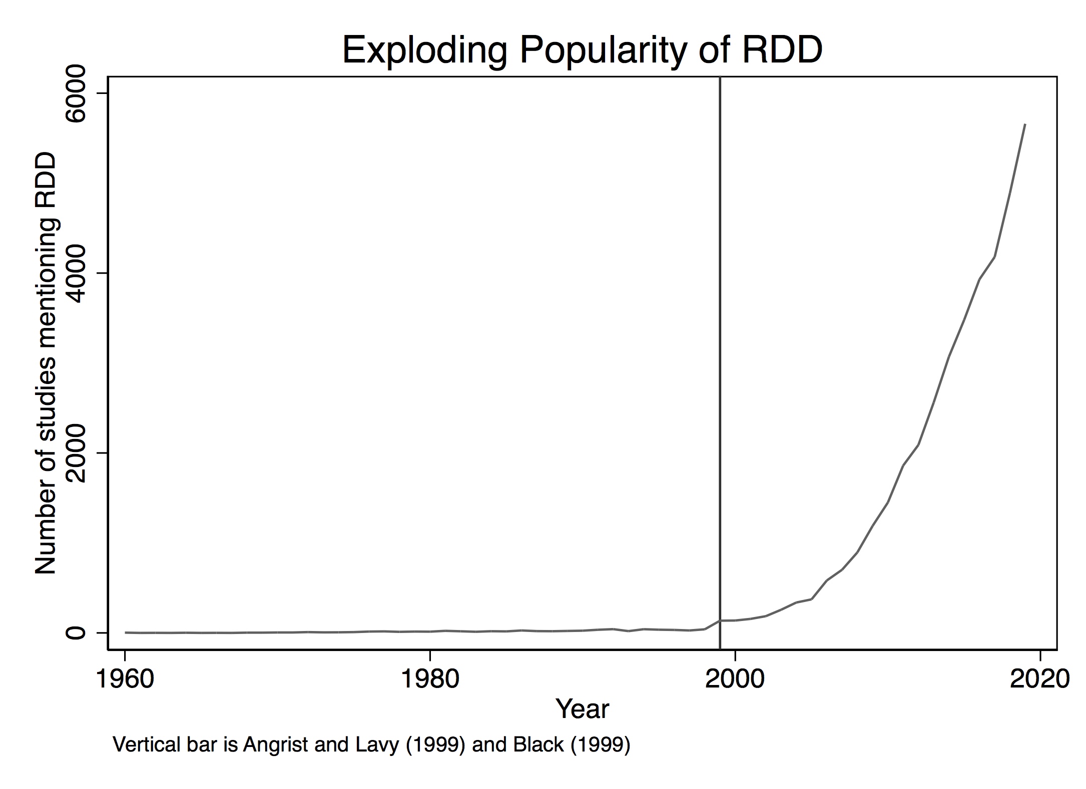
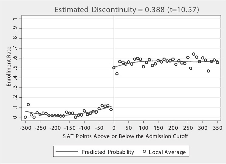
Over the last 25 years, interest in the regression discontinuity design (RDD) has surged (Figure 6.1). However, the method itself dates back 60 years to the work of Donald Campbell, an educational psychologist who pioneered its use. The earliest known application appears in Thistlehwaite and Campbell (1960), where he and his coauthor studied the effect of merit awards on future academic outcomes. Merit awards were given to students based on a test score cutoff—students above the cutoff received the award, while those below did not. This clear treatment assignment allowed them to estimate the causal effect of merit awards on future academic performance with precision.1 Despite Campbell’s advocacy and his understanding of its potential, RDD remained underutilized, largely confined to a handful of studies as it was viewed to be too niche and specialized.
Figure 6.1: Regression discontinuity over time.
Although Goldberger (1972) discussed RDD, the field of economics showed little interest until two young economists, in 1999, published empirical papers in the Quarterly Journal of Economics that popularized the method. Angrist and Lavy (1999) investigated the effect of class size on student achievement by leveraging a policy in Israeli public schools that mechanically created smaller classes when student numbers exceeded a specific threshold. Around the same time, Black (1999) innovatively applied what is now called a “spatial RD” by using discontinuities in school district zoning to estimate people’s willingness to pay for better schools. These studies marked a turning point, broadening RDD’s appeal. Further visibility came with Lee and Lemieux (2010)’s 2010 article in the Journal of Economic Literature, which provided a comprehensive overview of the method, as well as Mostly Harmless Econometrics by Angrist and Pischke (2009). Technological advancements, such as the growing availability of large administrative datasets, also likely contributed to RDD’s rise, as these datasets often contain the precise data structures required for an RDD study.
In this chapter, I will explore this method, emphasizing the intuition behind its assumptions and associated estimation methods. We will focus on the sharp RDD, reserving the fuzzy design for the Instrumental Variables chapter. I’ll conclude with a hands-on replication example, complete with code, to help you better understand the practical aspects of implementing and interpreting RDD studies.
Intuition of RDD
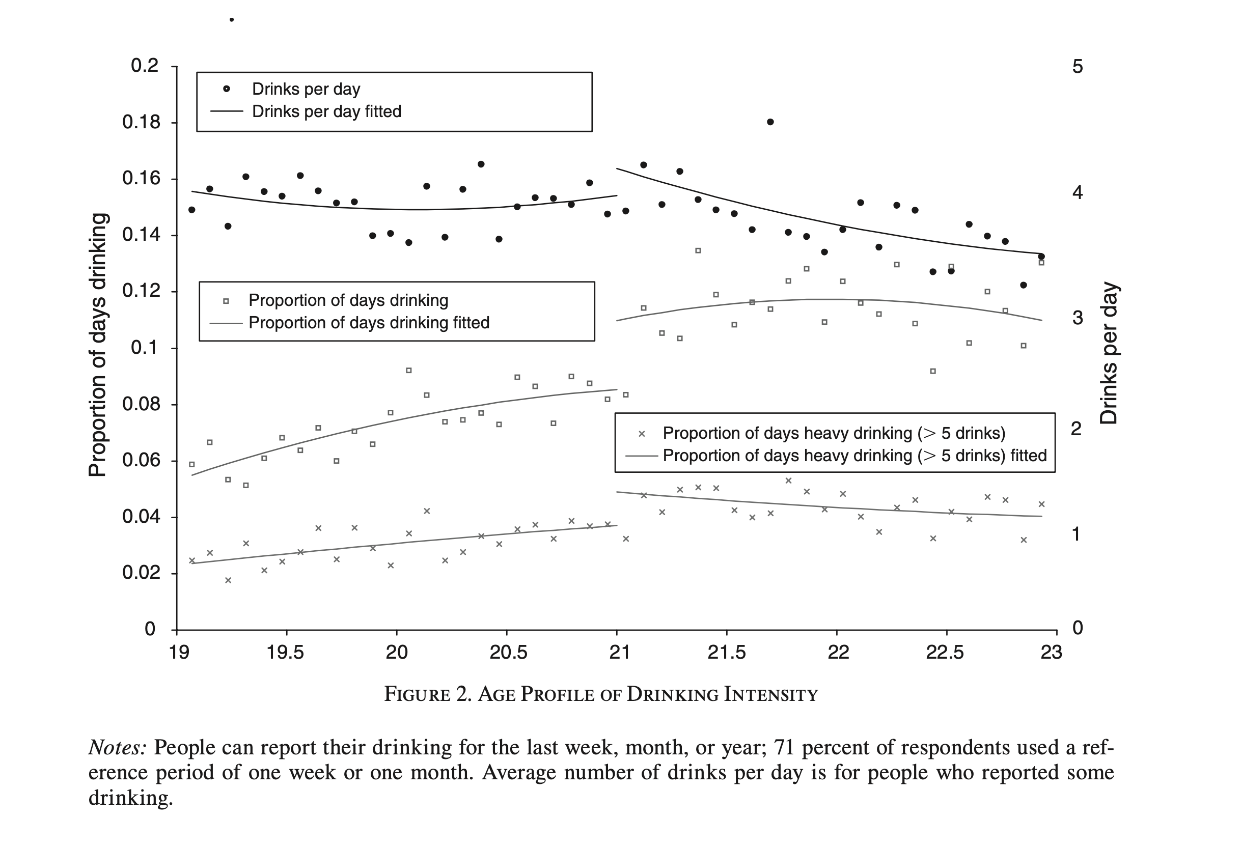
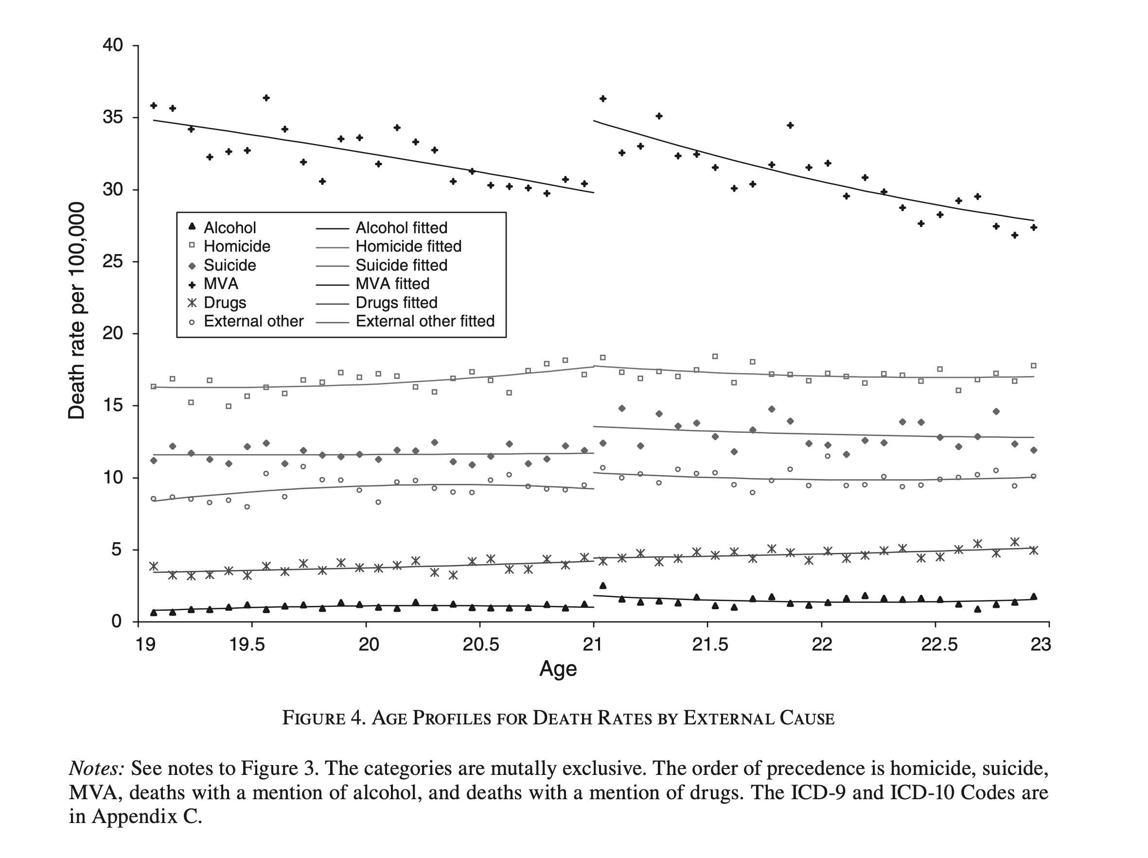
When teaching RDD, I like to start with visuals from actual studies because visuals play a central role in understanding RDD. But not just any visuals—RDD visuals have a particular presentation that clearly illustrates what the method is doing. the figures below come from Carpenter and Dobkin (2009), a study examining the causal effect of alcohol consumption on mortality. In the figure below, drinking behavior is plotted against age, while in the figure below, mortality is plotted against age. Both of these figures are typical of RDD studies. But what makes them distinctively RDD visuals?
In the figure above, alcohol consumption is measured by survey responses about frequency and quantity of drinking. Three main elements in this figure are key to understanding its purpose: the dots, the lines, and the breaks between lines. The dots represent average responses within specific age ranges. For instance, each dot aggregates responses from people who were of similar age, measured monthly (i.e., the first dot includes people who were between 19 years old and 19 years and one month old, and so on). Each dot is the average answer for people in that particular age range.
The curved lines show the predicted values from a regression model. This likely involved regressing responses on age and age-squared, which gives the line its curve. We’ll go over how this is done later, but for now, understand that these lines represent expected drinking behavior as a function of age.
Finally, there’s the “breaks” in the lines. Notice that the two lines for each question don’t touch, indicating that separate regression models were fit for people below and above age 21. For example, looking at the top set of dots (drinks per day), the predicted average slightly increases after age 21. However, it’s not just the change in slope that’s important—it’s the fact that the lines don’t connect. This gap results from different models on either side of the 21-year threshold.
The middle set of dots (share of days drinking) illustrates this further. Before age 21, the prediction for drinking frequency stops at around 8% of days. For those just above age 21, the regression line indicates an increase to 10% of days. This visual suggests a causal story: as respondents reach the legal drinking age of 21, their alcohol consumption rises.
Now consider the figure below, which examines mortality instead of drinking behavior. Here, the authors used death records with precise birth and death dates, allowing them to calculate exact ages at death. Like the previous figure, this one shows separate regression models on either side of the age-21 threshold, indicated by a break in the lines for each mortality outcome.
The “motor vehicle accidents” line is particularly revealing. Mortality due to motor vehicle accidents decreases with age, starting around 35 deaths per 100,000 people at age 19 and falling to a low of 30 at age 21. After age 21, the line jumps back up to around 35 deaths, likely due to increased alcohol consumption upon reaching the legal drinking age. Other mortality outcomes don’t exhibit this same jump, underscoring the association between drinking and car accidents.
These two visuals, taken together, tell a compelling story—one that resonates for those familiar with the risks of drinking and driving in the United States. When we see a jump in drinking behavior and corresponding car accident mortality at age 21, it intuitively suggests that legalized drinking plays a role. But it’s more than intuition; if this picture truly represents an RDD setup, it tells us something quantifiable: the average effect of legalized drinking is an increase in mortality by approximately 5 deaths per 100,000 people for 21-year-olds. As we’ll show, the effect we’re estimating is quite literally a local effect at age 21. While we use data from a range of ages to gain enough statistical power, the main focus is the difference at the cutoff, which here translates to around 5 more deaths per 100,000 at age 21. Given that there are about 4.3 million 21-year-olds in the United States, this effect translates to roughly 215 additional fatalities each year—solely caused by legalized alcohol.
And that’s the core of RDD. Causal inference leverages real-world mechanisms like randomization, covariates, or instruments to identify causal effects, and RDD is no exception—it just uses a different treatment assignment mechanism than the others. In RDD, treatment assignment changes at a known, observable cutoff—the “running variable”—which, in this case, is age. This makes RDD conceptually similar to methods relying on unconfoundedness, where covariates determine treatment assignment. However, RDD differs because it uses variation across a cutoff (here, age 21) rather than within the same value of a covariate. By formalizing this quasi-experimental setup, we can estimate treatment effects specifically for those who shift into treatment at the cutoff.
Jargon and Data
Each research design in this book comes with its own set of jargon—words that describe the treatment assignment mechanism and features related to treatment and its effects. These terms aren’t always statistical concepts themselves but are critical for understanding how each design works.
In RDD, the treatment assignment mechanism is called the running variable. Ideally, this is a continuous score, although it can also be multi-valued as long as it has enough granularity. This score determines whether a unit receives treatment or not. In our alcohol and mortality example, the running variable was age. In Hoekstra (2009), which examines the effect of attending a state flagship university on earnings, the running variable was a high school student’s standardized test score—used by the university to decide admissions.
Another key term is trends. In the context of RDD, trends are not time trends; instead, they refer to how the outcome changes as a function of the running variable. For example, in our alcohol and mortality study, we saw that as age increased, average mortality decreased. This negative correlation is an outcome trend. Strong trends can pose challenges for estimation, as they make it harder to detect effects in smaller samples.
Next, there’s the cutoff or threshold. This is a known value on the running variable where treatment assignment changes. Units on one side of the cutoff receive treatment, while those on the other side do not.
Finally, we have the terms discontinuity and jump. The essence of RDD is exploiting a cutoff in the running variable—where treatment assignment changes—to detect whether there’s a corresponding discontinuous change (up or down) in the mean outcome at the cutoff.
So, where do we find these running variables making treatment assignments with their cutoffs? They sound like they’d be rare. They are not. Humans embed them into algorithms all the time, whether simple (e.g., age) or complex (e.g., Uber’s surge pricing algorithm). Governments frequently use running variables with known cutoffs, such as age 65 for Medicare eligibility or income thresholds for poverty programs, as the mechanism by which some people are included and some excluded from some program. Identifying these “treatment assignment mechanisms” requires in-depth knowledge of the context you’re studying. The key is recognizing that the mechanism is based on a score of some kind, which opens the door for RDD.
Of course, all studies require data, and RDD is no exception. Specifically, we need a lot of data around the discontinuities. This implies that RDD is most effective with very large datasets. Large sample sizes are a hallmark of RDD studies, especially because strong trends in the running variable can increase the sample size requirements. Researchers often rely on administrative datasets, such as birth or education records, which provide the dense data needed for this method.
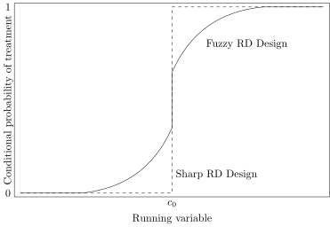
Figure 6.4: Sharp vs fuzzy RDD. Similar to a graph in (Klaauw 2002).
6.2 Identification Assumptions
Sharp RD Design
There are generally two accepted types of RDD studies. First, there’s the sharp design, where the probability of treatment jumps from 0 to 1 at the cutoff. Second, there’s the fuzzy design, where the probability of treatment discontinuously increases at the cutoff but does not reach certainty. In both designs, there exists a running variable, \(X\), which, upon reaching a cutoff \(c_0\), changes the likelihood of receiving treatment. the figure above illustrates the similarities and differences between the sharp RDD and the fuzzy RDD.
In a sharp RDD, treatment assignment is a deterministic function of the running variable \(X\).2 An example of a sharp design is Medicare enrollment, which is assigned sharply at age 65 (excluding cases of early disability).
A fuzzy RDD, on the other hand, represents a discontinuous jump in the probability of treatment at the cutoff without reaching a probability of 1. In these cases, the cutoff serves as an instrumental variable for treatment. For example, Angrist and Lavy (1999) used a fuzzy RDD by instrumenting for class size with a function derived from Israeli schools’ mechanical rules for determining class sizes.
More formally, in a sharp RDD, treatment status is a deterministic and discontinuous function of a running variable \(X_i\), defined as: \[
D_i =
\begin{cases}
1, & \text{if } X_i \geq c_0, \\
0, & \text{if } X_i < c_0
\end{cases}
\tag{6.1}\] where \(c_0\) is a known threshold or cutoff. If we know the value of \(X_i\) for each unit \(i\), we can determine with certainty whether that unit is treated. For example, if we know your age and you live in the United States, we can determine with certainty whether it is legal for you to drink alcohol. In sharp designs, if treatment status is fully determined by the running variable, we call it sharp. If treatment assignment is probabilistic based on the running variable, it’s a fuzzy design.
One key feature of sharp RDD is the absence of common support. Although this design is based on “selection on observables,” it does not allow overlap across treatment groups at the same value of the running variable. For example, in the United States, no 19-year-olds can legally drink, and all 21-year-olds can, meaning we have no overlap or “common support” between these groups for drinking legality. This absence of common support means we can’t directly compare treated and untreated units within the same value of the running variable, as we might with propensity scores or subclassification. Instead, we rely on regression and nonparametric methods to extrapolate or impute outcomes across the cutoff.
Target Parameter
The target parameter in any RDD, when treatment is sharply determined by the running variable, is the average effect of the treatment for the group of units at the cutoff. This parameter is technically an average treatment effect (\(\mathit{ATE}\)), but it applies specifically to those at the cutoff, which is why it is sometimes called the local average treatment effect. While we could debate terminology, the essential point is that this parameter captures the average treatment effect for individuals whose values of the running variable are precisely at the cutoff. Before defining it formally, let’s examine two figures to build intuition.
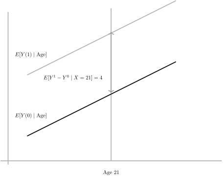
Assume that the running variable is age and the treatment is legalized purchasing of alcohol at age 21. In the figure above, I have drawn two expected potential outcome functions, \(E[Y^1 \mid \text{Age}]\) and \(E[Y^0 \mid \text{Age}]\). Notice that these functions are parallel to one another. Since each line represents one of the two expected potential outcomes across the running variable, the vertical distance between them at any point represents the treatment effect at that age. So, if we examine the gap between the two functions at a particular point on the running variable, this gap is the \(\mathit{ATE}\) for that value of the running variable. For instance, assume that the \(\mathit{ATE}\) at age 21 is 4.
Figure 6.5: Smooth potential outcomes with homogeneous treatment effects across age, the running variable. \(ATE\) is measured at the cutoff.
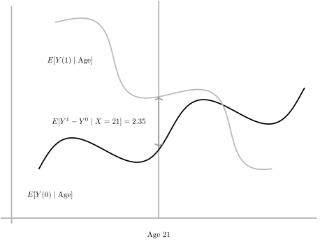
Now look at the figure above. Notice that in this case, the expected potential outcome functions are no longer parallel; instead, they curve and even intersect around age 23. What does this imply? This pattern reflects heterogeneous treatment effects across age. While the \(\mathit{ATE}\) at age 21 is 2.35, the treatment effect is much larger for younger individuals, decreases for middle-aged individuals, and eventually becomes negative for the oldest people in the sample.
Figure 6.6: Smooth potential outcomes with heterogeneous treatment effects across age, the running variable. \(ATE\) is measured at the cutoff.
When treatment effects are constant, as in the figure above, the \(\mathit{ATE}\) at the cutoff is representative of the entire population’s treatment effects. However, under unbounded heterogeneous treatment effects, as in the figure above, the \(\mathit{ATE}\) at the cutoff only reflects the treatment effect for units at that specific point on the running variable. It does not necessarily provide information about treatment effects for other parts of the population.
Let’s denote the \(\mathit{ATE}\) at the cutoff as \(\delta\). This parameter can be formally defined as: \[
\begin{align}
\delta &= \lim_{X_i \to c_0} E\big[Y^1_i \mid X_i = c_0\big] -
\lim_{X_i \to c_0^-} E\big[Y^0_i \mid X_i = c_0\big] \\
&= \lim_{X_i \to c_0} E\big[Y_i \mid X_i = c_0\big] - \lim_{X_i \to
c_0^-} E\big[Y_i \mid X_i = c_0\big]
\end{align}
\tag{6.2}\] The sharp RDD estimates this average causal effect of treatment as the running variable approaches the cutoff. It is only in this limit that we achieve overlap across treatment conditions, making identification possible. This average causal effect at the boundary represents the \(\mathit{ATE}\) for individuals exactly at the cutoff. In other words, it captures the treatment effect specific to the subpopulation defined by \(X = c_0\).
Because identification in RDD relies on a limiting argument, we are technically identifying an average causal effect exclusively for units precisely at the cutoff. If treatment effects vary along the running variable, then what we estimate is an average effect that is local to the cutoff. Formally, this average treatment effect can be expressed as: \[
\begin{equation}
\delta_{SRD} = E\big[Y^1 - Y^0 \mid X = c_0\big]
\end{equation}
\tag{6.3}\]
Extrapolation plays a critical role in estimating treatment effects with sharp RDD. For a unit \(i\) just below \(c_0\), treatment status is \(D_i = 0\), while for a unit \(i\) just above \(c_0\), treatment status is \(D_i = 1\). At any given value of \(X_i\), we observe either treated or untreated outcomes, but not both. This lack of common support means that we must rely on extrapolation to estimate the potential outcomes across the cutoff. And to do that reliably, we must make assumptions about the potential outcome functions.
Smoothness Assumption
Hahn, Todd, and Klaauw (2001) proved you can identify the \(\mathit{ATE}\) at the cutoff by assuming that the expected potential outcomes were smooth across the cutoff. This means that if you could trace out the functions, \(E[Y_i^0 | X=c_0]\) and \(E[Y_i^1 | X=c_0]\), they’d move across the cutoff without you picking up your pen to draw it somewhere else. If the mean potential outcomes are smooth, then it more or less means nothing other than the treatment happened to shift the outcomes at \(X=c_0\) except for the treatment. In other words, smoothness means that the outcomes don’t shift ordinarily at the cutoff.
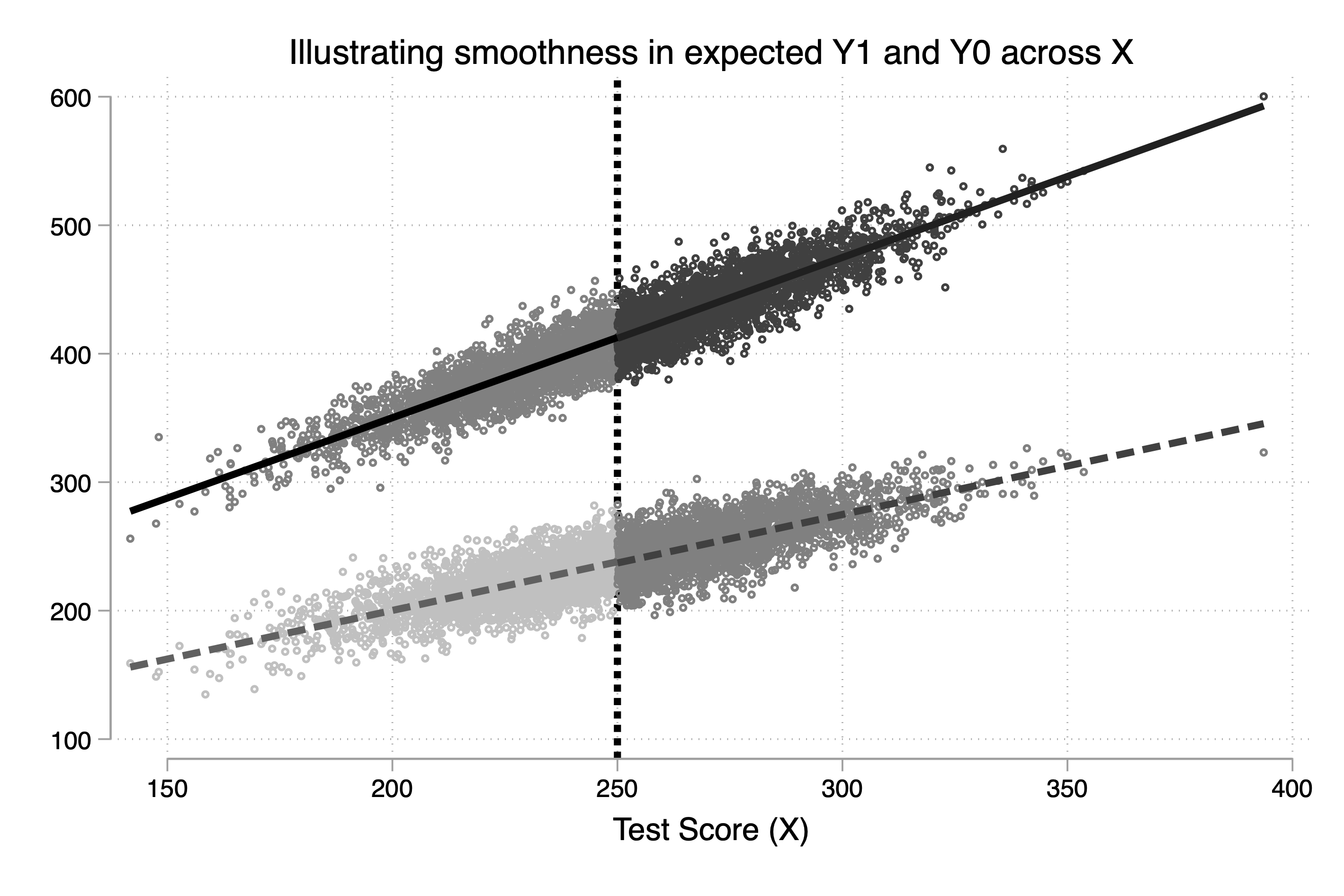
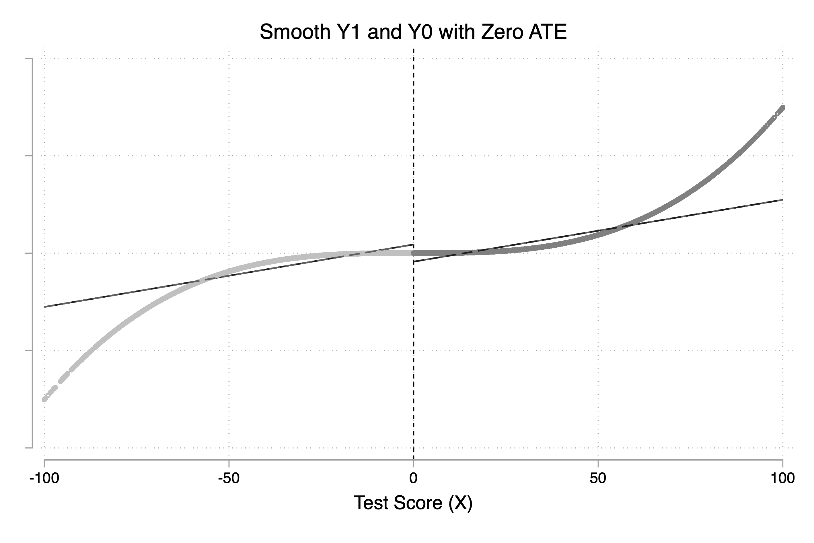
Abstract ideas like this are often easier to understand with data. To illustrate the concept, let’s look at an example using a simple simulation. I’ll generate both potential outcomes using the following formula. Notice that \(Y^1\) depends on \(X\) as does \(Y^0\), but the slope differs for each.
The smoothness assumption simply means that there is no jump in either \(E[Y^1]\) or \(E[Y^0]\) at the cutoff, and as you can see in our two potential outcome formulas, there isn’t. And when we plot these two potential outcomes against \(X\), there is no jump visually either (Figure 6.7).
Figure 6.7: Smooth expected potential outcomes, \(E[Y^1]\) and \(E[Y^0]\), across the running variable, including through the cutoff, \(X = 250\).
What Hahn, Todd, and Klaauw (2001) showed is that RDD can identify the \(\mathit{ATE}\) at the cutoff if we have potential outcome functions like those depicted in Figure 6.7. Notice in the equation that the treatment does not cause these potential outcomes to change once treated. In fact, nothing happens at the cutoff—the two functions are smooth.
6.3 Estimation
Regression Specifications
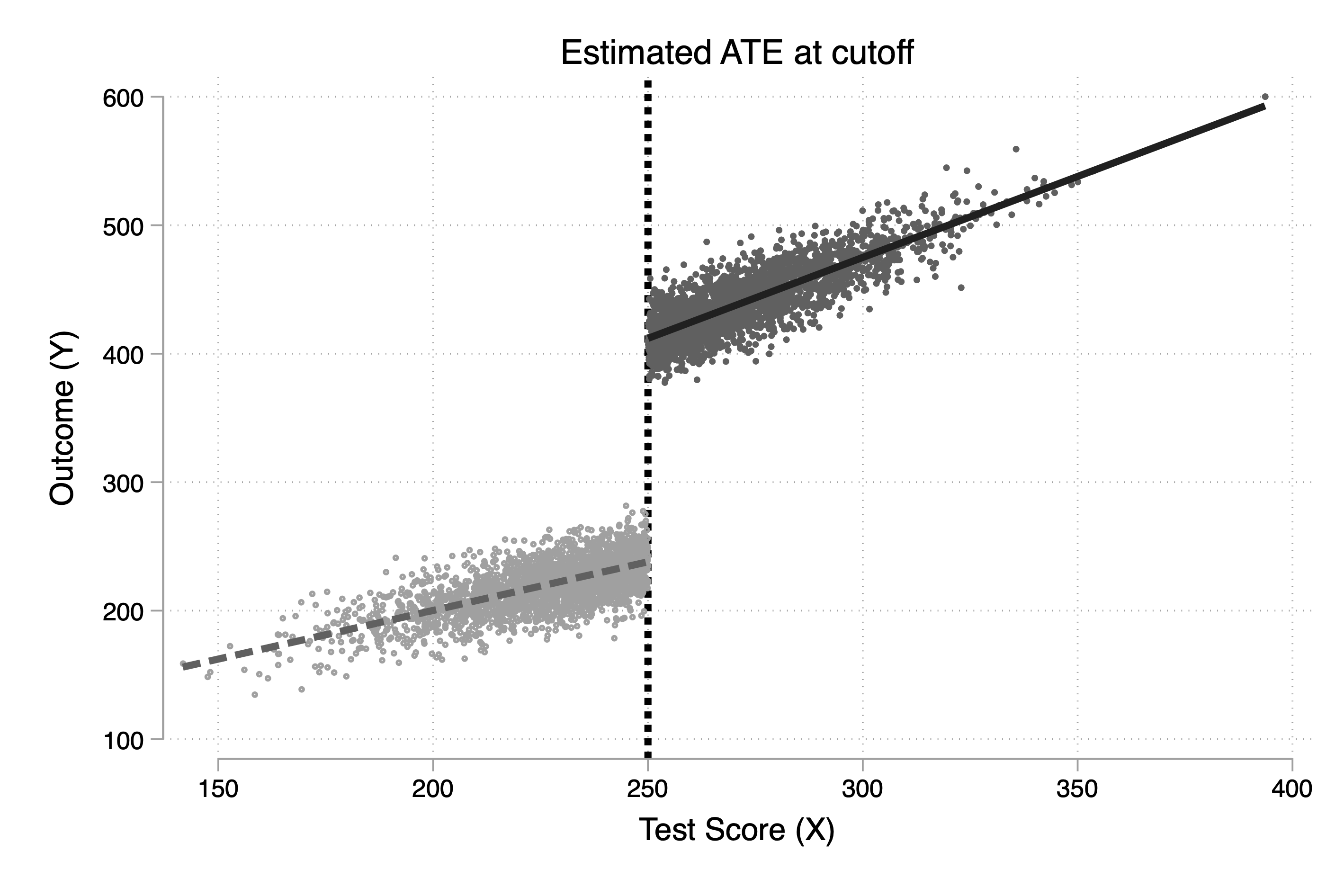
When units are treated, then \(Y_i=Y^1_i\). And when they aren’t, then \(Y_i=Y^0_i\). This means that we never observe both potential outcomes for each unit, and when treatment is sharp, then we also never observe \(Y^1_i\) for units whose running variable value is below the cutoff, and we never observe \(Y^0_i\) for units whose running variable value is above the cutoff. Such situations cause us to move from the picture depicted in Figure 6.7 to the picture depicted in Figure 6.8.
Figure 6.8: Jump in expected outcome, \(E[Y]\), at the cutoff, \(X = c_0\) equal to \(E[Y^1 - Y^0|X = c_0]\).
Our goal is to find an estimator that can get an accurate estimate of the gap between where the dashed line from the left touches the vertical line and the solid line from the right does, because at that point, the gap is the \(\mathit{ATE}\). The problem is that we have no units with both \(Y^0\) and \(Y^1\) at the cutoff, so we must use estimators that can take the data from either side, fit a model, and then project predicted \(\widehat{Y}\) at the cutoff. And a natural choice for doing that is OLS, so long as we have the correct specification.
There are two steps for estimate the \(\mathit{ATE}\) at the cutoff using regressions. They are:
Recenter the running variable by subtracting the cutoff value from it
Regress \(Y_i\) onto a constant, the treatment variable, the running variable, and an interaction
When I say recenter, I mean generate a new running variable equal to the old running variable minus the cutoff value itself:
\[
\begin{equation}
\widetilde{x} = x_{original} - 250
\end{equation}
\tag{6.4}\] When you do this, the running variable is equal to zero at the original cutoff.
Secondly, we use the running variable and the treatment indicator to mark where the treatment occurred. We then estimate Equation 6.5:
\[
\begin{equation}
Y_i = \alpha + \delta D_i + \beta_1 \widetilde{X}_i + \beta_2 D_i
\times \widetilde{X}_i + \varepsilon_i
\label{eq:rdd_ols}
\end{equation}
\tag{6.5}\] with \(\widetilde{X}\) being the recentered running variable. Notice that we are interacting the treatment indicator with the running variable. This allows for heterogeneous treatment effects. More to the point, it allows for the slopes on the expected potential outcome functions to differ, which implies heterogeneous treatment effects. The slope on the running variable below the cutoff is estimated as \(\widehat{\beta_1}\), the slope on the running variable above the cutoff is estimated as \(\widehat{\beta_2}\), and \(\widehat{\delta}\) is our estimate of \(\delta_{SRD}\).
Nonlinearities in DGP and Misspecified Regressions
The previous data generating process had explicitly made potential outcomes increase by 0.75 or 1.25 for every one unit change in the running variable, depending on the potential outcome. But what if the effect of the running variable on outcomes was highly nonlinear? In that case, we had potentially underfit the model, which can introduce bias.3
Let me illustrate the setup and then show you the regression specification in code so you can see it. We start by defining the expected potential outcome functions as a function of a parametric regression model: \[
\begin{align}
E\big[Y^0\mid X_i\big] &=\alpha + \beta_{01} \widetilde{X}_i +
\dots + \beta_{0p}\widetilde{X}_i^p \nonumber
\\
E\big[Y^1\mid X_i\big] &=\alpha + \delta + \beta_{11}
\widetilde{X}_i + \dots + \beta_{1p} \widetilde{X}_i^p
\end{align}
\tag{6.6}\] where \(\widetilde{X}_i\) is the recentered running variable (i.e., \(X_i - c_0\)). Centering at \(c_0\) ensures that the treatment effect at \(X_i=X_0\) is the coefficient on \(D_i\) in a regression model with interaction terms.
If we want to formally derive the regression model that goes with these functions, we have to use the switching equation. It is: \[
\begin{eqnarray}
Y_i &=& D_i Y^1_i + (1-D_i) Y^0_i \nonumber \\
Y_i &=& D_i Y^1_i + Y^0_i - D_i Y^0_i \nonumber \\
Y_i &=& Y^0_i + D_i Y^1_i - D_i Y^0_i \nonumber \\
Y_i &=& Y^0_i + D_i (Y^1_i - Y^0_i) \nonumber \\
E[Y\mid X]&=&E[Y^0\mid X]+D \Big(E[Y^1\mid X] - E[Y^0 \mid X]\Big )
\end{eqnarray}
\tag{6.7}\] where the last step simply takes the conditional expectation of the left- and right-hand side with respect to the running variable.
Since our goal is to model the expected potential outcome functions so that they are allowed to have their own separate relationship with the running variable, then we have to interact the treatment indicator with the polynomials as I have done in Equation 6.8. \[
\begin{equation}
Y_i= \alpha + \beta_{01}\tilde{X}_i + \dots +
\beta_{0p}\tilde{X}_i^p + \delta D_i+ \beta_1^*D_i \tilde{X}_i +
\dots + \beta_p^* D_i \tilde{X}_i^p + \varepsilon_i
\label{eq:rdd_polynomial}
\end{equation}
\tag{6.8}\] where \(\beta_1^* = \beta_{11} - \beta_{01}\), and \(\beta_p^* = \beta_{1p} - \beta_{0p}\). The equation we looked at earlier was just a special case of the above equation with \(\beta_1^*=\beta_p^*=0\). The treatment effect at \(c_0\) is \(\delta\). And the treatment effect at \(X_i-c_0>0\) is \(\delta + \beta_1^*c + \dots + \beta_p^* c^p\).
Let’s see this in action with another simulation, only this time I will intentionally model the potential outcome functions as a function of higher order polynomials, but I will impose zero treatment effects too by setting \(Y^1-Y^0\). This ensures that the \(\mathit{ATE}\) is zero at the cutoff, but the higher order polynomials will be underfit.
gen x = rnormal(250, 30)
gen x_c = x-250
gen     x2 = x_c*x_c
gen     x3 = x_c*x_c*x_c
gen     y0 = 1000 + 0*treat + 0.75*x_c + -0.5*x2 + 1.5*x3 + rnormal(0,1000)
gen     y1 = y0
If I draw an OLS line through either side of y0 and y1, both of which were generated as based on a third order polynomial transformation of the running variable, then I get Figure 6.9. You can probably immediately see what is going to happen once we move from the potential outcomes to the realized outcomes using the switching equation, but before we do, look closely at the potential outcomes—they touch. They touch because there is no treatment effect, and if there isn’t a treatment effect, then it means that at the cutoff they are both smooth and equal to one another, as that will give you an \(\mathit{ATE}\) of zero.
Figure 6.9: Smooth expected potential outcomes with no treatment effects.
Notice in Figure 6.9 that the straight lines are OLS regression lines, fit through the left-hand side of the cutoff separately from the right-hand side. This has underfit the data, which is clearly visible with the naked eye. But what happens if I then estimate three regression models of the following form?
reg y treat##c.x_c, robust
reg y treat##c.(x_c x2), robust
reg y treat##c.(x_c x2 x3), robust
I report the estimated \(\widehat{\delta}_{SRD}\) for each regression specification in Table 6.1. As you can see, models 1 and 2 find large and statistically significant effects for \(\widehat{\delta}_{SRD}\). That’s because these specifications are underfit. But when I include polynomials up to a cubic (i.e., \(X\), \(X^1\), and \(X^3\)), then the estimated treatment effect drops to around zero.
Table 6.1: Estimated \(ATE\) and Standard Errors Across Model Specifications
Estimated
\(-176,368.30\)
\(61,866.33\)
\(1.14\)
\((2,242.15)\)
\((873.49)\)
\((25.52)\)
Polynomials
\(X\)
\(X\), \(X^2\)
\(X\), \(X^2\), \(X^3\)
So, what’s the lesson here? We want to understand the challenges we face with these regressions because they are sensitive to the outlying values of the variable when fitting the lines. Ultimately, even though we are focused on the treatment indicator and its coefficient, because we are extrapolating based on the functional form, if we misspecify, then we can get wildly incorrect values. In this case, we underfit the model and, given the strength of these polynomials on the potential outcomes, it turned out to lead to strong biases.
Nonparametric Kernels
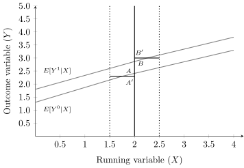
But, as we mentioned earlier, Gelman and Imbens (2019) has recently discouraged the use of higher order polynomials when estimating local linear regressions. An alternative is to use kernel regression. The nonparametric kernel method has problems because you are trying to estimate regressions at the cutoff point that can result in a boundary problem. In the figure below, the bias is caused by strong trends in expected potential outcomes throughout the running variable.
Figure 6.10: Parallel upward-sloping lines for expected potential outcomes with bins aligned at specified X values. Inspired by regression discontinuity illustrations by Fabian Waldinger.
While the true effect in this diagram is \(AB\),—that is the distance from \(E[Y^1|X]\) (B) to \(E[Y^0|X]\) (A)—if you take averages within the bins, then it will necessarily intersect those potential outcome functions at spots where the mean “hits the boundary” at the wrong spots if there are trends. You can see why I think it’s the trends in the potential outcome functions that are causing the bias, because look—\(B'A' \neq BA\). Now, the bias is small in this case, but that’s because I drew it that way.
This is the risk of using weights that are the same for each unit within the bin. We call this using a rectangular kernel, which is the standard kernel, when producing histograms. We are basically using histograms to estimate the mean of the expected potential outcome functions as they cross the threshold, and with trends and a rectangular kernel, it’ll be biased.
The standard solution to this problem is to run local linear nonparametric regression (Hahn, Todd, and Klaauw 2001). In the case described above, this would substantially reduce the bias. So, what is that? Think of kernel regression as a weighted regression restricted to a window (hence “local”). The kernel provides the weights to that regression.4 A rectangular kernel would give the same result as taking \(E[Y]\) at a given bin on \(X\). But triangular kernels give more importance to the observations closest to the cutoff without changing the underlying strategy; it’s just changing the weighting scheme. The model is some version of: \[
\begin{equation}
(\widehat{a},\widehat{b})=_{a,b}
\sum_{i=1}^n\Big(y_i - a -b(x_i-c_0)\Big)^2K
\left(\dfrac{x_i-c_o}{h}\right)1(x_i>c_0)
\end{equation}
\tag{6.9}\]
A kernel is like the shape of the window. A rectangular kernel, for instance, would be like a plain, rectangular window—every point within the window is equally weighted. A triangular kernel, on the other hand, would tilt the shape of the window so it narrows as you approach the edges. Why would you ever want a funky, triangular window? Imagine you wanted to draw attention to something—a mountain, for example—that’s closer to the center of your view. The triangular window “weights” the view so that the center gets more emphasis than the edges, which could make the mountain really stand out. The purpose of using a kernel is similar: it adjusts how much weight is given to data points based on how far they are from the center of the “window.”
Now, the bandwidth is the size of the window. A small bandwidth means a tiny window, letting you focus closely on what’s right in front of you. A large bandwidth means a big window, taking in a broader view. Choosing the right bandwidth is important—too small, and you miss the bigger picture; too large, and the details get blurry.
Finally, bins relate to the intervals we use to summarize the data. Think of them as sections, or as slices along the running variable (like panels of glass in a multi-pane window). When you fit a regression within a bin, you’re focusing on just that slice of data. The bins and their sizes help define how much data is grouped together for the analysis.
Optimal Bandwidths and Specification Choices
When transitioning to nonparametric regression methods, researchers face several critical choices: the bandwidth\(h\), the kernel\(K(\cdot)\), and the polynomial order\(p\).5 Each of these choices directly impacts the quality of the estimation, and there is no universally “correct” answer. Instead, researchers must carefully balance bias, variance, and subjective judgment, while acknowledging that these choices inherently introduce uncertainty and potential bias into the analysis.
The bandwidth \(h\) determines the width of the neighborhood around the cutoff that is used for estimation. Smaller bandwidths focus on observations close to the cutoff, reducing bias but increasing variance due to the smaller number of observations. Larger bandwidths include more data, decreasing variance but risking bias if the included observations deviate significantly from the true function. Recent advancements have made it possible to estimate optimal bandwidths that minimize the mean squared error (MSE), striking an ideal balance between bias and variance. Some methods even allow for bandwidths to vary asymmetrically on either side of the cutoff, which can be especially useful when the data exhibit different densities or trends across the threshold.
The kernel function \(K(\cdot)\) assigns weights to each observation within the bandwidth based on its distance from the cutoff. These weights determine how much influence each observation has on the estimate. Different kernels provide varying weighting schemes:
Rectangular kernels assign equal weight to all observations within the bandwidth, similar to taking the mean of observations within a bin.
Triangular kernels prioritize observations closer to the cutoff by assigning weights that decline linearly as the distance increases.
Epanechnikov kernels use a parabolic weighting scheme, balancing bias and variance.
Calonico, Cattaneo, and Titiunik (2014) recommend the triangular kernel when paired with an MSE-optimal bandwidth. This combination provides unbiased and efficient point estimates by assigning maximum weight to observations at the cutoff and zero weight to those outside the bandwidth.
The polynomial order \(p\) determines the complexity of the regression used to estimate the potential outcomes. A simple difference in means (\(p=0\)) is intuitive but suffers from boundary problems, where the estimates at the cutoff are biased due to trends in the running variable. Higher-order polynomials (\(p > 1\)) address this issue but can lead to overfitting and instability. Local linear regression (\(p=1\)) is generally preferred, as it balances simplicity with robustness. However, this choice interacts with the bandwidth \(h\), which governs the size of the neighborhood used for fitting the model.
Local polynomial estimation follows a structured approach, and it follows these steps:
Choose a polynomial order \(p\) and a kernel function \(K(\cdot)\).
Select a bandwidth \(h\).
For observations above the cutoff, fit a weighted least squares (WLS) regression of \(Y\) on a constant and recentered running variable term with \(p\) polynomial terms and weights \(K\left(\frac{X_i-c}{h}\right)\) for each observation. This estimates the point \(\mu_+ = E[Y_i^1 \mid X_i = c]\): \[
\widehat{\mu}_+: \widehat{Y}_i = \widehat{\mu}_+ +
\widehat{\mu}_{+,1}(X_i-c) + \widehat{\mu}_{+,2}(X_i-c)^2 + \dots +
\widehat{\mu}_{+,p}(X_i-c)^p
\tag{6.10}\]
Repeat the above regression for observations below the cutoff to estimate \(\mu_- = E[Y_i^0 \mid X_i = c]\): \[
\widehat{\mu}_-: \widehat{Y}_i = \widehat{\mu}_- +
\widehat{\mu}_{-,1}(X_i-c) + \widehat{\mu}_{-,2}(X_i-c)^2 + \dots +
\widehat{\mu}_{-,p}(X_i-c)^p
\tag{6.11}\]
Calculate the sharp regression discontinuity (RD) point estimate as: \[
\widehat{\delta} = \widehat{\mu}_+ - \widehat{\mu}_-
\tag{6.12}\]
The bias-variance trade-off is central to these methods. Approximation error (bias) arises when \(p\), \(h\), and \(K(\cdot)\) fail to capture the true underlying function, while variance increases when fewer observations near the cutoff are used. The MSE is the combination of these two sources of error: \[
MSE(\widehat{\delta}) = Bias^2(\widehat{\delta}) + Variance(\widehat{\delta})
\tag{6.13}\] Minimizing the MSE provides an optimal bandwidth \(h_{MSE}\), which balances bias and variance. The solution, proportional to \[
h_{MSE} \propto \bigg( \frac{V}{B^2} \bigg)^{\frac{1}{2p+3}}
n^{-\frac{1}{2p+3}},
\tag{6.14}\] indicates that optimal bandwidths is larger with a smaller sample size (to reduce variance) and is smaller with more curvature or more noise in the data (to reduce bias). These data-driven, automated methods reduce the subjectivity in bandwidth selection, providing a more reliable framework for estimation.
Inference
When making statistical inferences in RD designs, it’s crucial to understand the limitations of conventional confidence intervals. Asymptotic 95% confidence intervals for RD point estimators can be misleadingly small if they fail to incorporate the bias and variance terms. This stems from the fact that the local polynomial approach is a nonparametric approximation of the unknown potential outcome regression functions. The result is a confidence interval of the form: \[
CI = \bigg[ (\widehat{\delta} - B) \pm 1.96 \cdot \sqrt{V} \bigg],
\tag{6.15}\] where \(B\) represents the bias and \(V\) the variance. Addressing these terms is not just a technical detail but a cornerstone of valid inference in RD designs.
The conventional approach to confidence intervals assumes that the polynomial used in the estimation process perfectly approximates the underlying potential outcomes. This assumption leads to the following confidence interval: \[
CI_{us} = \bigg[ \widehat{\delta} \pm 1.96 \cdot \sqrt{V} \bigg]
\tag{6.16}\] However, this method has significant limitations. If the approximation error is non-trivial—say, due to trends in the running variable or inadequate polynomial order—then inference based on conventional intervals will be incorrect. This leads to over-rejection of the null hypothesis of zero treatment effects, which Cattaneo, Jansson, and Ma (2019) strongly discourage. Conventional intervals are, therefore, not credible when there is even moderate bias.
One way to address this issue is through bias-corrected confidence intervals. These intervals adjust for the bias term by estimating it with \(\widehat{B}\), resulting in: \[
CI_{bc} = \bigg[ (\widehat{\delta} - \widehat{B}) \pm 1.96 \cdot \sqrt{V} \bigg]
\tag{6.17}\] While this approach mitigates bias, it introduces new challenges. The bias term \(B\) depends on the trends in the running variable and whether the chosen polynomial order adequately captures these trends. Unfortunately, this method does not account for the additional variability introduced by estimating the bias term itself, which can distort coverage probabilities in finite samples.
To overcome these issues, robust bias-corrected confidence intervals have been proposed. These intervals not only adjust for the bias term but also incorporate the variability introduced by the bias estimation step into the variance term: \[
CI_{rbc} = \bigg[ (\widehat{\delta} - \widehat{B}) \pm 1.96 \cdot
\sqrt{V_{bc}} \bigg]
\tag{6.18}\] This additional adjustment ensures that the confidence intervals remain valid in practice, albeit at the cost of slightly larger intervals for the same bandwidth. The inclusion of this additional variance term reflects the inherent trade-off between reducing bias and controlling variance.
These three types of confidence intervals—conventional, bias-corrected, and robust bias-corrected—highlight the evolving landscape of RD inference. A summary of these approaches is shown in the table below:
Type of CI
Centered at
Standard error
Conventional: \(CI_{us}\)
\(\widehat{\delta}\)
\(\sqrt{\widehat{V}}\)
Bias-corrected: \(CI_{bc}\)
\(\widehat{\delta} - \widehat{B}\)
\(\sqrt{\widehat{V}}\)
Robust bias-corrected: \(CI_{rbc}\)
\(\widehat{\delta} - \widehat{B}\)
\(\sqrt{\widehat{V_{bc}}}\)
Finally, it’s worth reflecting on the practical challenges that researchers face in RD inference and the evolution of methodologies to address them. As we’ve discussed, bias and variance are central concerns when using local polynomial regressions. However, the practical reality of sparse data near the cutoff can exacerbate these challenges. When observations near the cutoff are limited—either due to a narrow range of the running variable or large gaps between its values—estimation can suffer. Sparse data not only increases variability but also leads to heteroskedasticity-robust confidence intervals that may fail to center properly, a problem that likely arises more often than practitioners realize.
Historically, researchers addressed these issues by clustering standard errors along the running variable, a practice recommended by Lee (2008) and Lee and Card (2008) that was widely adopted in most subsequent RD studies. However, subsequent work by Kolesár and Rothe (2018) has shown that this approach often performs poorly, leading to inflated Type I error rates. Their work strongly discourages clustering on the running variable and instead advocates for heteroskedastic-robust standard errors or “honest” confidence intervals. Honest intervals, as implemented in the RDHonest package in R, guarantee correct coverage properties under certain assumptions about the conditional expectation functions, providing a valuable tool for researchers.
Another innovative approach is randomization inference, as proposed by Cattaneo, Jansson, and Ma (2019). This method assumes that within a sufficiently small window around the cutoff, treatment assignment is effectively random. By treating this localized subset of data as a randomized experiment, randomization inference allows for exact or approximate \(p\)-values under weaker assumptions than those required for local polynomial regression. This approach is particularly appealing when data are sparse near the cutoff, offering an alternative framework for RD inference that aligns closely with the experimental analogy often invoked in RD designs.
6.4 Challenges to Identification
The requirement for RDD to estimate a causal effect are the continuity assumptions. That is, the expected potential outcomes change smoothly as a function of the running variable through the cutoff. In words, this means that the only thing that causes the outcome to change abruptly at \(c_0\) is the treatment. But, this can be violated in practice if:
the assignment rule is known in advance
agents are interested in adjusting
agents have time to adjust
the cutoff is endogenous to factors that independently cause potential outcomes to shift
nonrandom heaping along the running variable
Examples include retaking an exam, self-reported income, etc. But some other unobservable characteristic change could happen at the threshold, and this has a direct effect on the outcome. In other words, the cutoff is endogenous. An example would be age thresholds used for policy, such as when a person turns 18 and faces more severe penalties for crime. This age threshold is associated both with the treatment (i.e., higher penalties for crime), but is also correlated with variables that affect the outcomes such as graduating from high school, voting rights, etc. Let’s tackle these problems separately.
McCrary Density Test
Because of these challenges to identification, a lot of work by econometricians and applied microeconomists has gone to trying to figure out solutions to these problems. The most influential is a density test by Justin McCrary, now called the McCrary density test (McCrary 2008). The McCrary density test is used to check for whether units are sorting on the running variable. Let me explain what I mean with an example. Let’s imagine that there were two rooms with patients in line for some life saving treatment. Patients in room A will receive the life saving treatment, and room B will knowingly receive nothing. What would you do if you were in room B? Like me, you’d probably stand up, open the door and walk across the hall to room A. There are natural incentives for the people in room B to get into room A and the only thing that would keep people in room B from sorting into room A is if it were impossible.
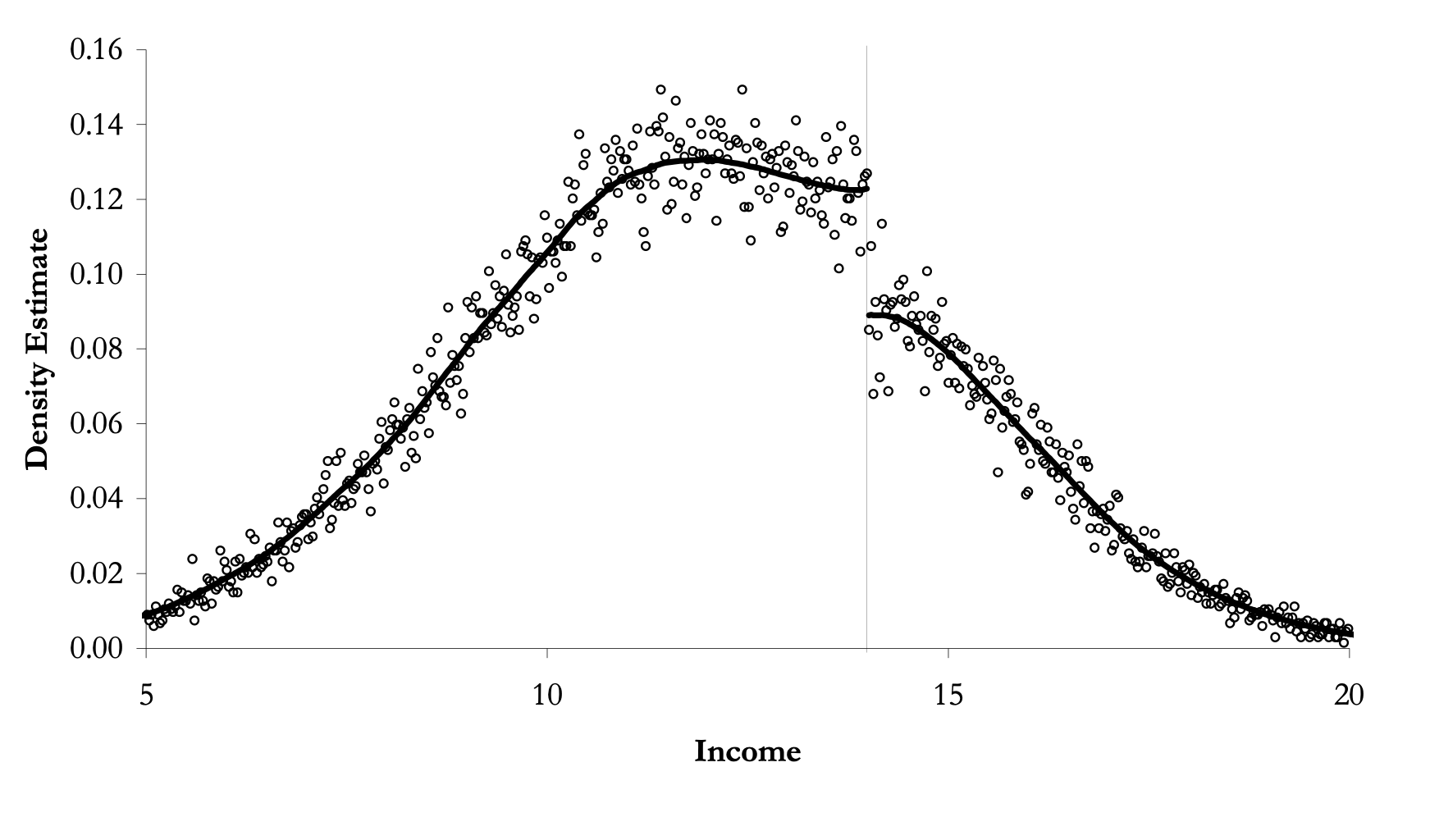
But, now let’s imagine the people in room B had successfully sorted themselves into room A. What would that look like to an outsider? If they were successful, then room A would have more patients than room B. In fact, in the extreme, room A is crowded and room B is empty. This is the heart of the McCrary density test, and when we see such things at the cutoff, we have some suggestive evidence that people are sorting on the running variable. This is sometimes called manipulation.
Remember earlier when I said we should think of continuity as the null because nature doesn’t make jumps? If you see a turtle on a fencepost, it probably didn’t get there itself. Well, the same goes for the density. If the null is a continuous density through the cutoff, then bunching in the density at the cutoff is a sign that someone is moving over to the cutoff—probably to take advantage of the rewards that await them there. Sorting on the sorting variable is a testable prediction under the null of a continuous density. Assuming a continuous distribution of units, sorting on the running variable means that units are moving just on the other side of the cutoff. Formally, if we assume a desirable treatment \(D\) and an assignment rule \(X\geq c_0\), then we expect individuals will sort into \(D\) by choosing \(X\) such that \(X\geq c_0\) as long as they’re able. If they do, then it could imply selection bias insofar as their sorting is a function of potential outcomes.
The kind of test needed to investigate whether manipulation is occurring is a test that checks whether there is bunching of units at the cutoff. In other words, we need a density test. McCrary (2008) suggests a formal test where, under the null, the density should be continuous at the cutoff point. Under the alternative hypothesis, the density should increase at the kink.6 I’ve always liked this test because it’s a really simple statistical test based on a theory that human beings are optimizing under constraints. And if they are optimizing, that makes testable predictions—like a discontinuous jump in the density at the cutoff. Statistics built on behavioral theory can take us further.
Mechanically, partition the assignment variable into bins and calculate frequencies (i.e., the number of observations) in each bin. Treat the frequency counts as the dependent variable in a local linear regression. If you can estimate the conditional expectations, then you have the data on the running variable, so in principle, you can always do a density test. I recommend the package rddensity,7 which you can install for R as well.8 These packages are based on Cattaneo, Jansson, and Ma (2019), which is based on local polynomial regressions that have less bias in the border regions.
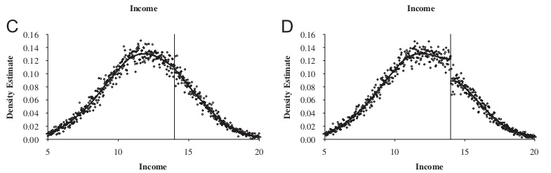
This is a high-powered test. You need a lot of observations at \(c_0\) to distinguish a discontinuity in the density from noise. Let me illustrate with a picture from McCrary (2008) showing a situation with and without manipulation in the figure below.
Figure 6.11: A picture with and without a discontinuity in the density from (McCrary 2008).
A picture with and without a discontinuity in the density from (McCrary 2008).
Covariate Balance
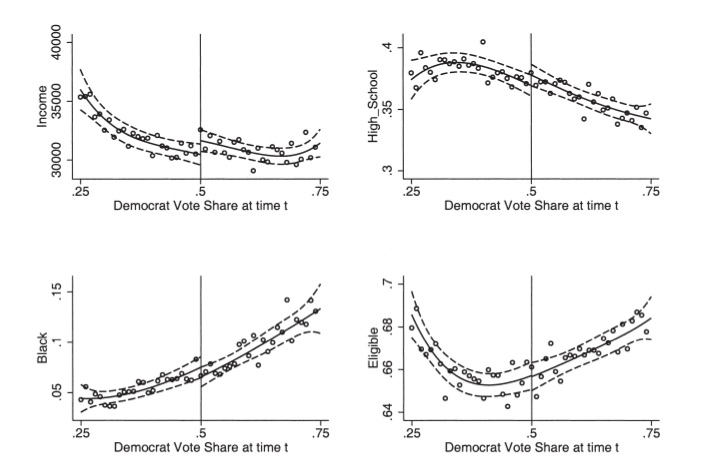
It has become common in this literature to provide evidence for the credibility of the underlying identifying assumptions, at least to some degree. While the assumptions cannot be directly tested, indirect evidence may be persuasive. We’ve already mentioned one such test—the McCrary density test. A second test is a covariate balance test. For RDD to be valid in your study, there must not be an observable discontinuous change in the average values of reasonably chosen covariates around the cutoff. As these are pretreatment characteristics, they should be invariant to change in treatment assignment. An example of this is from Lee, Moretti, and Butler (2004) where they evaluated the impact of Democratic voteshare, just at 50%, on various demographic factors (the figure below).
Figure 6.12: Figure from (Lee, Moretti, and Butler 2004). Panels refer to (top left to bottom right) district characteristics: real income, percent high school degree, percent black, and percent eligible to vote. Circles represent the average characteristic within intervals of 0.01 in Democratic vote share. The continuous line represents the predicted values from a fourth-order polynomial in vote share fitted separately for points above and below the 50 percent threshold. The dotted line represents the 95
Figure from (Lee, Moretti, and Butler 2004). Panels refer to (top left to bottom right) district characteristics: real income, percent high school degree, percent black, and percent eligible to vote. Circles represent the average characteristic within intervals of 0.01 in Democratic vote share. The continuous line represents the predicted values from a fourth-order polynomial in vote share fitted separately for points above and below the 50 percent threshold. The dotted line represents the 95% confidence interval.
This test is basically what is sometimes called a placebo test. That is, you are looking for there to be no effects where there shouldn’t be any. So, a third kind of test is an extension of that—just as there shouldn’t be effects at the cutoff on pretreatment values, there shouldn’t be effects on the outcome of interest at arbitrarily chosen cutoffs. Imbens and Lemieux (2008) suggest to look at one side of the discontinuity, take the median value of the running variable in that section, and pretend it was a discontinuity, \(c_0'\). Then test whether there is a discontinuity in the outcome at \(c_0'\). You do not want to find anything.
Nonrandom Heaping on the Running Variable
Almond et al. (2010) is a fascinating study. They are interested in estimating the causal effect of medical expenditures on health outcomes, in part because many medical technologies, while effective, may not justify the costs associated with their use. Determining their effectiveness is challenging given that medical resources are, we hope, optimally assigned to patients based on patient potential outcomes. To put it a different way, if the physician perceives that an intervention will have the best outcome, then that is likely treatment that will be assigned to the patient. This violates independence, and more than likely, if the endogeneity of the treatment is deep enough, controlling for selection directly will be tough if not impossible. As we saw with our Perfect Doctor example earlier, such nonrandom assignment of interventions can lead to confusing correlations. Counterintuitive correlations may be nothing more than selection bias.
But Almond et al. (2010) had an ingenious insight—in the United States, it is typically the case that babies whose birthweight falls below 1500 grams receive heightened medical attention. This 1500 gram categorization is called the “very low birth weight” range, and is quite dangerous for the child. Using administrative hospital records linked to mortality data, the authors find that the one-year infant mortality decreases by around one percentage point when the child’s birthweight is just below the 1,500 gram threshold compared to those born just above. Given the mean one-year mortality is 5.5%, this estimate is sizable suggesting that the medical interventions triggered by the very low birthweight classification have benefits that far exceed their costs.
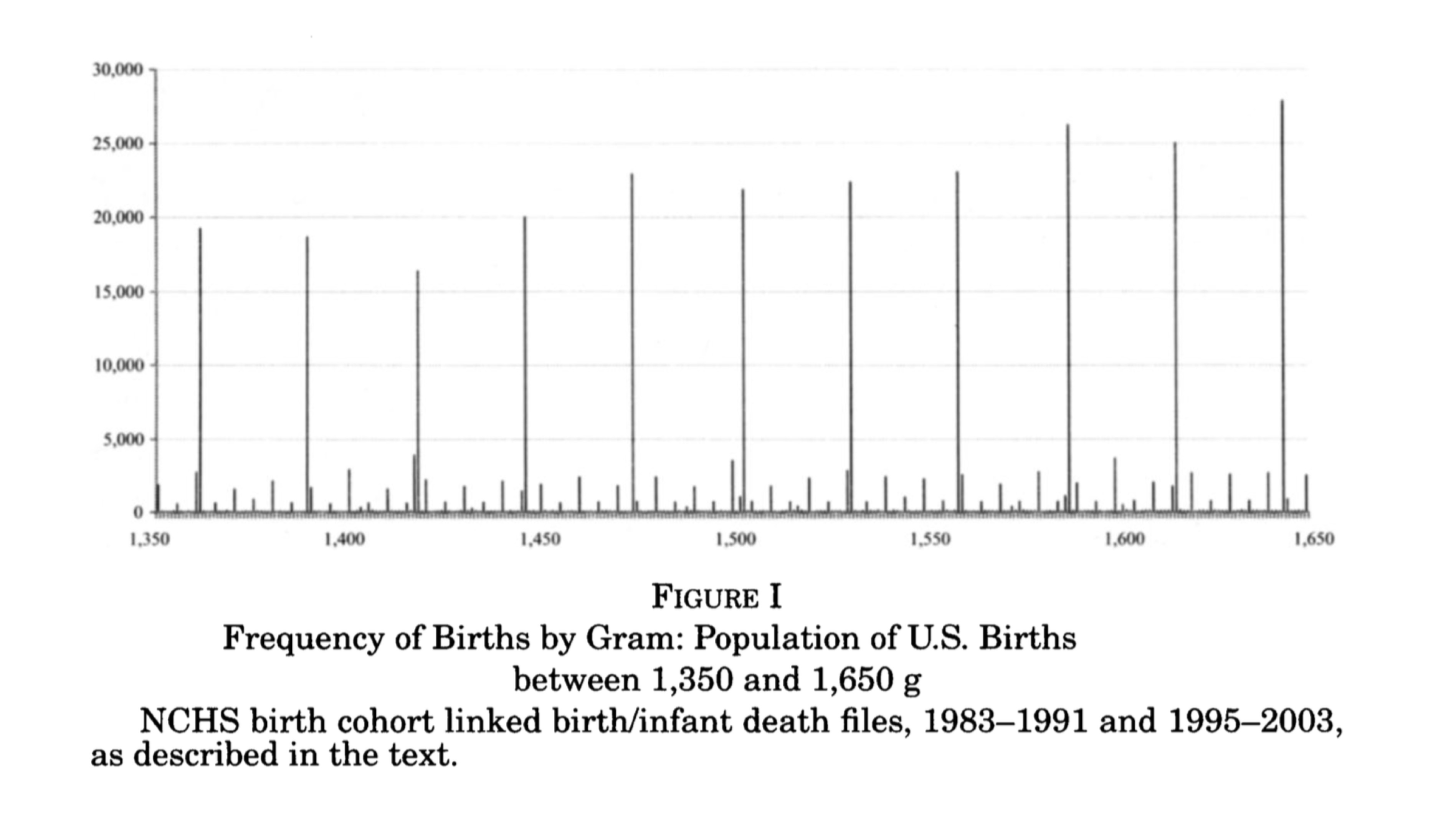
Barreca et al. (2011) and Barreca, Lindo, and Waddell (2016) highlight some of econometric issues related to what they call “heaping” on the running variable. Heaping is when there is excess number of units at certain points along the running variable. In this case, it appeared to be at regular 100 gram intervals and was likely caused by a tendency for hospitals to round to nearest integer. A visualization of this problem can be seen in the original Almond et al. (2010), which I reproduce here in the figure below. The long black lines appearing regularly across the birth weight distribution are excess mass of children born at those numbers. This sort of event is unlikely to occur naturally and is almost certainly caused by either sorting or rounding. It could be due to less sophisticated scales, or more troubling, staff rounding a child’s birthweight to 1500 grams in order to make her eligible for specialized medical attention.
Almond et al. (2010) attempt to study this more carefully using the conventional McCrary density test previously discussed, and find no clear statistically significant evidence for sorting on the running variable at the 1500 gram cutoff. Satisfied, they conduct their main analysis in which they find a causal effect of around one percentage point reduction in one-year mortality.
The focus of Barreca et al. (2011) and [(2016)] is very much focused on the heaping phenomenon shown in the figure above. Part of the strength of this study is to illustrate some of the shortcomings of a conventional McCrary density test. In this case, the data heap at 1500 grams appears to be babies whose mortality rates are unusually high. These children are outliers compared to units to both the immediate left and right. It is important to note that such events would not occur naturally; there is no reason to believe nature would produce heaps of children born with outlier health defects every 100 grams. Barreca, Lindo, and Waddell (2016) comment on what might be going on.
This [heaping at 1500 grams] may be a signal that poor-quality hospitals have relatively high propensities to round birth weights but is also consistent with manipulation of recorded birth weights by doctors, nurses, or parents to obtain favorable treatment for their children. Barreca et al. (2011) show that this nonrandom heaping leads one to conclude that it is “good” to be strictly less than any 100-g cutoff between 1,000 and 3,000 grams. (Barreca, Lindo, and Waddell (2016))
Since estimation in an RDD compares means as we approach the threshold from either side, the estimates should not be sensitive to the observations at the threshold itself. Their solution is a so-called “donut hole” RDD wherein they remove units in the vicinity of 1500 grams and reestimate the model. Insofar as units are dropped, the parameter we are estimating at the cutoff has become an even more unusual type of local average treatment effect and may be even less informative about the average treatment effects that policymakers are desperate to know. But the strength of this rule is that it allows for the possibility that units at the heap differ markedly due to selection bias than those in the surrounding area. Dropping these units reduces the sample size by around 2%, but has very large effects on one-year mortality, which is approximately 50% smaller than what was found by Almond et al. (2010).
These companion papers help us better understand some of the ways in which selection bias can creep into the RDD. Heaping is not fatal, which is good news for researchers facing such a problem. The donut hole RDD can be used to circumvent some of the problems. But ultimately this solution involves dropping observations, and insofar as your sample size is small relative to the number of heaping units, the donut hole approach could be infeasible. It also changes the parameter of interest to be estimated in ways that may be difficult to understand or explain. Caution with nonrandom heaping along the running variable is probably a good attitude to have.
6.5 Medicare and Universal Healthcare
Card, Dobkin, and Maestas (2008) is an example of a sharp RDD, because it focuses on the provision of universal healthcare insurance for the elderly—Medicare at age 65. What makes this a policy-relevant question is that questions regarding universal insurance have become highly relevant because of the debates surrounding the Affordable Care Act, as well as several Democratic senators supporting Medicare-for-all. But it is also important for its sheer size. In 2014, Medicare was 14% of the federal budget at $505 billion.
Approximately 20% of nonelderly adults in the US lacked insurance in 2005. Most were from lower-income families, and nearly half were African American or Hispanic. Many analysts have argued that unequal insurance coverage contributes to disparities in healthcare utilization and health outcomes across socioeconomic status. But, even among the insured, there is heterogeneity in the form of different copays, deductibles, and other features that affect use. Evidence that better insurance causes better health outcomes is limited because health insurance suffers from deep selection bias. Both supply and demand for insurance depend on health status, confounding observational comparisons between people with different insurance characteristics.
The situation for the elderly looks very different, though. Less than 1% of the elderly population are uninsured. Most have fee-for-service Medicare coverage. And that transition to Medicare occurs sharply at age 65—the threshold for Medicare eligibility.
The authors estimate a reduced form model measuring the causal effect of health insurance status on healthcare usage: \[
y_{ija} = X_{ija} \alpha + f_k(\alpha ; \beta ) + \sum_k C_{ija}^k
\delta^k + u_{ija}
\tag{6.19}\] where \(i\) indexes individuals, \(j\) indexes a socioeconomic group, \(a\) indexes age, \(u_{ija}\) indexes the unobserved error, \(y_{ija}\) healthcare usage, \(X_{ija}\) a set of covariates (e.g., gender and region), \(f_j(\alpha ; \beta )\) a smooth function representing the age profile of outcome \(y\) for group \(j\), and \(C_{ija}^k\)\((k=1,2,\dots ,K)\) are characteristics of the insurance coverage held by the individual such as copayment rates. The problem with estimating this model, though, is that insurance coverage is endogenous: \(cov(u,C) \neq 0\). The authors use Medicare’s eligibility age threshold of 65 as their identification strategy, arguing that this provides credibly exogenous variation in insurance status.
Suppose health insurance coverage can be summarized by two dummy variables: \(C_{ija}^1\) (any coverage) and \(C_{ija}^2\) (generous insurance). Card, Dobkin, and Maestas (2008) estimate the following linear probability models: \[
\begin{align*}
C_{ija}^1&=X_{ija}\beta_j^1 + g_j^1(a) + D_a \pi_j^1 + v_{ija}^1
\\
C_{ija}^2 &=X_{ija} \beta_j^2 + g_j^2(a) + D_a \pi_j^2 + v_{ija}^2
\end{align*}
\tag{6.20}\] where \(\beta_j^1\) and \(\beta_j^2\) are group-specific coefficients, \(g_j^1(a)\) and \(g_j^2(a)\) are smooth age profiles for group \(j\), and \(D_a\) is a dummy if the respondent is equal to or over age 65. Recall the reduced form model: \[
\begin{eqnarray*}
y_{ija} = X_{ija} \alpha + f_k(\alpha ; \beta ) + \sum_k C_{ija}^k
\delta^k + u_{ija}
\end{eqnarray*}
\tag{6.21}\] Combining the \(C_{ija}\) equations, and rewriting the reduced form model, we get: \[
\begin{eqnarray*}
y_{ija}=X_{ija}\Big(\alpha_j+\beta_j^1\delta_j^1+ \beta_j^2
\delta_j^2\Big)h_j(a)+D_a\pi_j^y+ v_{ija}^y
\end{eqnarray*}
\tag{6.22}\] where \(h(a)=f_j(a) + \delta^1 g_j^1(a) + \delta^2 g_j^2(a)\) is the reduced form age profile for group \(j\), \(\pi_j^y=\pi_j^1\delta^1 + \pi_j^2 \delta^2\) and \(v_{ija}^y=u_{ija} + v_{ija}^1 \delta^1 + v_{ija}^2 \delta^2\) is the error term. Assuming that the profiles \(f_j(a)\), \(g_j(a)\) and \(g_j^2(a)\) are continuous at age 65 (i.e., the continuity assumption necessary for identification), then any discontinuity in \(y\) is due to insurance. The magnitudes will depend on the size of the insurance changes at age 65 (\(\pi_j^1\) and \(\pi_j^2\)) and on the associated causal effects (\(\delta^1\) and \(\delta^2\)).
For some basic healthcare services, such as routine doctor visits, it may be that the only thing that matters is insurance. But in those situations, the implied discontinuity in \(Y\) at age 65 for group \(j\) will be proportional to the change in insurance status experienced by that group. For more expensive or elective services, the generosity of the coverage may matter. For instance, if patients are unwilling to cover the required copay or if the managed care program won’t cover the service, this creates a potential identification problem in interpreting the discontinuity in \(y\) for any one group. Since \(\pi_j^y\) is a linear combination of the discontinuities in coverage and generosity, \(\delta^1\) and \(\delta^2\) can be estimated by a regression across groups: \[
\pi_j^y=\delta^0+\delta^1\pi_j^1+\delta_j^2\pi_j^2+e_j
\tag{6.23}\] where \(e_j\) is an error term reflecting a combination of the sampling errors in \(\pi_j^y\), \(\pi_j^1\) and \(\pi_j^2\).
Card, Dobkin, and Maestas (2008) use a couple of different datasets—one a standard survey and the other administrative records from hospitals in three states. First, they use the 1992–2003 National Health Interview Survey (NHIS). The NHIS reports respondents’ birth year, birth month, and calendar quarter of the interview. Authors used this to construct an estimate of age in quarters at date of interview. A person who reaches 65 in the interview quarter is coded as age 65 and 0 quarters. Assuming a uniform distribution of interview dates, one-half of these people will be 0–6 weeks younger than 65 and one-half will be 0–6 weeks older. Analysis is limited to people between 55 and 75. The final sample has 160,821 observations.
The second dataset is hospital discharge records for California, Florida, and New York. These records represent a complete census of discharges from all hospitals in the three states except for federally regulated institutions. The data files include information on age in months at the time of admission. Their sample selection criteria is to drop records for people admitted as transfers from other institutions and limit people between 60 and 70 years of age at admission. Sample sizes are 4,017,325 (California), 2,793,547 (Florida), and 3,121,721 (New York).
Some institutional details about the Medicare program may be helpful. Medicare is available to people who are at least 65 and have worked 40 quarters or more in covered employment or have a spouse who did. Coverage is available to younger people with severe kidney disease and recipients of Social Security Disability Insurance. Eligible individuals can obtain Medicare hospital insurance (Part A) free of charge, and medical insurance (Part B) for a modest monthly premium. Individuals receive notice of their impending eligibility for Medicare shortly before their 65th birthday and are informed they have to enroll in it and choose whether to accept Part B coverage. Coverage begins on the first day of the month in which they turn 65.
There are five insurance-related variables: probability of Medicare coverage, any health insurance coverage, private coverage, two or more forms of coverage, and that their primary insurance is managed care. Data are drawn from the 1999–2003 NHIS and for each characteristic, authors show the incidence rate at ages 63–64 and the change at age 65 based on a version of the \(C_K\) equations that include a quadratic in age, fully interacted with a post-65 dummy as well as controls for gender, education, race/ethnicity, region, and sample year. Alternative specifications were also used, such as a parametric model fit to a narrower age window (ages 63–67) and a local linear regression specification using a chosen bandwidth. Both show similar estimates of the change at age 65.
Table 6.2: Insurance Characteristics Just before Age 65 and Estimated Discontinuities at Age 65
On
Medicare
Any
insurance
Private
coverage
2+ forms
coverage
Managed care
Overall sample
59.7
(4.1)
  9.5
 (0.6)
  −2.9
 (1.1)
  44.1
  (2.8)
−28.4 (2.1)
White non-Hispanic
High school dropout
58.5
(4.6)
 13.0
 (2.7)
  −6.2
 (3.3)
  44.5
  (4.0)
−25.0 (4.5)
High school graduate
64.7
(5.0)
  7.6
 (0.7)
  −1.9
 (1.6)
  51.8
  (3.8)
−30.3 (2.6)
Some college
68.4
(4.7)
  4.4
 (0.5)
  −2.3
 (1.8)
  55.1
  (4.0)
−40.1 (2.6)
Minority
High school dropout
44.5
(3.1)
 21.5
 (2.1)
  −1.2
 (2.5)
  19.4
  (1.9)
−8.3
(3.1)
High school graduate
44.6
(4.7)
  8.9
 (2.8)
  −5.8
 (5.1)
  23.4
  (4.8)
−15.4 (3.5)
Some college
52.1
(4.9)
  5.8
 (2.0)
  −5.4
 (4.3)
  38.4
  (3.8)
−22.3 (7.2)
Classified by ethnicity only |
White non-Hispanic
65.2
(4.6)
  7.3
 (0.5)
  −2.8
 (1.4)
  51.9
  (3.5)
−33.6 (2.3)
Black non-Hispanic
48.5
(3.6)
 11.9
 (2.0)
  −4.2
 (2.8)
  27.8
  (3.7)
−13.5 (3.7)
Hispanic
44.4
(3.7)
 17.3
 (3.0)
  −2.0
 (1.7)
  21.7
  (2.1)
−12.1 (3.7)
Entries in each cell are estimated regression discontinuities at age 65 from quadratics in age interacted with a dummy for 65 and older. Other controls such as gender, race, education, region, and sample year are also included. Data is from the pooled 1999–2003 NHIS.
The authors present their findings in Table 6.2. What to know about this table is that each cell shows the average treatment effect for the 65-year-old population that complies with the treatment. We can see, not surprisingly, that the effect of receiving Medicare is to cause a very large increase of people being on Medicare, as well as reducing coverage on private and managed care.
Formal identification in an RDD relating some outcome (insurance coverage) to a treatment (Medicare age-eligibility) that itself depends on some running variable (age) relies on the continuity assumptions that we discussed earlier. That is, we must assume that the conditional expectation function for both potential outcomes is continuous at age \(65\). This means that both \(E[Y^0\mid a]\) and \(E[Y^1\mid a]\) are continuous through age of 65. If that assumption is plausible, then the average treatment effect at age 65 is identified as: \[
\lim_{65 \leftarrow a}E\big[y^1\mid a\big] -
\lim_{a \rightarrow 65}E\big[y^0\mid a\big]
\tag{6.24}\]
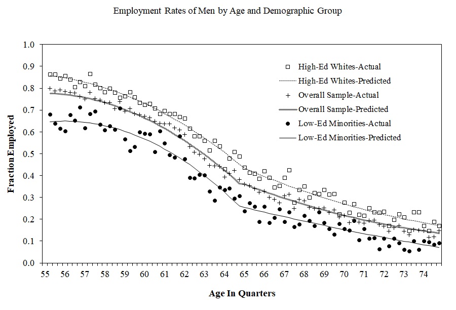
The continuity assumption requires that all other factors, observed and unobserved, that affect insurance coverage are trending smoothly at the cutoff, in other words. But what else changes at age 65 other than Medicare eligibility? Employment changes. Typically, 65 is the traditional age when people retire from the labor force. Any abrupt change in employment could lead to differences in healthcare utilization if nonworkers have more time to visit doctors.
The authors need to, therefore, investigate this possible confounder. They do this by testing for any potential discontinuities at age 65 for confounding variables using a third dataset—the March CPS 1996–2004. And they ultimately find no evidence for discontinuities in employment at age 65 (the figure below).
Next the authors investigate the impact that Medicare had on access to care and utilization using the NHIS data. Since 1997, NHIS has asked four questions. They are:
“During the past 12 months has medical care been delayed for this person because of worry about the cost?”
“During the past 12 months was there any time when this person needed medical care but did not get it because (this person) could not afford it?”
“Did the individual have at least one doctor visit in the past year?”
“Did the individual have one or more overnight hospital stays in the past year?”
Estimates from this analysis are in Table 6.3.. Each cell measures the average treatment effect for the complier population at the discontinuity. Standard errors are in parenthesis. There are a few encouraging findings from this table. First, the share of the relevant population who delayed care the previous year fell 1.8 points, and a similar drop for the share who did not get care at all in the previous year. The share who saw a doctor went up slightly, as did the share who stayed at a hospital. These are not very large effects in magnitude, it is important to note, but they are relatively precisely estimated. Note that these effects differed considerably by race and ethnicity as well as education.
Table 6.3: Measures of Access to Care Just before 65 and Estimated Discontinuities at Age 65
Delayed last year
Did not get care last year
Saw doctor last year
Hospital stay last year
Overall sample
−1.8
(0.4)
−1.3
(0.3)
1.3
(0.7)
1.2
(0.4)
White non-Hispanic
High school dropout
−1.5
(1.1)
−0.2
(1.0)
3.1
(1.3)
1.6
(1.3)
High school graduate
0.3
(2.8)
−1.3
(2.8)
−0.4
(1.5)
0.3
(0.7)
Some college
−1.5
(0.4)
−1.4
(0.3)
0.0
(1.3)
2.1
(0.7)
Minority
High school dropout
−5.3
(1.0)
−4.2
(0.9)
5.0
(2.2)
0.0
(1.4)
High school graduate
−3.8
(3.2)
1.5
(3.7)
1.9
(2.7)
1.8
(1.4)
Some college
−0.6
(1.1)
−0.2
(0.8)
3.7
(3.9)
0.7
(2.0)
Classified by ethnicity only
White non-Hispanic
−1.6
(0.4)
−1.2
(0.3)
0.6
(0.8)
1.3
(0.5)
Black non-Hispanic
−1.9
(1.1)
−0.3
(1.1)
3.6
(1.9)
0.5
(1.1)
Hispanic
−4.9
(0.8)
−3.8
(0.7)
8.2
(0.8)
11.8
(1.6)
Entries in each cell are estimated regression discontinuities at age 65 from quadratics in age interacted with a dummy for 65 and older. Other controls such as gender, race, education, region, and sample year are also included. First two columns are from 1997–2003 NHIS and last two columns are from 1992–2003 NHIS.
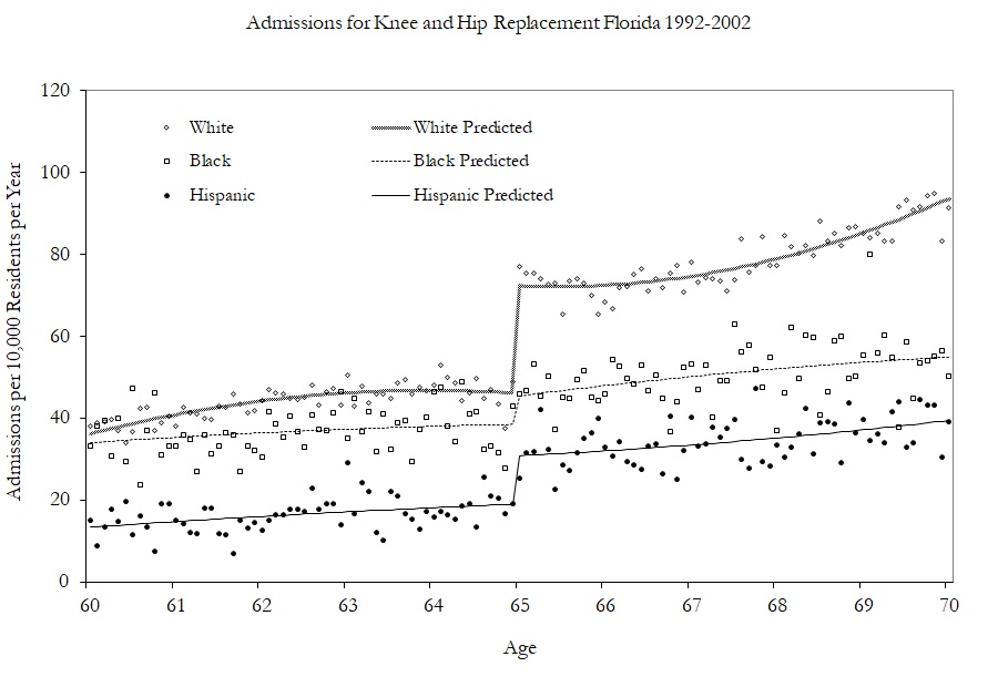
Having shown modest effects on care and utilization, the authors turn to examining the kinds of care they received by examining specific changes in hospitalizations. The figure below shows the effect of Medicare on hip and knee replacements by race. The effects are largest for Whites.
Table 6.4: Regression Discontinuity Estimates of Changes in Mortality Rates
Death rate in
7 days
14 days
28 days
90 days
180 days
365 days
Quadratic no controls
\(-1.1\)
\(-1.0\)
\(-1.1\)
\(-1.2\)
\(-1.0\)
(0.2)
(0.2)
(0.3)
(0.3)
(0.4)
(0.4)
Quadratic plus controls
\(-1.0\)
\(-0.8\)
\(-0.9\)
\(-0.9\)
\(-0.8\)
\(-0.7\)
0.2)
(0.2)
(0.3)
(0.3)
(0.3)
(0.4)
Cubic plus controls
\(-0.7\)
\(-0.7\)
\(-0.6\)
\(-0.9\)
\(-0.9\)
\(-0.4\)
(0.3)
(0.2)
(0.4)
(0.4)
(0.5)
(0.5)
Local OLS with ad hoc bandwidths
\(-0.8\)
\(-0.8\)
\(-0.8\)
\(-0.9\)
\(-1.1\)
\(-0.8\)
(0.2)
(0.2)
(0.2)
(0.2)
(0.3)
(0.3)
Dependent variable for death within interval shown in the column heading. Regression estimates at the discontinuity of age 65 for flexible regression models. Standard errors in parenthesis.
In conclusion, the authors find that universal healthcare coverage for the elderly increases care and utilization, as well as coverage. In a subsequent study (Card, Dobkin, and Maestas 2009), the authors examined the impact of Medicare on mortality and find slight decreases in mortality rates (see Table 6.4).
6.6 DUI and Recidivism Data Exercise
Difficulty Identifying Deterrence in Nonexperimental Data
Understanding the effectiveness of criminal deterrence policies has been a central theme in economics since Gary Becker’s seminal work in 1968 (Becker 1968). Becker proposed that crimes could be deterred through two separate channels: increasing the probability of arrest or enhancing punishment conditional on conviction. These mechanisms align with the broader economic theory of human behavior, which emphasizes the tendency of individuals to weigh costs and benefits—even in criminal contexts—before making decisions. If deterrence holds, the very communication of severe penalties might suffice to reduce crime, as individuals adjust their behavior to avoid the threat of punishment. This “scared straight” interpretation of deterrence suggests that penalties can be made severe enough to dissuade criminal activity without requiring frequent enforcement.
The challenge lies in testing these ideas with the datasets and policy assignment mechanisms available. Much of the historical work on crime relied on aggregate data, which introduces significant difficulties for causal inference. For instance, aggregate data often conflates two simultaneous effects of increased penalties: the hypothesized deterrence effect, where potential offenders rationally reduce their offending, and the mechanical effect of incapacitation, where offenders are physically removed from communities through incarceration. For example, consider the case of lengthening prison sentences—a primary driver of mass incarceration in the United States (Neal and Rick 2016). Longer sentences theoretically increase penalties, reducing crime through rational deterrence. However, longer sentences also lead to a growing stock of incarcerated individuals, mechanically reducing crime by removing potential offenders from society.
This dual effect makes it incredibly difficult to disentangle the specific role of deterrence. Did the crime rate drop because individuals rationally avoided offenses, or because a larger share of offenders were incapacitated? Without granular data or well-designed experiments, it becomes nearly impossible to parse these competing mechanisms. Thus, while the theory of deterrence is elegant, empirically isolating its effects requires creativity and methodological rigor, often with innovative uses of natural experiments or quasi-experimental designs.
The problem is that incapacitation and deterrence channels often operate simultaneously, making it extraordinarily challenging to disentangle their individual contributions. Identifying one without the other would require exceptionally sophisticated methods, which is why studies that claim to isolate deterrence effects tend to rely on high-quality data and cutting-edge research designs. Two notable studies stand out, though there are more. Drago, Galbiati, and Vertova (2009) exploited a collective pardon in Italy as a natural experiment to identify deterrence effects through a clever aspect of the policy’s design. While the pardon released many prisoners, it came with a significant caveat—if someone reoffended, they would face the penalty for the new offense plus the remaining time they had left to serve. This created quasi-random variation in sentence lengths, as the same offense could carry different penalties for individuals based on how much time they had left. Their findings revealed small reductions in recidivism as sentence lengths increased.
Similarly, Lee and McCrary (2017) used administrative data from Florida to study deterrence using an RDD framework. Their dataset included exact birth dates and crime dates, allowing them to exploit the discontinuous increase in penalties at age 18, when offenders transition to being tried as adults. Under the assumption that penalties rise sharply at this legal threshold, they found evidence of small deterrence effects. Both studies underscore the importance of well-designed natural experiments and administrative data in detecting even modest deterrence effects.
How Can We Tell if Drunk Driving Was Deterred, Then?
Hansen (2015) contributes to this work on detecting deterrence with a study on drunk driving.9 If we were to imagine a randomized experiment in which you took two nearly identical groups of people, all of whom had drunk and driven before, and flipped a coin: heads the first group will be punished with a harsher sentence than the second group. If deterrence is correct, the first group should drink and drive less than the second. Hansen (2015) found a coin flip in the data on DUI penalties in the dataset collected from Washington state.
What we are going to do in this section is copy what Hansen (2015) does in a few tables and figures. We won’t replicate it because I was only able to get from Hansen a subset of the original data. The original data, for instance, has 512,694 DWI stops in Washington State, but our dataset will have 214,558. But what I have found is that the less we need to replicate every jot and tittle of a table or figure, the more we can just focus on the pedagogical steps around implementing the method. And that’s our main goal—learn more of the confidence we need to know about RDD through hands-on implementation and copying a published paper in a series of steps that are easy to understand.
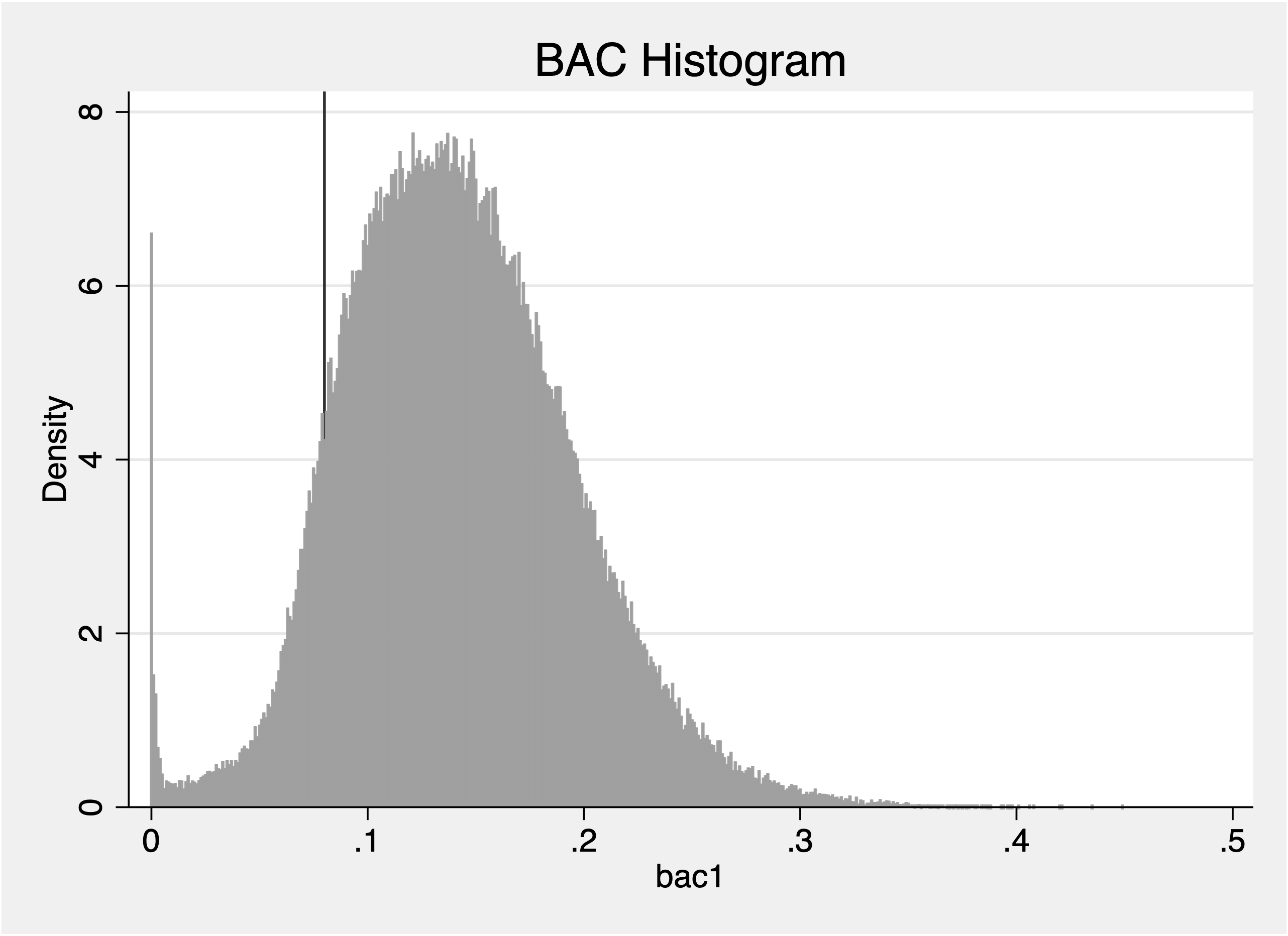
But first, let me lay out some background information for those readers who are not from the United States. In the United States, where drinking and driving has historically been a major problem, if a police officer suspects someone of driving while intoxicated, they will usually pull them over in their patrol car, and then order them to breathe into a machine called a breathalyzer. The breathalyzer records the amount of alcohol in their blood, which is measured in units of “blood alcohol content” or BAC. And in the United States, if BAC is 0.08 or higher, they will be arrested and charged with a DUI offense, which carries punishments that vary across states.
The situation in Washington was interesting, though, because they used escalating punishment for repeat offenders and I present it in Table 6.5. First offenders had, in other words, lower punishment than second offenders who had lower punishment than third offenders. Furthermore, Washington had higher penalties for drivers that blew 0.15 or higher, called “Aggravated DUI,” but for this replication, I will only focus on the more typical case of 0.08. Also, because identifying information on the driver was contained in the administrative data, Hansen was able to see repeat offenders simply because the same person would, if caught drinking and driving again, appear in the dataset again.
The treatment assignment mechanism is known—a person is charged with a DUI if they blow a 0.08 or higher. So the running variable, BAC, is the mechanism by which a DUI is assigned, and it’s a sharp design. Because the breathalyzer data is collected by the agency, manipulation is difficult to accomplish, but that is one of the checks we will see. And so the research design is fairly straightforward once you understand it—compare people who blew 0.079 to people who blew 0.081. If the people who blew 0.081 were less likely to reoffend, then it would suggest they are being deterred by the higher punishment.10
Table 6.5: Punishments for DUI Conviction Based on BAC and Prior Offenses (Hansen 2015)
BAC
1st Offense
2nd Offense
DUI
Agg. DUI
DUI
Agg. DUI
Min. penalty
$865.50
$1,120.50
$1,120.50
$1,545.50
Max. penalty
$5,000
$5,000
$5,000
$5,000
Min. jail time
24 hours
48 hours
30 days
45 days
Min. home release
14 days*
28 days*
60 days**
90 days**
License susp./revok. period
90 days⁺
365 days⁺⁺
2 years⁺⁺
900 days⁺⁺
This table outlines the Washington statutes on sanctions and punishments depending on the BAC measured. * In lieu of jail time, ** Mandatory, + Suspension, ++ Revocation
Figure 6.16: Examining manipulation of the BAC running variable using a histogram.
The first figure of the paper is a histogram showing the distribution of people’s breathalyzer test results, so I’ve replicated it in Figure 6.16 and in the hansen1 code. There is also a density test command for those that want to see that too. But note that the density tests can be a little funky when the running variable is not continuous, and it is technically not continuous in this case despite being incredibly precise. The unit of measurement in the breathalyzers used in Washington State at this time was 0.001. This is important to note, so let me pause for one second to emphasize it. What exactly differentiates a “continuous running variable” from a “multi-valued running variable?” If a running variable is truly continuous, then it means the probability that any two people have the exact same running variable value is zero. You could bin the running variable, and that probability for two people having the same one is likely 1.0, but a truly continuous running variable means no two people have the same value.
A multi-valued running variable, though, is one in which the running variable is coarsened, at least on some level. Now it may be because the underlying technology used cannot help but coarsen. The breathalyzers, as I said, used in Hansen’s study could not be more precise than 0.001—which already seems incredibly precise, but my point is to say that this technically discrete running variable would have many people with the same values because it is not possible to be somewhere else than in one of those 0.001 bins.
* hansen1.do - Create our own versions of the Hansen (2015) figures and tables. clearcapturelogclose* Install packages:* net install rdrobust, from(https://raw.githubusercontent.com/rdpackages/rdrobust/master/stata) replace* net install rddensity, from(https://raw.githubusercontent.com/rdpackages/rddensity/master/stata) replace* net install lpdensity, from(https://sites.google.com/site/nppackages/lpdensity/stata) replace* ssc install cmogramuse https://github.com/scunning1975/causal-inference-class/raw/master/hansen_dwi, clear* Checking for manipulation in the running variable first by plotting a histogramhist bac1, discrete width(0.001) color(gs10%90) scheme(sj) xline(0.08) title("BAC Histogram")rddensity bac1, c(0.08) plot
library(fixest)library(ggplot2)library(rdrobust)library(rddensity)library(binsreg)# load the data from githubdf <- haven::read_dta("https://github.com/scunning1975/causal-inference-class/raw/master/hansen_dwi.dta")# create dui treatment variable for bac1>=0.08df$dui = (df$bac1 >0.08)# Re-center our running variable at bac1=0.08df$bac1_orig = df$bac1df$bac1 = df$bac1 -0.08# Find evidence for manipulation or heaping using histogramsggplot(df) +geom_histogram(aes(x = bac1), binwidth =0.001,alpha =0.8, color ="steelblue" ) +labs(x ="Blood Alcohol Content",y ="Frequency",title ="Replicating Figure 1 of Hansen AER 2015" ) +theme_bw()# Use rddensity from Cattnaeo, Titunik and Farrell papersrddensity::rddensity(X = df$bac1, c =0.08) |>summary()
Next we will conduct basic covariate balance checks. I have four covariates that should not be systematically related to the running variable around the cutoff: whether a driver was a male, white, how old they were in years, and whether they’d been in an accident. I’ll present tables and figures. The regression equation that Hansen uses is going to model the expected potential outcome functions below the cutoff differently than above, which allows for heterogeneous treatment effects across the running variable as we discussed previously. That equation is Equation 6.25: \[
\begin{equation}
Y_i = \alpha + \delta DUI_i + \alpha_1 BAC_i + \alpha_2 BAC_i
\times DUI_i +\gamma X_i + \varepsilon_i
\label{eq:hansen_rdd}
\end{equation}
\tag{6.25}\] where the outcome, \(Y_i\), is whether a person commits a second offense in the future. He knows whether they do, recall, because his dataset contains personal identifying number and name, which allows him to track them over time. So, if the same identified person appears twice, it means they were arrested twice, and in this context he’ll also know their BAC since this is all DUI stops. This is a fairly common way in which recidivism is recorded using administrative data.11
A couple more things about Equation 6.25. Notice that he will be including covariates that he thinks are highly predictive of the outcome because, as we discussed in the Unconfoundedness chapter, doing so can reduce the residual variance in the outcome. Second, the parameter of interest is \(\delta\), which is technically supposed to be measuring the \(\delta_{SRD}\), but we will need to get the specification correct to do that empirically. And then notice that \(BAC_i\), which is the running variable, enters both by itself and interacted with \(DUI_i\). The parameter \(\alpha_1\) is measuring the slope of the running variable with respect to the outcome below 0.08 BAC and \(\alpha_2\) is measuring it above. And lastly, he says of his regressions that he is going to use bandwidths—in his preferred specification—that are 0.05 above and below the cutoff. So, we will need to be sure we do the same as we are also wanting to copy his results as much as possible, and his preference is to use the local linear regression.
And one last thing—because OLS without any weights on the observations will automatically weight them equally, he writes that he is going to use the rectangular kernel, so we will too. Later, when we examine the same question with optimal bandwidths and kernel weighted regressions, we can explore that more closely. But that goes beyond what he did, so we will wait on that.
Table 6.6: OLS Estimates of the Effect of DUI on Various Outcomes
Outcome
White
Male
Age
Accident
Estimated effect of punishment
0.0057 (0.0050)
0.0062 (0.0057)
−0.1404 (0.1644)
−0.0034 (0.0041)
Mean of dependent variable Observations
0.8463 89,967
0.7842 89,967
33.9199 89,967
0.0834 89,967
Models were estimated using OLS, with DUI interacted with the running variable BAC. Only observations with BAC values between 0.03 and 0.13 were included in the analysis. Standard errors are heteroskedasticity-robust.
To put these coefficients in Table 6.6 into perspective, let’s look not just at the standard error, but also the mean of the dependent variable as that’ll help us put them into context. The average number of whites is 84.6% of the people in this range. If they get arrested for DUI earlier, then it increases by around 0.6 percentage points. And you can see it’s similar across the board: 0.6pp for males, a tenth of a year younger, and a reduction in accidents of 0.3pp. These are not statistically significant, but the standard errors are so small that these are precise nulls. Now let’s make some pictures.
* hansen2.do. Covariate balance regressions and pictures. use https://github.com/scunning1975/causal-inference-class/raw/master/hansen_dwi, clear* Create treatment dummy for whether you were arrested for a DUI (bac1>=0.08 and you are arrested)gen dui = 0replace dui = 1 if bac1>=0.08 & bac1~=.* Recenter running variableren bac1 bac1_origlabelvariable bac1_orig "BAC"gen bac1=bac1_orig-0.08* Checking for covariate balancereg male dui##c.bac1 if bac1_orig>=0.03 & bac1_orig<=0.13, robustregwhite dui##c.bac1 if bac1_orig>=0.03 & bac1_orig<=0.13, robustreg aged dui##c.bac1 if bac1_orig>=0.03 & bac1_orig<=0.13, robustreg acc dui##c.bac1 if bac1_orig>=0.03 & bac1_orig<=0.13, robust* Let's make a few nonparametric pictures using one of our graphing preferred commandscmogram male bac1_orig if bac1_orig>=0.03 & bac1_orig<=0.13, scattercut(0.08) line(0.08) lfittitle(Male Driver)graphsave male_graph.gph, replacecmogram white bac1_orig if bac1_orig>=0.03 & bac1_orig<=0.13, scattercut(0.08) line(0.08) lfittitle(White Driver)graphsave white_graph.gph, replacecmogram aged bac1_orig if bac1_orig>=0.03 & bac1_orig<=0.13, scattercut(0.08) line(0.08) lfittitle(Age of Driver)graphsave aged_graph.gph, replacecmogram acc bac1_orig if bac1_orig>=0.03 & bac1_orig<=0.13, scattercut(0.08) line(0.08) lfittitle(Driver in Accident)graphsave acc_graph.gph, replace* Combine all four graphsgraphcombine male_graph.gph white_graph.gph aged_graph.gph acc_graph.gph, ///title("Covariate Balance Across the BAC Running Variable")
# Load required librarieslibrary(fixest)library(ggplot2)library(rdrobust)library(rddensity)library(binsreg)# Define URL for dataurl <-"https://github.com/scunning1975/causal-inference-class/raw/master/hansen_dwi.dta"# Load the data from githubdf <- haven::read_dta(url)# 1.a. create dui treatment variable for bac1>=0.08df$dui = (df$bac1 >0.08)# 1.b. Re-center our running variable at bac1=0.08df$bac1_orig = df$bac1df$bac1 = df$bac1 -0.08# Use two separate bandwidths (0.03 to 0.13; 0.055 to 0.105)# Model: yi = Xi*gamma + alpha1*DUIi + alpha2*BACi + alpha3*BACi*DUIi + ui# First bandwidthfeols(c(white, male, acc, aged) ~ dui + bac1 +i(dui, bac1), df[df$bac1_orig >=0.03& df$bac1_orig <=0.13, ], vcov ="hc1") |>etable()# Second bandwidthfeols(c(white, male, acc, aged) ~ dui + bac1 +i(dui, bac1), df[df$bac1_orig >=0.055& df$bac1_orig <=0.105, ], vcov ="hc1") |>etable()
The pictures that I combined into the figure above are pretty, but more than that, they confirm the regression results. The dots are the mean driver outcomes for a given bin across the running variable. And, I fit lines through the data below and above just as we had done with the regression models in Table 6.6. Just like we found in the OLS models, we find the same thing here—nothing. There’s no evidence from regression models of DUI arrests causing any change in exogenous characteristics, nor is there any visual evidence. The point estimates are tiny relative to the mean of the dependent variable, and aren’t statistically significant anyway.
Figure 6.17: Placebos on exogenous demographics and car characteristics.
Placebos on exogenous demographics and car characteristics.
Now we are ready to tackle the main outcome of interest: recidivism. As I said earlier, recidivism is measurable in these data because Hansen had half a million stops with personal identifiers. And these personal identifiers operate like social security numbers—you get to keep them and they track you within a given jurisdiction, sometimes across the state as well. If they appeared twice, then it means they’d been pulled over twice under the suspicion of drunk driving. But if they blew 0.08 or over, then they were charged with DUI. So, in this context “recidivism” means they were both pulled over a subsequent time and blew above 0.08 on the breathalyzer. Let’s start now with pictures.
Figure 6.18: Linear (left) and quadratic (right) regression estimation of heightened DUI penalties on recidivism.
Linear (left) and quadratic (right) regression estimation of heightened DUI penalties on recidivism.
How do we interpret the figure above? It’s clearly different than the figures we saw in the figure above. For one, the lines aren’t touching on either side of the vertical dashed line. Plus, the scale of those means range from 0.08 to 0.14, which means 8% recidivism to 14% subsequent arrest for DUI. In other words, it’s not common, per se, which means the estimated treatment effects appear to be relatively large. But how do we interpret the magnitude of the estimated treatment effect? We take the point where the regression lines hit the boundaries on either side, where the top \(E[Y^0|BAC=0.08]\) and the bottom is estimated \(E[Y^1|BAC=0.08]\). Eyeballing, that looks to be around 11.5% minus 9.75% or 1.75pp reduction in recidivism, give or take. That’s with the linear fitting of the expected potential outcome functions, mind you.
In the right image of the figure above though, I fit it with a quadratic, allowing for more flexibility in the shape of those expected potential outcome functions. This does change the point estimates, but only barely. The upper point estimated \(E[Y^0|BAC=0.08]\) is maybe a little less than 11.5% and the lower point estimate is a little higher than it had been, so probably the estimated effect at the cutoff might be closer to 1.25pp to 1.5pp, just based on a rough guess.
Let’s be precise now and run the regressions we ran from Equation 6.25. In the first column, I’ll use the exact same specification from Equation 6.25 in that I will only interact the treatment indicator with BAC. This will be more like the first figure in the figure above. But in the second column, I will control for BAC, BAC\(^2\), and then interact DUI with them both. This way, I model the nonlinearities in the potential outcome functions more flexibly. I present this in Table 6.7.
Table 6.7: OLS Estimates of the Effect of DUI on Recidivism with Different Polynomial Specifications
Outcome
Recidivism
Estimated effect of punishment
−0.0236
−0.0143
(0.0044)
(0.0062)
Polynomials included
BAC
BAC, BAC-squared
Mean of dependent variable
0.1171
0.1113
observations
89,967
89,967
Models were estimated using OLS, with DUI interacted with the running variable BAC. The second column includes a quadratic term for BAC. Only observations with BAC values between 0.03 and 0.13 were included. Standard errors are heteroskedasticity-robust.
Both of the models have statistically significant, but more importantly, precisely estimated large effects. For instance, take the mean of the dependent variable in model 1: it’s estimated to be 11.7% of the sample that have gotten a DUI again in the future. The DUI is estimated to have reduced it 2.4 percentage points, which would mean to take the average down at the cutoff to 9.3%. This is close to what we found in the left-hand side image of the figure above with the linear fit. In the second model, when I also interacted a quadratic transformation of the running variable, BAC, with the DUI indicator variable, the coefficient shrank to \(-1.4\)pp. This is similar to my rough interpretation of the right image of the figure above.
Lastly, I’m going to reestimate the models using the rdrobust commands (Calonico et al. 2017), which are based on Calonico, Cattaneo, and Titiunik (2014) and related work. I estimate models with optimal bandwidth selection that allowed the bandwidth to differ on either side of the cutoff. I also report robust standard errors. As you can see, as I include higher order polynomials, the numbers of observations used for estimation grow as the bandwidths get larger. Recall that this is because the formula for optimal bandwidths is an increasing function of the polynomials, so as we include more of them, bandwidths are mechanically increased. Ultimately, the effect sizes in Table 6.8 are not so terribly different from what we found using the regression specifications with rectangular kernels and a fixed bandwidth distance of 0.05 on either side.
Table 6.8: Local Polynomial RD Estimates of DUI on Recidivism
Estimated effect of punishment
\(-0.0189\)
\(-0.0196\).
\(-0.0209\)
(0.0051)
(0.0061)
(0.0071)
Polynomials included
–
BAC
BAC, BAC-squared
Bandwidth (Left)
0.020
0.033
0.038
Bandwidth (Right)
0.014
0.054
0.094
Observations (Effective)
13,794
16,774
17,545
Models were estimated using local polynomial regression RD with triangular kernels and MSE-optimal bandwidths. Coefficients and standard errors correspond to the robust method. Bandwidths are allowed to differ on either side of the cutoff. The running variable is BAC. Standard errors account for heteroskedasticity.
The paper is a good prototype, I think, for understanding how to implement a standard RDD. We walked through the standard types of evidence: pictures of the density of the running variable, covariate balance tests, linear and quadratic regression models with rectangular kernels of the outcome, more pictures of exogenous covariates and our intended outcome across the running variable, optimal bandwidth selection—these are all fairly standard. The evidence, I think, for recidivism is compelling. It would seem that something happened to the people who had been arrested for a DUI already. Either the experience of the prior arrest scared them enough that they were less likely to drive intoxicated again (which is not exactly a deterrence effect), or the escalated penalties were themselves responsible for the reduction in recidivism, but I think what I believe is that the second offense of a DUI is less likely to happen for those who were more or less randomly given a first one.
6.7 Practical Advice
Before we conclude, I thought I would just do a walk through that was more generalized than what we just did in the Hansen (2015) replication. Think of this as not exactly a checklist, so much as the types of exhibits I think you should have in your mind as you draw a line through all the evidence you should be weighing in your study. These are not written in stone, but I think what I’ve got here is probably a good set of things for you to check for in your own work and what to expect in other people’s as well.
Visualizing the Outcome
As I mentioned earlier, RDD is an unusually intensive visualization methodology, meaning—get ready to make a lot of pictures. Because as a rule, if you cannot see the estimated treatment effects in the data, you’re probably underpowered and/or they’re not there. And communicating the findings visually should be a very high priority. Even if your final results rely on parametric or nonparametric regression, presenting clear, intuitive graphs helps to substantiate your claims and builds trust with your audience. Figures that effectively illustrate the discontinuities—or lack thereof—can tell a compelling story even before the equations and statistical models step in.
Figure 6.19: Binscatter with quadratic fit on each side of the cutoff.
Figure 6.20: Probability of treatment in a fuzzy RDD (Hoekstra 2009).
Figure 6.21: Density of the running variable around the cutoff from simulated data by (McCrary 2008).
As we have seen already, you should be presenting your results as means across bins of the running variable. This is ordinarily going to be dots, and it may or may not include the regression lines. People have preferences for whether or not they want to see that, and I for some reason don’t care. But some just want to see the raw data, and others want to provide the fit that is likely to be in the regression. It’s common to see it either way. What is universal is that people will present the outcomes as means plotted in bins across the running variable.
What you will be doing is either making your own bins and calculating means, or using some automated software to do so. In addition to the ways I did in the replication, another popular method for creating these is called binscatter, which is reviewed in Cattaneo et al. (2024). These plots combine the benefits of binning and scatterplots by averaging outcomes within bins but still retain flexibility. For instance, Figure 6.19 overlays a quadratic fit for each side of the cutoff on top of the bin means. This approach can highlight sharp discontinuities, though you should consider providing multiple fits (e.g., linear, quadratic) to ensure robustness.
Checking the Probability of Treatment
In RDDs, where the treatment assignment had not been sharp, it is essential to examine the probability of treatment as a function of the running variable. This ensures that the treatment assignment mechanism exhibits a clear jump at the cutoff. Without this “bite,” it’s impossible to estimate the first stage effectively. A good example is Hoekstra (2009), which studied the returns to attending the state flagship university on wages. Before looking at the effect of attending on earnings, though, he first looked at the effect of admission on attendance, which in his case would be equivalent to a “first stage.” the figure above demonstrates a clear jump in the treatment probability at the cutoff, providing strong visual evidence of compliance with the RD assumptions.
Figure 6.22: Balance checks: Panels refer to district characteristics such as income and education levels. Circles represent average characteristics within intervals of the running variable. Source: Lee, Moretti, and Butler (2004).
Balance checks: Panels refer to district characteristics such as income and education levels. Circles represent average characteristics within intervals of the running variable. Source: Lee, Moretti, and Butler (2004).
Checking Density and Covariate Balance
Another key diagnostic step is examining the density of the running variable around the cutoff. The McCrary density test is a popular method for formally testing for discontinuities in the running variable’s density. However, a simpler first step is to visualize the distribution. Figure 6.21 shows the density of observations plotted against the running variable, with clear attention paid to potential heaping or discontinuities near the cutoff.
Balance checks are equally important. These involve plotting covariates against the running variable to ensure no discontinuities at the cutoff. the figure above demonstrates this approach, showing district-level characteristics plotted against the running variable. In this example, smoothness through the cutoff suggests no evidence of systematic differences in covariates, providing further confidence in the validity of the RD design. If you find significant jumps in covariates, it could imply that the potential outcomes might also be discontinuous, which would undermine the identification strategy.
6.8 Concluding Remarks
RDD remains one of the most credible designs among observational methods. Some evidence suggests that of the observational designs, it seems to have been less sensitive to unusual patterns reflecting p-hacking, for instance (Brodeur, Cook, and Heyes 2020). The credibility may in fact be endogenous to that fact, but it may also be that there are not so many ways to cheat. You are so often presenting the raw data in visually transparent ways, for instance. The preference is usually for fairly simple regressions where the number of choices the researcher makes are small and of limited ability to squeeze water from a rock.
Nevertheless, there are still obstacles. RDD typically is fairly data intensive since you’re trying to primarily estimate effects at the boundary of the cutoff itself. Acquiring these data in the first place has absolutely nothing to do with understanding the econometrics of the material in this chapter, but at the same time, if you don’t know the material in this chapter when the opportunity arises for you to acquire the data suitable for this design, then you may not be in the position to do so. Luck favors the prepared, in other words.
Almond, Douglas, Joseph J. Doyle, Amanda Kowalski, and Heidi Williams. 2010. “Estimating Returns to Medical Care: Evidence from at-Risk Newborns.”The Quarterly Journal of Economics 125 (2): 591–634.
Angrist, Joshua D., and Victor Lavy. 1999. “Using Maimonides’ Rule to Estimate the Effect of Class Size on Scholastic Achievement.”Quarterly Journal of Economics 114 (2): 533–75.
Angrist, Joshua D., and Jorn-Steffen Pischke. 2009. Mostly Harmless Econometrics. 1st ed. Princeton University Press.
Barreca, Alan I., Melanie Guldi, Jason M. Lindo, and Glen R. Waddell. 2011. “Saving Babies? Revisiting the Effect of Very Low Birth Weight Classification.”Quarterly Journal of Economics 126 (4): 2117–23.
Barreca, Alan I., Jason M. Lindo, and Glen R. Waddell. 2016. “Heaping-Induced Bias in Regression-Discontinuity Designs.”Economic Inquiry 54 (1): 268–93.
Becker, Gary. 1968. “Crime and Punishment: An Economic Approach.”The Journal of Political Economy 76: 169–217.
Black, Sandra E. 1999. “Do Better Schools Matter? Parental Valuation of Elementary Education.”Quarterly Journal of Economics 114 (2): 577–99.
Brodeur, Abel, Nikolai Cook, and Anthony Heyes. 2020. “Methods Matter: P-Hacking and Publication Bias in Causal Analysis in Economics.”American Economic Review 110 (10): 3634–60.
Calonico, Sebastian, Matias D. Cattaneo, Max H. Farrell, and Rocio Titiunik. 2017. “Rdrobust: Software for Regrssion Discontinuity Designs.”Stata Journal 17 (2): 372–404.
Calonico, Sebastian, Matis D. Cattaneo, and Rocio Titiunik. 2014. “Robust Nonparametric Confidence Intervals for Regression-Discontinuity Designs.”Econometrica 82 (6): 2295–2326.
Card, David, Carlos Dobkin, and Nicole Maestas. 2008. “The Impact of Nearly Universal Insurance Coverage on Health Care Utilization: Evidence from Medicare.”American Economic Review 98 (5): 2242–58.
———. 2009. “Does Medicare Save Lives?”The Quarterly Journal of Economics 124 (2): 597–636.
Carpenter, Christopher, and Carlos Dobkin. 2009. “The Effect of Alcohol Consumption on Mortality: Regression Discontinuity Evidence from the Minimum Drinking Age.”American Economic Journal: Applied Economics 1 (1): 164–82.
Cattaneo, Matias D., Richard K. Crump, Max H. Farrell, and Yingjie Feng. 2024. “On Binscatter.”American Economic Review 114 (5): 1488–1514.
Cattaneo, Matias D., Michael Jansson, and Xinwei Ma. 2019. “Simply Local Polynomial Density Estimators.”Journal of the American Statistical Association 00 (0): 1–7.
Cook, Thomas D. 2008. “‘Waiting for Life to Arrive’: A History of the Regression-Discontinuity Design in Psychology, Statistics and Economics.”Journal of Econometrics 142: 636–54.
Cunningham, Scott, Jonathan A. Seward, Karen Clay, and Vivian S. Vigliotti. 2024. “Adverse Impacts of Mental Health Needs Assessment on Jail Outcomes.”Journal of Human Resources 59 (5).
DeAngelo, Gregory, and Benjamin Hansen. 2014. “Life and Death in the Fast Lane: Police Enforcement and Traffic Fatalities.”American Economic Journal: Economic Policy 6 (2): 231–57.
Drago, Francesco, Roberto Galbiati, and Pietro Vertova. 2009. “The Deterence Effects of Prison: Evidence from a Natural Experiment.”Journal of Political Economy 117 (2): 257–80.
Gelman, Andrew, and Guido W. Imbens. 2019. “Why Higher-Order Polynomials Should Not Be Used in Regression Discontinuity Designs.”Journal of Business and Economic Statistics 37 (3): 447–56.
Goldberger, A. S. 1972. “Selection Bias in Evaluating Treatment Effects: Some Formal Illustrations.”
Hahn, Jinyong, Petra Todd, and Wilbert van der Klaauw. 2001. “Identification and Estimation of Treatment Effects with a Regression-Discontinuity Design.”Econometrica 69 (1): 201–9.
Hansen, Ben. 2015. “Punishment and Deterrence: Evidence from Drunk Driving.”American Economic Review 105 (4): 1581–1617.
Hoekstra, Mark. 2009. “The Effect of Attending the Flagship State University on Earnings: A Discontinuity-Based Approach.”Review of Economics and Statistics 91 (4): 717–24.
Imbens, Guido W., and Thomas Lemieux. 2008. “Regression Discontinuity Designs: A Guide to Practice.”Journal of Econometrics 142: 615–35.
Klaauw, Wilbert van der. 2002. “Estimating the Effect of Financial Aid Offers on College Enrollment: A Regression-Discontinuity Approach.”International Economic Review 43 (4): 1249–87.
Kolesár, Michal, and Christoph Rothe. 2018. “Inference in Regression Discontinuity Designs with a Discrete Running Variable.”American Economic Review 108 (8): 2277–2304.
Lee, David S. 2008. “Randomized Experiments from Non-Random Selection in u.s. House Elections.”Journal of Econometrics 142: 675–97.
Lee, David S., and David Card. 2008. “Regression Discontinuity Inference with Specification Error.”Journal of Econometrics 142 (2): 655–74.
Lee, David S., and Thomas Lemieux. 2010. “Regresion Discontinuity Designs in Economics.”Journal of Economic Literature 48: 281–355.
Lee, David S., and Justin McCrary. 2017. “The Deterrence Effect of Prison: Dynamic Theory and Evidence.”Advances in Econometrics 38: 73–146.
Lee, David S., Enrico Moretti, and Matthew J. Butler. 2004. “Do Voters Affect or Elect Policies: Evidence from the u.s. House.”Quarterly Journal of Economics 119 (3): 807–59.
McCrary, Justin. 2008. “Manipulation of the Running Variable in the Regression Discontinuity Design: A Design Test.”Journal of Econometrics 142: 698–714.
Neal, Derek, and Armin Rick. 2016. “The Prison Boom and Sentencing Policy.”Journal of Legal Studies 45 (1).
Thistlehwaite, Donald, and Donald Campbell. 1960. “Regression-Discontinuity Analysis: An Alternative to the Ex-Post Facto Experiment.”Journal of Educational Psychology 51: 309–17.
For a detailed history of RDD’s development and adoption, see Cook (2008).↩︎
Klaauw (2002) referred to the running variable as the “selection variable.” Since Klaauw (2002) was an early paper in the modern RDD literature, the terminology was not yet standardized. Here, “running variable” and “selection variable” are used interchangeably.↩︎
Higher order polynomials can lead to overfitting and biased estimates of the \(\mathit{ATE}\) at the cutoff (Gelman and Imbens 2019), but underfitting is also a threat. They can both cause spurious estimates of treatment effects in regression-specifications in RDD setups.↩︎
Stata’s poly command estimates kernel-weighted local polynomial regression.↩︎
The modern data-driven approach to optimal bandwidth selection originates with Imbens and Kalyanaraman [2012], who derive the asymptotically optimal bandwidth under squared-error loss for local linear regression at the cutoff. I am indebted toCattaneo, Idrobo, and Titiunik [2020] for their subsequent synthesis, which I consider an exceptionally clear treatment of both the econometrics of RDD and its implementation in software, and which I follow in this section and the next.↩︎
In those situations, anyway, where the treatment is desirable to the units.↩︎
This research complements earlier work, such as DeAngelo and Hansen (2014), who found evidence of deterrence in policing strategies, and earlier studies linking legal drinking age laws to increased traffic fatalities such as Carpenter and Dobkin (2009) that we discussed earlier in the chapter.↩︎
But it’s also possible that the first offense’s punishment scarred them so much that they got the help they needed. That is not exactly what Becker (1968) is about, but for our purposes, it’s not all that important as we just want to focus on the steps to implementing an RDD in practice.↩︎
We do it too in our study of suicide attempts in a large urban county jail (Cunningham et al. 2024).↩︎