
Causal Inference:
The Mixtape.
Buy the print version today:
Buy the print version today:
\[ % Define terms \newcommand{\Card}{\text{Card }} \DeclareMathOperator*{\cov}{cov} \DeclareMathOperator*{\var}{var} \DeclareMathOperator{\Var}{Var\,} \DeclareMathOperator{\Cov}{Cov\,} \DeclareMathOperator{\Prob}{Prob} \newcommand{\independent}{\perp \!\!\! \perp} \DeclareMathOperator{\Post}{Post} \DeclareMathOperator{\Pre}{Pre} \DeclareMathOperator{\Mid}{\,\vert\,} \DeclareMathOperator{\post}{post} \DeclareMathOperator{\pre}{pre} \]
One of the main things I wanted to cover in the chapter on directed acylical graphical models was the idea of the backdoor criterion. Specifically, insofar as there exists a conditioning strategy that will satisfy the backdoor criterion, then you can use that strategy to identify some causal effect. We now discuss three different kinds of conditioning strategies. They are subclassification, exact matching, and approximate matching.1
Subclassification is a method of satisfying the backdoor criterion by weighting differences in means by strata-specific weights. These strata-specific weights will, in turn, adjust the differences in means so that their distribution by strata is the same as that of the counterfactual’s strata. This method implicitly achieves distributional balance between the treatment and control in terms of that known, observable confounder. This method was created by statisticians like Cochran (1968), who tried to analyze the causal effect of smoking on lung cancer, and while the methods today have moved beyond it, we include it because some of the techniques implicit in subclassification are present throughout the rest of the book.
One of the concepts threaded through this chapter is the conditional independence assumption, or CIA. Sometimes we know that randomization occurred only conditional on some observable characteristics. For instance, in Krueger (1999), Tennessee randomly assigned kindergarten students and their teachers to small classrooms, large classrooms, and large classrooms with an aide. But the state did this conditionally—specifically, schools were chosen, and then students were randomized. Krueger therefore estimated regression models that included a school fixed effect because he knew that the treatment assignment was only conditionally random.
This assumption is written as \[ (Y^1,Y^0) \independent D\mid X \] where again \(\independent\) is the notation for statistical independence and \(X\) is the variable we are conditioning on. What this means is that the expected values of \(Y^1\) and \(Y^0\) are equal for treatment and control group for each value of \(X\). Written out, this means:
\[ \begin{align} E\big[Y^1\mid D=1,X\big]=E\big[Y^1\mid D=0,X\big] \\ E\big[Y^0\mid D=1,X\big]=E\big[Y^0\mid D=0,X\big] \end{align} \]
Let me link together some concepts. First, insofar as CIA is credible, then CIA means you have found a conditioning strategy that satisfies the backdoor criterion. Second, when treatment assignment had been conditional on observable variables, it is a situation of selection on observables. The variable \(X\) can be thought of as an \(n\times k\) matrix of covariates that satisfy the CIA as a whole.
A major public health problem of the mid- to late twentieth century was the problem of rising lung cancer. For instance, the mortality rate per 100,000 from cancer of the lungs in males reached 80–100 per 100,000 by 1980 in Canada, England, and Wales. From 1860 to 1950, the incidence of lung cancer found in cadavers during autopsy grew from 0% to as high as 7%. The rate of lung cancer incidence appeared to be increasing.
Studies began emerging that suggested smoking was the cause since it was so highly correlated with incidence of lung cancer. For instance, studies found that the relationship between daily smoking and lung cancer in males was monotonically increasing in the number of cigarettes a male smoked per day. But some statisticians believed that scientists couldn’t draw a causal conclusion because it was possible that smoking was not independent of potential health outcomes. Specifically, perhaps the people who smoked cigarettes differed from non-smokers in ways that were directly related to the incidence of lung cancer. After all, no one is flipping coins when deciding to smoke.
Thinking about the simple difference in means decomposition from earlier, we know that contrasting the incidence of lung cancer between smokers and non-smokers will be biased in observational data if the independence assumption does not hold. And because smoking is endogenous—that is, people choose to smoke—it’s entirely possible that smokers differed from the non-smokers in ways that were directly related to the incidence of lung cancer.
Criticisms at the time came from such prominent statisticians as Joseph Berkson, Jerzy Neyman, and Ronald Fisher. They made several compelling arguments. First, they suggested that the correlation was spurious due to a non-random selection of subjects. Functional form complaints were also common. This had to do with people’s use of risk ratios and odds ratios. The association, they argued, was sensitive to those kinds of functional form choices, which is a fair criticism. The arguments were really not so different from the kinds of arguments you might see today when people are skeptical of a statistical association found in some observational data set.
Probably most damning, though, was the hypothesis that there existed an unobservable genetic element that both caused people to smoke and independently caused people to develop lung cancer. This confounder meant that smokers and non-smokers differed from one another in ways that were directly related to their potential outcomes, and thus independence did not hold. And there was plenty of evidence that the two groups were different. For instance, smokers were more extroverted than non-smokers, and they also differed in age, income, education, and so on.
The arguments against the smoking cause mounted. Other criticisms included that the magnitudes relating smoking and lung cancer were implausibly large. And again, the ever-present criticism of observational studies: there did not exist any experimental evidence that could incriminate smoking as a cause of lung cancer.2
The theory that smoking causes lung cancer is now accepted science. I wouldn’t be surprised if more people believe in a flat Earth than that smoking doesn’t causes lung cancer. I can’t think of a more well-known and widely accepted causal theory, in fact. So how did Fisher and others fail to see it? Well, in Fisher’s defense, his arguments were based on sound causal logic. Smoking was endogenous. There was no experimental evidence. The two groups differed considerably on observables. And the decomposition of the simple difference in means shows that contrasts will be biased if there is selection bias. Nonetheless, Fisher was wrong, and his opponents were right. They just were right for the wrong reasons.
To motivate what we’re doing in subclassification, let’s work with Cochran (1968), which was a study trying to address strange patterns in smoking data by adjusting for a confounder. Cochran lays out mortality rates by country and smoking type (Table 5.1).
| Smoking group | Canada | UK | US |
|---|---|---|---|
| Non-smokers | 20.2 | 11.3 | 13.5 |
| Cigarettes | 20.5 | 14.1 | 13.5 |
| Cigars/pipes | 35.5 | 20.7 | 17.4 |
As you can see, the highest death rate for Canadians is among the cigar and pipe smokers, which is considerably higher than for non-smokers or for those who smoke cigarettes. Similar patterns show up in both countries, though smaller in magnitude than what we see in Canada.
This table suggests that pipes and cigars are more dangerous than cigarette smoking, which, to a modern reader, sounds ridiculous. The reason it sounds ridiculous is because cigar and pipe smokers often do not inhale, and therefore there is less tar that accumulates in the lungs than with cigarettes. And insofar as it’s the tar that causes lung cancer, it stands to reason that we should see higher mortality rates among cigarette smokers.
But, recall the independence assumption. Do we really believe that:
\[ \begin{align} E\big[Y^1\mid \text{Cigarette}\big] = E\big[Y^1\mid \text{Pipe}\big] = E\big[Y^1\mid \text{Cigar}\big] \\ E\big[Y^0\mid \text{Cigarette}\big]= E\big[Y^0\mid \text{Pipe}\big] = E\big[Y^0\mid \text{Cigar}\big] \end{align} \]
Is it the case that factors related to these three states of the world are truly independent to the factors that determine death rates? Well, let’s assume for the sake of argument that these independence assumptions held. What else would be true across these three groups? Well, if the mean potential outcomes are the same for each type of smoking category, then wouldn’t we expect the observable characteristics of the smokers themselves to be as well? This connection between the independence assumption and the characteristics of the groups is called balance. If the means of the covariates are the same for each group, then we say those covariates are balanced and the two groups are exchangeable with respect to those covariates.
One variable that appears to matter is the age of the person. Older people were more likely at this time to smoke cigars and pipes, and without stating the obvious, older people were more likely to die. In Table 5.2 we can see the mean ages of the different groups.
| Smoking group | Canada | British | US |
|---|---|---|---|
| Non-smokers | 54.9 | 49.1 | 57.0 |
| Cigarettes | 50.5 | 49.8 | 53.2 |
| Cigars/pipes | 65.9 | 55.7 | 59.7 |
The high means for cigar and pipe smokers are probably not terribly surprising. Cigar and pipe smokers are typically older than cigarette smokers, or at least they were in 1968 when Cochran was writing. And since older people die at a higher rate (for reasons other than just smoking cigars), maybe the higher death rate for cigar smokers is because they’re older on average. Furthermore, maybe by the same logic, cigarette smoking has such a low mortality rate because cigarette smokers are younger on average. Note, using DAG notation, this simply means that we have the following DAG:
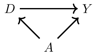
where \(D\) is smoking, \(Y\) is mortality, and \(A\) is age of the smoker. Insofar as CIA is violated, then we have a backdoor path that is open, which also means that we have omitted variable bias. But however we want to describe it, the common thing is that the distribution of age for each group will be different—which is what I mean by covariate imbalance. My first strategy for addressing this problem of covariate imbalance is to condition on age in such a way that the distribution of age is comparable for the treatment and control groups.3
So how does subclassification achieve covariate balance? Our first step is to divide age into strata: say, 20–40, 41–70, and 71 and older. Then we can calculate the mortality rate for some treatment group (cigarette smokers) by strata (here, that is age). Next, weight the mortality rate for the treatment group by a strata-specific (or age-specific) weight that corresponds to the control group. This gives us the age-adjusted mortality rate for the treatment group. Let’s explain with an example by looking at Table 5.3. Assume that age is the only relevant confounder between cigarette smoking and mortality.4
| Death rates | # of Cigarette smokers | # of Pipe or cigar smokers | |
|---|---|---|---|
| Age 20–40 | 20 | 65 | 10 |
| Age 41–70 | 40 | 25 | 25 |
| Age \(\geq 71\) | 60 | 10 | 65 |
| Total | 100 | 100 |
What is the average death rate for pipe smokers without subclassification? It is the weighted average of the mortality rate column where each weight is equal to \(\dfrac{N_t}{N}\), and \(N_t\) and \(N\) are the number of people in each group and the total number of people, respectively. Here that would be \[ 20 \times \dfrac{65}{100} + 40 \times \dfrac{25}{100} + 60 \times \dfrac{10}{100}=29. \] That is, the mortality rate of smokers in the population is 29 per 100,000.
But notice that the age distribution of cigarette smokers is the exact opposite (by construction) of pipe and cigar smokers. Thus the age distribution is imbalanced. Subclassification simply adjusts the mortality rate for cigarette smokers so that it has the same age distribution as the comparison group. In other words, we would multiply each age-specific mortality rate by the proportion of individuals in that age strata for the comparison group. That would be \[ 20 \times \dfrac{10}{100} + 40 \times \dfrac{25}{100} + 60 \times \dfrac{65}{100}=51 \] That is, when we adjust for the age distribution, the age-adjusted mortality rate for cigarette smokers (were they to have the same age distribution as pipe and cigar smokers) would be 51 per 100,000—almost twice as large as we got taking a simple naı̈ve calculation unadjusted for the age confounder.
Cochran uses a version of this subclassification method in his paper and recalculates the mortality rates for the three countries and the three smoking groups (see Table 5.4). As can be seen, once we adjust for the age distribution, cigarette smokers have the highest death rates among any group.
| Smoking group | Canada | UK | US |
|---|---|---|---|
| Non-smokers | 20.2 | 11.3 | 13.5 |
| Cigarettes | 29.5 | 14.8 | 21.2 |
| Cigars/pipes | 19.8 | 11.0 | 13.7 |
This kind of adjustment raises a question—which variable(s) should we use for adjustment? First, recall what we’ve emphasized repeatedly. Both the backdoor criterion and CIA tell us precisely what we need to do. We need to choose a set of variables that satisfy the backdoor criterion. If the backdoor criterion is met, then all backdoor paths are closed, and if all backdoor paths are closed, then CIA is achieved. We call such a variable the covariate. A covariate is usually a random variable assigned to the individual units prior to treatment. This is sometimes also called exogenous. Harkening back to our DAG chapter, this variable must not be a collider as well. A variable is exogenous with respect to \(D\) if the value of \(X\) does not depend on the value of \(D\). Oftentimes, though not always and not necessarily, this variable will be time-invariant, such as race. Thus, when trying to adjust for a confounder using subclassification, rely on a credible DAG to help guide the selection of variables. Remember—your goal is to meet the backdoor criterion.
Let me now formalize what we’ve learned. In order to estimate a causal effect when there is a confounder, we need (1) CIA and (2) the probability of treatment to be between 0 and 1 for each strata. More formally,
\((Y^1,Y^0) \independent D\mid X\) (conditional independence)
\(0<Pr(D=1 \mid X) <1\) with probability one (common support)
These two assumptions yield the following identity
\[ \begin{align} E\big[Y^1-Y^0\mid X\big] & = E\big[Y^1 - Y^0 \mid X,D=1\big] \\ & = E\big[Y^1\mid X,D=1\big] - E\big[Y^0\mid X,D=0\big] \\ & = E\big[Y\mid X,D=1\big] - E\big[Y\mid X,D=0\big] \end{align} \]
where each value of \(Y\) is determined by the switching equation. Given common support, we get the following estimator:
\[ \begin{align} \widehat{\delta_{ATE}}= \int \Big(E\big[Y\mid X,D=1\big] - E\big[Y\mid X,D=0\big]\Big)d\Pr(X) \end{align} \]
Whereas we need treatment to be conditionally independent of both potential outcomes to identify the ATE, we need only treatment to be conditionally independent of \(Y^0\) to identify the ATT and the fact that there exist some units in the control group for each treatment strata. Note, the reason for the common support assumption is because we are weighting the data; without common support, we cannot calculate the relevant weights.
For what we are going to do next, I find it useful to move into actual data. We will use an interesting data set to help us better understand subclassification. As everyone knows, the Titanic ocean cruiser hit an iceberg and sank on its maiden voyage. Slightly more than 700 passengers and crew survived out of the 2,200 people on board. It was a horrible disaster. One of the things about it that was notable, though, was the role that wealth and norms played in passengers’ survival.
Imagine that we wanted to know whether or not being seated in first class made someone more likely to survive. Given that the cruiser contained a variety of levels for seating and that wealth was highly concentrated in the upper decks, it’s easy to see why wealth might have a leg up for survival. But the problem was that women and children were explicitly given priority for boarding the scarce lifeboats. If women and children were more likely to be seated in first class, then maybe differences in survival by first class is simply picking up the effect of that social norm. Perhaps a DAG might help us here, as a DAG can help us outline the sufficient conditions for identifying the causal effect of first class on survival.
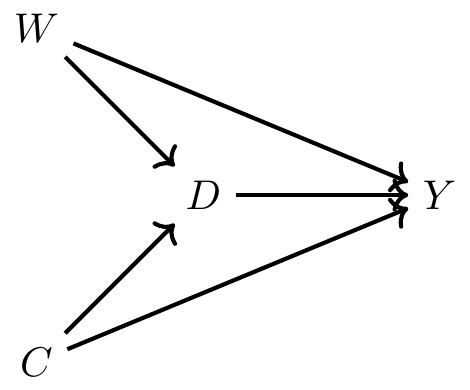
Now before we commence, let’s review what this DAG is telling us. This says that being a female made you more likely to be in first class but also made you more likely to survive because lifeboats were more likely to be allocated to women. Furthermore, being a child made you more likely to be in first class and made you more likely to survive. Finally, there are no other confounders, observed or unobserved.5
Here we have one direct path (the causal effect) between first class (\(D\)) and survival (\(Y\)) and that’s \(D \rightarrow Y\). But, we have two backdoor paths. One travels through the variable Child (C): \(D \leftarrow C \rightarrow Y\); the other travels through the variable Woman (W): \(D \leftarrow W \rightarrow Y\). Fortunately for us, our data includes both age and gender, so it is possible to close each backdoor path and therefore satisfy the backdoor criterion. We will use subclassification to do that, but before we do, let’s calculate a naı̈ve simple difference in outcomes (SDO), which is just \[ E\big[Y\mid D=1\big] - E\big[Y\mid D=0\big] \] for the sample.
use https://github.com/scunning1975/mixtape/raw/master/titanic.dta, clear
gen female=(sex==0)
label variable female "Female"
gen male=(sex==1)
label variable male "Male"
gen     s=1 if (female==1 & age==1)
replace s=2 if (female==1 & age==0)
replace s=3 if (female==0 & age==1)
replace s=4 if (female==0 & age==0)
gen     d=1 if class==1
replace d=0 if class!=1
summarize survived if d==1
gen ey1=r(mean)
summarize survived if d==0
gen ey0=r(mean)
gen sdo=ey1-ey0
su sdolibrary(tidyverse)
library(haven)
read_data <- function(df)
{
full_path <- paste("https://github.com/scunning1975/mixtape/raw/master/",
df, sep = "")
df <- read_dta(full_path)
return(df)
}
titanic <- read_data("titanic.dta") %>%
mutate(d = case_when(class == 1 ~ 1, TRUE ~ 0))
ey1 <- titanic %>%
filter(d == 1) %>%
pull(survived) %>%
mean()
ey0 <- titanic %>%
filter(d == 0) %>%
pull(survived) %>%
mean()
sdo <- ey1 - ey0import numpy as np
import pandas as pd
import statsmodels.api as sm
import statsmodels.formula.api as smf
from itertools import combinations
import plotnine as p
# read data
import ssl
ssl._create_default_https_context = ssl._create_unverified_context
def read_data(file):
return pd.read_stata("https://github.com/scunning1975/mixtape/raw/master/" + file)
## Simple Difference in Outcomes
titanic = read_data("titanic.dta")
titanic['d'] = 0
titanic.loc[titanic['class']=='1st class', 'd'] = 1
titanic['sex_d'] = 0
titanic.loc[titanic['sex']=='man', 'sex_d'] = 1
titanic['age_d'] = 0
titanic.loc[titanic['age']=='adults', 'age_d'] = 1
titanic['survived_d'] = 0
titanic.loc[titanic['survived']=='yes', 'survived_d'] = 1
ey0 = titanic.loc[titanic['d']==0, 'survived_d'].mean()
ey1 = titanic.loc[titanic['d']==1, 'survived_d'].mean()
sdo = ey1 - ey0
print("The simple difference in outcomes is {:.2%}".format(sdo))Using the data set on the Titanic, we calculate a simple difference in mean outcomes (SDO), which finds that being seated in first class raised the probability of survival by 35.4%. But note, since this does not adjust for observable confounders age and gender, it is a biased estimate of the ATE. So next we use subclassification weighting to control for these confounders. Here are the steps that will entail:
Stratify the data into four groups: young males, young females, old males, old females.
Calculate the difference in survival probabilities for each group.
Calculate the number of people in the non-first-class groups and divide by the total number of non-first-class population. These are our strata-specific weights.
Calculate the weighted average survival rate using the strata weights.
Let’s review this with some code so that you can better understand what these four steps actually entail.
* Subclassification
cap n drop ey1 ey0
su survived if s==1 & d==1
gen ey11=r(mean)
label variable ey11 "Average survival for male child in treatment"
su survived if s==1 & d==0
gen ey10=r(mean)
label variable ey10 "Average survival for male child in control"
gen diff1=ey11-ey10
label variable diff1 "Difference in survival for male children"
su survived if s==2 & d==1
gen ey21=r(mean)
su survived if s==2 & d==0
gen ey20=r(mean)
gen diff2=ey21-ey20
su survived if s==3 & d==1
gen ey31=r(mean)
su survived if s==3 & d==0
gen ey30=r(mean)
gen diff3=ey31-ey30
su survived if s==4 & d==1
gen ey41=r(mean)
su survived if s==4 & d==0
gen ey40=r(mean)
gen diff4=ey41-ey40
count if s==1 & d==0
count if s==2 & d==0
count if s==3 & d==0
count if s==4 & d==0
count if d == 0

gen wt1=281/1876
gen wt2=44/1876
gen wt3=1492/1876
gen wt4=59/1876
gen wate=diff1*wt1 + diff2*wt2 + diff3*wt3 + diff4*wt4
sum wate sdolibrary(stargazer)
library(magrittr) # for %$% pipes
library(tidyverse)
library(haven)
titanic <- read_data("titanic.dta") %>%
mutate(d = case_when(class == 1 ~ 1, TRUE ~ 0))
titanic %<>%
mutate(s = case_when(sex == 0 & age == 1 ~ 1,
sex == 0 & age == 0 ~ 2,
sex == 1 & age == 1 ~ 3,
sex == 1 & age == 0 ~ 4,
TRUE ~ 0))
ey11 <- titanic %>%
filter(s == 1 & d == 1) %$%
mean(survived)
ey10 <- titanic %>%
filter(s == 1 & d == 0) %$%
mean(survived)
ey21 <- titanic %>%
filter(s == 2 & d == 1) %$%
mean(survived)
ey20 <- titanic %>%
filter(s == 2 & d == 0) %$%
mean(survived)
ey31 <- titanic %>%
filter(s == 3 & d == 1) %$%
mean(survived)
ey30 <- titanic %>%
filter(s == 3 & d == 0) %$%
mean(survived)
ey41 <- titanic %>%
filter(s == 4 & d == 1) %$%
mean(survived)
ey40 <- titanic %>%
filter(s == 4 & d == 0) %$%
mean(survived)
diff1 = ey11 - ey10
diff2 = ey21 - ey20
diff3 = ey31 - ey30
diff4 = ey41 - ey40
obs = nrow(titanic %>% filter(d == 0))
wt1 <- titanic %>%
filter(s == 1 & d == 0) %$%
nrow(.)/obs
wt2 <- titanic %>%
filter(s == 2 & d == 0) %$%
nrow(.)/obs
wt3 <- titanic %>%
filter(s == 3 & d == 0) %$%
nrow(.)/obs
wt4 <- titanic %>%
filter(s == 4 & d == 0) %$%
nrow(.)/obs
wate = diff1*wt1 + diff2*wt2 + diff3*wt3 + diff4*wt4
stargazer(wate, sdo, type = "text")import numpy as np
import pandas as pd
import statsmodels.api as sm
import statsmodels.formula.api as smf
from itertools import combinations
import plotnine as p
# read data
import ssl
ssl._create_default_https_context = ssl._create_unverified_context
def read_data(file):
return pd.read_stata("https://github.com/scunning1975/mixtape/raw/master/" + file)
## Weighted Average Treatment Effect
titanic = read_data("titanic.dta")
titanic['d'] = 0
titanic.loc[titanic['class']=='1st class', 'd'] = 1
titanic['sex_d'] = 0
titanic.loc[titanic['sex']=='man', 'sex_d'] = 1
titanic['age_d'] = 0
titanic.loc[titanic['age']=='adults', 'age_d'] = 1
titanic['survived_d'] = 0
titanic.loc[titanic['survived']=='yes', 'survived_d'] = 1
titanic['s'] = 0
titanic.loc[(titanic.sex_d == 0) & (titanic.age_d==1), 's'] = 1
titanic.loc[(titanic.sex_d == 0) & (titanic.age_d==0), 's'] = 2
titanic.loc[(titanic.sex_d == 1) & (titanic.age_d==1), 's'] = 3
titanic.loc[(titanic.sex_d == 1) & (titanic.age_d==0), 's'] = 4
obs = titanic.loc[titanic.d == 0].shape[0]
def weighted_avg_effect(df):
diff = df[df.d==1].survived_d.mean() - df[df.d==0].survived_d.mean()
weight = df[df.d==0].shape[0]/obs
return diff*weight
wate = titanic.groupby('s').apply(weighted_avg_effect).sum()
print("The weigthted average treatment effect estimate is {:.2%}".format(wate))Here we find that once we condition on the confounders gender and age, first-class seating has a much lower probability of survival associated with it (though frankly, still large). The weighted ATE is 18.9%, versus the SDO, which is 35.4%.
Here we’ve been assuming two covariates, each of which has two possible set of values. But this was for convenience. Our data set, for instance, only came to us with two possible values for age—child and adult. But what if it had come to us with multiple values for age, like specific age? Then once we condition on individual age and gender, it’s entirely likely that we will not have the information necessary to calculate differences within strata, and therefore be unable to calculate the strata-specific weights that we need for subclassification.
For this next part, let’s assume that we have precise data on Titanic survivor ages. But because this will get incredibly laborious, let’s just focus on a few of them.
| Age and Gender | Survival Prob. 1st Class | Controls | Diff | # of 1st Class | # of Controls |
|---|---|---|---|---|---|
| Male 11-yo | 1.0 | 0 | 1 | 1 | 2 |
| Male 12-yo | – | 1 | – | 0 | 1 |
| Male 13-yo | 1.0 | 0 | 1 | 1 | 2 |
| Male 14-yo | – | 0.25 | – | 0 | 4 |
| … |
Here we see an example of the common support assumption being violated. The common support assumption requires that for each strata, there exist observations in both the treatment and control group, but as you can see, there are not any 12-year-old male passengers in first class. Nor are there any 14-year-old male passengers in first class. And if we were to do this for every combination of age and gender, we would find that this problem was quite common. Thus, we cannot estimate the ATE using subclassification. The problem is that our stratifying variable has too many dimensions, and as a result, we have sparseness in some cells because the sample is too small.
But let’s say that the problem was always on the treatment group, not the control group. That is, let’s assume that there is always someone in the control group for a given combination of gender and age, but there isn’t always for the treatment group. Then we can calculate the ATT. Because as you see in this table, for those two strata, 11-year-olds and 13-year-olds, there are both treatment and control group values for the calculation. So long as there exist controls for a given treatment strata, we can calculate the ATT. The equation to do so can be compactly written as:
\[ \widehat{\delta}_{ATT} = \sum_{k=1}^K\Big(\overline{Y}^{1,k} - \overline{Y}^{0,k}\Big)\times \bigg( \dfrac{N^k_T}{N_T} \bigg ) \]
We’ve seen a problem that arises with subclassification—in a finite sample, subclassification becomes less feasible as the number of covariates grows, because as \(K\) grows, the data becomes sparse. This is most likely caused by our sample being too small relative to the size of our covariate matrix. We will at some point be missing values, in other words, for those \(K\) categories. Imagine if we tried to add a third strata, say, race (black and white). Then we’d have two age categories, two gender categories, and two race categories, giving us eight possibilities. In this small sample, we probably will end up with many cells having missing information. This is called the curse of dimensionality. If sparseness occurs, it means many cells may contain either only treatment units or only control units, but not both. If that happens, we can’t use subclassification, because we do not have common support. And therefore we are left searching for an alternative method to satisfy the backdoor criterion.
Subclassification uses the difference between treatment and control group units and achieves covariate balance by using the \(K\) probability weights to weight the averages. It’s a simple method, but it has the aforementioned problem of the curse of dimensionality. And probably, that’s going to be an issue in any research you undertake because it may not be merely one variable you’re worried about but several—in which case, you’ll already be running into the curse. But the thing to emphasize here is that the subclassification method is using the raw data, but weighting it so as to achieve balance. We are weighting the differences, and then summing over those weighted differences.
But there are alternative approaches. For instance, what if we estimated \(\widehat{\delta}_{ATT}\) by imputing the missing potential outcomes by conditioning on the confounding, observed covariate? Specifically, what if we filled in the missing potential outcome for each treatment unit using a control group unit that was “closest” to the treatment group unit for some \(X\) confounder? This would give us estimates of all the counterfactuals from which we could simply take the average over the differences. As we will show, this will also achieve covariate balance. This method is called matching.
There are two broad types of matching that we will consider: exact matching and approximate matching. We will first start by describing exact matching. Much of what I am going to be discussing is based on Abadie and Imbens (2006).
A simple matching estimator is the following:
\[ \widehat{\delta}_{ATT} = \dfrac{1}{N_T} \sum_{D_i=1}(Y_i - Y_{j(i)}) \]
where \(Y_{j(i)}\) is the \(j\)th unit matched to the \(i\)th unit based on the \(j\)th being “closest to” the \(i\)th unit for some \(X\) covariate. For instance, let’s say that a unit in the treatment group has a covariate with a value of 2 and we find another unit in the control group (exactly one unit) with a covariate value of 2. Then we will impute the treatment unit’s missing counterfactual with the matched unit’s, and take a difference.
But, what if there’s more than one variable “closest to” the \(i\)th unit? For instance, say that the same \(i\)th unit has a covariate value of 2 and we find two \(j\) units with a value of 2. What can we then do? Well, one option is to simply take the average of those two units’ \(Y\) outcome value. But what if we found 3 close units? What if we found 4? And so on. However many matches \(M\) that we find, we would assign the average outcome \(\left(\dfrac{1}{M} \right)\) as the counterfactual for the treatment group unit.
Notationally, we can describe this estimator as
\[ \widehat{\delta}_{ATT} = \dfrac{1}{N_T} \sum_{D_i=1} \bigg ( Y_i - \bigg [\dfrac{1}{M} \sum_{m=1}^M Y_{j_m(1)} \bigg ] \bigg ) \]
This estimator really isn’t too different from the one just before it; the main difference is that this one averages over several close matches as opposed to just picking one. This approach works well when we can find a number of good matches for each treatment group unit. We usually define \(M\) to be small, like \(M=2\). If M is greater than 2, then we may simply randomly select two units to average outcomes over.
Those were both ATT estimators. You can tell that these are \(\widehat{\delta}_{ATT}\) estimators because of the summing over the treatment group.6 But we can also estimate the ATE. But note, when estimating the ATE, we are filling in both missing control group units like before and missing treatment group units. If observation \(i\) is treated, in other words, then we need to fill in the missing \(Y^0_i\) using the control matches, and if the observation \(i\) is a control group unit, then we need to fill in the missing \(Y^1_i\) using the treatment group matches. The estimator is below. It looks scarier than it really is. It’s actually a very compact, nicely-written-out estimator equation.
\[ \widehat{\delta}_{ATE} = \dfrac{1}{N} \sum_{i=1}^N (2D_i - 1) \bigg [ Y_i - \bigg ( \dfrac{1}{M} \sum_{m=1}^M Y_{j_m(i)} \bigg ) \bigg ] \]
The \(2D_i-1\) is the nice little trick. When \(D_i=1\), then that leading term becomes a \(1\).7 And when \(D_i=0\), then that leading term becomes a negative 1, and the outcomes reverse order so that the treatment observation can be imputed. Nice little mathematical form!
Let’s see this work in action by working with an example. Table 5.6 shows two samples: a list of participants in a job trainings program and a list of non-participants, or non-trainees. The left-hand group is the treatment group and the right-hand group is the control group. The matching algorithm that we defined earlier will create a third group called the matched sample, consisting of each treatment group unit’s matched counterfactual. Here we will match on the age of the participant.
| Trainees | Non-Trainees | ||||
| Unit | Age | Earnings | Unit | Age | Earnings |
| 1 | 18 | 9500 | 1 | 20 | 8500 |
| 2 | 29 | 12250 | 2 | 27 | 10075 |
| 3 | 24 | 11000 | 3 | 21 | 8725 |
| 4 | 27 | 11750 | 4 | 39 | 12775 |
| 5 | 33 | 13250 | 5 | 38 | 12550 |
| 6 | 22 | 10500 | 6 | 29 | 10525 |
| 7 | 19 | 9750 | 7 | 39 | 12775 |
| 8 | 20 | 10000 | 8 | 33 | 11425 |
| 9 | 21 | 10250 | 9 | 24 | 9400 |
| 10 | 30 | 12500 | 10 | 30 | 10750 |
| 11 | 33 | 11425 | |||
| 12 | 36 | 12100 | |||
| 13 | 22 | 8950 | |||
| 14 | 18 | 8050 | |||
| 15 | 43 | 13675 | |||
| 16 | 39 | 12775 | |||
| 17 | 19 | 8275 | |||
| 18 | 30 | 9000 | |||
| 19 | 51 | 15475 | |||
| 20 | 48 | 14800 | |||
| Mean | 24.3 | $11,075 | 31.95 | $11,101.25 |
Before we do this, though, I want to show you how the ages of the trainees differ on average from the ages of the non-trainees. We can see that in Table 5.6—the average age of the participants is 24.3 years, and the average age of the non-participants is 31.95 years. Thus, the people in the control group are older, and since wages typically rise with age, we may suspect that part of the reason their average earnings are higher ($11,075 vs. $11,101) is because the control group is older. We say that the two groups are not exchangeable because the covariate is not balanced. Let’s look at the age distribution. To illustrate this, we need to download the data first. We will create two histograms—the distribution of age for treatment and non-trainee group—as well as summarize earnings for each group. That information is also displayed in Figure 5.1.
use https://github.com/scunning1975/mixtape/raw/master/training_example.dta, clear
histogram age_treat, bin(10) frequency
histogram age_control, bin(10) frequency
su age_treat age_control
su earnings_treat earnings_control

histogram age_treat, bin(10) frequency
histogram age_matched, bin(10) frequency
su age_treat age_control
su earnings_matched earnings_matchedlibrary(tidyverse)
library(haven)
read_data <- function(df)
{
full_path <- paste("https://github.com/scunning1975/mixtape/raw/master/",
df, sep = "")
df <- read_dta(full_path)
return(df)
}
training_example <- read_data("training_example.dta") %>%
slice(1:20)
ggplot(training_example, aes(x=age_treat)) +
stat_bin(bins = 10, na.rm = TRUE)
ggplot(training_example, aes(x=age_control)) +
geom_histogram(bins = 10, na.rm = TRUE)import numpy as np
import pandas as pd
import statsmodels.api as sm
import statsmodels.formula.api as smf
from itertools import combinations
import plotnine as p
# read data
import ssl
ssl._create_default_https_context = ssl._create_unverified_context
def read_data(file):
return pd.read_stata("https://github.com/scunning1975/mixtape/raw/master/" + file)
training_example = read_data("training_example.dta")
p.ggplot(training_example, p.aes(x='age_treat')) + p.stat_bin(bins = 10)
p.ggplot(training_example, p.aes(x='age_control')) + p.geom_histogram(bins = 10)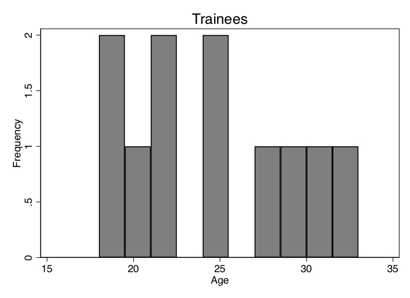
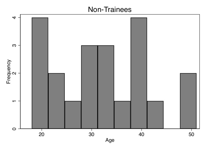
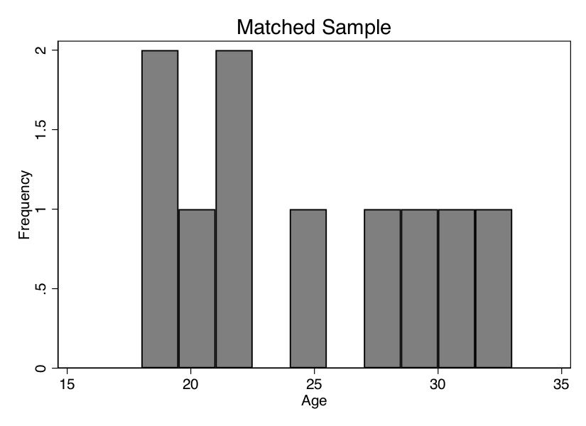
As you can see from Figure 5.1, these two populations not only have different means (Table 5.6); the entire distribution of age across the samples is different. So let’s use our matching algorithm and create the missing counterfactuals for each treatment group unit. This method, since it only imputes the missing units for each treatment unit, will yield an estimate of the \(\widehat{\delta}_{ATT}\).
| Trainees | Non-Trainees | Matched Sample | ||||||
| Unit | Age | Earnings | Unit | Age | Earnings | Unit | Age | Earnings |
| 1 | 18 | 9500 | 1 | 20 | 8500 | 14 | 18 | 8050 |
| 2 | 29 | 12250 | 2 | 27 | 10075 | 6 | 29 | 10525 |
| 3 | 24 | 11000 | 3 | 21 | 8725 | 9 | 24 | 9400 |
| 4 | 27 | 11750 | 4 | 39 | 12775 | 8 | 27 | 10075 |
| 5 | 33 | 13250 | 5 | 38 | 12550 | 11 | 33 | 11425 |
| 6 | 22 | 10500 | 6 | 29 | 10525 | 13 | 22 | 8950 |
| 7 | 19 | 9750 | 7 | 39 | 12775 | 17 | 19 | 8275 |
| 8 | 20 | 10000 | 8 | 33 | 11425 | 1 | 20 | 8500 |
| 9 | 21 | 10250 | 9 | 24 | 9400 | 3 | 21 | 8725 |
| 10 | 30 | 12500 | 10 | 30 | 10750 | 10,18 | 30 | 9875 |
| 11 | 33 | 11425 | ||||||
| 12 | 36 | 12100 | ||||||
| 13 | 22 | 8950 | ||||||
| 14 | 18 | 8050 | ||||||
| 15 | 43 | 13675 | ||||||
| 16 | 39 | 12775 | ||||||
| 17 | 19 | 8275 | ||||||
| 18 | 30 | 9000 | ||||||
| 19 | 51 | 15475 | ||||||
| 20 | 48 | 14800 | ||||||
| Mean | 24.3 | $11,075 | 31.95 | $11,101.25 | 24.3 | $9,380 |
Now let’s move to creating the matched sample. As this is exact matching, the distance traveled to the nearest neighbor will be zero integers. This won’t always be the case, but note that as the control group sample size grows, the likelihood that we find a unit with the same covariate value as one in the treatment group grows. I’ve created a data set like this. The first treatment unit has an age of 18. Searching down through the non-trainees, we find exactly one person with an age of 18, and that’s unit 14. So we move the age and earnings information to the new matched sample columns.
We continue doing that for all units, always moving the control group unit with the closest value on \(X\) to fill in the missing counterfactual for each treatment unit. If we run into a situation where there’s more than one control group unit “close,” then we simply average over them. For instance, there are two units in the non-trainees group with an age of 30, and that’s 10 and 18. So we averaged their earnings and matched that average earnings to unit 10. This is filled out in Table 5.7.
Now we see that the mean age is the same for both groups. We can also check the overall age distribution (Figure 5.2). As you can see, the two groups are exactly balanced on age. We might say the two groups are exchangeable. And the difference in earnings between those in the treatment group and those in the control group is $1,695. That is, we estimate that the causal effect of the program was $1,695 in higher earnings.
Let’s summarize what we’ve learned. We’ve been using a lot of different terms, drawn from different authors and different statistical traditions, so I’d like to map them onto one another. The two groups were different in ways that were likely a direction function of potential outcomes. This means that the independence assumption was violated. Assuming that treatment assignment was conditionally random, then matching on \(X\) created an exchangeable set of observations—the matched sample—and what characterized this matched sample was balance.
The previous example of matching was relatively simple—find a unit or collection of units that have the same value of some covariate \(X\) and substitute their outcomes as some unit \(j\)’s counterfactuals. Once you’ve done that, average the differences for an estimate of the ATE.
But what if you couldn’t find another unit with that exact same value? Then you’re in the world of approximate matching.
One of the instances where exact matching can break down is when the number of covariates, \(K\), grows large. And when we have to match on more than one variable but are not using the sub-classification approach, then one of the first things we confront is the concept of distance. What does it mean for one unit’s covariate to be “close” to someone else’s? Furthermore, what does it mean when there are multiple covariates with measurements in multiple dimensions?
Matching on a single covariate is straightforward because distance is measured in terms of the covariate’s own values. For instance, distance in age is simply how close in years or months or days one person is to another person. But what if we have several covariates needed for matching? Say, age and log income. A 1-point change in age is very different from a 1-point change in log income, not to mention that we are now measuring distance in two, not one, dimensions. When the number of matching covariates is more than one, we need a new definition of distance to measure closeness. We begin with the simplest measure of distance, the Euclidean distance:
\[ \begin{align} ||X_i-X_j|| & = \sqrt{ (X_i-X_j)'(X_i-X_j) } \\ & = \sqrt{\sum_{n=1}^k (X_{ni} - X_{nj})^2 } \end{align} \]
The problem with this measure of distance is that the distance measure itself depends on the scale of the variables themselves. For this reason, researchers typically will use some modification of the Euclidean distance, such as the normalized Euclidean distance, or they’ll use a wholly different alternative distance. The normalized Euclidean distance is a commonly used distance, and what makes it different is that the distance of each variable is scaled by the variable’s variance. The distance is measured as: \[ ||X_i-X_j||=\sqrt{(X_i-X_j)'\widehat{V}^{-1}(X_i-X_j)} \] where \[ \widehat{V}^{-1} = \begin{pmatrix} \widehat{\sigma}_1^2 & 0 & \dots & 0 \\ 0 & \widehat{\sigma}_2^2 & \dots & 0 \\ \vdots & \vdots & \ddots & \vdots \\ 0 & 0 & \dots & \widehat{\sigma}_k^2 \\ \end{pmatrix} \] Notice that the normalized Euclidean distance is equal to: \[ ||X_i - X_j|| = \sqrt{\sum_{n=1}^k \dfrac{(X_{ni} - X_{nj})}{\widehat{\sigma}^2_n}} \] Thus, if there are changes in the scale of \(X\), these changes also affect its variance, and so the normalized Euclidean distance does not change.
Finally, there is the Mahalanobis distance, which like the normalized Euclidean distance measure, is a scale-invariant distance metric. It is: \[ ||X_i-X_j||=\sqrt{ (X_i-X_j)'\widehat{\Sigma}_X^{-1}(X_i - X_j) } \] where \(\widehat{\Sigma}_X\) is the sample variance-covariance matrix of \(X\).
Basically, more than one covariate creates a lot of headaches. Not only does it create the curse-of-dimensionality problem; it also makes measuring distance harder. All of this creates some challenges for finding a good match in the data. As you can see in each of these distance formulas, there are sometimes going to be matching discrepancies. Sometimes \(X_i\neq X_j\). What does this mean? It means that some unit \(i\) has been matched with some unit \(j\) on the basis of a similar covariate value of \(X=x\). Maybe unit \(i\) has an age of 25, but unit \(j\) has an age of 26. Their difference is 1. Sometimes the discrepancies are small, sometimes zero, sometimes large. But, as they move away from zero, they become more problematic for our estimation and introduce bias.
How severe is this bias? First, the good news. What we know is that the matching discrepancies tend to converge to zero as the sample size increases—which is one of the main reasons that approximate matching is so data greedy. It demands a large sample size for the matching discrepancies to be trivially small. But what if there are many covariates? The more covariates, the longer it takes for that convergence to zero to occur. Basically, if it’s hard to find good matches with an \(X\) that has a large dimension, then you will need a lot of observations as a result. The larger the dimension, the greater likelihood of matching discrepancies, and the more data you need. So you can take that to the bank—most likely, your matching problem requires a large data set in order to minimize the matching discrepancies.
Speaking of matching discrepancies, what sorts of options are available to us, putting aside seeking a large data set with lots of controls? Well, enter stage left, Abadie and Imbens (2011), who introduced bias-correction techniques with matching estimators when there are matching discrepancies in finite samples. So let’s look at that more closely, as you’ll likely need this in your work.
Everything we’re getting at is suggesting that matching is biased because of these poor matching discrepancies. So let’s derive this bias. First, we write out the sample ATT estimate, and then we subtract out the true ATT. So: \[ \widehat{\delta}_{ATT} = \dfrac{1}{N_T} \sum_{D_i=1} (Y_i - Y_{j(i)}) \] where each \(i\) and \(j(i)\) units are matched, \(X_i \approx X_{j(i)}\) and \(D_{j(i)}=0\). Next we define the conditional expection outcomes
\[ \begin{align} \mu^0(x) & = E\big[Y\mid X=x, D=0\big] = E\big[Y^0\mid X=x\big] \\ \mu^1(x) & = E\big[Y\mid X=x, D=1\big] = E\big[Y^1\mid X=x\big] \end{align} \]
Notice, these are just the expected conditional outcome functions based on the switching equation for both control and treatment groups.
As always, we write out the observed value as a function of expected conditional outcomes and some stochastic element:
\[ \begin{align} Y_i = \mu^{D_i}(X_i) + \varepsilon_i \end{align} \]
Now rewrite the ATT estimator using the above \(\mu\) terms:
\[ \begin{align} \widehat{\delta}_{ATT} & =\dfrac{1}{N_T} \sum_{D_i=1} \big(\mu^1(X_i) + \varepsilon_i\big) - \big(\mu^0(X_{j(i)}\big) + \varepsilon_{j(i)}) \\ & =\dfrac{1}{N_T} \sum_{D_i=1} \big(\mu^1(X_i) - \mu^0(X_{j(i)})\big) + \dfrac{1}{N_T} \sum_{D_i=1} \big(\varepsilon_i - \varepsilon_{j(i)}\big) \end{align} \]
Notice, the first line is just the ATT with the stochastic element included from the previous line. And the second line rearranges it so that we get two terms: the estimated ATT plus the average difference in the stochastic terms for the matched sample.
Now we compare this estimator with the true value of ATT. \[ \widehat{\delta}_{ATT} - \delta_{ATT} = \dfrac{1}{N_T} \sum_{D_i=1} (\mu^1(X_i) - \mu^0(X_{j(i)}) - \delta_{ATT} + \dfrac{1}{N_T} \sum_{D_i=1}\big(\varepsilon_i - \varepsilon_{j(i)}\big) \] which, with some simple algebraic manipulation is:
\[ \begin{align} \widehat{\delta}_{ATT} - \delta_{ATT} & = \dfrac{1}{N_T} \sum_{D_i=1} \left( \mu^1(X_i) - {\mu^0(X_i)} - \delta_{ATT}\right) \\ & + \dfrac{1}{N_T} \sum_{D_i=1} (\varepsilon_i - \varepsilon_{j(i)}) \\ & + \dfrac{1}{N_T} \sum_{D_i=1} \left( {\mu^0(X_i)} - \mu^0(X_{j(i)}) \right). \end{align} \]
Applying the central limit theorem and the difference, \(\sqrt{N_T}(\widehat{\delta}_{ATT} - \delta_{ATT})\) converges to a normal distribution with zero mean. But: \[ E\Big[ \sqrt{N_T} (\widehat{\delta}_{ATT} - \delta_{ATT})\Big] = E\Big[ \sqrt{N_T}(\mu^0(X_i)-\mu^0(X_{j(i)}) )\mid D=1\Big]. \] Now consider the implications if the number of covariates is large. First, the difference between \(X_i\) and \(X_{j(i)}\) converges to zero slowly. This therefore makes the difference \(\mu^0(X_i) - \mu(X_{j(i)})\) converge to zero very slowly. Third, \(E[ \sqrt{N_T} (\mu^0(X_i) - \mu^0(X_{j(i)}))\mid D=1]\) may not converge to zero. And fourth, \(E[ \sqrt{N_T} (\widehat{\delta}_{ATT} - \delta_{ATT})]\) may not converge to zero.
As you can see, the bias of the matching estimator can be severe depending on the magnitude of these matching discrepancies. However, one piece of good news is that these discrepancies are observed. We can see the degree to which each unit’s matched sample has severe mismatch on the covariates themselves. Second, we can always make the matching discrepancy small by using a large donor pool of untreated units to select our matches, because recall, the likelihood of finding a good match grows as a function of the sample size, and so if we are content to estimating the ATT, then increasing the size of the donor pool can get us out of this mess. But let’s say we can’t do that and the matching discrepancies are large. Then we can apply bias-correction methods to minimize the size of the bias. So let’s see what the bias-correction method looks like. This is based on Abadie and Imbens (2011).
Note that the total bias is made up of the bias associated with each individual unit \(i\). Thus, each treated observation contributes \(\mu^0(X_i) - \mu^0(X_{j(i)})\) to the overall bias. The bias-corrected matching is the following estimator:
\[ \begin{align} \widehat{\delta}_{ATT}^{BC} = \dfrac{1}{N_T} \sum_{D_i=1} \bigg [ (Y_i - Y_{j(i)}) - \Big(\widehat{\mu}^0(X_i) - \widehat{\mu}^0(X_{j(i)})\Big) \bigg ] \end{align} \]
where \(\widehat{\mu}^0(X)\) is an estimate of \(E[Y\mid X=x,D=0]\) using, for example, OLS. Again, I find it always helpful if we take a crack at these estimators with concrete data. Table 5.8 contains more make-believe data for eight units, four of whom are treated and the rest of whom are functioning as controls. According to the switching equation, we only observe the actual outcomes associated with the potential outcomes under treatment or control, which means we’re missing the control values for our treatment group.
| Unit | \(Y^1\) | \(Y^0\) | \(D\) | \(X\) |
|---|---|---|---|---|
| 1 | 5 | 1 | 11 | |
| 2 | 2 | 1 | 7 | |
| 3 | 10 | 1 | 5 | |
| 4 | 6 | 1 | 3 | |
| 5 | 4 | 0 | 10 | |
| 6 | 0 | 0 | 8 | |
| 7 | 5 | 0 | 4 | |
| 8 | 1 | 0 | 1 |
Notice in this example that we cannot implement exact matching because none of the treatment group units has an exact match in the control group. It’s worth emphasizing that this is a consequence of finite samples; the likelihood of finding an exact match grows when the sample size of the control group grows faster than that of the treatment group. Instead, we use nearest-neighbor matching, which is simply going to match each treatment unit to the control group unit whose covariate value is nearest to that of the treatment group unit itself. But, when we do this kind of matching, we necessarily create matching discrepancies, which is simply another way of saying that the covariates are not perfectly matched for every unit. Nonetheless, the nearest-neighbor “algorithm” creates Table 5.9.
Recall that \[ \widehat{\delta}_{ATT} - \dfrac{5-4}{4} + \dfrac{2-0}{4} + \dfrac{10-5}{4}+\dfrac{6-1}{4}=3.25 \] With the bias correction, we need to estimate \(\widehat{\mu}^0(X)\). We’ll use OLS. It should be clearer what \(\widehat{\mu}^0(X)\) is. It is is the fitted values from a regression of \(Y\) on \(X\). Let’s illustrate this using the data set shown in Table 5.9.
| Unit | \(Y^1\) | \(Y^0\) | \(D\) | \(X\) |
|---|---|---|---|---|
| 1 | 5 | 4 | 1 | 11 |
| 2 | 2 | 0 | 1 | 7 |
| 3 | 10 | 5 | 1 | 5 |
| 4 | 6 | 1 | 1 | 3 |
| 5 | 4 | 0 | 10 | |
| 6 | 0 | 0 | 8 | |
| 7 | 5 | 0 | 4 | |
| 8 | 1 | 0 | 1 |
use https://github.com/scunning1975/mixtape/raw/master/training_bias_reduction.dta, clear
reg Y X
gen muhat = _b[_cons] + _b[X]*X
listlibrary(tidyverse)
library(haven)
read_data <- function(df)
{
full_path <- paste("https://github.com/scunning1975/mixtape/raw/master/",
df, sep = "")
df <- read_dta(full_path)
return(df)
}
training_bias_reduction <- read_data("training_bias_reduction.dta") %>%
mutate(
Y1 = case_when(Unit %in% c(1,2,3,4) ~ Y),
Y0 = c(4,0,5,1,4,0,5,1))
train_reg <- lm(Y ~ X, training_bias_reduction)
training_bias_reduction <- training_bias_reduction %>%
mutate(u_hat0 = predict(train_reg))import numpy as np
import pandas as pd
import statsmodels.api as sm
import statsmodels.formula.api as smf
from itertools import combinations
import plotnine as p
# read data
import ssl
ssl._create_default_https_context = ssl._create_unverified_context
def read_data(file):
return pd.read_stata("https://github.com/scunning1975/mixtape/raw/master/" + file)
training_bias_reduction = read_data("training_bias_reduction.dta")
training_bias_reduction['Y1'] = 0
training_bias_reduction.loc[training_bias_reduction['Unit'].isin(range(1,5)), 'Y1'] = 1
training_bias_reduction['Y0'] = (4,0,5,1,4,0,5,1)
train_reg = sm.OLS.from_formula('Y ~ X', training_bias_reduction).fit()
training_bias_reduction['u_hat0'] = train_reg.predict(training_bias_reduction)
training_bias_reduction = training_bias_reduction[['Unit', 'Y1', 'Y0', 'Y', 'D', 'X', 'u_hat0']]
training_bias_reductionWhen we regress \(Y\) onto \(X\) and \(D\), we get the following estimated coefficients:
\[ \begin{align} \widehat{\mu}^0(X) & =\widehat{\beta}_0 + \widehat{\beta}_1 X \\ & = 4.42 - 0.049 X \end{align} \]
This gives us the outcomes, treatment status, and predicted values in Table 5.10.
| Unit | \(Y^1\) | \(Y^0\) | \(Y\) | \(D\) | \(X\) | \(\widehat{\mu}^0(X)\) |
|---|---|---|---|---|---|---|
| 1 | 5 | 4 | 5 | 1 | 11 | 3.89 |
| 2 | 2 | 0 | 2 | 1 | 7 | 4.08 |
| 3 | 10 | 5 | 10 | 1 | 5 | 4.18 |
| 4 | 6 | 1 | 6 | 1 | 3 | 4.28 |
| 5 | 4 | 4 | 0 | 10 | 3.94 | |
| 6 | 0 | 0 | 0 | 8 | 4.03 | |
| 7 | 5 | 5 | 0 | 4 | 4.23 | |
| 8 | 1 | 1 | 0 | 1 | 4.37 |
And then this would be done for the other three simple differences, each of which is added to a bias-correction term based on the fitted values from the covariate values.
Now, care must be given when using the fitted values for bias correction, so let me walk you through it. You are still going to be taking the simple differences (e.g., 5 – 4 for row 1), but now you will also subtract out the fitted values associated with each observation’s unique covariate. So for instance, in row 1, the outcome 5 has a covariate of 11, which gives it a fitted value of 3.89, but the counterfactual has a value of 10, which gives it a predicted value of 3.94. So therefore we would use the following bias correction: \[ \widehat{\delta}_{ATT}^{BC} = \dfrac{ 5-4 - (3.89 - 3.94)}{4} + \dots \] Now that we see how a specific fitted value is calculated and how it contributes to the calculation of the ATT, let’s look at the entire calculation now.
\[ \begin{align} \widehat{\delta}_{ATT}^{BC} & = \dfrac{ (5-4) - \Big( \widehat{\mu^0}(11) - \widehat{\mu^0}(10)\Big) }{4} + \dfrac{ (2-0) -\Big( \widehat{\mu^0}(7) - \widehat{\mu^0}(8)\Big) }{4} \\ & \quad+\ \dfrac{ (10-5) - \Big( \widehat{\mu^0}(5) - \widehat{\mu^0}(4)\Big)}{4} + \dfrac{ (6-1) - \Big( \widehat{\mu^0}(3) - \widehat{\mu^0}(1)\Big)}{4} \\ & = 3.28 \end{align} \]
which is slightly higher than the unadjusted ATE of 3.25. Note that this bias-correction adjustment becomes more significant as the matching discrepancies themselves become more common. But, if the matching discrepancies are not very common in the first place, then by definition, bias adjustment doesn’t change the estimated parameter very much.
Bias arises because of the effect of large matching discrepancies. To minimize these discrepancies, we need a small number of \(M\) (e.g., \(M=1\)). Larger values of \(M\) produce large matching discrepancies. Second, we need matching with replacement. Because matching with replacement can use untreated units as a match more than once, matching with replacement produces smaller discrepancies. And finally, try to match covariates with a large effect on \(\mu^0(.)\).
The matching estimators have a normal distribution in large samples provided that the bias is small. For matching without replacement, the usual variance estimator is valid. That is:
\[ \begin{align} \widehat{\sigma}^2_{ATT} = \dfrac{1}{N_T} \sum_{D_i=1} \bigg ( Y_i - \dfrac{1}{M} \sum_{m=1}^M Y_{j_m(i)} - \widehat{\delta}_{ATT} \bigg )^2 \end{align} \]
For matching with replacement:
\[ \begin{align} \widehat{\sigma}^2_{ATT} & = \dfrac{1}{N_T} \sum_{D_i=1} \left( Y_i - \dfrac{1}{M} \sum_{m=1}^M Y_{j_m(i)} - \widehat{\delta}_{ATT} \right)^2 \\ & + \dfrac{1}{N_T} \sum_{D_i=0} \left( \dfrac{K_i(K_i-1)}{M^2} \right) \widehat{\var}(\varepsilon\mid X_i,D_i=0) \end{align} \]
where \(K_i\) is the number of times that observation \(i\) is used as a match. Then \(\widehat{\var}(Y_i\mid X_i, D_i=0)\) can be estimated by matching. For example, take two observations with \(D_i=D_j=0\) and \(X_i \approx X_j\): \[ \widehat{\var}(Y_i\mid X_i,D_i=0) = \dfrac{(Y_i-Y_j)^2}{2} \] is an unbiased estimator of \(\widehat{\var}(\varepsilon_i\mid X_i, D_i = 0)\). The bootstrap, though, doesn’t create valid standard errors (Abadie and Imbens 2008).
Buy the print version today:
There are several ways of achieving the conditioning strategy implied by the backdoor criterion, and we’ve discussed several. But one popular one was developed by Donald Rubin in the mid-1970s to early 1980s called the propensity score method (Rubin 1977; Rosenbaum and Rubin 1983). The propensity score is similar in many respects to both nearest-neighbor covariate matching by Abadie and Imbens (2006) and subclassification. It’s a very popular method, particularly in the medical sciences, of addressing selection on observables, and it has gained some use among economists as well (Dehejia and Wahba 2002).
Before we dig into it, though, a couple of words to help manage expectations. Despite some early excitement caused by Dehejia and Wahba (2002), subsequent enthusiasm was more tempered (Smith and Todd 2001, 2005; King and Nielsen 2019). As such, propensity score matching has not seen as wide adoption among economists as in other nonexperimental methods like regression discontinuity or difference-in-differences. The most common reason given for this is that economists are oftentimes skeptical that CIA can be achieved in any data set—almost as an article of faith. This is because for many applications, economists as a group are usually more concerned about selection on unobservables than they are selection on observables, and as such, they reach for matching methods less often. But I am agnostic as to whether CIA holds or doesn’t hold in your particular application. There’s no theoretical reason to dismiss a procedure designed to estimate causal effects on some ad hoc principle one holds because of a hunch. Only prior knowledge and deep familiarity with the institutional details of your application can tell you what the appropriate identification strategy is, and insofar as the backdoor criterion can be met, then matching methods may be perfectly appropriate. And if it cannot, then matching is inappropriate. But then, so is a naı̈ve multivariate regression in such cases.
We’ve mentioned that propensity score matching is an application used when a conditioning strategy can satisfy the backdoor criterion. But how exactly is it implemented? Propensity score matching takes those necessary covariates, estimates a maximum likelihood model of the conditional probability of treatment (usually a logit or probit so as to ensure that the fitted values are bounded between 0 and 1), and uses the predicted values from that estimation to collapse those covariates into a single scalar called the propensity score. All comparisons between the treatment and control group are then based on that value.
There is some subtlety to the propensity score in practice, though. Consider this scenario: two units, A and B, are assigned to treatment and control, respectively. But their propensity score is 0.6. Thus, they had the same 60% conditional probability of being assigned to treatment, but by random chance, A was assigned to treatment and B was assigned to control. The idea with propensity score methods is to compare units who, based on observables, had very similar probabilities of being placed into the treatment group even though those units differed with regard to actual treatment assignment. If conditional on \(X\), two units have the same probability of being treated, then we say they have similar propensity scores, and all remaining variation in treatment assignment is due to chance. And insofar as the two units A and B have the same propensity score of 0.6, but one is the treatment group and one is not, and the conditional independence assumption credibly holds in the data, then differences between their observed outcomes are attributable to the treatment.
Implicit in that example, though, we see another assumption needed for this procedure, and that’s the common support assumption. Common support simply requires that there be units in the treatment and control group across the estimated propensity score. We had common support for 0.6 because there was a unit in the treatment group (A) and one in the control group (B) for 0.6. In ways that are connected to this, the propensity score can be used to check for covariate balance between the treatment group and control group such that the two groups become observationally equivalent. But before walking through an example using real data, let’s review some papers that use it.8
The National Supported Work Demonstration (NSW) job-training program was operated by the Manpower Demonstration Research Corp (MRDC) in the mid-1970s. The NSW was a temporary employment program designed to help disadvantaged workers lacking basic job skills move into the labor market by giving them work experience and counseling in a sheltered environment. It was also unique in that it randomly assigned qualified applicants to training positions. The treatment group received all the benefits of the NSW program. The controls were basically left to fend for themselves. The program admitted women receiving Aid to Families with Dependent Children, recovering addicts, released offenders, and men and women of both sexes who had not completed high school.
Treatment group members were guaranteed a job for nine to eighteen months depending on the target group and site. They were then divided into crews of three to five participants who worked together and met frequently with an NSW counselor to discuss grievances with the program and performance. Finally, they were paid for their work. NSW offered the trainees lower wages than they would’ve received on a regular job, but allowed for earnings to increase for satisfactory performance and attendance. After participants’ terms expired, they were forced to find regular employment. The kinds of jobs varied within sites—some were gas-station attendants, some worked at a printer shop—and men and women frequently performed different kinds of work.
The MDRC collected earnings and demographic information from both the treatment and the control group at baseline as well as every nine months thereafter. MDRC also conducted up to four post-baseline interviews. There were different sample sizes from study to study, which can be confusing.
NSW was a randomized job-training program; therefore, the independence assumption was satisfied. So calculating average treatment effects was straightforward—it’s the simple difference in means estimator that we discussed in the potential outcomes chapter.9 \[ \dfrac{1}{N_T} \sum_{D_i=1} Y_i - \dfrac{1}{N_C} \sum_{D_i=0} Y_i \approx E[Y^1 - Y^0] \approx ATE \] The good news for MDRC, and the treatment group, was that the treatment benefited the workers.10 Treatment group participants’ real earnings post-treatment in 1978 were more than earnings of the control group by approximately $900 (Lalonde 1986) to $1,800 (Dehejia and Wahba 2002), depending on the sample the researcher used.
Lalonde (1986) is an interesting study both because he is evaluating the NSW program and because he is evaluating commonly used econometric methods from that time. He evaluated the econometric estimators’ performance by trading out the experimental control group data with data on the non-experimental control group drawn from the population of US citizens. He used three samples of the Current Population Survey (CPS) and three samples of the Panel Survey of Income Dynamics (PSID) for this non-experimental control group data, but I will use just one for each. Non-experimental data is, after all, the typical situation an economist finds herself in. But the difference with the NSW is that it was a randomized experiment, and therefore we know the average treatment effect. Since we know the average treatment effect, we can see how well a variety of econometric models perform. If the NSW program increased earnings by approximately \(\$900\), then we should find that if the other econometrics estimators does a good job, right?
Lalonde (1986) reviewed a number of popular econometric methods used by his contemporaries with both the PSID and the CPS samples as nonexperimental comparison groups, and his results were consistently horrible. Not only were his estimates usually very different in magnitude, but his results were almost always the wrong sign! This paper, and its pessimistic conclusion, was influential in policy circles and led to a greater push for more experimental evaluations.11 We can see these results in the following tables from Lalonde (1986). Table 5.11 shows the effect of the treatment when comparing the treatment group to the experimental control group. The baseline difference in real earnings between the two groups was negligible. The treatment group made $39 more than the control group in the pre-treatment period without controls and $21 less in the multivariate regression model, but neither is statistically significant. But the post-treatment difference in average earnings was between $798 and $886.12
| NSW Treatment - Control Earnings | |||||
| Name of comparison group | Pre-Treatment Unadjusted | Pre-Treatment Adjusted | Post-Treatment Unadjusted | Post-Treatment Adjusted | Difference-in-Differences |
| Experimental controls | $ 39 | $ -21 | $ 886 | $ 798 | $ 856 |
| (383) | (378) | (476) | (472) | (558) | |
| PSID-1 | \(-\$15,997\) | \(-\$ 7,624\) | \(-\$ 15,578\) | \(-\$ 8,067\) | \(-\$749\) |
| (795) | (851) | (913) | (990) | (692) | |
| CPS-SSA-1 | \(-\$ 10,585\) | \(-\$4,654\) | \(-\$8,870\) | \(- \$4,416\) | $195 |
| (539) | (509) | (562) | (557) | (441) |
Table 5.11 also shows the results he got when he used the non-experimental data as the comparison group. Here I report his results when using one sample from the PSID and one from the CPS, although in his original paper he used three of each. In nearly every point estimate, the effect is negative. The one exception is the difference-in-differences model which is positive, small, and insignificant.
So why is there such a stark difference when we move from the NSW control group to either the PSID or CPS? The reason is because of selection bias: \[ E\big[Y^0\mid D=1\big] \neq E\big[Y^0\mid D=0\big] \] In other words, it’s highly likely that the real earnings of NSW participants would have been much lower than the non-experimental control group’s earnings. As you recall from our decomposition of the simple difference in means estimator, the second form of bias is selection bias, and if \(E[Y^0\mid D=1] < E[Y^0\mid D=0]\), this will bias the estimate of the ATE downward (e.g., estimates that show a negative effect).
But as I will show shortly, a violation of independence also implies that covariates will be unbalanced across the propensity score—something we call the balancing property. Table 5.12 illustrates this showing the mean values for each covariate for the treatment and control groups, where the control is the 15,992 observations from the CPS. As you can see, the treatment group appears to be very different on average from the control group CPS sample along nearly every covariate listed. The NSW participants are more black, more Hispanic, younger, less likely to be married, more likely to have no degree and less schooling, more likely to be unemployed in 1975, and more likely to have considerably lower earnings in 1975. In short, the two groups are not exchangeable on observables (and likely not exchangeable on unobservables either).
| All | CPS Controls | NSW Trainees | ||||
| \(N_c = 15,992\) | \(N_t = 297\) | |||||
| Covariate | Mean | SD | Mean | Mean | T-statistic | Diff. |
| Black | 0.09 | 0.28 | 0.07 | 0.80 | 47.04 | \(-0.73\) |
| Hispanic | 0.07 | 0.26 | 0.07 | 0.94 | 1.47 | \(-0.02\) |
| Age | 33.07 | 11.04 | 33.2 | 24.63 | 13.37 | 8.6 |
| Married | 0.70 | 0.46 | 0.71 | 0.17 | 20.54 | 0.54 |
| No degree | 0.30 | 0.46 | 0.30 | 0.73 | 16.27 | \(-0.43\) |
| Education | 12.0 | 2.86 | 12.03 | 10.38 | 9.85 | 1.65 |
| 1975 Earnings | 13.51 | 9.31 | 13.65 | 3.1 | 19.63 | 10.6 |
| 1975 Unemp | 0.11 | 0.32 | 0.11 | 0.37 | 14.29 | \(-0.26\) |
The first paper to reevaluate Lalonde (1986) using propensity score methods was Dehejia and Wahba (1999). Their interest was twofold. First, they wanted to examine whether propensity score matching could be an improvement in estimating treatment effects using non-experimental data. And second, they wanted to show the diagnostic value of propensity score matching. The authors used the same non-experimental control group data sets from the CPS and PSID as Lalonde (1986) did.
Let’s walk through this, and what they learned from each of these steps. First, the authors estimated the propensity score using maximum likelihood modeling. Once they had the estimated propensity score, they compared treatment units to control units within intervals of the propensity score itself. This process of checking whether there are units in both treatment and control for intervals of the propensity score is called checking for common support.
One easy way to check for common support is to plot the number of treatment and control group observations separately across the propensity score with a histogram. Dehejia and Wahba (1999) did this using both the PSID and CPS samples and found that the overlap was nearly nonexistent, but here I’ll focus on their CPS sample. The overlap was so bad that they opted to drop 12,611 observations in the control group because their propensity scores were outside the treatment group range. Also, a large number of observations have low propensity scores, evidenced by the fact that the first bin contains 2,969 comparison units. Once this “trimming” was done, the overlap improved, though still wasn’t great.
We learn some things from this kind of diagnostic, though. We learn, for one, that the selection bias on observables is probably extreme if for no other reason than the fact that there are so few units in both treatment and control for given values of the propensity score. When there is considerable bunching at either end of the propensity score distribution, it suggests you have units who differ remarkably on observables with respect to the treatment variable itself. Trimming around those extreme values has been a way of addressing this when employing traditional propensity score adjustment techniques.
| NSW T-C Earnings | Propensity Score Adjusted | ||||||
| Stratification | Matching | ||||||
| Comparison group | Unadj. | Adj. | Quadratic Score | Unadj. | Adj. | Unadj. | Adj. |
| Experimental controls | 1,794 | 1,672 | |||||
| (633) | (638) | ||||||
| PSID-1 | \(-15,205\) | 731 | 294 | 1,608 | 1,494 | 1,691 | 1,473 |
| (1154) | (886) | (1389) | (1571) | (1581) | (2209) | (809) | |
| CPS-1 | \(-8498\) | 972 | 1,117 | 1,713 | 1,774 | 1,582 | 1,616 |
| (712) | (550) | (747) | (1115) | (1152) | (1069) | (751) |
With estimated propensity score in hand, Dehejia and Wahba (1999) estimated the treatment effect on real earnings 1978 using the experimental treatment group compared with the non-experimental control group. The treatment effect here differs from what we found in Lalonde because Dehejia and Wahba (1999) used a slightly different sample. Still, using their sample, they find that the NSW program caused earnings to increase between $1,672 and $1,794 depending on whether exogenous covariates were included in a regression. Both of these estimates are highly significant.
The first two columns labeled “unadjusted” and “adjusted” represent OLS regressions with and without controls. Without controls, both PSID and CPS estimates are extremely negative and precise. This, again, is because the selection bias is so severe with respect to the NSW program. When controls are included, effects become positive and imprecise for the PSID sample though almost significant at 5% for CPS. But each effect size is only about half the size of the true effect.
Table 5.13 shows the results using propensity score weighting or matching.13 As can be seen, the results are a considerable improvement over Lalonde (1986). I won’t review every treatment effect the authors calculated, but I will note that they are all positive and similar in magnitude to what they found in columns 1 and 2 using only the experimental data.
Finally, the authors examined the balance between the covariates in the treatment group (NSW) and the various non-experimental (matched) samples in Table 5.14. In the next section, I explain why we expect covariate values to balance along the propensity score for the treatment and control group after trimming the outlier propensity score units from the data. Table 5.14 shows the sample means of characteristics in the matched control sample versus the experimental NSW sample (first row). Trimming on the propensity score, in effect, helped balance the sample. Covariates are much closer in mean value to the NSW sample after trimming on the propensity score.
| Matched Sample | \(N\) | Age | Education | Black | Hispanic | No Degree | Married | RE74 | RE75 |
| NSW | 185 | 25.81 | 10.335 | 0.84 | 0.06 | 0.71 | 0.19 | 2,096 | 1,532 |
| PSID | 56 | 26.39 | 10.62 | 0.86 | 0.02 | 0.55 | 0.15 | 1,794 | 1,126 |
| (2.56) | (0.63) | (0.13) | (0.06) | (0.13) | (0.13) | (0.12) | (1,406) | ||
| CPS | 119 | 26.91 | 10.52 | 0.86 | 0.04 | 0.64 | 0.19 | 2,110 | 1,396 |
| (1.25) | (0.32) | (0.06) | (0.04) | (0.07) | (0.06) | (841) | (563) |
Standard error on the difference in means with NSW sample is given in parentheses.
Propensity score is best explained using actual data. We will use data from Dehejia and Wahba (2002) for the following exercises. But before using the propensity score methods for estimating treatment effects, let’s calculate the average treatment effect from the actual experiment. Using the following code, we calculate that the NSW job-training program caused real earnings in 1978 to increase by $1,794.343.
use https://github.com/scunning1975/mixtape/raw/master/nsw_mixtape.dta, clear
su re78 if treat
gen y1 = r(mean)
su re78 if treat==0
gen y0 = r(mean)
gen ate = y1-y0
su ate
di 6349.144 - 4554.801
* ATE is 1794.34
drop if treat==0
drop y1 y0 ate
compresslibrary(tidyverse)
library(haven)
read_data <- function(df)
{
full_path <- paste("https://github.com/scunning1975/mixtape/raw/master/",
df, sep = "")
df <- read_dta(full_path)
return(df)
}
nsw_dw <- read_data("nsw_mixtape.dta")
nsw_dw %>%
filter(treat == 1) %>%
summary(re78)
mean1 <- nsw_dw %>%
filter(treat == 1) %>%
pull(re78) %>%
mean()
nsw_dw$y1 <- mean1
nsw_dw %>%
filter(treat == 0) %>%
summary(re78)
mean0 <- nsw_dw %>%
filter(treat == 0) %>%
pull(re78) %>%
mean()
nsw_dw$y0 <- mean0
ate <- unique(nsw_dw$y1 - nsw_dw$y0)
nsw_dw <- nsw_dw %>%
filter(treat == 1) %>%
select(-y1, -y0)import numpy as np
import pandas as pd
import statsmodels.api as sm
import statsmodels.formula.api as smf
from itertools import combinations
import plotnine as p
# read data
import ssl
ssl._create_default_https_context = ssl._create_unverified_context
def read_data(file):
return pd.read_stata("https://github.com/scunning1975/mixtape/raw/master/" + file)
nsw_dw = read_data('nsw_mixtape.dta')
mean1 = nsw_dw[nsw_dw.treat==1].re78.mean()
mean0 = nsw_dw[nsw_dw.treat==0].re78.mean()
ate = np.unique(mean1 - mean0)[0]
print("The experimental ATE estimate is {:.2f}".format(ate))Next we want to go through several examples in which we estimate the average treatment effect or some if its variants such as the average treatment effect on the treatment group or the average treatment effect on the untreated group. But here, rather than using the experimental control group from the original randomized experiment, we will use the non-experimental control group from the Current Population Survey. It is very important to stress that while the treatment group is an experimental group, the control group now consists of a random sample of Americans from that time period. Thus, the control group suffers from extreme selection bias since most Americans would not function as counterfactuals for the distressed group of workers who selected into the NSW program. In the following, we will append the CPS data to the experimental data and estimate the propensity score using logit so as to be consistent with Dehejia and Wahba (2002).
* Reload experimental group data
use https://github.com/scunning1975/mixtape/raw/master/nsw_mixtape.dta, clear
drop if treat==0

* Now merge in the CPS controls from footnote 2 of Table 2 (Dehejia and Wahba 2002)
append using https://github.com/scunning1975/mixtape/raw/master/cps_mixtape.dta
gen agesq=age*age
gen agecube=age*age*age
gen edusq=educ*edu
gen u74 = 0 if re74!=.
replace u74 = 1 if re74==0
gen u75 = 0 if re75!=.
replace u75 = 1 if re75==0
gen interaction1 = educ*re74
gen re74sq=re74^2
gen re75sq=re75^2
gen interaction2 = u74*hisp

* Now estimate the propensity score
logit treat age agesq agecube educ edusq marr nodegree black hisp re74 re75 u74 u75 interaction1
predict pscore

* Checking mean propensity scores for treatment and control groups
su pscore if treat==1, detail
su pscore if treat==0, detail

* Now look at the propensity score distribution for treatment and control groups
histogram pscore, by(treat) binrescalelibrary(tidyverse)
library(haven)
read_data <- function(df)
{
full_path <- paste("https://github.com/scunning1975/mixtape/raw/master/",
df, sep = "")
df <- read_dta(full_path)
return(df)
}
nsw_dw_cpscontrol <- read_data("cps_mixtape.dta") %>%
bind_rows(nsw_dw) %>%
mutate(agesq = age^2,
agecube = age^3,
educsq = educ*educ,
u74 = case_when(re74 == 0 ~ 1, TRUE ~ 0),
u75 = case_when(re75 == 0 ~ 1, TRUE ~ 0),
interaction1 = educ*re74,
re74sq = re74^2,
re75sq = re75^2,
interaction2 = u74*hisp)
# estimating
logit_nsw <- glm(treat ~ age + agesq + agecube + educ + educsq +
marr + nodegree + black + hisp + re74 + re75 + u74 +
u75 + interaction1, family = binomial(link = "logit"),
data = nsw_dw_cpscontrol)
nsw_dw_cpscontrol <- nsw_dw_cpscontrol %>%
mutate(pscore = logit_nsw$fitted.values)
# mean pscore
pscore_control <- nsw_dw_cpscontrol %>%
filter(treat == 0) %>%
pull(pscore) %>%
mean()
pscore_treated <- nsw_dw_cpscontrol %>%
filter(treat == 1) %>%
pull(pscore) %>%
mean()
# histogram
nsw_dw_cpscontrol %>%
filter(treat == 0) %>%
ggplot() +
geom_histogram(aes(x = pscore))
nsw_dw_cpscontrol %>%
filter(treat == 1) %>%
ggplot() +
geom_histogram(aes(x = pscore))import numpy as np
import pandas as pd
import statsmodels.api as sm
import statsmodels.formula.api as smf
from itertools import combinations
import plotnine as p
# read data
import ssl
ssl._create_default_https_context = ssl._create_unverified_context
def read_data(file):
return pd.read_stata("https://github.com/scunning1975/mixtape/raw/master/" + file)
# Prepare data for logit
nsw_dw_cpscontrol = read_data('cps_mixtape.dta')
nsw_dw_cpscontrol = pd.concat((nsw_dw_cpscontrol, nsw_dw))
nsw_dw_cpscontrol['u74'], nsw_dw_cpscontrol['u75'] = 0, 0
nsw_dw_cpscontrol.loc[nsw_dw_cpscontrol.re74==0, 'u74'] = 1
nsw_dw_cpscontrol.loc[nsw_dw_cpscontrol.re75==0, 'u75'] = 1
# estimating propensity score
logit_nsw = smf.glm(formula="""treat ~ age + I(age**2) + I(age**3) + educ + I(educ**2) +
marr + nodegree + black + hisp + re74 + re75 + u74 + u75 + educ*re74""",
family=sm.families.Binomial(),
data=nsw_dw_cpscontrol).fit()
nsw_dw_cpscontrol['pscore'] = logit_nsw.predict(nsw_dw_cpscontrol)
nsw_dw_cpscontrol.groupby('treat')['pscore'].mean()
p.ggplot(nsw_dw_cpscontrol, p.aes(x='pscore')) + p.geom_histogram(bins=50) + p.facet_wrap("treat", scales='free')The propensity score is the fitted values of the logit model. Put differently, we used the estimated coefficients from that logit regression to estimate the conditional probability of treatment, assuming that probabilities are based on the cumulative logistic distribution: \[ \Pr\big(D=1\mid X\big) = F(\beta_0 + \gamma \text{Treat} + \alpha X) \] where \(F()=\dfrac{e}{(1+e)}\) and \(X\) is the exogenous covariates we are including in the model.
As I said earlier, the propensity score used the fitted values from the maximum likelihood regression to calculate each unit’s conditional probability of treatment regardless of actual treatment status. The propensity score is just the predicted conditional probability of treatment or fitted value for each unit. It is advisable to use maximum likelihood when estimating the propensity score so that the fitted values are in the range \([0,1]\). We could use a linear probability model, but linear probability models routinely create fitted values below 0 and above 1, which are not true probabilities since \(0\leq p \leq 1\).
The definition of the propensity score is the selection probability conditional on the confounding variables; \(p(X)=\Pr(D=1\mid X)\). Recall that we said there are two identifying assumptions for propensity score methods. The first assumption is CIA. That is, \((Y^0,Y^1) \independent D\mid X\). It is not testable, because the assumption is based on unobservable potential outcomes. The second assumption is called the common support assumption. That is, \(0<\Pr(D=1\mid X) < 1\). This simply means that for any probability, there must be units in both the treatment group and the control group. The conditional independence assumption simply means that the backdoor criterion is met in the data by conditioning on a vector \(X\). Or, put another way, conditional on \(X\), the assignment of units to the treatment is as good as random.14
| Treatment group | ||
| Percentiles | Values | Smallest |
| 1% | 0.0011757 | 0.0010614 |
| 5% | 0.0072641 | 0.0011757 |
| 10% | 0.0260147 | 0.0018463 |
| 25% | 0.1322174 | 0.0020981 |
| 50% | 0.4001992 | |
| Percentiles | Values | Largest |
| 75% | 0.6706164 | 0.935645 |
| 90% | 0.8866026 | 0.93718 |
| 95% | 0.9021386 | 0.9374608 |
| 99% | 0.9374608 | 0.9384554 |
| CPS Control group | ||
| Percentiles | Values | Largest |
| 1% | 5.90e-07 | 1.18e-09 |
| 5% | 1.72e-06 | 4.07e-09 |
| 10% | 3.58e-06 | 4.24e-09 |
| 25% | 0.0000193 | 1.55e-08 |
| 50% | 0.0001187 | |
| 50% | .0003544 | |
| Percentiles | Values | Largest |
| 75% | 0.0009635 | 0.8786677 |
| 90% | 0.0066319 | 0.8893389 |
| 95% | 0.0163109 | 0.9099022 |
| 99% | 0.1551548 | 0.9239787 |
Common support is required to calculate any particular kind of defined average treatment effect, and without it, you will just get some kind of weird weighted average treatment effect for only those regions that do have common support. The reason it is “weird” is that average treatment effect doesn’t correspond to any of the interesting treatment effects the policymaker needed. Common support requires that for each value of \(X\), there is a positive probability of being both treated and untreated, or \(0<\Pr(D_i=1\mid X_i) < 1\). This implies that the probability of receiving treatment for every value of the vector \(X\) is strictly within the unit interval. Common support ensures there is sufficient overlap in the characteristics of treated and untreated units to find adequate matches. Unlike CIA, the common support requirement is testable by simply plotting histograms or summarizing the data. Here we do that two ways: by looking at the summary statistics and by looking at a histogram. Let’s start with looking at a distribution in table form before looking at the histogram.
The mean value of the propensity score for the treatment group is 0.43, and the mean for the CPS control group is 0.007. The 50th percentile for the treatment group is 0.4, but the control group doesn’t reach that high a number until the 99th percentile. Let’s look at the distribution of the propensity score for the two groups using a histogram now.
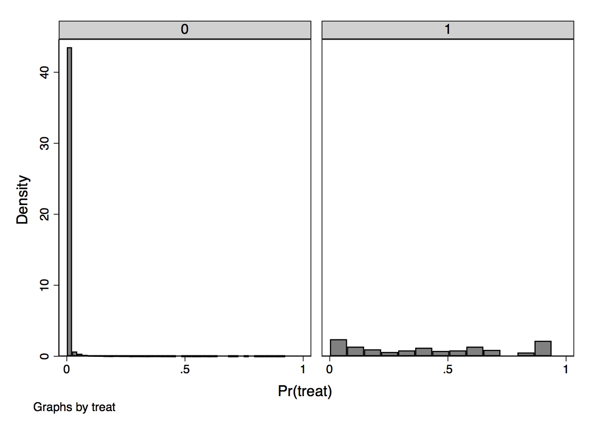
These two simple diagnostic tests show what is going to be a problem later when we use inverse probability weighting. The probability of treatment is spread out across the units in the treatment group, but there is a very large mass of nearly zero propensity scores in the CPS. How do we interpret this? What this means is that the characteristics of individuals in the treatment group are rare in the CPS sample. This is not surprising given the strong negative selection into treatment. These individuals are younger, less likely to be married, and more likely to be uneducated and a minority. The lesson is, if the two groups are significantly different on background characteristics, then the propensity scores will have grossly different distributions by treatment status. We will discuss this in greater detail later.
For now, let’s look at the treatment parameter under both assumptions.
\[ \begin{align} E[\delta_i(X_i)] & =E\big[Y_i^1 - Y_i^0\mid X_i=x\big] \\ & = E\big[Y_i^1\mid X_i=x\big]-E\big[Y_i^0\mid X_i=x\big] \end{align} \]
The conditional independence assumption allows us to make the following substitution, \[ E\big[Y^1_i\mid D_i = 1, X_i = x\big] = E\big[Y_i\mid D_i = 1, X_i = x\big] \] and same for the other term. Common support means we can estimate both terms. Therefore, under both assumptions: \[ \delta = E[\delta(X_i)] \] From these assumptions we get the propensity score theorem, which states that under CIA \[ (Y^1,Y^0) \independent D\mid X \] This then yields \[ (Y^1,Y^0) \independent D \mid p(X) \] where \(p(X) =\Pr(D=1\mid X)\), the propensity score. In English, this means that in order to achieve independence, assuming CIA, all we have to do is condition on the propensity score. Conditioning on the propensity score is enough to have independence between the treatment and the potential outcomes.
This is an extremely valuable theorem because stratifying on \(X\) tends to run into the sparseness-related problems (i.e., empty cells) in finite samples for even a moderate number of covariates. But the propensity scores are just a scalar. So stratifying across a probability is going to reduce that dimensionality problem.
The proof of the propensity score theorem is fairly straightforward, as it’s just an application of the law of iterated expectations with nested conditioning.15 If we can show that the probability an individual receives treatment conditional on potential outcomes and the propensity score is not a function of potential outcomes, then we will have proved that there is independence between the potential outcomes and the treatment conditional on \(X\). Before diving into the proof, first recognize that \[ \Pr\big(D=1\mid Y^0, Y^1, p(X)\big)=E\big[D\mid Y^0, Y^1, p(X)\big] \] because
\[ \begin{align} E\big[D\mid Y^0, Y^1, p(X)\big] & =1 \times \Pr\big(D=1\mid Y^0, Y^1, p(X)\big) \\ & +0 \times \Pr\big(D=0\mid Y^0, Y^1, p(X)\big) \end{align} \]
and the second term cancels out because it’s multiplied by zero. The formal proof is as follows:
\[ \begin{align} \Pr\big(D=1\mid Y^1,Y^0, p(X)\big) & = \underbrace{{E\big[D\mid Y^1, Y^0, p(X)\big]}}_{\text{See previous equation}} \\ & =\underbrace{{E} \Big[E \big[D\mid Y^1,Y^0,p(X),X\big] {\mid Y^1,Y^0,p(X)\Big]}}_{ \text{by LIE}} \\ & =\underbrace{{E} \Big[E \big[D\mid Y^1,Y^0,X\big] {\mid Y^1,Y^0,p(X)\Big]}}_{\text{Given $X$, we know $p(X)$}} \\ & =\underbrace{{E} \Big[E \big[D\mid X\big] {\mid Y^1,Y^0,p(X)\Big]}}_{ \text{by conditional independence}} \\ & = \underbrace{{E} \Big[p(X) {\mid Y^1, Y^0, p(X)\Big]}}_{\text{propensity score definition}} \\ & = p(X) \end{align} \]
Using a similar argument, we obtain:
\[ \begin{align} \Pr\big(D=1\mid p(X)\big) & = \underbrace{E\big[D\mid p(X) \big]}_{\text{Previous argument}} \\ & =\underbrace{E \Big[E\big[D\mid X\big]\mid p(X)\Big]}_{\text{LIE}} \\ & =\underbrace{E\big[p(X)\mid p(X)\mid]}_{\text{definition}} \\ & = p(X) \end{align} \]
and \(\Pr(D=1\mid Y^1, Y^0, p(X)) = \Pr(D=1\mid p(X))\) by CIA.
Like the omitted variable bias formula for regression, the propensity score theorem says that you need only control for covariates that determine the likelihood a unit receives the treatment. But it also says something more than that. It technically says that the only covariate you need to condition on is the propensity score. All of the information from the \(X\) matrix has been collapsed into a single number: the propensity score.
A corollary of the propensity score theorem, therefore, states that given CIA, we can estimate average treatment effects by weighting appropriately the simple difference in means.16
Because the propensity score is a function of \(X\), we know
\[ \begin{align} \Pr\big(D=1\mid X, p(X)\big) & =\Pr\big(D=1\mid X\big) \\ & = p(X) \end{align} \]
Therefore, conditional on the propensity score, the probability that \(D=1\) does not depend on \(X\) any longer. That is, \(D\) and \(X\) are independent of one another conditional on the propensity score, or \[ D \independent \mid p(X) \] So from this we also obtain the balancing property of the propensity score: \[ \Pr\big(X \mid| D=1, p(X)\big)= \Pr\big(X\mid D=0, p(X)\big) \] which states that conditional on the propensity score, the distribution of the covariates is the same for treatment as it is for control group units. See this in the following DAG:
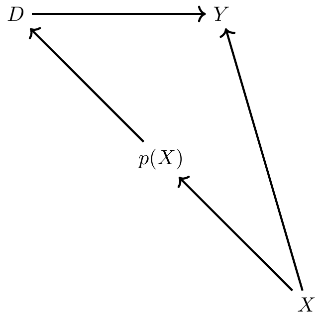
Notice that there exist two paths between \(X\) and \(D\). There’s the direct path of \(X \rightarrow p(X) \rightarrow D\), and there’s the backdoor path \(X \rightarrow Y \leftarrow D\). The backdoor path is blocked by a collider, so there is no systematic correlation between \(X\) and \(D\) through it. But there is systematic correlation between \(X\) and \(D\) through the first directed path. But, when we condition on \(p(X)\), the propensity score, notice that \(D\) and \(X\) are statistically independent. This implies that \(D \independent X \mid p(X)\), which implies \[ \Pr\big(X \mid D=1, \widehat{p}(X\big)= \Pr\big(X\mid D=0, \widehat{p}(X)\big) \] This is something we can directly test, but note the implication: conditional on the propensity score, treatment and control should on average be the same with respect to \(X\). In other words, the propensity score theorem implies balanced observable covariates.17
There are several ways researchers can estimate average treatment effects using an estimated propensity score. Busso, DiNardo, and McCrary (2014) examined the properties of various approaches and found that inverse probability weighting was competitive in several simulations. As there are different ways in which the weights are incorporated into a weighting design, I discuss a few canonical versions of the method of inverse probability weighting and associated methods for inference. This is an expansive area in causal inference econometrics, so consider this merely an overview of and introduction to the main concepts.
Assuming that CIA holds in our data, then one way we can estimate treatment effects is to use a weighting procedure in which each individual’s propensity score is a weight of that individual’s outcome (Imbens 2000). When aggregated, this has the potential to identify some average treatment effect. This estimator is based on earlier work in survey methodology first proposed by Horvitz and Thompson (1952). The weight enters the expression differently depending on each unit’s treatment status and takes on two different forms depending on whether the target parameter is the ATE or the ATT (or the ATU, which is not shown here):
\[ \begin{align} \delta_{ATE} & =E[Y^1-Y^0] \nonumber \\ & =E \left[ Y \cdot \dfrac{D - p(X)}{p(X) \cdot (1-p(X))} \right] \\ \delta_{ATT} & =E\big[Y^1-Y^0\mid D=1\big] \nonumber \\ & =\dfrac{1}{\Pr(D=1)} \cdot E \left[ Y \cdot \dfrac{D-p(X)}{1-p(X)} \right] \end{align} \]
A proof for ATE is provided:
\[ \begin{align} E \left[ Y \dfrac{D-p(X)}{p(X)(1-p(X))} \Big\vert X \right] & = E \left[ \dfrac{Y}{p(X)} \Big\vert X,D=1 \right] p(X) \nonumber \\ & + E\left[ \dfrac{-Y}{1-p(X)} \Big\vert X,D=0 \right](1-p(X)) \nonumber \\ & = E\big[Y\mid X,D=1\big] - E\big[Y\mid X,D=0\big] \end{align} \]
and the results follow from integrating over \(P(X)\) and \(P(X\mid D=1)\).
The sample versions of both ATE and ATT are obtained by a two-step estimation procedure. In the first step, the researcher estimates the propensity score using logit or probit. In the second step, the researcher uses the estimated score to produce sample versions of one of the average treatment effect estimators shown above. Those sample versions can be written as follows:
\[ \begin{align} \widehat{\delta}_{ATE} & =\dfrac{1}{N} \sum_{i=1}^N Y_i \cdot \dfrac{D_i - \widehat{p}(X_i)}{\widehat{p}(X_i) \cdot (1-\widehat{p}(X_i))} \\ \widehat{\delta}_{ATT} & =\dfrac{1}{N_T} \sum_{i=1}^N Y_i \cdot \dfrac{D_i -\widehat{p}(X_i)}{1-\widehat{p}(X_i)} \end{align} \]
We have a few options for estimating the variance of this estimator, but one is simply to use bootstrapping. First created by Efron (1979), bootstrapping is a procedure used to estimate the variance of an estimator. In the context of inverse probability weighting, we would repeatedly draw (“with replacement”) a random sample of our original data and then use that smaller sample to calculate the sample analogs of the ATE or ATT. More specifically, using the smaller “bootstrapped” data, we would first estimate the propensity score and then use the estimated propensity score to calculate sample analogs of the ATE or ATT over and over to obtain a distribution of treatment effects corresponding to different cuts of the data itself.18 If we do this 1,000 or 10,000 times, we get a distribution of parameter estimates from which we can calculate the standard deviation. This standard deviation becomes like a standard error and gives us a measure of the dispersion of the parameter estimate under uncertainty regarding the sample itself.19 Adudumilli (2018) and Bodory et al. (2020) discuss the performance of various bootstrapping procedures, such as the standard bootstrap or the wild bootstrap. I encourage you to read these papers more closely when choosing which bootstrap is suitable for your question.
The sensitivity of inverse probability weighting to extreme values of the propensity score has led some researchers to propose an alternative that can handle extremes a bit better. Hirano and Imbens (2001) propose an inverse probability weighting estimator of the average treatment effect that assigns weights normalized by the sum of propensity scores for treated and control groups as opposed to equal weights of \(\dfrac{1}{N}\) to each observation. This procedure is sometimes associated with Hájek (1971). Millimet and Tchernis (2009) refer to this estimator as the normalized estimator. Its weights sum to one within each group, which tends to make it more stable. The expression of this normalized estimator is shown here: \[ \widehat{\delta}_{ATT}=\bigg [ \sum_{i=1}^N \dfrac{Y_iD_i}{\widehat{p}} \bigg ] / \bigg [ \sum_{i=1}^N \dfrac{D_i}{\widehat{p}} \bigg ] - \bigg [ \sum_{i=1}^N \dfrac{Y_i(1-D_i)}{(1-\widehat{p})} \bigg ] / \bigg [ \sum_{i=1}^N \dfrac{(1-D_i)}{(1-\widehat{p})} \bigg ] \] Most software packages have programs that will estimate the sample analog of these inverse probability weighted parameters that use the second method with normalized weights. For instance, Stata’s -teffects- and R’s -ipw- can both be used. These packages will also generate standard errors. But I’d like to manually calculate these point estimates so that you can see more clearly exactly how to use the propensity score to construct either non-normalized or normalized weights and then estimate ATT.
* Manual with non-normalized weights using all the data
gen d1=treat/pscore
gen d0=(1-treat)/(1-pscore)
egen s1=sum(d1)
egen s0=sum(d0)

gen y1=treat*re78/pscore
gen y0=(1-treat)*re78/(1-pscore)
gen ht=y1-y0

* Manual with normalized weights
replace y1=(treat*re78/pscore)/(s1/_N)
replace y0=((1-treat)*re78/(1-pscore))/(s0/_N)
gen norm=y1-y0
su ht norm

* ATT under non-normalized weights is -$11,876
* ATT under normalized weights is -$7,238

drop d1 d0 s1 s0 y1 y0 ht norm

* Trimming the propensity score
drop if pscore <= 0.1
drop if pscore >= 0.9

* Manual with non-normalized weights using trimmed data
gen d1=treat/pscore
gen d0=(1-treat)/(1-pscore)
egen s1=sum(d1)
egen s0=sum(d0)

gen y1=treat*re78/pscore
gen y0=(1-treat)*re78/(1-pscore)
gen ht=y1-y0

* Manual with normalized weights using trimmed data
replace y1=(treat*re78/pscore)/(s1/_N)
replace y0=((1-treat)*re78/(1-pscore))/(s0/_N)
gen norm=y1-y0
su ht norm

* ATT under non-normalized weights is $2,006
* ATT under normalized weights is $1,806library(tidyverse)
library(haven)
#continuation
N <- nrow(nsw_dw_cpscontrol)
#- Manual with non-normalized weights using all data
nsw_dw_cpscontrol <- nsw_dw_cpscontrol %>%
mutate(d1 = treat/pscore,
d0 = (1-treat)/(1-pscore))
s1 <- sum(nsw_dw_cpscontrol$d1)
s0 <- sum(nsw_dw_cpscontrol$d0)
nsw_dw_cpscontrol <- nsw_dw_cpscontrol %>%
mutate(y1 = treat * re78/pscore,
y0 = (1-treat) * re78/(1-pscore),
ht = y1 - y0)
#- Manual with normalized weights
nsw_dw_cpscontrol <- nsw_dw_cpscontrol %>%
mutate(y1 = (treat*re78/pscore)/(s1/N),
y0 = ((1-treat)*re78/(1-pscore))/(s0/N),
norm = y1 - y0)
nsw_dw_cpscontrol %>%
pull(ht) %>%
mean()
nsw_dw_cpscontrol %>%
pull(norm) %>%
mean()
#-- trimming propensity score
nsw_dw_cpscontrol <- nsw_dw_cpscontrol %>%
select(-d1, -d0, -y1, -y0, -ht, -norm) %>%
filter(!(pscore >= 0.9)) %>%
filter(!(pscore <= 0.1))
N <- nrow(nsw_dw_cpscontrol)
#- Manual with non-normalized weights using trimmed data
nsw_dw_cpscontrol <- nsw_dw_cpscontrol %>%
mutate(d1 = treat/pscore,
d0 = (1-treat)/(1-pscore))
s1 <- sum(nsw_dw_cpscontrol$d1)
s0 <- sum(nsw_dw_cpscontrol$d0)
nsw_dw_cpscontrol <- nsw_dw_cpscontrol %>%
mutate(y1 = treat * re78/pscore,
y0 = (1-treat) * re78/(1-pscore),
ht = y1 - y0)
#- Manual with normalized weights with trimmed data
nsw_dw_cpscontrol <- nsw_dw_cpscontrol %>%
mutate(y1 = (treat*re78/pscore)/(s1/N),
y0 = ((1-treat)*re78/(1-pscore))/(s0/N),
norm = y1 - y0)
nsw_dw_cpscontrol %>%
pull(ht) %>%
mean()
nsw_dw_cpscontrol %>%
pull(norm) %>%
mean()import numpy as np
import pandas as pd
import statsmodels.api as sm
import statsmodels.formula.api as smf
from itertools import combinations
import plotnine as p
# read data
import ssl
ssl._create_default_https_context = ssl._create_unverified_context
def read_data(file):
return pd.read_stata("https://github.com/scunning1975/mixtape/raw/master/" + file)
# Prepare data for logit
nsw_dw_cpscontrol = read_data('cps_mixtape.dta')
nsw_dw_cpscontrol = pd.concat((nsw_dw_cpscontrol, nsw_dw))
nsw_dw_cpscontrol[['u74', 'u75']] = 0
nsw_dw_cpscontrol.loc[nsw_dw_cpscontrol.re74==0, 'u74'] = 1
nsw_dw_cpscontrol.loc[nsw_dw_cpscontrol.re75==0, 'u75'] = 1
# estimating propensity score
logit_nsw = smf.glm(formula="""treat ~ age + age**2 + age**3 + educ + educ**2 +
marr + nodegree + black + hisp + re74 + re75 + u74 + u75 + educ*re74""",
family=sm.families.Binomial(),
data=nsw_dw_cpscontrol).fit()
nsw_dw_cpscontrol['pscore'] = logit_nsw.predict(nsw_dw_cpscontrol)
# continuation
N = nsw_dw_cpscontrol.shape[0]
# Manual with non-normalized weights using all data
nsw_dw_cpscontrol = nsw_dw_cpscontrol
nsw_dw_cpscontrol['d1'] = nsw_dw_cpscontrol.treat/nsw_dw_cpscontrol.pscore
nsw_dw_cpscontrol['d0'] = (1-nsw_dw_cpscontrol.treat)/(1-nsw_dw_cpscontrol.pscore)
s1 = nsw_dw_cpscontrol.d1.sum()
s0 = nsw_dw_cpscontrol.d0.sum()
nsw_dw_cpscontrol['y1'] = nsw_dw_cpscontrol.treat * nsw_dw_cpscontrol.re78 / nsw_dw_cpscontrol.pscore
nsw_dw_cpscontrol['y0'] = (1 - nsw_dw_cpscontrol.treat) * nsw_dw_cpscontrol.re78 / (1 - nsw_dw_cpscontrol.pscore)
nsw_dw_cpscontrol['ht'] = nsw_dw_cpscontrol['y1'] - nsw_dw_cpscontrol['y0']
te_1 = nsw_dw_cpscontrol.ht.mean()
print("Treatment Effect (non-normalized, all data): {:.2f}".format(te_1))
nsw_dw_cpscontrol['y1'] = nsw_dw_cpscontrol.treat * nsw_dw_cpscontrol.re78 / nsw_dw_cpscontrol.pscore
nsw_dw_cpscontrol['y1'] /= s1/N
nsw_dw_cpscontrol['y0'] = (1 - nsw_dw_cpscontrol.treat) * nsw_dw_cpscontrol.re78 / (1 - nsw_dw_cpscontrol.pscore)
nsw_dw_cpscontrol['y0'] /= s0/N
nsw_dw_cpscontrol['ht'] = nsw_dw_cpscontrol['y1'] - nsw_dw_cpscontrol['y0']
te_2 = nsw_dw_cpscontrol.ht.mean()
print("Treatment Effect (normalized, all data): {:.2f}".format(te_2))
nsw_dw_trimmed = nsw_dw_cpscontrol.drop(['d1', 'd0', 'y1', 'y0'], axis=1)
nsw_dw_trimmed = nsw_dw_trimmed[nsw_dw_trimmed.pscore.between(.1, .9)]
N = nsw_dw_trimmed.shape[0]
nsw_dw_trimmed['y1'] = nsw_dw_trimmed.treat * nsw_dw_trimmed.re78 / nsw_dw_trimmed.pscore
nsw_dw_trimmed['y0'] = (1 - nsw_dw_trimmed.treat) * nsw_dw_trimmed.re78 / (1 - nsw_dw_trimmed.pscore)
nsw_dw_trimmed['ht'] = nsw_dw_trimmed['y1'] - nsw_dw_trimmed['y0']
te_3 = nsw_dw_trimmed.ht.mean()
print("Treatment Effect (non-normalized, trimmed data): {:.2f}".format(te_3))
nsw_dw_trimmed['y1'] = nsw_dw_trimmed.treat * nsw_dw_trimmed.re78 / nsw_dw_trimmed.pscore
nsw_dw_trimmed['y1'] /= s1/N
nsw_dw_trimmed['y0'] = (1 - nsw_dw_trimmed.treat) * nsw_dw_trimmed.re78 / (1 - nsw_dw_trimmed.pscore)
nsw_dw_trimmed['y0'] /= s0/N
nsw_dw_trimmed['ht'] = nsw_dw_trimmed['y1'] - nsw_dw_trimmed['y0']
te_4 = nsw_dw_trimmed.ht.mean()
print("Treatment Effect (normalized, trimmed data): {:.2f}".format(te_4))When we estimate the treatment effect using inverse probability weighting using the non-normalized weighting procedure described earlier, we find an estimated ATT of \(-\$11,876\). Using the normalization of the weights, we get \(-\$7,238\). Why is this so much different than what we get using the experimental data?
Recall what inverse probability weighting is doing. It is weighting treatment and control units according to \(\widehat{p}(X)\), which is causing units with very small values of the propensity score to blow up and become unusually influential in the calculation of ATT. Thus, we will need to trim the data. Here we will do a very small trim to eliminate the mass of values at the far-left tail. Crump et al. (2009) develop a principled method for addressing a lack of overlap. A good rule of thumb, they note, is to keep only observations on the interval [0.1,0.9], which was performed at the end of the program.
Now let’s repeat the analysis having trimmed the propensity score, keeping only values whose scores are between 0.1 and 0.9. Now we find $2,006 using the non-normalized weights and $1,806 using the normalized weights. This is very similar to what we know is the true causal effect using the experimental data, which was $1,794. And we can see that the normalized weights are even closer. We still need to calculate standard errors, such as based on a bootstrapping method, but I leave it to you investigate that more carefully by reading Adudumilli (2018) and Bodory et al. (2020), who, as I mentioned, discuss the performance of various bootstrapping procedures such as the standard bootstrap and the wild bootstrap.
An alternative, very popular approach to inverse probability weighting is matching on the propensity score. This is often done by finding a couple of units with comparable propensity scores from the control unit donor pool within some ad hoc chosen radius distance of the treated unit’s own propensity score. The researcher then averages the outcomes and then assigns that average as an imputation to the original treated unit as a proxy for the potential outcome under counterfactual control. Then effort is made to enforce common support through trimming.
But this method has been criticized by King and Nielsen (2019). The King and Nielsen (2019) critique is not of the propensity score itself. For instance, the critique does not apply to stratification based on the propensity score (Rosenbaum and Rubin 1983), regression adjustment or inverse probability weighting. The problem is only focused on nearest-neighbor matching and is related to the forced balance through trimming as well as myriad other common research choices made in the course of the project that together ultimately amplify bias. King and Nielsen (2019) write: “The more balanced the data, or the more balance it becomes by trimming some of the observations through matching, the more likely propensity score matching will degrade inferences” (p.1).
Nevertheless, nearest-neighbor matching, along with inverse probability weighting, is perhaps the most common method for estimating a propensity score model. Nearest-neighbor matching using the propensity score pairs each treatment unit \(i\) with one or more comparable control group units \(j\), where comparability is measured in terms of distance to the nearest propensity score. This control group unit’s outcome is then plugged into a matched sample. Once we have the matched sample, we can calculate the ATT as \[ \widehat{ATT}=\dfrac{1}{N_T} (Y_i - Y_{i(j)}) \]
where \(Y_{i(j)}\) is the matched control group unit to \(i\). We will focus on the ATT because of the problems with overlap that we discussed earlier.
teffects psmatch (re78) (treat age agesq agecube educ edusq marr nodegree black hisp re74 re75 u74 u75 interaction1, logit), atet gen(pstub_cps) nn(5)library(MatchIt)
library(Zelig)
m_out <- matchit(treat ~ age + agesq + agecube + educ +
educsq + marr + nodegree +
black + hisp + re74 + re75 + u74 + u75 + interaction1,
data = nsw_dw_cpscontrol, method = "nearest",
distance = "logit", ratio =5)
m_data <- match.data(m_out)
z_out <- zelig(re78 ~ treat + age + agesq + agecube + educ +
educsq + marr + nodegree +
black + hisp + re74 + re75 + u74 + u75 + interaction1,
model = "ls", data = m_data)
x_out <- setx(z_out, treat = 0)
x1_out <- setx(z_out, treat = 1)
s_out <- sim(z_out, x = x_out, x1 = x1_out)
summary(s_out)# Missing python codeI chose to match using five nearest neighbors. Nearest neighbors, in other words, will find the five nearest units in the control group, where “nearest” is measured as closest on the propensity score itself. Unlike covariate matching, distance here is straightforward because of the dimension reduction afforded by the propensity score. We then average actual outcome, and match that average outcome to each treatment unit. Once we have that, we subtract each unit’s matched control from its treatment value, and then divide by \(N_T\), the number of treatment units. When we do that in Stata, we get an ATT of $1,725 with \(p<0.05\). Thus, it is both relatively precise and similar to what we find with the experiment itself.
There are two kinds of matching we’ve reviewed so far. Exact matching matches a treated unit to all of the control units with the same covariate value. But sometimes this is impossible, and therefore there are matching discrepancies. For instance, say that we are matching continuous age and continuous income. The probability we find another person with the exact same value of both is very small, if not zero. This leads therefore to mismatching on the covariates, which introduces bias.
The second kind of matching we’ve discussed are approximate matching methods, which specify a metric to find control units that are “close” to the treated unit. This requires a distance metric, such as Euclidean, Mahalanobis, or the propensity score. All of these can be implemented in Stata or R.
Iacus, King, and Porro (2012) introduced a kind of exact matching called coarsened exact matching (CEM). The idea is very simple. It’s based on the notion that sometimes it’s possible to do exact matching once we coarsen the data enough. If we coarsen the data, meaning we create categorical variables (e.g., 0- to 10-year-olds, 11- to 20-year olds), then oftentimes we can find exact matches. Once we find those matches, we calculate weights on the basis of where a person fits in some strata, and those weights are used in a simple weighted regression.
First, we begin with covariates \(X\) and make a copy called \(X*\). Next we coarsen \(X*\) according to user-defined cutpoints or CEM’s automatic binning algorithm. For instance, schooling becomes less than high school, high school only, some college, college graduate, post college. Then we create one stratum per unique observation of \(X*\) and place each observation in a stratum. Assign these strata to the original and uncoarsened data, \(X\), and drop any observation whose stratum doesn’t contain at least one treated and control unit. Then add weights for stratum size and analyze without matching.
But there are trade-offs. Larger bins mean more coarsening of the data, which results in fewer strata. Fewer strata result in more diverse observations within the same strata and thus higher covariate imbalance. CEM prunes both treatment and control group units, which changes the parameter of interest, but so long as you’re transparent about this and up front, readers may be willing to give you the benefit of the doubt.20 Just know, though, that you are not estimating the ATE or the ATT when you start trimming (just as you aren’t doing so when you trim propensity scores).
The key benefit of CEM is that it is part of a class of matching methods called monotonic imbalance bounding (MIB). MIB methods bound the maximum imbalance in some feature of the empirical distributions by an ex ante decision by the user. In CEM, this ex ante choice is the coarsening decision. By choosing the coarsening beforehand, users can control the amount of imbalance in the matching solution. It’s also very fast.
There are several ways of measuring imbalance, but here we focus on the \(L1(f,g)\) measure, which is \[ L1(f,g)=\dfrac{1}{2} \sum_{l_1 \dots l_k} \Big|f_{l1 \dots l_k} - g_{l_1 \dots l_k}\Big| \] where \(f\) and \(g\) record the relative frequencies for the treatment and control group units. Perfect global balance is indicated by \(L1=0\). Larger values indicate larger imbalance between the groups, with a maximum of \(L1=1\). Hence the “imbalance bounding” between 0 and 1.
Now let’s get to the fun part: estimation. We will use the same job-training data we’ve been working with for this estimation.
ssc install cem

* Reload experimental group data
use https://github.com/scunning1975/mixtape/raw/master/nsw_mixtape.dta, clear
drop if treat==0

* Now merge in the CPS controls from footnote 2 of Table 2 (Dehejia and Wahba 2002)
append using https://github.com/scunning1975/mixtape/raw/master/cps_mixtape.dta
gen agesq=age*age
gen agecube=age*age*age
gen edusq=educ*edu
gen u74 = 0 if re74!=.
replace u74 = 1 if re74==0
gen u75 = 0 if re75!=.
replace u75 = 1 if re75==0
gen interaction1 = educ*re74
gen re74sq=re74^2
gen re75sq=re75^2
gen interaction2 = u74*hisp

cem age (10 20 30 40 60) age agesq agecube educ edusq marr nodegree black hisp re74 re75 u74 u75 interaction1, treatment(treat)
reg re78 treat [iweight=cem_weights], robustlibrary(cem)
library(MatchIt)
library(Zelig)
library(tidyverse)
library(estimatr)
m_out <- matchit(treat ~ age + agesq + agecube + educ +
educsq + marr + nodegree +
black + hisp + re74 + re75 +
u74 + u75 + interaction1,
data = nsw_dw_cpscontrol,
method = "cem",
distance = "logit")
m_data <- match.data(m_out)
m_ate <- lm_robust(re78 ~ treat,
data = m_data,
weights = m_data$weights)# Missing python codeThe estimated ATE is $2,152, which is larger than our estimated experimental effect. But this ensured a high degree of balance on the covariates, as can be seen from the output from the cem command itself.
| Covariate | L1 | Mean | Min. | 25% | 50% | 75% | Max. |
|---|---|---|---|---|---|---|---|
| age | .08918 | .55337 | 1 | 1 | 0 | 1 | 0 |
| agesq | .1155 | 21.351 | 33 | 35 | 0 | 49 | 0 |
| agecube | .05263 | 626.9 | 817 | 919 | 0 | 1801 | 0 |
| school | 6.0e-16 | \(\rm -2.3e-14\) | 0 | 0 | 0 | 0 | 0 |
| schoolsq | 5.4e-16 | \(\rm -2.8e-13\) | 0 | 0 | 0 | 0 | 0 |
| married | 1.1e-16 | \(\rm -1.1e-16\) | 0 | 0 | 0 | 0 | 0 |
| nodegree | 4.7e-16 | \(\rm -3.3e-16\) | 0 | 0 | 0 | 0 | 0 |
| black | 4.7e-16 | \(\rm -8.9e-16\) | 0 | 0 | 0 | 0 | 0 |
| hispanic | 7.1e-17 | \(-3.1e-17\) | 0 | 0 | 0 | 0 | 0 |
| re74 | .06096 | 42.399 | 0 | 0 | 0 | 0 | \(-94.801\) |
| re75 | .03756 | \(-73.999\) | 0 | 0 | 0 | \(-222.85\) | \(-545.65\) |
| u74 | 1.9e-16 | \(\rm -2.2e-16\) | 0 | 0 | 0 | 0 | 0 |
| u75 | 2.5e-16 | \(\rm -1.1e-16\) | 0 | 0 | 0 | 0 | 0 |
| interaction1 | .06535 | 425.68 | 0 | 0 | 0 | 0 | \(-853.21\) |
As can be seen from Table 5.17, the values of \(L1\) are close to zero in most cases. The largest \(L1\) gets is 0.12 for age squared.
Matching methods are an important member of the causal inference arsenal. Propensity scores are an excellent tool to check the balance and overlap of covariates. It’s an under-appreciated diagnostic, and one that you might miss if you only ran regressions. There are extensions for more than two treatments, like multinomial models, but I don’t cover those here. The propensity score can make groups comparable, but only on the variables used to estimate the propensity score in the first place. It is an area that continues to advance to include covariate balancing (Imai and Ratkovic 2013; Zubizarreta 2015; Zhao 2019) and doubly robust estimators (Band and Robins 2005). Consider this chapter more about the mechanics of matching when you have exact and approximate matching situations.
Learning about the propensity score is particularly valuable given that it appears to have a very long half-life. For instance, propensity scores make their way into other contemporary designs too, such as difference-in-differences (Sant’Anna and Zhao 2018). So investing in a basic understanding of these ideas and methods is likely worthwhile. You never know when the right project comes along for which these methods are the perfect solution, so there’s no intelligent reason to write them off.
But remember, every matching solution to a causality problem requires a credible belief that the backdoor criterion can be achieved by conditioning on some matrix \(X\), or what we’ve called CIA. This explicitly requires that there are no unobservable variables opening backdoor paths as confounders, which to many researchers requires a leap of faith so great they are unwilling to make it. In some respects, CIA is somewhat advanced because it requires deep institutional knowledge to say with confidence that no such unobserved confounder exists. The method is easy compared to such domain-specific knowledge. So if you have good reason to believe that there are important, unobservable variables, you will need another tool. But if you are willing to make such an assumption, then these methods and others could be useful for you in your projects.
Buy the print version today:
Everything I know about matching I learned from the Northwestern causal inference workshops in lectures taught by the econometrician Alberto Abadie. I would like to acknowledge him as this chapter is heavily indebted to him and those lectures.↩︎
But think about the hurdle that the last criticism actually creates. Just imagine the hypothetical experiment: a large sample of people, with diverse potential outcomes, are assigned to a treatment group (smoker) and control (non-smoker). These people must be dosed with their corresponding treatments long enough for us to observe lung cancer develop—so presumably years of heavy smoking. How could anyone ever run an experiment like that? Who in their right mind would participate!? Just to describe the idealized experiment is to admit it’s impossible. But how do we answer the causal question without independence (i.e., randomization)?↩︎
Interestingly, this issue of covariate balance weaves throughout nearly every identification strategy that we will discuss.↩︎
A truly hilarious assumption, but this is just illustrative.↩︎
I’m sure you can think of others, though, in which case this DAG is misleading.↩︎
Notice the \(D_i=1\) in the subscript of the summation operator.↩︎
\(2 \times 1 - 1 = 1.\)↩︎
I cannot emphasize this enough—this method, like regression more generally, only has value for your project if you can satisfy the backdoor criterion by conditioning on \(X\). If you cannot satisfy the backdoor criterion in your data, then the propensity score does not assist you in identifying a causal effect. At best, it helps you better understand issues related to balance on observables (but not unobservables). It is absolutely critical that your DAG be, in other words, credible, defensible, and accurate, as you depend on those theoretical relationships to design the appropriate identification strategy.↩︎
Remember, randomization means that the treatment was independent of the potential outcomes, so simple difference in means identifies the average treatment effect.↩︎
Lalonde (1986) lists several studies that discuss the findings from the program.↩︎
It’s since been cited a little more than 1,700 times.↩︎
Lalonde reports a couple different diff-in-diff models, but for simplicity, I will only report one.↩︎
Let’s hold off digging into exactly how they used the propensity score to generate these estimates.↩︎
CIA is expressed in different ways according to the econometric or statistical tradition. Rosenbaum and Rubin (1983) called it the ignorable treatment assignment, or unconfoundedness. Barnow, Cain, and Goldberger (1981) and Dale and Krueger (2002) called it selection on observables. In the traditional econometric pedagogy, as we discussed earlier, it’s called the zero conditional mean assumption.↩︎
This all works if we match on the propensity score and then calculate differences in means. Direct propensity score matching works in the same way as the covariate matching we discussed earlier (e.g., nearest-neighbor matching), except that we match on the score instead of the covariates directly.↩︎
Just because something is exchangeable on observables does not make it exchangeable on unobservables. The propensity score theorem does not imply balanced unobserved covariates. See Brooks and Ohsfeldt (2013).↩︎
Bootstrapping and randomization inference are mechanically similar. Each randomizes something over and over, and under each randomization, reestimates treatment effects to obtain a distribution of treatment effects. But that is where the similarity ends. Bootstrapping is a method for computing the variance in an estimator where we take the treatment assignment as given. The uncertainty in bootstrapping stems from the sample, not the treatment assignment. And thus with each bootstrapped sample, we use fewer observations than exist in our real sample. That is not the source of uncertainty in randomization inference, though. In randomization inference, as you recall from the earlier chapter, the uncertainty in question regards the treatment assignment, not the sample. And thus in randomization inference, we randomly assign the treatment in order to reject or fail to reject Fisher’s sharp null of no individual treatment effects.↩︎
Abadie and Imbens (2008) show that the bootstrap fails for matching, but inverse probability weighting is not matching. This may seem like a subtle point, but in my experience many people conflate propensity score based matching with other methods that use the propensity score, calling all of them “matching.” But inverse probability weighting is not a matching procedure. Rather, it is a weighting procedure whose properties differ from that of using imputation and generally the bootstrap is fine.↩︎
They also may not. The methods are easy. It’s convincing readers that’s hard.↩︎