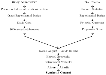
I will conclude the book with a discussion of a class of panel estimators called synthetic control. But before I do, I also want to conclude the final part of our story about Princeton’s labor economists and Harvard’s statisticians and econometricians to note that synthetic control is, like the LATE, a method born out of a fusion of the two traditions.
Synthetic control was developed by one of the first PhD students that Josh Angrist had at MIT, Alberto Abadie, who has also been a long-time collaborator of Guido Imbens’s. In many ways this chapter is about a unique and original contribution to causal inference made by a young Abadie, early in his career, and the work that has since built on it.
Two rivers into causal inference
Synthetic controls models, at their core, are explicit imputation estimators that estimate what would have happened to a treated unit or units had some intervention never occurred. But that is, as we have seen throughout the book, simply what all of causal inference is about—the imputation of counterfactuals using a different group, which under some assumptions, is a valid proxy for another. Synthetic control targets the ATT, just like diff-in-diff. And like diff-in-diff, this family of models is used with longitudinal data. Though synthetic control started out as a method for estimating causal effects in comparative case studies, the methods have since evolved to handle many of the same complex problems as diff-in-diff, such as differential timing. And like diff-in-diff, they have intuitive graphical evidence like the event study. But as we will see, they do not depend on the parallel trends assumption and therefore cannot be considered part of the diff-in-diff family tree, according to the perspective I’ve been putting forth in the book.
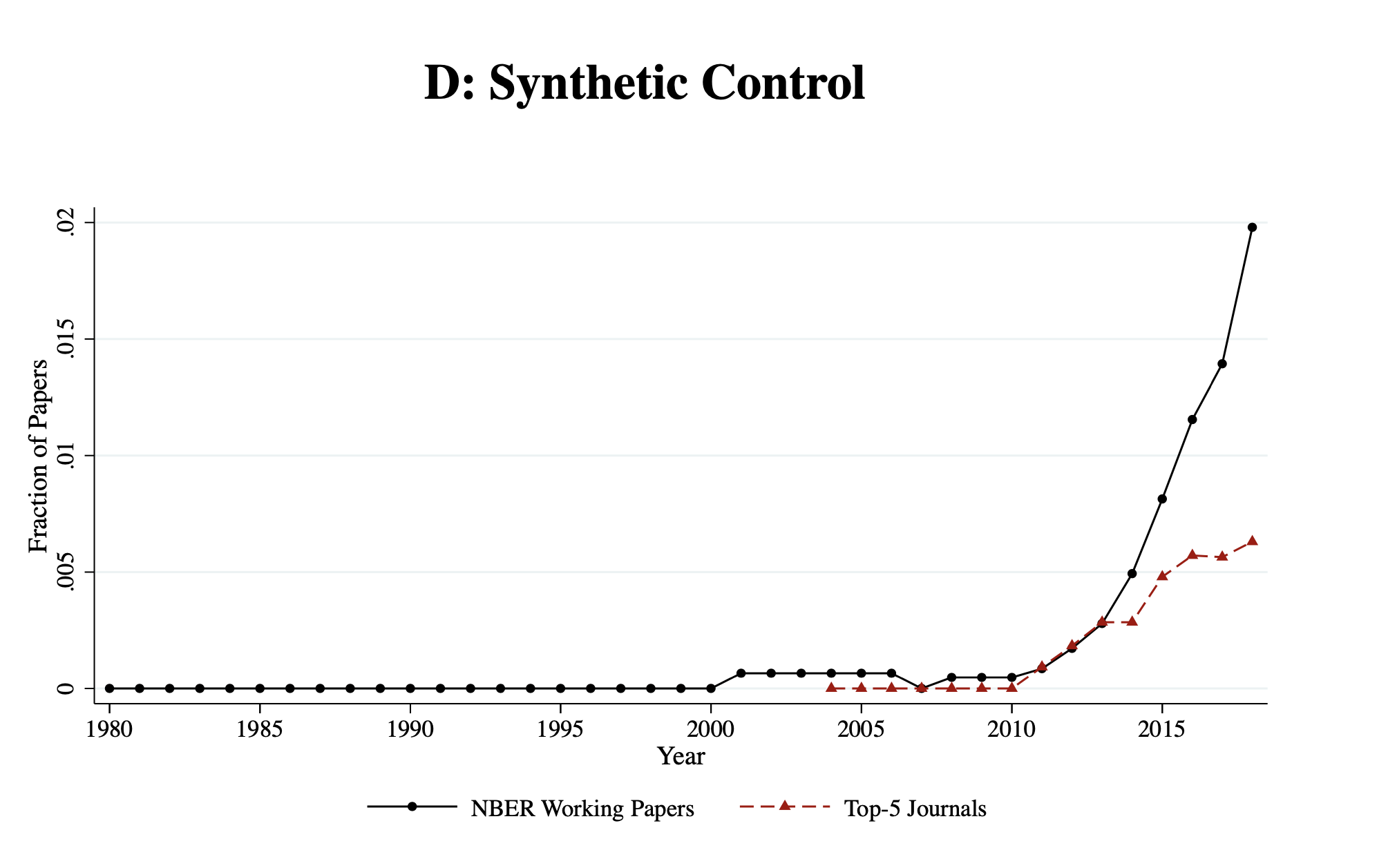
The first appearance of the synthetic control estimator was in a 2003 article where it was used to estimate the impact of terrorism on economic activity in the Basque Country, a beautiful and culturally distinct region in northern Spain (Abadie and Gardeazabal 2003). Since that publication, it has become very popular—particularly after the release of an R and Stata package coinciding with Abadie, Diamond, and Hainmueller (2010). For some questions, synthetic control might quite literally be the only credible way forward. The estimator has been so influential that Athey and Imbens (2017) said it was “arguably the most important innovation in the policy evaluation literature in the last 15 years.” Its popularity has increased, in particular, since the late 2010s(Figure 11.1).
Figure 11.1: Growth in mentions of synthetic control at top economics journals and among NBER working papers (Currie, Kleven, and Zwiers 2020).
In the traditional model developed by Abadie, the method optimally chooses a set of weights that when applied to a group of corresponding untreated units produce an optimally estimated counterfactual to the unit that received the treatment. This counterfactual, called the “synthetic control,” functions like an outline of what would have happened to the aggregate treated unit had the treatment never occurred. We will discuss it now with a motivating example—the famous Mariel boatlift paper by Card (1990).
Cuba, Miami, and the Mariel Boatlift
While the theoretical effect of immigration on native workers and labor market conditions is by and large not debated, the empirical effect of immigration is (Card and Peri 2016). Do inflows of immigrants empirically depress domestic wages and employment of workers in local labor markets? For Card (1990), this was an empirical question, and he used a natural experiment to evaluate it.
In 1980, Cuban leader Fidel Castro announced that anyone wishing to leave Cuba could do so through the port of Mariel. This triggered a mass exodus now known as the Mariel Boatlift. Between April and October 1980, approximately 125,000 Cubans departed from Mariel Harbor and arrived in the United States, with the vast majority settling in Miami, Florida. The boatlift ended when Cuba and the United States agreed to halt the migration. This sudden inflow of immigrants increased Miami’s labor force by about 7%, largely composed of low-skilled workers entering a relatively concentrated labor market.
Card saw this as an ideal natural experiment to evaluate the effect of immigration on local labor markets. It was arguably an exogenous shift in the labor supply curve, which would allow him to determine if wages fell and employment increased, consistent with a simple competitive labor market model. He used individual-level data on unemployment from the Current Population Survey for Miami and chose four comparison cities (Atlanta, Los Angeles, Houston, and Tampa-St. Petersburg). The choice of these four cities is delegated to a footnote in the paper wherein Card argues that these four cities were selected because they were similar to Miami based on demographics and economic conditions. He then implemented a difference-in-differences design and, somewhat surprisingly, found no discernible effect of the Boatlift on wages or unemployment in Miami. Card interpreted this as evidence that Miami’s labor market was able to absorb the labor supply shock with minimal disruption.
The paper was controversial—not necessarily because Card used a natural experiment to estimate the effect of immigration on wages and employment, but because his findings contradicted prevailing expectations. Many economists had anticipated that such a large influx of low-skilled workers would depress wages and increase unemployment among existing low-skilled workers in Miami. Yet Card found little to no effect. A later study by Peri and Yasenov (2019) replicated Card’s analysis using synthetic control methods and reached similar conclusions (Peri and Yasenov 2019). Despite the ongoing debate—fueled in part by the heterogeneity of immigration episodes and their context-specific treatment effects—Card’s study remains highly influential. Indeed, it was one of the key pieces of work cited by the Nobel Prize committee when he was awarded the prize and is undoubtedly now considered a modern classic in labor economics.
Card’s study was a comparative case study that had certain strengths and weaknesses. The policy intervention occurred at an aggregate level, for which aggregate data was available. But the problems with the study were that the selection of the control group was, in retrospect, ad hoc and therefore potentially subjective. Estimated treatment effects, after all, compare what did happen with what is predicted to have happened absent Castro’s decision. Perhaps a different set of cities would find a different set of results. Secondly, the standard errors reflect sampling variance as opposed to uncertainty about the ability of the control group to reproduce the counterfactual of interest. Abadie and Gardeazabal (2003) and Abadie, Diamond, and Hainmueller (2010) introduced the synthetic control estimator as a way of addressing both issues simultaneously.
Abadie and Gardeazabal (2003)’s original synthetic control model uses a data driven approach to estimate a non-negatively weighted average of control group unit outcomes, drawn from a large “donor pool” of units, to model the counterfactual. The method is based on the observation that, when the units of analysis are a few aggregate units, a combination of comparison units (the “synthetic control”) often does a better job of reproducing characteristics of a treated unit than using a single comparison unit alone. The comparison unit, therefore, in this method is selected to be the weighted average of all comparison units that best resemble the characteristics of the treated unit(s) in the pretreatment period and is “optimal,” so-called, because it is the uniquely best set of weights that minimize the matching discrepancy observed in the pretreatment period.
Abadie, Diamond, and Hainmueller (2010) argue that the synthetic control method offers several advantages over traditional regression-based approaches. One key advantage is that synthetic control precludes extrapolation. Rather than relying on functional form assumptions, it resolves the problem of the missing counterfactual by constructing a weighted combination of control units that closely resemble the treated unit in the pretreatment period—ideally over a long span of time. As with many causal inference methods we’ve reviewed, the estimated effect is the difference between the treated unit’s observed post-treatment outcome and the outcome of its synthetic control over the same period. Crucially, the synthetic control is built from a convex combination of contemporaneous control units—it does not project forward from historical data. Because of this, the estimated effect is interpreted relative to actual observed data, not to forecasts or extrapolations, which can be a source of bias in regression-based estimators, particularly in settings with limited support or influential outliers (King and Zeng 2006).
A second advantage concerns the design stage of the study. Unlike regression-based methods, synthetic control does not require access to post-treatment outcomes when constructing the counterfactual. This separation of design and estimation helps guard against peeking at the results while specifying the model—an important principle we emphasized in the difference-in-differences checklist from the previous chapter. While researchers can still violate this principle by looking ahead, the key point is that synthetic control makes it possible to focus solely on design during model construction, since the fitting process uses only pretreatment data (Rubin 2007, 2008). This allows for a more honest design and strengthens the credibility of the causal claims when followed in practice.
Another advantage—though ironically, also a common source of criticism—is the transparency of the synthetic control method. The estimated weights explicitly show what each control unit contributes to the counterfactual. This stands in contrast to the black box of regression models, where weights are often buried in matrix algebra and rarely surfaced in practice. This transparency is, unambiguously, a strict advantage: it clarifies which comparisons are driving the estimates. But it also gives skeptics something to latch onto—something they wouldn’t have had if the weights had remained invisible, as they typically do in standard regression output.
Consider a study using synthetic control to estimate the effect of a policy in California. The researcher constructs a synthetic control unit—a weighted average of other US states—and presents a table of weights showing, say, that Idaho receives a weight of 0.3. A seminar participant objects: “Idaho? Thirty percent of California? That’s absurd!” But the irony is that in a regression framework, as Abadie, Diamond, and Hainmueller (2015) once showed, Idaho might have received an even larger weight, or even a negative one, and no one would ever know—because standard software doesn’t show those weights unless you know how to dig them out and then voluntarily produce them for a sometimes bloodthirsty crowd.
In a way, that’s the ironic strength of synthetic control: by making its inner workings transparent, it invites more scrutiny than methods that conceal their mechanics.
Formalization
Let’s now formalize the method. Let \(Y_{jt}\) be the outcome of interest for unit \(j\) of \(J+1\) aggregate units at time \(t\), and treatment group be \(j=1.\) The synthetic control estimator models the effect of the intervention at time \(T_0\) on the treatment group using a linear combination of optimally chosen units as a synthetic control. For the post-intervention period, the synthetic control estimator measures the causal effect as \(Y_{1t}- \sum_{j=2}^{J+1}w_j^*Y_{jt}\) where \(w_j^*\) is a vector of optimally chosen weights.
Matching values from control variables, \(X_1\) and \(X_0,\) are selected by the researcher because they are thought to be strong predictors of post-intervention outcomes. The weights are chosen so as to minimize the norm, \(||X_1 - X_0W||\) subject to weight constraints. There are two weight constraints. First, we require that \(W=(w_2, \dots, w_{J+1})'\) with \(w_j \geq 0\) for \(j=2, \dots, J+1\). Second, let \(w_2 + \dots + w_{J+1}=1\). In words, no unit receives a negative weight, and weights sum to one. This means that either units have positive weights bounded between 0 and 1, or they have a zero weight—but they cannot receive a negative weight.1 You might sometimes hear people say that the synthetic control is a “properly weighted average” for this reason.
Abadie, Diamond, and Hainmueller (2010) present the minimization of the following equation as the objective in the traditional synthetic control: \[
\begin{eqnarray*}
||X_1 - X_0W|| = \sqrt{(X_1 - X_0W)'V(X_1 - X_0W)}
\end{eqnarray*}
\tag{11.1}\] where \(V\) is some \((k \times k)\) symmetric and positive semidefinite matrix. The \(V\) matrix is important and subtle as it measures the “importance” of the characteristics chosen in predicting the outcome. As such you might hear someone call the \(V\) matrix the “importance matrix” as shorthand. Let \(X_{jm}\) be the value of the \(m\)-th covariates for unit \(j\). Typically, \(V\) is diagonal with main diagonal \(v_1, \dots, v_k\). Then the synthetic control weights minimize the aggregate matching discrepancy: \[
\text{Matching Discrepancy} = \sum_{m=1}^k v_m \bigg(X_{1m} -
\sum_{j=2}^{J+1}w_jX_{jm} \bigg)^2
\tag{11.2}\] where \(v_m\) is a weight that reflects the relative importance that we assign to the \(m\)-th variable when we measure the discrepancy between the treated unit and the synthetic control. Note the similarity here between this kind of distance minimization and the sort of distance minimization we saw in nearest neighbor matching discussed in the Unconfoundedness chapter (Abadie and Imbens 2006, 2008, 2011).
The solution to this constrained minimization problem yields an optimal set of weights, \(W^*\). But the choice of \(V\) is central, too, because \(W^*\) depends on one’s choice of \(V\). The synthetic control \(W^*(V)\) is meant to reproduce the behavior of the outcome variable for the treated unit in the absence of the treatment. Therefore, the weights \(v_1, \dots, v_k\) should reflect the predictive value of the covariates. Abadie, Diamond, and Hainmueller (2010) suggests different choices of \(V\), but most people choose \(V\) that minimizes the root mean squared prediction error (RMSPE), since the hope is that the final vector of weights will create a synthetic control that closely approximates the trends in \(Y\) for the two groups anyway: \[
\text{RMSPE} = \sum_{t=1}^{T_0} \bigg (Y_{1t} -
\sum_{j=2}^{J+1}w_j^*(V)Y_{jt}\bigg )^2
\tag{11.3}\]
Outcome Model Assumption
What about unobserved factors? Comparative case studies are complicated by unmeasured variables that influence the outcome of interest, as well as heterogeneity in how both observed and unobserved factors operate across units and over time. I’ll return to these complications in more detail later, but for now, let’s focus on the foundational assumption in Abadie, Diamond, and Hainmueller (2010): that the untreated potential outcome, \(Y^0_{it}\), is generated by a “factor model” like the one in Equation 11.4. \[
\begin{equation}
Y_{it}^0 = \alpha_t + \theta_t Z_i + \lambda_t u_i + \varepsilon_{it}
\label{eq:synth_factor_po}
\end{equation}
\tag{11.4}\]
What does it mean to say that the synthetic control model assumes the untreated potential outcome, \(Y^0_{it}\), is generated by a “factor model?” At a high level, this reflects a choice in the causal inference playbook: to begin with an outcome model. That is, synthetic control falls into the class of methods that assume a model of the outcome itself—rather than the treatment assignment mechanism—as the basis for identifying causal effects, and then work out the implications of that assumption for accuracy and bias.
To see the connection, recall the outcome regression approach discussed in the previous difference-in-differences chapter, where Heckman, Ichimura, and Todd (1997) used the parallel trends assumption to model how outcomes would have evolved for the treated group in the absence of treatment. Synthetic control makes a similar move, but with a more structured modeling assumption: it assumes that untreated outcomes are driven by a small number of latent “factors” that affect all units, along with unit-specific and time-specific components. This is what we mean by a factor model here—we are assuming an explicit structure governing how untreated outcomes evolve over time including in counterfactual.
There are two broad strategies for causal inference: sometimes researchers model the assignment mechanism (as with propensity scores or in randomized experiments), and other times the method will house an engine under the hood that is a model of the potential outcomes themselves. In Abadie and Gardeazabal (2003) and Abadie, Diamond, and Hainmueller (2010), they took the latter path: their synthetic control posited a structured model for how untreated potential outcomes evolved and would have continued to evolve, specifically via a factor model. This model captures both observed and unobserved confounders as latent factors that drive the untreated potential outcomes over time.
Since Abadie’s original work, researchers have expanded the synthetic control framework by considering alternative assumptions—not only about outcomes, but also about how treatment is assigned. For example, Bottmer et al. (2024) take a “design-based” perspective, shifting attention from potential outcome modeling to the process by which treatment is assigned, such as through randomization. In this chapter, though, we’ll focus on the classic factor model introduced in Abadie, Diamond, and Hainmueller (2010), which serves as the conceptual engine behind the original synthetic control method. If you’re interested in exploring the design-based alternative, I encourage you to take a look at Bottmer et al. (2024).
So, what exactly is this factor model approach? In the synthetic control framework, the untreated potential outcomes, \(Y^0_{it}\), are assumed to be generated by a set of latent “factors” and unit- and time-specific effects—essentially, an additive model that includes both observed and unobserved components. Like all structural assumptions in causal inference, this model is not directly testable. But it serves as the conceptual fuel behind the method: with a sufficiently long pre-intervention period, it becomes theoretically possible to identify a set of weights that replicate the treated unit’s outcome trajectory under this assumed factor structure.
At an intuitive level, having many pretreatment periods strengthens the credibility of the synthetic control (Abadie, Diamond, and Hainmueller 2015; Ben-Michael, Feller, and Rothstein 2021). If the treated unit and its synthetic counterpart closely track each other over a long stretch of time before treatment, it suggests that both observed and unobserved factors are likely balanced. The idea is that only units similar across both types of factors would behave so similarly in the absence of intervention. In this way, a long pretreatment series acts as evidence—imperfect but powerful—that the synthetic control is a validcounterfactual.
Example: California’s Proposition 99
Abadie and Gardeazabal (2003) developed the synthetic control estimator so as to evaluate the impact of terrorism on the Basque Country in northern Spain. But we will discuss Abadie, Diamond, and Hainmueller (2010), which is a more thorough exposition of the method as well as an illustration of its use with a cigarette tax in California called Proposition 99. Thus, we won’t be visiting the Basque Country in this chapter, but I leave that exercise to the reader to do on their own, as you will not regret it. Until then, let’s look more closely at synthetic controls of cigarette smoking in California throughout the 1970s, 1980s,and 1990s.
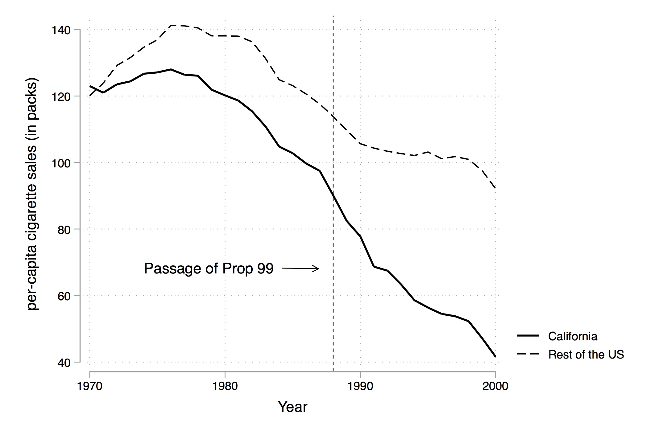
Figure 11.2: California cigarette sales vs the rest of the country.
In 1988, California passed comprehensive tobacco control legislation called Proposition 99. Proposition 99 increased cigarette taxes by 25 cents a pack, spurred clean-air ordinances throughout the state, funded anti-smoking media campaigns, earmarked tax revenues to health and anti-smoking budgets, and produced more than $100 million a year in anti-tobacco projects. Other states had similar control programs, and so the authors dropped those states from their analysis.2
Figure 11.2 shows changes in cigarette sales for California and the rest of the United States annually from 1970 to 2000. As can be seen, cigarette sales fell after Proposition 99, but as they were already falling, it’s not clear if there was any effect—particularly since they were falling in the rest of the country at the same time.
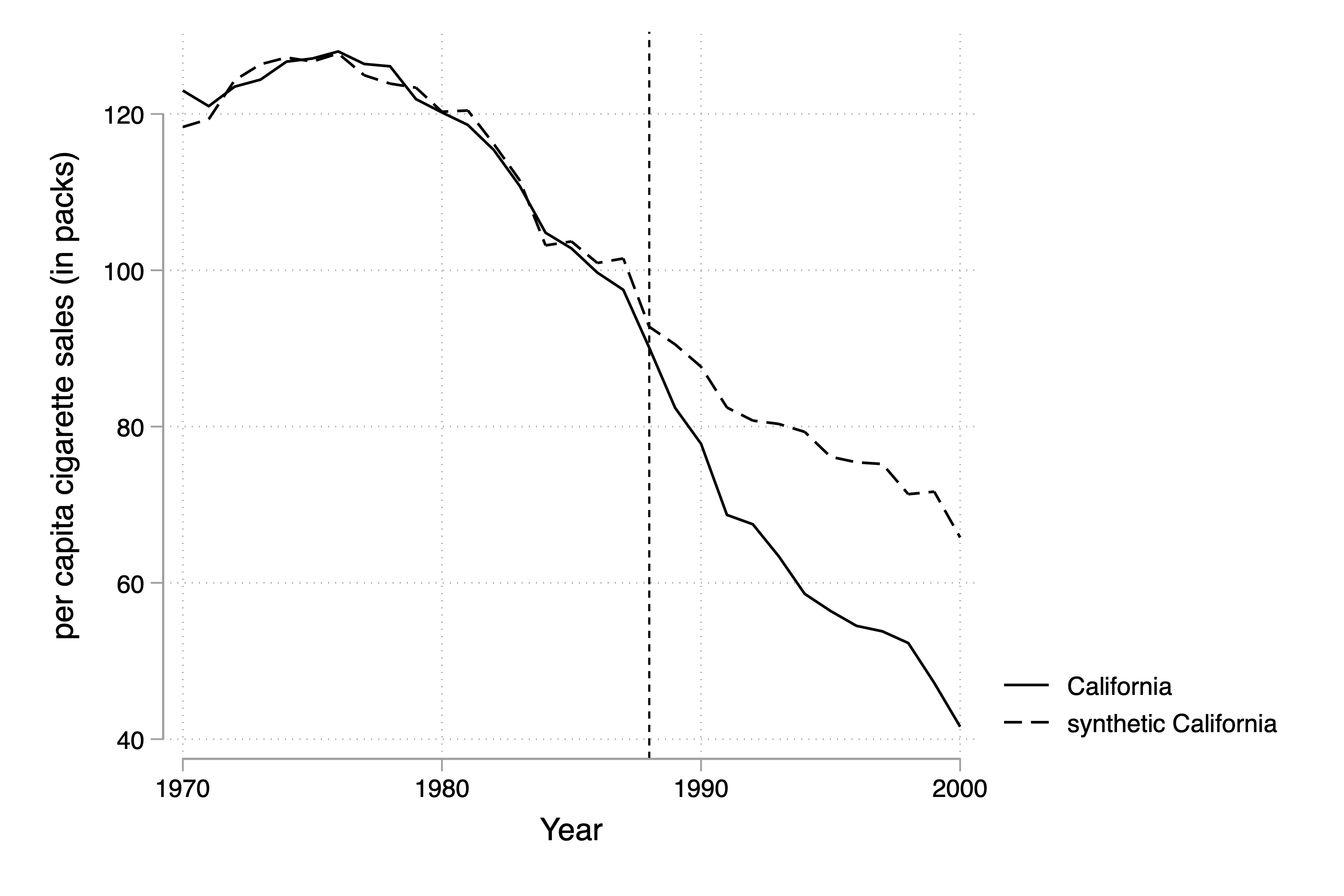
Using their method, Abadie, Diamond, and Hainmueller (2010) select an optimal set of weights that when applied to the rest of the country produces the figure shown in Figure 11.3. Notice that pretreatment, this set of weights produces a nearly identical time path for California as the real California itself, but post-treatment, the two series diverge. There appears at first glance to have been an effect of the program on cigarettesales.
Figure 11.3: California cigarette sales vs synthetic California.
The variables they used for their distance minimization are listed in Table 11.1. Notice that this analysis produces values for the treatment group and control group that facilitate a simple investigation of balance. This is not a technical test, as there is only one value per variable per treatment category, but it’s the best we can do with this method. And it appears that the variables used for matching are similar across the two groups, particularly for the laggedvalues.3
Table 11.1: Balance Table
Variables
Real
Synthetic
38 control states
Ln(GDP per capita)
10.08
9.86
9.86
Percent aged 15–24
17.40
17.40
17.29
Retail price
89.42
89.41
87.27
Beer consumption per capita
24.28
24.20
23.75
Cigarette sales per capita 1988
90.10
91.62
114.20
Cigarette sales per capita 1980
120.20
120.43
136.58
Cigarette sales per capita 1975
127.10
126.99
132.81
Note: All variables except lagged cigarette sales are averaged for the 1980–1988 period. Beer consumption is averaged 1984–1988.
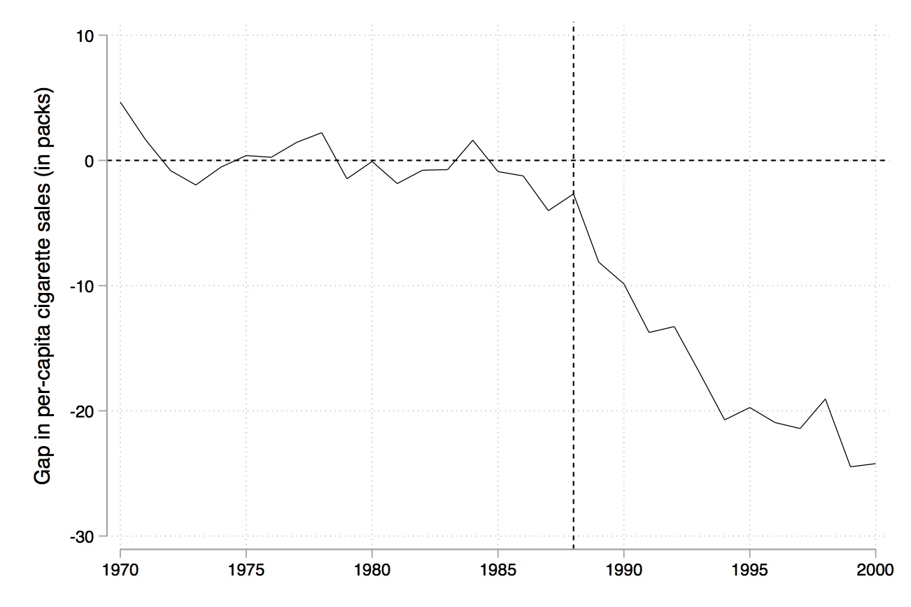
Like RDD, synthetic control is a picture-intensive estimator. Your estimator is basically a picture of two series, which, if there is a causal effect, diverge from each other post-treatment, but resemble each other pretreatment. It is common to therefore see a picture just showing the difference between the two series (Figure 11.4).
Figure 11.4: Gap in cigarette sales for estimation pre- and post-treatment.
Inference with Synthetic Control
How do we determine whether the observed difference between the two series is a statistically significant difference? After all, we only have two observations per year. Maybe the divergence between the two series is nothing more than prediction error, and any model chosen would’ve done that, even if there was no treatment effect. Abadie, Diamond, and Hainmueller (2010) suggest that we use the randomization inference method discussed at the beginning of the book to construct exact \(p\)-values based on Fisher (1935). Firpo and Possebom (2018) call the null hypothesis used in this test the “no treatment effect whatsoever,” which is the most commonly tested null you will encounter in papers that use synthetic control.
Recall that randomization inference involves reassigning the treatment to each untreated unit as if it had been treated, reestimating the model each time, and then collecting the resulting estimates into a distribution that forms the basis for inference. Abadie, Diamond, and Hainmueller (2010) recommend a specific test statistic: the ratio of the root mean squared prediction error (RMSPE) in the post-treatment period to that in the pretreatment period.
So, in this application, that’s what we will do. We will estimate the same synthetic control model—with the same covariate and pretreatment outcome values as in Table 11.1—but do so 39 times, once for each state. In each iteration, we return California to the donor pool, treating each placebo state as if it were a real treated unit and assume no treatment effect whatsoever. This gives us a set of placebo treatment effects. For each, we compute the post-/pretreatment RMSPE ratio, and then compare California’s value to the distribution of placebo values by ranking it in absolute terms.
Here are the formal steps:
Iteratively apply the synthetic control method to each country/state in the donor pool and obtain a distribution of placebo effects.
Calculate the RMSPE for each placebo for the pretreatment period: \[
RMSPE = \bigg (\dfrac{1}{T-T_0} \sum_{t=T_0+t}^T \bigg (Y_{1t} -
\sum_{j=2}^{J+1} w_j^* Y_{jt} \bigg )^2 \bigg )^{\tfrac{1}{2}}
\tag{11.5}\]
Calculate the RMSPE for each placebo for the post-treatment period (similar equation but for the post-treatment period).
Compute the ratio of the post- to pretreatment RMSPE.
Sort this ratio in descending order from highest to lowest.
Calculate the treatment unit’s ratio in the distribution as \(p=\dfrac{RANK}{TOTAL}\).
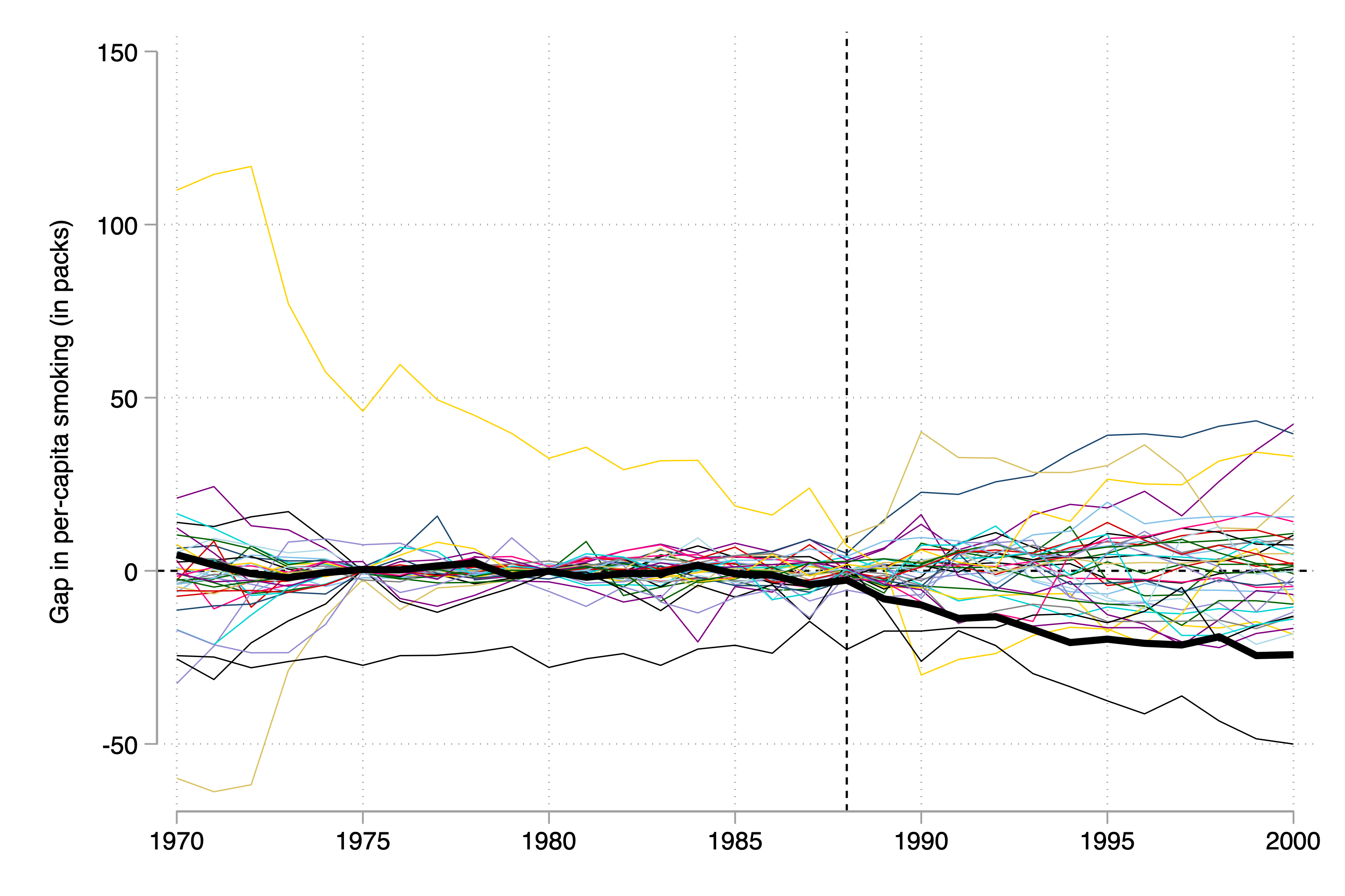
In other words, what we want to know is whether California’s treatment effect is extreme, which is a relative concept compared to the donor pool’s own placebo ratios. The figure shows what this looks like.
Figure 11.5: Placebo distribution using all units as donor pool.
Placebo distribution using all units as donor pool.
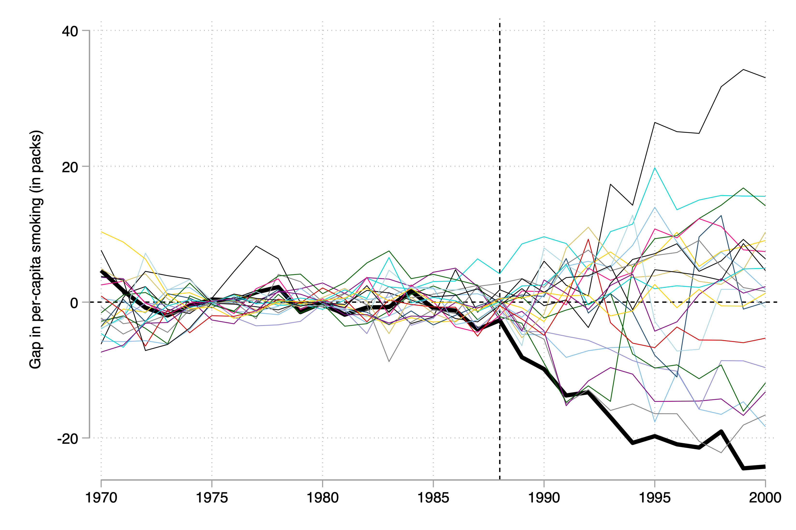
I can rank the exact \(p\)-value, which is 0.026, because it has the largest ratio of post- to pre-RMSPE, but it is a bit difficult to see the extreme nature of the scaled treatment effect in the figure. So, to help, Abadie, Diamond, and Hainmueller (2010) recommend dropping the states whose pretreatment RMSPE is considerably different than California’s because, as you can see, these poorly fit placebos are kind of blowing up the scale and making it hard to see what’s going on. They do this in several steps, but I’ll just skip to the last step (the figure). In this, they’ve dropped any state unit from the graph whose pretreatment RMSPE is more than two times that of California’s. This therefore limits the picture to just units whose model fit, pretreatment, was pretty good, like California’s.
Figure 11.6: Pre-Proposition 99 RMSPE$$2 times Pre-Prop 99 RMSPE for CA.
Pre-Proposition 99 RMSPE $$2 times Pre-Prop 99 RMSPE for CA.
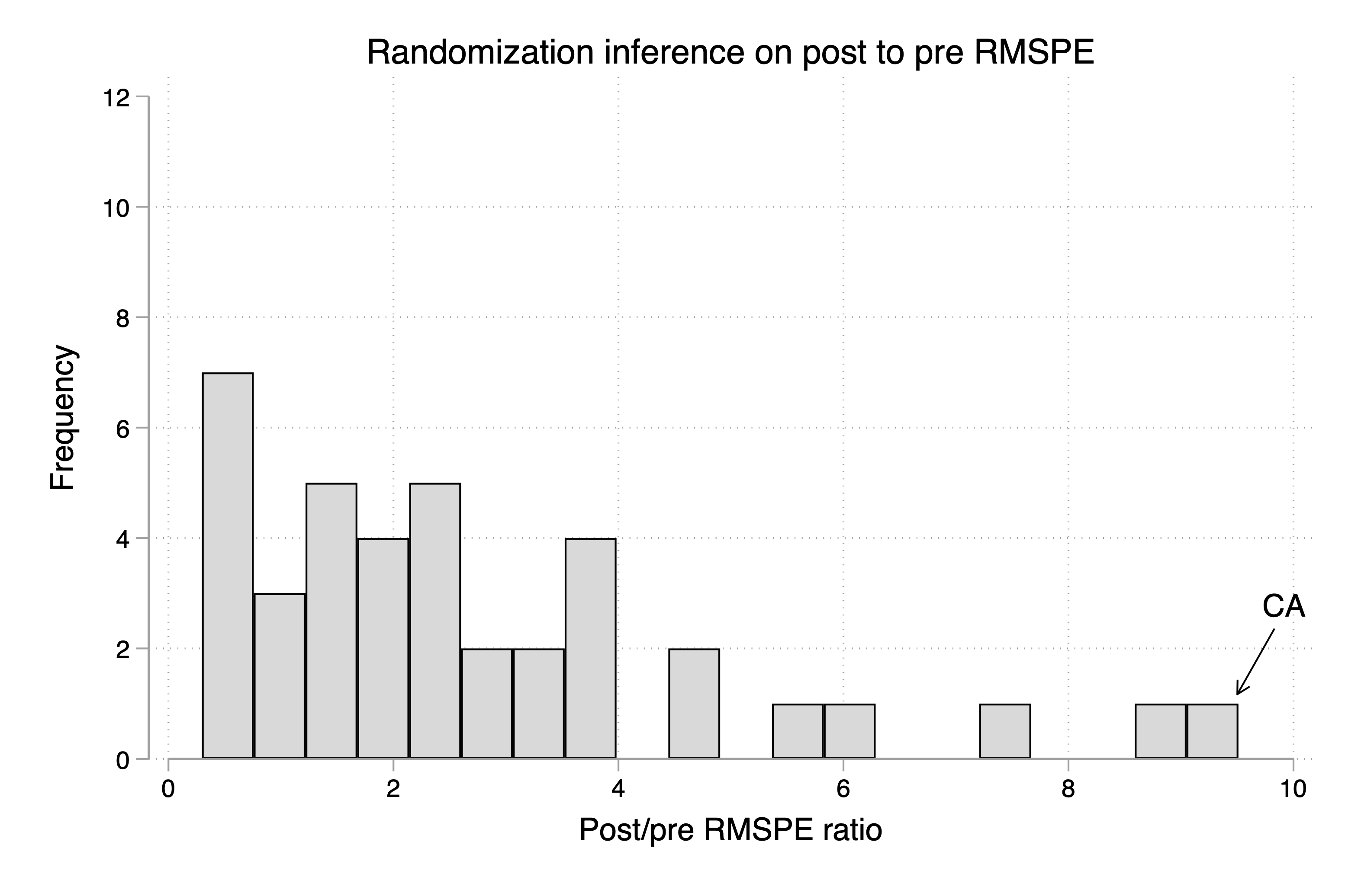
But, ultimately, inference is based on those exact \(p\)-values. So, the way we do this is we simply create a histogram of the ratios, and more or less mark the treatment group in the distribution so that the reader can see the exact \(p\)-value associated with the model. I produce that here in Figure 11.7.
As can be seen, California is ranked 1st out of 39 state units.4 This gives an exact \(p\)-value of 0.026, which is less than the conventional 5% suggested by Ronald Fisher (Fisher 1935).
Figure 11.7: Histogram of post-to-pre RMSPE of all units.
Data Exercise: Texas Prison Construction and Black Male Incarceration
In our data application, we’ll focus on a specific shock to Texas’s corrections system: a major expansion in prison infrastructure during the early 1990s. This wave of new prison construction was a transformative investment, fundamentally reshaping Texas’s approach to incarceration and offering a unique lens through which we can explore its effect on Black male incarceration.
My aim in highlighting this period is twofold: first, to analyze a pivotal moment in the history of US mass incarceration—not one driven by increases in crime or arrests, but rather by the expansion of operational capacity itself. This focus allows us to examine how the simple increase in available prison beds might have substituted for paroles, perhaps accelerating incarceration rates for Black men independent of other criminal justice factors. And second, this provides us with an alternative dataset and case study to the now classic smoking dataset commonly used in synthetic control exercises from Abadie, Diamond, and Hainmueller (2010).
In 1980, the Texas Department of Corrections (TDC) lost a major civil lawsuit: Ruiz v. Estelle. The case, brought by inmate David Ruiz against prison director William Estelle, challenged the constitutionality of Texas prison conditions, especially overcrowding. To many observers’ surprise, Ruiz won. As a result, the courts imposed constraints on how many inmates could be housed per cell, triggering a series of court-mandated settlements. TDC was placed under federal court supervision, a status that would persist until 2003.
The housing caps created a sharp constraint: Texas could no longer manage rising inmate populations through overcrowding. With limited options, the state turned to early parole as a stopgap solution—releasing prisoners before their full sentences were served to reduce population pressure. This strategy became essential in the 1980s, as prison admissions surged nationwide and Texas lawmakers resisted the high cost of prison expansion.
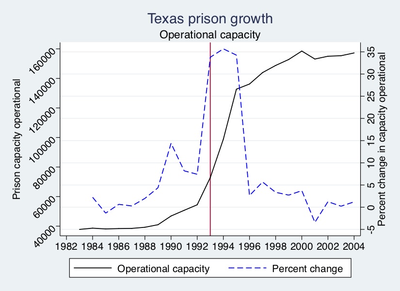
Eventually, however, the state began to build. Prison construction started modestly in the late 1980s under Governor Bill Clements, but it wasn’t until 1993, under Governor Ann Richards, that Texas launched a major construction drive. Backed by a billion-dollar legislative package, the state doubled its prison capacity in just three years. The scale of this expansion is visible in Figure 11.8.
As Figure 11.8 shows, the capacity expansion under Governor Clements was modest. But under Ann Richards, the pace and scale changed dramatically: operational capacity increased by more than 30% annually for three consecutive years, more than doubling the number of available prison beds in a remarkably short span.
What was the effect of this massive construction effort? Expanding capacity does not mechanically increase incarceration—but in this case, it did. Texas had long relied on early parole to manage overcrowding. Once the physical constraint was lifted, the state began to retain more of the individuals it had previously released. And the effects were especially stark for one group: African American men.
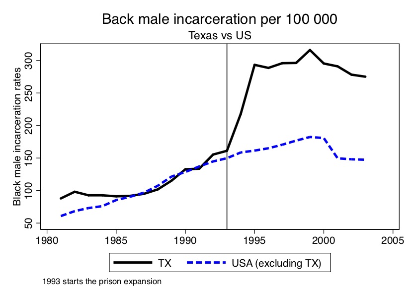
Figure 11.9: African American male incarceration trends for Texas vs Rest of USA.
As shown in Figure 11.9, the incarceration rate for Black men in Texas jumped from around 150 to 350 per 100,000 in just two years. Practically overnight, Texas transformed from a median state into one of the most punitive in the country.
We’re now going to analyze the effect of the prison construction boom under Governor Ann Richards on Black male incarceration using synthetic control.5
To make this accessible, I’ve posted a full texassynth.do file to GitHub that runs the complete analysis, along with a README that explains the directory structure and how to reproduceeverything.6
The R file is more streamlined than the Stata implementation, which is broken into several components, but I’ll guide you through both. Even though more efficient ways of implementing synthetic control now exist, I find the “long way” is often more pedagogically effective. Efficiency in a book like this can obscure more than it reveals when you’re learning something for the first time. So, let’s get started—step by step.
The first step is to create the figure showing the effect of the 1993 prison construction on Black male incarceration. I’ve chosen a set of covariates and pretreatment outcome variables for the matching; I encourage you, though, to play around with different models. We can already see, though, from Figure 11.9, that prior to 1993, Texas Black male incarceration was pretty similar to the rest of the country. The fact that Texas had a Black male incarceration rate that was not extremely high or low has some advantages. One of them is that it is possible to take a positively weighted average of other states to approximate Texas’s own trends. If Texas had been extreme, though—either the smallest or the largest—then that would be impossible. But here, as it turns out, that was not the case as Texas was prior to the expansion fairly run-of-the-mill with respect to the rest of country on this outcome.
Notice that you can choose either to match on the entire pretreatment average, or you can choose particular years. I chose both. Also recall that Abadie, Diamond, and Hainmueller (2010) notes the importance of controlling for pretreatment outcomes to soak up the heterogeneity; I do that as well. Let’s look at what these lines made (Figure 11.10).
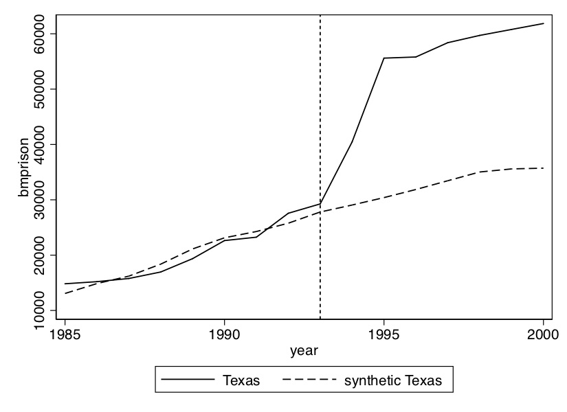
Figure 11.10: Synthetic control estimated effect of prison construction on African American male imprisonment.
This is the kind of outcome that you ideally want to see. That is, a very similar pretreatment trend in the synthetic Texas group compared to the actual Texas group. If there is that, then the divergence in the post-treatment period tends to be more credible as an estimate of the causal effect of the program you’re studying. We will now plot the gap between these two lines using the following commands:
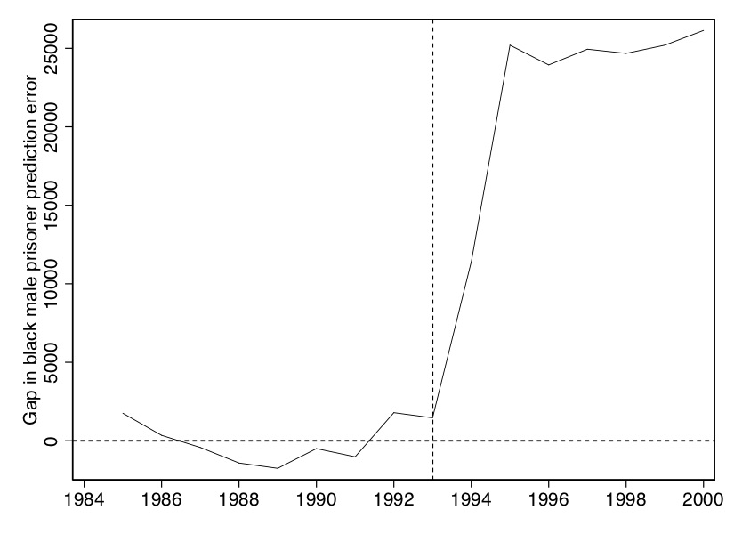
Figure 11.11: Gap in Black male imprisonment between actual Texas and synthetic Texas from synthetic control.
The figure that this makes is basically nothing more than the gap between the actual Texas and the synthetic Texas from Figure 11.10.
And finally, we will show the weights used to construct the synthetic Texas (Figure 11.11).
Synthetic Control Weights
State name
Weight
California
0.408
Florida
0.109
Illinois
0.36
Louisiana
0.122
Now that we have our estimates of the causal effect, we move into the calculation of the exact \(p\)-value that will be based on assigning the treatment to every state and re-estimating our model. Texas will always be thrown back into the donor pool each time. This next part will contain multiple Stata programs, but because of the efficiency of the R package, I will only produce one R program. So, all exposition henceforth will focus on the Stata commands.
This is a loop that will cycle through every state and estimate the model. It will then save data associated with each model into the ../data/synth/synth_bmcrate_‘i’.dta data file where ‘i’ is one of the state FIPS code listed after local statelist. Now that we have each of these files, we can calculate the post-to-pre RMSPE.
Notice that this is going to first create the gap between the treatment state and the counterfactual state before merging each of them into a single data file.
In this part, we are calculating the post-RMSPE, the pre-RMSPE and the ratio of the two. Once we have this information, we can compute a histogram. The following commands do that.
* show post/pre-expansion RMSPE ratioforall states, generatehistogramforeach i oflocal statelist {matrixrownames state`i'=`i'matlist state`i', names(rows) }#delimit ; mat state=state1\state2\state4\state5\state6\state8\state9\state10\state11\state12\state13\state15\state16\state17\state18\state20\state21\state22\state23\state24\state25\state26\state27\state28\state29\state30\state31\state32\state33\state34\state35\state36\state37\state38\state39\state40\state41\state42\state45\state46\state47\state48\state49\state51\state53\state55#delimit cr* ssc install mat2txt mat2txt, matrix(state) saving(../inference/rmspe_bmprate.txt) replaceinsheetusing ../inference/rmspe_bmprate.txt, clearren v1 statedrop v5gsort -ratiogenrank=_ngenp=rank/46export excel using ../inference/rmspe_bmprate, firstrow(variables) replace import excel ../inference/rmspe_bmprate.xls, sheet("Sheet1") firstrow clearhistogramratio, bin(20) frequency fcolor(gs13) lcolor(black) ylabel(0(2)6) xtitle(Post/pre RMSPE ratio) xlabel(0(1)5)* Show the post/pre RMSPE ratioforall states, generate the histogram.listrankpif state==48
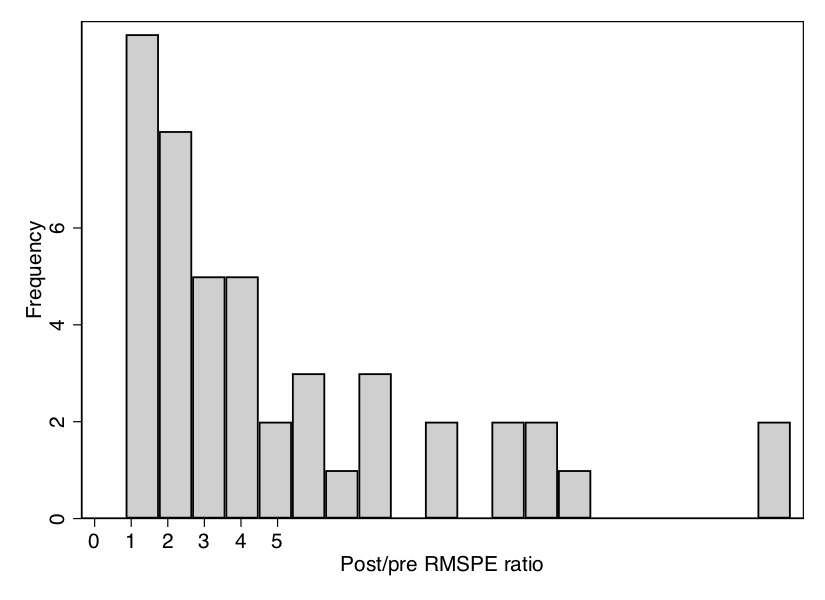
All the looping will take a few moments to run, but once it is done, it will produce a histogram of the distribution of ratios of post-RMSPE to pre-RMSPE. As you can see from the \(p\)-value, Texas has the second highest ratio out of 46 state units, giving it a \(p\)-value of 0.04. We can see that in Figure 11.12.
Figure 11.12: Histogram of the distribution of ratios of post-RMSPE to pre-RMSPE under randomization inference. Texas is, along with Illinois, one of the two states with the highest test statistic and is shown in the far right of the graph.
Notice that in addition to the figure, this created an Excel spreadsheet containing information on the pre-RMSPE, the post-RMSPE, the ratio, and the rank. We will want to use that again when we limit our display next to states whose pre-RMSPE are similar to that of Texas.
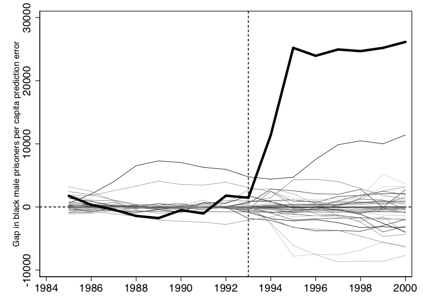
Now we want to create the characteristic placebo graph where all the state placebos are laid on top of Texas. To do that we use the following syntax:
* Inference 3: all the placeboes on the same pictureuse ../data/synth/placebo_bmprate.dta, replace* Picture of the full sample, including outlier RSMPE#delimit; twoway(line gap1 year ,lp(solid)lw(vthin)) (line gap2 year ,lp(solid)lw(vthin)) (line gap4 year ,lp(solid)lw(vthin)) (line gap5 year ,lp(solid)lw(vthin))(line gap6 year ,lp(solid)lw(vthin)) (line gap8 year ,lp(solid)lw(vthin)) (line gap9 year ,lp(solid)lw(vthin)) (line gap10 year ,lp(solid)lw(vthin)) (line gap11 year ,lp(solid)lw(vthin)) (line gap12 year ,lp(solid)lw(vthin)) (line gap13 year ,lp(solid)lw(vthin)) (line gap15 year ,lp(solid)lw(vthin)) (line gap16 year ,lp(solid)lw(vthin)) (line gap17 year ,lp(solid)lw(vthin))(line gap18 year ,lp(solid)lw(vthin)) (line gap20 year ,lp(solid)lw(vthin)) (line gap21 year ,lp(solid)lw(vthin)) (line gap22 year ,lp(solid)lw(vthin)) (line gap23 year ,lp(solid)lw(vthin)) (line gap24 year ,lp(solid)lw(vthin)) (line gap25 year ,lp(solid)lw(vthin)) (line gap26 year ,lp(solid)lw(vthin))(line gap27 year ,lp(solid)lw(vthin))(line gap28 year ,lp(solid)lw(vthin)) (line gap29 year ,lp(solid)lw(vthin)) (line gap30 year ,lp(solid)lw(vthin)) (line gap31 year ,lp(solid)lw(vthin)) (line gap32 year ,lp(solid)lw(vthin)) (line gap33 year ,lp(solid)lw(vthin)) (line gap34 year ,lp(solid)lw(vthin))(line gap35 year ,lp(solid)lw(vthin))(line gap36 year ,lp(solid)lw(vthin))(line gap37 year ,lp(solid)lw(vthin)) (line gap38 year ,lp(solid)lw(vthin)) (line gap39 year ,lp(solid)lw(vthin))(line gap40 year ,lp(solid)lw(vthin)) (line gap41 year ,lp(solid)lw(vthin)) (line gap42 year ,lp(solid)lw(vthin)) (line gap45 year ,lp(solid)lw(vthin)) (line gap46 year ,lp(solid)lw(vthin)) (line gap47 year ,lp(solid)lw(vthin))(line gap49 year ,lp(solid)lw(vthin)) (line gap51 year ,lp(solid)lw(vthin)) (line gap53 year ,lp(solid)lw(vthin)) (line gap55 year ,lp(solid)lw(vthin)) (line gap48 year ,lp(solid)lw(thick)lcolor(black)), /*treatment unit, Texas*/yline(0, lpattern(shortdash) lcolor(black)) xline(1993, lpattern(shortdash) lcolor(black))xtitle("",si(small)) xlabel(#10) ytitle("Gap in black male prisoners prediction error", size(small))legend(off);#delimit cr
Here, we will only display the main picture with the placebos, though one could show several cuts of the data that drop states whose pretreatment fit compared to Texas is rather poor (Figure 11.13).
Figure 11.13: Placebo distribution from randomization inference. Texas is the bold line.
Now that you have seen how to use this do file to estimate a synthetic control model, you are ready to play around with the data yourself. All of this analysis so far has used Black male (total counts) incarceration as the dependent variable, but perhaps the results would be different if we used Black male incarceration rate. That information is contained in the dataset. I would like for you to do your own analysis using the Black male incarceration rate variable as the dependent variable. You will need to find a new model to fit this pattern, as it’s unlikely that the one we used for levels will do as good a job describing rates as it did levels. In addition, you should implement the placebo-date falsification exercise that we mentioned from Abadie, Diamond, and Hainmueller (2015). Choose 1989 as your treatment date and 1992 as the end of the sample and check whether the same model shows the same treatment effect as you found when you used the correct year, 1993, as the treatment date. I encourage you to use these data and this file to learn the ins and outs of the procedure itself, as well as to think more deeply about what synthetic control is doing and how to best use it in research.
Weighting Donor Pool Units and the Risk of Extrapolation
Before we move on to other synthetic control estimators, let’s pause and discuss a few features in the canonical synthetic control from Abadie and Gardeazabal (2003) and Abadie, Diamond, and Hainmueller (2015). One of the key distinctions between synthetic control and traditional regression is the way each method weights donor pool units to estimate causal effects. In both methods, weights effectively “fill in” the missing counterfactuals—either explicitly, as in synthetic control, or implicitly, as in regression through functional form assumptions. But, despite these similarities, synthetic control and regression achieve weighting through fundamentally different mechanics that are worth unpacking before we proceed.
Abadie’s synthetic control method insists on using only non-negative weights on the control units. The idea here is similar to the principles we have reviewed already, which is that synthetic control is trying to find something akin to nearest neighbors that look, on average, like the treatment group in the preperiod. Since regression always has a better fit than synthetic control, given regression uses weights to minimize the mean squared error of the outcome, synthetic control’s constraint that the weights sum to 1 and are non-negative will always be a worse fit. But regression achieves this better fit through extrapolation via negative weighting making it sensitive to misspecification and model dependency. Synthetic control is more like matching under unconfoundedness, and (Ben-Michael, Feller, and Rothstein 2021) actually suggested that it was based on implicit propensity score modeling of the counterfactual. If you recall, the regression models that assumed unconfoundedness used extrapolation, but the matching and weighting methods used interpolation, which is why common support was so important because, without it, bias from poor fit would enter in.
To illustrate, consider Abadie, Diamond, and Hainmueller (2015)’s analysis of Germany’s reunification. I’ve reproduced his weights on the donor pool using synthetic control versus regression in Table 11.2. Notice that the synthetic control weights on the donor pool were “sparse”—numerous control units had zero weight, meaning they do not contribute to the synthetic control estimate of Germany’s counterfactual. By contrast, regression assigned nearly all donor units some weight, including some negative weights. This difference underscores a core feature of regression: its reliance on extrapolation, which makes it dependent on the accuracy of the model’s functional form—something that is itself not verifiable since it is modeling the counterfactual, not the realized outcome. The non-negative weights inherent to the original synthetic control estimator mean that it does not extrapolate. However, it does require something akin to common support, like under unconfoundedness, though in this context it is called the convex hull, meaning the modeling of the treatment groups using the weighted average of the donor pool is a “good fit” in the preperiod—even a very good fit.
Table 11.2: The Synthetic Weight Is the Country Weight Assigned by the Synthetic Control Method
Country
Synthetic control weight
Regression weight
Country
Synthetic control weight
Regression weight
Australia
0
0.12
Netherlands
0.09
0.14
Austria
0.42
0.26
New Zealand
0
0.12
Belgium
0
0
Norway
0
0.04
Denmark
0
0.08
Portugal
0
\(-0.08\)
France
0
0.04
Spain
0
\(-0.01\)
Greece
0
\(-0.09\)
Switzerland
0.11
0.05
Italy
0
\(-0.05\)
United Kingdom
0
0.06
Japan
0.16
0.19
United States
0.22
0.13
The regression weight is the weight assigned by linear regression. See Abadie, Diamond, and Hainmueller (2015) for details.
If we try to create a synthetic control for an outlier, like Michael Jordan’s basketball performance, the limitations of non-negative weighting become obvious. Matching his performance would be nearly impossible since he has no close “matches” in the data; synthetic control would yield a poor fit. But regression, unconstrained, could easily assign a below average basketball player an exaggerated, negative weight, as maybe these “anti-Jordans” technically improve the fit in complex ways. Here lies the problem: if negative weights are the only path to a fit, we end up extrapolating beyond the data. The original synthetic control method by Abadie and his coauthors avoided this, though, which ensured that the counterfactual remained tethered to observable, comparable units.
Ultimately, this limitation of synthetic control is also its strength. By avoiding extreme counterfactuals, synthetic control sacrifices some flexibility in fit, but it prevents us from falling into the trap of model dependency and risky extrapolation (King and Zeng 2006). Regression weights, while seemingly more adaptable, can compromise the credibility of our estimates by constructing counterfactuals from units too dissimilar to provide reliable insights. This constraint—of using only non-negative, similar units—keeps synthetic control grounded, ensuring that it operates as a method for robust matching rather than speculative extrapolation.
We will return to this issue of the advantages, as well as the practical disadvantages, of having to choose between non-negative weights and negative weighting schemes, but they are ultimately at the core of the progression of the rest of this chapter. But first, let’s look at some issues around covariate selection, as that is a topic that I think has not always been very clear to practitioners, or at least wasn’t to me.
Factor Models and Imperfect Fit
The depiction of bias in synthetic control was historically done using factor models (Abadie, Diamond, and Hainmueller 2010). A factor model posits that an outcome, like wages, can be viewed as a product of time-specific “shocks” and unit-specific characteristics. In the Diff-in-Diff chapter, though, I referred to it as “covariate-specific trends” because, in my modeling of the potential outcome, the parameter on some covariate would change over time.
For concreteness, consider a worker’s unobservable trait like “grit,” which perhaps measures their resilience and motivation. While grit may be stable over time, the returns to grit, or its contribution to wages, might fluctuate with economic shifts or changing labor market demands.7 In factor model terms, grit would correspond to unit-specific loadings, while time-specific changes in returns to grit are akin to the shocks. This structure lets us capture stable traits while also modeling evolving conditions, making factor models a natural fit for constructing a synthetic counterfactual.
Many writers discussing synthetic control would discuss the method’s potential bias by assuming that a factor model generated the missing potential outcome, \(Y^0_{1t}\) and that it fits the weights so as to approximate that factor model as closely as possible. This model fitting is done using covariates, but their role is different from other methods we reviewed, like unconfoundedness or diff-in-diff. In synthetic control, covariates work to align control units with the treated unit in the pretreatment period. Without this alignment, synthetic control cannot create a credible post-treatment counterfactual. This means that covariates are valuable insofar as they fit the weights implied by the factor model. Increasingly, researchers rely solely on lagged outcomes as covariates (Ben-Michael, Feller, and Rothstein 2021).
But sometimes neither covariates nor lagged outcomes can find a suitable weighted average that resembles the treated unit prior to treatment. So then, what are the implications if a perfect match doesn’t exist? Then synthetic control may be biased. The bias, in other words, originates from the imperfect fit, which implies that the weights implied by a factor model were not obtained.
Interestingly, this imperfect fit has a source in the constraints imposed on the problem in the first place. We required that the weights be non-negative, but you can always improve the fit if you relax that constraint. Recall from Abadie, Diamond, and Hainmueller (2015)’s analysis of Germany’s reunification how some of the regression weights were negative (Table 11.2). Regression found an “optimal” fit by assigning nearly all donor units some weight, including negative weights, by allowing for extrapolation based on an assumed functional form. This trade-off highlights that while regression may achieve a “better” fit, it does so by constructing a model-dependent counterfactual.
Let’s use an interesting example. Lionel Messi is considered to be one of the greatest athletes who ever lived. If we wanted to find a “synthetic Messi,” but we required that the weights be non-negative, we might find that the weighted average of soccer players comprising his counterfactual look nothing like him. The weights might be optimal, but all that would mean is that they are the best you can do given the constraints imposed on the model. That is simply because if Messi is an outlier, and since he is an outlier, you can never approximate him by taking a non-negatively weighted average of other players—he’ll always be far from them. For outliers like him, extrapolation may be necessary to approximate the counterfactual.8
Beyond imperfect fit, the risk of “cherry-picking” results through covariate selection poses a broader concern. Abadie, Diamond, and Hainmueller (2010) initially suggested synthetic control removes researcher bias through data-driven weighting, but subsequent research shows a more nuanced reality. Covariate choices, though optimal for a given specification, can influence donor weights and potentially bias results. For example, Ferman, Pinto, and Possebom (2020) found that specification searching—varying the choice of pretreatment lags—could raise the likelihood of false positives, as certain specifications may spuriously align with researchers’ desired outcomes. They recommend presenting results across multiple specifications to prevent any single cherry-picked model from biasing interpretations.
So, in the next sections, I go through some of these “second best” modifications to Abadie’s synthetic control method.
11.2 Demeaning Bias in Synthetic Control with Ferman and Pinto
When synthetic control’s pretreatment fit is imperfect, Abadie, Diamond, and Hainmueller (2015) caution against its use:
The applicability of the [synthetic control] method requires a sizable number of pre-intervention periods. The reason is that the credibility of a synthetic control depends upon how well it tracks the treated unit’s characteristics and outcomes over an extended period of time prior to the treatment. We do not recommend using this method when the pretreatment fit is poor or the number of pretreatment periods is small. A sizable number of post-intervention periods may also be required in cases when the effect of the intervention emerges gradually after the intervention or changes over time. (Abadie et al. [2015, my emphasis])
To formally understand the bias that Abadie, Diamond, and Hainmueller (2015) are talking about, consider a factor model as the basis for the untreated potential outcome, \(Y_{it}^0\). This model accommodates both measured and unmeasured factors that may affect outcomes, represented as follows:
\[
Y_{it}^0 = \alpha_t + \theta_t Z_i + \lambda_t u_i + \varepsilon_{it}
\tag{11.6}\] where \(\alpha_t\) is a common factor, \(\theta_t\) represents time-varying coefficients on observed characteristics \(Z_i\), \(\lambda_t\) denotes unobserved common factors (e.g., economic shocks), and \(u_i\) indicates individual units’ exposure to these factors. Here, \(\varepsilon_{it}\) captures unit-specific transitory shocks. In this setup, \(\lambda_t\) could represent a macroeconomic shock, and \(u_i\) an individual’s susceptibility to it.
Under this model, synthetic control bias can arise when the control units fail to replicate the treated unit’s factor loadings, \(u_i\), accurately. The bias is thus bounded by the extent to which synthetic weights, \(w_j^*\), can match both the observed characteristics \(Z_i\) and exposure to \(\lambda_t\). Specifically, as demonstrated by Abadie and coauthors, if the synthetic control cannot closely fit \(Y_{1t}\) across the pretreatment period, we risk fitting on transitory noise (\(\varepsilon_{it}\)) rather than the true factor structure. The bounds on this bias depend on the ratio between the scale of transitory shocks, \(\varepsilon_{it}\), and the length of the pretreatment period. This is partly why long pretreatment data series is so critical to the validity of synthetic control—it’s necessary so as to avoid fitting on noise.9
Building on this, Ferman and Pinto (2021) proposed a demeaning approach for synthetic control that adjusts for average differences in outcomes prior to treatment. By centering outcomes on their pretreatment mean, this method aims to remove shared exposure to aggregate shocks (\(\lambda_t\)), thus addressing one of the core issues that can lead to biased synthetic control estimates under imperfect fit. Demeaning, in this sense, functions similarly to the role of fixed effects in diff-in-diff, which aims to eliminate time-invariant unobserved heterogeneity.
In cases where pretreatment fit is incomplete or noisy, the demeaning adjustment improves synthetic control’s bias properties. This allows researchers to better exploit the synthetic control framework even when control units cannot perfectly mimic the treated unit’s trend. Consequently, demeaning helps enhance the reliability of synthetic control in settings closer to those typically assumed under diff-in-diff, improving robustness against violations of common support.
But, while demeaning reduces bias by adjusting for baseline differences, it can increase variance, particularly in small samples. Researchers should therefore consider this trade-off carefully, weighing the benefit of reduced bias against the potential for increased variance when choosing this method.
Ferman and Pinto also offer practical advice on implementing the demeaned synthetic control estimator. For instance, they suggest applying the demeaned approach in contexts where unobserved confounders may bias diff-in-diff estimates. Additionally, they introduce a specification test to assess the suitability of the demeaned synthetic control estimator in cases with imperfect pretreatment fit, helping researchers validate the reliability of their estimates.
Next, we will review a different strategy to addressing synthetic control bias from imperfect pretreatment fit—using an outcome regression model similar to Abadie and Imbens (2011) to correct the bias. But as there are no free lunches, we will explore what we pay to do this.
11.3 Augmenting Synthetic Control with Ben-Michael, Feller, and Rothstein
Addressing Imperfect Pretreatment Fit in Synthetic Control
As I mentioned earlier in the chapter, the canonical synthetic control developed in Abadie and Gardeazabal (2003) and Abadie, Diamond, and Hainmueller (2010) is estimated under the constraint that weights must be non-negative and sum to one. This restriction forces synthetic control to be a positively weighted combination of the comparison group units, and for this estimator to minimize bias effectively, the treated unit must lie within the convex hull of the control units—meaning a close fit in the pretreatment period. This non-negative weighting scheme ensures that the estimator remains an interpolation (rather than an extrapolation), making it less model-dependent and more robust.
However, achieving a perfect fit is not always feasible, particularly with high-frequency or noisy data, where the pretreatment characteristics of treated and control units differ significantly. This situation, known as imperfect fit, is quite common in practice. To illustrate, let’s return to our Messi example. Imagine, as I said, trying to construct a synthetic Messi that matched his career but you can only use non-negative weights that sum to 1. By definition, that would mean that Messi has significantly better players and worse players if we are to achieve balance between the real Messi and the synthetic one. But if he is in fact the GOAT, then it is by definition impossible to achieve this. Not without relaxing the requirement that the weights either sum to 1 or allow for extrapolation. Similarly, synthetic control often falls short when attempting to match highly unique treated units, particularly “extreme” on levels, which poses problems for anyone trying to study those types of unicorns using synthetic control and other nearest neighbor style methods. Extrapolation may then be the only option you have left for someone like Messi.
To address bias from imperfect fit, Ben-Michael, Feller, and Rothstein (2021) introduced augmented synthetic control, which adapts the bias correction approach from Abadie and Imbens (2011) (covered in our chapter on unconfoundedness). Augmented synthetic control enhances the traditional synthetic control by implementing a sequence of bias-reducing steps. It first employs the non-negative weighting method of Abadie and Gardeazabal (2003) to create an initial counterfactual estimate, though this estimate may remain biased if pretreatment fit is imperfect.
The next step involves estimating an outcome model using ridge regression to capture and correct for matching bias, utilizing only the control group data. Finally, the initial synthetic control weights are “augmented” with weights from this ridge-adjusted outcome model, which improves balance and reduces bias. This adjustment, however, introduces some negative weights, increasing model dependency but allowing for more accurate bias correction when exact pretreatment balance cannot be achieved.
While Doudchenko and Imbens (2017) in an unpublished manuscript also proposed relaxing the non-negativity constraint on weights, incorporating an intercept term and elastic net regularization to allow for negative weights, augmented synthetic control tackles the issue of imperfect fit by directly estimating the matching bias and then using this estimate to reweight the original synthetic control weights. However, these negative weights come at a cost—the same cost we encountered with regression under unconfoundedness. Specifically, they increase model dependency because the causal inference now hinges on the accuracy of the underlying outcome model, rather than simply approximating the counterfactual through weighted nearest-neighbor matching, which yields a nearly identical imputed counterfactual.
Assume Missing Potential Outcome Follows a Factor Model
We begin with the underlying model for untreated potential outcomes and assume that \(Y^0_{jt}\), the untreated potential outcome, follows a factor model: \[
Y_{jt}^0 = m_{jt} + \varepsilon_{jt}
\tag{11.7}\] where \(m(.)\) are pretreatment potential outcomes and \(\varepsilon_{jt}\) is an idiosyncratic error term. In this setup, since \(\widehat{m}(.)\) estimates the post-treatment outcome, it can be viewed as an estimate of matching bias. By projecting post-treatment outcomes, \(\widehat{m}(.)\) helps us correct for any imbalance in the control group. This approach is then just like the bias correction methods for inexact matching, developed by Abadie and Imbens (2011), that we discussed in the unconfoundedness chapter.
Following this structure, synthetic control achieves balance not by solely minimizing idiosyncratic errors, which average to zero in large samples, but rather by focusing on unobserved heterogeneity across units. As noted by Abadie, Diamond, and Hainmueller (2010) and further analyzed by Ferman and Pinto (2021), synthetic control weights decrease in bias as \(T\), the number of periods in the pretreatment period, grows—assuming that exact balance is achieved. When the weights do, in fact, achieve exact balance, then the bias of synthetic control shrinks to zero as \(T\) grows. However, in most applications, perfect balance is difficult to attain, and limited time periods exacerbate the challenge, often leaving unobserved heterogeneity unaccounted for.
This problem has many causes. One is that the number isn’t much larger than the number of units. In my paper with Manisha Shah, for instance, we estimated synthetic control models relating to a surprising judicial ruling that found Rhode Island did not have laws prohibiting “indoor” sex work (Cunningham and Shah 2018). Our panel was long for synthetic control standards as in one model, our pretreatment data went from 1965 to 2003, the year of the treatment. That’s 38 pretreatment years on 50 states. In Abadie, Diamond, and Hainmueller (2010), the smoking data had only 18 years pretreatment. These probably fall a tad short of \(T \rightarrow \infty\). But, even then for these shorter panels, exact balance rarely holds, and if it does not hold, then the unobserved heterogeneity doesn’t get canceled out with large \(T\) anyway. So, the problem of bias and imperfect fit has many practical reasons, which makes the need for a bias correction valuable in this context.
This gap between the large sample theoretical properties of synthetic control and its application in real-world datasets underscores the practical need for bias correction within synthetic control methods. When exact balance is unattainable, any remaining unobserved heterogeneity can contribute to bias that won’t simply disappear by increasing \(T\). This is where bias correction methods come in, serving as tools to minimize the impact of this imperfection.
In real-world applications, it’s rare to encounter perfect balance, and adjustments like these won’t always produce flawless results. However, they can help mitigate bias enough to yield more reliable estimates. Approaching this challenge optimistically, we can see bias correction as an added layer that enhances synthetic control’s adaptability—moving it from an idealized framework to a robust tool applicable even in more constrained settings. While the theoretical benefits of synthetic control improve as \(T \rightarrow \infty\), these bias correction techniques are practical steps that help us make the most of the data at hand.
Estimating Bias with Augmented Synthetic Control
Ben-Michael, Feller, and Rothstein (2021) propose an adjustment to synthetic control methods that accounts for poor pretreatment fit by directly estimating and removing matching bias. This approach shares much of the underlying logic with Abadie and Imbens (2011). To implement this, we use the outcome regression factor model, \(\widehat{m}_{jT}\), to estimate the post-treatment potential outcome, \(Y_{jT}^0\), which is unobservable for the treated group.
The augmented synthetic control is a multi-step procedure:
First, we estimate the synthetic control weights based on Abadie and Gardeazabal (2003) and Abadie, Diamond, and Hainmueller (2010), generating optimal non-negative weights.
Next, we estimate the matching bias using ridge regression.
Finally, we “augment” the original synthetic control estimate by applying the bias adjustment from the ridge regression.
When all steps are completed, the equation for augmented synthetic control with bias correction is given by: \[
\begin{eqnarray}
Y_1^{aug,0} &=& \sum_{D_j=0} \widehat{w}_j^{synth} Y_{j} +
\underbrace{ \bigg [ \widehat{m}(X_1) - \sum_{D_j=0} \widehat{w}_j
\widehat{m}(X_j) \bigg ]}_{\mathclap{\text{Matching Bias}}} \nonumber \\
&=& \widehat{m}(X_1) + \sum_{D_j=0} \widehat{w_j}^{synth}(Y_j -
\widehat{m}(X_j))
\label{eq:augsynth}
\end{eqnarray}
\tag{11.8}\] where \(\widehat{w}_j^{synth}\) represents the canonical synthetic control weights (Abadie and Gardeazabal 2003; Abadie, Diamond, and Hainmueller 2010). Since augmented synthetic control “augments” the original synthetic control estimator, we require these weights first to proceed.
This expression refines the synthetic control estimate by incorporating additional terms to address imbalance: \(\widehat{m}(X_1)\) for the treated outcome and \(\sum_{D_j=0} \widehat{w}_j \widehat{m}(X_j)\) for the control outcomes. The adjustment term approximates bias correction, aligning with methods from Abadie and Imbens (2011). When the pretreatment fit is excellent, this adjustment term reduces to zero, and augmented synthetic control aligns closely with the original synthetic control estimator. And in cases with no bias, the final term in Equation 11.8, \(\widehat{m}(X_1) - \sum_{D_j=0} \widehat{w}_j \widehat{m}(X_j) = 0\), as this term directly measures post-treatment matching bias.
Now that we see that step 3 is where we are going, we need to get the weights used for the augmentation. We get them using ridge regression. By introducing ridge-based adjustments, augmented synthetic control minimizes the bias associated with imperfect fit in cases where traditional synthetic control alone would struggle to provide an unbiased estimate.
Get the Ridge Weights
Before we get into the actual estimation of \(\widehat{m}\), note that it is designed to extrapolate \(Y^0\) based on covariates \(X\), which are often lagged outcomes. However, overfitting can become a concern. Since this is ultimately a prediction problem, penalized regressions are a natural solution, which is why ridge regression is used here. Ridge regression minimizes reweighting error while penalizing extreme weights, thereby relaxing the non-negativity constraint. The key to augmented synthetic control is its use of ridge regression to reweight the synthetic control estimates so as to improve the fit and minimize the bias. One challenge is selecting the ridge regression’s hyperparameter, but this is typically handled through cross-validation.
Formally, augmented synthetic control identifies optimal weights \(w_j^{aug}\) by solving Equation 11.9: \[
\begin{equation}
\text{arg min}_{\eta_0, \eta} \frac{1}{2} \sum_{D_j=0} (Y_j -
(\eta_0 + X_j' \eta))^2 + \lambda^{ridge} || \eta ||_2^2
\label{eq:aug_ridge}
\end{equation}
\tag{11.9}\] where \(\lambda^{ridge}\) is a tuning parameter that controls the degree of extrapolation. What you’re trying to do is adjust with the \(\widehat{w}_j^{aug}\) weights to improve balance, and the ridge weights are key to doing that. And, though ridge regression introduces the possibility of negative weights, the augmented synthetic control employs only the minimal negative reweighting needed to reach the convex hull of control units. Once we’ve done this, we adjust for imbalance using the \(\widehat{\eta}^{ridge}\) parameter as a weight on the outcome model itself: \[
\begin{eqnarray}
Y_1^{aug,0} &=& \sum_{D_j=0} \widehat{w}_j^{synth} Y_{j} + \bigg (
X_1 - \sum_{D_j=0} \widehat{w}_j^{synth} X_j \bigg )
\widehat{\eta}^{ridge} \nonumber \\
&=& \sum_{D_j=0} \widehat{w}_j^{aug}Y_j
\label{eq:augsynth_ridege}
\end{eqnarray}
\tag{11.10}\]
So to summarize, when the treated unit lies in the convex hull of the control units, then the synth weights exactly balance lagged outcomes, and synth and augmented are the same thing, as all the additional terms in the augmented synth weights sum to zero under perfect balance. But, when they aren’t perfectly balanced, then ridge augmented synth will use negative weights to make adjustments, and the larger the matching bias is based on the imperfect fit pretreatment, the larger the extrapolation will be. And the larger the extrapolation is, the more model dependent the estimates are.
The amount of extrapolation is determined by the estimated hyper parameter, \(\widehat{\lambda}^{ridge}\). And when it is large, it is the same as when synth has great pretreatment fit, as then the adjustment itself is small, and the new augmented weights are pretty similar to the synth weights.
Data Exercise: Smoking and Prisons
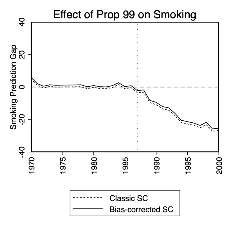
Next, we will look at an application using the augmented synthetic control method alongside the classic synthetic control method by Abadie and Gardeazabal (2003). We will look at two different datasets to illustrate two points: that when the imperfect fit grows, the bias adjustment grows. And secondly, when the fit is perfect, there is no bias adjustment, and the augmented synthetic control is the classical synthetic control. To illustrate it, we will look at two datasets. The first will be the smoking dataset from Abadie, Diamond, and Hainmueller (2010). In Figure 11.14, both the classic synthetic control and the bias adjusted method are illustrated, and as you can see, the bias adjustment is small, but visible. The negative weighting simply shifted the classic synthetic control a small amount.
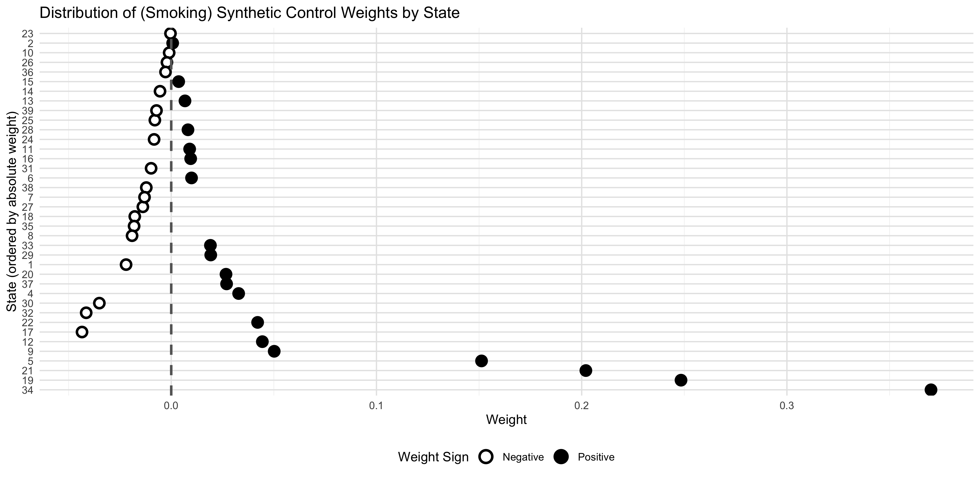
The fact that they are not the same means that the augmented synthetic control weights are slightly negative. Given the difference between the two estimators is not very large in the first place, the amount of negative weighting is probably inconsequential, but we can check. But interestingly, that is not exactly what we find. In the figure, the augmented synthetic control model weights are listed in order from smallest to largest in absolute value. As you can see, there are oscillating positive and negative weights, but the largest weights are positive.
Figure 11.14: Effect of Prop 99 on smoking using augmented synthetic control and classic synth.
Figure 11.15: Distribution of positive and negative weights in augmented synthetic control estimated effect of Prop 99 on smoking.
Distribution of positive and negative weights in augmented synthetic control estimated effect of Prop 99 on smoking.
Figure 11.16: Effect of prison construction on Black male incarceration using augmented synthetic control and classic synth.
Distribution of positive and negative weights in augmented synthetic control estimated effect of prison construction on Black male incarceration.
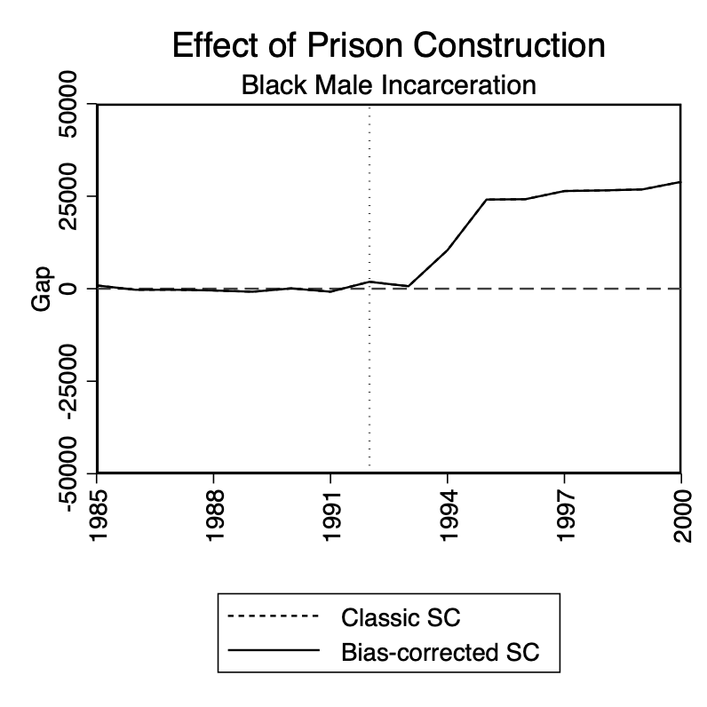
Now let’s look at a situation where the pretreatment fit is actually quite good. In the prison construction example, male incarceration (Black and white) was growing over the time period we studied, but the growth was smooth, and Texas was roughly in the middle of the pack before the prison construction. That’s because after Texas Department of Corrections lost the Ruiz vs Estelle case, they were unable to overcrowd and they were unable to build prisons, so they paroled intensively instead, causing prison population growth to remain flat while other states caught up. But the point is, the growth in prison populations sloped upward, but were largely smooth and similar. It was therefore quite easy to construct a non-negatively weighted synthetic control that resembled Texas.
So, according to what we discussed in this section, if the pretreatment fit is excellent, then the matching bias terms should cancel out, causing the augmented synthetic control and the classic synthetic control to be the same. In Figure 11.16, I present both classic synthetic control and augmented synthetic control, but in fact they are the same because the pretreatment fit was excellent.
In the figure, I then plot a distribution of weights, and interestingly some of them are slightly negative. This is a quirk of the augsynth package in R, though. It uses a slight penalty term when estimating synthetic control that causes some of the weights to be infinitesimally positive and negative when, had it simply used the constraint of non-negative weights, they would’ve all been zero.
In conclusion, the augmented synthetic control method allows us to use a ridge regression to estimate an outcome model off the control group in the pretreatment period to predict the post-treatment matching bias for treatment and control group, reweight the synthetic control estimator, and get a bias corrected “augmented” synthetic control that always reduces bias, but at the cost of negative weighting and increased extrapolation. As a matter of caution, I would say that the more you are model dependent for your estimates of causal effects, the further away you move from a design approach. The degree to which you are willing to tolerate extrapolation and negative weighting is, in all sincerity, a function of the importance of the research question, and your willingness to tolerate uncertainty about modeling assumptions.
# Load necessary libraries# devtools::install_github("ebenmichael/augsynth")# devtools::install_github("bcastanho/SCtools")library(tidyverse)library(haven)library(augsynth)library(SCtools)library(ggplot2)library(dplyr)# Load the smoking datasmoking <- haven::read_dta("https://raw.github.com/scunning1975/mixtape/master/synth_smoking.dta") # Convert state to character and set treated as numericsmoking <- smoking %>%mutate(state =as.character(state),treated =as.numeric(state =="3"& year >=1989) # )# Check for any issues in treated assignmenttable(smoking$treated, smoking$state =="3")# Run the augmented synthetic controlsyn_tx <-augsynth( cigsale ~ treated, unit = state, time = year, data = smoking, progfunc ="ridge", scm =TRUE)# When using outcome model: in augsyth(), when set progfunc = 'ridge' (or other functions), we can plot cross-validation MSE by setting cv = T list(syn_tx$weights)summary(syn_tx) # Generate the plot with jackknife confidence intervalsplot(syn_tx, inf_type ="jackknife+")# Assume syn$weights contains the synthetic control weights for each stateweights <-as.data.frame(syn_tx$weights)colnames(weights) <-"weight"weights$state <-rownames(weights)# Convert state to a factor, ordered by weight magnitudeweights <- weights %>%mutate(state =fct_reorder(state, abs(weight), .desc =TRUE))# Plot the weights distributionggplot(weights, aes(x = weight, y = state)) +geom_point(aes(shape = weight >0, fill = weight >0), size =3, stroke =1.5) +# Different shapes and fillsgeom_vline(xintercept =0, linetype ="dashed", color ="gray40", size =1) +# Vertical line at zeroscale_shape_manual(values =c(21, 19), labels =c("Negative", "Positive")) +# Hollow circle vs solid circlescale_fill_manual(values =c("white", "gray30"), labels =c("Negative", "Positive")) +# White fill vs gray filllabs(title ="Distribution of (Smoking) Synthetic Control Weights by State",x ="Weight",y ="State (ordered by absolute weight)" ) +theme_minimal() +theme(legend.position ="bottom",panel.grid.major =element_line(color ="gray90", size =0.5),panel.grid.minor =element_line(color ="gray95", size =0.25) ) +guides(shape =guide_legend(title ="Weight Sign", override.aes =list(size =4)),fill =guide_legend(title ="Weight Sign", override.aes =list(size =4)) )# Extract weights (synthetic control weights for each donor unit)weights <-as.numeric(syn_tx$weights)# Extract actual treated outcomestreated_outcomes <-as.data.frame(syn_tx$data$synth_data$Y1plot)treated_years <- syn_tx$data$time# Calculate the synthetic control outcome by applying the weights to donor outcomesdonor_outcomes <-as.matrix(syn_tx$data$synth_data$Y0plot)synthetic_outcomes <- donor_outcomes %*% weights# Combine treated and synthetic outcomes into one data frame for plottingplot_data <-data.frame(Year = treated_years,Treated =unlist(treated_outcomes),Synthetic = synthetic_outcomes)ggplot(plot_data, aes(x = Year)) +geom_line(aes(y = Treated, color ="Treated Outcome")) +geom_line(aes(y = Synthetic, color ="Synthetic Control")) +labs(title ="Estimated Effect of Prop 99 on Smoking",subtitle ="Augmented Synthetic Control",y ="Black Male Inmates",color ="Group" ) +geom_vline(xintercept =1993, linetype ="dashed", color ="gray") +# Add dashed vertical linetheme_minimal()# Texas - perfect fittexas <- haven::read_dta("https://raw.github.com/scunning1975/mixtape/master/texas.dta") # create a treated variabletexas$treated =as.numeric(texas$state =='Texas'& texas$year >=1993)# Augmented Synthetic Controlssyn_tx <-augsynth( bmprison ~ treated, unit = statefip, time = year, data = texas, progfunc ="ridge", scm = T )# When using outcome model: in augsyth(), when set progfunc = 'ridge' (or other functions), we can plot cross-validation MSE by setting cv = T list(syn_tx$weights)summary(syn_tx) # Generate the plot with jackknife confidence intervalsplot(syn_tx, inf_type ="jackknife+")# Assume syn$weights contains the synthetic control weights for each stateweights <-as.data.frame(syn_tx$weights)colnames(weights) <-"weight"weights$state <-rownames(weights)# Convert state to a factor, ordered by weight magnitudeweights <- weights %>%mutate(state =fct_reorder(state, abs(weight), .desc =TRUE))# Plot the weights distributionggplot(weights, aes(x = weight, y = state)) +geom_point(aes(shape = weight >0, fill = weight >0), size =3, stroke =1.5) +# Different shapes and fillsgeom_vline(xintercept =0, linetype ="dashed", color ="gray40", size =1) +# Vertical line at zeroscale_shape_manual(values =c(21, 19), labels =c("Negative", "Positive")) +# Hollow circle vs solid circlescale_fill_manual(values =c("white", "gray30"), labels =c("Negative", "Positive")) +# White fill vs gray filllabs(title ="Distribution of (Prison) Synthetic Control Weights by State",x ="Weight",y ="State (ordered by absolute weight)" ) +theme_minimal() +theme(legend.position ="bottom",panel.grid.major =element_line(color ="gray90", size =0.5),panel.grid.minor =element_line(color ="gray95", size =0.25),aspect.ratio =0.6, # Better aspect ratio like the smoking plotplot.margin =margin(0.5, 0.5, 0.5, 0.5, "cm") # Consistent margins ) +guides(shape =guide_legend(title ="Weight Sign", override.aes =list(size =4)),fill =guide_legend(title ="Weight Sign", override.aes =list(size =4)) )# Save the plotggsave("/Users/scunning/Library/CloudStorage/Dropbox-MixtapeConsulting/scott cunningham/0. Yale_Mixtape/graphics/prison_augsynthweights.png", width =10, height =6, dpi =300, bg ="white")# Extract weights (synthetic control weights for each donor unit)weights <-as.numeric(syn_tx$weights)# Extract actual treated outcomestreated_outcomes <-as.data.frame(syn_tx$data$synth_data$Y1plot)treated_years <- syn_tx$data$time# Calculate the synthetic control outcome by applying the weights to donor outcomesdonor_outcomes <-as.matrix(syn_tx$data$synth_data$Y0plot)synthetic_outcomes <- donor_outcomes %*% weights# Combine treated and synthetic outcomes into one data frame for plottingplot_data <-data.frame(Year = treated_years,Treated =unlist(treated_outcomes),Synthetic = synthetic_outcomes)ggplot(plot_data, aes(x = Year)) +geom_line(aes(y = Treated, color ="Treated Outcome")) +geom_line(aes(y = Synthetic, color ="Synthetic Control")) +labs(title ="Estimated Effect of Prison Construction on Black Male Incarceration",subtitle ="Augmented Synthetic Control",y ="Black Male Inmates",color ="Group" ) +geom_vline(xintercept =1993, linetype ="dashed", color ="gray") +# Add dashed vertical linetheme_minimal()
11.4 Matrix Completion with Nuclear Norm Regularization
When I was in graduate school, Netflix was still a new company. It wasn’t yet the streaming juggernaut it is today. It was in hindsight such an interesting new company that I never would’ve guessed it would become what it became. Basically the user experience was this—you’d pick DVDs online and add them to a list called your “queue.” This queue was just an ordered list, and whatever you had in your queue, Netflix would send the top three DVDs on your list through the mail. You could keep them as long as you wanted, but once you were done, you’d send them back, and Netflix would send you the next DVDs in your queue. This back-and-forth continued until you either canceled your subscription or ran out of shows to watch.
What might make someone cancel their subscription? Likely, it would happen if they felt they’d exhausted everything worth watching. But imagine this—if Netflix could figure out what you liked, then they could maybe stop you from canceling just by helping you navigate all this unknown material. After all, the search costs for finding great new music or great new shows are not trivial, and we depend on word of mouth. And, if Netflix could become fantastic at word of mouth, you’d likely stay subscribed much longer. Early on, Netflix had a recommendation system, likely a basic algorithm by today’s standards, that suggested titles based on what people similar to you had liked. But they knew they could improve this, so in 2006, they launched a public competition: the first team to beat their recommendation algorithm by 10 points on a predefined accuracy scale would win US$1 million.
This contest attracted a wide range of competitors—from teams at MIT to individual developers working from home. Netflix provided a vast training dataset with user-submitted data on preferences, though, as with most real-world data, it was imperfect and subject to various selection biases. Participants used this data to build their models, which they then submitted for testing against a holdout dataset that Netflix kept private.
Initially, progress was swift—within six months, over half of the improvement target had been reached. But after that, things slowed down. Incremental gains became harder to achieve. Finally, in 2009, a winner was announced. Ironically, by then, Netflix no longer needed the new model. But the competition had yielded important advancements, one of which was the method of matrix completion, which played a significant role in the winning approach. The winning team, BellKor’s Pragmatic Chaos, achieved this by employing an ensemble of methods, with matrix factorization playing a central role. This approach involved decomposing the user-item interaction matrix into lower-dimensional matrices, effectively capturing latent factors that influence user preferences and movie characteristics. By leveraging these latent factors, the team significantly enhanced the accuracy of their recommendations.
In this section, I’ll discuss how Athey et al. (2021) extended matrix completion—which was originally a predictive algorithm, not a causal method—into the realm of causal inference.10 By leveraging matrix completion’s ability to impute missing data, the authors adapted it to handle the “incomplete matrix” of potential outcomes—a matrix where certain entries are missing, not because they weren’t observed, but because they represent counterfactuals.
Matrix completion in this causal context is an explicit imputation method that leverages complex patterns both across units and over time to fill in missing counterfactuals, effectively completing the matrix of potential outcomes.11 This approach represents a significant shift from traditional synthetic control methods, which were originally designed for single treated units by Abadie and Gardeazabal (2003). With matrix completion, synthetic control methods evolve into a more flexible panel estimator, capable of accommodating multiple treated units, differential treatment timing, and cases where the conditional parallel trends assumption does not hold (Cunningham, DeAngelo, and Tripp 2024).
In what follows, we’ll explore how matrix completion with nuclear norm regularization can serve as a promising tool for panel data settings where traditional assumptions, such as parallel trends, may be untenable. Let’s dive in, and you’ll see how this method could open new doors for causal inference in complex panel data environments.
Matrix of Potential Outcomes and the Problem of Missing Counterfactuals
To illustrate the concept of matrix completion in causal inference, consider a matrix of potential outcomes, denoted \(Y^0\), that represents the outcomes for units across time if they had not been treated. This matrix organizes the untreated potential outcomes for each unit \(i\) over time periods \(t\): \[
Y^0_{it} =
\begin{pmatrix}
Y^0_{11} & Y^0_{12} & Y^0_{13} & \dots & Y^0_{1t} \\
Y^0_{21} & Y^0_{22} & Y^0_{23} & \dots & Y^0_{2t} \\
\vdots & \vdots & \vdots & \ddots & \vdots \\
Y^0_{i1} & Y^0_{i2} & Y^0_{i3} & \dots & Y^0_{it}
\end{pmatrix}
\tag{11.11}\]
Once treatment occurs, we observe outcomes for treated units only under treatment, which means the potential untreated outcomes for those units become unobserved counterfactuals. The matrix of potential outcomes now has missing entries in the final column for many of the units since this matrix is only a matrix of \(Y^0\): \[
Y^0_{it} =
\begin{pmatrix}
Y^0_{11} & Y^0_{12} & Y^0_{13} & \dots & ? \\
Y^0_{21} & Y^0_{22} & Y^0_{23} & \dots & ? \\
\vdots & \vdots & \vdots & \ddots & \vdots \\
Y^0_{i1} & Y^0_{i2} & Y^0_{i3} & \dots & Y^0_{it}
\end{pmatrix}
\tag{11.12}\]
Matrix completion with nuclear norm regularization aims to estimate these missing values by leveraging both observed patterns across units and stable trends over time. This approach provides a way to impute missing potential outcomes and, ultimately, calculate treatment effects, such as the ATT, even when data is incomplete due to treatment.
Vertical vs Horizontal Regression: Synthetic Control vs Unconfoundedness
Doudchenko and Imbens (2017) and Ferman and Pinto (2021) demonstrated that the original synthetic control estimator by Abadie and Gardeazabal (2003) can be interpreted as a “vertical” regression.12 In this approach, the outcomes of the treated unit prior to treatment are regressed on the control units’ outcomes in the same periods. Here, the columns of the \(Y\) matrix form the units of observation, reflecting the concept of “vertical” regression. This setup applies constraints like non-negative weights and a zero intercept, keeping the estimator within the convex hull of the controls, thus minimizing extrapolation, but note it was actually on that point that Doudchenko and Imbens (2017) made an early innovation by allowing for a nonzero intercept and negative weights which allowed for synthetic control to stand a distance from the convex hull. A theme we will see again with Imben’s coauthored paper on synthetic difference-in-differences, in fact (Arkhangelsky et al. 2021).
In contrast, “horizontal” regression, typical in unconfoundedness-based approaches, imputes missing potential outcomes by leveraging patterns over time within each unit rather than across units. This is achieved by regressing the final period outcome on lagged outcomes for each unit, using the rows of the \(Y\) matrix as the basis for observation. A flexible, nonparametric version of horizontal regression would correspond to matching, where each treated unit finds a control unit with a similar pretreatment trend, enabling imputation under unconfoundedness assumptions.
Matrix completion with nuclear norm regularization accommodates both vertical and horizontal regression structures, offering a broader framework that can adapt to the specific patterns in the data, whether across units or over time, to estimate causal effects.
Thin vs Fat Matrices and Their Implications for Causal Inference
Another critical consideration in matrix completion is the structure of the outcome matrix—whether it is “thin,” “fat,” or “square”—each of which has implications for the regression structure and assumptions used. In each of the following matrices, note that these are matrices filled with the untreated potential outcome, \(Y^0_{it}\). So, if you see a question mark in one of the cells, it necessarily means that that potential outcome has disappeared. But remember, potential outcomes disappear because the unit at that time period was treated, which under the switching equation always causes one potential outcome to vanish and another to come alive. So, what we are looking at in these matrices is just a block structure showing that causality version of the missing data problem.
Thin Matrices. In unconfoundedness-based methods, such as matching or inverse probability weighting, the outcome matrix often has many units (\(N\)) but only a few time periods (\(T\)), resulting in a thin matrix. For instance, in the original LaLonde NSW dataset, he had thousands of treatment and control units but only one pretreatment year. Arkhangelsky et al. (2021) call this type of incomplete matrix the single-treated-period block structure because there is a single period in which they were treated (e.g., between 1975 and 1978). The single-treated block structure looks like this: \[
Y^0_{it} =
\begin{pmatrix}
Y^0_{11} & Y^0_{12} & Y^0_{1T} \\
Y^0_{21} & Y^0_{22} & Y^0_{2T} \\
Y^0_{31} & Y^0_{32} & ? \\
Y^0_{41} & Y^0_{42} & ? \\
\vdots & \vdots &\vdots \\
Y^0_{i1} & Y^0_{i2} & ?
\end{pmatrix}
\tag{11.13}\]
Fat Matrices. Conversely, synthetic control methods often employ fat matrices, where the number of time periods (\(T\)) is greater than the number of units (\(N\)). This configuration allows for tracking trends over many periods, supporting the construction of a synthetic control: \[
Y^0_{it} =
\begin{pmatrix}
Y^0_{11} & Y^0_{12} & Y^0_{13} & \dots & Y^0_{1T} \\
Y^0_{21} & Y^0_{22} & Y^0_{23} & \dots & Y^0_{2T} \\
\vdots & \vdots & \vdots & \ddots \\
Y^0_{i1} & Y^0_{i2} & ? & \dots & ?\\
\end{pmatrix}
\tag{11.14}\]
Square Matrices and Differential Timing. And then there are the differential timing block structures where treatment occurs at different times for different units, which is one of the reasons I have wanted to bring the estimator to people’s attention, as its ability to handle differential timing makes it a logical candidate for a variety of panel applications. The staggering will tend to make these block structures between the thin and fat matrices and a bit closer to a square having a similar number of units and time periods: \[
Y^0_{it} =
\begin{pmatrix}
Y^0_{11} & ? & ? & \dots & ? \\
Y^0_{21} & Y^0_{22} & Y^0_{23} & \dots & Y^0_{2T} \\
Y^0_{31} & Y^0_{32} & ? & \dots & Y^0_{3T} \\
\vdots & \vdots & \vdots & \ddots & \vdots \\
Y^0_{i1} & Y^0_{i2} & ? & \dots & ?
\end{pmatrix}
\tag{11.15}\]
Matrix completion with nuclear norm regularization, as a distinct methodology, can accommodate all of these block structures—thin, fat, and square. Interestingly, it also unites synthetic control and unconfoundedness methods, providing a versatile framework for causal inference in panel data. And, not surprisingly, both of their assumptions will play a role in identification.
Identification
With matrix completion and nuclear norm regularization clarified, we are ready to discuss the identification assumptions underpinning this approach.
Matrix completion with nuclear norm regularization relies on two primary identification assumptions: unconfoundedness and a low-rank structure. Unconfoundedness assumes that treatment assignment, particularly the timing of adoption, is conditionally independent of potential outcomes, given observed covariates and trends captured by the low-rank matrix. This assumption implies that, conditional on the systematic part of the outcome matrix \(L^*\), the adoption dates are independent of each other and of the idiosyncratic errors. By conditioning on \(L^*\), this assumption aligns with typical unconfoundedness in causal inference, where treatment timing is assumed independent of potential outcomes, allowing observed outcomes to accurately inform counterfactual imputation.
The low-rank structure assumption posits that the outcome matrix can be represented by a low-rank matrix. This regularization constraint helps focus on broad patterns rather than noise, assuming that a limited number of latent factors drive most variations in outcomes. The low-rank assumption on the matrix \(L^*\) is foundational to the matrix completion approach, as it facilitates the imputation of missing values in the outcome matrix \(Y\). By assuming a low-rank structure, matrix completion methods can rely on a simplified, interpretable representation of the data, enabling the model to “borrow strength” from patterns that manifest across both units and time periods.
The low-rank assumption implies that \(L^*\) is governed by a limited set of underlying, or latent, factors. Because the rows and columns of \(L^*\) are linearly dependent, this small set of factors can capture the primary patterns within the complete outcome matrix. The nuclear norm regularization implements this assumption by penalizing the sum of singular values of the estimated matrix \(\hat{L}\), effectively shrinking some singular values towards zero. This results in a simpler, more parsimonious representation that reduces the number of effective parameters and makes imputation more reliable.
However, if \(L^*\) were not low rank—meaning it had many independent dimensions or unique patterns—the matrix completion approach would struggle. A high-rank structure implies that the variation in outcomes is driven by a complex set of factors that cannot be captured by a few latent dimensions. This complexity could result in overfitting or unstable estimates with high variance, as the method loses its ability to generalize across units and time.
These two assumptions enable matrix completion with nuclear norm regularization to be applied to a range of panel data structures, allowing it to address complexities like differential timing and heterogeneous treatment effects, bridging unconfoundedness and synthetic control methodologies. The low-rank assumption is essential for the success of matrix completion in causal inference with panel data, as it imposes a structure that allows for efficient use of the observed data to impute missing values and estimate treatment effects accurately.
Estimation and Inference
To estimate matrix completion via nuclear norm regularization, we model the \(N \times T\) outcome matrix \(Y\) as: \[
Y = L^* + e
\tag{11.16}\] where \(E[e|L^*] = 0\). Here, \(L^*\) represents the low-rank matrix capturing core patterns, while \(e\) represents an error term assumed to be \(\sigma\)-sub-Gaussian and independent across observations. This error can be interpreted as measurement error under the condition of zero mean conditional independence.
The objective function for estimating \(L^*\) minimizes the sum of squared differences, with an additional penalty term, \(||L||\), applied to the nuclear norm of \(L\). This penalty prevents the model from overfitting by regularizing the singular values (akin to the matrix’s rank), allowing broad patterns to dominate the imputation rather than noise. The objective function is given by: \[
\arg\min_{L, \Gamma, \Delta} \left\{ \frac{1}{O} ||P_0(Y - L - \Gamma
1_T^T - 1_N \Delta^T)||_F^2 + \Lambda||L|| \right\}
\tag{11.17}\] where \(P_0\) denotes the projection operator on the observed entries, \(\Gamma\) and \(\Delta\) are fixed effects capturing unit and time-specific patterns, and \(\Lambda\) is the penalty parameter optimized via cross-validation.
And last, for inference, matrix completion with nuclear norm regularization employs a nonparametric bootstrap approach to obtain uncertainty estimates. This process allows for flexible confidence intervals by resampling observed data points, making it especially useful in cases of heteroskedastic or non-normally distributed errors.
11.5 Synthetic Difference-in-Differences
Congratulations to all of us—we made it to the last estimator of the second edition of the Mixtape! If I could pop a bottle of champagne for us, I would. We’ve covered a lot of ground, from the randomized experiment to synthetic control, and we are now going to land this plane with Arkhangelsky et al. (2021)’s synthetic difference-in-differences estimator. So, let’s get to it.
Synthetic Diff-in-Diff is Like a Bob Dylan and Johnny Cash Duet
Synthetic difference-in-differences is like when Bob Dylan and Johnny Cash got together and recorded “Girl from the North Country” on Dylan’s 1969 album, Nashville Skyline. Two great musicians got together and made a great song even greater. From synthetic control, it borrows the concept of finding weights that make control units look similar to treated units before the treatment happened. But, recall the biases that emerge when that fit is imperfect (Abadie, Diamond, and Hainmueller 2015; Ferman and Pinto 2021; Ben-Michael, Feller, and Rothstein 2021). Several estimators have been discussed to address that, from demeaning to using outcome regressions to estimate and hopefully remove some of that matching bias. Synthetic difference-in-differences is in the spirit of these efforts in that it was developed to take seriously the inability, sometimes, to find a good match.
But, if synthetic control is biased when you have an imperfect match, then how does synthetic difference-in-differences overcome that problem? It uses difference-in-differences. From difference-in-differences, synthetic difference-in-differences incorporates unit and time fixed effects into the estimation stage that allows it to account for unit-specific characteristics (e.g., states with different baseline education levels) and common period-specific effects (e.g., economic booms). And, unlike either synthetic control or difference-in-differences, synthetic difference-in-differences introduces a new ingredient: time weights. These weights help prioritize pretreatment periods that are most informative about what would have happened without treatment, which synthetic difference-in-differences derives from the data itself.
Intuition and Steps
Synthetic diff-in-diff begins by identifying weights for control units to align their pretreatment trends with those of treated units, followed by selecting weights for time periods to balance pre- and post-treatment trends. By doing so, synthetic difference-in-differences reduces its reliance on strong assumptions about pre-existing trends, while still enabling comparable post-treatment estimates. The goal of this reweighting process is to create a control group that behaves similarly to the treatment group pretreatment without requiring exact equivalence.
In essence, synthetic diff-in-diff doesn’t need pre-existing parallel trends; rather, it approximates them, which enhances the applicability of the difference-in-differences framework. This flexibility, in principle, makes synthetic difference-in-differences potentially a solution when neither diff-in-diff nor synthetic control alone were appropriate, either because parallel trends was implausible, or pretreatment fit was poor.
Outcome Model
In the synthetic difference-in-differences model, the outcome \(Y\) is modeled as a combination of a systematic component \(L\), a treatment effect \(D \circ \delta\), and an idiosyncratic error \(E\). Its appearance is similar in some respects to the one we saw in matrix completion, though here we are not depending on the low matrix assumption. The equation for the outcome, nevertheless, is: \[
Y = L + D \circ \delta + E
\tag{11.18}\] where \(Y\) represents the matrix of observed outcomes, \(L\) is the systematic component often modeled as \(L = \Gamma \Upsilon^\top\) (where \(\Gamma\) is the unit factor matrix and \(\Upsilon\) is the time factor matrix), \(D\) is the treatment assignment matrix, where entries indicate treated units and periods, \(\delta\) is the treatment effect matrix, applied selectively by \(D \circ \delta\), and \(E\) represents the idiosyncratic error component.
In this structure, the component \(D \circ \delta\) selectively applies the treatment effect \(\delta\) to only those units and periods indicated by \(D\), focusing on the ATT by isolating the impact of treatment within the observed outcomes.13 The systematic component \(L\) captures the underlying trends and patterns in the outcome variable that are attributable neither to treatment nor to random noise. This component can be complex and poses a potential confounding risk if not adequately controlled.
This \(L\) component is thought to be the source of the bias since the error is on average zero. And so, to mitigate bias from \(L\), synthetic diff-in-diff constructs two weights that reweights comparison units and time, called the unit and time weights. These weights (\(\hat{\omega}\) and \(\hat{\lambda}\)) are empirical estimates of theoretical weight parameters called “oracle weights” (\(\tilde{\omega}\) and \(\tilde{\lambda}\)). These oracle weights are derived to minimize the expected values of the objective functions for unit and time weights, respectively, as follows: \[
(\tilde{\omega}_0, \tilde{\omega}) = \arg \min_{\omega_0 \in
\mathbb{R}, \omega \in \Omega} \mathbb{E} \left[
\ell_{\text{unit}}(\omega_0, \omega) \right]
\tag{11.19}\]\[
(\tilde{\lambda}_0, \tilde{\lambda}) = \arg \min_{\lambda_0 \in
\mathbb{R}, \lambda \in \Lambda} \mathbb{E} \left[
\ell_{\text{time}}(\lambda_0, \lambda) \right]
\tag{11.20}\]
Think of these oracle weights as more like “ideal” weights that would, on average, perfectly balance the systematic component \(L\) in the pretreatment period, theoretically removing bias when estimating treatment effects.
In practice, synthetic diff-in-diff uses data-driven weights (\(\hat{\omega}\) and \(\hat{\lambda}\)) that approximate these oracle weights, because they are theoretical and therefore cannot be directly observed. But, the data driven procedure is done in its spirit by aiming to closely balance the treated and control groups in terms of \(L\) pretreatment. Under specific conditions, the estimated weights converge to those theoretical oracle counterparts as the sample size increases, making the synthetic diff-in-diff estimator consistent and asymptotically unbiased.
Assumptions and Estimation
So then, how shall we go about the task of estimating these weights, and what must be true for them to be reasonable approximations of the true theoretical weights? There are four assumptions:
Assumption 1 (Error Properties): The rows of the error matrix in synthetic diff-in-diff are assumed to be independent, identically distributed Gaussian vectors with bounded eigenvalues in their covariance matrix. This assumption is slightly more stringent than in traditional diff-in-diff or synth, which generally assume error independence, but not necessarily something so specific as Gaussian distributions.
Assumption 2 (Sample Sizes): Synthetic diff-in-diff’s success relies on large samples: both the number of control units (\(N_{co}\)) and pretreatment periods (\(T_{pre}\)) should be large, and ideally, the product of treated units (\(N_{tr}\)) and post-treatment periods (\(T_{post}\)) should also be large. The design seeks a balance between \(T_{pre}\) and \(N_{co}\) and a large enough sample size to allow reweighting to perform effectively.
Assumption 3 (Systematic Component Properties): Synthetic diff-in-diff assumes that the systematic component, \(L\), has a limited number of large singular values. This low-rank structure allows synthetic difference-in-differences to capture broad patterns while mitigating noise, and it goes beyond traditional synth or diff-in-diff by reducing the number of latent factors driving variation across units and time.
Assumption 4 (Weighting Properties and L): Synthetic diff-in-diff assumes that “oracle” weights, derived from the systematic component \(L\), can reduce bias by removing systematic differences between treated and control groups. This assumption is akin to the parallel trends in diff-in-diff but applies after reweighting and does not require perfect balance, only parallelism.
That covers the assumptions, but how exactly are the treatment effects calculated? It then estimates two separate weights: one weight for comparison units, and one weight for time periods. These are called unit weights and time weights, respectively.14 Unit weights \(\widehat{w}\) are found by solving a constrained least squares problem using pretreatment data, which, recall, was how Doudchenko and Imbens had reframed synthetic control in the first place. The objective is as always to match pretreatment trends as closely as possible while allowing for a constant gap. Since synthetic difference-in-differences does not require that the treatment group lie on the convex hull, this is one area where it differs from the traditional synthetic control. This unit weighting step is represented by the following equation: \[
\begin{equation}
\hat{w}_{1} + \hat{w}^{T} Y_{j,\text{pre}} \approx Y_{1,\text{pre}}
\end{equation}
\tag{11.21}\]
That part is really not so terribly different from the traditional synthetic control except for the allowance that the synthetic control differ in levels measured with an intercept. The next step introduces a new weighting, though, that was not present—the estimation of the time weights \(\hat{\lambda}\). Synthetic diff-in-diff finds time weights that adjust for temporal dynamics, which ensures that the pretreatment periods that are most predictive of the control group’s post-treatment \(Y^0\) are represented. Time weights are calculated as: \[
\begin{equation}
\hat{\lambda}_{j=1} + Y_{1,\text{pre}} \hat{\lambda} \approx Y_{1,\text{post}}
\end{equation}
\tag{11.22}\]
The combination of these two weights are what make synthetic diff-in-diff. Once you have them both, you then run the following weighted difference-in-differences regression: \[
\begin{equation}
\textrm{arg min}_{\delta, \mu, \alpha, \beta} = \left\{
\sum_{i=1}^N \sum_{t=1}^T (Y_{it} - \mu - \alpha_i -\beta_t -
W_{it}\delta )^2 \hat{w}_i^{SDID} \hat{\lambda}_t^{SDID} \right\}
\end{equation}
\tag{11.23}\]
This double weighting of the units and time periods ensures that both control units as well as pretreatment periods contribute meaningfully to estimating the counterfactual outcomes. While it differs from the matrix completion method, you can hear if you listen closely that these are similar in the way that they are using both cross-sectional variation and temporal variation for imputation, but mostly that is where the similarities end.
Practical Considerations
That completes the basics of the method, but then what are some practical things to keep in mind when using it? The actual implementation of synth diff-in-diff is straightforward with available R and Stata packages thanks to the work of Athey et al. (2024).15 I highly encourage that you study the documentation with a fine-tooth comb, though, as the devil’s in the details when it comes to implementing the method (and all methods) in practice. But there are also several practical suggestions to consider.
First, you should make sure that the pretrends are comparable between your two groups, and this is not as straightforward in my experience as when using synthetic control since synthetic diff-in-diff allows for the treatment group and the synthetic control to be separated by an intercept. This necessarily means that they will in many cases not be on top of each other in the ideal scenarios required by the traditional synthetic control. So, you’ll want to look closely, and at the moment, the visual validation for unusual patterns is all we seem to have for this method, though that could change.
But remember, the fact that they differ by an intercept is not problematic since the final estimation is a weighted least squares regression that weights by the estimated unit and time weights. In other words, this is as much a difference-in-differences method as it is a synthetic control method, and the weights are what allow for parallel trends to be broken in the raw data. In other words, the weights are crucial.
So then, what do you want to share with people about these weights? First, you should most likely show figures that display the distribution of the time weights when you present the time series figures of your treatment and synthetic control unit. This way, people can see that your synthetic control is heavily influenced by particular pretreatment years. Second, you should also present plots of the unit weights so that readers know who is and who is not heavily promoting the synthetic control you’re using.
Another possible suggestion, on that note, of what to show concerns the questions of robustness. You may also want to compare the results from synthetic difference-in-differences from a traditional synthetic control and a difference-in-differences method, too. You’ll often see people do that—they’ll show the synthetic diff-in-diff, alongside both synth and diff-in-diff, as a way of displaying the robustness of a result. That is the case in the original Arkhangelsky et al. (2021), for instance.
What about the differential timing scenarios, though? Can you use synthetic diff-in-diff in those cases? The answer is, yes, you can. Arkhangelsky et al. (2021), in the appendix, note that their estimator can be extended to that complex design scenario. Athey et al. (2024) has an excellent discussion of it in section 2.3 of their article, as does Porreca (2022).16
Finally, inference. The synth diff-in-diff packages offer different options for standard error computation, including a randomization inference as well as the jackknife and bootstrap procedures. Researchers should select an approach that aligns with the data’s structure and their modeling goals, especially in cases with a small number of treated units or complex time dynamics.
11.6 Concluding Remarks
Synth diff-in-diff is a valuable approach combining strengths of both diff-in-diff and synth methods, offering a nuanced approach when the assumptions of either method alone may be too restrictive. For researchers who have found themselves wanting a model that allows flexibility in matching and diff-in-diff, synth diff-in-diff provides a useful alternative worth learning more about and considering. It is a powerful, new causal panel tool that merges the strengths of synthetic control and diff-in-diff, aiming to offset each method’s limitations through their combination. This innovative approach is both practical and adaptable, and it stands as a robust alternative with strong potential to gain traction in causal panel data analysis.
Abadie, Alberto, Alexis Diamond, and Jens Hainmueller. 2010. “Synthetic Control Methods for Comparative Case Studies: Estimating the Effect of California’s Tobacco Control Program.”Journal of the American Statistical Association 105 (490): 493–505.
———. 2015. “Comparative Politics and the Synthetic Control Method.”American Journal of Political Science 59 (2): 495–510.
Abadie, Alberto, and Javier Gardeazabal. 2003. “The Economic Costs of Conflict: A Case Study of the Basque Country.”American Economic Review 93 (1): 113–32.
Abadie, Alberto, and Guido W. Imbens. 2006. “Large Sample Properties of Matching Estimators for Average Treatment Effects.”Econometrica 74 (1): 235–67.
———. 2008. “On the Failure of the Bootstrap for Matching Estimators.”Econometrica 76 (6): 1537–57.
———. 2011. “Bias-Corrected Matching Estimators for Average Treatment Effects.”Journal of Business and Economic Statistics 29: 1–11.
Arkhangelsky, Dmitry, Susan Athey, David A. Hirshberg, Guido W. Imbens, and Stefan Wager. 2021. “Synthetic Difference-in-Differences.”American Economic Review 111 (12): 4088–118.
Athey, Susan, Mohsen Bayati, Nikolay Doudchenko, Guido W. Imbens, and Khashayar Khosravi. 2021. “Matrix Completion Methods for Causal Panel Data Models.”Journal of the American Statistical Association 116 (536): 1716–30.
Athey, Susan, Damian Clarke, Guido W. Imbens, and Daniel Pailanir. 2024. “On Synthetic Difference-in-Differences and Related Estimation Methods in Stata.”Stata Journal 24 (4).
Athey, Susan, and Guide W. Imbens. 2017. “The State of Applied Econometrics: Causality and Policy Evaluation.”Journal of Economic Perspectives 31 (2): 3–32.
Ben-Michael, Eli, Avi Feller, and Jesse Rothstein. 2021. “The Augmented Synthetic Control Method.”Journal of the American Statistical Association 116 (536).
Bottmer, Lea, Guido W. Imbens, Jann Spiess, and Merrill Warnick. 2024. “A Design-Based Perspective on Synthetic Control Methods.”Journal of Business and Economic Statistics 42 (2).
Card, David. 1990. “The Impact of the Mariel Boatlift on the Miami Labor Market.”Industrial and Labor Relations Review 43 (2): 245–57.
Card, David, and Giovanni Peri. 2016. “Immigration Economics: A Review.”
Cunningham, Scott, Gregory DeAngelo, and John Tripp. 2024. “Did Craigslist’s Erotic Services Reduce Female Homicide and Rape?”Journal of Human Resources 59 (5).
Cunningham, Scott, and Manisha Shah. 2018. “Decriminalizing Indoor Prostitution: Implications for Sexual Violence and Public Health.”Review of Economic Studies 85 (3): 1683–1715.
Currie, Janet, Henrik Kleven, and Esmee Zwiers. 2020. “Technology and Big Data Are Changing Economics: Mining Text to Track Methods.”AEA Papers and Proceedings 110 (May): 42–48.
Doudchenko, Niklay, and Guido W. Imbens. 2017. “Balancing, Regression, Difference-in-Differences and Synthetic Control Methods: A Synthesis.”
Ferman, Bruno, and Cristine Pinto. 2021. “Synthetic Controls with Imperfect Pretreatment Fit.”Quantitative Economics 12 (4): 1197–1221.
Ferman, Bruno, Cristine Pinto, and Vitor Possebom. 2020. “Cherry Picking with Synthetic Controls.”Journal of Policy Analysis and Management 39 (2): 510–32.
Firpo, Sergio, and Vitor Possebom. 2018. “Synthetic Control Method: Inference, Sensitivity Analysis and Confidence Sets.”Journal of Causal Inference 6 (2).
Fisher, R. A. 1935. The Design of Experiments. Edinburgh: Oliver; Boyd.
Heckman, James J., Hidehiko Ichimura, and Petra E. Todd. 1997. “Matching as an Econometric Evaluation Estimator: Evidence from Evaluating a Job Training Programme.”Review of Economic Studies 64: 605–54.
King, Gary, and Langche Zeng. 2006. “The Dangers of Extreme Counterfactuals.”Political Analysis 14 (2): 131–59.
Peri, Giovanni, and Vasil Yasenov. 2019. “The Labor Market Effects of a Refugee Wave: Synthetic Control Method Meets the Mariel Boatlift.”Journal of Human Resources 54 (2): 267–309.
Rubin, Donald B. 2007. “The Design Versus the Analysis of Observational Studies for Causal Effects: Parallels with the Design of Randomized Trials.”Statistics in Medicine 26 (1): 20–36.
We will explore estimators that relax this non-negativity constraint later in the chapter.↩︎
As we noted with two-way fixed effects in the last chapter, it is a sin to compare treated units to already-treated units.↩︎
As our goal has been to identify a set of weights that minimize the discrepancy between the treated unit’s characteristics, \(X_i\), and those of the synthetic control, it’s worth clarifying what we mean when we call these weights “optimal.” Specifically, the selected weights are optimal in the sense that no alternative set of non-negative weights (that sum to one) produces a smaller pretreatment matching error. In other words, within the constrained space of feasible weights, the algorithm has found the best possible match. Of course, if we were to relax the non-negativity constraint—as some extensions of synthetic control have explored—we might achieve a closer match, though potentially at the cost of interpretability or robustness.↩︎
Recall, they dropped several states that had similar legislation passed over this time period.↩︎
In this analysis, I use counts of Black male imprisonment, not rates. But if you’re looking for practice, I encourage you to rerun the analysis using incarceration rates and compare the results. Seeing how the method behaves with both can deepen your intuition about the results—and about the synthetic control weights themselves.↩︎
I’ve written the code from scratch, rather than relying on newer automated packages. That’s a personal preference: I find that coding these methods by hand—when feasible—not only sharpens my understanding, but also helps me avoid misinterpreting the defaults and assumptions embedded in other people’s code.↩︎
For an excellent discussion of this, I encourage you to read the blog post by Kyle Butts entitled “Factor Models and Synthetic Control” at https://www.kylebutts.com/blog/factor-model/.↩︎
The next estimator tackles imperfect fit by introducing minimal negative weights for cases outside the convex hull, addressing outliers with a slight compromise on non-negative weighting. Augmented synthetic control and related methods selectively allow negative weights as a “last resort” and therefore strike a careful balance to improve fit while minimizing extreme extrapolation. Augmented synthetic control does this by adjusting the original synthetic control weights with a penalized regression, which shifts the original synthetic control to improve the fit. It does this by allowing for negative weights. But I’ll discuss this in more detail soon.↩︎
This is decidedly not an argument for long pretreatment data series on diff-in-diff, though. Recall that identification of the ATT needs only one pretreatment period for diff-in-diff. It needs more for credibility, but not identification itself.↩︎
Susan Athey has been one of a handful of pioneering economists showing the usefulness of machine learning methods at assisting in the task of causal inference.↩︎
Though recall, all of causal inference is technically imputation since the fundamental problem of causal inference is that we are missing data on the counterfactuals.↩︎
Matrix completion brings new vocabulary to causal inference, notably “vertical” and “horizontal” regression. Those were both novel adjectives with which to describe a regression when I first read these papers, but I see it now more often and usually in the synthetic control literature.↩︎
The notation \(D \circ \delta\) represents the element-wise (Hadamard) product, where the entries in \(D\) act as selectors for applying the treatment effect \(\delta\). This notation ensures that the treatment effect is applied only to treated units and time periods, helping isolate the ATT by capturing the difference in outcomes solely attributable to the treatment.↩︎
Synthetic difference-in-differences technically begins the process of estimation by calculating a regularization parameter that aligns with a typical one-period change in outcomes for untreated units. This regularization helps prevent overfitting. But I want to focus mainly on the estimation of the two weights.↩︎