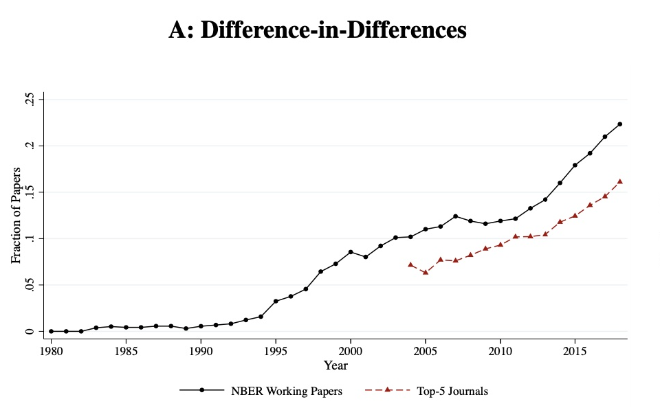
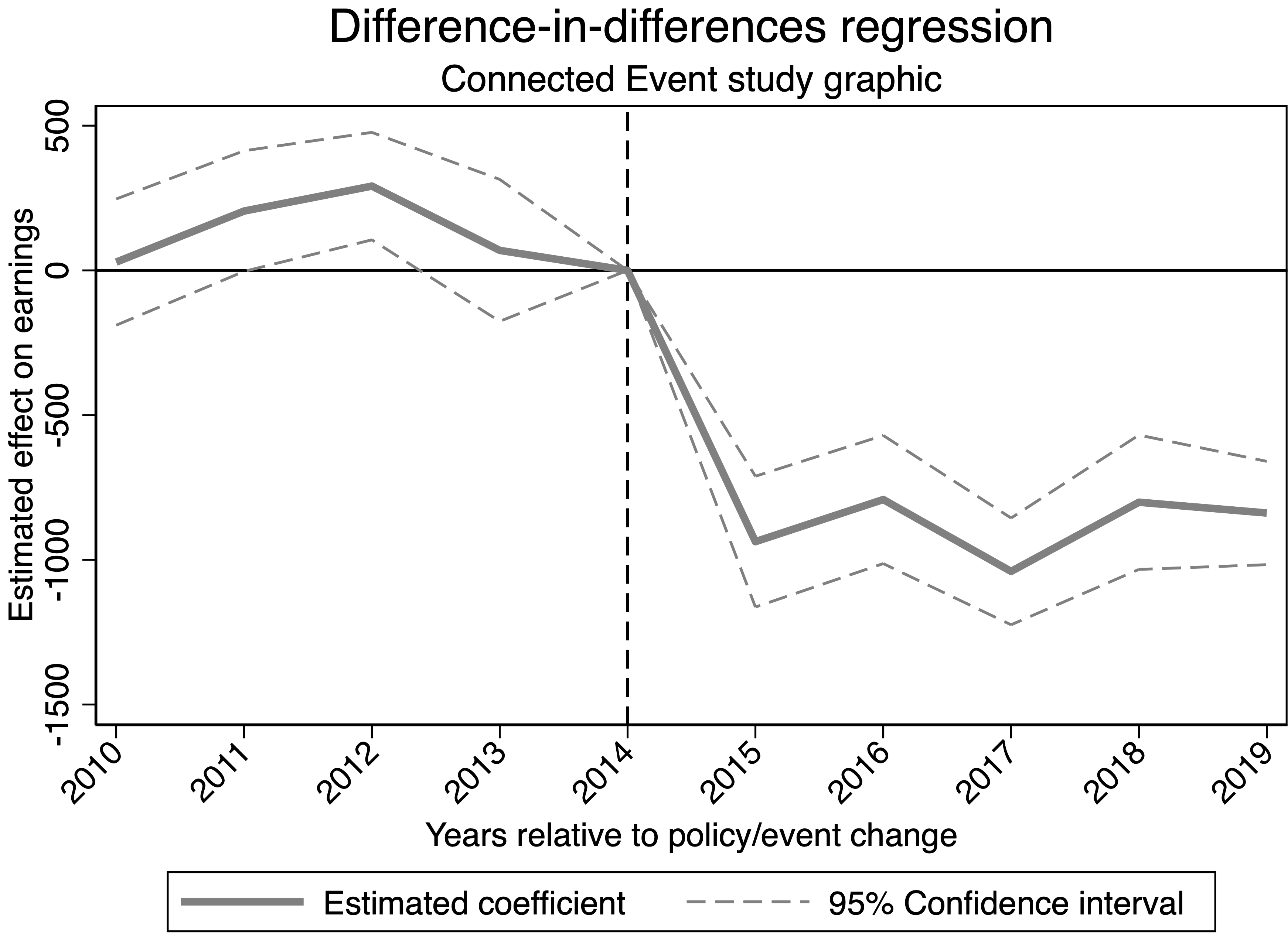
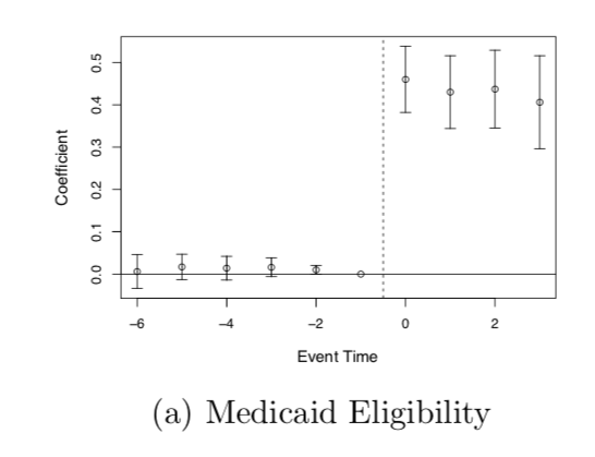
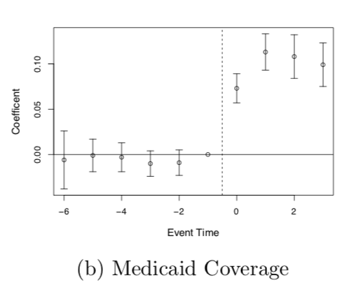
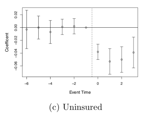
Difference-in-differences (diff-in-diff) is one of the most widely used quasi-experimental methods inside and outside of economics, though that was not always the case. The figure below shows a steady rise in the mentions of diff-in-diff, a trajectory mapped by Currie, Kleven, and Zwiers (2020) using the universe of working papers at the National Bureau of Economic Research (NBER) and top economics journals. This figure captures diff-in-diff’s momentum within economics since the early 1980s, when it began being used more frequently to study topics in labor economics like the returns to job training programs (O. Ashenfelter and Card 1985).
The method is much older than the figure below suggests. That figure only shows mentions of it within economics, but the method was not originally developed within economics. It was born in medicine in the 19th century. Not to be too melodramatic, but diff-in-diff has had many lives and many deaths like the Phoenix—a mythical bird that dies only to be reborn in new times and places. Each time diff-in-diff was born, it was brought forth by a researcher attempting to decipher data in a way that was transparent and that could easily be communicated to policymakers. Those two features seem to be common in each part of its life cycle, and through these cycles of death and rebirth, researchers’ understanding of its strengths and limitations, as well as how best to use it, was honed and improved upon, which has contributed to making it what it is today—the preferred method by many for working with longitudinal data conducting causal inference.
Figure 9.1: (Currie, Kleven, and Zwiers 2020) display of growing popularity of diff-in-diff since 1980 using percent of NBER papers and percent of top 5 journals in economics that mention it.
Ignaz Semmelweis in Vienna
The Vienna General Hospital was a teaching hospital offering free childbirth services. In the 1840s, the hospital had two maternity clinics: the First Clinic, staffed by male doctors and medical students, and the Second Clinic, run by female midwives. And, hidden inside these clinics was a troubling, perplexing mystery. Maternal mortality rates in the First Clinic were nearly three times higher than in the Second Clinic, primarily due to postpartum infections. This disparity seemed inexplicable, in part because it was the same hospital. There were differences between the clinics, but the differences could not have caused the disparities—or so said the primitive theories about disease that people believed at the time.
The clinics differed in two ways—how women were assigned to either clinic, and what happened in the delivery rooms of each clinic. First, depending on the day and time that women arrived in labor, they would be directed to either Clinic 1 or 2. This was by law. Years earlier, Vienna had adopted a policy requiring women to be admitted to either the First or Second Clinic depending on their arrival time, which we now know was randomizing women in labor to either clinic. Thus, since no one was choosing their clinic, but rather chance was choosing it for them, the differences in maternal mortality could not be attributed to pre-existing conditions. It had to be something in one of the two clinics, but what, and why?1
Ignaz Semmelweis was a Hungarian physician in the 1840s who served as chief resident at the Vienna General Hospital. Semmelweis, from what I could gather reading his book, The Etiology, Concept, and Prophylaxis of Childbed Fever(Semmelweis 1861), was a meticulous observer and a careful thinker. His attention to every possible detail related to every scrap of information around him that might be relevant to understanding the disease was impressive. Every possible factor would be scrutinized and then systematically eliminated as a potential cause for the disparity in death rates. His deduction happened by chance when one of his colleagues developed symptoms identical to those of the infected mothers and subsequently died. This heartbreaking event appeared to set Semmelweis’s theory into motion. He noted that the hospital, as a teaching institution, was both delivering children for women in labor and a medical school to train future physicians, and part of their training was in anatomy.
Physicians and students in the First Clinic conducted autopsies on cadavers as part of their education and then moved directly to assist in childbirth without having disinfected themselves thoroughly. As the midwives did not partake in the anatomy classes, they did not handle the cadavers. Semmelweis hypothesized that doctors and students were inadvertently transferring “cadaverous particles” to women during labor, causing deadly infections. Although he did not advance an actual germ theory of disease, he correctly intuited that some harmful substance was being transmitted from the cadavers to patients, and though it was invisible, it was nonetheless lethal. And so, both to falsify his theory and address the problem at hand, he implemented an unprecedented new policy: he required all doctors in the First Clinic to wash their hands with a chlorine solution before assisting in childbirth.
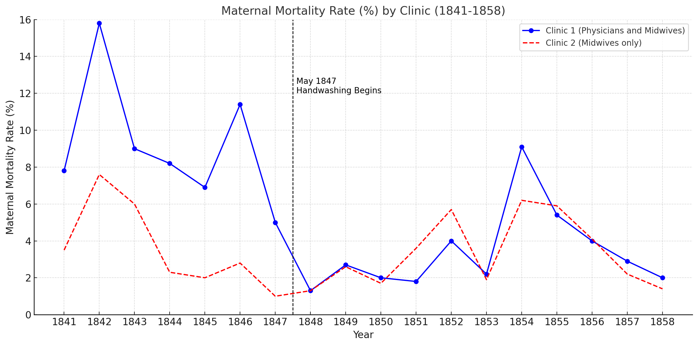
The results were staggering. The figure below shows the time series for the two clinics’ maternal mortality rates before and after the handwashing rule was implemented in May 1847.2 Maternal mortality rate in the First Clinic, which had been four times higher than that of the Second Clinic one year before the policy, plummeted to the level of the Second Clinic immediately. This sharp decline confirmed his hypothesis.
Figure 9.2: Time series plot of maternal mortality rates (%) by clinic from 1841 to 1858. Clinic 1 represents physicians and midwives, while Clinic 2 represents midwives only. The dashed vertical line marks May 1847, when handwashing began in Clinic 1.
But, despite the overwhelming success of the intervention, Semmelweis struggled to convince his peers. Colleagues attributed the drop in mortality to unrelated factors, such as improved ventilation, and dismissed the idea that unseen “particles” could carry disease. A strongly entrenched theory about disease transmission at the time made such a pathway impossible, so the evidence Semmelweis presented was not persuasive. Isolated and increasingly agitated, Semmelweis clashed with his colleagues, leading to his alienation from the medical community. Tragically, his mental health deteriorated, and he was eventually committed to a mental institution by a close friend, where he died from injuries sustained during his confinement, his work largely unrecognized and unappreciated.
John Snow’s Grand Experiment
In the 19th century, very little was known about cholera other than it killed its hosts quickly and painfully. Once a person became infected, they would die usually within days from constant vomiting and acute diarrhea leading to severe dehydration. It claimed tens of thousands of lives in London over several epidemic waves in the early to mid-1800s. At the time, the medical community attributed the disease to something called miasma, which was a theory that disease traveled through poisons found in foul-smelling air. Microscopes were still too rudimentary to see microorganisms, so invisible agents in water were unimaginable. What was not unimaginable was the stink. Fueled by London’s industrial revolution and expanding population, the city reeked with odors from the factories, sewage, and waste runoff into the Thames River. Miasma seemed plausible and efforts to clean up the city in direct response to it were probably, ironically, also helpful at improving public health—just not helpful at addressing cholera epidemics.
Diff-in-diff dies in Vienna and is then reborn almost immediately to a London resident named John Snow. Snow was a physician who had been on the frontlines of these outbreaks and was skeptical that miasma was causing the epidemics (Freedman 1991; Johnson 2007; Coleman 2019). Observing puzzling patterns of transmission, he found evidence that didn’t fit the miasma explanation. For example, cholera followed trade routes, seeming to affect sailors who had visited cholera-infected ports but sparing those who hadn’t. Poorer areas with poor sanitation were hardest hit, but some buildings and even adjacent neighborhoods showed dramatically different infection rates. Sometimes a building right next to another would go untouched while the first one suffered considerable casualties. These inconsistencies raised doubts in Snow’s mind about miasma as a comprehensive explanation.
Snow’s alternative hypothesis was original and correct: he posited that cholera was caused by a living organism that entered the body through food and drink, flowed through the alimentary canal, and returned to the water supply through waste, creating a vicious cycle. His ability to test this theory came about through a stroke of luck. By the mid-19th century, two water companies—Lambeth Waterworks Company and Southwark and Vauxhall Waterworks Company—both drew water from the Thames downstream from the city center. Between 1849 and 1854, London required the water utility companies to move their pipes upstream. Lambeth moved its intake pipes upstream, above the city and beyond the polluted sewage discharge points, but by 1854, Southwark and Vauxhall had not yet done so and households were still drawing their water from the river downstream. By the 1854 epidemic, Snow had access to a natural experiment: households served by Lambeth were receiving cleaner water, while those served by Southwark and Vauxhall were drinking contaminated water from the same neighborhoods.
Snow meticulously gathered data on cholera mortality rates, and then went door to door in the neighborhoods served by the two water companies to inquire about which utility company serviced that building. Sometimes the families knew and would share with him that information, and sometimes they didn’t. But because in 1854 the water source for Lambeth was further up the river, the salt content was different, so he would collect water samples from the tap and go back to his office to test it. His concern for data quality is even more impressive than his command over research design.
His analysis showed striking contrasts: cholera mortality rates in Lambeth households saw significant declines from 1849 to 1854 compared to those in Southwark and Vauxhall households. Snow’s landmark manuscript On the Mode of Communication of Cholera(Snow 1855), presented this evidence in a series of tables linking cholera transmission to contaminated water, and these tables and the logic behind them can now be recognized as a precursor to diff-in-diff.
But like Semmelweis, his compelling evidence did not persuade policymakers nor did it appear to persuade people in medicine. Miasma theory was so deeply entrenched that it was just not possible for even compelling evidence to crack it open.3 And the fact that our work can be both ignored and yet important is probably itself one of the most important lessons to be learned from that episode. But we also learn more than the importance of fighting for the sake of fighting, because Snow, like Semmelweis, also left a legacy of being open-minded, deeply attentive to the details, meticulous, and concerned about data quality, and answering one’s own questions using careful research designs.
It would be over a century before diff-in-diff was brought back to life, this time by a labor economist at Princeton in the early to mid-1970s.
9.2 Four Averages and Three Subtractions
In this section, we will introduce diff-in-diff, not in a regression model, but as “four averages and three subtractions.” Once I have done everything I can to explain the logic of diff-in-diff using only four averages and three subtractions, we will move into regression models. But to ensure everyone is on the same page, I will start first with a simple table that explains the logic of diff-in-diff, then introduce potential outcomes notation, then introduce a regression model, and then conduct some analysis with code. My goal is to make the fundamentals of diff-in-diff as accessible as they can be, from as many angles as possible, so that no one gets left behind. This material forms the core of the method, which will carry us through the more technical and complex designs, including covariates and differential timing.
Orley Ashenfelter Goes to Washington
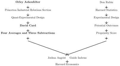
The third birth of diff-in-diff happens when Orley Ashenfelter, a first-generation quantitative labor economist (Card and Farber 2005), made it a foundational tool for contemporary policy evaluation through his own applications of it to studying job training programs in the 1970s and 1980s. And to help us see the connection between diff-in-diff and the broader Mississippi River metaphor, I have updated our “Two Rivers into Causal Inference” graphic to emphasize Ashenfelter, as well as his student and coauthor who is also closely associated with the design, the Nobel Laureate David Card.
Two rivers into causal inference
After completing his PhD at Princeton in 1968, Orley Ashenfelter joined the Office of Evaluation in Washington, DC, where he was tasked with studying job training programs. The role gave him access to a rare longitudinal dataset on labor market outcomes, allowing him to track participants’ earnings over time.
His approach echoed the logic of Semmelweis and Snow: observe two groups—those exposed to a treatment and those not—and track their outcomes over time. But unlike Semmelweis or Snow, Ashenfelter used panel data and estimated fixed effects models with time and thousands of individual controls to study the program’s effect on earnings.
Yet, like Semmelweis and Snow, Ashenfelter wasn’t just trying to convince other researchers. He wanted to communicate results to policymakers—people without the background or patience for technical terms like “regression.” It was in that context, facing the rhetorical demands of DC bureaucrats, that Ashenfelter began shifting his language away from econometric jargon and toward something simpler: difference-in-differences.
Illustrating Diff-in-Diff with a Table
Returning to Snow’s grand experiment, recall that between 1849 and 1854, the Lambeth Waterworks Company relocated its intake pipes upstream in compliance with London policy, while the Southwark and Vauxhall Waterworks Company did not (Johnson 2007). I’ll illustrate this design with Snow’s study using the following table. In Table 9.1, the quasi-experiment is organized as four averages (cholera mortality rates) and three subtractions. My notation will be simple. I’ll use \(Y\) as a measure of the average cholera mortality in each period (1854, or “after,” and 1849, or “before”) for Lambeth (our treatment group) and Southwark and Vauxhall (our comparison group).
Cholera mortality is expressed as the sum of different things on the right side of the equal sign. In 1849, before Lambeth moved its pipes, average cholera mortality in Lambeth will be \(Y = L\), and for Southwark and Vauxhall, it’s \(Y = SV\). In 1854, “after,” we’ll represent changes in cholera mortality for Lambeth as \(L + \mathbf{D + L_t}\). Here, \(\mathbf{L_t}\) is our counterfactual trend—representing what we expect Lambeth’s cholera mortality would have been had they not moved their pipes. The variable \(\mathbf{D}\) stands for the effect of Lambeth’s pipe relocation on cholera mortality, but only for Lambeth, and only afterwards, as that is the only row in which it appears.
Table 9.1: Lambeth and Southwark and Vauxhall, 1849 and 1854
Companies
Time
Average mortality
\(D_1\)
\(D_2\)
Lambeth
Before
\(Y = L\)
After
\(Y = L + \mathbf{L_t + D}\)
\(\mathbf{L_t + D}\)
\(\mathbf{D} + (\mathbf{L_t} - SV_t)\)
Southwark and Vauxhall
Before
\(Y = SV\)
After
\(Y = SV + SV_t\)
\(SV_t\)
Diff-in-diff calculations involve only two steps.
Subtract “after” from “before” for each group, yielding Lambeth’s \(D_1\) and Southwark and Vauxhall’s \(D_1\). These first two subtractions isolate the changes in cholera mortality from 1849 to 1854 for each company, leaving only the trends and the causal effect.
Calculate the third subtraction. Subtract Southwark and Vauxhall’s \(D_1\) from Lambeth’s \(D_1\). This yields the “difference-in-differences” estimate, \(D_2 = \mathbf{D} + (\mathbf{L_t} - SV_t)\).
In the final step, the difference-in-differences gives us not the isolated effect \(\mathbf{D}\) alone but the sum of three terms. The observed difference, \(\mathbf{L_t} - SV_t\), represents any counterfactual trend, so the validity of the diff-in-diff as the true effect depends on whether the trend in cholera mortality for Lambeth, had it not moved its pipe, would match the trend we observed in Southwark and Vauxhall. When that assumption holds, \(D\) can be estimated directly.
Snow’s presentation of results was not as straightforward as our diff-in-diff table here; his tables covered many neighborhoods, requiring a close analysis of several comparisons. However, we can reconstruct a modified version of his Table XII, focusing on his findings for these two water companies, as shown in Table 9.2. Here, population-adjusted cholera mortality is displayed per 10,000 households. In Southwark and Vauxhall, the mortality rate remained high between 1849 and 1854, whereas in Lambeth it dramatically decreased.
Following our diff-in-diff framework of four averages and three subtractions, we observe a reduction in cholera mortality of 97 per 10,000 households, assuming \(\mathbf{L_t} = SV_t\). This number, –97, is Snow’s estimate of the average effect of moving the pipe on cholera mortality and it suggests that cleaner water may have prevented an additional 97 deaths per 10,000 households.
Table 9.2: Average Effect of Lambeth’s Pipe Relocation on Cholera Mortality per 10,000 Households (Modified Snow’s Table XII)
Companies
Time
Average mortality
\(D_1\)
\(D_2\)
Lambeth
Before
62
After
14
-48
-97
Southwark and Vauxhall
Before
565
After
614
49
Using the data in Table 9.2 and applying Orley’s “four averages and three subtractions,” we estimate that by moving its pipe upstream, Lambeth saw 97 fewer cholera deaths per 10,000 households in 1854 than would have occurred had the pipe remained downstream—so long as the counterfactual trend, \(\mathbf{L_t}\), equals the actual comparison group trend, \(SV_t\). The diff-in-diff approach is straightforward yet powerful. It relies on these simple averages and subtractions to yield causal insights, provided that our comparison group accurately represents the counterfactual outcome in the treatment group.
Illustrating Diff-in-Diff with a Regression
For a very long time, I think most people thought that the phrase “difference-in-differences” was a synonym for two-way fixed effects (TWFE). Why did they think that? Well, the truth is quite possibly a surprise to many. The reason that diff-in-diff and TWFE regressions were thought to be the same thing is because there are, in fact, three specific regression formulas that are numerically identical to calculating four averages and three subtractions when working with only two groups and two time periods (Baker et al. 2025).
Equation 9.1 presents the “four averages and three subtractions” equation, or what is more often now called simply the \(2 \times 2\) calculation (Goodman-Bacon 2021; Baker et al. 2025). Starting now, and for the remainder of this chapter and the next chapter, you will see me oscillate between referring to Equation 9.1 as “four averages and three subtractions” and the simple \(2 \times 2\). I like to use both terms interchangeably so that readers can constantly be reminded that at its core, diff-in-diff is nothing more than four averages and three subtractions, to quote Orley Ashenfelter, but as that’s a mouthful, and keeping with the emerging nomenclature in the econometrics of diff-in-diff, I also want you to equate that with the phrase “\(2 \times 2\).” So, let’s now look at Equation 9.1 so we can connect it with regression. \[
\begin{equation}
\widehat{\mathbf{\delta}}_{DiD} = \bigg ( \overline{y}_k^{post(k)}
- \overline{y}_k^{pre(k)} \bigg ) - \bigg (
\overline{y}_U^{post(k)} - \overline{y}_U^{pre(k)} \bigg )
\label{eq:4averages}
\end{equation}
\tag{9.1}\] Here, \(k\) represents a collection of units treated at the same time, and \(U\) is a group of units who were not treated in either the preperiod or the postperiod.
Now consider the following regression specification, shown in Equation 9.2: \[
\begin{equation}
Y_{ist} = \alpha_0 + \alpha_1 Treat_{is} + \alpha_2 Post_{t} +
\mathbf{\delta} (Treat_{is} \times Post_t) + \varepsilon_{ist}
\label{eq:ols_did}
\end{equation}
\tag{9.2}\]
The key question is whether the estimated coefficient \(\widehat{\delta}\) in Equation 9.2 will match \(\widehat{\mathbf{\delta}}_{DiD}\) in Equation 9.1.
To explore this, let’s put both equations to the test using real data. We’ll draw on data from Cheng and Hoekstra (2013), which provides a balanced panel of 50 states from 2000 to 2010. During this period, various states passed “stand your ground” laws allowing lethal force in self-defense beyond the home. But for simplicity, and so it fits with the simple 2 \(\times\) 2 calculations we’re focused on in this chapter, I’ll restrict the sample to only the states that passed the law in 2006 plus the states that never passed it during this period. In other words, I’m going to drop all states from the sample that passed the law in 2005, 2007, 2008, and 2009. I will also look only at the effect of the reforms on homicide, since that is the focus of Cheng and Hoekstra (2013).
################################################################################# name: equivalence.R# description: show that did equation is numerically equivalent to OLS specification################################################################################# Load necessary libraries# install.packages(c("tidyverse", "fixest", "haven"))library(tidyverse)library(fixest)library(haven)# Load the datadata <- haven::read_dta("https://github.com/scunning1975/mixtape/raw/master/castle.dta")# Filter the datadata <- data %>%filter(!(effyear %in%c(2005, 2007, 2008, 2009)))# Generate post and treat variablesdata <- data %>%mutate(year =as.numeric(year),post =ifelse(year >=2006, 1, 0),treat =ifelse(!is.na(effyear), 1, 0) )# Calculate means for different groups(mean_values <- data %>%group_by(post, treat) %>%summarise(mean_l_homicide =mean(l_homicide, na.rm =TRUE)))# Calculate the DiD manually(did <-with(mean_values, { (mean_l_homicide[post ==1& treat ==1] - mean_l_homicide[post ==0& treat ==1]) - (mean_l_homicide[post ==1& treat ==0] - mean_l_homicide[post ==0& treat ==0])}))# Run the regression model <-feols( l_homicide ~i(post) +i(treat) + post:treat, data = data, cluster =~ state)model
Below in Table 9.3 I present the calculation I did in Equation 9.1 as well as the OLS estimate of \(\widehat{\delta}\) from Equation 9.2. And notice—the numbers are identical.
Table 9.3: Estimates of Castle Doctrine Reform on Log Homicides Presented Using Four Averages and Three Subtractions and OLS
Four Averages and Three Subtractions
OLS Estimate
DiD Estimate
0.0682359
0.0682359
To see why this particular OLS specification is identical to the four averages and three subtractions calculation in Equation 9.1, let’s calculate the four averages and three subtractions ourselves using a regression equation so we can see for ourselves that the two are the same. The OLS equation again is: \[
\begin{equation}
Y_{ist} = \alpha_0 + \alpha_1 Treat_{is} + \alpha_2 Post_{t} +
\mathbf{\delta} (Treat_{is} \times Post_t) + \varepsilon_{ist}
\end{equation}
\tag{9.3}\]
If we estimate this equation using OLS, then we get fitted values for \(\widehat{\alpha_0}\), \(\widehat{\alpha_1}\), and \(\widehat{\delta}\). Below are calculated sample mean log homicides, \(\overline{Y}\), equal to the coefficients estimated with OLS to illustrate what I mean. For each average, you simply sum the fitted values from the previous equation that correspond to that group and time period.
Non-Reform States Pre: \(\overline{Y}_{NR,Pre} = \widehat{\alpha_0}\)
Non-Reform States Post: \(\overline{Y}_{NR,Post} = \widehat{\alpha_0} +\widehat{\alpha_2}\)
Reform States Pre: \(\overline{Y}_{R,Pre} = \widehat{\alpha_0} +\widehat{\alpha_1}\)
The \(\widehat{\delta}\) in Equation 9.2, when estimated with OLS, is the exact same calculation as the four averages and three subtractions method in Equation 9.1. It’s no wonder then, given the equivalence of the two methods, that Orley would’ve chosen the “four averages and three subtractions” to explain the results of his analysis of job training programs to people in DC who did not have economics or statistics backgrounds. It’s not that he was dumbing it down. Rather, it’s that regression coefficient is literally four averages and three subtractions, so that’s what he chose to convey.
I said earlier that there are in fact three regression specifications that calculate “four averages and three subtractions,” but I have just given us only one. What then are the other two? Equations Equation 9.5, Equation 9.5, and Equation 9.5 list all three regression specifications that, curiously enough, are numerically identical to the “four averages and three subtractions” equation from Equation 9.1. \[
\begin{eqnarray}
Y_{it} &=& \alpha + \beta_1 \text{Post}_t + \beta_2 \text{Treat}_i
+ \delta (\text{Post}_t \times \text{Treat}_i) + \varepsilon_{it}
\label{eq:did_interaction} \\
Y_{it} &=& \alpha_i + \gamma_t + \delta (\text{Post}_t \times
\text{Treat}_i) + \varepsilon_{it} \label{eq:did_twfe} \\
\Delta Y_i &=& \alpha + \delta \text{Treat}_i + \varepsilon_i
\label{eq:did_longdiff}
\end{eqnarray}
\tag{9.5}\] where Equation 9.5 first calculates the difference between the pre- and post-treatment outcomes for each unit, called the “long difference,” which is here represented with \(\Delta Y_i\), and then regresses the long difference onto a treatment dummy. The code for these three regressions is listed below in both Stata and R.
# name: equivalence2.R# author: scott cunningham # description: OLS and Manual are the same# Load required librarieslibrary(haven)library(dplyr)library(fixest)library(tidyr)# Clear workspace and load datarm(list =ls())# Load the castle datasetcastle <-read_dta("https://github.com/scunning1975/mixtape/raw/master/castle.dta")# Set up panel structure (equivalent to xtset)castle <- castle %>%arrange(sid, year)# Drop specific years and create variablescastle <- castle %>%filter(!(effyear %in%c(2005, 2007, 2008, 2009))) %>%select(-post) %>%mutate(post =ifelse(year >=2006, 1, 0),treat =ifelse(effyear ==2006, 1, 0) ) %>%filter(year %in%c(2005, 2006))# Example 1: OLS regression with interactionscat("Example 1: OLS regression with interactions\n")model1 <-feols(l_homicide ~ post * treat, data = castle, cluster =~sid)summary(model1)# Example 2: Twoway fixed effects (state and year fixed effects)cat("\nExample 2: Twoway fixed effects (state and year fixed effects)\n")model2 <-feols(l_homicide ~ treat:post +factor(year) | sid, data = castle, cluster =~sid)summary(model2)# Example 3: Regress "long difference" onto treatment dummycat("\nExample 3: Regress 'long difference' onto treatment dummy\n")# Create the difference data (removing prison variable that doesn't exist)diff_data <- castle %>%select(sid, year, l_homicide, treat) %>%pivot_wider(names_from = year,values_from = l_homicide,names_prefix ="l_homicide_" ) %>%mutate(diff = l_homicide_2006 - l_homicide_2005 )model3 <-feols(diff ~ treat, data = diff_data, cluster =~sid)summary(model3)
To summarize, I refer to the manual method of calculating four averages and three subtractions as the \(2 \times 2\). And then I refer to Equation 9.5 as the simple interaction OLS specification, Equation 9.5 as the TWFE OLS specification because it controls for individual and time fixed effects, and Equation 9.5 as the “long difference” OLS specification. All four of them, regardless of which one you choose, gives the exact same number–0.0682359–as seen in Table 9.4 below.
Table 9.4: Estimates of Castle Doctrine Reform on Log Homicides Presented Using Four Averages and Three Subtractions and OLS
\(2 \times 2\)
Interaction OLS
TWFE
Long difference
DiD Estimate
0.0682359
0.0682359
0.0682359
0.0682359
Note: All four methods are numerically identical to one another.
This equivalence reveals something important about both statistical practice and communication. Since these OLS specifications are computationally equivalent to “four averages and three subtractions,” practitioners often prefer regression because it provides access to standard statistical inference tools like standard errors and hypothesis tests.
But Orley’s goal was different: communicating with nonpractitioners. The history of difference-in-differences has always emphasized clear communication—from Ignaz Semmelweis and John Snow onward, the goal was conveying urgent results to those outside the analytical weeds. Orley coined “difference-in-differences” as a truthful but accessible nickname for these regression specifications, avoiding unnecessary OLS jargon while preserving analytical integrity.
This highlights the hidden curriculum of causal inference: successful communication of complex ideas to nonpractitioners. Many of us learn this only after failed attempts to explain fixed effects to journalists or policymakers.4
9.3 Potential Outcomes and Identification
Diff-in-diff is a causal design, not simply four numbers subtracted in a row. What is it that allows one to go, therefore, from four averages and three subtractions to making a claim about causality? What’s the secret? To understand the causal interpretation of diff-in-diff, as we have done in the previous chapters, we have to introduce potential outcomes. Without potential outcomes, at least in the design tradition that this book is mostly focused on, we really can’t talk about causality. But fortunately, we get to keep our four averages and three subtractions when we do it.
Parallel Trends Assumption
There are several steps involved in going from four averages and three subtractions to making inferences about causal effects. In this section, though, we’ll move deeper in that direction, by starting with Equation 9.6 and then making just a few substitutions and some simple manipulations similar to things we’ve been doing in earlier chapters. \[
\begin{equation}
\widehat{\delta}_{DiD} = \bigg ( E[Y_k|Post] - E[Y_k|Pre] \bigg ) -
\bigg ( E[Y_U | Post ] - E[ Y_U | Pre] \bigg) \label{eq:did_eq1}
\end{equation}
\tag{9.6}\]
We move between realized outcomes, \(Y\), and potential outcomes, \(Y^1\) or \(Y^0\), depending on whether a unit is treated or not. There is only one period in time when any group is treated and that’s the treatment group in the post-treatment period. The rest of the time, units are not treated. Therefore, in the preperiod, we make the replacement \(Y=Y^0\) for both treated and control. Since the control group remained “never-treated,” it is also \(Y=Y^0\) in the post-treatment period. But, as I said, since the treatment group was treated in the postperiod, then we replace \(Y=Y^1\) for that group in that time period. These substitutions based on the switching equation allow us to write Equation 9.7: \[
\begin{eqnarray}
\widehat{\delta}_{DiD} &=& \bigg ( \underbrace{E[Y^1_k|Post] -
E[Y^0_k|Pre] \bigg ) - \bigg ( E[Y^0_U | Post ] - E[ Y^0_U |
Pre]}_{\mathclap{\text{Switching equation}}} \bigg) \label{eq:did_eq2}
\end{eqnarray}
\tag{9.7}\] where, recall, this is the switching equation: \[
\begin{eqnarray*}
Y=D \times Y^1 + (1-D) \times Y^0
\end{eqnarray*}
\tag{9.8}\]
If you look closely at Equation 9.7, you’ll see that nothing in there is (yet) a causal effect, because a causal effect is \(Y^1 - Y^0\) for the same groups at the same point in time. But throughout the diff-in-diff equation, we are either comparing two different groups at the same time, like \(E[Y^1|D=1,Post] - E[Y^0|D=0, Post]\), or we are comparing the same group at different points in time, like \(E[Y^1|D=1, Post] - E[Y^0|D=1,Pre]\). So, let’s make a simple adjustment to Equation 9.7 by adding a zero to the right-hand side. Zeroes are special numbers because when you add them to one side of an equation, you don’t actually do anything to the equation other than bring the zero in. I’ll do it for the same reason—to introduce new terms to our diff-in-diff equation. \[
\begin{eqnarray}
\widehat{\delta}_{DiD} &=& \bigg ( \underbrace{E[Y^1_k|Post] -
E[Y^0_k|Pre] \bigg ) - \bigg ( E[Y^0_U | Post ] - E[ Y^0_U |
Pre]}_{\mathclap{\text{Switching equation}}} \bigg) \label{eq:did_eq3} \\
&&+ \underbrace{\mathbf{E[Y_k^{\textbf{0}} |Post] -
E[Y^{\textbf{0}}_k | Post]}}_{\mathclap{\text{Adding zero}}}
\end{eqnarray}
\tag{9.9}\]
I have one last step before we’re done. I’m going to now rearrange Equation 9.9 by moving some terms around so that you can better see the exact moment when the diff-in-diff equation goes from being noncausal to causal. Look closely at Equation 9.10 and compare it with Equation 9.9. They’re the same equation, only with some terms moved around. \[
\begin{eqnarray}
\widehat{\delta}_{\text{DiD}} &=& \underbrace{E[Y^1_k | Post] -
\mathbf{E[Y^{\textbf{0}}_k |
Post]}}_{\text{\emph{ATT}}} \\
&& + \bigg [ \underbrace{\mathbf{E[Y^{\textbf{0}}_k | Post]} -
E[Y^{0}_k | Pre] \bigg ] - \bigg [ E[Y^0_U | Post] - E[Y_U^0 | Pre]
}_{\text{Non-parallel trends bias}} \bigg ]
\end{eqnarray}
\tag{9.10}\]
Diff-in-diff calculations are the sum of two conceptually distinct terms. The first term is the \(\mathit{ATT}\), which for diff-in-diff designs is the only causal parameter you can recover. Thus when you are estimating diff-in-diff, develop the habit of remembering that you are identifying the average effect of a program on a treated group in the post-treatment period. While it’s possible that the group is similar enough to other groups that you might extrapolate and speak more generally, technically, diff-in-diff only speaks to average treatment effect for the treated group in the post-treatment period.
The second term in Equation 9.10 is technically a bias term, and it is actually a form of selection bias. Selection bias is technically expressed as differences in \(E[Y^0]\) for treated and control, only in this case it’s selection bias related to differences between treatment and control in their changes in \(Y^0\) (i.e., \(E[\Delta Y^0]\)), not its levels. I call this bias term “non-parallel trends bias term.” And if you look closely at the second row of Equation 9.10, the non-parallel trends bias is itself calculated as the diff-in-diff based on \(Y^0\) (whereas the main diff-in-diff calculation is based on \(Y\)).
Table 9.5: Diff-in-Diff Example Table with Pre/Postperiods and Parallel Trends
Year
Group
\(Y^1\)
\(Y^0\)
\(Y\)
\(D\)
Pre/Post
1980
1
3.58
3.58
0
Pre
1981
1
4.52
4.52
0
Pre
1982
1
5.57
5.57
0
Pre
1983
1
6.53
6.53
0
Pre
1984
1
7.57
7.57
0
Pre
1985
1
8.56
8.56
0
Pre
1986
1
19.55
9.56
19.55
1
Post
1987
1
30.59
10.52
30.59
1
Post
1988
1
41.55
11.59
41.55
1
Post
1989
1
52.57
12.58
52.57
1
Post
1990
1
63.56
13.58
63.56
1
Post
1980
2
3.59
3.59
0
Pre
1981
2
4.56
4.56
0
Pre
1982
2
5.59
5.59
0
Pre
1983
2
6.54
6.54
0
Pre
1984
2
7.55
7.55
0
Pre
1985
2
8.58
8.58
0
Pre
1986
2
9.58
9.58
0
Post
1987
2
10.58
10.58
0
Post
1988
2
11.62
11.62
0
Post
1989
2
12.58
12.58
0
Post
1990
2
13.58
13.58
0
Post
To help us better understand the connection between diff-in-diff, the \(\mathit{ATT}\), and parallel trends, I have arranged a simple numerical example for us to do together. Table 9.5 has two groups—group 1 and group 2—and two time periods. The preperiod is from 1980 to 1985 and the postperiod is from 1986 to 1990, and it’s called pre and post because group 1 receives some treatment in 1986 that lasts until 1990.
There are three columns I want us to look at closely. They are the two potential outcome columns, \(Y^1\) and \(Y^0\), and the realized outcome column, \(Y\). Notice that when \(D=0\), \(Y=Y^0\), but when \(D=1\), then \(Y=Y^1\). That’s the work of the switching equation. It assigns one of the two potential outcomes to our timeline, so to speak, depending on whether the unit was or was not treated at that moment in time. So, from 1986 to 1990, since the treatment group is treated, it means we observe\(Y=Y^1\), but we cannot observe the counterfactual, \(Y^0\), as it does not exist.
Let’s go back to our diff-in-diff equation and note what it equals by writing out the entire diff-in-diff equation in terms of the \(\mathit{ATT}\) and the parallel trends bias term: \[
\begin{eqnarray}
&&\underbrace{\bigg( E[Y_k|Post] - E[Y_k|Pre] \bigg) - \bigg( E[Y_U
| Post ] - E[ Y_U | Pre] \bigg)}_{\text{1. Diff-in-diff equation}}\nonumber\\
&&= \underbrace{E[Y^1_k | Post] - \mathbf{E[Y^{\textbf{0}}_k |
Post]}}_{\text{2. \emph{ATT}}} \label{eq:did_tab2} \\
&&\quad + \underbrace{\bigg[ \mathbf{E[Y^{\textbf{0}}_k | Post]} -
E[Y^0_k | Pre] \bigg ] - \bigg [ E[Y^0_U | Post] - E[Y^0_U | Pre]
\bigg]}_{\text{3. Non-parallel trends bias}} \nonumber
\end{eqnarray}
\tag{9.11}\]
What I want us to do now is use the data in Table 9.5 and calculate all three numbered elements in Equation 9.11: 1) the diff-in-diff equation, 2) the \(\mathit{ATT}\), and 3) the non-parallel trends bias term. We’ll start with the diff-in-diff equation. To calculate the value of the diff-in-diff equation, we need four averages first, so let’s do that. I’ve done that in Table 9.6:
Table 9.6: Diff-In-Diff Numerical Values
Averages of Y
Group 1
Group 2
Pre
6.06
6.07
Post
41.56
11.59
Trend in outcomes
35.51
5.52
Now, using those numbers, let’s calculate the diff-in-diff value using the diff-in-diff equation: \[
\begin{align}
&\bigg (E[Y_k|Post] - E[Y_k|Pre] \bigg) - \bigg( E[Y_U | Post ] -
E[ Y_U | Pre] \bigg) \nonumber\\
&\quad = (41.56 - 6.06) - (11.59 - 6.07) \nonumber \\
&\quad = 35.51 - 5.52 \nonumber \\
&\quad = 29.99
\end{align}
\tag{9.12}\]
Next, let’s calculate the \(\mathit{ATT}\). The definition of the \(\mathit{ATT}\) is \(E[Y^1|D=1,Post] - \mathbf{E[Y^{\textbf{0}}|D=\textbf{1},Post]}\). To get these numbers, we simply calculate the average, \(\frac{9.56+10.52+11.59+ 12.58+13.58}{5} = 11.566\), calculate the average \(\frac{19.55+30.59+41.55+52.57+63.56}{5}=41.564\), and then subtract the two to get \(41.564 - 11.566 = \textbf{30}\). And thus we see that the \(\mathit{ATT}\) is 30, whereas the diff-in-diff is 29.99.
Finally, let’s calculate the non-parallel trends bias term using the calculation for it in Equation 9.11. We can either do it directly, which I’ll do below, or we can do it by solving for the bias term using Equation 9.11. If we solve directly for the non-parallel trends bias term, we see that it is equal to \(DiD-\mathit{ATT}\):
So, it looks like our diff-in-diff estimate of the \(\mathit{ATT}\) is a little biased—it’s off by \(-0.01\). Why is that? Well, we know why—it’s because the first part of the non-parallel trends bias term is \(-0.01\) less than the second part. The bias of diff-in-diff always has that interpretation, but let’s see for ourselves by calculating the non-parallel trends bias term using Equation 9.13 directly with the averaged \(Y^0\) values I’ve put for you in Table 9.7: \[
\begin{eqnarray}
&=& \big ( \mathbf{E[Y^{\textbf{0}}_k | Post]} - E[Y^0_k | Pre]
\big ) - \big(E[Y^0_U | Post] - E[Y^0_U | Pre]\big) \nonumber \\
&=& (11.57-6.06) - (11.59-6.07) \nonumber \\
&=& 5.51 - 5.52 \nonumber \\
&=& -0.01
\label{eq:did_pt}
\end{eqnarray}
\tag{9.13}\]
Table 9.7: Non-parallel Trends Bias Calculation
Averages of \(Y^0\)
Group 1
Group 2
Pre
6.06
6.07
Post
11.57
11.59
Counterfactual trend
5.51
5.52
Non-parallel trends bias
\(-0.01\)
So, we can see that the reason why diff-in-diff was a biased estimate of the (albeit a very small bias of only \(-0.01\)) is simply because the change in \(\mathbf{E[Y^{\textbf{0}}]}\) for the treatment group over time was slightly less than the change in \(E[Y^0]\) for the control group. But note, it is crucial that this point be well understood before we go any further. The change in \(\mathbf{E[Y^{\textbf{0}}]}\) for the treatment group is counterfactual. We don’t know what the potential outcome for the treatment group would’ve been in the postperiod had it not been treated because that didn’t happen. And we cannot know it, too. Just like you cannot know what would have happened to you had you not gone to college or graduated high school. Nonetheless, diff-in-diff equals the when that bias term is zero.
To help drive this point home, let’s now work through another example where diff-in-diff is severely biased, but the actual diff-in-diff value is the same as in the exercise we just completed. The new information is contained in Table 9.8 and it is basically the same as the previous table, only this time the \(Y^0\) values for the treatment group in the postperiod have changed.
Table 9.8: Diff-in-Diff Example Table with Pre/Postperiods but Non-Parallel Trends
Year
Group
\(Y^1\)
\(Y^0\)
\(Y\)
\(D\)
Pre/Post
1980
1
3.58
3.58
0
Pre
1981
1
4.52
4.52
0
Pre
1982
1
5.57
5.57
0
Pre
1983
1
6.53
6.53
0
Pre
1984
1
7.57
7.57
0
Pre
1985
1
8.56
8.56
0
Pre
1986
1
19.55
15
19.55
1
Post
1987
1
30.59
25
30.59
1
Post
1988
1
41.55
35
41.55
1
Post
1989
1
52.57
48
52.57
1
Post
1990
1
63.56
60
63.56
1
Post
1980
2
3.59
3.59
0
Pre
1981
2
4.56
4.56
0
Pre
1982
2
5.59
5.59
0
Pre
1983
2
6.54
6.54
0
Pre
1984
2
7.55
7.55
0
Pre
1985
2
8.58
8.58
0
Pre
1986
2
9.58
9.58
0
Post
1987
2
10.58
10.58
0
Post
1988
2
11.62
11.62
0
Post
1989
2
12.58
12.58
0
Post
1990
2
13.58
13.58
0
Post
Since the \(\mathit{ATT}\) and the non-parallel trends bias terms use that information, their values are different. But since the diff-in-diff equation does not use any counterfactuals, it has not changed. Let’s see by calculating the diff-in-diff again using the information in Table 9.9. You’ll see that it is the same information as before.
Table 9.9: Diff-In-Diff Numerical Values Using Numbers from Table 9.8
Averages of Y
Group 1
Group 2
Pre
6.06
6.07
Post
41.56
11.59
Trend in outcomes
35.51
5.52
DiD equation
29.99
So, if diff-in-diff hasn’t changed, what has changed? Let’s now calculate the together. \[
\begin{eqnarray}
\mathit{ATT} &=& E[Y^1|D=1,Post] -
\mathbf{E[Y^{\textbf{0}}|D=\textbf{1},Post]} \nonumber \\
&=& \frac{19.55+30.59+41.55+52.57+63.56}{5} \nonumber\\
&& - \frac{15+25+35+48+60}{5} \nonumber \\
&=& 41.564 - 36.6 \nonumber \\
&=& \textbf{4.96}
\label{eq:att_nopt2}
\end{eqnarray}
\tag{9.14}\]
As you can see, the \(\mathit{ATT}\) is no longer 30; it is 4.96. It’s changed—not because the realized data changed, but rather because the counterfactual values of \(Y^0\) changed. We only know that it did because this is a simulation; in the real world, you cannot ever know this. It is impossible for me to know, for instance, what my life would be like now had I not majored in English in college. And some genie could snap their fingers and change those counterfactuals for me right now and I would never know since that’s counterfactual and therefore does not exist.
Now, we know that the non-parallel trends bias term equals \(DID-\mathit{ATT}\), so that means it equals \(29.99-4.96=25.03\). But let’s calculate it manually just so we can maintain our comfort level with these simple calculations using potential outcomes. I’ve put that information into a table again for us:
Table 9.10: Non-parallel Trends Bias Calculation Using the Numbers in Table 9.8
Averages of \(Y^0\)
Group 1
Group 2
Pre
6.06
6.07
Post
36.60
11.59
Counterfactual trend
30.55
5.52
Non-parallel trends bias
25.03
So, let’s regroup and review. In the first exercise, diff-in-diff was 29.99 and was unbiased for the \(\mathit{ATT}\). And in the second exercise, diff-in-diff was also 29.99, but this time it was biased. Why? Because in the first the change in \(E[Y^0]\) for both groups had been the same, but in the second they diverged. As one of these terms is not real, we cannot know just from looking at data whether our data is more like the first than the second. Later what we will do is provide a roadmap of common practices and ways of reasoning that may help you infer whether parallel trends is plausible, and if not, what you can do to possibly overcome it. But for now, we are just going to leave things there and move to our next assumption: the “no anticipation” assumption.
No Anticipation Assumption
I am not a huge fan of the nickname of the next assumption as it immediately invokes human reasoning that is actually not what is required by the assumption. The second assumption is commonly called the no anticipation assumption, which implies that to use diff-in-diff, we must as social scientists stop believing that humans can hear of a future event and back out its implications for the present. But before we dive into that sort of thing, I think we should ground ourselves in what no anticipation literally means. All that no anticipation means is that the potential outcome of the treatment group prior to the treatment’s occurrence is \(Y^0\). No anticipation, in other words, is shorthand for “the treatment group is not treated until it is in fact treated."
To help us understand what no anticipation means, I am going to begin with its violation in the hopes that by seeing its violation, we might better understand that the no anticipation is obvious, mundane, and also crucial when designing any diff-in-diff. I’ll start with the diff-in-diff equation and then make a substitution with the switching equation that is different than we did before.
Notice that in the second row of Equation 9.15, when I replaced \(Y\) with potential outcomes using the switching equation, I made \(Y=Y^1\) for the treatment group in both periods. That is what a no anticipation assumption violation means—it means that for your “pretreatment period,” the treatment group was already treated. Why would you ever use as your baseline, in diff-in-diff, an already treated period? That’s not our point yet—our point here is only to understand the consequences of that choice, not to prescribe whether it is good or bad to do so.
So, if you have a no anticipation assumption violation, then what exactly would diff-in-diff identify? Since the calculation is the same, does this equal the plus parallel trends, or is it something else, and if it is something else, what? To answer that question, I need to make a couple of substitutions. I’m going to add in two zeroes based on the differences in counterfactuals so that I better understand what diff-in-diff is identifying in this case. \[
\begin{eqnarray}
&=& \bigg ( E[Y^1_k|Post] - \mathbf{E[Y^{\textbf{1}}_k|Pre]} \bigg
) - \bigg ( E[Y^0_U | Post ] - E[ Y^0_U | Pre] \bigg) \nonumber \\
&&+ \mathbf{E[Y^{\textbf{0}}_k|Post]} -
\mathbf{E[Y^{\textbf{0}}_k|Post]} \nonumber \\
&&+ \mathbf{E[Y^{\textbf{0}}_k|Pre]} -
\mathbf{E[Y^{\textbf{0}}_k|Pre]}
\end{eqnarray}
\tag{9.16}\]
Now let me move these terms in Equation 9.16 around so that I can better understand what diff-in-diff is identifying if our treatment group was already treated at baseline. \[
\begin{eqnarray}
&=& \underbrace{\bigg ( E[Y^1_k|Post] -
\mathbf{E[Y^{\textbf{0}}_k|Post]} \bigg )}_{\text{\emph{ATT} at
post-treatment for group $k$}} \nonumber \\
&&+ \underbrace{\bigg ( \mathbf{E[Y^{\textbf{0}}_k|Post]} -
\mathbf{E[Y^{\textbf{0}}_k|Pre]} \bigg ) - \bigg ( E[Y^0_U | Post ]
- E[ Y^0_U | Pre] \bigg )}_{\text{Non-parallel trends bias}} \nonumber \\
&& - \underbrace{\bigg ( \mathbf{E[Y^{\textbf{1}}_k|Pre]} -
\mathbf{E[Y^{\textbf{0}}_k|Pre]} \bigg )}_{\text{\emph{ATT} at
baseline for group $k$}} \label{eq:did_na3}
\end{eqnarray}
\tag{9.17}\]
And to simplify, I’ll group all of that into this simple expression: \[
\begin{equation}
\widehat{\delta}_{DiD} = \mathit{ATT}_k(Post) + PT - \mathit{ATT}_k(Pre)
\label{eq:did_na3a}
\end{equation}
\tag{9.18}\]
Equation 9.17 states that when you estimate diff-in-diff using two periods and two groups, and your treatment group is treated in the pretreatment period, the only way that this can identify the \(\mathit{ATT}\) is if 1) parallel trends holds and 2) the \(\mathit{ATT}\) for your treatment group at baseline was zero. This means either that the future treatment was a surprise—hence it was not “anticipated"—or that it was known ahead of time, but its treatment effect was zero at baseline. Either way, \(Y=Y^0\) for the treatment group in the preperiod, which is all that is implied by no anticipation.
I think it may be helpful to take this somewhat abstract decomposition from theory to simulated data. This simulation will create 1,000 firms with 25 per state, in 40 states, and over four years. It will then follow those 1,000 firms from 1990 to 1993. The treatment happens only to the treatment group in 1991, and once treated, the firms stay treated. This means that only 1990 is untreated for the treatment group, so if I wanted to estimate the using diff-in-diff, I would need to use 1990 as my baseline.
I generated two types of treatment effects. The first, labeled delta_c in the code, is equal to 10 in 1991, 1992, and 1993. This therefore means that the \(\mathit{ATT}\) is 10. These are the constant treatment effects. Then I generated a second type of treatment effects labeled delta_d equal to 10 in 1991, 20 in 1992, and 30 in 1993. This means that the \(\mathit{ATT}\) is 20 in this case. These are dynamic treatment effects. As Equation 9.17 says that diff-in-diff will be zero if treatment effects are constant, but nonzero if dynamic, we will want to check each to confirm.
# Set seed for reproducibilitylibrary(sandwich)library(lmtest)set.seed(20200403)# Create the base data framen_states <-40n_firms_per_state <-25n_years <-4# Create expanded data frame for states and firmsstates_rep <-rep(1:n_states, each = n_firms_per_state)firms_data <-data.frame(state = states_rep,firms =runif(n_states * n_firms_per_state, 0, 5))# Now expand for yearsfirms_data <- firms_data[rep(seq_len(nrow(firms_data)), each = n_years), ]firms_data <- firms_data[order(firms_data$state), ]# Create year variablefirms_data$year <-rep(1:4, times =nrow(firms_data)/4)firms_data$n <- firms_data$year# Replace years with actual datesfirms_data$year <-ifelse(firms_data$year ==1, 1990,ifelse(firms_data$year ==2, 1991,ifelse(firms_data$year ==3, 1992, 1993)))# Create unique ID for each firmfirms_data$id <-as.numeric(factor(paste(firms_data$state, firms_data$firms)))# Treatment group assignment (upper half of IDs)firms_data$group <-ifelse(firms_data$id >=500, 1, 0)# Create post indicatorsfirms_data$post <-ifelse(firms_data$year >=1991, 1, 0)firms_data$post_na <-ifelse(firms_data$year >=1992, 1, 0)# Generate error termfirms_data$e <-rnorm(nrow(firms_data), 0, 1)# Generate potential outcomesfirms_data$y0 <- firms_data$firms + firms_data$n + firms_data$e# Constant treatment effectsfirms_data$y1_c <- firms_data$y0firms_data$y1_c[firms_data$year >=1991] <- firms_data$y0[firms_data$year >=1991] +10# Dynamic treatment effectsfirms_data$y1_d <- firms_data$y0firms_data$y1_d[firms_data$year ==1991] <- firms_data$y0[firms_data$year ==1991] +10firms_data$y1_d[firms_data$year ==1992] <- firms_data$y0[firms_data$year ==1992] +20firms_data$y1_d[firms_data$year ==1993] <- firms_data$y0[firms_data$year ==1993] +30# Calculate treatment effectsfirms_data$delta_c <- firms_data$y1_c - firms_data$y0firms_data$delta_d <- firms_data$y1_d - firms_data$y0# Create treatment indicatorfirms_data$d <-ifelse(firms_data$year >=1991& firms_data$group ==1, 1, 0)# Generate observed outcomesfirms_data$y_c <- firms_data$d * firms_data$y1_c + (1- firms_data$d) * firms_data$y0firms_data$y_d <- firms_data$d * firms_data$y1_d + (1- firms_data$d) * firms_data$y0# Calculate aggregate treatment effectsatt_c <-mean(firms_data$delta_c[firms_data$year >=1991& firms_data$group ==1], na.rm =TRUE)att_d <-mean(firms_data$delta_d[firms_data$year >=1991& firms_data$group ==1], na.rm =TRUE)# Print summary of treatment effectscat("Average Treatment Effects:\n")cat("Constant ATT:", att_c, "\n")cat("Dynamic ATT:", att_d, "\n\n")# Fit regression models# Correct specification - Constant Treatment Effectsmodel_c <-lm(y_c ~factor(group) *factor(post), data = firms_data)coeftest(model_c, vcov =vcovHC(model_c, type ="HC1"))# Correct specification - Dynamic Treatment Effectsmodel_d <-lm(y_d ~factor(group) *factor(post), data = firms_data)coeftest(model_d, vcov =vcovHC(model_d, type ="HC1"))# Incorrect specification - Constant Treatment Effectsmodel_c_na <-lm(y_c ~factor(group) *factor(post_na), data =subset(firms_data, year >=1991))coeftest(model_c_na, vcov =vcovHC(model_c_na, type ="HC1"))# Incorrect specification - Dynamic Treatment Effectsmodel_d_na <-lm(y_d ~factor(group) *factor(post_na), data =subset(firms_data, year >=1991))coeftest(model_d_na, vcov =vcovHC(model_d_na, type ="HC1"))
I’ll present my results using the DiD regression specification from Equation 9.2, which I’ll rewrite here so you don’t have to flip back. \[
\begin{eqnarray*}
Y_{ist} = \alpha_0 + \alpha_1 Treat_{is} + \alpha_2 Post_{t} +
\mathbf{\delta} (Treat_{is} \times Post_t) + \varepsilon_{ist}
\end{eqnarray*}
\tag{9.19}\]
I then ran four regressions and present that output in Table 9.11. Column 1 uses the data that has constant treatment effects, which means the \(\mathit{ATT}\) is 10. And in this specification I used as my baseline 1990, which was not yet treated. The coefficient in column 1 is 9.976, which is approximately correct. In column 2, I used the data that had dynamic treatment effects, which recall, had an \(\mathit{ATT}\) of 20. And again, with the correct specification, my estimation was approximately correct again at 19.976.
But then in columns 3 and 4, I chose to intentionally specify the model where I used as my baseline 1991, which as we know was already treated. In 1991, the \(\mathit{ATT}\) under constant treatment effects is 10. But in Equation 9.17, we know that if you use as your baseline a period that is already treated, and treatment effects are constant from pre to postperiod, then diff-in-diff under parallel trends will equal zero (i.e., in the post minus in the pre is zero if the \(\mathit{ATT}\) is the same in both periods). And if you look closely at column 3, that’s exactly what I find.
In column 4, I ran the same specification, only I used the variable for which dynamic treatment effects is true. The treatment effect in 1991 is 10, and the treatment effect in 1992 is 20 and 30 in 1993, as I said. That means that the in the postperiod, defined as 1992 and 1993, is 25. But since it is 10 in the preperiod, then Equation 9.17 says that the diff-in-diff equation will be 25–10, or 15. And that’s what I found.
Table 9.11: Diff-in-Diff Results With Simulated Data With and Without No Anticipation Violation
(1)
(2)
(3)
(4)
DiD coefficient
9.976
19.976
0.017
15.017
(0.131)
(0.266)
(0.136)
(0.220)
\(ATT\)
10
20
10
20
Specification
NA
NA
NA Violated
NA Violated
Now that we see conceptually that diff-in-diff requires no anticipation, what exactly does that mean for practice? It’s very simple—you want to make sure that your baseline period in your diff-in-diff is not treated. If it is treated, then it will attenuate your results as just shown. How do you do that? The main way is to correctly date the treatment timing such that the preperiod was never treated. On the safe side, even if the group was treated only briefly, let that be the start of your first treatment period. Make your baseline completely clean so that you can avoid this problem.
It’s possible that no anticipation can be violated, too, if people are looking forward in time and in response to a future policy, and change their behavior at baseline. If they do, then it is as though they were treated at baseline. All of this is an extension of SUTVA in many ways, only no anticipation is limiting interference from the future to the past in this case. In such instances where you are truly concerned about people or organizations changing behavior (e.g., exiting markets, firing people, hiring people) in response to future policies, then the best bet would probably be to hedge and make the baseline the period before the law change was announced, as opposed to the period before the law change was enforced.
Just note, though, that when you do make a change like that, you are technically also making two other changes. First, the \(\mathit{ATT}\) has changed because the \(\mathit{ATT}\) is an average over all post-treatment periods, and by rolling back the treatment date, you have necessarily lengthened the post-treatment window to include a period of announcement but not yet enforcement. This is just something you want to be aware of as it changes interpretation.5 And it will change your parallel trends assumption because recall that your parallel trends assumption is always with respect to some fixed baseline, which you have now changed so as to satisfy no anticipation.
None of these are right or wrong in some abstract sense—they just are the case, and you want to be cognizant of them as you make these design decisions so that any decision you made, you made with your eyes wide open and without crossing your fingers. You want it to be that the decisions you make were intentional, and not made for you because of a misunderstanding.
Avoid Already-Treated Controls
The following is not an assumption so much as a strong recommendation. Researchers are strongly advised to not use an already-treated group as a control. And in many ways, a reader reading this might say “obviously I’m not going to use a treated group as a control because I need a control group to be, by definition, not treated.” That’s absolutely true, and you should listen to your gut about that. But the problem is that some statistical models that we will review behind the scenes actually make calculations that use already-treated groups as a control, but without telling us. In other words, some methods have secrets and skeletons in their closets and we need to get a handle now about why those secrets are or are not problematic.
What I want to do here is just walk you through the steps from first principles so that you can see for yourself, outside of any statistical model, why diff-in-diff with an already-treated group as a control is problematic. Let’s go through our series of steps starting with Equation 9.20, which defines the diff-in-diff equation and then makes substitutions to potential outcomes based on whether a unit is treated or not. \[
\begin{eqnarray}
\widehat{\delta}_{DiD} &=& \bigg ( E[Y_k|Post] - E[Y_k|Pre] \bigg )
- \bigg ( E[Y_U | Post ] - E[ Y_U | Pre] \bigg) \nonumber \\
&=& \bigg ( E[Y^1_k|Post] - E[Y^0_k|Pre] \bigg ) - \bigg (
\mathbf{E[Y^{\textbf{1}}_U | Post ]} - \mathbf{E[Y^{\textbf{1}}_U |
Pre]} \bigg) \nonumber\\
\label{eq:did_at1}
\end{eqnarray}
\tag{9.20}\]
I put the last two terms in bold to emphasize that they are in fact treated units. I’m going to now add zeroes, but this time I am going to add three zeroes: \[
\begin{eqnarray}
&=& \bigg ( E[Y^1_k|Post] - E[Y^0_k|Pre] \bigg ) - \bigg (
\mathbf{E[Y^{\textbf{1}}_U | Post ]} - \mathbf{E[Y^{\textbf{1}}_U |
Pre]} \bigg) \nonumber \\
&&+ \mathbf{E[Y^{\textbf{0}}_k|Post]} -
\mathbf{E[Y^{\textbf{0}}_k|Post]} \nonumber \\
&&+ \mathbf{E[Y^{\textbf{0}}_U|Post]} -
\mathbf{E[Y^{\textbf{0}}_U|Post]} \nonumber \\
&&+ \mathbf{E[Y^{\textbf{0}}_U|Pre]} -
\mathbf{E[Y^{\textbf{0}}_U|Pre]} \label{eq:did_at2}
\end{eqnarray}
\tag{9.21}\]
And we’ll just rearrange that into a form that is more interpretable in terms of the \(\mathit{ATT}\) and parallel trends plus any additional biases: \[
\begin{eqnarray}
&=& \underbrace{E[Y^1_k|Post] -
\mathbf{E[Y^{\textbf{0}}_k|Post]}}_{\text{\emph{ATT}}} \nonumber \\
&&+ \underbrace{\bigg (\mathbf{E[Y^{\textbf{0}}_k|Post]} -
E[Y^0_k|Post] \bigg ) - \bigg ( \mathbf{E[Y^{\textbf{0}}_U|Post]} -
\mathbf{E[Y^{\textbf{0}}_U|Pre]} \bigg )}_{\text{Non-parallel
trends bias}} \label{eq:did_at3}\\
&&- \underbrace{\bigg [ \bigg ( \mathbf{E[Y^{\textbf{1}}_U | Post
]} - \mathbf{E[Y^{\textbf{0}}_U|Post]} \bigg ) - \bigg (
\mathbf{E[Y^{\textbf{1}}_U | Pre]} -
\mathbf{E[Y^{\textbf{0}}_U|Pre]} \bigg ) \bigg ]}_{\text{Change in
\emph{ATT} for group $U$ from pre to post}} \nonumber
\end{eqnarray}
\tag{9.22}\]
And now let me just rewrite this out for you to see this expressed without all that notation: \[
\begin{equation}
\widehat{\delta}_{DiD} = \mathit{ATT}_k + PT - \Delta \mathit{ATT}_U
\end{equation}
\tag{9.23}\]
If you use an already-treated group as a control in a diff-in-diff, then even if you have parallel trends, your diff-in-diff will be equal to the minus the change in the from the preperiod to the postperiod for our control group. It’s similar to the bias under a no anticipation (NA) violation in that it is biasing “downward,” but now the problems reverse. If the treatment effects for the control group are constant, then there is no bias, whereas with an NA violation, a constant treatment effect caused the diff-in-diff equation to equal zero. But if the treatment effect in the control group is changing between the pre and postperiods, then the diff-in-diff equation will shave off some of the an amount equal to that change.
9.4 Diff-in-Diff and the Minimum Wage
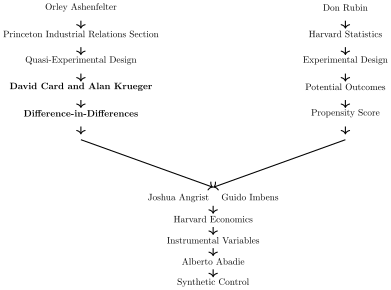
To motivate this section on the minimum wage, I’ve tweaked our Mississippi River metaphor to emphasize, once again, the Princeton side, as the material in this section turned out to be fairly influential in two ways: to the empirical literature on minimum wages, and secondly, to what appears to have been a turning point in the widespread adoption and acceptance of diff-in-diff as a design-based approach to causal inference.
Two rivers into causal inference
David Card and Alan Krueger were colleagues at Princeton, both deeply embedded in the Princeton Industrial Relations Section, both esteemed and transformative labor economists.6 In late 1991, they learned that New Jersey was raising its minimum wage later in 1992, but that Pennsylvania, a neighboring state, would not be. They began planning the study immediately and decided they would focus on fast food restaurant workers in both states using a survey methodology.7 To create their survey, using the phone book, they collected the names of all the fast food restaurants (not including McDonald’s) in the two states and hired someone to call each of them to collect data on workers’ labor market outcomes like wages and employment. They needed the survey done twice, too—once before and once after the implementation of the law change. So the first round of calls were made in February 1992, which will be the preperiod, and then again in November 1992, which will be the postperiod.
Figure 9.3: Distribution of wages for NJ and PA in November 1992 from (Card and Krueger 1994).
For studies like these, it is recommended that if at all possible, before you look at the effect of some policy on your main outcomes of interest, you first see if the policy had any first stage effect on take-up. This is sometimes called by the labor economics community the policy’s “bite.” In this minimum wage context, it simply means you need to show that when the minimum wage increased, low-wage workers saw their wages increase. If they didn’t, then it’s hard to imagine why any other effect would’ve happened. Card and Krueger showed that, and the figure above is one of the pictures they produced to do so:
The figure above shows the distribution of wages in November 1992 after the minimum wage hike.8 As can be seen, the minimum wage hike was binding, evidenced by the mass of wages at the minimum wage in New Jersey. The interpretation here is that the minimum wage increase had “bite” on New Jersey workers because its intended goal—to raise low wage workers’ wages—happened.
A long-standing source of contention in the field of economics regards the empirical estimates of the minimum wage on employment, not on wages. Theoretically, neoclassical models of competitive labor markets predict declines in employment from increases in the minimum wage, particularly over longer time horizons where the growth rate in employment could be affected (Meer and West 2016). But as we saw in the early chapter on Giffen behavior by Jensen and Miller (2008), the firm’s response to higher wages is just as complex, albeit for different reasons, as households’ responses to higher prices. It’s possible, even within that broader neoclassical tradition, for minimum wages to increase employment, depending on the amount of competition in the area (Robinson 1933).
But recall, also, the ethos of Princeton’s Industrial Relations Section—it did seem like the Section’s hyper focus on realistic empirical estimates over theoretical claims had shaped the entire worldview of the economists there such that the attachment to theoretical claims like that would always require rigorous falsification using high-quality data and valid research designs. So, Card and Krueger collected their own data both before and after for the same fast food restaurants using an original telephone survey, managed attrition between the sampling with a high degree of success, and reported their results in a table like Table 9.12, below.
Table 9.12: Simple DD Using Sample Averages on Full-Time Employment
Dependent variable
PA
NJ
NJ - PA
FTE before
23.3
20.44
-2.89
(1.35)
(0.51)
(1.44)
FTE after
21.147
21.03
-0.14
(0.94)
(0.52)
(1.07)
Change in mean FTE
-2.16
0.59
2.76
(1.25)
(0.54)
(1.36)
Standard errors in parentheses.
If employment responded to a minimum wage increase as it would in a highly competitive labor market, we would expect employment to decrease due to higher wage costs. However, in their sample, Card and Krueger (1994) find the opposite—a positive effect of +2.76 in mean full-time-equivalent employment. Importantly, this result isn’t just noise: dividing the coefficient by the standard error gives a t-statistic of about 2, indicating the result is statistically significant at conventional levels, which allows us to reject the null hypothesis of no effect.9
The response to this paper’s finding of a positive employment effect was mixed. Some labor economists weren’t surprised, given ongoing debates about empirical methods in the field. Others found the results implausible because they contradicted standard competitive labor market theory. Regardless of one’s view of the findings, the paper was undeniably influential both for minimum wage research and the broader adoption of diff-in-diff in economics (Currie, Kleven, and Zwiers 2020).
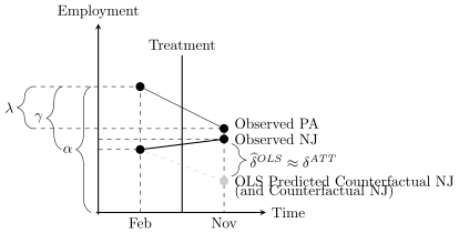
Figure 9.4: DD regression diagram.
Graphically Imputing Counterfactuals With Regressions and Parallel Trends
Before we move on, let’s use this minimum wage example to illustrate graphically how the following OLS model more or less imputes the missing counterfactual for New Jersey’s employment in absence of treatment. First, let’s write down a diff-in-diff regression equation that is catered to the New Jersey context: \[
\begin{equation}
Y_{its} = \alpha + \gamma NJ_s + \lambda Post_t + \delta (NJ_s
\times Post_t) + \varepsilon_{its}
\end{equation}
\tag{9.24}\] where \(i\) indexes individual workers, \(s\) is for states, \(t\) is for time, NJ is a dummy equal to 1 if the observation is from NJ, and \(Post\) is a dummy equal to 1 if the observation is from November (the postperiod).
We can visualize the coefficients from this regression in the figure above.10 The constant, \(\alpha\), is the sample average for Pennsylvania’s employment in February, before the minimum wage increase, but \(\alpha+\lambda\) measures average Pennsylvania employment in November. But, average employment for New Jersey workers before the minimum wage increase is \(\alpha+\gamma\). And finally, average employment for New Jersey workers in the postperiod is the sum of all four coefficients, \(\alpha + \gamma + \lambda + \delta\). Visually, we can see all four averages in the figure above, which I marked with horizontal dashed lines. Graphically, OLS is imputing the missing counterfactual for New Jersey using the trend in Pennsylvania. And if the trend in Pennsylvania runs “parallel” to the counterfactual trend in New Jersey, then this imputation will be correct.
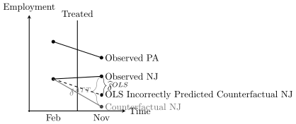
But what happens when Pennsylvania’s slope is not equal to New Jersey’s counterfactual slope? To see what happens then, look at the figure below. Notice that when parallel trends doesn’t hold, the diff-in-diff calculation did not change. The only difference is that now diff-in-diff is biased.
Figure 9.5: DD regression diagram without parallel trends.
9.5 Indirect Evidence for Parallel Trends
Event Studies
The parallel trends assumption cannot be tested because it involves a non-existent counterfactual that cannot be observed. But, we still must justify the choices we make that we think validate our decisions to use one control over another as our comparison group. And, in this section we are going to review one of the most common pieces of evidence for that—the event study.
The intuition for event studies, and their connection to parallel trends, is straightforward, but it’s also often misunderstood. We cannot directly verify parallel trends in \(E[Y^0]\) in the postperiod because we cannot observe \(E[Y^0|D=1,Post]\). But we can directly verify parallel pretrends from two periods prior to the preperiod. So, people typically attempt to verify the plausibility of parallel trends in the post by investigating parallel trends in the pre. Before we dive into it, just note though that it is technically not required for identifying the \(\mathit{ATT}\). What’s needed is that the post-treatment counterfactual trend in \(E[Y^0]\) for the treatment group be the same as the control group. That is not the same thing as requiring pretrends to be parallel.
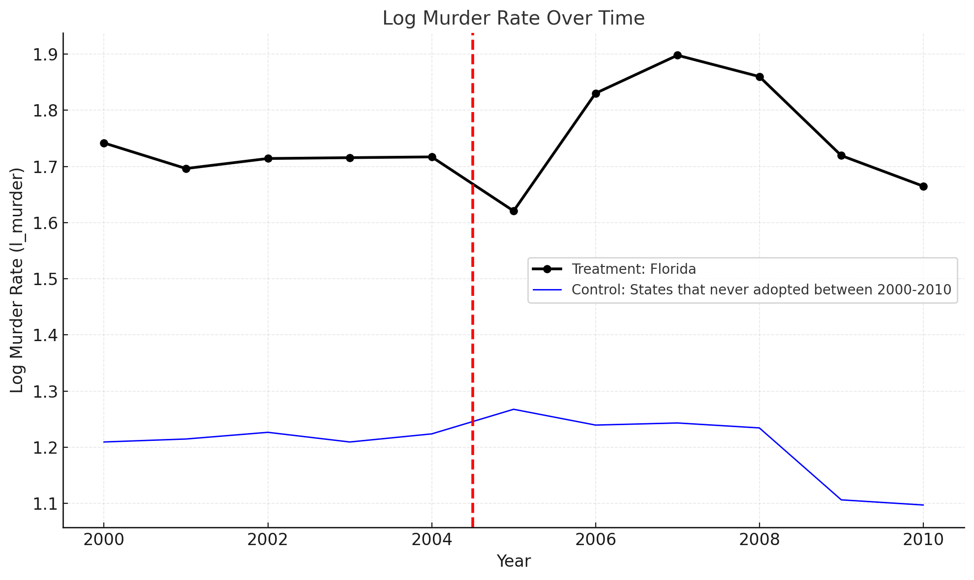
Event studies are primarily visual exhibits used to evaluate whether two groups were on similar trajectories prior to the treatment occurring for one of them. You can either plot the raw data, or you can plot regression coefficients from an event study regression specification. An example of a study that showed an event study with raw data is Cheng and Hoekstra (2013). The authors plotted several separate event study plots, one per treatment group, so that the readers could simply compare the evolution of the outcomes over time for treatment and control with their own eyes. There’s definitely something to be said about this kind of transparency.
Figure 9.6: Diff-in-diff event study with raw data points of average log murder reproduced from (Cheng and Hoekstra 2013).
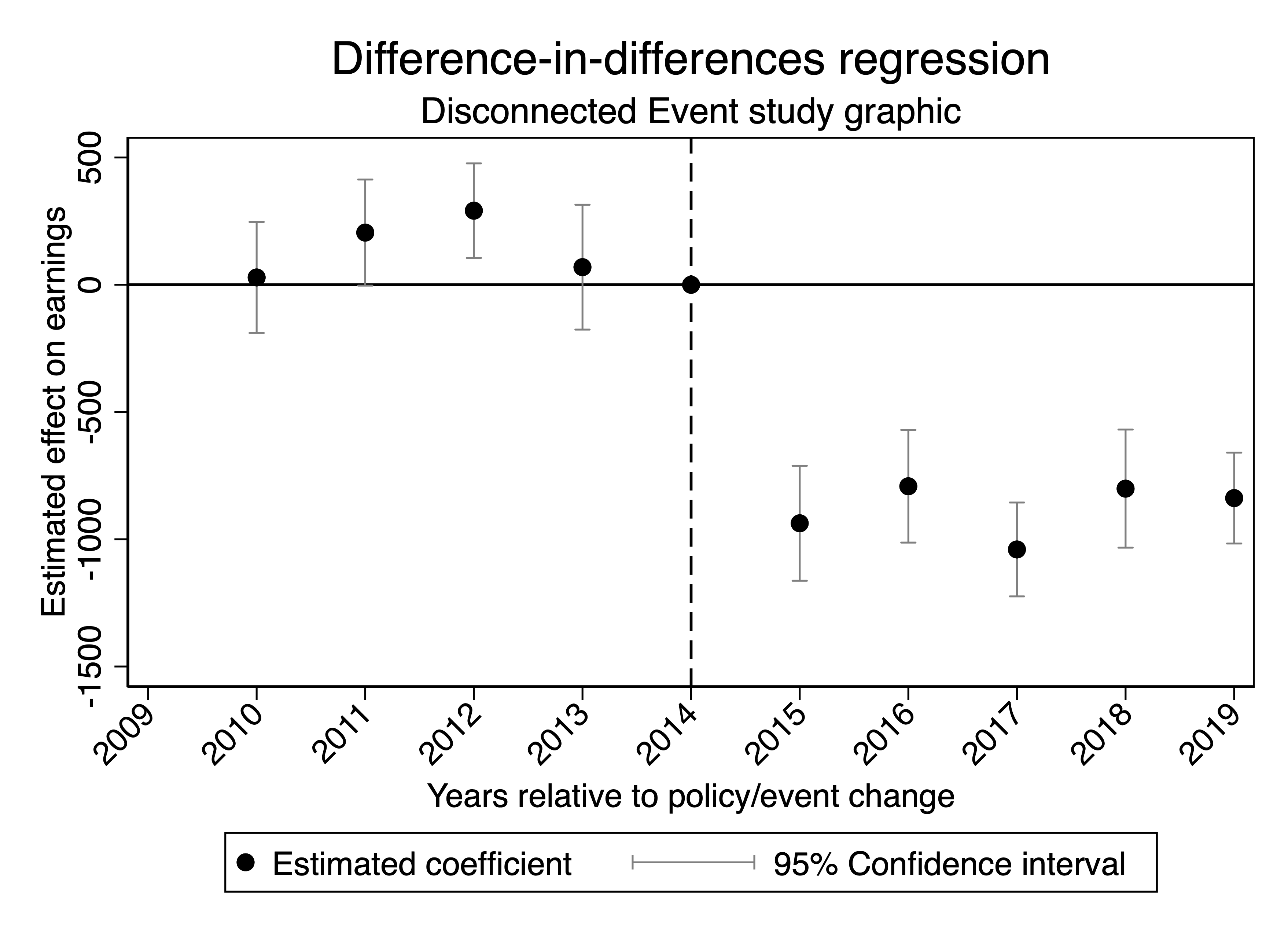
But it’s probably more than likely you’ll be visualizing a particular sequence of regression coefficients or something equivalent, so it’s important that we review the regression specification for that. Consider the following regression (Equation Equation 9.25): \[
\begin{equation}
Y_{its} = \alpha + \sum_{t=-2}^{-q}\mu_{t} (D_s \times \tau_t) +
\sum_{t=0}^m \delta_{t} (D_s \times \tau_t) + \sum_{t \neq -1}
\tau_t + D_s + \varepsilon_{ist} \label{eq:es}
\end{equation}
\tag{9.25}\]
This regression is actually very similar to our typical regression specification in which we interacted the treatment with a post dummy, only now the treatment is being interacted with all calendar dummies except for one (the baseline period). We omit the baseline because, recall, we want to impose no anticipation, and that requires that our baseline be untreated.
Each of the coefficients multiplying an interaction in Equation Equation 9.25 is itself a diff-in-diff equation. What I mean is that the estimated coefficient, \(\widehat{\mu}_{t=-3}\), is equal to this four averages and three subtractions calculation: \[
\begin{equation}
\widehat{\mu}_{t-3} = \bigg ( E[Y_k|t=-3] - E[Y_k|t=-1] \bigg ) -
\bigg ( E[Y_U | t=-3 ] - E[ Y_U | t=-1] \bigg) \\
\end{equation}
\tag{9.26}\]
You will sometimes see this representation of the event study also called the “long difference” calculation because you’re always comparing a period in time to a fixed baseline, making it therefore “long” depending on the distance to the baseline that you’re focused on. But the point is that this is what OLS is doing—each of the coefficients, both the \(\widehat{\mu}_t\) coefficients describing the preperiod and the \(\widehat{\delta}_t\) in the postperiod, are simply a series of diff-in-diff equations, but instead of the “post” you have things like \(t-3\) or \(t+2\).
Now, if it is a diff-in-diff equation, and no anticipation holds, then we can write out the \(t-3\) coefficient as: \[
\begin{align}
\widehat{\mu}_{t-3} &= \mathit{ATT}_{t-3} \nonumber \\
&\quad + \bigg ( E[Y^0_k|t-3] - E[Y^0_k|t-1] \bigg ) \nonumber\\
&\quad- \bigg ( E[Y^0_U|t-3] - E[Y^0_U|t-1] \bigg )
\end{align}
\tag{9.27}\]
And given that the in the preperiod is zero, then we can rewrite this: \[
\begin{align}
\widehat{\mu}_{t-3} &= \bigg ( E[Y^0_k|t-3] - E[Y^0_k|t-1] \bigg ) \nonumber\\
&\quad- \bigg ( E[Y^0_U|t-3] - E[Y^0_U|t-1] \bigg ) \label{eq:es_pre1}
\end{align}
\tag{9.28}\]
So, each coefficient in the pretreatment period only measures the differential trend in \(E[Y^0]\) between the two groups. And, while this may look like a parallel trends term, notice that we can calculate all four of those quantities because none of them are counterfactuals. So, we automatically know then, that it is not the parallel trends assumption—it is rather saying that the groups are comparable on trends in the preperiod.
But then, how do we interpret the actual numbers? For instance, what if \(\widehat{\mu}_{t-3}\) was not exactly zero. What if it was \(+1.5\). What does a 1.5 mean? Well, it means the treatment group’s change in \(Y\) from \(t-3\) to \(t-1\) was 1.5 units higher than the control group’s change measured over the same time horizon. For instance, maybe the treatment group’s trend is \(+10\), but maybe the control group trend is \(+8.5\). Positive coefficients mean the treatment group trend is higher than the control group trend and when it’s negative, then the opposite.
So, then how do you interpret the \(\widehat{\delta}\) coefficients in the postperiod? They are estimates of the \(\mathit{ATT}\) for that particular calendar date. If you examine the event study coefficient at \(t+2\), it’s the estimate of the \(\mathit{ATT}\) for the treatment group in \(t+2\)only, which is only accurate if parallel trends hold from the baseline period (here \(t-1\)) to that period (here \(t+2\)), if there is no anticipation, and if you use a never or not-yet-treated group as a control. It may be tedious to say all that as specifically as I just did, but in my experience, the less comfortable one feels saying those exact statements, the less clear one is about exactly what is being done in the event study itself.
Once you’ve estimated these coefficients, then you will typically plot the coefficients on a time series graph, along with 95% confidence intervals, on all leads (the \(\widehat{\mu}\) coefficients) and lags (the \(\widehat{\delta}\) coefficients). And there are largely two different ways that people will do this—they’ll either plot the point estimates and whiskerplots measuring the confidence intervals, or they’ll only plot the confidence intervals and connect them with a line. I made the event study both ways—the first way plots the coefficients with the points disconnected from one another and confidence intervals as whiskers as shown in Figure 9.7 and a second way where I connected the confidence intervals as shown in Figure 9.8.
There is not a correct or incorrect way, per se, of presenting the information from event studies visually, except that whichever way you choose, you want it to be the one that your audience expects and understands. My personal preference is for the disconnected method over the connected method, but that is partly just a matter of taste. I don’t like the way the confidence intervals appear to shrink as you approach the omitted period in the disconnected method, as it gives the illusion that point estimates are becoming more precise at that point, but that’s just an optical illusion. In fact, there aren’t any confidence intervals there as nothing had been estimated there anyway. I also don’t like that you can’t be certain how many coefficients there are in Figure 9.8.
Figure 9.7: Diff-in-diff event study with regression coefficients and 95% confidence intervals using the disconnected method.
Figure 9.8: Diff-in-diff event study with regression coefficients and 95% confidence intervals using the connected method.
But I am more confident that my preference is for the disconnected method than I am that the disconnected method is somehow better. When it comes to aesthetics, which is where I’d place the standards related to data visualization, there is a lot of subjectivity. Generally speaking, I think the goal is always to make beautiful figures that communicate the truth you want others to understand in a form that they can understand. Beauty is necessary so that the reader actually desires to look at and interpret the picture. Truth is required as the goal is honest communication with another person about the facts of your study. And care to communicate in a form the reader understands means putting yourself in their shoes and asking yourself what is likely to confuse them, and then eliminating that from your display.
9.6 The Importance of Falsifications in Diff-in-Diff
Scientific theories achieve credibility not just by explaining observed phenomena, but by excluding alternative explanations. That means that having alternative explanations that provide precise, falsifiable predictions is an important part of any causal study. This principle was central to philosopher Karl Popper’s view of science. Popper (1959) argued that a theory is scientific only if it can be tested and potentially proven wrong. In Popper’s words: “In so far as a scientific statement speaks about reality, it must be falsifiable; and in so far as it is not falsifiable, it does not speak about reality.” Thus, a good theory doesn’t simply account for what we already know; it makes bold predictions that put your original results at risk for being rejected.
Applying this concept to causal inference, including diff-in-diff, means conducting tests to rule out alternative explanations. In diff-in-diff, falsifications are tests of alternative explanations for your results. What is needed then is two theories—the one being that your treatment caused the results of your diff-in-diff, and the other being that something else did. A falsification in this case would require that the alternative theory make other testable predictions not relevant to the treatment you’re studying, and then testing for those predictions. If, when you test the alternative theory’s predictions on something else, and you fail to reject the null hypothesis, the feasibility of the alternative explanation for your main results is weakened.11
There are roughly two kinds of falsification designs that people employ, which I call “same outcome, alternative groups” and “same group, alternative outcomes.” Let’s review them both now.
Same Outcome, Alternative Groups
The idea behind “Same Outcome, Alternative Groups” falsification tests is to imagine an alternative explanation for your diff-in-diff results that would also impact a group irrelevant to your treatment and then applying your diff-in-diff model to that context. Consider this as an example: You are studying the effect of the minimum wage on employment and therefore focus your attention on low-wage workers whose wages are increasing as a result of the minimum wage increase. You find in this study that increases in the minimum wage reduce employment.
But perhaps there is another explanation and that is that there were state-wide declines in employment due to the area’s faltering economies. As a result of these broader, more systemic problems, many industries and many workers, not just the lowest-wage ones, saw declines in employment. Fortunately, this is testable with a “same outcome, alternative group” falsification. You would simply reestimate your diff-in-diff model using the higher-wage workers’ employment as your outcome of interest. If you find using this falsification declines in employment by a group of people who aren’t paid the minimum wage, it calls into question that the original results could be due to the minimum wage.
Rejecting the null hypothesis on the alternative group does not mean that you can be certain your original findings were spurious because, again, it’s entirely possible that they still were true. The point is that the falsification is a secondary source of evidence that the parallel trends assumption was plausible in the first case, but just like pretrends can be suggestive evidence that parallel trends holds, falsifications like the “same outcome, alternative groups” are also suggestive evidence. In the next section, I will discuss a fabulous example of the “same outcome, alternative group” falsification by Miller, Johnson, and Wherry (2021) involving a placebo group unaffected by Medicaid expansion. But I’ll wait to show you that.
Same Group, Alternative Outcomes
An alternative approach to falsification testing within the diff-in-diff framework involves examining the same group but looking at alternative outcomes that should not be affected by the treatment. If the treatment truly impacts a given outcome, it shouldn’t be influencing unrelated outcomes for the same group. Researchers have applied this reasoning in clever ways to challenge established models and bring more scrutiny to popular empirical approaches.
Imagine a study examining the impact of state increases in cigarette taxes on smoking-related hospitalizations. The primary hypothesis is that the taxes reduce hospitalizations for smoking-related illnesses, such as heart attacks, due to reductions in smoking. But again, maybe this is a spurious finding driven by a different policy that happened at the same time in the same place. Perhaps at the same time that states increased their cigarette taxes, states expanded public insurance that increased preventative healthcare. This expansion in healthcare is thought to be the primary cause of declines in heart attacks, not the cigarette taxes, but if that is true, then the expansion in healthcare should affect other conditions unrelated to smoking, such as appendicitis or fractures. These conditions should not be influenced by cigarette taxes, as they are unrelated to smoking behavior or secondhand smoke exposure, but they should be influenced by more generous public insurance. If the analysis finds no effect of cigarette taxes on hospitalizations for these unrelated conditions, it strengthens the argument that the observed reduction in smoking-related hospitalizations was caused by cigarette taxes and not due to broader confounding trends affecting allhospitalizations.
By contrast, if the analysis reveals a similar reduction in hospitalizations for non-smoking-related conditions, this could indicate that your main results are spurious, driven by broader factors, such as changes in hospital reporting practices or concurrent health policies, rather than the taxes themselves. For this to be done well, though, one must have a credible and compelling alternative theory that makes additional predictions not made by the program you are studying.
I’ll conclude with two real-world examples that I find delightful examples of “same group, alternative outcomes” falsification. One striking example comes from the literature on rational addiction. For those unfamiliar with this literature, Becker and Murphy (1988) proposed that addiction could be rational, and that theoretical framework has, in turn, been a cornerstone theoretical framework for studying public policies aimed at regulating addictive goods. Researchers would typically estimate empirical models derived from the Becker and Murphy (1988) theoretical framework to commodities and activities like alcohol, tobacco, and gambling, often finding evidence that these behaviors align with the rational addiction framework.
In a clever falsification exercise, Auld and Grootendorst (2004) applied the rational addiction model to unrelated commodities—such as milk, eggs, and oranges—that could not plausibly be considered addictive. Surprisingly, the model suggested that milk was one of the most addictive goods studied. This finding cast doubt not so much on the theoretical underpinnings of rational addiction, but on the empirical techniques applied to aggregate data commonly used to support it. If the model is misclassifying milk as addictive, when milk may not be addictive,12 it raises serious questions about the reliability of the same models applied to alcohol, tobacco, etc. using similar data.
Another fascinating example of the “same group, alternative outcomes” falsification was two studies on peer effects and obesity. Estimating peer effects is notoriously difficult, as highlighted by Manski (1993), because peers are chosen, not randomized. Despite these known problems of endogeneity, influential studies found that behaviors like obesity, smoking, and even happiness seemed “contagious” within social networks (Christakis and Fowler 2007). However, Cohen-Cole and Fletcher (2008) used the common empirical peer effect model on a dataset with social network information to examine outcomes that couldn’t possibly be shared with or contagious between peers such as acne, height, and headaches. Yet, even these traits appeared to exhibit “contagion” effects in observational data.
Unfortunately for some of us, we have not been able to become taller by having tall friends. A more likely explanation for why tall people have tall friends is that they all play together on the basketball team.
Again, it does not mean that the original results must be wrong simply because the same empirical model finds evidence for peer effects on alternative outcomes that cannot be influenced by peers, like headaches and height, but it is suggestive that something is wrong with that empirical model if it is.
These two examples show how examining alternative outcomes within the same group can provide a robust falsification test, uncovering potential flaws in empirical designs without challenging the theoretical framework itself.
Inference
Many studies employing diff-in-diff strategies use data spanning multiple years—not just one pre- and one post-treatment period as in Card and Krueger (1994). The variables of interest in these setups often vary only at the group level, such as by state, and outcome variables are typically serially correlated. For instance, in Card and Krueger (1994), employment in each state is likely correlated within the state and also serially correlated over time. Bertrand, Duflo, and Mullainathan (2004) show that conventional standard errors can severely understate the variability of the estimators, leading to biased downward standard errors that are “too small” and consequently over-reject the null hypothesis. To address this, Bertrand, Duflo, and Mullainathan (2004) propose the following solutions: block bootstrapping, aggregation into two periods, and clustering standard errors at the group level. Below is a detailed explanation of each method.
Block bootstrapping: If the block is a state, then block bootstrapping involves resampling states with replacement. Implementing this requires programming to loop through samples and store estimates, with mechanics similar to randomization inference. Readers interested in programming block bootstraps can adapt their approach from these general principles.
Aggregation: This approach avoids the time-series dimension by simplifying to one pre- and one postperiod. For settings with just one untreated group and no differential timing, this is straightforward: calculate averages for the pre- and postperiods and conduct difference-in-differences on these aggregates. When facing differential timing, residualization steps are added: first, regress the outcome on panel unit and time fixed effects, keeping only residuals for treated groups. Then divide the residuals into pre- and postperiods and regress on the post-treatment indicator. This approach does not recover the original point estimate, so it is typically used only when simpler methods are impractical.
Clustering: Clustering the standard errors by group (often the level of treatment) is the most common and straightforward method for correcting standard errors, as it accounts for arbitrary serial correlation in errors within groups over time. For example, in state-level panels, clustering at the state level is standard. This method is widely available in statistical software, making it easy to apply without additional programming.
Inference in panel settings remains complex, especially with few clusters. When cluster numbers are small, clustering alone may lead to inflated false-positive rates. In extreme cases, such as with only one treatment unit, clustering may fail entirely: even techniques like the wild bootstrap can have high false positive rates (Cameron, Gelbach, and Miller 2008; MacKinnon and Webb 2017). For these cases, randomization inference—as shown by Buchmueller, DiNardo, and Valletta (2011)—might be an alternative approach worth pursuing.
9.7 Diff-in-Diff in the Courtroom
There is a difference between your main results from diff-in-diff and evidence, but what is the difference? What do I mean by evidence and what do I mean by results? And what constitutes evidence in a diff-in-diff? Consider this courtroom analogy.
The prosecutor and defense attorney are attempting to persuade a judge and jury of their point of view using evidence, logic, and precedent. This is a zero–sum game because if the prosecution wins, the defense loses and vice versa. But what defines the prosecutor’s success is shifting the jury’s collective beliefs that the defendant is guilty “beyond a reasonable doubt.” And to do that there are three parts to the prosecution’s case, each of which represents something distinct and unique in your own diff-in-diff study.
Assertion of the defendant’s guilt. Note that the assertion of guilt is not evidence of guilt, but rather simply a claim that the defendant is guilty of some offense.
Presentation of evidence. Evidence might include eye witnesses who can put the defendant at the crime scene, the broken glass showing signs of forced entry, and fingerprints found on the smoking gun.
Evidence of a credible motive. Motive would be the jilted lover, or an insurance policy for which the defendant was the sole beneficiary.
Each of these things on the itemized list we know by heart because we’ve seen countless movies and television shows set in the courtroom, or we know people who are lawyers. We know that the claim of guilt and the evidence for guilt are completely different. And we know that a lawyer’s case (point 1) gets stronger the more relevant evidence that is produced (point 2) and the more credible a theory of why the defendant would do it (point 3) is presented.
You are the prosecution in a case entitled “The Causal Effect of \(D\) on \(Y\) Using Diff-in-Diff.” Your diff-in-diff estimates are point 1, the claim of guilt. But these are not your evidence for the claim of guilt and to focus on point 1 to the exclusion of point 2 is a case so weak that readers and the public are justified to reject it. Your diff-in-diff study needs conclusive evidence, not merely a table of regression coefficients with asterisks by the numbers.
In this section, I will extend this courtroom metaphor to suggest the five elements of a strong study using diff-in-diff. The list that I will be discussing is:
Tables and figures showing the policy had bite.
Graphical event studies.
Tables and figures showing reasonable falsifications.
Tables and figures showing Main Results.
Tables, figures, and narrative suggesting plausible mechanisms that explain your results.
To illustrate each of these, I would like to do so in the context of an excellent study involving the expansion of public insurance in the United States in the mid-2010s under then president Barack Obama and his vice president, Joseph Biden.
Medicaid and Mortality
A provocative study by Miller, Johnson, and Wherry (2021) examined the expansion of Medicaid under the Affordable Care Act (ACA). They were primarily interested in the effect that this expansion had on population mortality. Earlier work had cast doubt on Medicaid’s effect on mortality (Finkelstein et al. 2012; Baicker et al. 2013), so revisiting the question with a larger sample size had value.
Like Snow before them, the authors link datasets on deaths with a large-scale federal survey data, thus showing that shoe-leather often goes hand in hand with good design. They use these data to evaluate the causal impact of Medicaid enrollment on mortality using a diff-in-diff design. Their focus is on the near-elderly adults (i.e., adults below but near the age 65) in states with and without the Affordable Care Act Medicaid expansions, and they find a 0.13 percentage point decline in annual mortality, which is a 9.3% reduction over the sample mean, as a result of the ACA expansion. This effect is a result of a reduction in disease-related deaths and gets larger over time. Medicaid, in their estimation, caused a non-trivial number of lives to be saved.
As with many contemporary diff-in-diff designs, Miller, Johnson, and Wherry (2021) evaluate the plausibility of parallel trends with event studies in which they plotted regression coefficients with 95% confidence intervals on their treatment leads and lags. Including leads and lags into the diff-in-diff model allowed the reader to check both the degree to which the post-treatment treatment effects were dynamic, and whether the two groups were comparable on outcome dynamics prior to Medicaid expansion. Models like this one usually follow a form like: \[
Y_{its} = \gamma_s + \lambda_t +
\sum_{\tau=-q}^{-1}\gamma_{\tau}D_{s\tau} +
\sum_{\tau=0}^m\delta_{\tau}D_{s\tau}+x_{ist}+
\varepsilon_{ist}
\tag{9.29}\] Treatment occurs in year 0. You include \(q\) leads or anticipatory effects and \(m\) lags or post-treatment effects.
Miller, Johnson, and Wherry (2021) produce numerous event studies, which when taken together, tell the main parts of the story of their paper. I will focus on five of them. The event study plots are, to me, quite powerful. Let’s look at the first three related to the “bite” of the policy expansion.
State expansion of Medicaid under the Affordable Care Act increased Medicaid eligibility (the figure below), which is not altogether surprising. But it also caused an increase in Medicaid enrollment (the figure below), as well as a reduction in the percent of the population uninsured (the figure below). All three of these are simply showing that the ACA Medicaid expansion had “bite”—people enrolled and became insured who otherwise would not have been insured. The last outcome—uninsured—is helpful because it suggests that the second outcome—enrollment—was not merely people switching from private insurance to public insurance. At least some of it was coming from people switching from uninsured to insured, thus giving them better access to free healthcare, presumably for the first time.
The authors also present a “same outcome, alternative group” falsification. Some context about the institutions of public insurance may be useful for readers outside of the United States. The United States has two universal healthcare programs—Medicaid aimed at poor people and Medicare aimed at elderly people aged 65 and older. The expansion of Medicaid would hypothetically only matter for the poor; it would not matter for the elderly population. And since the authors are focused on the “near elderly” population, any alternative explanation for their results that is not Medicaid, but rather common to older people in those expanding states, should probably show up for the elderly population not enrolled in Medicaid.
The figure below presents graphical evidence for the placebo elderly population. And using event studies, they show both that the elderly do not enroll in Medicaid when it expands, and they show no change in mortality either. Whatever is going on in the expanding states relative to the non-expanding states, it does not appear to be affecting the mortality of elderly people.
Figure 9.12: Falsification estimates effect of Medicaid expansion on 65 and older Medicaid coverage and mortality (Miller, Johnson, and Wherry 2021).
Figure 9.13: Falsification estimates effect of Medicaid expansion on 65 and older Medicaid coverage and mortality (Miller, Johnson, and Wherry 2021).
Figure 9.14: (Miller, Johnson, and Wherry 2021) estimates of Medicaid expansion’s effects on annual mortality using leads and lags in an event study model.
Next, the authors looked at the mortality rates of the near elderly population, which are their main results. They present event studies for this outcome, just like they had with the others, so that we can investigate the pretrends. The figure above shows some evidence that the expansion of Medicaid may have caused near elderly mortality rates to decline, though the standard errors are large enough that while each one is different from zero, they are not different from another (including the ones pretreatment), and a linear trend cannot be rejected (Rambachan and Roth 2023). But when the figure above is taken alongside the falsifications and the other evidence presented, it is compelling to me and worth considering as plausible evidence that Medicaid’s expansion saved lives.
Recall, though, the last element in our courtroom drama: motive. Why did the defendant kill the victim with the candlestick? Was it revenge? Was it opportunistic murder? Without a plausible motive, the jury and the judge can find it hard to believe beyond a reasonable doubt why someone would commit such a heinous crime. And that same doubt creeps into a diff-in-diff study oftentimes without some evidence for the mechanism driving the main results. The authors show evidence suggesting that the reason the mortality coefficients were so negative was because individuals who got on Medicaid because of the expansion received care that allowed them to get treatment for life-threatening illnesses—a finding that itself has policy implications.
I consider Miller, Johnson, and Wherry (2021) to be in the same category as Card and Krueger (1994)—an important policy study using difference-in-differences that also serves as an excellent research exemplar.
Of course, Miller, Johnson, and Wherry (2021) might still be wrong. We can never know the counterfactual mortality had expansion states not expanded Medicaid. This uncertainty isn’t unique to their study—it’s the fundamental challenge that motivates causal inference. Any difference-in-differences study could be wrong since parallel trends cannot be directly tested without observing the missing counterfactual \(E[Y^0|D-1,Post]\).
What I find compelling about Miller, Johnson, and Wherry (2021) is their layered evidence and careful presentation. They address multiple alternative explanations, leaving skeptical readers with few remaining objections. Like Snow’s cholera study, they combine visualization, narrative, and falsification tests alongside their main results. Their thoughtful communication helps readers understand the analysis without sacrificing rigor—echoing Ashenfelter’s goal when coining “difference-in-differences."
I encourage reading this paper not just to learn about Medicaid and mortality, but to study how the authors construct their argument, what evidence they seek, and how they present it through clear tables and compelling visualizations.
9.8 Treatment Assignment Mechanisms and Parallel Trends
Up until now, our discussion of diff-in-diff has really focused on two things: it’s focused on the diff-in-diff equation, and it’s focused on the parallel trends assumption. In this section, I will discuss Marx, Tamer, and Tang (2024) and Ghanem, Sant’Anna, and Wüthrich (2024) and their findings of what treatment assignment mechanisms always violate parallel trends and which ones do not. I will accompany my own thoughts on this topic drawn from reading Heckman and Robb (1985), Guide W. Imbens and Rubin (2015), Guido W. Imbens and Xu (2024), and Roy (1951).
Recall that the “treatment assignment mechanism” refers to things like randomization, instrumental variables, running variables, and observables. My use of the phrase “treatment assignment mechanism” is my way of describing the reason some units were treated but not others. In other words, the treatment assignment mechanism is not which units were treated but why they were treated. It is about the “why” and the “how,” not the “who” if that makes sense, and its origin traces back to Neyman (1923) and Fisher (1925), and according to Guide W. Imbens and Rubin (2015) and much of Rubin’s writings on this topic, it is a core part of the design tradition’s approach to causal inference. It helps explain why it is so crucial that we understand the institutional details surrounding the events in our data.
I will repeatedly use particular phrases that I would like to define up front. First, I will often switch between saying “selection” and “treatment assignment mechanism.” Both are referring to how the how and why units are chosen to be treated. Second, I will often use the phrase “untreated potential outcome” in place of \(Y^0\). It represents the outcome associated with units that are not treated. This can be counterfactual, which is why I emphasize the phrase “untreated potential outcome” as opposed to merely saying “outcome.” My example throughout will usually be a job training program and the outcome usually some labor market outcome like earnings. And I will typically oscillate between “good news” and “bad news.” Good news is treatment assignment mechanisms that do not necessarily violate parallel trends, and bad news is treatment assignment mechanisms that are sufficient to violate parallel trends.
Good News: Common Constant Trend
The one instance where parallel trends cannot be violated holds for all treatment assignment mechanisms. If \(Y^0\) changes each period by the same amount that is also the same for every panel unit, then parallel trends cannot be violated. It will not matter whatsoever how units are chosen for treatment if there is a common constant trend—parallel trends will always hold.
Good News: Selection on Baseline Untreated Potential Outcome \(Y^0\)
Kahn-Lang and Lang (2019) write that, “Any DiD paper should address why the original levels of the experimental and control groups differed, and why this would not impact trends.” What does it mean when “original levels” are different between the experimental, or treatment, group and the control? It means that average outcomes were clearly different from one another at baseline. Whenever average variables differ between treatment and control, it is suggestive that the treatment was not random. Nonrandom treatment assignment does not itself violate parallel trends because all we need for parallel trends is \(\mathbf{E[\Delta Y^{\textbf{0}}|D=\textbf{1},Post]} = E[\Delta Y^0|D=0, Post]\). The problem is that if they are different on levels, it could suggest that \(Y^0\) trends are also different.
To be concrete, let’s use our example of job training programs and earnings. Let \(Y^0\) be earnings for people if they are not enrolled and \(Y^1\) be earnings if they were. When enrollment into the job training program happened based on baseline \(Y^0\), I mean a story like this. The local university offers courses on the programming language Python. Betty and Ronnie are two workers who earn some annual salary equal to \(Y^0_{betty}\) and \(Y^0_{ronnie}\). Betty’s salary is below some threshold, so she enrolls in the Python class, but Ronnie’s isn’t, so she doesn’t. This is what I mean by “selection on baseline potential outcomes.” And, if there is selection on \(Y^0\) at baseline, then the “original levels of the experimental and control group,” to quote Kahn-Lang and Lang (2019), will differ.
You might think that if there is selection on \(Y^0\) at baseline, and it creates differences in \(E[Y^0]\) for the treatment and control at baseline, therefore \(\mathbf{E[\Delta Y^{\textbf{0}}|D=\textbf{1}, Post]} \neq E[\Delta Y^0|D=0, Post]\), but perhaps surprisingly, Ghanem, Sant’Anna, and Wüthrich (2024) show that this alone will not violate it. It is not, in other words, sufficient to violate parallel trends.
The easiest way for me to see this was with a simulation.13 My simulation will follow 250 workers in five cities over consecutive six years. Each city contains 1,500 workers. And to create some complexity in the data such that constant parallel trends is not the case, I assign each worker to one of four distinct groups and each group has its own trend in \(Y^0\).14 The treatment assignment mechanism is based solely on each worker’s baseline untreated potential outcome, \(Y^0\). Specifically, the selection rule will be that if their baseline earnings fell below the 25th percentile of all workers’ baseline earnings, then they enroll in the program, otherwise they don’t. This is akin to using the baseline potential outcome as a running variable, like in our RDD chapter, as the assignment mechanism. I estimate event studies of the form we’ve discussed and plot the point estimates and 95% confidence intervals in the figure below, alongside the “true” for each period, so that you can see how selection on \(Y^0\) at baseline has no effect on parallel trends.
Figure 9.15: Event study simulation with heterogeneous group trends and selection on baseline untreated potential outcomes.
This type of threshold-based assignment mechanism, often observed in social programs or policies, is one where units qualify for treatment only if their baseline outcome falls below a specific threshold. For example, a cash transfer program targeting only those with incomes below a certain level might be an example of such an assignment mechanism. Ghanem, Sant’Anna, and Wüthrich (2024) show that this is not itself a problem for diff-in-diff.
But, now look at the pretreatment coefficients—they are not zero. They are not zero, even though the data I generated satisfied pretreatment trends in \(E[Y^0]\) by group. This is a mechanical artifact of selection on baseline untreated potential outcome, \(Y^0\). Even though Ghanem, Sant’Anna, and Wüthrich (2024) show that selection on baseline outcomes does not violate parallel trends, it can create breaks in pretrends. These breaks in pretrends might lead a person to believe that therefore parallel trends is also broken, when it isn’t. Thus selection on baseline potential outcomes may not violate parallel trends and yet create broken pretrends, which will create challenges for anyone who solely relies on pretrends for guidance about identification.
Why does selection on baseline \(Y^0\) violate pretrends not parallel trends? Because the baseline is both the point of selection and the omitted category for all your event study coefficients, and since by definition the treatment group was selected by the value of \(Y^0\) relative to some threshold, it created a mechanical difference in trends that dips for the treatment group at baseline. This is not to say that all such dips at baseline are examples of this kind of selection; rather, it is simply to note that there is a case where it does not violate parallel trends, and that when it is of this sort, it will make it difficult to deduce the plausibility of parallel trends based on pretrends. But perhaps this is where falsifications might be more valuable.
The difficult part of this is that there is no solution to it because there is no problem in the first place. As you can see from the post-treatment coefficients, our regressions are unbiased estimates of the in each time period. And that means that parallel trends held. The problem that this creates is for the pretrend test itself—if you use the pretrends as a test for parallel trends and selection is on \(Y^0\), then you will falsely conclude that parallel trends failed when in fact it didn’t. And any effort to “fix” the problem, perhaps by making \(t-2\) the omitted period, could satisfy pretrends, but then violate parallel trends as parallel trends held from the baseline already, not \(t-2\).
What should you take away from this, then? Care should be given to how one diagnoses the problem, and the main way we guard against mistakes here is institutional knowledge about the assignment mechanism. The main takeaway is the importance of understanding the treatment assignment mechanism, which can only come from investigations you did outside of the dataset. Let’s say that you knowthat an agency targeted the poorest performing schools based on test scores with an intervention, and you want to know the effect of the intervention itself on test scores. Knowing this can help assuage concerns you may have about pretrends because you will already know that this is an exceptional case in which the assignment mechanism does not violate parallel trends, but does have the potential to disrupt pretrends.
Good News: Selection on Fixed Effects
Tiffany Maxwell, played by Jennifer Lawrence in my favorite movie, Silver Linings Playbook, said in her defense to an insult issued by another character against her, “there will always be a part of me that’s sloppy and dirty, but I like that part of myself, just like all the other parts of myself, and can you say the same?” It’s a profound scene that speaks volumes to life’s journey and the need for self-acceptance and self-forgiveness.
But listen closely to what she said—“there will always be a part of me that’s sloppy and dirty.” When there are attributes that are permanent for a person, then they are our fixed effects. And Tiffany Maxwell says that her “sloppy and dirty parts” are her fixed effects—which is all the more reason why it was vital for her to love and accept them, as they are not distinguishable from who she is. We carry our fixed effects, our own “sloppy and dirty parts,” wherever we go, but also whenever we go. They are fixed over short time horizons, but many are fixed over longer ones as well.
In the context of diff-in-diff, selection into a treatment category based on fixed “sloppy and dirty parts” does not in and of itself violate parallel trends. It also does not violate pretrends, unlike selection on \(Y^0\). To illustrate, I used the same data as before, only this time selected people into the treatment based on whether their fixed effects were above the median of all fixed effects in the data. I then estimated the event study again, which is shown in the figure below.
Figure 9.16: Difference-in-differences event study simulation with heterogeneous group trends and selection on fixed effects.
Difference-in-differences event study simulation with heterogeneous group trends and selection on fixed effects.
Like selection on untreated potential outcomes, Ghanem, Sant’Anna, and Wüthrich (2024) showed that selection on fixed effects, meaning only certain types of people go into the treatment, does not in and of itself violate parallel trends, and therefore does not in and of itself create problems for diff-in-diff. As you can see, both pre- and post-treatment coefficients are unbiased estimates of the target parameters we are after. Which, again, speaks volumes to the importance of learning, ahead of time, the treatment assignment mechanisms and whether they were selecting on fixed effects or not.
Good News: Selection on Observables
We have not yet discussed covariates in the context of diff-in-diff, so I’m going to wait and share simulations with you on that in the next chapter. Here, I will simply say that selection on observable characteristics also doesn’t create an issue for parallel trends. Sometimes, parallel trends can hold conditional on certain observable characteristics. We will discuss this in more detail in the next chapter, but this kind of selection is consistent with something called conditional parallel trends in which parallel trends holds, but only within the stratification of the covariates themselves. This mechanism will require controlling for covariates in the model, ensuring that after accounting for these covariates, the trends in untreated outcomes would be identical between treated and untreated groups. But, I’m going to leave the details of the actual estimation until the next chapter. For now, I will just say that being selected into the program because of your high school GPA or age is not itself going to violate parallel trends. It won’t guarantee it, as you can still have selection on observables and not have parallel trends, but my point is that it’s not a problem, in and of itself.
Good News: Selection on Imperfect Foresight
A final selection mechanism that allows parallel trends is one where units have imperfect foresight about the future. If individuals are assigned to treatment without fully anticipating future outcomes, selection will not depend on expected treatment effects, allowing parallel trends to hold. This assumption is particularly relevant in contexts where treatment is not self-selected based on anticipated outcomes.
For instance, if individuals are assigned to a training program based on past or present performance, without knowing how it will impact their future earnings, parallel trends are more likely to hold. My simulation models this by assigning treatment without reference to expected future outcomes, showing that imperfect foresight can help sustain parallel trends by reducing the likelihood of selection based on anticipated effects.
These selection mechanisms provide a framework to evaluate when parallel trends may hold. Each scenario highlights different ways in which treatment assignment interacts with untreated outcomes, revealing the mechanisms that preserve or disrupt the parallel trends assumption. This nuanced understanding of selection underlies the diff-in-diff methodology, guiding us toward assumptions that support causal identification.
Bad News: Perfect Doctor
But what if an individual unit is not selected based on randomization, \(Y^0\), fixed effects, observables, or imperfect foresight? And what if trends in \(Y^0\) are not constant? What else is there that could place some units but not others into treatment categories you’re interested in? The most notorious one is the one we introduced much earlier in the book that I called “Perfect Doctor.” It is the treatment assignment mechanism in which individual units choose their treatments based on the correct inference that the treatment will help them or not. Heckman, Urzua, and Vytlacil (2006) calls this “essential heterogeneity,” which has its roots in an old 1951 classic article (Roy 1951).
To illustrate the problems created by the Perfect Doctor treatment assignment mechanism, I have created a simulation. Note that prior to any treatment happening, parallel trends was possible. The potential outcome \(Y^0\) was a function of a person’s age and their GPA but with different magnitudes by year. I also generated heterogeneous treatment effects with respect to age and GPA so that I could get a distribution of positive and negative treatment effects. And then, once I had those, I assigned treatment based on the Perfect Doctor: people for whom the treatment was positive were treated; people for whom it was negative were not. The figure below shows the assignment based on treatment effects.
Figure 9.17: Illustration of Perfect Doctor treatment assignment based on treatment gains.
When the treatment assignment was made based on treatment effects themselves, it broke parallel trends. I plotted the expected \(Y^0\) for treatment and control in the figure below. As you can see, the treatment group is seeing rising\(E[Y^0]\) but the control group is seeing flatter trends in \(E[Y^0]\)—both before, but also after. So visually, we already know we’re in trouble because the treatment and control group, via this selection mechanism, are on diverging paths.
Figure 9.18: Illustration of trends in \(E[Y^0]\) for treatment and control group after Perfect Doctor assignment.
Figure 9.19: Diff-in-diff event study with OLS under heterogeneous treatment effects and Perfect Doctor treatment assignment.
Next I ran regressions. I estimated the \(\mathit{ATT}\) controlling for the covariates used to generate the heterogeneous treatment effects and then simulated the data 1,000 times to get a distribution of the estimates. The figure above shows the distribution of coefficients with standard deviations as bars. As you can see, the data has been utterly altered such that the regression equation used does not identify the causal effects correctly.
There had been units in the data on parallel paths with respect to \(E[Y^0]\), but the treatment assignment (Perfect Doctor) permanently rearranged the dataset such that the treatment and control groups did not follow parallel paths on \(E[Y^0]\), and as such, diff-in-diff was a biased estimator of the \(\mathit{ATT}\). Marx, Tamer, and Tang (2024) provides a robust discussion of this problem with forward-looking behavior, as well.
Is this guaranteed to happen? No. It is not guaranteed that all actors in your dataset made such near perfect decisions about the future returns to their program. Ghanem, Sant’Anna, and Wüthrich (2024) show that imperfect foresight, for instance, does not mangle parallel trends. And so perhaps, given that humans more often than not are not great at figuring out what is best for them under counterfactual states of the world, maybe Perfect Doctor is more the exception than the rule. After all, even elite tennis players and professional football teams seem to be doing it wrong (Tversky and Kahneman 1974; Walker and Wooders 2001; Romer 2006; Kahneman 2011). Nevertheless, it is for this reason—and I am no doubt showing my true colors as a microeconomist—that I am not terribly comfortable using diff-in-diff when individuals choose their own treatments unless I can be somewhat assured that it satisfies one of the situations that Ghanem, Sant’Anna, and Wüthrich (2024) covered (e.g., fixed effects).
9.9 Concluding Remarks
We covered a lot of ground in this chapter. We learned about the history of diff-in-diff, for instance, and its data requirements. We discussed the parameter that diff-in-diff identifies under three assumptions—no anticipation, SUTVA, and parallel trends—and we discussed the diff-in-diff equation of “four averages and three subtractions.” We also discussed the regression specification that one can use in place of manually calculating the diff-in-diff equation, the role of the event study, bite, and falsifications in diff-in-diff as well as discussing in detail the types of behavior that threaten parallel trends and the types that don’t. And occasionally I offered up my own opinions, which is always dangerous, but I did it anyway because Danger is my middle name.
But we aren’t done with diff-in-diff yet because we now want to know what our options are if parallel trends is not plausible. And what do we do when there is more than just one treatment group, which was the only situation we covered in this chapter. In the next chapter we will build on what we did here in this chapter, and hopefully between the two of them, you’ll have whatever you need when it’s time to stay and when to move on from diff-in-diff altogether.
Ashenfelter, Orley C., and Alan B. Krueger. 1994. “Estimates of the Economic Returns to Schooling from a Sample of Twins.”American Economic Review 84 (5): 1157–73.
Ashenfelter, Orley, and David Card. 1985. “Using the Longitudinal Structure of Earnings to Estimate the Effect of Training Programs.”Review of Economics and Statistics 67 (4): 648–60.
Auld, M. Christopher, and Paul Grootendorst. 2004. “An Empirical Analysis of Milk Addiction.”Journal of Health Economics 23 (6): 1117–33.
Baicker, Katherine, Sarah L. Taubman, Heidi L. Allen, Mira Bernstein, Jonathan Gruber, Joseph Newhouse, Eric Schneider, Bill Wright, Alam Zaslavsky, and Amy Finkelstein. 2013. “The Oregon Experiment – Effects of Medicaid on Clinical Outcomes.”New England Journal of Medicine 368 (May): 1713–22.
Baker, Andrew, Brantly Callaway, Scott Cunningham, Andrew Goodman-Bacon, and Pedro H. C. Sant’Anna. 2025. “Difference-in-Differences Designs: A Practitioner’s Guide.”Journal of Economic Literature forthcoming.
Becker, Gary S., and Kevin M. Murphy. 1988. “A Theory of Rational Addiction.”Journal of Political Economy 96 (4).
Bertrand, Marianne, Esther Duflo, and Sendhil Mullainathan. 2004. “How Much Should We Trust Differences-in-Differences Estimates?”Quarterly Journal of Economics 119 (1): 249–75.
Buchmueller, Thomas C., John DiNardo, and Robert G. Valletta. 2011. “The Effect of an Employer Health Insurance Mandate on Health Insurance Coverage and the Demand for Labor: Evidence from Hawaii.”American Economic Journal: Economic Policy 3 (4): 25–51.
Cameron, A. Colin, Jonah B. Gelbach, and Douglas L. Miller. 2008. “Bootstrap-Based Improvements for Inference with Clustered Errors.”Review of Economics and Statistics 90 (3): 414–27.
Card, David, and Henry S. Farber. 2005. “Introduction: Festschrift Articles Honoring Orley Ashenfelter.”Industrial and Labor Relations Review 58 (3).
Card, David, and Alan Krueger. 1994. “Minimum Wages and Employment: A Case Study of the Fast-Food Industry in New Jersey and Pennsylvania.”American Economic Review 84: 772–93.
Cheng, Cheng, and Mark Hoekstra. 2013. “Does Strengthening Self-Defense Law Deter Crime or Escalate Violence? Evidence from Expansions to Castle Doctrine.”Journal of Human Resources 48 (3): 821–54.
Christakis, Nicholas A., and James H. Fowler. 2007. “The Spread of Obesity in a Large Social Network over 32 Years.”New England Journal of Medicine 357 (4): 370–79.
Cohen-Cole, Ethan, and Jason Fletcher. 2008. “Deteching Implausible Social Network Effects in Acne, Height, and Headaches: Longtiudinal Analysis.”British Medical Journal 337 (a2533).
Coleman, Thomas S. 2019. “Causality in the Time of Cholera: John Snow as a Prototype for Causal Inference.”
Currie, Janet, Henrik Kleven, and Esmee Zwiers. 2020. “Technology and Big Data Are Changing Economics: Mining Text to Track Methods.”AEA Papers and Proceedings 110 (May): 42–48.
Finkelstein, Amy, Sarah Taubman, Bill Wright, Mira Bernstein, Jonathan Gruber, Joseph P. Newhouse, Heidi Allen, and Katherine Baicker. 2012. “The Oregon Health Insurance Experiment: Evidence from the First Year.”Quarterly Journal of Economics 127 (3): 1057–1106.
Fisher, Ronald A. 1925. Statistical Methods for Research Workers. Oliver; Boyd, Edinburgh.
Freedman, David A. 1991. “Statistical Models and Shoe Leather.”Sociological Methodology 21: 291–313.
Ghanem, Dalia, Pedro H. C. Sant’Anna, and Kaspar Wüthrich. 2024. “Selection and Parallel Trends.”
Goodman-Bacon, Andrew. 2021. “Difference-in-Differences with Variation in Treatment Timing.”Journal of Econometrics 225 (2): 254–77.
Heckman, James J., and Richard Robb. 1985. “Alternative Methods for Evaluating the Impact of Interventions: An Overview.”Journal of Econometrics 30 (1-2): 239–67.
Heckman, James J., Sergio Urzua, and Edward Vytlacil. 2006. “Understanding Instrumental Variables in Models with Essential Heterogeneity.”The Review of Economics and Statistics 88 (3): 389–432.
Imbens, Guide W., and Donald B. Rubin. 2015. Causal Inference for Statistics, Social and Biomedical Sciences: An Introduction. 1st ed. Cambridge University Press.
Imbens, Guido W., and Yiqing Xu. 2024. “LaLonde (1986) After Nearly Four Decades: Lessons Learned.”
Jensen, Robert T., and Nolan H. Miller. 2008. “Giffen Behavior and Subsistence Consumption.”American Economic Review 98 (4): 1553–77.
Johnson, Steven. 2007. The Ghost Map: The Story of London’s Most Terrifying Epidemic – and How It Changed Science, Cities, and the Modern World. Riverhead Books.
Kahneman, Daniel. 2011. Thinking, Fast and Slow. Farrar, Straus; Giroux.
Kahn-Lang, Ariella, and Kevin Lang. 2019. “The Promise and Pitfalls of Differences-in-Differences: Reflections on 16 and Pregnant and Other Applications.”Journal of Business and Economic Statistics 38 (3): 1–14.
MacKinnon, James G., and Matthew D. Webb. 2017. “Wild Bootstrap Inference for Wildly Different Cluster Sizes.”Journal of Applied Econometrics 32 (2): 233–54.
Manski, Charles F. 1993. “Identification of Endogenous Social Effects: The Reflection Problem.”Review of Economic Studies 60: 531–42.
Marx, Philip, Elie Tamer, and Xun Tang. 2024. “Parallel Trends and Dynamic Choices.”Journal of Political Economy: Microeconomics 2 (1): 129–71.
Meer, Jonathan, and Jeremy West. 2016. “Effects of the Minimum Wage on Employment Dynamics.”Journal of Human Resources 51 (2): 500–522.
Miller, Sarah, Norman Johnson, and Laura R. Wherry. 2021. “Medicaid and Mortality: New Evidence from Linked Survey and Administrative Data.”Quarterly Journal of Economics 136 (3): 1783–1829.
Neyman, Jerzy. 1923. “On the Application of Probability Theory to Agricultural Experiments. Essay on Principles.”Annals of Agricultural Sciences, 1–51.
Popper, Karl. 1959. The Logic of Scientific Discovery. Basic Books.
Rambachan, Ashesh, and Jonathan Roth. 2023. “A More Credible Approach to Parallel Trends.”Review of Economic Studies 90: 2555–91.
Robinson, Joan. 1933. The Economics of Imperfect Competition. Macmillan.
Romer, David. 2006. “Do Firms Maximize? Evidence from Professional Football.”Journal of Political Economy 114 (2): 340–65.
Roy, A. D. 1951. “Some Thoughts on the Distribution of Earnings.”Oxford Economic Papers 3 (2): 135–46.
Semmelweis, Ignaz Philipp. 1861. The Etiology, Concept, and Prophylaxis of Childbed Fever. Pest, Vienna, Leipzig: C. A. Hartleben’s Verlags-Expedition.
Snow, John. 1855. On the Mode of Communication of Cholera. 2nd ed. John Churchill.
Tversky, Amost, and Daniel Kahneman. 1974. “Judgment Under Uncertainty: Heuristics and Biases.”Science 185 (4157): 1124–31.
Walker, Mark, and John Wooders. 2001. “Minimax Play at Wimbledon.”American Economic Review 91 (5): 1521–38.
The situation in the First Clinic was so dire, and its reputation so well-known, that mothers in labor would go to great lengths to avoid it—some even preferred to give birth in the streets and arrive at the hospital only afterward, umbilical cord in hand, rather than risk being admitted to a clinic seen as a place of death.↩︎
A fable might help bring these and other stories in this chapter to life. A man goes to his doctor and states that he has died. The doctor, puzzled, tells the man that he cannot be dead because he is speaking to him right now, but the patient says, “I understand that, but I am dead, which must mean dead people can speak.” The doctor thinks about it and then asks the man, “Can dead people bleed?” The patient pauses, thinks about it, and says “No, dead people cannot bleed.” The doctor then pulls out a needle and pricks the man’s finger causing a droplet of blood to form. The man stares for a long time at the blood on his hand and whispers to himself, “What do you know? I guess dead men can bleed.” Sometimes we hold beliefs that make it impossible to believe the obvious, even when the obvious is right in front of our noses.↩︎
I once made the rookie mistake of trying to explain triple differences to a journalist over the phone. That was probably a half hour wasted for both of us.↩︎
It probably technically violates the SUTVA requirement that the treatment be the same for all units, too, as now the treatment is “announced but not enforced” and then changes to “announced and enforced,” but I don’t want to be too much of a downer, so I’ll just say it’s up to you.↩︎
Economists are not, as a group, known for conducting their own surveys, but interestingly in 1994, Krueger actually published two articles in the American Economic Review using his own original surveys—one being the study on minimum wages with Card and Krueger (1994) that we will discuss, and another being a paper estimating the returns to schooling using a sample of twins he coauthored with Orley (O. C. Ashenfelter and Krueger 1994).↩︎
That’s a cool picture. It’s pretty striking when there’s no white space above the black histogram for NJ at $5.05. You should think carefully about the use of white space in your graphs and what it conveys and what you are trying to convey. Put yourself, always, in the reader’s shoes when making these figures. What do they probably see? Oftentimes you and I see something else entirely because we’ve been working on these projects for what feels like forever, but this is the first and maybe last time they’ll ever see this picture, so it needs to say exactly what you are trying to say.↩︎
A t-statistic above 1.96 implies statistical significance at the 5% level in a two-tailed test.↩︎
I first saw this graphical presentation by the economist Fabian Waldinger, but where I’ve butchered the example, blame me, and where it is helpful, thank him.↩︎
In my opinion, falsifications are more important than event studies in drawing conclusions about the plausibility of parallel trends, but I suspect I am in the minority.↩︎
For whatever it’s worth, I feel like I am addicted to milk. The stomach, much like the heart, loves what it loves.↩︎
This simulation is available online at the free book website but is not shown here to save space.↩︎
Workers differ in characteristics like age and race, but for the purposes of this simulation, these covariates will not influence selection into treatment.↩︎