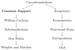
In an earlier chapter, we introduced potential outcomes and noted that estimating average treatment effects was possible if the treatment had been randomized. Yet many important questions can’t be addressed with randomized controlled trials (RCTs). Imagine studying whether parental methamphetamine abuse causes child abuse. In theory, we could randomly assign families to methamphetamine use or not and observe the outcomes. But, of course, we can’t—and shouldn’t—run such an experiment. Not only would that experiment be unethical, but it’s also practically impossible. Yet the question remains vital.
Observational or quasi-experimental designs step in to address causal questions when RCTs are unavailable. This isn’t because randomization wouldn’t answer the question—it absolutely would. Rather, it’s because the ideal experiment is often unethical, impractical, or outright impossible. But here’s the problem: when we move away from randomization, the standards for evidence often drop. That’s backward. Without randomization, we face more uncertainty, so our standards for evidence should rise.
This chapter introduces unconfoundedness, a central idea in quasi-experimental design. But unconfoundedness isn’t just about running regressions or adding covariates. Effective causal inference requires more than statistical tools or programming skills—it demands careful, thoughtful design. The rest of this book will explore these designs in detail, but let’s begin by emphasizing a key principle: good design trumps analysis.
Two Rivers of Causal Inference and Unconfoundedness
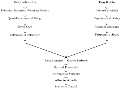
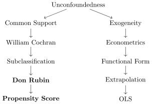
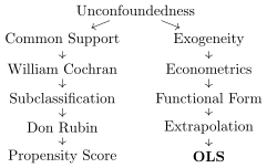
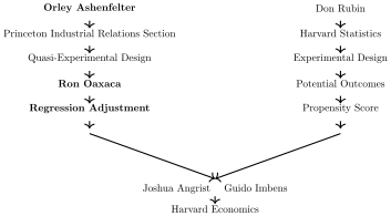
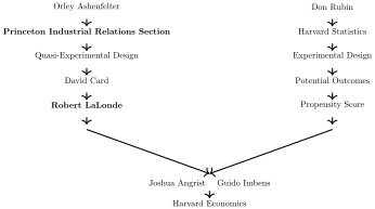
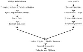
This chapter heavily draws on the statistics and experimental design tradition, as opposed to the labor economics group at Princeton. A great deal of it can be connected back to Don Rubin and his work on unconfoundedness methods, like the propensity score, as well as key figures like Guido Imbens and Alberto Abadie, though there are many more not shown. The point I mainly want to make, though, is that the unconfoundedness material that I cover comes from the statistics tradition operating through Don Rubin.
Two rivers into causal inference
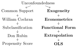
I don’t want to overstate this, but my reading of this period and these authors is that the unconfoundedness approach to causal inference was not particularly interesting to the economists at Princeton’s Industrial Relations Section. As a culture and community, the economists in the Section, including the former Princeton student and later Nobel Laureate, Jim Heckman (not shown), struck me as by and large pretty skeptical that unconfoundedness based methods could on their own successfully eliminate selection bias in observational work. What I tended to see come out of the Section was innovations that emphasized instrumental variables, regression discontinuity and difference-in-differences, not unconfoundedness.
But the Harvard statistics tradition tended to be more open-minded to unconfoundedness, as well as pioneering many of the methods we associate with it. And in this chapter, I’ll focus on their contributions, the right-hand river, particularly the idea that carefully defined treatment assignment mechanisms can resolve biases and clarify causal relationships. Our emphasis here is on using covariates effectively to address selection bias, an approach Rubin’s tradition has championed. I have found that by situating oneself within that broader historical conversation, I’ve been able to better appreciate why this method works for some questions and why it might fall short for others. But the Harvard statistics tradition tended to be more open-minded to unconfoundedness, as well as pioneering many of the methods we associate with it. And in this chapter, I’ll focus on their contributions, the right-hand river, particularly the idea that carefully defined treatment assignment mechanisms can resolve biases and clarify causal relationships.
Treatment Assignment Mechanisms Resolve Bias, Not Models
We begin by revisiting the concept of the treatment assignment mechanism in experimental design. Recall our definitions from before. We define individual treatment effects as \(\delta_i = Y^1_i - Y^0_i\) and their averages as \(\mathit{ATE}\), \(\mathit{ATT}\), and \(\mathit{ATU}\) depending on the population of interest. When we compare any group of units treated with something to a group of units that weren’t, we can decompose that simple difference in mean outcomes into the sum of three things: \[
\begin{eqnarray}
SDO &=& \mathit{ATE} \nonumber \\
&&+ \mathbf{E[Y^{\textbf{0}}|D=\textbf{1}]} - E[Y^0|D=0] \nonumber \\
&&+ (1-\pi)(\mathit{ATT}-\mathit{ATU})
\label{eq:conf_sdo}
\end{eqnarray}
\tag{5.1}\] And this is true all the time. This is not just true in the observational cases—it’s always true. It’s just that in a situation where the treatment has been randomized, we can make certain deductions that allow us to know the second and third terms drop out. For instance, if the treatment is distributed to a population for reasons that are unrelated \(Y^0\), then it is psychologically warranted to believe this: \[
\begin{eqnarray*}
E[Y^0] &=& E[Y^0|D=0] = \mathbf{E[Y^{\textbf{0}}|D=\textbf{1}]}
\label{eq:conf_po0}
\end{eqnarray*}
\tag{5.2}\] In other words, if the treatment is independent of \(Y^0\), then the treatment and control group will have the same mean \(Y^1\). They’ll have the same variance and other stuff too, but I’ll just focus on the mean here. And if the treatment is also independent of \(Y^1\), then this is true too: \[
\begin{eqnarray*}
E[Y^1] &=& \mathbf{E[Y^{\textbf{1}}|D={\textbf{1}}]} =
\mathbf{E[Y^{\textbf{1}}|D=\textbf{0}]}
\label{eq:conf_po1}
\end{eqnarray*}
\tag{5.3}\] And with just those two equalities, we can plug them into Equation 5.1 and things immediately start to vanish. And I encourage you to do that again, if you haven’t already. Start with the independence assumption, write down those equalities, then plug it into the SDO equation and watch as things disappear until you are left with \(SDO=\mathit{ATE}\).
Before we move into the material in this chapter, let me pause and emphasize two things. The SDO was a statistical model. The independence of the treatment from the potential outcomes was the treatment assignment mechanism. Our ability to estimate, therefore, the came from both the treatment assignment mechanism (treatments independent of potential outcomes) and a statistical model (simple difference in mean outcomes). The treatment assignment mechanism gave us permission, you might say, to make the deductions we made in the two equations above which we then inserted into our statistical model.
You have to have both of these things.1 But the point I’m making is that were it not that the treatment assignment mechanism satisfied independence, then selection bias would’ve remained from Equation 5.1, as well as heterogeneous treatment effect bias. The statistical model alone cannot resolve bias—the statistical model matched with the assignment mechanism can. And as this emphasis on the treatment assignment mechanism is the core of the field of causal inference and what differentiates it from other branches of statistics, I tend to emphasize it alongside the descriptions and explanations of the statistical models. Because we knew that the treatment was independent of \(Y^1\) and \(Y^0\), we knew that the mean of each one was the same in both groups, even though technically speaking, \(\mathbf{E[Y^{\textbf{1}}|D=\textbf{0}]}\) and \(\mathbf{E[Y^{\textbf{0}}|D=\textbf{1}]}\) don’t actually exist.2
To summarize: randomization is a treatment assignment mechanism. Randomization is not a statistical model. Regressions are a statistical model. Regressions are not a treatment assignment mechanism. If we can keep these things separated in our minds, it tends to really help us when trying to articulate what we are attempting to do in our studies, as well as what others are doing. But if we conflate the two—thinking, for instance, that statistical models can eliminate selection bias when in fact statistical models cannot “do” anything—that is when we will get tripped up. It is not a statistical model alone that eliminates selection bias but rather statistical models appropriately matched with particular treatment assignment mechanisms.
Nevertheless, as I said earlier, there are many instances where the controlled randomized experiment is not feasible. Maybe it is too expensive, maybe it is impractical, maybe it is unethical, or maybe it is all three. The randomized experiment involving getting parents to become addicted to meth so we could determine ten years later if meth causes child abuse is cruel and unusual while simultaneously being an important policy question, which creates a real dilemma. So, what we want to do in this chapter is figure out how we deal with the problems in Equation 5.1 if we can’t control the randomization ourselves. Is there another way, where we use our knowledge of the treatment assignment mechanism to make similar types of deductions that allow for simple plug-ins, and if so what is it?
5.2 Confounders, Covariates, and Colliders
In this chapter, we will be discussing the methodologies that are technically further down the hierarchy ladder in those metaphors, because we will be discussing a set of estimators that try to eliminate selection bias by “controlling for stuff.” Controlling for stuff is probably the most common form of causal inference anywhere, after all. Running a regression, as it’s called, and putting in controls is what most of us learned on day one of our stats and econometrics classes. And sometimes it was the only thing we studied all semester. But, what I want to be emphasizing as we go along is that there are ways to do this poorly and there are ways to do this that maximize the potential for us to learn something from the study. And I’ll start with a discussion about the crucial role of selecting the covariates prior to looking at the outcomes you’re studying.
The “controlling for covariates” approach to causal inference goes by many names. Sometimes it is called selection on observables (Heckman and Robb 1985) or selection based on known and quantified confounders (Barnow, Cain, and Goldberger 1980). I like both of those naming conventions because of the word “selection” as “selection” is nearly synonymous with what I mean by the phrase “treatment assignment mechanism.” Some of the other phrases you’ll see are a lot more jargony, though. You’ll hear it sometimes called ignorable treatment assignment mechanism (D. Rubin 1978) interchangeably with unconfoundedness (Rosenbaum and Rubin 1983; Guido W. Imbens 2004; Guide W. Imbens and Rubin 2015; Guido W. Imbens and Xu 2024). And then you’ll sometimes hear it called conditional independence (Angrist and Pischke 2009). But you will also even hear, especially in an econometrics class, the word exogeneity, though, as I’ll note later in the chapter, this is usually made in reference to regression models and those regression models will come with some additional assumptions to identify the same parameters as when we use other methods (Guide W. Imbens and Rubin 2015).
I chose to call this chapter “Unconfoundedness” because I wanted to emphasize the problem created by the confounder, and the importance of being sure that you have accounted for all the confounders so that the treatment then becomes “unconfounded.” Plus, by calling it unconfoundedness, it helps us link the statistical material in this chapter with the causal graphs by Pearl and others from the earlier chapter. As you’ll see, I use the causal graphs pretty intensively in this chapter.
When I say that we have to know the treatment assignment mechanism, I should say one thing first. That question can be intimidating when it involves people because ultimately the motivation of people in making their own choices is impossible for an outsider to fully comprehend. I barely understand why I do the things I do, and oftentimes the reason I think I made a choice I will later update and wonder if in fact I made that choice for some other reason. Human psyches are complex and difficult to understand. So, when I talk about the importance of understanding the treatment assignment mechanism in order to use it for causal inference, think of it more as in understanding it “well enough.” You will do your best to understand it, and when there is uncertainty, you will make note of it. You will keep good notes. So, let’s use as our example a situation where I will argue it is possible to make a statement like unconfoundedness without having full knowledge of every jot and tittle that went into the exact assignment of people into a treatment—first-class seating on the Titanic.
Unconfounded First-Class Seating on the Titanic
Most readers are very familiar with the sinking of the Titanic on its maiden voyage, April 15, 1912. While crossing the Atlantic Ocean in the middle of the night, the Titanic struck a large iceberg and eventually sank, killing around 1,500 passengers and saving only 700. When sinking became an unavoidable outcome, the Captain of the Titanic made a decision to prioritize women and children’s assignment to lifeboats. There were not enough lifeboats for all 2,200 passengers, so rationing them was an unavoidable problem, and the Captain used the now famous “women and children first” rule to do so. I’m pretty sure that if you got on a lifeboat, you lived, and I’m pretty sure if you didn’t get a lifeboat, you died. So, that’s not the treatment effect I’m interested in. I’m interested rather in whether being seated in first class increased your chances of getting a lifeboat. Here we will examine how that rule may have affected our ability to understand the impact that being seated in first class had on survival.
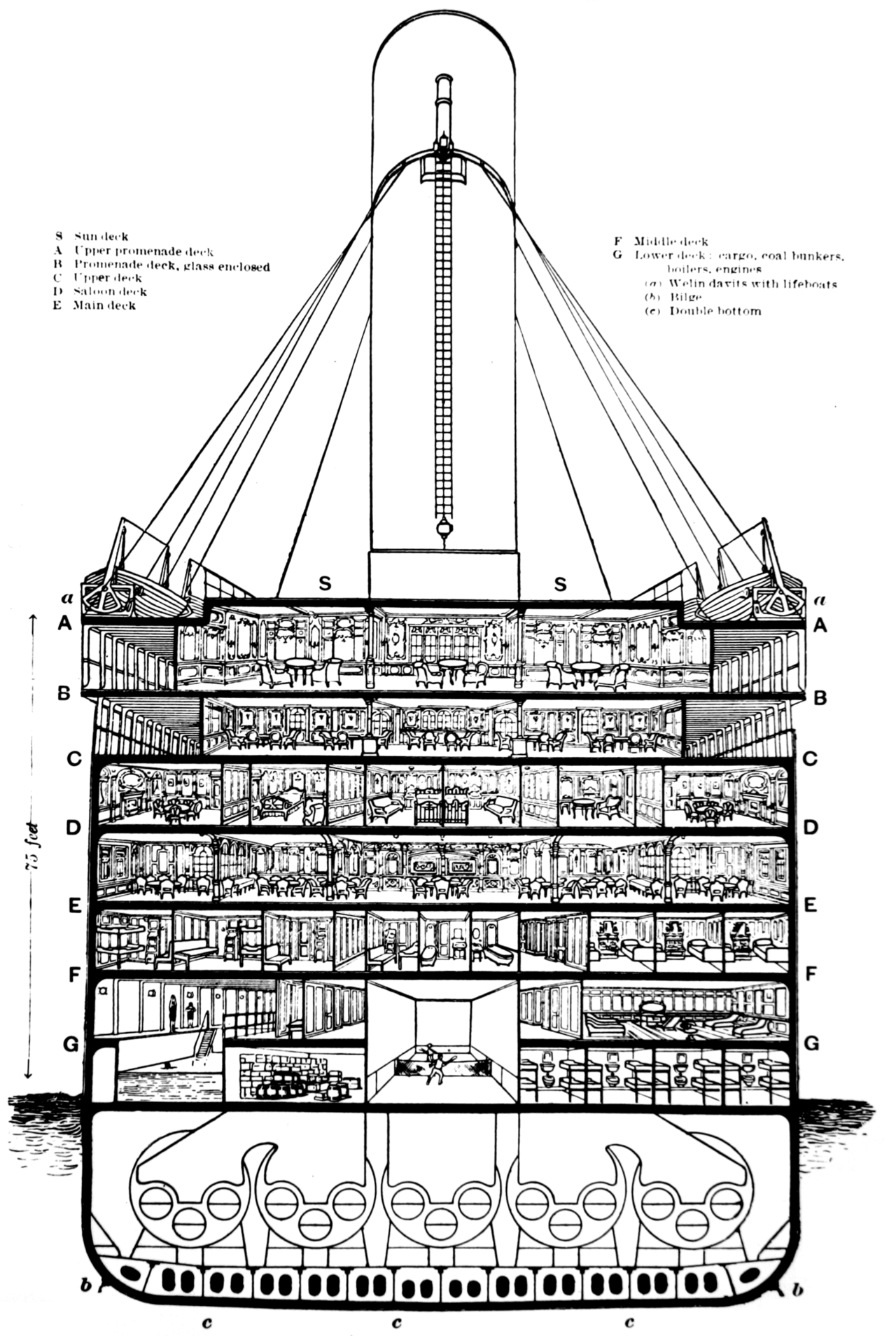
The schematic in Figure 5.1 shows the Titanic’s layout. First-class decks B and C were closest to the lifeboats, while second and third class, as well as the crew’s quarters, were on lower decks D to G. This layout suggests that first-class passengers had easier access to lifeboats, potentially increasing their survival odds, even under the “women and children first” rule.
Figure 5.1: Schematic of the Titanic from the White Line Liner’s publicity material (White Star Line 1910).
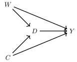
Using this information, I have constructed a hypothetical DAG (shown above) where sex (\(W\)) and age (\(C\)) are confounders connecting first-class tickets (\(D\)) and survival (\(Y\)). These variables are confounders if women and children had different distributions in first class (treatment \(D\)) than anywhere else. And since the Captain used those characteristics to assign lifeboats, those characters also significantly improved one’s chances of survival (while reducing others). Given the research question is whether having a first-class ticket (\(D\)) affects survival (\(Y\)), we express the problem of backdoor paths in terms of those two variables’ relationship to one another through the non-causal channels.
Figure 5.2: DAG describing the confounding of first class by the maritime rule, “Women and Children First,” and its effect on survival on the Titanic.
This DAG shows both the causal path of interest (i.e., the effect of first class on survival) as well as two open backdoor paths:
Main causal path of interest
\(D \rightarrow Y\)
Backdoor paths
\(D \leftarrow W \rightarrow Y\)Open
\(D \leftarrow C \rightarrow Y\)Open
Since both backdoor paths are open, but only a noncollider links the first and last variable, then closing each path is straightforward. We need only to block \(W\) and \(C\) in our models. If we include these confounders, we can estimate the average causal effect of a first-class ticket on survival because including them closes the backdoor paths leaving only the causal path as the remaining explanation for a remaining correlation between first class and survival.
\(D \leftarrow \fbox{W} \rightarrow Y\)Closed
\(D \leftarrow \fbox{C} \rightarrow Y\)Closed
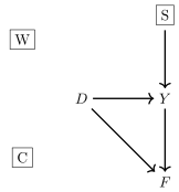
Now let’s put in a collider and another covariate that is irrelevant so that we can better understand the difference between confounders, colliders, and covariates. The figure above illustrates a second scenario with two new variables. For the sake of argument, just assume they both exist and are in your dataset. The first one is a variable indicating whether a passenger became famous (\(F)\) after the sinking. This could be because they survived and a lot of newspaper articles were written about them.3 In this case, fame (\(F\)) is a collider on the chain from first class (\(D\)) and survival (\(Y\)) if people in first class were more likely to get written about and people who survived were more likely to survive.
You can easily imagine that if you had a dataset with that variable in it how tempted you would be to control for it in a study evaluating the impact of first-class seating on survival, right? I can’t even buy KETTLE® Chips anymore because if they’re in the house, they last like 5 minutes. It’s the same with interesting colliders in our dataset. It takes logic and understanding to avoid controlling for a collider because oftentimes they are just independently fascinating variables that we want to study. And it’s not that we can’t do that—it’s just that in this particular question about the effect of first class on survival, they’re dangerous. It’s not that they are dangerous as some autonomous characteristic—rather, they’re dangerous in that particular question. The particular task of a causal question will make a variable off limits when in another context it is perfectly allowed.
But let’s say that the second variable is a variable in our dataset indicating whether this person had brought with them on the trip a sophisticated swim suit (\(S\)) that allowed a person to survive in the frigid water. This special swim suit would allow a person to tread water in the ocean without getting hypothermia, all night if necessary. Notice that this variable, \(S\), has no connection, though, to first-class seating—it affects survival, but it’s independent of first class. This variable, which for our sake I’m just calling a neutral covariate, is fine to control for and in fact may even be really valuable for reducing the uncertainty in your estimates as it’ll reduce the variance in the outcome due to the error term by pulling it out of the error term.
This modified DAG is shown in the figure above. I’ve blocked out the variables that are fine to control for or necessary to control for and left open the ones that you must not control for so that you see it visually before we walk through the steps.
Figure 5.3: DAG for Titanic survival: Confounders (\(W\) and \(C\)), collider (\(F\)), and neutral covariate (\(S\)).
Let’s start with fame and media attention (\(F\)). Fame is influenced by being in first class and surviving, making it a collider along the path connecting first class (\(D\)) to survival (\(Y\)). Now consider swimming ability combined with possessing an advanced thermal swimming suit (\(S\)). If good swimmers are no more likely to be seated in first class but are more likely to survive, then \(S\) is neither a confounder nor a collider; it simply increases the odds of survival.
Imagine you found data on \(F\) and \(S\) for all 2,200 passengers. Using resources like LexisNexis, you proxy a person’s fame by the number of newspaper articles written about them postsinking. Additionally, you obtain information from the ship’s records about passengers’ valuables, including thermal suits. Merging these variables with data on passenger survival and ticket class, you create a new dataset with seven variables: a passenger’s name, sex (\(W\)), age (\(C\)), fame (\(F\)), thermal suit (\(S\)), ticket class (\(D\)), and survival (\(Y\)). Merging these data, you now have a comprehensive dataset. So, which variables should you include and which ones should you not include if your goal remains to estimate the average causal effect of first class on survival? While the DAG has changed with these new data, the backdoor criterion has not.
\(D \leftarrow \fbox{W} \rightarrow Y\)Closed
\(D \leftarrow \fbox{C} \rightarrow Y\)Closed
\(D \rightarrow F \leftarrow Y\)Closed
\(S \rightarrow Y\)Irrelevant
As you can see, the backdoor criterion remains satisfied even if we obtain data on \(F\) and \(S\). To estimate the average causal effect of first class on survival, we still need only to block backdoor paths 1 and 2, as those are the only ones that are open. Fame may be interesting, but it is not necessary to estimate the average effect of first class on survival. And furthermore, not only is it unnecessary—more to the point, it is dangerous. It’s what is sometimes called, even, a bad control (Angrist and Pischke 2009) because it is a collider along the backdoor path from first class \(D\) to survival \(Y\). And as we already know, you should not control for colliders as they introduce bias in your estimates of your treatment’s average effect on some outcome.
But what about \(S\)? Including \(S\) in your model can improve the precision of your estimator. Even though \(S\) is neither a confounder nor a collider, it has a direct effect on the outcome. Controlling for \(S\) reduces the unexplained variation in the outcome, making the outcome less noisy. This, in turn, can make your estimated treatment effects more precisely measured and reduce your standard errors. Thus, while \(S\) is not necessary to satisfy the backdoor criterion, its inclusion can enhance the precision of your estimates.
There are many more types of variables and DAG structures than I have covered here. For a comprehensive taxonomy of covariate adjustment strategies, both good and bad, I highly recommend Cinelli, Forney, and Pearl (2022). This article shows the richness afforded by different DAGs with respect to covariate selection, and insofar as you are depending on any strategy that uses covariates for identification, it’s probably worth learning by heart. DAGs are a crucial step in expressing the treatment assignment mechanism visually and grounding your analysis.
However, it’s tempting to include every variable in your model without understanding their roles, which can be dangerous. Including everything can lead to biased estimates, especially if colliders are present. Even automated machine learning methods for covariate selection can be problematic. Hündermund, Louw, and Caspi (2023) demonstrated through simulations that these methods can become biased if they do not first exclude colliders. Therefore, it’s essential to identify and exclude colliders before using automated selection techniques.
Covariate Selection Without a DAG
What if you don’t have a DAG, or even experts can’t agree on one? Here are some emergency rules for selecting covariates when you’re unsure about the correct variables to condition on:
Include Confounders: If you feel confident that certain variables are confounders, include them.
Use Predictive Variables: Include variables highly predictive of the outcome before treatment. These are likely confounders or precision-improving variables like \(S\). They are probably not colliders.
Avoid Outcomes: Do not include variables that might be outcomes. If you’re unsure, exclude any variables measured after treatment at minimum.
One practical approach is to regress pretreatment outcomes on a range of covariates and use those that are highly predictive. This method works well if you’re interested in the \(\mathit{ATT}\), as the baseline outcomes can help identify predictive covariates.4
Guide W. Imbens and Rubin (2015) and Guido W. Imbens and Xu (2024) suggest using “placebo analyses” to justify your covariate choices. Placebo analyses provide an indirect assessment of selection on observables and are verifiable. For instance, if you decide to condition on five variables, you can check their validity by estimating your model in the pretreatment period. The pretreatment period is a good choice because (a) the treatment has not yet occurred so the treatment cannot affect the outcome logically, but (b) the pretreatment period has a similar DAG structure probably. So if your covariate selection finds effects of the program on the outcome when it is literally impossible, then it suggests your covariate strategy is not credible.
While placebo analyses are less formal than DAGs, they are testable and can provide practical insights. By including plausible confounders, strong predictors of the outcome, avoiding outcomes, and using placebo analyses, you leverage your prior knowledge about the treatment assignment mechanism, ensuring a more informed approach to covariate selection.
5.3 Identification Assumptions
Before we get into the estimation of causal effects using covariates that fit our selection on observables situations, we need to lay out in clear terms the assumptions, which are statistically equivalent to the backdoor criterion expressed earlier. We will be examining in a subsequent section estimation methods that can be described in two separate ways: those that use common support for estimation (i.e., propensity scores), and those that use imputation off of functional forms (i.e., regressions). I will in this section focus on the assumptions necessary for estimating the first class of models. Those assumptions are unconfoundedness and common support, which are two terms that you maybe aren’t fully familiar with, so I’ll lay them out in some detail now.
Selecting Target Parameters
When estimating causal effects, it’s crucial to understand which population-level causal parameter you’re targeting, as there are several ways to approach this. The parameter you choose depends on your specific goals and the population you are interested in. There are three primary aggregate causal parameters to consider, and to make it concrete, let’s use an example of the polio vaccine. We want to know the average effect of the polio vaccine on mortality and there are three formal target parameters we could try to estimate. They are:
\(\mathit{ATE}\): The average treatment effect is the mean effect of the polio vaccine on mortality for everyone in the sample. It does not depend on the treatment assignment since it averages the effect over the entire population. It is written as \(E[Y^1 - Y^0]\) or \(E[\delta]\).
\(\mathit{ATT}\): The average treatment effect on the treated group is the mean effect of the polio vaccine on mortality but only for those people who were vaccinated. Unlike the \(\mathit{ATE}\), the \(\mathit{ATT}\) depends on treatment status, and different treatment assignments can yield different measurements without altering the \(\mathit{ATT}\). It is written as \(E[Y^1 - Y^0 | D=1]\) or \(E[\delta | D=1]\).
\(\mathit{ATU}\): The average treatment effect on the untreated group is the mean effect of the polio vaccine on mortality for those people who never took it in the first place. This may sound like a strange parameter, but it’s no more strange than the other two once we remember that the treatment effect, \(\delta_i\), is defined for everyone, regardless of whether they were treated. So, if we just grouped together the subpopulation of people who never took the vaccine, and averaged their treatment effects, we’d get the \(\mathit{ATU}\). It is written as \(E[Y^1 - Y^0 | D=0]\) or \(E[\delta | D=0]\).
In a randomized experiment, the independence of potential outcomes ensures that the \(\mathit{ATE}\), \(\mathit{ATT}\), and \(\mathit{ATU}\) are equal. This is because the random treatment assignment leads to similar distributions of covariates in the treatment and control groups. However, when treatment assignment is based on covariates, these distributions differ, resulting in potentially different values for \(\mathit{ATE}\), \(\mathit{ATT}\), and \(\mathit{ATU}\).
Given this, a key theme in the following chapter is that it is important that before your study even starts, you decide which population you’re trying to study. Do you want to study the entire population’s response to the treatment? That’s the \(\mathit{ATE}\). Do you want to study the treatment effect for the people who took the treatment? That’s the \(\mathit{ATT}\). They are both defined, they both can be identified, but they have different assumptions, different estimators, different interpretations.
The easiest way for me to figure out in my own research as to whether I want to know the \(\mathit{ATE}\), \(\mathit{ATT}\), or \(\mathit{ATU}\) is to simply ask myself, “If I took my study to the mayor, what would I tell them to do with my causal effect?” And if they want to vaccinate everyone, that’s the \(\mathit{ATE}\). But if they only want to vaccinate certain groups of people who look like the people in my treatment group, then that’s the \(\mathit{ATT}\). And in all seriousness, who knows? As I’ll try to say throughout the book, sometimes it’s absolutely the case that the policy decision is to put everyone in the treatment. But other times, for example, particular programs that target poor people or lower performing students, that isn’t the goal. Sometimes we develop policies that are going to be targeted at a particular group, in which case the \(\mathit{ATE}\) may not be the parameter of interest.
The point is, you want to let this idea of “who will we target with the policy?” drive which choice you make over which parameter you want to know. By understanding their specific research goals and intended applications, researchers can more effectively choose between \(\mathit{ATE}\), \(\mathit{ATT}\), and \(\mathit{ATU}\) to obtain meaningful and relevant results.
Let’s say you are studying a remedial math class for poor performing students and the treatment is summer school. You are probably wanting to know the \(\mathit{ATT}\)—the average effect of remedial school on test scores for those people who attended remedial school—because ultimately you’re going to talk to the superintendent about the effect of summer school on low performing students. The superintendent is probably not curious about the effect of summer school on the valedictorian because she has no plans to send them to summer school! Well, if the superintendent isn’t going to apply this particular intervention to everyone, then you don’t want to get distracted by the \(\mathit{ATE}\).
But if it’s something more universal, like whether to start school at 9:00 a.m. instead of 8:00 a.m., then it’s likely to be the \(\mathit{ATE}\) you want to know (Edwards 2012). But do you see how you let the policy goal and the subpopulation implied by that policy goal guide you into choosing the parameter? It means that the choice of the parameter is endogenous to that larger question and policy goal, and that means there is no exogenous parameter that is always our goal. Depending on the policy goals, some parameters will be necessary to know, while others may not be relevant. But it does mean that up front, you have to make a decision about which of these you want to know, and why, as it will dictate a lot of what comes next.
Unconfoundedness Is a Version of Independence
Before we dive into the statistics of unconfoundedness, I want to review one more time what independence had bought us. Recall that we wrote down independence with Equation 5.4: \[
(Y^1,Y^0) \independent D \text{ (Independence)}
\tag{5.4}\]
If the treatment is independent of both potential outcomes, then the following equalities can be deduced: \[
E[Y^1] = E[Y^1|D=1] = \mathbf{E[Y^{\textbf{1}}|D=\textbf{0}]}
\tag{5.5}\]
If Equation 5.5 and Equation 5.6 are both true, then we can plug in the observed equality for any missing equality when the missing one is needed in a chosen statistical model, as we had done in the simple difference in mean outcomes (SDO). That plugging in process had been the cause of the \(SDO=\mathit{ATE}\) as you may recall. Independence, in other words, made the \(SD\) causal.
But what if we are not in that situation but we are still interested in the \(\mathit{ATE}\) as our target parameter? For example, maybe we want to know the average effect of a polio vaccine on mortality for the entire population but we know that the vaccines are not independent of the potential outcomes? For instance, perhaps older people are more likely to get the vaccine than younger people, and older people are more likely to die than young people simply because they are older. Then \(SDO \neq \mathit{ATE}\) because \(E[Y^0|D=1] \neq E[Y^0|D=0]\) due to the differing compositions of old and young in the two groups, and their differing potentialoutcomes.
But, what if, for the sake of argument, it was true that vaccinations were independent of potential outcomes when we compared old people to old people, and young people to young people? That is, what if vaccination was independent, but only conditionally speaking? That’s called “conditional independence,” but which I’m going to call unconfoundedness, and it looks like this: \[
\begin{eqnarray}
&&(Y^1,Y^0) \independent D\mid X\text{ (Unconfoundedness)} \label{eq:unc}
\end{eqnarray}
\tag{5.7}\]
In this equation, \(Y^1\) and \(Y^0\) are the potential outcomes, \(D\) is the treatment assignment, and \(X\) is a set of covariates. Unconfoundedness implies that conditional on \(X\), the treatment assignment is independent of the potential outcomes. This is also sometimes called selection on observables.
When we say that units are “selected” into the treatment based on observable covariates, we actually mean two things. First, we mean that the treatment was taken up differentially based on observable covariates. That caused differences in the distribution of the covariates, such as the percent old, among the vaccination and non-vaccination groups. But there’s a second thing. Unconfoundedness means that there still exists randomization of vaccinations, only it’s now randomization within the “dimensions” of \(X\) itself. Unconfoundedness means that for units with the same values of \(X\), treatment assignment was basically random. Technically, it was independent of potential outcomes for people with comparable values of \(X\), but as it’s hard to imagine what else it could mean, it most likely means the treatment was conditionally random. This assumption allows us to write similar equalities as we had under independence, but which are technically a little different: \[
E[Y^1|X=x] = E[Y^1|D=1, X=x] =
\mathbf{E[Y^{\textbf{1}}|D=\textbf{0}, X=x]}
\tag{5.8}\]\[
E[Y^0|X=x] = \mathbf{E[Y^{\textbf{0}}|D=\textbf{1}, X=x]} =
E[Y^0|D=0, X=x]
\tag{5.9}\]
Though the bolded quantities are counterfactuals, unconfoundedness implies we can use the observed outcomes in their place for units with the same values of \(X\). Thus unconfoundedness implies the same kind of “plug-in” approach of using realized outcomes to replace missing potential outcomes that we had done earlier when dissecting the mathematics of the randomized experiment.
Unconfoundedness Is Controversial to Some People
This assumption can be controversial in some fields, particularly in the fields with branches within them that are hyperfocused on understanding and modeling human decision-making. For instance, in economics, my field, it might even be borderline heretical to assume that people of comparable values of \(X\) are randomizing their choices. It would be downright strange even to imagine that people with the same observables are flipping coins over whether to have a baby, whether to take someone off life support, where to live, or how much schooling to get. Why? Because these are some of the most important decisions in a person’s life for which people leave almost nothing to chance.
And yet, that is what unconfoundedness means. Why? Because Equation 5.7 is an independence assumption, independence means randomizing choices, and the conditional part means that it is randomization for people with identical values of \(X\). Look closely at Equation 5.4 and then look closely at Equation 5.7. Notice how they have the same form with only a slight, somewhat inconsequential, modification. Then look at the implications of independence contained in Equation 5.5 and Equation 5.6 and compare that to the implications of unconfoundedness contained in Equation 5.8 and Equation 5.9. If randomization is what Equation 5.4 means, then conditional randomization is what Equation 5.7 means.
I emphasize this for a few reasons. One, I think one’s scientific training can inform one’s support for or opposition to methodologies based on unconfoundedness. It’s not so much that it is itself a controversial statement, because there’s nothing at all controversial about it. It’s an assumption. The problem is that it’s an assumption about people, their choices, their goals, their competency at achieving those goals, and their foresight at the time of the decision as to what outcomes might connect to those choices. Some fields, like mine, believe people are rational, and that idea has been extended to also therefore mean that they make choices when the net benefits of an action are the highest. To quote Heckman, Urzua, and Vytlacil (2006), that level of rationality is called essential heterogeneity in which people or units “adopt treatments (participate in programs) with at least partial knowledge of their idiosyncratic response."
And so, when an empirical methodology asks microeconomists to assume that people with similar characteristics are flipping coins when making nontrivial life decisions, it can be a very tough pill to swallow.5 It may be at least partly for this reason that the Princeton group tended to favor methods where treatments were assigned to units from the outside, as opposed to treatments that were conditionally random.
But, for some fields, unconfoundedness is no more controversial than saying the wallpaper on someone’s wall really brought the room together. My sense is the further one moves away from economics, the less controversial it becomes. The more one moves away from academia, the less controversial it becomes. And the more one moves away from the decision sciences, the less controversial it becomes.
I personally am a mixed bag about it. I personally believe all methods are based on assumptions, and those assumptions must be credible. The assumptions are either based on the treatment assignment mechanism or they are based on some modeling of a missing potential outcome, and sometimes both. If you are going to use unconfoundedness, you must defend it. And to defend it largely means being confident that indeed the treatment really was conditionally random. You’ll need to explain how you know that, why you know that, and why it is you think that the measurement of those observables is both in your dataset and correctly measured. If you’re confident that it’s credible, then you proceed. And if you’re not confident you don’t proceed with unconfoundedness.
Despite this opposition, unconfoundedness is used because it provides a pragmatic approach to causal inference. Guido W. Imbens (2004) addresses this controversy and offers three arguments in defense of unconfoundedness:
Statistical Motivation: Comparing outcomes for treated and control units while adjusting for covariates is a natural starting point for evaluating treatment effects. This approach is pragmatic, even if it doesn’t provide the final word on the treatment’s efficacy. And I think this is a very good counter point to make.
Empirical Issue: Treatment evaluations inherently involve comparisons, and theory, first hand knowledge, and frankly, common sense and your own expertise, can guide us as to which variables to adjust for. The unconfoundedness assumption asserts that all necessary variables are observed, making it an empirical issue rather than a theoretical one. And if you’re reading this, just remember—you are aspiring to become the person with the level of expertise needed to know those variables.
Optimization and Unobserved Characteristics: But this is my favorite reason. Even if agents optimize their treatment choices, that doesn’t mean that Equation 5.7 is necessarily violated if the reason for their choices wasn’t about \(Y^1\) and \(Y^0\) to begin with. The differences in unobserved characteristics unrelated to outcomes, in other words, do not necessarily invalidate unconfoundedness. The assumption remains plausible if the decision-maker’s objectives differ from your outcome of interest. Perhaps they cared about college’s effect on wages, but you are studying college’s effect on marriage and fertility. Well, when people go to college, maybe thinking about whether \(Y^1_i-Y^0_i>0\) where \(Y^1\) is their marriage outcome if they go to college and \(Y^0\) is their marriage outcome if they don’t, is so far outside their brain, defending unconfoundedness might make sense.
Common Support
There are two routes I’m going to take in this chapter. I’m going to walk us through the estimators based on common support and “interpolation.” And I’m going to take us through estimators that depend on functional form and “extrapolation.” The former will be things like matching. The latter will be regressions. The following diagram is meant to serve as a roadmap.
As you can see, unconfoundedness and common support are distinct concepts; you can have one without the other. Unconfoundedness implies that for units with identical confounder values, their mean potential outcomes are the same because the treatment is independent of those outcomes for those groups. This allows using the control group’s realized outcomes to substitute for the treatment group’s missing potential outcomes so long as they share the same \(X\) values (and vice versa).
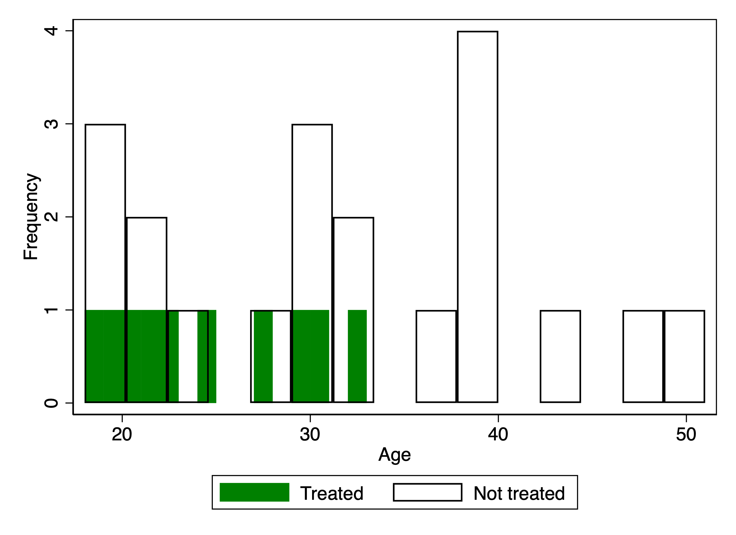
However, common support has a more practical interpretation. It ensures that there are individuals in both treatment and control groups with the same values of \(X\). For example, if \(X\) represents age groups, then common support means that young, middle-aged, and older individuals exist in both treatment and control groups. Without common support, we cannot leverage the unconfoundedness assumption, even if it holds true.
Even for studies that use designs based on unconfoundedness and common support, whether common support holds can often be an after thought, but it is just as crucial as unconfoundedness. Unlike unconfoundedness, which is based on the distribution of potential outcomes and is not directly testable, common support can be verified using observable covariates. It requires that there be at least one person in each group with the same values of \(X\). This ensures that there is a pathway to compare potential outcomes across groups with the same \(X\) values.
Verifying common support is simple: you count the units. If the share of units in the treatment group with values of \(X=x\) is not the total number of units with values \(X=x\), and vice versa for the comparison group, then common support holds. The mathematical representation of common support needed to estimate the \(\mathit{ATE}\) is: \[
\begin{align}
0 < Pr(D=1 \mid X) < 1\text{ } \label{eq:cs}
\end{align}
\tag{5.10}\]
Equation 5.10 means that there are at least some individuals with certain characteristics, \(X\), in both treatment and control. For example, if the treatment is our polio vaccine, and \(X\) is young, middle-aged, and older people, it means that there are young people who took the vaccine and young people who didn’t; middle-aged people who took the vaccine and middle aged people who didn’t; older people who took the vaccine and older people who didn’t. Common support requires that the conditional probabilities of treatment be between 0 and 1 for each of the groups, as that ensures that units with the same \(X\) values exist in both treatment and control.
How does common support differ from unconfoundedness? How can you have one but not the other? Think of it maybe like this. Unconfoundedness is like the blueprint that would allow you to assemble jigsaw puzzle pieces into the picture on the cover of the jigsaw puzzle box. You don’t yet need the pieces to know that it is possible to assemble the pieces correctly.
But common support is about the pieces. It’s about whether all the pieces to make the puzzle are in the box. You can have the picture but not the jigsaw puzzle pieces needed to make it—maybe they forgot to send one of the corner pieces. Or maybe they only sent one jigsaw puzzle piece. You can be the greatest assembler of jigsaw puzzle pieces to have ever lived, but if the puzzle pieces don’t hypothetically form the picture and you don’t have the actual puzzle pieces, you cannot assemble them into the picture on the box. That’s the basic idea, only translated to the treatment-control context.
Weighting Treatment Effects Under Unconfoundedness
So with that all said, let’s take both of these assumptions and illustrate how to estimate the \(\mathit{ATE}\) using simple weighting. I’ll first write down the definition of \(\mathit{ATE}\). Then I’ll distribute the conditional expectations, followed by some simple substitution based on unconfoundedness. \[
\begin{align}
\mathit{ATE} &=& \underbrace{E \left[ E\big[Y^1 - Y^0 \mid X=x \big] \right]}_{\text{Definition of \textit{ATE}}} \\
&=& E \left[ \underbrace{E\big[Y^1 \mid X=x\big] - E\big[Y^0 \mid X=x \big]}_{\text{Distribute conditional expectations}} \right] \\
&=& E \left[ \underbrace{E\big[Y^1 \mid D=1, X=x\big] - E\big[Y^0 \mid D=0, X=x \big]}_{\text{Unconfoundedness}} \right]
\end{align}
\tag{5.11}\] The last line is a subtle substitution, and for a long time I used to just run past it, but lately I seem to be a bit more entranced by it, so let me just explain it. In the second line, \(E[Y^1|X=x]\) was describing the entire population, not just one particular group, like \(D=1\). But notice that in the third line, we replaced it with \(E[Y^1|D=1, X=x]\). What this means is that since the treatment is conditionally random, then the distribution of the potential outcomes, conditional on \(X\), are the same in the treatment group as they are in the total population. That means we can replace the first term in the second line with the first term in the third line.
But the value of this is a pretty big deal because notice that the first term in the third line is actually in the data. We observe, in other words, \(Y^1\) for the treatment group; we just never did for the control group as for the control group, \(Y^1\) had always been counterfactual. But under unconfoundedness, that those values are gone for the control is not a big deal for us because whatever they were, they are the same on average as the mean of \(Y^1\) for our treatment group, conditional on \(X\). We did the same thing for the control group in the second part of both lines as well.
Part of the value of assumptions like independence and unconfoundedness is that they give us permission to make logical deductions that enable us to use certain numbers from certain groups as proxies for the counterfactual numbers that are lost forever. That formula allows us to build a simple estimator by replacing the potential outcomes with realized outcomes, then weighting by the share of units within each covariate dimension. If you put aside the desirability of it in your particular application, and just focus on the logic and the possibilities it opens up to us, I think you might agree with me that it is kind of cool. I think it’s kind of cool how we are able to look at something and, under an assumption, know that we are looking at counterfactuals too. \[
\begin{align}
\mathit{ATE} & = \underbrace{E \left[ E\big[Y \mid D=1, X=x\big] - E\big[Y \mid D=0, X=x \big] \right] }_{\mathclap{\text{Switching equation}}} \nonumber \\
&=\! \underbrace{\int \Big(E\big[Y \mid D=1, X=x \big] - E\big[Y
\mid D=0, X=x \big]\Big)d\Pr(X=x)}_{\mathclap{\text{Common support}}}
\end{align}
\tag{5.12}\] Note then that we really have two key assumptions driving this estimator of the \(\mathit{ATE}\). Unconfoundedness allowed us in Equation 5.11 to justify why we used the control group and the treatment group in the way that we did. And common support allowed us to weight over the simple differences in mean outcomes for them.
To make this now very concrete, consider this example. You have a dataset with a variable called \(X\) measuring people’s ages and it has three values: young, middle-aged, and old. If the conditional s for young, middle-aged, and old people are 80, 55, and 100, respectively, and each group makes up one-third of the population, then the \(\mathit{ATE}\) is: \[
\begin{eqnarray*}
\widehat{\mathit{ATE}} &=& \frac{N_y}{N} \times SDO_{y} +
\frac{N_m}{N} \times SDO_{m} + \frac{N_o}{N} \times SDO_{o} \\
&=& \frac{1}{3} \times 80 + \frac{1}{3} \times 55 + \frac{1}{3} \times 100 \\
&=& 78.33
\end{eqnarray*}
\tag{5.13}\] where \(N\) is the number of people in the population, and \(N_y\), \(N_m\), and \(N_o\) are the number of young, middle-age, and old people in the population, and \(N=N_y+N_m+N_o\). And notice that all we are weighting is the simple difference in mean outcomes for young people (in treatment and control), middle-aged people (in treatment and control), and older people (in treatment and control). You can’t weight, though, what isn’t there, so if there’s no old people in the treatment group, then clearly you cannot calculate \(SDO_o\) and so common support ultimately breaks the whole estimation process down.
Estimating the \(\mathit{ATT}\) Under Weaker Assumptions
Which is a nice segue into my next point. Sometimes we cannot estimate the \(\mathit{ATE}\), not because it’s not interesting to us, but because our dataset disallows it. It could be because unconfoundedness isn’t plausible, or because common support does not hold, or both. What I want to do in this short section is both explain why that would be true theoretically, but then explain a Plan B backup. And then I’ll more or less say that I think that the Plan B backup was potentially your goal all along, just maybe it wasn’t clear. A lot of these questions only became clearer over time as the problems of heterogeneous treatment effects became more clear.
When we say that the treatment is independent of both \(Y^0\) and \(Y^1\), conditional on age, we are basically saying that old people chose to get vaccinated without thinking of whether it would help them. Quite literally that’s what it means. Why? Because the effect of vaccinations is \(Y_i^1-Y_i^0\). And if old people are getting vaccinated independent of both potential outcomes, then they are also getting vaccinated independent of the treatment effects. Which means whatever they are doing, they aren’t paying attention to its effect on the outcome of interest.
I call that assumption the strong unconfoundedness assumption. It’s strong because it’s conditional independence with respect to both potential outcomes. But that is not our only option. There is also something called weak unconfoundedness, and that’s where the vaccination would be conditionally independent with respect to only one of the two potential outcomes. Usually it’s conditional independence with respect to \(Y^0\), as that assumption supports the estimation of the \(\mathit{ATT}\), and that is an interesting policy parameter. In this case the \(\mathit{ATT}\) would mean the average effect of vaccination on the vaccinated.
This is a weaker assumption, so it’s more plausible. But it’s more than that. This is also a more plausible assumption because it doesn’t require the same level of hyperrationality on the part of decision-makers as the stronger assumption did. What it would say is that old people could absolutely be thinking about what happens if they get vaccinated (i.e., \(Y^1\)). That’s completely fine. It’s just that they, as a group, aren’t thinking about what happens when they didn’t get vaccinated (i.e., \(Y^0\)). Weak unconfoundedness, in other words, simply means that groups of people with the identical \(X\) values didn’t really pay attention to what they gave up when they chose not to get treated; they just cared about what happened when they did.
I guess I’ll tip my hand and just say that as a microeconomist who bleeds “humans are rational” when he nicks his face while shaving, I find it pretty noncontroversial to imagine people make decisions without taking serious inventory of what they gave up. Partly I am not so bothered by this assumption because I am an economist. In our introductory economics classes, for instance, we teach something called “opportunity cost,” which is the value of the thing a person gave up when making their choices. It’s a core idea in economics; professors harp on it the whole semester; and yet college students still get it wrong on the exam. I’m not saying I believe automatically in it; I’m just saying that weak unconfoundedness isn’t nearly as problematic for me.
So, assuming weak unconfoundedness just requires dropping \(Y^1\) from Equation 5.7 and replacing it with Equation 5.14. \[
\begin{eqnarray}
Y^0 \independent D \mid X \label{eq:weak}
\end{eqnarray}
\tag{5.14}\]
With weak unconfoundedness, we can then write down the following equality too. Notice that this was present in our earlier unconfoundedness expression; we just no longer can assume that \(E[Y^1]\) is the same for both groups. But as it will turn out, this is still going to be a particularly valuable deduction for causal inference. \[
\begin{eqnarray*}
E[Y^0 \mid X=x] &=& \mathbf{E[Y^{\textbf{0}} \mid D={\textbf{1}},
X=x]} = E[Y^0 \mid D=0, X=x]
\end{eqnarray*}
\tag{5.15}\]
This result will be useful later because recall that the \(\mathit{ATE}\) is missing the bolded term, but since it is equal to the last term, where \(X=x\) occurs in both groups, we will be able to simply replace our missing bolded terms with our realized outcomes, which is supported with weak unconfoundedness.
A slight weakening of the common support assumption is also allowed if our goal is to estimate the \(\mathit{ATT}\). Weak common support only requires that there be comparable units in the control group for the covariates present in the treatment group. This is less restrictive than needing overlap across the entire distribution of \(X\), as is required for the \(\mathit{ATE}\). Thus, by relaxing these assumptions, we can focus on estimating the \(\mathit{ATT}\), which remains a valuable and often more relevant parameter for certain research questions. \[
\begin{equation}
\Pr(D = 0 \mid X) > 0 \quad \text{for all } X \text{ such that }
\Pr(D = 1 \mid X) > 0 \label{eq:wcs}
\end{equation}
\tag{5.16}\] What exactly does Equation 5.16 mean? Imagine this situation. Let’s say there are two groups: young and old. But the treatment group only has young people. The control group has young and old people. Weak support is satisfied because for those values of X in the treatment group, we have values of that same in the control group. It doesn’t matter that we are missing old people in the treatment group, though, because weak support only requires that it go in one direction, not both. That’s how you interpret Equation 5.16.
So, with both weak unconfoundedness and weak support, we start with the definition of \(\mathit{ATT}\), give ourselves some of the realized outcomes to use with the switching equation, switch between groups with unconfoundedness then weight based on common support like so: \[
\begin{eqnarray}
\widehat{\mathit{ATT}} &=& \underbrace{E[Y^1 \mid D=1, X=x] - E[Y^0
\mid D=1, X=x]}_{\text{Definition of \textit{ATT}}} \nonumber \\
&=& \underbrace{E[Y \mid D=1, X=x] - E[Y^0 \mid D=1,
X=x]}_{\text{Part of the switching equation}} \nonumber \\
&=& \underbrace{E[Y \mid D=1, X=x] - E[Y \mid D=0,
X=x]}_{\text{Weak unconfoundedness}} \nonumber \\
&=& \underbrace{\int \left(E[Y \mid X, D=1] - E[Y \mid X,
D=0]\right)d\Pr(X \mid D=1)}_{\text{Common support}}
\label{eq:att_weak}
\end{eqnarray}
\tag{5.17}\] where the weights here are the share of units by \(X\) in the treatment group only, not the entire population like we had needed with the \(\mathit{ATE}\). It is quite literally a difference in what we are weighting, not what our difference in means are, as we’ll see in the next section.
So, now that the generalized framework for using covariates to estimate causal effects has been laid out with our concepts of unconfoundedness and common support, let’s move forward and discuss some more specific estimation methods. The methods we will consider include four broad methodologies based on the use of covariates to estimate various target parameters: subclassification, exact matching, inexact matching, and inverse probability weighting.6 Throughout this discussion, I will emphasize several themes: heterogeneous treatment effects, failures of common support, bias correction methods, and the different target parameters.
5.4 Subclassification
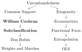
I’ll move us now down the common support branch of unconfoundedness to dive into subclassification. I first learned about Cochran (1968)’s subclassification in a workshop taught by Alberto Abadie, the econometrician and creator of the synthetic control method we’ll discuss later in the book. This method emerged during a time when the public health consequences of smoking tobacco were still debated, and it wasn’t settled science that smoking caused lung cancer.
Imagine the RCT that would be required to determine if smoking caused cancer. Heads, you spend your entire life smoking a pack a day. Tails you never smoke once. Put aside whether you think that’s an ethical experiment or if it’s less ethical than the ones that are run everyday in medicine and the social sciences—it’s not remotely realistic. People have strong antipathy to smoking, and others love it, and the top of a coin is probably not going to get them to comply.7 And yet, lung cancer seemed to be rising over the late 19th and early 20th century, and it certainly seemed correlated with smoking with the imperfect data that researchers had.
Cochran developed the subclassification method to estimate the effect of smoking on cancer and cancer-related mortality. The method was focused on a single covariate, but it’s always possible at least in principle to collapse a lot of variables into one variable.8 His method implicitly assumed that smoking was conditionally independent of the potential outcomes, which in this case would be cancer if a person smoked, and cancer if they didn’t. That does not, to me, seem like a crazy assumption—if we were choosing to smoke based on its effect on cancer, I suspect no one would smoke. Remember what I said from Guido W. Imbens (2004)—a person can have an objective when making their own decisions that is different from the research question we care about. So, unconfoundedness may fail with respect to their goals, but not with respect to ours as researchers. But, putting that aside, Cochran showed that by reweighting mortality rates for smokers and non-smokers according to the age distribution in the population of interest, one could obtain an estimate of the average treatment for all, or one subgroup, that only differed according to the probability weights used in the aggregation scheme.
To illustrate his subclassification method, I’d like to return to our Titanic example. We’ll introduce the subclassification method conceptually and demonstrate its application using data and code.
Titanic Example
Our goal is to estimate three average causal parameters associated with being seated in first class on the Titanic and its effect on surviving the sinking. Several datasets provide information on the Titanic’s passengers, but we’ll use one that includes the entire passenger list (including the crew) and that also categorizes age and sex into coarsened binary indicators to illustrate the subclassification method. If we use the dataset I’ve selected for us, then we’ll see that 62.5% of first class passengers survived, but only 27.1% of the rest of the ship survived, which is a difference of 35.4 percentage points.
* Simple difference inmean outcome and checks for covariate balanceuse https://github.com/scunning1975/mixtape/raw/master/titanic.dta, clearnumlabel, addgen female=(sex==0)labelvariable female "Female"gen male=(sex==1)labelvariable male "Male"gens=1 if (female==1 & age==1) // adult femalereplaces=2 if (female==1 & age==0) // child femalereplaces=3 if (female==0 & age==1) // adult malereplaces=4 if (female==0 & age==0) // child malegend=1 ifclass==1replaced=0 ifclass!=1summarize survived ifd==1 // 0.6246154, or 62.5 percent of first class survivedgen ey1=r(mean)summarize survived ifd==0 // 0.2707889, or 27.1 percent of other classes survivedgen ey0=r(mean)gen sdo=ey1-ey0su sdo // 0.3538265, or 35.4 percentage point higher survival if seated in first class versus any other class.regress survived d// 0.3538265, the same number as before.* Check for imbalance in women (female=1) and children (age=1)bysortd: summarize agebysortd: summarize female* Check for imbalance bystratatabs, gen(s)bysortd: summarize s1-s4exit
library(tidyverse)library(haven)library(broom) # For tidying model outputsread_data <-function(df) { full_path <-paste("https://raw.github.com/scunning1975/mixtape/master/", df, sep ="") df <-read_dta(full_path)return(df)}titanic <-read_data("titanic.dta") %>%mutate(d =if_else(class ==1, 1, 0))ey1 <- titanic %>%filter(d ==1) %>%pull(survived) %>%mean()ey0 <- titanic %>%filter(d ==0) %>%pull(survived) %>%mean()sdo <- ey1 - ey0# Run a regression of survived onto dregression_result <-lm(survived ~ d, data = titanic)tidy(regression_result)# Generate dummies for the stratified variables according to the s variabletitanic <- titanic %>%mutate(female =as.numeric(sex ==0),male =as.numeric(sex ==1),s =case_when( female ==1& age ==1~1, # adult female female ==1& age ==0~2, # child female female ==0& age ==1~3, # adult male female ==0& age ==0~4# child male ),s1 =as.numeric(s ==1),s2 =as.numeric(s ==2),s3 =as.numeric(s ==3),s4 =as.numeric(s ==4) )# Summarize counts and means by treatment status (d)summary_by_d <- titanic %>%group_by(d) %>%summarize(count_s1 =sum(s1),mean_s1 =mean(s1),count_s2 =sum(s2),mean_s2 =mean(s2),count_s3 =sum(s3),mean_s3 =mean(s3),count_s4 =sum(s4),mean_s4 =mean(s4),.groups ='drop' )print(summary_by_d)
The simple difference in mean outcomes is contaminated by selection bias and heterogeneous treatment effect bias, so unless we think people were flipping coins when they bought tickets into first class, then a simple comparison like that does not provide us with a measure of the average effect of first class on mortality.
Part of the problem is coming from the fact that since the captain followed a maritime rule to give the lifeboats to women and children first, then women and children would always have a higher chance of survival than men, regardless of which cabin they were seated in. So, if there’s more or less women and children in first class than in the other cabins, that alone will create selection bias. Table 5.1 shows that in fact is the case. There is slight imbalance of adults in first class compared to the rest of the ship, but there’s a major imbalance in the share of females in first class (44.6%) than in the rest of the ship (17.3%).
Table 5.1: Average Female and Adult Passengers by First-Class Status on the Titanic
Variable name
First class Obs
First class Mean
Non-first class plus crew Obs
Non-first class plus crew Mean
Percent adult
325
98.2%
1,876
94.5%
Percent female
325
44.6%
1,876
17.3%
So, how are we going to use subclassification to get rid of the various biases contaminating the SDO? There are four steps to do so, and if we are interested in the \(\mathit{ATE}\), it’s these specific four steps:
Stratify the confounders: This is done by interacting all covariates into \(k\) stratum. Our age and sex variables are binary, so we create four (\(k=4\)) stratum: male children, female children, male adults, female adults.
Calculate differences within stratum: Calculate average survival rates for each group within each stratum and take the difference.
Calculate probability weights: For the \(\mathit{ATE}\), count the total number of people in each stratum and divide by the total number of souls aboard (2,201).
Aggregate differences across stratum using weights: Estimate the by taking a weighted average of the differences in survival rates using the stratum weights.
Table 5.2 has all the information we need to estimate treatment effects using subclassification, but it’s all information from the programs I listed so you can do it yourself, too. First, we will take our two variables—sex and age—and create a single variable representing all combinations of age and sex. In these data, each passenger and crew member is either male or female, and their age is labeled either “child” or “adult.” So, when we stratify the confounders, what we are doing is taking the covariates and collapsing them into a single covariate, which contains the four combinations – adult males, adult females, boys, and girls—each of which is called a “stratum.” That’s step 1.
Table 5.2: Counts and Titanic Survival Rates by Stratum and First-Class Status
First Class
All Other Classes
Stratum k
Obs
Mean
Obs
Mean
Total
Male adult
175
0.326
1,492
0.188
1,667
Female adult
144
0.972
281
0.626
425
Male child
5
1
59
0.407
64
Female child
1
1
44
0.613
44
Total observations
325
1,876
2,201
Step 2 involves calculating the difference in survival rates within each stratum. For instance, 32.6% of male adults in first class survived, compared to 18.8% in other classes, a difference of 13.8 percentage points. Estimating difference in mean outcomes is straightforward in subclassification—it simply must be done within the stratified sample. To see all the differences in means for the other stratum, see Table 5.3 where they are listed.
Now comes the weighting. In Step 3, we calculate the share of units in a particular strata out of a total population, and the population differs depending on whether we want the \(\mathit{ATE}\) (the entire population), the \(\mathit{ATT}\) (the treatment group sub-population), or the \(\mathit{ATU}\) (the control group sub-population). These are probability weights, and different weights go, in other words, with different target parameters. So for the \(\mathit{ATE}\), you take a weighted average of all differences in means where the weights are each \(n_k\) divided by 2,201 because there are 2,201 people in the data. For example, there are 1,667 male adults, then the weight on male adults is 1,667/2,201 = 0.76. But if you were interested in the \(\mathit{ATT}\) , then the probability weight for male adults would be 175/325 = 0.538. These weights are reported in the first weight column of Table 5.3.
Table 5.3: Differences in Survival Rates, Stratification Weights, and Estimates of Parameters
Strata
Differences in survival
Weight\(_{k,ATE}\)
Weight\(_{k,ATT}\)
Weight\(_{k,ATU}\)
Male adult
0.138
0.76
0.54
0.80
Female adult
0.346
0.19
0.44
0.15
Male child
0.593
0.03
0.02
0.03
Female child
0.387
0.02
0.00
0.02
Simple difference in survival
SDO
\(\widehat{ATE}\)
\(\widehat{ATT}\)
\(\widehat{ATU}\)
Estimated coefficient
0.35
0.20
0.24
0.19
Step 4 involves taking a weighted average of the differences in survival rates for the first class passengers and everyone else using the weights from step 3. For the \(\mathit{ATE}\), this is: \[
\begin{eqnarray}
\widehat{\mathit{ATE}} &=& \left(\frac{1,667}{2,201} \times
SDO_{ma}\right) + \left(\frac{425}{2,201} \times SDO_{fa}\right) +
\left(\frac{64}{2,201} \times SDO_{mc}\right) \nonumber \\
&& + \left(\frac{45}{2,201} \times SDO_{fc}\right) \nonumber \\
&=& (0.76 \times 0.138) + (0.19 \times 0.346) + (0.03 \times 0.593)
\nonumber \\
&&+ (0.02 \times 0.387) \nonumber \\
&=& 0.20\text{ or 20 percentage points}
\end{eqnarray}
\tag{5.18}\]
The simple difference in mean survival rates for first class and everyone else was off by 15 percentage points. The SDO was 35 percentage points, but after adjusting for age and sex using subclassification, the \(\mathit{ATE}\) is 20 percentage points. Our estimate of the \(\mathit{ATE}\) is still large, but it is almost half the magnitude of the estimated SDO.
But while we can define the \(\mathit{ATE}\) parameter, maybe the estimate is strained. After all, not everyone can be seated in first class due to capacity constraints on the ship. So, even if we were interested in what the average effect of first class was on survival for the entire population, it is perhaps a bit of a stretch to say that we could literally put everyone in first class since 2,201 people can’t fit there. Furthermore, it’s probably implausible to maintain SUTVA for long because in the Titanic data, whenever one person gets a lifeboat, it means someone else doesn’t, and thus interference happens. I don’t have a great answer to that except to say this exercise made SUTVA extremely clear to me, so that was nice at least.
But let’s move into estimating a different parameter that may be slightly more realistic: the \(\mathit{ATT}\) . To estimate the \(\mathit{ATT}\) , we imagine that we are estimating what would’ve happened to each of our four stratified first class passengers had they instead been either the crew or seated in one of the other non-first-class cabins.
To estimate the \(\mathit{ATT}\) , we need to adjust the probability weights. But interestingly, we do not adjust the difference in mean survival within each stratum. In fact, the difference in mean outcomes within stratum are the same for all aggregate causal parameters using subclassification; the only reason aggregate causal parameters differ using this method is when their probability weights differ. So, when using subclassification to estimate the \(\mathit{ATT}\), the weights are calculated as the share of people in first class for each stratum. For example, there are 175 male adults in first class out of 325 people in the adult male stratum overall (Table 5.2), or 0.54. These weights are reported in Table 5.3 in the column labeled Weight\(_{k,\mathit{ATT}}\). \[
\begin{eqnarray}
\widehat{\mathit{ATT}} &=& (0.138 \times 0.54) + (0.346 \times
0.44) + (0.593 \times 0.02) \nonumber\\
&&+ (0.387 \times 0.00) \nonumber \\
&=& 0.24\text{ or 24 percentage points}
\end{eqnarray}
\tag{5.19}\]
The average causal effect of first class on those seated in first class is slightly higher than our estimate of the \(\mathit{ATE}\). Since the \(\mathit{ATE}\) is a weighted average of the \(\mathit{ATT}\) and the \(\mathit{ATU}\), this indicates that the \(\mathit{ATU}\) will be smaller than the \(\mathit{ATT}\). We can estimate the \(\mathit{ATU}\) using the same differences within stratum, but the probability weights are based on the share of units in the other classes for each stratum: \[
\begin{eqnarray}
\widehat{\mathit{ATU}} &=& (0.138 \times 0.80) + (0.346 \times
0.15) + (0.593 \times 0.03) \nonumber\\
&&+ (0.387 \times 0.02) \nonumber \\
&=& 0.19\text{ or 19 percentage points}
\end{eqnarray}
\tag{5.20}\]
Below is the code in R and Stata that I used to construct the information in Table 5.2 and Table 5.3 for those who want to see, with their own eyes, how these numbers and estimates were calculated.
* Subclassification estimatesof the average causal effect of first classon surviving the Titanic sinkingclearcapturelogcloseuse https://github.com/scunning1975/mixtape/raw/master/titanic.dta, clear* Step 1: Stratify the databy sex and agegen adult_male = 0replace adult_male = 1 if sex==1 & age==1gen adult_female = 0replace adult_female = 1 if sex==0 & age==1gen child_male = 0replace child_male = 1 if sex==1 & age==0gen child_female = 0replace child_female = 1 if sex==0 & age==0gen first_class = 0replace first_class = 1 ifclass==1* Step 2: Calculate differences inmean survival rate forall four stratasu survived if adult_female==1 & first_class==1gen ey11=r(mean)labelvariable ey11 "Average survival for adult females in first class"su survived if adult_female==1 & first_class==0gen ey10=r(mean)labelvariable ey10 "Average survival for adult females in other class cabins"gen diff_af=ey11-ey10labelvariable diff_af "Simple difference in survival rates for adult females"su survived if adult_male==1 & first_class==1gen ey21=r(mean)labelvariable ey21 "Average survival rate for adult males in first class"su survived if adult_male==1 & first_class==0gen ey20=r(mean)labelvariable ey20 "Average survival rate for adult males in other class cabins"gen diff_am=ey21-ey20labelvariable diff_am "Difference in survival rates for male adults"su survived if child_male==1 & first_class==1gen ey31=r(mean)labelvariable ey31 "Average survival rate for male children in first class"su survived if child_male==1 & first_class==0gen ey30=r(mean)labelvariable ey30 "Average survival rate for male children in other class cabins"gen diff_cm=ey31-ey30 labelvariable diff_cm "Difference in survival rates for male children"su survived if child_female==1 & first_class==1gen ey41=r(mean)labelvariable ey41 "Average survival rate for female children in first class"su survived if child_female==1 & first_class==0gen ey40=r(mean)labelvariable ey40 "Average survival rate for female children in other class cabins"gen diff_cf=ey41-ey40labelvariable diff_cf "Difference in survival rates for female children"* Calculate weights for each causal parameter: ATE, ATT and ATU* Step 3: Display the number of observations. Compare this with the chapterbysort first_class: tab sex age, freqbysort first_class: su survived if adult_male==1bysort first_class: su survived if adult_female==1bysort first_class: su survived if child_male==1bysort first_class: su survived if child_female==1* Step 3 (cont): Now construct the weights based on the counts for each parameter* Strata counts for ATEcountif adult_female==1 // Counts of adult femalesgen ate_af = `r(N)'countif adult_male==1 // Counts of adult malesgen ate_am = `r(N)'countif child_male==1 // Counts of male children gen ate_cm = `r(N)'countif child_female==1 // Counts of female childrengen ate_cf = `r(N)'countgen ate_N = `r(N)'* Construct weights for ATE bystratagen wt_ate_af = ate_af/ate_Ngen wt_ate_am = ate_am/ate_Ngen wt_ate_cm = ate_cm/ate_Ngen wt_ate_cf = ate_cf/ate_Nsu *ate* // Double check your work* Strata counts for first classfor ATTcountif adult_female==1 & first_class==1 // Counts of adult females in first classgen att_af1 = `r(N)'countif adult_male==1 & first_class==1 // Counts of adult males in first classgen att_am1 = `r(N)'countif child_male==1 & first_class==1 // Counts of male children in first classgen att_cm1 = `r(N)'countif child_female==1 & first_class==1 // Counts of female children in first classgen att_cf1 = `r(N)'countif first_class==1gen att_N = `r(N)'* Construct weights for ATT bystratagen wt_att_af = att_af/att_Ngen wt_att_am = att_am/att_Ngen wt_att_cm = att_cm/att_Ngen wt_att_cf = att_cf/att_Nsu *att* // Double check your work* Strata counts for non-first classfor ATUcountif adult_female==1 & first_class==0 // Counts of adult females in other classesgen atu_af0 = `r(N)'countif adult_male==1 & first_class==0 // Counts of adult males in other classesgen atu_am0 = `r(N)'countif child_male==1 & first_class==0 // Counts of male children in other classes gen atu_cm0 = `r(N)'countif child_female==1 & first_class==0 // Counts of female children in other classesgen atu_cf0 = `r(N)'countif first_class==0gen atu_N = `r(N)'* Construct weights for ATU bystratagen wt_atu_af = atu_af/atu_Ngen wt_atu_am = atu_am/atu_Ngen wt_atu_cm = atu_cm/atu_Ngen wt_atu_cf = atu_cf/atu_Nsu *atu* // Double check your work* Step 4: Estimate aggregate parameters using corresponding weights and differences within stratagen ate_strat = .gen att_strat = .gen atu_strat = .replace ate_strat = (wt_ate_af * diff_af) + (wt_ate_am * diff_am) + (wt_ate_cm * diff_cm) + (wt_ate_cf * diff_cf)labelvariable ate_strat "Stratification weighted estimate of ATE"replace att_strat = (wt_att_af * diff_af) + (wt_att_am * diff_am) + (wt_att_cm * diff_cm) + (wt_att_cf * diff_cf)labelvariable att_strat "Stratification weighted estimate of ATT"replace atu_strat = (wt_atu_af * diff_af) + (wt_atu_am * diff_am) + (wt_atu_cm * diff_cm) + (wt_atu_cf * diff_cf)labelvariable atu_strat "Stratification weighted estimate of ATU"sum *_strat // Double check your work
# Load necessary librarieslibrary(dplyr)library(haven)# Load Titanic datasettitanic <-read_dta("https://github.com/scunning1975/mixtape/raw/master/titanic.dta") %>%mutate(d =ifelse(class ==1, 1, 0), # Treatment indicators =case_when( # Stratify by sex and age sex ==0& age ==1~1, # Adult female sex ==0& age ==0~2, # Child female sex ==1& age ==1~3, # Adult male sex ==1& age ==0~4, # Child maleTRUE~0 ) )# Step 1: Calculate differences in mean survival rates for each stratumcalculate_differences <-function(data, strata) { data %>%filter(s == strata) %>%summarize(ey11 =mean(survived[d ==1], na.rm =TRUE), # Treatedey10 =mean(survived[d ==0], na.rm =TRUE), # Controldiff = ey11 - ey10 # Difference ) %>%mutate(stratum = strata)}differences <-bind_rows(lapply(1:4, function(i) calculate_differences(titanic, i)))# Step 2: Calculate total observations for ATE, ATT, and ATUn_total <-nrow(titanic)n_treated <-nrow(titanic %>%filter(d ==1))n_control <-nrow(titanic %>%filter(d ==0))# Calculate stratum-specific countsstratum_counts <- titanic %>%group_by(s, d) %>%summarize(count =n(), .groups ="drop") %>%pivot_wider(names_from = d, values_from = count, names_prefix ="d_") %>%mutate(total = d_1 + d_0,wt_ate = total / n_total, # ATE weightswt_att = d_1 / n_treated, # ATT weightswt_atu = d_0 / n_control # ATU weights )# Step 3: Merge weights with differencesweights_and_differences <- differences %>%left_join(stratum_counts, by =c("stratum"="s"))# Step 4: Calculate aggregate ATE, ATT, and ATUate <-sum(weights_and_differences$diff * weights_and_differences$wt_ate, na.rm =TRUE)att <-sum(weights_and_differences$diff * weights_and_differences$wt_att, na.rm =TRUE)atu <-sum(weights_and_differences$diff * weights_and_differences$wt_atu, na.rm =TRUE)# Output resultslist(ATE = ate,ATT = att,ATU = atu)
Curse of Dimensionality
Before we leave subclassification, it’s crucial to discuss what happens when we have “empty cells” because empty cells make it impossible to estimate all of the target parameters we just estimated. An empty cell occurs when a particular stratum is represented entirely by either the treatment group or the control group, but not both. This means that within that stratum, one of the groups is missing entirely, and as a result, we can’t calculate that group’s probability weight which subclassification requires. This phenomenon is often referred to by the more ominous term, the curse of dimensionality. Essentially, it indicates that if we were to try to fully stratify the covariates in our dataset, we’d have more “empty cells” because it would not be possible to fully do so.
To illustrate this, consider a modification of Table 5.2 where we drop the one girl in first class, resulting in an empty cell (i.e., no female children in first class). This adjustment reduces our total passenger count from 2,201 to 2,200, and the number of first-class passengers from 325 to 324. It also decreases the total number of girls on the boat from 45 to 44. This modified scenario is depicted in Table 5.4.9
Table 5.4: Counts and Titanic Survival Rates by Stratum and First-Class Status
First Class
All Other Classes
Stratum k
Obs
Mean
Obs
Mean
Total
Male adult
175
0.326
1,492
0.188
1,667
Female adult
144
0.972
281
0.626
425
Male child
5
1
59
0.407
64
Female child
0
n/a
44
0.613
44
Total observations
324
1,876
When we are faced with empty cells, it does not mean that we cannot estimate any causal effects. It means that we can only estimate causal effects for those groups that satisfy common support. Within subclassification, the impact of an empty cell either thwarts our ability to calculate the relevant probability weight that a particular parameter estimate requires or stops us from measuring the mean outcome for a given treatment-control stratum necessary for estimating the difference in means within that stratum. Since each estimated aggregate causal parameter is a weighted average of the product of both the probability weights and the associated stratum-specific difference in mean outcomes, missing either element makes it impossible to estimate the average treatment effect that relies on it. Empty cells impact both of these aspects, but only for some average treatment effect parameters. To see this, look at our new subclassification table, Table 5.5, in which the only female child in first class was hypothetically dropped from the sample.
Table 5.5: Differences in Survival Rates, Stratification Weights, and Estimates of Parameters Without Perfect Stratification
Stratum \(k\)
Differences in survival rates
Weight\(_{k,ATE}\)
Weight\(_{k,ATT}\)
Weight\(_{k,ATU}\)
Male adult
0.138
0.76
0.54
0.80
Female adult
0.346
0.19
0.44
0.15
Male child
0.593
0.03
0.02
0.03
Female child
n/a
0.02
0.0
0.02
Simple difference in mean outcomes
SDO
\(\widehat{ATE}\)
\(\widehat{ATT}\)
\(\widehat{ATU}\)
Estimated coefficient
0.35
n/a
0.24
n/a
Differences in survival rates, stratification weights, and estimated parameters. All coefficients should be multiplied by 100 to get a percentage point change in survival rate as a result of having a first-class cabin. Note that the SDO is a simple difference in mean outcomes and therefore not a weighted average over the stratum differences. But the estimated \(\mathit{ATE}\), \(\mathit{ATT}\), and \(\mathit{ATU}\) parameters are weighted averages in difference in means using corresponding stratification weights.
Since we are missing female children in first class, we do not have a mean survival rate for this group. It is undefined and, therefore, we cannot calculate a difference in mean outcomes for female children across the treatment and control groups. That quantity is not available (“n/a”), and any estimate that depends on it cannot be identified. This is partly why both the \(\mathit{ATU}\) and the \(\mathit{ATE}\) are undefined, as both require a difference in mean survival rates for female children to be complete.
But, we don’t have this problem for the \(\mathit{ATT}\) because every stratified subgroup in the treatment group has a counterpart in the control group. The treatment group in this modified table consists of men, women, and boys, and there are men, women, and boys in the control group. But what about the girls? Well, there are no girls in the treatment group, and we only need overlap for the people in the treatment group in order to get an estimate of the \(\mathit{ATT}\). So, since these are the only strata needed, we only need probability weights and differences in mean outcomes for these three strata to estimate the : \[
\begin{eqnarray}
\widehat{\mathit{ATT}} &=& (0.137 \times 0.54) + (0.346 \times
0.44) + (0.593 \times 0.02) \nonumber \\
&=& 0.24\text{ or 24 percentage points}
\end{eqnarray}
\tag{5.21}\]
There is a bigger picture involved with the curse of dimensionality that I want to highlight, and that is why it happens. It occurs because, as I mentioned earlier, the dimensions of the covariate set are larger than the sample size to such a degree that it is simply improbable or often impossible for common support to hold. Subclassification breaks down in finite samples because, as the number of covariates increases, the “dimension” increases even faster. The number of covariates (e.g., age, sex) is not the same as the number of those covariates’ dimensions (e.g., boys, girls, men, women). If we added one more covariate, so we had three covariates, each with two values, we would have eight dimensions, not three. And if we had ten covariates, each with two values, we would have \(2^{10}\) dimensions, or 1,024 dimensions. And that’s just with simple dummy variables. What if we had ten variables each with three values (e.g., young, middle-aged, old)? The number of dimensions would be \(3^{10}=59{,}049\). And if we had even one continuous covariate, the probability of finding anyone in the other group with that exact same value is zero, and common support breaks down instantly.
The curse of dimensionality, in other words, is based on the slices of all interactions of the covariates, not the number of covariates themselves. It’s based on the idea that we could theoretically collapse many variables into a single variable if we could just create values for every combination. But, if that’s what it means to be in a dimension, then you can see why the problem explodes as we add covariates and/or introduce covariates with many values. Methods like subclassification, matching, and weighting all break down when you add in covariates, not because it violates unconfoundedness—it may be necessary for unconfoundedness—but because common support fails. That is partly why these methods rely on having large enough sample sizes where the probability of finding units with the exact same values on the dimensions of \(X\) is between 0 and 1, but not 0 or 1. These non-parametric methods, based on simple differences in mean outcomes through matching or reweighting, force us to see these “curses” because, if they exist, then software attempting to estimate average treatment effects that need them will break down. Regressions, on the other hand, as I will show later, are special because they do not depend on common support. Thus, failing common support does not pose the same problem for regressions as it does for reweighting and matching. However, the things regression needs have their own set of issues, which we will cover later at the end of the chapter.
To conclude this section, subclassification is a reweighting method that stratifies the sample by the \(k\) dimensions of your conditioning set. It takes the simple difference in mean outcomes, calculates probability weights based on the counts of units within each stratum, and then takes a weighted average over the product of each \(k\) simple difference in mean outcomes and the associated probability weight for that stratum. With subclassification, you can estimate all three parameters we’ve discussed, provided the curse of dimensionality hasn’t come into play. When it does, the \(\mathit{ATE}\) is the first parameter to become unidentifiable. Whether you can estimate either of the other two conditional average treatment effect parameters depends entirely on the number and location of the empty cells.
The curse of dimensionality can be severe with any reasonably measured set of confounders, and it highlights the importance of carefully considering the inclusion of neutral covariates. Each additional unnecessary variable increases the number of strata exponentially, making support problems more likely. Despite this, many methods in causal inference conceptually resemble subclassification, including more complex approaches like difference-in-differences and synthetic control. The idea of reweighting comparison groups to estimate parameters is fundamental and appears throughout this book and causal inference as a whole. Next, we will examine another method similar to subclassification that can be used when common support perfectly holds—exact matching.
5.5 Exact Matching
Guide W. Imbens and Rubin (2015) wrote: “At some level, all methods for causal inference can be viewed as imputation methods, although some more explicitly than others” and when you think about it, doesn’t that have to be true? After all, if you accept the fundamental problem of causal inference is that you are missing one of the two potential outcomes you need to measure the average treatment effect, then if you correctly estimated the average treatment effect, you must have imputed those missing potential outcomes.
All of causal inference, when successful, correctly imputes missing counterfactuals because all of causal inference is essentially a missing data problem—it’s just that the missing data in causal inference are the counterfactuals, and our goal is to either explicitly impute them, or implicitly impute them, but impute them we must—otherwise we cannot get the correct answer. And some methods do that imputation under the hood, and some do it in plain sight. And exact matching is one of those ones that does it in plain sight.
Exact matching moves through a dataset “unit by unit” to find units in a comparison group who have the exact same values for all the covariates used for matching as the units in the target group. Once it finds someone in the comparison group with the same covariate values, it replaces the target group’s missing counterfactual outcomes with the matched group’s realized outcomes. I say it does this unit-by-unit because exact matching literally imputes missing counterfactuals at the individual level. Once all such imputations are completed, it averages both the treatment group (including any imputations) and the control group (including any imputations) and takes a simple difference. The weights are simple in that each observation is weighted identically by \(\frac{1}{N}\), where \(N\) is the number of units in the treatment group for the \(\mathit{ATT}\), the number of units in the control group for the \(\mathit{ATU}\), or the number of units in the entire sample for the \(\mathit{ATe}\).
Imagine a job training program that promises to increase your skills in areas valued by firms. However, the job training program is not randomized—at least not directly. Assume that selection into the job training program is based on a person’s age, and for units with the identical age, selection is more or less randomized. For this exercise, we will use a table with data on job trainees and their coarsened age at round intervals (e.g., 18, 29) and non-trainees. Each person in each group is listed by a number identifying them called their Unit ID, their age, and their post-treatment earnings. Since age is predetermined and cannot be affected by the job training program (i.e., job training programs can’t make you younger or older), and we assume that age is the principal reason people select into the program, then the rest of the variation in the treatment assignment is “as good as random.” Or if not random, at least conditionally independent of the potential outcomes.
Table 5.6: Comparison of Trainee Sample and Comparison Group
Trainee sample
Comparison group
Unit ID
Age
Earnings
Unit ID
Age
Earnings
1
18
$9,500.00
11
20
$8,500.00
2
29
$12,250.00
12
27
$10,075.00
3
24
$11,000.00
13
21
$8,725.00
4
27
$11,750.00
14
39
$12,775.00
5
33
$13,250.00
15
38
$12,550.00
6
22
$10,500.00
16
29
$10,525.00
7
19
$9,750.00
17
39
$12,775.00
8
20
$10,000.00
18
33
$11,425.00
9
21
$10,250.00
19
24
$9,400.00
10
30
$12,500.00
20
30
$10,750.00
21
33
$11,425.00
22
36
$12,100.00
23
22
$8,950.00
24
18
$8,050.00
25
43
$13,675.00
26
39
$12,775.00
27
19
$8,275.00
28
30
$9,000.00
29
51
$15,475.00
30
48
$14,800.00
Mean
24.3
$11,075.00
Mean
31.95
$11,101.25
The average earnings for the trainee sample in Table 5.6 is $11,075, and the average earnings for the comparison group is $11,101.25. If we take a simple difference in these two averages, we get a simple difference in mean outcomes (i.e., the SDO) equal to –$26.25. To the naive observer, the trainee program appeared to reduce trainee earnings by $26.25.
However, the average age of the treatment group is 24.3, while the average age of the comparison group is 31.95. We know that the age-earnings profile for most people is positive. That is, as we get older, our earnings tend to grow, regardless of whether we are in a job training program. Figure 5.4 shows the distribution of the two groups by age. Remember, selection is random by assumption conditional on age. Selection on age will generate different distributions of age in the two groups, and if people with different ages have different potential outcomes, it will also generate selection bias when making simple comparisons in their mean earnings.
Figure 5.4: Age distribution of trainees vs non-trainees.
The method involved in exact matching is simple. Assume we are interested in estimating the whose definition, recall, is: \[
\begin{eqnarray*}
\mathit{ATT} &=& E[Y^1|D=1] - \mathbf{E[Y^{\textbf{0}}|D=\textbf{1}]}
\end{eqnarray*}
\tag{5.22}\]
For the \(\mathit{ATT}\), we are missing the untreated potential outcome for each person in the training program, and so we will impute it using the comparison group. If we assume that enrollment in the job training program is independent of \(Y^0\) conditional on age, then we know the following is true: \[
\begin{eqnarray*}
\underbrace{\mathbf{E[Y^{\textbf{0}}|D=\textbf{1}, X=x]} =
E[Y^0|D=0, X=x]}_{\mathclap{\text{Unconfoundedness}}}
\end{eqnarray*}
\tag{5.23}\]
This allows us to replace the population mean, \(\mathbf{E[Y^{\textbf{0}}|D=\textbf{1}]}\) with the realized mean outcome from the comparison group, \(E[Y^0|D=0, X=x]\), since under unconfoundedness they are equal to one another. Then our estimator of the \(\mathit{ATT}\) can be written down. \[
\begin{eqnarray}
\mathit{ATT} &=& E[Y^1|D=1] -
\underbrace{\mathbf{E[Y^{\textbf{0}}|D=\textbf{1}]}}_{\mathclap{\text{Missing}}}
\nonumber \\
&=& E[Y^1|D=1] - \underbrace{E\left[ \mathbf{E[Y^{\textbf{0}}|D=\textbf{1},
X=x]}}_{\mathclap{\text{Missing}} \right]}
\end{eqnarray}
\tag{5.24}\] Under unconfoundedness and if the one-to-one matches exist (common support), our estimator of the \(\mathit{ATT}\) is in Equation 5.25: \[
\begin{eqnarray}
\widehat{\mathit{ATT}} &=& E[Y^1|D=1] - E\left[ \underbrace{E[Y^0|D=0, X=x]}_{ \mathclap{\text{Unconfoundedness}}} \right] \nonumber \\
&=& \underbrace{E[Y|D=1] - E\left[ E[Y|D=0, X=x] \right]}_{\mathclap{\text{Switching equation}}} \nonumber \\
&=& \underbrace{\dfrac{1}{N_T} \sum_{D_i=1}(Y_i - Y_{j(i)})}_{\mathclap{\text{Common support}}}\label{eq:semi}
\end{eqnarray}
\tag{5.25}\] where \(N_T\) is the number of units in the treatment group, and \(D_i=1\) limits the averaging to only the treatment group units. Common support allows us to make exact matches, ensuring that there are units in the control group with the same covariate values as those in the treatment group. The sample-based exact matching estimator of the \(\mathit{ATT}\) uses these control group units to serve as the treatment group’s missing counterfactuals. The notation changes from an expectation operator to the sample operator because we are using a sample of the data to estimate the \(\mathit{ATT}\). We might call Equation 5.25 the sample-based exact matching estimator of the \(\mathit{ATT}\).
So, if you were to implement exact matching in an actual dataset, you’d follow these four steps:
For each unit \(i\) in the treatment group with known and quantified confounder \(X=x_i\), find all units \(j\) in the donor pool for whom \(x_i=x_j\). These \(j\) units are our \(M\) matches.
For each unit \(i\), replace its missing potential outcome, \(Y^0_i\), with the matched \(j\) units’ realized outcomes, \(\frac{1}{M} \sum {Y}_{j(i)}\), from Step 1. Do this for all \(i\) units in the treatment group.
For each unit \(i\), calculate the difference between realized earnings and matched earnings, \(\widehat{\delta}i=Y_i - \frac{1}{M} \sum {Y}_{j(i)}\).
Finally, estimate the sample by averaging over all \(i\) differences in earnings from Step 3 as \(\frac{1}{N_T} \sum \widehat{\delta}_i\), where \(N_T\) is the number of treatment units.
Let’s use this algorithm together on the previous table of data and see how it works. The algorithm will produce the one-to-one matching assignments shown in Table 5.7. Unit ID 1 in the trainee sample is 18 years old. She is matched with unit ID 24 in the control group, who is also 18. We list unit ID 14’s number, age, and earnings ($8,050) in the matched sample. Next, we look at unit ID 2 in the trainee sample, who is 29 years old. In the comparison group, only unit ID 16 is 29, so we use unit ID 6’s information for the match. We continue this process unit-by-unit.
Table 5.7: Matched Comparison of Trainee Sample and Comparison Group
Trainee sample
Comparison group
Matched Trainee sample
Unit ID
Age
Earnings
Unit ID
Age
Earnings
Unit ID
Age
Earnings
1
18
$9,500.00
11
20
$8,500.00
24
18
$8,050.00
2
29
$12,250.00
12
27
$10,075.00
16
29
$10,525.00
3
24
$11,000.00
13
21
$8,725.00
19
24
$9,400.00
4
27
$11,750.00
14
39
$12,775.00
12
27
$10,075.00
5
33
$13,250.00
15
38
$12,550.00
18,21
33
$11,425.00
6
22
$10,500.00
16
29
$10,525.00
23
22
$8,950.00
7
19
$9,750.00
17
39
$12,775.00
27
19
$8,275.00
8
20
$10,000.00
18
33
$11,425.00
11
20
$8,500.00
9
21
$10,250.00
19
24
$9,400.00
13
21
$10,075.00
10
30
$12,500.00
20
30
$10,750.00
20,28
30
$9,875.00
21
33
$11,425.00
22
36
$12,100.00
23
22
$8,950.00
24
18
$8,050.00
25
43
$13,675.00
26
39
$12,775.00
27
19
$8,275.00
28
30
$9,000.00
29
51
$15,475.00
30
48
$14,800.00
Mean
24.3
$11,075.00
-
31.95
$11,101.25
-
24.3
$9,380.00
But what do we do when we encounter “ties?” Ties occur when more than one unit has the same value of the conditioning set (same age as our trainee). This happens with unit ID 5 in the trainee sample, who is 33 years old, and there are two people in the control group who are also 33: unit IDs 18 and 21. We include both individuals’ information in the matched sample. The same issue occurs with unit ID 10 in the trainee sample, who is 30 years old. There are two people in the comparison group who are also 30: unit IDs 20 and 28. Since their earnings are different ($10,750 and $9,000), we average their earnings ($10,750+$9,000)/2 = $9,875, and replace ID 10’s missing counterfactual earnings with this average earnings from unit IDs 20 and 28. This is what we mean by imputation, if it was not yet clear—just replace one thing for another using some rule that conforms to our assumptions and the estimator based on those assumptions.
To handle ties, the exact matching estimator is slightly modified. The exact match estimator of the that can accommodate ties simply takes the average over all the exact matches, imputes that value, and then calculates simple averages over the original trainee group and the newly matched imputed group’s earnings. This is shown in Equation 5.26. \[
\begin{equation}
\widehat{\mathit{ATT}} = \dfrac{1}{N_T} \sum_{D_i=1} \bigg ( Y_i -
\bigg [\dfrac{1}{M} \sum_{m=1}^M Y_{j_m(i)} \bigg ] \bigg )
\label{eq:att_match}
\end{equation}
\tag{5.26}\]
The second part of that interior term in brackets with the summation symbol over \(M\) matches may be a little confusing, but all it is saying is that we want to first average the earnings for the matched outcomes, like we did with units 10 and 18 earlier, for each unit faced with \(M\) ties. Then once all those matches have been imputed unit-by-unit, we take the average over all those outcomes by summing and dividing by the number of units in the matched sample, which here would be \(N_T=10\). The sample-based exact matching estimator of the \(\mathit{ATT}\) is essentially the mean of the original trainee group’s earnings minus the mean of the matched sample’s earnings. In this case, it is $11,075 minus $9,380, which is $1,695. Under the assumptions of weak unconfoundedness and common support, the estimated using exact matching indicates that the job training program increased earnings by $1,695 compared to what they would have been if the trainees had not enrolled in the program.
And that’s the sample-based matching estimator. Pretty straightforward and surprisingly easy to understand. Implementing it in software is another matter, but fortunately, we have tools that handle this for us, so we don’t need to code it by hand. We haven’t yet discussed how to get a standard error with this method, but we will cover that in the next section on nearest neighbor matching. For now, let’s continue by exploring how these estimates of the average treatment effects are calculated.
Equation 5.26 is the formula for the sample-based exact matching estimator of the \(\mathit{ATT}\). What if you want to know the sample-based exact matching estimator of the instead? Assuming the fuller expression of unconfoundedness and common support from earlier, we need to fill in unit-by-unit exact imputations for our treatment group (as we did), and then do the same for our control group. Depending on the ages in the control group, this may not always be possible. In our case, it isn’t. For instance, in the comparison group, unit 29 is 51 years old, but there is no one in the trainee sample of that age.
Just as when we dropped the only female child from first class in the Titanic example, we can estimate the \(\mathit{ATT}\), but we cannot estimate the \(\mathit{ATE}\) or the \(\mathit{ATU}\) due to the lack of common support. However, if common support did hold, the formula for the \(\mathit{ATE}\) would be: \[
\begin{equation}
\widehat{\mathit{ATE}} = \dfrac{1}{N} \sum_{i=1}^N (2D_i - 1) \bigg
[ Y_i - \bigg ( \dfrac{1}{M} \sum_{m=1}^M Y_{j_m(i)} \bigg ) \bigg ]
\label{eq:ate_match}
\end{equation}
\tag{5.27}\]
The 2 in the first parenthesis can be confusing, but here’s a way to understand it better. For the treated units, \(D_i=1\), and therefore \((2 \times 1 - 1)=1\), giving us the same expression as our sample-based exact match estimator of the \(\mathit{ATT}\). However, when imputing the non-trainee units using the trainee sample as our comparison group, \(D_i=0\) for them, so the first parenthesis becomes \((2 \times 0 - 1)=-1\).10 This reverses the terms in brackets, using the realized outcomes of the control group but matching to the average outcomes of the trainee sample to impute the missing counterfactual.
Exact matching and subclassification were accomplishing the same thing only with different objectives. They were both causing the distribution of covariates to be the same in the treatment and control group, and since the covariate imbalance was causing the bias, it’s corrected when balance is achieved. We can see its distribution for both the trainees and the newly matched trainee sample in Figure 5.5. I made one change to the figure, which you can see in the code above, though. Since two of the trainees had two comparison group units with the identical age, but our final estimation used only their average outcome, I wanted to show the age distribution on what was ultimately the matched sample and not count age twice for those units.
Figure 5.5: Histogram of age for trainees and the matched sample.
5.6 Minimizing Matching Discrepancies with Nearest Neighbors
While subclassification and exact matching are both unbiased and numerically the same, they are almost never practical in “real” datasets because of the curse of dimensionality problems we noted. With even a single continuous confounder, or a few multivalued ones, it will be practically impossible to exactly match.
So then, what is a second best solution? There are a few, but I will start with nearest neighbor matching in which a set of neighbors are, as a group, “optimal.” They are optimal in that the group minimizes a particular measure of the two groups’ overall matching error or what I’ll refer to as the “matching discrepancy.” I will only talk about estimating the \(\mathit{ATT}\) to keep things simple, but note this can be applied to the \(\mathit{ATE}\) and the \(\mathit{ATU}\) too.
Nearest Neighbors and One Confounder
Exact matching means that each unit in the treatment group has a clone in the control group with respect to the exact values of \(X\). This means that if \(X\) is age and race, every race-age combination in the treatment group has a counterpart in the control. But, when that isn’t true, weak support fails, and when weak support fails, we typically begin to explore second best alternatives like nearest (as opposed to exact) neighbors.
Nearest neighbor matching estimates of the follow a simple sequence of steps. Each unit \(i\) in the treatment group is matched to its nearest neighbor \(j\) in the control group whose value of \(X=x_j\) is closest to the treatment group unit’s own \(X=x_i\). When we find that nearest neighbor, we match the units to one another, subtract one outcome from the other and then take the average over all the treated units according to Equation 5.28. \[
\begin{eqnarray}
\widehat{\mathit{ATT}} = \frac{1}{N_T}\sum_{D_i=1} (Y_i - Y_{j(i)})
\label{eq:nnmatch}
\end{eqnarray}
\tag{5.28}\]
The difference between Equation 5.28 and the earlier sample-based exact matching estimator lies in the selection of control units. With exact matching, \(Y_{j(i)}\) was the observed outcome of a control unit from the control group donor pool whose confounder values were identical to those of the treated unit \(i\). In nearest neighbor matching, \(Y_{j(i)}\) represents the outcome of the control unit(s) whose covariate values \(X_{j(i)}\) are the closest to \(X_i\) among all control observations.
We can also average the realized outcomes over \(M\) closest matches to account for ties, leading to the following expression for nearest neighbor matching: \[
\begin{eqnarray*}
\widehat{\mathit{ATT}} =
\frac{1}{N_T}\sum_{D_i=1}\left(Y_i-\left[\frac{1}{M}\sum_{m=1}^M
Y_{j_m(1)}\right]\right)
\label{eq:nnmatch2}
\end{eqnarray*}
\tag{5.29}\]
When you only have one confounder, the matching process is relatively straightforward because the concept of distance is simple. For instance, if the only confounder is age, a person’s nearest neighbor is the one closest in age. It doesn’t matter how you measure age—whether in years, months, or days—your nearest neighbor will always be the same person. Even if age is measured in logarithmic units, your nearest neighbor remains unchanged. This simplicity is one of the advantages of having a single confounder: the nearest neighbor is consistent regardless of the scale of the variable. We will start with this simple case of one confounder, and then we will extend it with more than one confounder.
The method of nearest neighbor matching and one confounder is the same as exact matching; the difference is that we will end up with inexact matches and potential bias from “matching discrepancies.” Consider the simple list of workers enrolled in a job trainee program and those not enrolled in the same training program in Table 5.8. There is only one confounder—age—and the mean is very different between the two groups. The mean age for the treatment group is 25.5 and the mean age for the control group is 41.8. The simple difference in mean earnings is \(\$17,762 - \$15,427 = \$2,334.60\).
Table 5.8: Comparison of Trainees and Non-trainee Earnings with Age Confounder
Trainees
Non-Trainees
Person ID
Age
Earnings
Person ID
Age
Earnings
1
23
$17,728
11
49
$15,499
2
26
$17,770
12
54
$15,566
3
23
$17,736
13
47
$15,487
4
27
$17,777
14
49
$15,501
5
31
$17,832
15
55
$15,554
6
25
$17,758
16
44
$15,448
7
24
$17,744
17
34
$15,352
8
26
$17,764
18
50
$15,509
9
20
$17,706
19
45
$15,469
10
30
$17,805
20
27
$15,281
21
25
$15,249
22
32
$15,321
23
44
$15,452
24
35
$15,354
25
52
$15,523
26
53
$15,539
27
44
$15,454
28
35
$15,354
29
39
$15,398
30
23
$15,238
Mean:
25.5
$17,762
-
41.8
$15,427
Next, we will perform the matching process. Unit by unit, we take each trainee’s age and find the person(s) in the control group who has the same or closest age. Once we find that person, we use them as the trainee’s counterfactual. This is what Equation 5.28 represents. Let’s look closely at Table 5.8 to follow the logic of nearest neighbor matching.
Take Person 1, for example. Her age is 23. In the non-trainee group, Person 30 is also 23, so we will use Person 30 as the counterfactual for Person 1. This is reflected in Table 5.9. For Person 2, who is 26 years old, no one in the non-trainee group is exactly 26. Expanding our search to +1/–1, we find two people—Persons 20 and 21—who are close in age (27 and 25 years old, respectively). We average their ages and use this average as Person 2’s counterfactual. This process continues for all trainees. Table 5.9 contains all the nearest neighbor matches. Seven people had exact matches, while three required “nearest neighbors.” The new matched sample is similar, but not identical, in age to the trainee sample. The trainee sample has an average age of 25.5, while the matched sample has an average age of 26.64. The estimated for this sample using this method is $2,496.10.
Table 5.9: Comparison of Trainees, Non-trainees, and Matched Sample
Trainee sample
Comparison group
Matched Trainee sample
Person ID
Age
Earnings
Person ID
Age
Earnings
Unit ID
Age
Earnings
1
23
$17,728
11
49
$15,499
30
23
$15,238
2
26
$17,770
12
54
$15,566
21,20
25,27
$15,265
3
23
$17,736
13
47
$15,487
30
23
$15,238
4
27
$17,777
14
49
$15,501
22
32
$15,281
5
31
$17,832
15
55
$15,554
29
39
$15,321
6
25
$17,758
16
44
$15,448
21
25
$15,249
7
24
$17,744
17
34
$15,352
21,30
23,25
$15,249
8
26
$17,764
18
50
$15,509
21,20
25,27
$15,265
9
20
$17,706
19
45
$15,469
24
35
$15,238
10
30
$17,805
20
27
$15,281
25
52
$15,321
21
25
$15,249
22
32
$15,321
23
44
$15,452
24
35
$15,354
25
52
$15,523
26
53
$15,539
27
44
$15,454
28
35
$15,354
29
39
$15,398
30
23
$15,238
Mean:
25.5
$17,762
-
41.8
$15,427
-
26.64
$15,266
Nearest Neighbors in Multiple Dimensions and Minimized Distance
So, inexact matching with one confounder was fairly straightforward, but what if we had two? What does it then mean to be “near” another unit on dimensions measured by two covariates, each in different scales? To find the optimal matched dataset, we have to introduce an objective function and then solve it with a matched dataset that optimizes that function. Again, I’ll explain with a numerical example in which workers are choosing to participate in the job training program, and the confounders are age and high school grades. We will introduce a new concept called the Euclidean distance and follow a detailed walk through as to how it is minimized.
With more than one confounder, our goal will be to find a set of matches from the control group, \(j\), assigned to each treated unit \(i\), that in aggregate produces the smallest matching discrepancy value where a matching discrepancy is equal to this formula called the Euclidean distance: \[
\begin{align}
||X_i-X_j|| &= \sqrt{ (X_i-X_j)'(X_i-X_j) } \nonumber \\
&= \sqrt{\sum_{n=1}^k (X_{ni} - X_{nj})^2 }
\label{eq:euclidean}
\end{align}
\tag{5.30}\] The interior of the parenthesis is each matched pair’s gap in their covariates, which is then squared, summed, and concluded with the square root to get it back to the original scale. The units of the Euclidean distance, frankly, don’t make sense, so don’t bother trying to interpret them. They don’t make sense because they treat each covariate, no matter how it’s measured, as the same thing. So, if Adam is matched with Jill, and Adam is 35 and has a high school GPA of 2.0, and Jill is 33 and has a high school GPA of 4.0, the Euclidean distance would be \(\sqrt{(35-33)^2 + (2-4)^2} = \sqrt{4 + 4} = \sqrt{8} = 2.8\). Two point eight what exactly? Two point eight years difference? No. Two point eight points difference in their high school GPA? No. Then 2.8 what? Oh—that’s simple. It’s 2.8 units in Euclidean distance, of course. What’s that mean? Admittedly, the Euclidean distance as a measure is a little weird because of how it has no interpretable units.
But putting that aside, when the total matches happen, then changing even one of the matches out for another will technically have a higher Euclidean distance when the goal all along had been to minimize that. For instance, if the algorithm matched Adam with Eve and the Euclidean distance was 2.79, then replacing Eve with Jill will not make things better. It either has no effect, because they were ties in the first place, or it’ll make the fit worse (e.g., 2.8 instead of 2.79). Let’s walk through a few examples. I think it pays off later—ironically with synthetic control.
Table 5.10 shows participants both enrolled and not enrolled in a job training program along with their earnings. I also list each person’s age and high school grade point average. Age is measured in years, but high school grade point average is measured on a 4 point scale. As you can see, trainees are both younger (24.3 years old versus 31.95 years old) and have slightly higher high school grades (2.37 vs 1.788). The simple difference in mean earnings between them, without controlling for age and GPA, is –$26.25.
Table 5.10: Trainees and Non-trainees with Two Confounders, Age and High School Grade Point Average
Trainees
Non-Trainees
Unit
Age
GPA
Earnings
Unit
Age
GPA
Earnings
1
18
1.28
$9,500.00
1
20
1.89
$8,500.00
2
29
2.8
$12,250.00
2
27
1.78
$10,075.00
3
24
3.92
$11,000.00
3
21
1.84
$8,725.00
4
27
2.29
$11,750.00
4
39
1.76
$12,775.00
5
33
2.5
$13,250.00
5
38
1.61
$12,550.00
6
22
1.34
$10,500.00
6
29
1.74
$10,525.00
7
19
1.66
$9,750.00
7
39
1.57
$12,775.00
8
20
2.6
$10,000.00
8
33
1.97
$11,425.00
9
21
1.94
$10,250.00
9
24
1.81
$9,400.00
10
30
3.37
$12,500.00
10
30
2.02
$10,750.00
11
33
1.64
$11,425.00
12
36
1.7
$12,100.00
13
22
1.66
$8,950.00
14
18
1.89
$8,050.00
15
43
1.45
$13,675.00
16
39
1.88
$12,775.00
17
19
1.86
$8,275.00
18
30
1.86
$9,000.00
19
51
1.96
$15,475.00
20
48
1.87
$14,800.00
Mean:
24.3
2.37
$11,075.00
Mean:
31.95
1.788
$11,101.25
Now, to illustrate nearest neighbor matching, I’ll do so by starting with bad matches and moving to the “optimal match,” which will be the one matched sample that minimized the Euclidean distance.
Table 5.11: Random Match #1: Comparison of Trainees, Matched Sample, and Matching Discrepancy
Trainees
Non-Trainees
Squared matching discrepancy
Unit
Age
GPA
Earnings
Unit
Age
GPA
Earnings
Squared Age gap
Squared GPA gap
1
18
1.28
$9,500
4
39
1.76
$12,775
441
0.23
2
29
2.8
$12,250
20
48
1.87
$14,800
361
0.86
3
24
3.92
$11,000
12
36
1.7
$12,100
144
4.93
4
27
2.29
$11,750
8
33
1.97
$11,425
36
0.10
5
33
2.5
$13,250
1
20
1.89
$8,500
169
0.37
6
22
1.34
$10,500
15
43
1.45
$13,675
441
0.01
7
19
1.66
$9,750
18
30
1.86
$9,000
121
0.04
8
20
2.6
$10,000
7
39
1.57
$12,775
361
1.06
9
21
1.94
$10,250
3
21
1.84
$8,725
0
0.01
10
30
3.37
$12,500
11
33
1.64
$11,425
9
2.99
Mean:
24.3
2.37
$11,075
Mean:
34.2
1.755
$11,520
Sum squared gaps:
2,093.61
Euclidean distance:
45.76
Table 5.12: Random Match #2: Comparison of Trainees, Matched Sample, and Matching Discrepancy
Trainees
Non-Trainees
Squared matching discrepancy
Unit
Age
GPA
Earnings
Unit
Age
GPA
Earnings
Squared Age gap
Squared GPA gap
1
18
1.28
$9,500
13
22
1.66
$8,950
16
0.14
2
29
2.8
$12,250
5
38
1.61
$12,550
81
1.42
3
24
3.92
$11,000
1
20
1.89
$8,500
16
4.12
4
27
2.29
$11,750
20
48
1.87
$14,800
441
0.18
5
33
2.5
$13,250
15
43
1.45
$13,675
100
1.10
6
22
1.34
$10,500
9
24
1.81
$9,400
4
0.22
7
19
1.66
$9,750
6
29
1.74
$10,525
100
0.01
8
20
2.6
$10,000
17
19
1.86
$8,275
1
0.55
9
21
1.94
$10,250
5
38
1.61
$12,550
289
0.11
10
30
3.37
$12,500
18
30
1.86
$9,000
0
2.28
Mean:
24.3
2.37
$11,075
Mean:
31.1
1.736
$10,822.5
Sum squared gaps:
1,058.12
Euclidean distance:
32.53
I grabbed ten random workers in the control group and matched them with my treatment group in Table 5.11. This match had an average age of 34.2 years and GPA of 1.755. The estimated from this matched sample is –$445. There is a Euclidean distance associated with this match, too, and it’s 45.76. I got there by taking the difference between each person’s characteristics and its match, squaring that gap, summing over all the squared gaps (2,093.61) and then taking the square root, which is 45.76. Is this, then, the smallest Euclidean distance possible? Let’s take another random ten people to match and see.
The second random match is shown in Table 5.12. By coincidence, this one is better on the measure of Euclidean distance, because this matched sample has a Euclidean distance of 32.53. The mean age is lower (31.1 versus 31.95 in the raw data), but the GPA is worse. Nevertheless, despite performing seemingly worse on some margins, the aggregate discrepancy fell, proxied at least by the Euclidean distance.
There is an optimal matching of unit-to-unit that minimizes the Euclidean distance and it’s the one shown in Table 5.13. The distance under this matching shrank to 2.99, and in fact, any other match you could make will always be larger leave you with a Euclidean distance that is larger than 2.99. And for this match, the estimated is $1,607.50. You can see code that does this for you in case you’re interested. It’s a very straightforward procedure.
* nearest neighbor match with two confoundersuse"https://github.com/scunning1975/mixtape/raw/master/nnmatch_distance.dta", clear* Estimate ATT using nearest neighbor matchteffects nnmatch (earnings age gpa) (treat), atet gen(osample) metric(euclidean) // ATT = 1607.50* Step 1: Create a variablefor matched outcomesgen matched_outcome = .gen distance = .* Step 2: Fill matched_outcome and calculate Euclidean distancesforeach i in 1/30 { // Iterate over all unitsif treat == 1 { * Find the matched control unit using osample1replace matched_outcome = earnings[osample1[_n]] if treat == 1 }}gen diff_in_means = earnings - matched_outcome* Step 3: Display results to verifylist unitid age gpa earnings diff_in_means treat osample1 matched_outcome if treat == 1su diff_in_means // ATT = 1607.50* Estimate ATT using nearest neighbor match with Mahanalobis distanceteffects nnmatch (earnings age gpa) (treat), atet metric(maha)
library(haven)library(dplyr)# Load the dataseturl <-"https://github.com/scunning1975/mixtape/raw/master/nnmatch_distance.dta"data <-read_dta(url)# View column names to confirmprint(colnames(data))# Split data into treated and control groupstreated <- data %>%filter(treat ==1)control <- data %>%filter(treat ==0)# Initialize a matrix to store distancesdistance_matrix <-matrix(NA, nrow =nrow(treated), ncol =nrow(control))# Calculate pairwise Euclidean distancesfor (i in1:nrow(treated)) {for (j in1:nrow(control)) { distance_matrix[i, j] <-sqrt((treated$age[i] - control$age[j])^2+ (treated$gpa[i] - control$gpa[j])^2) }}# Find the index of the nearest control for each treated unitnearest_control_indices <-apply(distance_matrix, 1, which.min)# Extract matched control observationsmatched_control <- control[nearest_control_indices, ]# Combine treated and matched control unitsmatched_data <-cbind( treated %>% dplyr::select(unitid, age, gpa, earnings), matched_control %>% dplyr::select(unitid, age, gpa, earnings) %>%rename(Control_Unit = unitid, Control_Age = age, Control_GPA = gpa, Control_Earnings = earnings))# Calculate differences and ATTmatched_data <- matched_data %>%mutate(Distance =sqrt((age - Control_Age)^2+ (gpa - Control_GPA)^2),Earnings_Diff = earnings - Control_Earnings)# Calculate ATTatt_manual <-mean(matched_data$Earnings_Diff)print(matched_data)print(paste("Manual ATT =", round(att_manual, 2)))
Table 5.13: Optimal Match that Minimizes Euclidean Distance
Trainees
Non-Trainees
Squared matching discrepancy
Unit
Age
GPA
Earnings
Unit
Age
GPA
Earnings
Squared Age gap
Squared GPA gap
1
18
1.28
$9,500
14
18
1.89
$8,050
0
0.37
2
29
2.8
$12,250
6
29
1.74
$10,525
0
1.12
3
24
3.92
$11,000
9
24
1.81
$9,400
0
4.45
4
27
2.29
$11,750
2
27
1.78
$10,075
0
0.26
5
33
2.5
$13,250
8
33
1.97
$11,425
0
0.28
6
22
1.34
$10,500
13
22
1.66
$8,950
0
0.10
7
19
1.66
$9,750
17
19
1.86
$8,275
0
0.04
8
20
2.6
$10,000
1
20
1.89
$8,500
0
0.50
9
21
1.94
$10,250
3
21
1.84
$8,725
0
0.01
10
30
3.37
$12,500
10
30
2.02
$10,750
0
1.82
Mean:
24.3
2.37
$11,075
Mean:
24.3
1.846
$9,467.5
Sum squared gaps:
8.97
Euclidean distance:
2.99
I have created a hypothetical distribution to help you visualize the idea that there is a unique match, which will minimize the Euclidean distance. Ignore the symmetry of the parabola in the figure above because this is purely illustrative. My point is merely to illustrate that the optimal match will be that matched sample that minimizes the Euclidean distance, and that any other match is non-decreasing in the Euclidean distance.11 I placed the first random match with a distance of 45.76 and the second with a distance of 32.53 on the curve, too, so you can conceptualize what we’ve been doing visually.
Figure 5.6: Optimal matching distribution and Euclidean distance.
Alternative Distance Formulas
But the Euclidean distance is not the only distance we might try to minimize. For instance, in the Euclidean distance, a one unit difference in age and a one unit difference in the log of age will be treated differently. So often what is done is to minimize a distance function that is not dependent on the scale. One example is the normalized Euclidean distance, which is measured as: \[
||X_i-X_j|| = \sqrt{(X_i-X_j)'\widehat{V}^{-1}(X_i-X_j)}
\tag{5.31}\] where \[
\widehat{V}^{-1} =
\begin{pmatrix}
\widehat{\sigma}_1^2 & 0 & \dots & 0 \\
0 & \widehat{\sigma}_2^2 & \dots & 0 \\
\vdots & \vdots & \ddots & \vdots \\
0 & 0 & \dots & \widehat{\sigma}_k^2 \\
\end{pmatrix}
\tag{5.32}\] Notice that the normalized Euclidean distance is equal to: \[
||X_i - X_j|| = \sqrt{\sum_{n=1}^k \dfrac{(X_{ni} -
X_{nj})^2}{\widehat{\sigma}^2_n}}
\tag{5.33}\] Thus, if there are changes in the scale of \(X\), these changes also affect its variance, and so the normalized Euclidean distance does not change.
Another popular distance metric that is also invariant to scaling is the Mahalanobis distance measured as: \[
||X_i-X_j||=\sqrt{ (X_i-X_j)'\widehat{\Sigma}_X^{-1}(X_i - X_j) }
\tag{5.34}\] where \(\widehat{\Sigma}_X\) is the sample variance-covariance matrix of \(X\). In the data we’ve been using, both the normalized Euclidean distance and the Mahalanobis distance yield a smaller estimate of $1,315 compared to the $1,607.50 we found using the Euclidean distance. All three of these estimates are presented below in Table 5.14.
Table 5.14: Estimates of ATT under Different Distance Metrics
1
2
3
Estimated
$1,607.50
$1,315
$1,315
(38.74)
(601.08)
(601.08)
Distance metric
Euclidean
Inverse diagonal
Mahalanobis
Number of matches
1
1
1
Standard errors are Abadie-Imbens robust. The distance metric “diagonal covariance” is the aforementioned inverse diagonal sample covariate covariance, which I have shortened to inverse diagonal.
Understanding the nuances of different distance metrics is crucial as it affects the matching quality and the resulting estimates. With these foundations in place, we can now move on to discuss inference, where we will explore how to derive valid conclusions from our matched samples.
Inference with Matching
Now, what about inference? As you can see in the output for the estimated in Table 5.14, there are standard errors below each estimated for all three estimators. Notice in the footnote I mention that these are “Abadie-Imbens robust standard errors.” Here I will briefly explain how these are calculated, though this may be more detailed than some readers need. These standard errors were generated using variance formulas provided by Abadie and Imbens (2006, 2008), which I’ll discuss now.
Abadie and Imbens (2008) showed that while we often use bootstrapping to estimate standard errors, the bootstrap is not valid with matching. Before this paper, the practice of bootstrapping was based mostly on intuition, but the formal justification was lacking. Abadie and Imbens (2008) examined bootstrapping with a single continuous covariate and found that the standard bootstrap did not provide valid standard errors in large samples without bias. Thus, the bootstrap cannot be used for inference when conducting nearest neighbor matching.
So, what are the Abadie-Imbens robust standard errors listed in Table 5.14? In their earlier work, Abadie and Imbens (2006) calculated asymptotic formulas for the variance of matching estimators when a fixed number of neighbors is used, as I’ve done here. This is a common situation, providing practical reasons to use these formulas. They showed that matching estimators have a normal distribution in large samples, provided that the bias is small. In a later article (Abadie and Imbens 2011), they expanded this to situations where matching biases are not trivial (something I’ll discuss in the next section). They provide various variance estimators with and without replacement and no bias correction, which I write out below with some brief commentary for two situations.
For matching without replacement and no adjustment for matching biases, the usual variance estimator is: \[
\begin{eqnarray}
\widehat{\sigma}^2_{\mathit{ATT}} = \dfrac{1}{N_T} \sum_{D_i=1}
\bigg ( Y_i - \dfrac{1}{M} \sum_{m=1}^M Y_{j_m(i)} -
\widehat{\mathit{ATT}} \bigg )^2
\end{eqnarray}
\tag{5.35}\]
This is the simpler case, as you do not have to adjust the variance for how many times a unit was used. However, it is more common to allow units to be used multiple times, or “with replacement,” in which case the variance formula is slightly more complicated. Although the first part of the following variance estimator is the same as the without replacement formula, allowing the matching estimator to use the same comparison unit multiple times ("with replacement") creates an adjustment with the second term below: The second term includes new terms. \[
\begin{eqnarray}
\widehat{\sigma}^2_{\mathit{ATT}} &=& \dfrac{1}{N_T} \sum_{D_i=1}
\left( Y_i - \dfrac{1}{M} \sum_{m=1}^M Y_{j_m(i)} -
\widehat{\mathit{ATT}} \right)^2 \nonumber\\
&&+ \dfrac{1}{N_T} \sum_{D_i=0} \left( \dfrac{K_i(K_i-1)}{M^2}
\right) \widehat{\var}(\varepsilon \mid X_i,D_i=0)
\end{eqnarray}
\tag{5.36}\]
For instance, \(K_i\) is the number of times that observation \(i\) is used as a match, and \(\widehat{\var}(\varepsilon \mid X_i, D_i = 0)\) must be estimated. They note that \(\widehat{\var}(Y_i \mid X_i, D_i=0)\) is an unbiased estimator of \(\widehat{\var}(\varepsilon \mid X_i,D_i=0)\) and can be calculated using matching itself.
These are the options you have for standard error calculations in the Stata and R packages when you do not want to adjust for matching discrepancies. You will sometimes see them referred to as Abadie-Imbens robust standard errors, or AI standard errors, based on Abadie and Imbens (2006, 2008, 2011).
5.7 Nearest Neighbor Matching with Bias Correction
In the figure above, the optimal match had a Euclidean distance of 2.99. Which means we did not find exact matches. Which means common support had not held. Which means that it is hypothetically possible that the estimated was biased because recall that for matching we need two things: unconfoundedness and common support. And so, since the minimum of the parabola was not tangent to the x-axis this necessarily means we had not satisfied strong nor weak support. Can we do anything, then, to address this bias caused by remaining matching discrepancy?
Turns out there was work done on this in Abadie and Imbens (2011). As this is the foundation for the augmented synthetic control method by Ben-Michael, Feller, and Rothstein (2021) that I cover in the Synthetic Control chapter, there are two reasons to include this material here—it’s independently valuable for anyone estimating average treatment effects using unconfoundedness methods, and it’s separately valuable to help level you up to a place where the somewhat more difficult application of it to synthetic control won’t seem so opaque.
Abadie and Imbens (2006) note that with unconfoundedness holding, matching discrepancies converge to zero at a rate equal to \(\frac{1}{N^\frac{1}{k}}\), where \(k\) is the number of covariate dimensions that you determined were necessary for unconfoundedness to hold in the first place. However, increasing sample size is often not feasible because in many scenarios, if we had more data, we would already be using it. Thus, while increasing the number of units in the comparison group can reduce matching bias, the speed at which that happens may be very slow, and that speed slows the larger the dimensions of the variables needed to satisfy unconfoundedness. Thus you can be left with bias even in large samples due to your inability to find exact or nearly-so matches because of the curse of dimensionality in your dataset.
Abadie and Imbens (2011) developed a second-best method for addressing this matching bias when increasing the sample size is not possible. This method corrects for the matching bias by estimating it using what is called an “outcome model.” This actually shows up a fair amount in causal inference. Sometimes the method will focus on the treatment assignment mechanism, like randomization or unconfoundedness. And then other times they’ll introduce a model of the missing potential outcome, in this case \(Y^0\), and ask you to entertain the thought that their model of that missing potential outcome can be estimated with a regression model. It’s almost always a regression model, though sometimes it’ll be a penalized regression such as in augmented synthetic control (Ben-Michael, Feller, and Rothstein 2021) or a factor model like in the original synthetic control (Abadie, Diamond, and Hainmueller 2010).
Regardless, Abadie and Imbens (2011) use unconfoundedness to make certain deductions about their ability to estimate with a regression under a potential outcome model the matching bias terms by regressing one thing to another using the control group sample only and then transplanting the results from that to the treatment group. It’s a four step process, which I’ll review now. First, let’s rewrite the matching formula for estimating the : \[
\begin{equation}
\widehat{\mathit{ATT}} = \dfrac{1}{N_T} \sum_{D_i=1} (Y_i - Y_{j(i)})
\label{eq:sample_att}
\end{equation}
\tag{5.37}\] where \(N_T\) is the number of units in the treatment group, and \(i\) and \(j(i)\) refer to the \(i\) units from treatment matched to the comparison group units \(j\) according to the solution to the minimization formula based on approximate matching, \(X_i \approx X_{j(i)}\), but not exact. Because the matching was approximate only, the potential bias exists and depends on the distribution of \(Y^0\) across the matched treated to matched comparison dimensions.
Next, we will define our potential outcomes and realized outcomes based on treatment assignment: \[
\begin{align}
\mu^0(X) &= E\big[Y\mid X=x, D=0\big] = E\big[Y^0\mid X=x\big] \\
\mu^1(X) &= E\big[Y\mid X=x, D=1\big] = E\big[Y^1\mid X=x\big]
\end{align}
\tag{5.38}\] Notice that new terms, \(\mu^0(X)\) and \(\mu^1(X)\), are simply the mean potential outcomes across strata. And we drop the treatment indicator by the end of each line because under unconfoundedness, the treatment assignment is independent of the potential outcomes. This will be crucial later on.
Now we build our outcome regression model. This is a nontrivial next step because at this point, we will be explicitly assuming that our \(\widehat{\mu}(X)\), which had been imputed using a regression, had the correct functional form in the first place: \[
\begin{eqnarray}
Y_i = \mu^{D_i}(X_i) + \varepsilon_i
\label{eq:att_mu}
\end{eqnarray}
\tag{5.39}\] Now rewrite Equation 5.37 by replacing the \(Y_i\) and \(Y_{j(i)}\) terms with the \(\mu\) terms from Equation 5.39. Note that we are comparing treated to comparison units; therefore we are comparing \(Y^1\) for the treatment group to the \(Y^0\) for the comparison group. But it’s only for the matched sample that this comparison is happening (as opposed to the whole sample like we did when we used the simple difference in mean outcomes). \[
\begin{align}
\widehat{\mathit{ATT}}
&=\dfrac{1}{N_T} \sum_{D_i=1} \big(\mu^1(X_i) + \varepsilon_i\big)
- \big(\mu^0(X_{j(i)}) + \varepsilon_{j(i)}) \nonumber
\\
&=\dfrac{1}{N_T} \sum_{D_i=1} \big(\mu^1(X_i) -
\mu^0(X_{j(i)})\big) + \dfrac{1}{N_T} \sum_{D_i=1}
\big(\varepsilon_i - \varepsilon_{j(i)}\big)
\label{eq:sample_att2}
\end{align}
\tag{5.40}\] At first glance, Equation 5.37 and Equation 5.40 look very different, but looks can be deceiving. The main change was replacing \(Y\) with the potential outcome models from Equation 5.39. We see that explicitly in the first line of Equation 5.40. The second line simply rearranged the terms to reveal that the estimated \(\mathit{ATT}\) from matching is the sum of two parts: the differences in potential outcomes and a composite error term. Now we are ready to derive the bias associated with matching discrepancies. Subtract the unknown but true \(\mathit{ATT}\) from Equation 5.40 as that is the bias of our estimate: \[
\begin{align}
\widehat{\mathit{ATT}} - \mathit{ATT}
&= \dfrac{1}{N_T} \sum_{D_i=1} (\mu^1(X_i) - \mu^0(X_{j(i)}) -
\delta_{\mathit{ATT}} \nonumber
\\
&+ \dfrac{1}{N_T} \sum_{D_i=1}\big(\varepsilon_i - \varepsilon_{j(i)}\big)
\label{eq:sample_att3}
\end{align}
\tag{5.41}\] But this isn’t really telling us much, so let’s introduce some terms by adding a zero to Equation 5.41 equal to \(\frac{1}{N_T} \sum_{D_i=1} \left( {\mu^0\mathbf{(X_i)}} \right ) - \frac{1}{N_T} \sum_{D_i=1} \left( {\mu^0\mathbf{(X_i)}} \right ) = 0\). This particular zero is based on differencing the same counterfactual, and since adding a zero leaves any equation unchanged, all I have done is introduce two potential outcome terms that with some simple rearranging of terms reveal the matching bias term I knew was there somewhere: \[
\begin{align}
\widehat{\mathit{ATT}} - \mathit{ATT}
&= \dfrac{1}{N_T} \sum_{D_i=1} \left( \mu^1(X_i) -
{\mu^0\mathbf{(X_i)}} - \mathit{ATT} \right) \nonumber
\\
&+ \dfrac{1}{N_T} \sum_{D_i=1} (\varepsilon_i - \varepsilon_{j(i)}) \nonumber
\\
&+ \underbrace{\dfrac{1}{N_T} \sum_{D_i=1} \left(
{\mu^0\mathbf{(X_i)}} - \mu^0(X_{j(i)}) \right)}_{
\mathclap{\text{Selection bias from matching discrepancy}}}
\label{eq:sample_att4}
\end{align}
\tag{5.42}\] Using the central limit theorem, the first row of Equation 5.42, \(\sqrt{N_T}(\widehat{\mathit{ATT}} - \mathit{ATT})\), converges to a normal distribution with zero mean making the first row equal to zero. The same reasoning applies to the second row, as these errors will, on average, cancel out to zero, allowing us to eliminate that term as well. This leaves us with the term on the third row, which represents the selection bias introduced by incorrectly imputing \(Y^0_i\) with \(Y^0_{j(i)}\), which I’ve isolated for you to see here in Equation 5.43. \[
\begin{equation}
\text{Matching bias}= E\Big[ \mu^0\mathbf{(X_i)}-\mu^0(X_{j(i)})
\mid D=1\Big] \label{eq:matchbias}
\end{equation}
\tag{5.43}\]
The reason that this matching bias is expressed in terms of \(Y^0\) and not, say, \(Y^1\), is because in our examples, we have been estimating the , and recall that the \(\mathit{ATT}\) is missing \(Y^0\) for the treatment group. Hence we are replacing its missing counterfactual with the observed \(Y^0\) of the control group. But the reason that matching discrepancies may cause selection bias is if those imputed counterfactuals are only approximately correct, and they might only be approximately correct if our nearest neighbor procedure had approximately matched in the first place. For instance, if we cannot find a control group match for a 13-year-old and instead match them with a 15-year-old, the difference in the potential outcome terms (\(Y^0\)) between 13-year-olds and 15-year-olds becomes crucial. The greater the difference in these \(Y^0\) terms, the more significant the selection bias. Thus, the impact of inexact matching on our estimate depends on two factors: the magnitude of the discrepancies in matching and the heterogeneity of potential outcomes across different strata of \(X\). When the distribution of \(Y^0\) terms varies significantly between these strata, poorer matches result in a larger selection bias. It is easier, I think, if I simply present to you a set of steps and then some examples, as well as some code, to help illustrate this for you.
Bias-Correction Steps Using Outcome Regression Imputation
To walk you through the steps involved in estimating a bias correction, I am going to introduce you to ten workers in Table 5.15. These ten workers were eligible for a job training program, but it was conditionally random on age. I present information about their enrollment, as well as their wages and age, in Table 5.15. A few things to notice. First, notice that the first four workers—Andy, Betty, Chad, and Doug—are enrolled in a program while the last six—Edith through Janet—are not. This table contains each worker’s known potential outcome based on their treatment assignment, but not their counterfactual. For instance, Andy makes $200 because \(Y^1\) equals $200 and he is treated. We do not know his counterfactual earnings had he not been in the program. But Edith’s \(Y^0\) is $225 and since she is not in the program, that is also what we will observe.
Table 5.15: Ten Workers Eligible, Conditional on Age, for a Job Training Program. The First Four Enrolled and the Second Six Did Not. We Have Their Age and Earnings, but Not Their Counterfactuals
Unit
Worker
\(Y^1\)
\(Y^0\)
\(D\)
Age
1
Andy
$200
.
1
23
2
Betty
$250
.
1
27
3
Chad
$150
.
1
29
4
Doug
$300
.
1
22
5
Edith
.
$225
0
27
6
Fred
.
$500
0
32
7
Gina
.
$200
0
26
8
Hank
.
$190
0
26
9
Inez
.
$180
0
28
10
Janet
.
$140
0
29
Find a set of comparison units that minimize some distance metric like the Mahanalobis distance like we did in the previous section. If you are estimating the \(\mathit{ATT}\), then you will only find nearest neighbors for the treated units. Estimate for each individual their individual treatment effect.
The first step of bias correction is to match. As there are only four people in the program, we can do this easily. Andy, who is 23, gets matched with anyone whose age is either exactly 23 or close to it. No one is 23, no one is 24, no one is 25, but both Gina (unit 7) and Hank (unit 8) are 26. So we average their earnings, \(\frac{(\$190 + \$200)}{2} = \$195\), and impute his missing \(Y^0\) with \(\widehat{Y^0}=\$350\). Betty, who is 27, gets matched to Edith, who is also 27, and thus we replace Betty’s missing \(Y^0\) with Edith’s observed \(Y^0\), which is $225. Chad gets matched to Janet, so his \(\widehat{Y^0}=\$140\). And Doug gets matched to Gina and Hank, just like Andy, and therefore his \(\widehat{Y^0}=\$195\), too. This matched sample is presented now in Table 5.16.
Table 5.16: Matched Sample with Imputed Counterfactuals and Estimated Individual Treatment Effects for the Treatment Group Using Nearest Neighbor Matching
Unit
Worker
\(Y^1\)
\(\widehat{Y^0}, Y^0\)
\(\widehat{\delta_i}\)
\(D\)
Age
1
Andy
$200
$195
$5
1
23
2
Betty
$250
$225
$25
1
27
3
Chad
$150
$140
$10
1
29
4
Doug
$300
$195
$105
1
22
5
Edith
.
$225
0
27
6
Fred
.
$500
0
32
7
Gina
.
$200
0
26
8
Hank
.
$190
0
26
9
Inez
.
$180
0
28
10
Janet
.
$140
0
29
Notice that I have gone ahead and matched and then calculated the individual treatment effect for each of our treated units represented with \(\widehat{\delta_i}\). The logic hopefully is clear, but in case not, Andy’s observed earnings is \(Y=Y^1=\$200\). His imputed \(Y^0\) is $195. Therefore his estimated individual treatment effect is $5. I did this for each person in my treatment group. The estimated is equal to \(\frac{\$5 + \$25 + \$10 + \$105}{4}=\$36.25\). I’m trying not to make a habit of this, but it may help you see for yourself. But in the following code, we get 36.25 whether we use a programming language’s canned package or if we do it manually ourselves.
* nnmatch1.do. Estimates ATT using nearest neighbor matching both manually and with nnmatch.* Part 1. Load in the simulated data.clear* Manually input the datainput str5 person str5 y1 str5 y0 d age"Andy""200""." 1 23"Betty""250""." 1 27"Chad""150""." 1 29"Doug""300""." 1 22"Edith"".""225" 0 27"Fred"".""500" 0 32"Gina"".""200" 0 26"Hank"".""190" 0 26"Inez"".""180" 0 28"Janet"".""140" 0 29end* Display the datalistdestring y1 y0 d age, forcereplace* Number themgen unit=_n* Switching equationgen earnings = d*y1 ifd==1replace earnings = (1-d)*y0 ifd==0* Display the tablein Stata's browserlist, noobs sep(0)* Just check I'm doing thisall correct by first manually estimating the ATT without bias adjustment.teffects nnmatch (earnings age) (d), nn(1) atet gen(match1) // get matches* Initialize y0_matchgen y0_match = .* Loop over each observation to assign y0_match for treatment group based on match11 and match12forvalues i = 1/`=_N' { * If the observation is a treated unitifd[`i'] == 1 { * Get the match idslocal match_id1 = match11[`i']local match_id2 = match12[`i'] * Check if match12 is missingif !missing(`match_id2') { * Assign y0_match as the average of y0 of the matched control unitsreplace y0_match = (y0[`match_id1'] + y0[`match_id2']) / 2 if_n == `i' }else { * Assign y0_match based on y0 of the single matched control unitreplace y0_match = y0[`match_id1'] if_n == `i' } }}* Display the datalist* Estimate individual treatment effectsgente = y1 - y0_match ifd==1* Perform nearest neighbor matching and generate output variablesteffects nnmatch (earnings age) (d), nn(1) atet generate(nn_)* Predict treatment effects and potential outcomespredict te_nnmatch, tepredict y0_nnmatch, po* Display resultslist unit person y1 y0 d age earnings match11 match12 y0_match nn_1 nn_2 te_nnmatch y0_nnmatch ifd==1su te// Estimated ATT is 36.25 same as nnmatch package
# Load necessary librarieslibrary(dplyr)library(MASS) # For Mahalanobis distance calculation# Create the datadata <-data.frame(person =c("Andy", "Betty", "Chad", "Doug", "Edith", "Fred", "Gina", "Hank", "Inez", "Janet"),y1 =c(200, 250, 150, 300, NA, NA, NA, NA, NA, NA),y0 =c(NA, NA, NA, NA, 225, 500, 200, 190, 180, 140),d =c(1, 1, 1, 1, 0, 0, 0, 0, 0, 0),age =c(23, 27, 29, 22, 27, 32, 26, 26, 28, 29))# Add unit ID and create earnings variabledata <- data %>% dplyr::mutate(unit =row_number(),earnings =ifelse(d ==1, y1, y0) )# Split data into treated and control groupstreated <- data %>% dplyr::filter(d ==1)control <- data %>% dplyr::filter(d ==0)# For a single variable, we'll use variance instead of covariancevar_age <-var(data$age)# Initialize matrices to store distances and matchesdistance_matrix <-matrix(NA, nrow =nrow(treated), ncol =nrow(control))match1 <-numeric(nrow(treated))match2 <-numeric(nrow(treated))# Calculate distances (scaled by variance)for (i in1:nrow(treated)) {for (j in1:nrow(control)) { distance_matrix[i, j] <- (treated$age[i] - control$age[j])^2/ var_age }}# Find matches (allowing for ties)for (i in1:nrow(treated)) { sorted_indices <-order(distance_matrix[i,]) match1[i] <- sorted_indices[1]# Check if second-best match is equally goodif (abs(distance_matrix[i, sorted_indices[1]] - distance_matrix[i, sorted_indices[2]]) <1e-10) { match2[i] <- sorted_indices[2] }}# Calculate matched outcomesmatched_data <- treated %>% dplyr::mutate(match11 = match1 +nrow(treated), # Adjust indices to match Stata outputmatch12 =ifelse(match2 >0, match2 +nrow(treated), NA),y0_match =ifelse(!is.na(match12), (control$earnings[match1] + control$earnings[match2]) /2, control$earnings[match1] ),te = earnings - y0_match )# Display resultsprint("Matched Data:")print(as.data.frame(matched_data)[, c("unit", "person", "y1", "y0", "d", "age", "earnings", "match11", "match12", "y0_match", "te")])# Calculate ATTatt <-mean(matched_data$te)print(paste("ATT =", round(att, 2)))# Summary statistics of treatment effectsprint("Summary of Treatment Effects:")print(summary(matched_data$te))
The second step starts the bias correction and is listed here now.
Regress \(Y_{j(i)}\) on \(X_{j(i)}\) with OLS using only the matched control group units. \[
\begin{equation}
Y_{j(i)} = \alpha + \beta X_{j(i)} + \varepsilon_j \nonumber
\end{equation}
\tag{5.44}\]
In their theory section, unless I’ve misread Abadie and Imbens (2011), they appear to use all of the control group for this step, but in their estimation section, and in all subsequent methods that implement this procedure, they use only the matched units for this step, so I will too. What this means in practice is to take the units we used in our first step, who we found as matches for our four treated units, and regress their earnings onto their age.
Use the fitted values \(\widehat{\alpha}\) and \(\widehat{\beta}\) to predict \(\widehat{\mu}^0(X)\) for both the \(i\) and the matched \(j(i)\) units: \[
\begin{eqnarray}
\widehat{\mu}^0_i &=& \widehat{\alpha} + \widehat{\beta} X_i \nonumber \\
\widehat{\mu}^0_{j(i)} &=& \widehat{\alpha} + \widehat{\beta}
X_{j(i)} \nonumber
\end{eqnarray}
\tag{5.45}\]
With those fitted values in hand, we move to step 3. In this, all that we are doing is taking the fitted values from step 2 and cranking our four treated units (Andy, Betty, Chad, and Doug) and our entire matched control units (Edith, Gina, Hank, and Janet) through it to get imputed outcomes.
In step 4, we take our original estimated treatment effect and subtract muhat01 - muhat00 from it.
Subtract \(\widehat{\mu}_i^0(X_i) - \widehat{\mu}_{j(i)}^0(X_{j(i)})\), our estimate of the selection bias caused by matching discrepancies, from the sample estimate of the : \[
\widehat{\mathit{ATT}}^{BC} = \dfrac{1}{N_T} \sum_{D_i=1} \bigg [
(Y_i - Y_{j(i)}) - \Big(\widehat{\mu}^0(X_i) -
\widehat{\mu}^0(X_{j(i)})\Big) \bigg ]
\tag{5.46}\]
Regression Specifications with Unknown Potential Outcome Model
The Abadie and Imbens (2011) bias correction method requires that we specify a very specific regression model, but which one? After all, we don’t know it. In Ben-Michael, Feller, and Rothstein (2021), they use a penalized ridge regression to avoid overfitting, and undoubtedly that’s probably the better route to take, but I nonetheless wanted to illustrate the issue of misspecification visually based on simulations. In this simulation, run 1,000 times, I specify three different regression equations, which I call the underfit, correct, and overfit specifications. I know which one is correct because this will be based on simulated data.
In this simulation, the true is $1,980, and \(Y^0\) is a linear function of age, gpa, age-squared, gpa-squared, and age-gpa interaction term. In the underfit specification, I model \(Y^0\) as a linear function of only age and gpa, and in the overfit specification, it’s a linear function of age, age-squared, age-cubed, gpa, gpa-squared, gpa-cubed and age-gpa interaction. I then ran this simulation 1,000 times. In each simulation, I estimated three main models each twice, giving us six total models. I estimate each model twice: once without the bias correction method and again with Abadie and Imbens (2011) bias correction. These simulations can be accessed online at the free version of the book, but here I only present the results from it since the full simulations take up a decent bit of space.
Figure 5.7: Each panel shows the distribution of ATT estimates from 1,000 Monte Carlo simulations for three different model specifications: underfit, correctly specified, and overfit. Each specification includes estimates both with and without bias correction. The legend and detailed descriptions of the controls are provided within the figure.
Figure 5.7 plots the distribution of the estimates from all the models. For the underfit specification, bias correction shifted the distribution closer to the true value, though not by much. The mean of the estimates without bias correction was too high at $2,007, but with bias correction, it was $1,998.
The second panel of Figure 5.7 shows the distribution of estimates without and with bias correction for the correctly specified model. Without bias correction, the mean is comparable to what we found in the underfit model. This is because, as mentioned, the common support problems baked into the data are severe, and the heterogeneity in potential outcomes with respect to age and GPA is large (i.e., 100 dollars per age and 1,000 dollars per GPA point). These matching discrepancies explicitly replace units “close” to one another whose underlying \(Y^0\) are still very different from their “true” (though unobserved) values. However, when we use bias adjustment, and given that we estimated the \(Y^0\) model with the exact correct specification, the mean of our coefficient estimates is 1980 with a standard deviation of 10.
Realistically, we know that no one knows the correct specification of the outcome regression model that generated the missing counterfactuals, even if we do know the confounders and have them in our data with correct and accurate measurements. So in the last panel, I included another higher-order polynomial by controlling for age-cubed and GPA-cubed in addition to the correct specification. This “overfitting” caused the mean of our coefficient estimates to increase from 1980.171 in the correct specification to 1980.175, with a slight decrease in variance. Without bias adjustment, the mean coefficient rose from 2007 to 2015.
While this is a simple data generating process, I hope you find this helpful. This exercise demonstrates precisely what bias adjustment does: it uses unconfoundedness and introduces an outcome regression model to reduce the bias associated with “bad matches.” This procedure, even when underfit, improves on the bias. Additionally, if you err on any side of specification, consider including a few higher-order terms and interactions. Just be careful not to overfit.
Matching bias can matter a lot in practice. The problem is connected to the amount of heterogeneity in the missing potential outcome with respect to the covariates. When those relationships are large, and support is particularly poor, then the bias can be pretty severe. I suggested that if you use bias correction, you may want to include higher-order polynomials and interactions, but as I mentioned with Ben-Michael, Feller, and Rothstein (2021), you may want to consider a method that guards against overfitting. Lin, Ding, and Han (2023) suggests that the Abadie and Imbens (2011) method can be viewed as a precursor to more modern double machine learning estimators. Thus, considering a more flexible approach than a simple linear regression in step 2 of either approach might be beneficial.
5.8 Propensity Scores
The distance minimization methods that we just discussed are not the only way to utilize unconfoundedness to estimate average treatment effects, nor are they probably even the most popular. In this section, I will walk us through what the propensity score is, how it is measured, some recommended best practices, and the two most common ways in which it is used: using matching and using weighting. Then I will conclude with an application that revisits Robert LaLonde’s classic study (Lalonde 1986) using propensity score analysis, which has a long tradition in writings by economists on the propensity score (Dehejia and Wahba 1999, 2002; Smith and Todd 2005).
Defining the Propensity Score
With that study in the back of our minds, let’s now move to a discussion of the propensity score. The propensity score was hinted at in D. B. Rubin (1977). What is it? How is it measured? And what do we do with it once we get it? Let’s review our graphic from earlier to try to get back on track. We now move down the graphic from earlier to Don Rubin and his propensity score with his former student, Paul Rosenbaum (Rosenbaum and Rubin 1983).
The propensity score is a measure of “the conditional probability of assignment to a particular treatment given a vector of observed covariates” (Rosenbaum and Rubin 1983). First, the propensity score is a probability. More specifically, it is a conditional probability, which means it is a fraction between 0 and 1 measuring the share of units in the treatment group out of all total units sharing the same observable characteristics. Second, it is a conditional probability of being treated. The propensity score is a measure of how the treatment assignment mechanism placing units into treatment or control was based systematically on the observable characteristics needed to satisfy unconfoundedness.
Figure 5.8: Visualization of the propensity score theorem using DAGs.
Visually, it’s like this DAG in the figure above, which on the left shows a matrix of confounders, \(X_k\) blocking \(D\) and \(Y\). The \(k\) subscript of \(X_k\) means there are \(k\) confounders. But if they are known and observable, then you can block on them and close all backdoor paths, thus satisfying the backdoor criterion. And the image on the right has the propensity score, \(Pr(D=1|X)\), sandwiched between \(X_k\) and \(D\), which means that blocking on the propensity score is equivalent to blocking on the original \(X_k\). This equivalence is called the propensity score theorem, and the proof for it can be found in both Rosenbaum and Rubin (1983) and Angrist and Pischke (2009). I’ll skip it for the sake of brevity, but the meaning is well summarized by Hirano, Imbens, and Ridder (2003):
We are interested in estimating the average effect of a binary treatment on a scalar outcome. If assignment to the treatment is exogenous or unconfounded, that is, independent of the potential outcomes given covariates, biases associated with simple treatment-control average comparisons can be removed by adjusted for differences in the covariates. Rosenbaum and Rubin (1983) show that adjusting solely for differences between treated and control units in the propensity score removes all biases associated with differences in covariates. (Hirano, Imbens, and Ridder (2003))
Estimation of the Propensity Score
There is a difference between the propensity score and an estimate of the propensity score. The true propensity score, as it were, is unknown except in a controlled experiment. In those instances, the propensity score would have been the different probabilities of treatment for groups in the sample. For instance, if men had a 50/50 chance of being treated, but women had a 60/40 chance, you know that \(Pr(D=1|Male)=0.5\) and \(Pr(D=1|Female)=0.6\). You know it because you’re the researcher running the experiment and you chose those propensity scores.
That is not the case in the nonexperimental study, though. In Durrance and Guldi (2015), the authors investigated the effect of bed rest on birth outcomes such as very low birth weight, very premature outcomes, and infant death. One of their methods used propensity scores to control for confounders. But they did not know first hand the true propensity score because bedrest was not randomized; rather it was based on medical rules, which they did know. But even when one knows the confounders, you still do not know the precise functional form that determined the assignment itself. Therefore, the authors had to estimate the propensity score using a semi-parametric method.
We estimate the conditional probability of treatment using a probit, logit, or other machine learning methods. The propensity score for unit \(i\) with covariates \(X_i\) is defined as \(\Pr(D_i = 1 \mid X_i) = F(\beta X_i)\). It is important to avoid using OLS for this estimation because it can produce propensity scores outside the [0,1] range due to its linear extrapolations. The probit or logit models ensure that the estimated probabilities are within the valid range.
Once the model is estimated, we use the coefficients to predict the propensity score for each unit. This predicted propensity score, \(\widehat{\rho}_i(X_i) = \widehat{\beta} X_i\), represents the estimated probability of treatment given the covariates. Each unit now has a predicted probability of treatment based on its covariate values relative to the rest of the sample. This allows for a standardized comparison across units with different covariate profiles.
Conceptually, the propensity score can be viewed as a frequentist probability. It answers the question: “If I drew someone from the sample with these characteristics, what fraction of those are in thetreatment group?” For each dimension of \(X\), it gives an estimate of the ratio \(\frac{N_T}{(N_T + N_C)}\), providing a practical interpretation of the propensity score.
Before we dive into estimation, let’s explore basic facts about the propensity score, drawn from the propensity score theorem, as well as required diagnostics based on those deductions.
Balancing Property
One of the implications of the propensity score theorem is the balancing property, which states that if the treatment, conditional on \(X\), is independent of the potential outcomes, then the treatment, conditional on the propensity score, is also independent of the potential outcomes (Rosenbaum and Rubin 1983). This means that the propensity score both reduces the dimensions of the confounders into a single number as well as creates a balancing score that ensures the covariate distributions are similar between treatment and control within small slices of the propensity score. We express that here in Equation 5.47: \[
\begin{equation}
X_i \perp D_i \mid \Pr(D_i = 1 \mid X_i)
\label{eq:pscore_balance}
\end{equation}
\tag{5.47}\] We can write down the implications of this property as: \[
\begin{eqnarray}
E[X \mid D=1, \Pr(D=1 \mid X)] &=& E[X \mid D=0, \Pr(D=1 \mid X)] \nonumber \\
&=& E[X \mid \Pr(D=1 \mid X)]
\label{eq:pscore_balance2}
\end{eqnarray}
\tag{5.48}\] It will not be perfectly balanced in the finite sample, but as that sample grows, and the slices of the propensity scores can get smaller, it will converge to balanced covariates between treatment and control. But one of the things that makes the balancing property interesting is that unlike unconfoundedness, Equation 5.48 is testable. There are many ways this could be done, but a popular way is to visualize it by looking at mean values of your covariates across ranges of the propensity score.
Durrance and Guldi (2015) demonstrated a version of this by comparing expectant mothers with similar propensity scores, some on bedrest, some not, and then examining the distribution of covariates for the two groups. The authors note that as predicted by the balancing property, for expectant mothers on bed rest compared to expectant mothers who were not on bed rest, the distribution of covariates were similar once adjusting for the propensity score, but were not otherwise, due to high selection on those observable variables (Figure 5.9). So, not only does the method reduce the dimensions of \(X\), it also ensures that for groups of units with the same propensity score, the distribution of covariates are the same or similar (depending on the degree to which common support holds in the underlying data).
Figure 5.9: Figure 4 from Durrance and Guldi (2015) showing balancing property for covariates for groups of units with similar propensity scores (“Matched”) versus a simple comparison of the treatment and control group (“Unmatched”).
The balancing property will only hold approximately, though, if the curse of dimensionality exists. When there are empty cells in the raw data such that the probability of treatment conditional on \(X\) is either exactly 0 or exactly 1, then it means that support does not hold, and if support fails to hold, then by definition, covariates cannot be balanced for those groups of units with such extreme propensity scores. So, if common support is lacking in the covariates \(X\), then collapsing them into the propensity score will not magically create support where none exists. Therefore, ensuring common support in the original covariates is crucial before applying propensity score methods. This is something we will revisit later.
Visualize the Propensity Score Separately for Treatment and Control
It is highly suggested that in addition to visualizing the balancing property, you also visualize with a simple histogram the distribution of the propensity scores in the treatment group separately from the control group. This will be your way of trying to check the degree to which overlap problems exist in your data because, recall, one of the things the propensity score is doing for us is to collapse the \(k\) confounders into a single scalar, and if nothing else, that is much easier to visualize than visualizing all possible combinations of all \(k\) confounders, which can be explosively large.
For instance, in the aforementioned bedrest study by Durrance and Guldi (2015), the authors showed the distribution of the estimated propensity score for those expectant mothers on bedrest (the treatment group) and those that weren’t on bedrest (the control group). As you can see, the figure shows strong overlap in the data. Visualizing this any other way, such as histograms for each covariate, is cumbersome, but it would also not be exactly what we need to see because overlap, recall, is not about covariates, but the dimensions of those covariates combined. And that’s much easier to visualize in the propensity score, so you’re highly encouraged to make that one of the first things you do in a study using covariates for identification of causal effects.
Figure 5.10: Figure 3 from Durrance and Guldi (2015) showing the distribution of the propensity score for the treatment group (i.e., expectant mothers on bedrest) and control group (i.e., expectant mothers not on bedrest).
So, the propensity score theorem implies the balancing property, which states that under unconfoundedness, the distribution of the observed confounders will be the same within the propensity score’s stratum when properly powered. But, that said, the propensity score theorem does not imply balanced unobserved covariates—only the ones you included in the propensity score regression will be balanced.
Estimation with Inverse Probability Weighting
There are two main ways researchers will estimate average treatment effects using an estimated propensity score: they will weight observations by the inverse of the propensity score, called inverse probability weighting, or they will match unit-to-unit based on the propensity score. Busso, DiNardo, and McCrary (2014) examined the properties of various approaches and found inverse probability weighting was competitive in several simulations. As there are different ways in which the weights are incorporated into a weighting design, I will discuss a few canonical versions of the inverse probability weighting method and associated methods for inference. This is an expansive area in causal inference econometrics, so consider this merely an overview of and introduction to the main concepts.
Assuming that unconfoundedness holds in our data, then one way that we can estimate treatment effects is to use a weighting procedure in which each individual’s propensity score is a weight of that individual’s outcome (Guido W. Imbens 2000). When aggregated, this has the potential to identify some average treatment effect. This estimator is based on earlier work in survey methodology first proposed by Horvitz and Thompson (1952). The weight enters the expression differently depending on each unit’s treatment status and takes on two different forms depending on whether the target parameter is the \(\mathit{ATE}\) or the \(\mathit{ATT}\) (or the \(\mathit{ATU}\), which is not shown here):12\[
\begin{align}
\mathit{ATE}&=E[Y^1-Y^0] \nonumber
\\
&=E \left[ Y \cdot \dfrac{D - p(X)}{p(X) \cdot (1-p(X))} \right]
\\
\mathit{ATT}&=E\big[Y^1-Y^0\mid D=1\big] \nonumber
\\
&=\dfrac{1}{\Pr(D=1)} \cdot E \left[ Y \cdot \dfrac{D-p(X)}{1-p(X)} \right]
\end{align}
\tag{5.50}\]
The sample versions of both ATE and ATT are obtained by a two-step estimation procedure. In the first step, the researcher estimates the propensity score using logit or probit. In the second step, the researcher uses the estimated score to produce sample versions of one of the average treatment effect estimators shown above. Those sample versions can be written as follows: \[
\begin{align}
\widehat{\mathit{ATE}} &=\dfrac{1}{N} \sum_{i=1}^N Y_i \cdot
\dfrac{D_i - \widehat{p}(X_i)}{\widehat{p}(X_i) \cdot (1-\widehat{p}(X_i))}
\\
\widehat{\mathit{ATT}}&=\dfrac{1}{N_T} \sum_{i=1}^N Y_i \cdot
\dfrac{D_i -\widehat{p}(X_i)}{1-\widehat{p}(X_i)}
\end{align}
\tag{5.51}\]
We have several options for estimating the variance of this estimator, and one common approach is bootstrapping. First introduced by Efron (1979), bootstrapping is a procedure used to estimate the variance of an estimator by repeatedly resampling the data. In the context of inverse probability weighting, this involves repeatedly drawing random samples, with replacement, from the original data, where each bootstrap sample is the same size as the original dataset. For each bootstrap sample, we calculate the sample analogs of the or to produce a distribution of treatment effect estimates.13
If we do this 1,000 or 10,000 times, we get an empirical distribution of parameter estimates that approximates the sampling distribution of our estimator. The standard deviation of this distribution provides an estimate of the standard error, giving us a measure of the dispersion of the parameter estimate under sampling uncertainty. Abadie and Imbens (2008) show that the bootstrap fails for matching but inverse probability weighting is not matching. This may seem like a subtle point, but in my experience many people conflate propensity score based matching with other methods that use the propensity score, calling all of them “matching.” But inverse probability weighting is not a matching procedure. Rather it is a weighting procedure whose properties differ from that of using imputation and generally the bootstrap is fine. Adudumilli (2018) and Bodory et al. (2020) discuss the performance of various bootstrapping procedures, such as a standard bootstrap or the wild bootstrap. I encourage you to read these papers more closely when choosing which bootstrap is suitable for your question.
The sensitivity of inverse probability weighting to extreme values of the propensity score has led some researchers to propose an alternative that can handle extremes a bit better. Hirano and Imbens (2001) propose an inverse probability weighting estimator of the average treatment effect that assigns weights normalized by the sum of propensity scores for treated and control groups as opposed to equal weights of \(\dfrac{1}{N}\) to each observation. This procedure is sometimes associated with Hájek (1971). Millimet and Tchernis (2009) refer to this estimator as the “normalized estimator.” Its weights sum to one within each group, which tends to make it more stable. The expression of this normalized estimator is shown here: \[
\begin{equation}
\widehat{\mathit{ATT}}=\bigg [ \sum_{i=1}^N
\dfrac{Y_iD_i}{\widehat{p}} \bigg ] / \bigg [ \sum_{i=1}^N
\dfrac{D_i}{\widehat{p}} \bigg ] - \bigg [ \sum_{i=1}^N
\dfrac{Y_i(1-D_i)}{(1-\widehat{p})} \bigg ] / \bigg [ \sum_{i=1}^N
\dfrac{(1-D_i)}{(1-\widehat{p})} \bigg ]
\end{equation}
\tag{5.52}\]
Estimation with Propensity Score Matching
An alternative very popular approach to inverse probability weighting is matching on the propensity score. This is often done by finding a couple of units with comparable propensity scores from the control unit donor pool within some ad hoc chosen radius distance of the treated unit’s own propensity score. The researcher then averages their outcomes and then assigns that average as an imputation to the original treated unit as a proxy for the potential outcome under counterfactual control. Then effort is made to enforce common support through trimming.
But this method has been criticized recently by King and Nielsen (2019). The King and Nielsen (2019) critique is not a critique of the propensity score itself. For instance, it does not apply to stratification based on the propensity score (Rosenbaum and Rubin 1983), regression adjustment, or inverse probability weighting. The problem is only focused on nearest neighbor matching and is related to the forced balance through trimming as well as a myriad other common research choices made in the course of the project, which together ultimately amplify bias. King and Nielsen (2019) write “the more balanced the data, or the more balanced it becomes by [trimming] some of the observations through matching, the more likely propensity score matching will degrade inferences.”
Nevertheless, nearest neighbor matching, along with inverse probability weighting, is perhaps the most common method for estimating a propensity score model. Thus I have decided to include a brief discussion of it. Nearest neighbor matching using the propensity score pairs each treatment unit \(i\) with one or more comparable control group units \(j\), where comparability is measured in terms of distance to the nearest propensity score. This control group unit’s outcome is then plugged into a matched sample. Once we have the matched sample, we can calculate the as: \[
\widehat{\mathit{ATT}}=\dfrac{1}{N_T} (Y_i - Y_{i(j)})
\tag{5.53}\] where \(Y_{i(j)}\) is the matched control group unit to \(i\).
There are several ways you will see people execute the propensity score matching, and there is no way to rank them as they are very dependent on the dataset used. There’s a method called caliper matching, for instance, in which you try to avoid making “bad matches” with units that are too far away measured on the propensity score by imposing an ad hoc tolerable maximum distance (e.g., 0.001 units on the propensity score) from the treated unit \(i\)’s own propensity score. This is a one-to-one imputation, but unlike the nearest neighbor matching based on minimizing a distance function, caliper matching will discard the treated unit if no control group can be found within that tolerable distance. This sort of dropping changes the sample, but it also changes the target parameter. It is no longer the \(\mathit{ATT}\) or the \(\mathit{ATE}\) after units start getting dropped because the \(\mathit{ATT}\) and the \(\mathit{ATE}\) are summaries of the treatment effects in the original sample. So, caliper matching by attempting to impose overlap through its calipers ends up also shifting the goalposts in unknown ways. And as I said, the caliper is also subjectively chosen by the researcher, which adds additional layers of uncertainty that won’t be captured by the standard errors (Huntington-Klein et al. 2021; Menkveld, Dreber, and al. 2024).
A second form of matching on the propensity score is similar but technically different in execution. It’s called radius matching, and in this case, the maximum allowed distance, still subjectively set by the researcher, will match the average outcome based on all units within that radius. The smaller the radius, the better the quality of matches, but the higher possibility you will end up with units getting dropped because of null matches within that radius. It may be partly for this reason that inverse probability weighting is often suggested as an alternative to matching because it does not suffer from the critique that King and Nielsen (2019) made. However, it also has fewer degrees of researcher freedom, such as setting maximum tolerable caliper or radius distances ahead of time—these are numbers without any theoretical rule to follow and thus create uncertainty.
5.9 Regression
In this section, I want to now transition away from the common support “interpolation” methods that we’ve been discussing and talk about regression-based methods. Here we will move from the left side of the following graph to the right. As we do, let’s learn a little bit about regressions, both in their origin and some basic facts about them when covariates are included.
In the early 19th century, astronomers were captivated by the discovery of Ceres, the first known asteroid, by Giuseppe Piazzi on January 1, 1801. Piazzi observed Ceres for 42 days before it disappeared behind the Sun, which had left its future position unknown. Carl Friedrich Gauss, then 24 years old, applied a novel mathematical technique to predict Ceres’s orbit using the limited data available.14 By the end of 1801, Gauss’s prediction allowed astronomers to rediscover Ceres near his calculated position. This was considered to be a landmark achievement in astronomy.
Gauss’s method, known today as the method of least squares, was historically about solving a prediction problem, not a causal inference problem. He modeled the observed positions of Ceres as a function of orbital parameters, introducing an error term to account for observational inaccuracies. By minimizing the sum of squared differences between observed and predicted positions, Gauss provided the best estimate of Ceres’s orbit.
We will not be focused on using regressions to predict outcomes, though. Our focus will be on the multivariate regression model in which a treatment indicator is included with other covariates necessary to satisfy unconfoundedness. We’ll explore the Frisch-Waugh-Lovell theorem, or what Angrist and Pischke (2009) call regression anatomy, to understand how coefficients in a multivariate model can be interpreted. From there, we’ll examine the critical assumptions underlying regression, including exogeneity, as well as introduce potential outcomes into regression models to better understand misspecification with heterogeneous treatment effects. Finally, we will analyze the implicit weights in regression models and conclude with the results of a simulation to illustrate these principles in practice.
Frisch-Waugh-Lovell Theorem
Ordinary least squares (OLS) is valued for its predictive power, serving as the best linear predictor of an outcome under both linear and nonlinear conditional expectation functions (CEFs). Angrist and Pischke (2009) emphasize that OLS minimizes mean squared prediction error among all linear functions, making it the optimal linear approximation to the true relationship between variables. These foundational properties underscore OLS’s importance in statistical analysis and empirical research.
Interpretation of OLS coefficients is straightforward when there is only one explanatory variable but seemingly gets more complicated when there’s more than one. But in fact they have some things in common. Consider now the following bivariate regression model expressed as: \[
Y_i = \beta_0 + \beta_1 X_i + u_i,
\tag{5.54}\] where \(Y_i\) is the outcome, \(X_i\) is the explanatory variable, and \(u_i\) is the error term. The interpretation of \(\widehat{\beta_1}\) is simple because it is calculated as: \[
\begin{equation}
\widehat{\beta_1} = \frac{\text{Cov}(Y_i, X_i)}{\text{Var}(X_i)}
\end{equation}
\tag{5.55}\] The OLS coefficient represents the slope of the best-fit line between \(Y_i\) and \(X_i\). But it is also a covariance between two variables scaled by one’s variance.
But what if, as is more often the case, there were more than one covariate? How do you express the coefficient as a scaled covariance in that case? The interpretation becomes more nuanced in multivariate regressions, where additional covariates are included. After all, how in a multivariate regression like the following could you interpret any one of these as a simple scaled covariance like I just wrote down? \[
\begin{equation}
Y_i = \beta_0 + \beta_1 X_{1i} + \beta_2 X_{2i} + \cdots + \beta_k
X_{ki} + \varepsilon_i,
\label{eq:fwl1}
\end{equation}
\tag{5.56}\] where \(\beta_1\) measures the effect of \(X_{1i}\) on \(Y_i\), holding all other covariates constant. It isn’t true that \(\widehat{\beta_1}\) in the second equation and \(\widehat{\beta_1}\) can possibly be the same thing even if the variables are the same thing, because what if the \(X\) covariates are all correlated with each other and the outcome? Then wouldn’t controlling for more of them change the coefficient on \(\widehat{\beta_1}\)? Which would imply that it isn’t a simple scaled covariance like we saw in the bivariate regression.
And that’s true. In a multivariate regression, OLS coefficients are not simple scaled covariances as they are in the bivariate model. However, the Frisch-Waugh-Lovell (FWL) theorem (Frisch and Waugh 1933; Lovell 1963) provides a way to interpret them as such. The FWL theorem shows that the coefficient \(\widehat{\beta_1}\) can be obtained by regressing \(Y_i\) on the residuals of \(X_{1i}\) from an auxiliary regression of \(X_{1i}\) on the other covariates. This highlights the unique variation in \(X_{1i}\) that contributes to explaining \(Y_i\), independent of the influence of othercovariates.
The FWL theorem allows us to decompose the estimation of a coefficient in a multivariate regression into three straightforward steps. This decomposition highlights the relationship between the outcome and the variable of interest, after accounting for the influence of other covariates.
Step 1.Auxiliary Regression
In the first step, we regress the variable of interest, \(X_{1i}\), onto all other covariates from Equation 5.56: \[
\begin{equation}
X_{1i} = \gamma_0 + \gamma_2 X_{2i} + \cdots + \gamma_K X_{Ki} + f_i,
\end{equation}
\tag{5.57}\] where \(f_i\) represents the residuals from this regression. We take the estimated coefficients (e.g., \(\widehat{\gamma_0}\)), multiply them by all the covariates and get a predicted \(\widehat{X_{1i}}\), or “fitted” value. Note that this is a new variable that is purely that part of the \(X_{1i}\) correlated with the other covariates.
Step 2.Residualization
In the next step, we subtract the fitted values, \(\widehat{X}_{1i}\), from the original values of \(X_{1i}\) to calculate a new residualized variable: \[
\begin{equation}
\tilde{X}_{1i} = X_{1i} - \widehat{X}_{1i}.
\end{equation}
\tag{5.58}\] This residualized variable captures the unique variation in \(X_{1i}\) that is uncorrelated with the other covariates. You will sometimes hear people say in this second step you have “partialed out” the other covariates.
Table 5.17: Comparison of Multivariate OLS and FWL Regression Results
Variables
(1)
(2)
d
1503.201
1503.201
(8.249)
(8.287)
age
1.173
–
(2.023)
gpa
9.081
–
(4.615)
Method
Multivariate OLS
FWL
N
4000
4000
Step 3.Regression with Residualized Variable
And in the last step, you regress the outcome, \(Y_i\), onto \(\tilde{X}_{1i}\). \[
\begin{equation}
Y_i = \alpha + \beta_1 \tilde{X}_{ti} + \nu_i
\end{equation}
\tag{5.59}\] Where the coefficient \(\widehat{\beta}_1\) obtained from this regression is numerically identical to the coefficient of \(X_{1i}\) in the original multivariate regression: \[
\begin{equation}
\beta_1 = \frac{\text{Cov}(Y_i, \tilde{X}_{1i})}{\text{Var}(\tilde{X}_{1i})}
\end{equation}
\tag{5.60}\]
I’ve included a simulation so that you can see how this is done. But it’s a very simple procedure and quite interesting. The results from estimating a simple simulated dataset of earnings as a function of a treatment indicator (d), a person’s age, and their high school GPA, estimated both directly using OLS and then through FWL, are shown in Table 5.17. In the first column, I estimated a multivariate regression and report all three covariates. But in the second column, I went through the three-step FWL process and report the coefficient on d. And the coefficient on d is identical in both columns.
# Load necessary librarylibrary(dplyr)# Set seed for reproducibilityset.seed(1500)# Generate datan <-4000age <-rnorm(n, mean =25, sd =2)gpa <-runif(n, min =1, max =4)gpa <- gpa -mean(gpa) # Center GPAy0 <-15000+0.5* age +1.5* gpa +rnorm(n, mean =1000, sd =250)y1 <- y0 +1500# ATE = 1500# Create treatment indicator (d)d <-rep(0, n)d[1:1500] <-1# Assign treatment to the first 1500 units# Generate earningsearnings <- d * y1 + (1- d) * y0# Create data framedata <-data.frame(age = age, gpa = gpa, y0 = y0, y1 = y1, delta = y1 - y0, d = d, earnings = earnings)# Step 1: Auxiliary regressionaux_reg <-lm(d ~ age + gpa, data = data)data$dhat <-predict(aux_reg)# Step 2: Residualize dhatdata$dtilde <- data$d - data$dhat# Step 3: Regression with residualized variablefwl_reg <-lm(earnings ~ dtilde, data = data)summary(fwl_reg)# Full multivariate regression for comparisonfull_reg <-lm(earnings ~ d + age + gpa, data = data)summary(full_reg)
An elegant proof by Filoso (2013) highlights the core mechanics of the Frisch-Waugh-Lovell theorem. The proof begins by substituting the outcome variable, \(y_i\), and the residualized explanatory variable, \(\tilde{x}_{ki}\), into the covariance structure used to calculate \(\beta_k\). The residualized variable, \(\tilde{x}_{ki}\), is constructed to be orthogonal to the covariates used in the auxiliary regression, \(X_{-k}\). This orthogonality simplifies the covariance calculation, ensuring that the contributions of other covariates are eliminated. The final result shows that \(\beta_k\) is a scaled covariance between \(y_i\) and \(\tilde{x}_{ki}\), isolating the unique contribution of \(x_{ki}\) to \(y_i\) after accounting for linear relationships with othercovariates.
The FWL theorem is particularly valuable for interpreting OLS coefficients in applied research. For example, when estimating the effect of family size on labor supply, we often include controls such as age and race to account for confounding factors. By applying FWL, we isolate the variation in family size that is uncorrelated with these controls, producing an estimate that requires less abstract reasoning to interpret. Additionally, the partialling-out process lends itself to clear visualization: scatterplots of residuals can illustrate the relationship between two variables after removing the influence of others. This ability to distill multivariate regression coefficients into interpretable, two-dimensional visualizations makes FWL a powerful and intuitive tool for understanding regressionoutputs.
Exogeneity and the Canonical OLS Model
This section covers the right side of the flow chart below starting with the econometric concept of “exogeneity” leading down to OLS. One key difference between OLS and methods like propensity scores and matching is that regressions do not require common support, meaning the curse of dimensionality is not a concern. Similar to propensity scores and matching, OLS relies on the assumption of unconfoundedness, making it a useful tool for causal inference in observational studies.
However, unlike matching methods that require common support, OLS depends heavily on an outcome model that assumes a specific functional form. This reliance on functional form introduces extrapolation, as OLS imputes missing counterfactuals based on a linear model. In some cases, this can be seen as a trade-off—extrapolation replaces the need for common support. For certain datasets and research contexts, this trade-off may be acceptable, but it is crucial to understand its implications.
Beyond functional form assumptions, the “canonical OLS model” also requires constant treatment effects for estimated treatment effects to have a causal interpretation. This is a highly restrictive condition that was not required when working with matching or propensity scores. While these limitations can complicate causal interpretation, it is possible to overcome them through specific OLS specifications, which I will address in the next section. For now, my goal is to thoroughly explore the challenges and assumptions inherent in the canonical OLS model to help you better understand these trade-offs.
I call Equation 5.61 the canonical OLS model because the treatment variable, \(D\), and covariate(s), \(X\), enter into the equation additively and separably. \[
\begin{equation}
Y_i = \alpha + \delta D_i + \beta X_i + \varepsilon_i,
\label{eq:ols_canon}
\end{equation}
\tag{5.61}\] where \(Y\) is earnings, \(D\) is college, \(X\) is age, and \(\varepsilon\) is the error term.
For \(\widehat{\delta}\) to have a causal interpretation, the treatment indicator must be “exogenous.” Guide W. Imbens and Rubin (2015) note that the exogeneity assumption “combines unconfoundedness with functional form and constant treatment effect assumptions that are quite strong, and arguably unnecessary.” We can see why with only a few steps.
First, let’s take conditional expectations of both sides of Equation 5.61 with respect to \(X_i\) for the treatment and control groups, separately:15\[
\begin{eqnarray}
E[Y_i | D_i = 1, X_i] &=& \alpha + \delta E[D_i | D_i=1, X_i] +
\beta_1 E[X_i | D_i=1, X_i] \nonumber \\
E[Y_i | D_i = 0, X_i] &=& \alpha + \delta E[D_i | D_i=0, X_i] +
\beta_1 E[X_i | D_i=0, X_i]
\end{eqnarray}
\tag{5.62}\]
Let’s replace \(Y\) for \(Y^1\) or \(Y^0\) depending on whether the unit is treated or not. But because we are discussing exogeneity, I also want to explore what happens when \(X\) is endogenous. That is, what if \(D\) not only impacts the outcome; what if it also impacts a control? To see what happens, let’s replace \(X\) with \(X^1\) or \(X^0\) depending on whether it was treated. What that means is that \(X=X^1\) in a world where it’s treated and \(X=X^0\) in a world where it’s not treated. The difference between \(X^1\) and \(X^0\) is the causal effect of \(D\) on the covariate, and if that effect is anything other than zero, it means that \(X\) is an outcome, not an exogenous covariate. \[
\begin{eqnarray}
E[Y^1_i | D_i = 1,X_i] &=& \alpha + \delta E[D_i | D_i = 0,
X^1_i]+ \beta_{11} E[X^1_i | D_i=1, X^1_i] \nonumber \\
E[Y^0_i | D_i = 0,X_i] &=& \alpha + \delta E[D_i | D_i = 0, X^0_i]
+ \beta_{01} E[X^0_i | D_i=0, X^0_i]
\label{eq:cef2}
\end{eqnarray}
\tag{5.63}\] I have done a few things here. We have to allow for the possibility that the \(X\) has a different effect on \(Y^1\) than it does on \(Y^0\) because, after all, they are different variables. And the way that we show that is by allowing for \(\beta_{11}\) and \(\beta_{01}\) to be potentially different from one another. What would that mean, though, for X to have a different effect on some outcome when treated than had they not been treated?
In this context, where \(Y^1_i\) is a person’s earnings when they went to college, and \(Y^0_i\) is that same person’s earnings had they not gone to college, and \(X\) is their age,16 then \(\beta_{11}\) is called the age-earnings profile if people have gone to college, and \(\beta_{01}\) is the age-earnings profile for the same people had they not gone to college. Think of it this way—many college educated people see their annual salaries increase every year through promotions, merit raise, and outside offers. But many people who do not have a college degree do not. Now, we don’t know if that’s caused by selection bias or if that’s because \(\beta_{11}>\beta_{01}\), but my point isn’t to settle that debate, merely to illustrate the interpretation of those parameters.
If you believe that the returns to a college degree vary with covariates \(X\), though, then it means there are heterogeneous treatment effects. If you believe there are heterogeneous treatment effects with respect to \(X\), it means \(\beta_{11} \neq \beta_{01}\).
So with that said, given that the OLS estimator is equivalent to a simple difference in conditional means, we can then write down as: \[
\begin{eqnarray}
\widehat{\delta}_{OLS} &=& E[Y^1_i | D_i = 1, X^1_i] - E[Y^0_i |
D_i = 0, X^0_i]
\end{eqnarray}
\tag{5.64}\] And I will replace those conditional expectations with their definitions from Equation 5.63, which becomes: \[
\begin{eqnarray}
\widehat{\delta}_{OLS} &=& \bigg (\alpha + \delta E[D_i | D_i=1,
X^1_i] + \beta_{11} E[X^1_i | D_i=1, X^1_i] \bigg ) \nonumber \\
&& - \bigg (\alpha + \delta E[D_i | D_i = 0, X^0_i] + \beta_{01}
E[X^0_i | D_i = 0, X^0_i] \bigg )
\label{eq:ols_exogeneity}
\end{eqnarray}
\tag{5.65}\] Since \(\alpha-\alpha=0\), the constant terms cancel out. In the top row, the conditional expectation, \(E[D_i | D_i=1, X^1_i]=1\) because \(D_i=1\), and so does its mean. But on the second row, that conditional expectation, \(E[D_i | D_i = 0, X^0_i]=0\) because \(D_i=0\), and so does its mean. I then rearrange Equation 5.65 into Equation 5.66: \[
\begin{equation}
\widehat{\delta}_{OLS} = \delta + \underbrace{\beta_{11} E[X^1_i
\mid D_i = 1, X^1_i] - \beta_{01} E[X^0_i \mid D_i = 0,
X^0_i]}_{\mathclap{\text{heterogeneous treatment effect bias}}}
\label{eq:ols_exog2}
\end{equation}
\tag{5.66}\] This is the general expression of what OLS identifies when applied to the canonical OLS model. The OLS estimator will on average equal the (\(\delta\)) plus heterogeneous treatment effect bias, and the reason that we can call it that is easy to understand if we assume the following things.
Covariates are not outcomes and therefore do not change when the treatment changes (i.e., \(X^1=X^0=X\)).
Treatment effects are homogeneous with respect to covariates, \(X\), (i.e., \(\beta_{11}=\beta_{01}=\beta_1\)).
When A1 and A2 are both true, then Equation 5.66 simply becomes \(\widehat{\delta}_{OLS} = \delta\), but when either of those does not hold, then \(\widehat{\delta}_{OLS} \neq \delta\) because it suffers from heterogeneous treatment effects bias.
There really is no cure for controlling for colliders, which is why it is so crucially important that we not do it. So, we have to avoid ever including outcomes as controls. But even if we avoid endogenous controls, and we have the controls needed to satisfy unconfoundedness, we may still not be satisfying exogeneity, ironically for precisely the reasons that were said in Guide W. Imbens and Rubin (2015).
Regression Adjustment
The problem had not been with OLS, though, despite all that—the problem had been with the canonical OLS model, which, recall, was when you control for the covariates needed to remove omitted variable bias, or unconfoundedness, additively and separably. That is, the problem was not OLS, but rather, this OLS model: \[
\begin{eqnarray*}
Y_i = \alpha + \delta D_i + \beta X_i + \varepsilon_i
\end{eqnarray*}
\tag{5.67}\] But the good news is that the same steps we went through just now actually lead us directly to the OLS specification that does not suffer from heterogeneous treatment effect bias. Which means there is a way to use OLS to estimate average treatment effects under unconfoundedness; it just isn’t the one we ran. To see what it is, I want to first show you our recurring graphic of the two rivers, Princeton and Harvard, because incredibly enough, what we are about to do next was first discovered by, once again, one of Orley’s students in the Princeton Industrial Relations Section, Ronald Oaxaca.
Two rivers into causal inference
Ronald Oaxaca is a distinguished labor economist whose contributions have had a profound impact on the study of wage differentials and labor market discrimination. He completed his PhD in economics at Princeton University in 1971 under Orley Ashenfelter. Oaxaca’s doctoral dissertation introduced a now-celebrated method for decomposing wage differentials between groups, later published in 1973 (R. Oaxaca 1973). This approach, developed independently but contemporaneously with Alan Blinder (Blinder 1973), was a generalization of a method developed by the sociologist Evelyn Kitagawa (Kitagawa 1955) who in the 1950s devised a decomposition technique to study group disparities.17 Known historically as the Oaxaca-Blinder decomposition and increasingly now as the Kitagawa-Oaxaca-Blinder decomposition, this method explains differences in mean outcomes—such as wages—by partitioning the “gap” into components attributable to group differences in endowments (e.g., education or experience) and the returns to those endowments. These gaps can signal discrimination or structural inequality.18
Becker (1957) had provided economics with a theoretical framework to analyze discrimination’s effect on workers inside labor markets, but Oaxaca’s decomposition provided an empirical framework for studying it. Oaxaca’s empirical method offered a way to quantify disparities in wages or employment opportunities between groups such as men and women or different racial groups. Though not explicitly designed as a causal estimator in the Neyman-Rubin sense, the decomposition reflects a causal logic by isolating how observable differences in endowments (e.g., education or experience) and their returns (e.g., wage offers) contribute to wage gaps from those factors that cannot be attributed to them. The method was particularly valuable because it worked within the structural framework of economics, where race and gender—while not manipulable treatments—could still be analyzed as exogenous characteristics driving unequal labor market outcomes.
So, while the decomposition bears his name, Oaxaca’s work reflects the collective progress of economists, sociologists, and demographers working to understand the mechanisms behind inequality. The Oaxaca-Blinder decomposition has since become a staple in labor economics, serving as a tool to measure and interpret disparities in earnings and employment opportunities across countless contexts. And what I want to do now is explain how this estimator, ironically enough, is the means by which the previously identified heterogeneous treatment effect bias can be removed from a regression. This method, as it turns out, will allow us to identify both the \(\mathit{ATE}\) and the \(\mathit{ATT}\), thus making the decomposition a treatment effects estimator (Słoczyński 2015, 2020).
First, let’s write down expressions for both potential outcomes in which \(X\) is exogenous but has a different effect on \(Y^0\) than on \(Y^1\): \[
\begin{eqnarray}
Y^0_i &=& \alpha + \beta_{01} X_i + \varepsilon_i \nonumber \\
Y^1_i &=& \alpha + \beta_{01} X_i + \delta D_i + \beta_{11} X_i
\times D_i + \varepsilon_i
\end{eqnarray}
\tag{5.68}\] If we take conditional expectations of both potential outcomes, we get: \[
\begin{eqnarray}
E[Y^0_i | D_i=0, X_i] &=& \alpha + \beta_{01} E[X_i | D_i = 0, X_i]
\nonumber \\
E[Y^1_i | D_i=1, X_i] &=& \alpha + \beta_{01} E[X_i | D_i = 0, X_i]
\nonumber \\
&& + \delta + \beta_{11} E[X_i | D_i=1,X_i]
\label{eq:ra1}
\end{eqnarray}
\tag{5.69}\] And if we then define the \(\mathit{ATE}\) as:
\[
\begin{equation}
\delta = E[Y_i^1 | D_i, X_i] - E[Y^0_i | D_i, X_i]
\end{equation}
\tag{5.70}\] we can use this expression for the \(\mathit{ATE}\) and replace both with the OLS conditional expectations from Equation 5.69 to get: \[
\begin{eqnarray}
&=& \bigg ( \alpha + \beta_{01} E[X_i | D_i=0, X_i] + \delta +
\beta_{11} E[X_i \times D_i | D_i=1,X_i] \bigg ) \nonumber \\
&& - \bigg (\alpha + \beta_{01} E[X_i | D_i=0, X_i] \bigg ) \nonumber \\
&=& \delta + \beta_{11} E[X_i \times D_i | D_i=1]
\label{eq:ra2}
\end{eqnarray}
\tag{5.71}\] This expression implies that in order to identify the and with OLS, the correct specification is in Equation 5.71. You can see discussions of this in Guido W. Imbens and Wooldridge (2009), Wooldridge (2010), Słoczyński (2020), and more, but the point is that, to identify the \(\mathit{ATE}\) and \(\mathit{ATT}\) with OLS under heterogeneous treatment effects and unconfoundedness requires this regression specification: \[
\begin{eqnarray}
Y_i = \alpha + \delta D_i + \beta_{01} X_i + \beta_{11} D_i \times
X_i + \varepsilon_i
\label{eq:ra3}
\end{eqnarray}
\tag{5.72}\] where \(\widehat{\delta}\) is the \(\mathit{ATE}\) but the \(\mathit{ATT}\) is equal to \(\widehat{\delta} + \widehat{\beta_{11}} E[X_i | D_i = 1]\) where \(E[X_i | D_i=1]\) is the sample average of \(X_i\) for the treatment group. This is what is meant by the term “regression adjustment” (RA) and has a connection to the Kitagawa, Oaxaca, and Blinder decomposition methods used to study group level differences accounting for observables.
It is somewhat easier to show than to explain at this point, so I will be walking you through a simple exercise, so that you can see the method for yourself. In the following simulation, there are 5,000 workers, 2,500 of whom have a college degree, and 2,500 don’t. There will be two exogenous covariates—age and GPA—but each will have different means in the treatment and control group. I then recenter age and GPA and create quadratic transformations of each one as well as an interaction of age and GPA. Then I define potential outcomes: \[
\begin{eqnarray}
Y^0 &=& 15000 + 10.25 \cdot \text{age} - 10.5 \cdot \text{age}^2 +
1000 \cdot \text{gpa} - 10.5 \cdot \text{gpa}^2 \nonumber \\
&&+ 500 \cdot (\text{age} \times \text{gpa}) + e \\
Y^1 &=& Y^0 + 2500 + 100 \cdot \text{age} + 1100 \cdot \text{gpa}
\end{eqnarray}
\tag{5.73}\] Note that since age and GPA are both recentered, their means are equal to zero. Thus, if I define the \(\mathit{ATE}\) as \(E[Y^1-Y^0]\) it is equal to $2,500 because \(E[\text{age}]=0\) and \(E[\text{gpa}]=0\) after recentering. But the \(\mathit{ATT}\) is equal to $1,952, and that is because the treatment effects vary with age and GPA and the treatment group has different compositions of workers of differing ages and differing high school GPA levels.
I then estimated two regressions. First, I estimated the canonical OLS model. Second, I estimated an equation according to Equation 5.72 in this code. I then took the coefficients on the treatment indicator and all interactions and multiplied the interactions by the covariate sample means for the treatment group only. I then ran a simulation 1,000 times and estimated the canonical OLS model and the regression adjustment estimate of both the \(\mathit{ATE}\) and the \(\mathit{ATT}\).
Figure 5.11: Canonical OLS model (left distribution) versus regression adjustment (right distribution) estimate of ATE Monte Carlo simulation (1,000 trials).
As can be seen from Figure 5.11, the canonical OLS model that controlled for age, age-squared, GPA, GPA-squared, and age-GPA interaction, plus the treatment indicator yielded a biased estimate of the \(\mathit{ATE}\). The true \(\mathit{ATE}\) was $2,500, but the canonical OLS model was centered at $2,380, despite satisfying unconfoundedness and there being no more omitted variables biasing the results. Regression adjustment, on the other hand, was centered exactly on the \(\mathit{ATE}\). I then also plotted the distribution of regression adjustment coefficient estimates for the \(\mathit{ATT}\) in Figure 5.12. The true \(\mathit{ATT}\) was centered on $1,952, and the RA was as well.
Figure 5.12: Regression adjustment estimate of Monte Carlo simulation (1,000 trials).
This is not to say, though, that regression adjustment estimators are always unbiased under unconfoundedness and heterogeneous treatment effects because, recall, regression adjustment has another assumption: functional form. Inside the RA model is a potential outcome model of the missing potential outcome. Recall from earlier when I defined \(Y^0\), the “true” potential outcome model had been:
And when I estimated the regression adjustment model, I interacted the treatment with age, GPA, age-squared, GPA-squared, and the interaction. Had I left even one of those interactions out, then the RA estimates would’ve been biased too. The functional form requirement replaces the common support requirement but it is not free. It required the model to be correctly specified.
(Angrist and Pischke 2009) present several OLS theorems, including that it is the best linear predictor of the outcome, which it is. But in causal inference, we are not predicting outcomes so much as we are predicting potential outcomes, and missing ones at that. We can do so using OLS, but not with the canonical OLS model as its target is not the one we are after unless we are willing to make unnecessarily strong assumptions like constant treatment effects.
There are, in fact, even more issues with that canonical model, such as the way that it places more weight on the treatment category with the smallest number of units and less weight on the largest ones (Słoczyński 2022). Furthermore, at best, one could only recover one parameter in the canonical OLS model since there is only one treatment indicator, whereas in regression adjustment, it’s possible to get both the \(\mathit{ATE}\) and the \(\mathit{ATT}\) . So, there are in fact several things regarding the canonical OLS model that make it probably questionable when estimating average effects
5.10 National Support Work Demonstration Data Exercise
1970s Empirical Crisis
In the early 1970s, Orley Ashenfelter traveled to Washington, DC, to study job training programs using new survey datasets. These datasets included participants and nonrandomized comparison groups, which were considered adequate at the time for evaluating such programs. However, after years of analysis, Ashenfelter concluded that nonrandomized designs were fundamentally inadequate for capturing the causal effects of job training programs. He wrote:
It is my general impression that just as manpower training was considered the panacea of the 1960’s for resolving the problems of chronically unemployed workers, it is now widely believed that these training programs were failures. As I have suggested in this paper, neither judgment about manpower training programs has been supported by any careful empirical analysis. One is led to wonder how such wild swings in public opinion are generated in the face of such staggering ignorance about the actual as opposed to the intended effects of a program. As I have also suggested, the earnings of the 1964 cohort of [Manpower Development and Training Act (MDTA)] trainees do seem to have been raised by training above what they otherwise would have been, though the absence of an experimental design for this study puts a considerable range of uncertainty into the estimates. Clearly further work with the data system described here would be desirable, and I intend to report further results in the future. Still, there will never be a substitute for a carefully designed study using experimental methods, and there is no reason why this could not still be carried out. But perhaps it is too late for such a study since the panacea peddlers have lost interest in training programs and have now turned to the notion of a massive public employment program as the panacea of the 1970’s. (Ashenfelter (1997))
Today, it is unsurprising to hear an economist advocating for randomized controlled trials (RCTs), but in the early 1970s, this was far from the norm. At the time, though, RCTs had not yet become so common in economics, with notable exceptions like the RAND Health Insurance Experiment that ran from 1972 to 1982, and the Negative Income Tax Experiments in the late 1960s and early 1970s. Fraker and Maynard (1987) wrote that despite growing acceptance in some areas and “contrary to the strong recommendations of leading labor economists in support of experiment (see, for example Ashenfelter (1997)), researchers continued to use nonexperimental designs, especially in evaluations of ongoing programs like WIN and CETA and in evaluations with limited funding."
Ashenfelter’s frustration also probably reflected the growing broad awareness that there was an empirical crisis in labor economics during the 1970s that in time led to widespread acceptance, and particularly at Princeton, that the empirical research was not reliable. This is one of the themes running in the background, for instance, in David Card’s own Nobel Prize acceptance speech (Card 2021). The use of empiricism in early applied labor seemed to be done in two main ways—as an example following the development of a fairly complex theoretical model (which was usually the main value of the study), or as a program evaluation. Program evaluation studies were studies whose sole purpose was to estimate the real-world effectiveness of specific programs, such as minimum wage policies or education initiatives. These studies aimed to stand on their empirical merits, and it was within this context that Lalonde (1986) emerged.
Evaluating the Comparison Group Construction Methodology
Robert LaLonde, a student of Orley Ashenfelter and David Card at the Princeton Industrial Relations Section, wrote a dissertation addressing the 1970s empirical crisis and the pressing need for reliable program evaluation estimates. His contribution was an ingenious critique of the prevalent “comparison group construction methodology,” a term later coined by Fraker and Maynard (1987), which involved constructing nonexperimental comparison groups for program participants.
Two rivers into causal inference
The so-called “comparison group construction methodology” varied widely in implementation and reliability. Killingsworth and Heckman (1987) highlighted this variability by summarizing elasticities of female labor supply responses to work incentives, showing such a broad range of estimates that many seemed implausible. Even advanced methods, like instrumental variables and parametric selection models, often failed to produce credible results. H. Gregg Lewis, a prominent labor economist, famously ignored studies that did not pass his informal “Lewis test,” dismissing results that seemed inconsistent with established knowledge or intuition.
LaLonde’s study directly evaluated the reliability of the comparison group methodology. He leveraged the randomized design of the National Supported Work Demonstration (NSW)—a job training program implemented by the Manpower Demonstration Research Corporation (MDRC)—to test whether nonexperimental comparison group methods could replicate experimental results. The NSW program provided temporary employment, counseling, and gradual wage increases over 9–18 months to individuals facing significant employment barriers, including long-term welfare recipients, ex-offenders, school dropouts, and individuals with addiction struggles. Most participants were minorities.
LaLonde first analyzed the RCT data from NSW, confirming that randomized participation increased real earnings for male participants in 1978 by $798–$886, depending on the specification. These results, reproduced in Table 5.18, served as the benchmark. He then replaced the experimental control group with six constructed comparison groups drawn from survey datasets and applied the standard econometric methods of the time. I only produce two of the results from his constructed comparison group results. Also in Table 5.18, the final two columns show the estimated effect of the program on real earnings for NSW participants without controls (“Unadj”) and with controls (“Adj”). Not only are results using nonexperimental data not between $800 and $900, the ground truth known from the RCT, but they aren’t even the correct sign.
This approach was not an evaluation of NSW itself but a study of the comparison group design. By using an RCT with known causal effects as the standard, LaLonde could assess whether the nonexperimental methods successfully recovered the true program impact. When these methods failed, the fault lay not with the program but with the nonexperimental design and methodologies employed. LaLonde’s conclusion about the reliability of the nonexperimental program evaluation was bleak:
This study shows that many of the econometric procedures and comparison groups used to evaluate employment and training programs would not have yielded accurate or precise estimates of the impact of the National Supported Work Program. The econometric estimates often differ significantly from the experimental results. Moreover, even when the econometric estimates pass conventional specification tests, they still fail to replicate the experimentally determined results. Even though I was unable to evaluate all nonexperimental methods, this evidence suggests that policymakers should be aware that the available nonexperimental evaluations of employment and training programs may contain large and unknown biases resulting from specification errors. (LaLonde [1986])
And in their very similar study, Fraker and Maynard (1987) came to the same stark conclusion about the reliability of using the constructed comparison group methodology:
Table 5.18: Earnings Comparisons and Estimated Training Effects for the NSW Male Participants Using Experimental and Nonexperimental Comparison Groups from CPS
Experimental controls
CPS controls
Unadj
Adj
Unadj
Adj
Estimated NSW effect
$886
$798
–$8,870
–$4,416
(476)
(472)
(562)
(557)
Treated units
297
297
297
297
Comparison units
425
425
15,992
15,992
Unadjusted columns do not include any controls. Adjusted columns include age, age-squared, years of schooling, high school dropout status, and race.
The overwhelming conclusion from this study is that comparison group study designs should be avoided when reliable estimates of program impacts are an important study objective. This analysis demonstrated that results may be severely biased depending on the target population, the comparison group selected, and/or the analytic model used. More importantly, there is at present no way to determine a priori whether comparison group results will yield valid indicators of the program impacts. (Fraker and Maynard (1987))
Reevaluating NSW with Different Methods
Lalonde (1986) did not implement propensity scores analysis despite Rosenbaum and Rubin (1983) having been out for a few years. This reflects, I think, just how far apart the two academic units were from one another at that time. There seemed to be few readings of one another’s body of work, in either direction, until Josh Angrist and Guido Imbens get jobs at Harvard.19 When that happens, motivated by their importing of potential outcomes into the analysis of instrumental variables, it seems that it also initiates a revisiting of LaLonde’s work in a course on causal inference taught by Imbens and Rubin. It’s there that two PhD students, Rajeev Dehejia and Sadek Wahba, undertake a “re-evaluation” of LaLonde’s own evaluation of using propensity scores to analyze the NSW program with the nonexperimental control group.
Two rivers into causal inference
The first reevaluations of Lalonde (1986) using propensity score methods were conducted by Dehejia and Wahba (1999) and later by Dehejia and Wahba (2002). The main objective was to investigate whether propensity score matching could get close to estimating the true effect of NSW on earnings. Unlike both Lalonde and Fraker and Maynard (1987), Dehejia and Wahba (1999) and [(2002)] found strong evidence that propensity score matching could successfully replicate the experimental results of the NSW program. However, key differences in the dataset used by Dehejia and Wahba (1999) led to significant methodological distinctions compared to the original study. Guido W. Imbens and Xu (2024) summarized these differences:
Dehejia and Wahba (1999) focused solely on male participants, stating that “estimates for this group were the most sensitive to functional-form specification” (Dehejia and Wahba (1999), p. 1054). They constructed a subsample from LaLonde’s original data that includes participants with available 1974 earnings and unemployment status. Dehejia and Wahba (1999) argued that this subsample remains a valid experimental sample because its construction relies on pretreatment information only, such as month of assignment and employment history, ensuring that treatment assignment remains orthogonal to all pretreatment variables. Notably, this subsample contains only 62% of the original treated group used by LaLonde. They also use the subsets of the same six datasets as LaLonde for nonexperimental controls, which likewise contain 1974 earnings and unemployment information. This collection of datasets, referred to as the LDW data, is now widely used in causal inference literature. (Guido W. Imbens and Xu (2024))
This reduced dataset included 185 male NSW participants, down from the original 297 in Lalonde (1986). As Smith and Todd (2005) noted, this selected sample has higher treatment effects than the lost units. Evidence supporting this includes the updated experimental estimates: whereas the original sample yielded an estimated return of $800–$900, the reduced sample showed an \(\mathit{ATE}\) of $1,794—roughly twice as large. This discrepancy is not, therefore, as easy to compare with LaLonde’s original analysis. But the focus on this subsample, as explained in Dehejia (2005), aimed to facilitate the identification of more suitable controls by incorporating longer pretreatment earnings histories.
I do not take a position in the debate over the strength or weaknesses of the subsample. I personally include it for two reasons. One, if you’ve not seen the Dehejia and Wahba (DW) dataset before, then this is the time to do so. It’s used all the time, and so by familiarizing yourself with it now, it may make things smoother when you read about it elsewhere. But two, as you’ve probably guessed by now, I am a nostalgic person. I find LaLonde’s story in all of this special. That dissertation was highly original and had a lasting impression. And I love thinking about young PhD students doing such interesting and lasting work. So with that said, let’s go through, together, a series of steps that one might mimic when undertaking any study using unconfoundedness as its primary assumption.20
Practical Guide to Unconfoundedness: NSW Data Exercise
Step 1.Explicitly state the aggregate causal parameter
The first step in any causal study is to explicitly state the target parameter, expressed both in terms of potential outcomes and the population of interest. This usually means deciding, ahead of time, whether you’re going to seek to estimate the \(\mathit{ATE}\) or the \(\mathit{ATT}\). As each have different assumptions and different estimators, but also refer to different populations, it’s vital that you make this decision early on to avoid going down dark alleys.
For the NSW, I will be seeking to estimate the \(\mathit{ATT}\). I have three reasons why. First, the \(\mathit{ATT}\) is usually the parameter of interest when it comes to programs targeting a nonrandom group of people. When there are heterogeneous treatment effects from a program focused on a particular group, then usually it means to know the effect of the program is practically speaking to know the effect of the program on the program participants.
The second reason I prefer to start with the \(\mathit{ATT}\) is psychological. The \(\mathit{ATT}\) takes a bit more work to wrap one’s head around. It requires thinking more explicitly about heterogeneous treatment effects and target populations. It’s sufficiently taxing that I have found it puts me in the right frame of mind to ask myself if that is even the parameter I want to know. If I start with the \(\mathit{ATE}\), almost always it encourages me to sidestep the curiosity altogether, but if I start with the \(\mathit{ATT}\), then I would only switch to the \(\mathit{ATE}\) by being intentional about it and not simply doing so without thinking about it.
But the third reason has to do with the particulars of DW and NSW. We know under random assignment that the \(\mathit{ATE}=\mathit{ATT}=\mathit{ATU}\). And we know that in the DW sample, the NSW program had an \(\mathit{ATE}\) as well as an \(\mathit{ATT}\) of $1,794. When LaLonde and DW replaced the control group with the Current Population Survey (CPS) respondents, though, we no longer knew the \(\mathit{ATE}\). That’s because the experimental control group units were gone, and it was only by summing and averaging over all of them that we knew in the first place the \(\mathit{ATE}\) was $1,794.
But we still know that the \(\mathit{ATT}\) is $1,794, even in the DW subsample, because it is the same treated units as in the randomized experiment, or at least the DW subsample of it. And so, since the purpose of Lalonde (1986) was always to evaluate the evaluation methodologies by comparing the nonexperimental results with the known causal effect, I can only do that if I estimate the \(\mathit{ATT}\) because the \(\mathit{ATE}\) is no longer known. It is no longer known because we have replaced the experimental control group with the nonexperimental control group, and it is implausible to think that the mean treatment effects in those two groups are interchangeable. Thus, the appropriate target parameter in the DW subsample is the \(\mathit{ATT}\), not the \(\mathit{ATE}\), which is a subtle point that bears repeating and thinking about.
Step 2.Select covariates needed for unconfoundedness and check for balance
Having chosen the \(\mathit{ATT}\), I next have to decide on the covariates that will be used for the study. Remember, this step is not testable. Common support is testable, but unconfoundedness is not, and I have strongly encouraged the reader to consider using DAGs for covariate selection. And when that is not possible, I then suggested selecting all known confounders and baseline variables, while avoiding any outcomes. And then, last, I suggested choosing covariates that are highly predictive of the missing potential outcome as a last stab, and suggested running simple correlational analysis in the pretreatment period, where \(Y=Y^0\).
Once covariates are selected, we complete the second step by investigating the imbalance in the treatment and control groups. I have suggested augmenting the more typical “table 1” with one that shows sample means and standard deviations for the treatment and group separately, as opposed to showing merely the sample means and standard deviations for the entire sample. My version of this kind of “Recommended Table” is presented in Table 5.19.
Table 5.19: Example of a “Recommended Table 1” Showing Covariate Means and Standard Deviations in Male NSW Participants and CPS Comparison Respondents from the DW Subsample
Variable
DW Subsample
DW CPS control
Age
25.82
33.23
(7.16)
(11.05)
Years of schooling
10.35
12.03
(2.01)
(2.87)
Proportion high school dropouts
0.71
0.30
(0.46)
(0.46)
Proportion married
0.19
0.71
(0.39)
(0.45)
Proportion Black
0.84
0.07
(0.36)
(0.26)
Proportion Hispanic
0.06
0.07
(0.24)
(0.26)
Real earnings in 1975 (thousands)
1.53
13.65
(3.22)
(9.27)
Proportion unemployed in 1975
0.60
0.11
(0.49)
(0.31)
Real earnings in 1974 (thousands)
2.10
14.02
(4.89)
(9.57)
Proportion unemployed in 1974
0.71
0.12
(0.46)
(0.32)
Observations
185
15,992
Standard deviations are in parentheses, presented below the means. Data are drawn from the Dehejia and Wahba (1999) subsample.
The observable differences between the treated group (NSW participants) and the CPS control group are substantial and highlight significant selection into treatment. The treated group is younger on average (25.82 years vs 33.23 years) and has lower educational attainment (10.35 years of schooling vs 12.03 years). They are also far more likely to be high school dropouts (71 vs 30%) and far less likely to be married (19% vs 71%). Additionally, the treated group is predominantly Black (84% vs 7%), with similar proportions of Hispanic participants across groups (6% vs 7%).
These demographic imbalances are coupled with stark differences in labor market characteristics. The treated group had significantly lower real earnings in 1974 and 1975 ($2,100 and $1,530 vs $14,020 and $13,650, respectively) and much higher unemployment rates in both years (71% and 60% vs 12% and 11%). Importantly, these differences reflect demographic variables (e.g., education, race, age) that are themselves strong predictors of labor market outcomes, emphasizing the challenges of achieving balance through observational data.
Step 3.Estimate the propensity score and plot its distribution in a histogram or density plot for the two groups
Recall that estimators in the unconfoundedness family of estimators require one of two additional assumptions: for the matching and weighting procedures like propensity scores, you need common support, and for regressions that extrapolate, you need a correct functional form requirement. As common support is testable, we can look at that directly by estimating and then plotting the propensity score for the two groups separately. In many ways, this is similar to the “Recommended table 1,” but the difference is that common support requires overlap in all dimensions, but our “Recommended table 1” is only able to look at means and standard deviations for a variable, one at a time. But frankly, just from looking at Table 5.19, it’s clear that a problem with overlap is waiting for us when we look at the propensity score.
To estimate the propensity score, I regressed the treatment indicator onto all the covariates using logit in Table 5.19 as well as polynomial transformations used in Dehejia and Wahba (2002).21 I then used those estimated coefficients and predicted the outcome, which is my estimate of the true and unknown propensity score. I then plotted the propensity score for the two groups in the figure below.
Figure 5.13: Histogram of propensity score by treatment status.
Histogram of propensity score by treatment status.
This step cannot be skipped because it helps guide subsequent decisions. As we can see here in the figure above, there are sizable differences in the distributions of the propensity score for the two groups. The NSW participants have propensity scores that appear relatively evenly distributed from 0 to 1, though there are some spots where you see there are no units with those particular values (e.g., 0.7 to 0.8). But the propensity scores for the CPS sample are highly concentrated at the far left part of the distribution. To put into perspective, there are 15,992 CPS respondents in the data and 12,050 have propensity scores less than 0.001. Which means that 75% of the control group looks nothing like the male NSW trainees on the very variables that are highly predictive of earnings and participation.
This overlap issue is directly relevant for our step 1 because recall that in order for us to estimate the \(\mathit{ATE}\), we need overlap on both sides—we need counterparts in the control group for our NSW participants, but we also need NSW counterparts for our CPS sample. And if we can only find support for one side, it can make it impossible to identify the \(\mathit{ATE}\), but not necessarily the \(\mathit{ATU}\) or the \(\mathit{ATT}\). I encourage you to investigate this on your own—it does appear that there is some overlap in the CPS sample for our treated unit, but it’s spotty.
Step 4.Trim (or not) the propensity score
One of the things that is commonly done is to trim the propensity score, which means dropping units with very high and very low propensity scores. This is done in part because the inverse probability weights can easily blow up for estimating the because recall that for the \(\mathit{ATE}\), the inverse probability weights are equal to \(\frac{-\rho(X)_i}{1-\rho(X)_i}\) where \(\rho(X)_i\) is the estimated propensity score for each unit. Each of the weights is multiplied by the outcome for the CPS sample when estimating the with inverse probability weighting, and therefore it is sensitive to outliers in the control group who have very large propensity scores. For instance, if a CPS respondent had a propensity score of \(\rho(X)_i=0.9\), then its inverse probability weight (IPW) is \(\frac{-0.9}{0.1}=-9\). But if the propensity score was 0.95, the IPW weight becomes \(-19\). And if it is 0.99, then it becomes –99.
Putting aside a normalization of the weights (Hájek 1971), trimming is also a way to keep this from happening and in Crump et al. (2009), the authors suggest a simple rule to drop all units whose propensity scores are above 0.9 and below 0.1. But it should be emphasized that while doing so can impose overlap on the data, it comes at a price. And that price is that the more units you drop from your sample, the more you move away from the original parameter. So, if the original was, as we showed from the NSW RCT, equal to $1,794, we have no idea what it is once we start dropping units from the sample. In our case, when we drop units whose propensity scores are below 0.1 or above 0.9, we dropped 52 units from the treatment group causing our treatment units to fall from 185 to 133. That means that if the 52 units’ treatment effects were significantly different from $1,794, then the new will no longer be $1,794 and we will be unable to say in what follows whether our results are capable of capturing the original experimental result. Nonetheless, we do this for the sake of illustrating that this is usually a recommended step (see Guido W. Imbens and Xu (2024) for instance), and if you choose not to, you should at least know that it is a topic worth having.
Step 5.Select your estimators and estimate with and without bias correction
In the fifth step, we select our estimators and estimate the target parameter. I will use inverse probability weighting, nearest neighbor matching with and without bias correction, propensity score matching and regression adjustment. I present those results in Table 5.20. I present the original NSW results from the RCT as well for comparison.
First, unlike the original Lalonde (1986) and unlike Fraker and Maynard (1987) as well, all estimates are positive and all are statistically significant. They are all within each other’s 95% confidence intervals also, so none of these are statistically different from one another or from the original RCT result of $1,794. The result that is closest to the original result is regression adjustment estimates. This is a similar finding as Słoczyński (2015) who also found that regression adjustment outperformed the other estimators he considered.
Table 5.20: Estimated Treatment Effects for the NSW Male Participants Using Various Methods
Method
RCT
IPW
PSM
NNM
NNM w/ BC
RA
Estimated effect
1,794
2,741
2,810
2,765
2,746
2,124
(633)
(915)
(905)
(958)
(962)
(908)
Coefficients represent the estimated treatment effect on earnings (in dollars). Standard errors are reported in parentheses. RCT \(=\) randomized controlled trial, IPW \(=\) inverse probability weighting, PSM \(=\) propensity score matching, NNM \(=\) nearest neighbor matching, BC \(=\) bias correction, RA \(=\) regression adjustment.
But, in many respects, we really don’t know if that is true since I trimmed the data. Again, when I dropped 52 treated units in order to impose overlap on the sample, I traded off a known of $1,704 for common support. We have no idea if the 52 units were comparable on treatment effects to the average, and since they were by definition outliers in their own groups, there is a good chance they may not be. Thus, while RA is closest to $1,704 in this sample, we do not know if the in the trimmed sample remained $1,704 and thus assessing RA’s relative performance to the others is not possible. We can only say that they are all similar in magnitude as the original NSW results.
Step 6.Falsifications on baseline period
Guido W. Imbens and Xu (2024) notes that to assess the credibility of unconfoundedness, researchers should implement placebo tests, calling such tests “essential.” I will follow Guido W. Imbens and Xu (2024) and conduct placebo analysis on the baseline 1975 period.
As the NSW sample had not yet enrolled in NSW in 1975, but the confounder structures between treatment groups and real earnings are probably the same as they are in 1978, then it probably constitutes a decent falsification to see if our model satisfies unconfoundedness. If we estimate our models again, using the baseline earnings as our placebo outcome, and find something other than a zero, it may suggest that unconfoundedness does not hold in these data. Such falsification exercises, as they are also called, are common in quasi-experimental work, as I discuss later in the diff-in-diff chapters.
So, what I did was I reassessed all the previous analysis starting at Step 2 in choosing covariates, which is the same set as before only excluding real earnings in 1975 and unemployment in 1975 as an explanatory variable. Then in Step 3, I estimated a new propensity score. In Step 4, I trimmed this new propensity score. And in Step 5, I estimated all the same models again, including the RCT, but this time only used real earnings in 1975 as my outcome variable. I present my results from this falsification analysis in Table 5.21.
Table 5.21: Falsification Test on 1975 Earnings: Estimated Treatment Effects for the NSW Male Participants
Method
RCT
IPW
PSM
NNM
NNM w/ BC
RA
Estimated effect
265.15
-1,347.42
-889.55
-838.79
-764.56
-884.63
(303.16)
(702.99)
(433.48)
(411.95)
(409.49)
(383.61)
Coefficients represent the estimated differences in 1975 earnings (‘re75’) between treated and control groups. Standard errors are reported in parentheses. RCT \(=\) randomized controlled trial, IPW \(=\) inverse probability weighting, PSM \(=\) propensity score matching, NNM \(=\) nearest neighbor matching, BC \(=\) bias correction, RA \(=\) regression adjustment.
As can be seen, the baseline differences in treatment and control at baseline are already not zero. The treatment group at baseline made $265 more dollars than the experimental control group (off a mean of $1,267). The effect is not statistically significant, though, but we start out by simply noting that the DW subsample is a noisy nonzero result at baseline.
If the design satisfies unconfoundedness, then the placebo falsification test should yield a zero coefficient assuming the confounder structure is similar at baseline 1975 as it is in 1978. Now we cannot exactly reproduce the 1978 design because we only have one year pretreatment earnings data (i.e., 1974) when we roll back one year, but in 1978 we had two years pretreatment earnings (i.e., 1974 and 1975). Recall that Dehejia (2005) felt that more pretreatment earnings data as a control was necessary, so the falsification may not be ideal. But putting that aside, we can see that with the data we do have, the results are not strongly in favor of unconfoundedness. All five of our estimators find strongly negative and statistically significant differences at baseline, despite at baseline there had not yet been enrollment in NSW.
The code for all six steps is presented here for those who want to study it. There are small differences between the code due to package differences, plus I bootstrapped the RA standard error in R, but otherwise the logic and procedures are similar. For anyone wanting to learn more, I highly encourage reading Guido W. Imbens and Xu (2024).
# Load required librarieslibrary(tidyverse)library(haven)library(sandwich)library(MatchIt)library(Matching)library(boot)library(readstata13)url <-"https://raw.githubusercontent.com/scunning1975/mixtape/master/"nsw_data <-read.dta13(str_c(url, "nsw_mixtape.dta"))cps_data <-read.dta13(str_c(url, "cps_mixtape.dta"))# Initial analysis on experimental datalm(re78 ~ treat, data = nsw_data) %>%summary()lm(re75 ~ treat, data = nsw_data) %>%summary()# Drop treated units from NSW and append CPS controlsnsw_subset <- nsw_data %>%filter(treat ==1)combined_data <-bind_rows(nsw_subset, cps_data)# Create new variablescombined_data <- combined_data %>%mutate(agesq = age^2,agecube = age^3,edusq = educ^2,u74 =ifelse(re74 ==0, 1, 0),u75 =ifelse(re75 ==0, 1, 0),interaction1 = educ * re74,re74sq = re74^2,re75sq = re75^2,interaction2 = u74 * hisp )# Step 2: Summary statistics by treatment statuscombined_data %>%group_by(treat) %>%summarise(across(c(age, educ, marr, nodegree, black, hisp, re74, re75, u74, u75), list(mean = mean, sd = sd)))# Step 3: Estimate propensity scoreps_model <-glm(treat ~ age + agesq + agecube + educ + edusq + marr + nodegree + black + hisp + re74 + re75 + u74 + u75 + interaction1,family =binomial(link ="logit"),data = combined_data)combined_data$pscore <-predict(ps_model, type ="response")# Create histogram of propensity scoresggplot(combined_data, aes(x = pscore, fill =factor(treat))) +geom_histogram(position ="identity", alpha =0.5, bins =50) +labs(title ="Distribution of Propensity Score",x ="Propensity Score",fill ="Treatment") +theme_minimal()# Step 4: Trim the sampledata_trimmed <- combined_data %>%filter(pscore >=0.1& pscore <=0.9)# Step 5(i): Inverse probability weightingdata_trimmed <- data_trimmed %>%mutate(ipw =case_when( treat ==1~1, treat ==0~ pscore/(1-pscore) ))# Weighted regression with robust standard errorsipw_model <-lm(re78 ~ treat, data = data_trimmed, weights = ipw)robust_se <-sqrt(diag(vcovHC(ipw_model, type ="HC1")))summary(ipw_model)cat("\nRobust standard errors:", robust_se)# Step 5(ii): Propensity Score Matchingmatch_out <-matchit(treat ~ age + agesq + agecube + educ + edusq + marr + nodegree + black + hisp + re74 + re75 + u74 + u75,data = data_trimmed,method ="nearest",ratio =1)matched_data <-match.data(match_out)match_result <-lm(re78 ~ treat, data = matched_data)summary(match_result)# Step 5(iii): Nearest neighbor matching without and with bias adjustment# Create matrix of covariatesX <-as.matrix(data_trimmed[, c("age", "agesq", "agecube", "educ", "edusq", "marr","nodegree", "black", "hisp", "re74", "re75", "u74", "u75")])# Without bias adjustmentnn_match <-Match(Y = data_trimmed$re78,Tr = data_trimmed$treat,X = X,M =1,BiasAdjust =FALSE)summary(nn_match)# With bias adjustmentnn_match_bias <-Match(Y = data_trimmed$re78,Tr = data_trimmed$treat,X = X,M =1,BiasAdjust =TRUE)summary(nn_match_bias)# Step 5(iv): Regression adjustment# Function to calculate KOB ATTcalc_kob_att <-function(data) {# Fit separate models for treated and control kob_treated <-lm(re78 ~ age + agesq + agecube + educ + edusq + marr + nodegree + black + hisp + re74 + re75 + u74 + u75, data = data %>%filter(treat ==1)) kob_control <-lm(re78 ~ age + agesq + agecube + educ + edusq + marr + nodegree + black + hisp + re74 + re75 + u74 + u75, data = data %>%filter(treat ==0))# Generate predictions data <- data %>%mutate(mu1 =predict(kob_treated, newdata = data),mu0 =predict(kob_control, newdata = data) )# Calculate ATT kob_att <-mean(data$mu1[data$treat ==1] - data$mu0[data$treat ==1])return(kob_att)}# Bootstrap functionboot_kob <-function(data, indices) { d <- data[indices,]return(calc_kob_att(d))}# Perform bootstrapset.seed(123)boot_results <-boot(data = data_trimmed, statistic = boot_kob,R =1000)# Get point estimate and confidence intervalskob_att <-calc_kob_att(data_trimmed)kob_ci <-boot.ci(boot_results, type ="perc")# Print resultscat("Regression Adjustment (KOB) Results:\n")cat("ATT Estimate:", kob_att, "\n")cat("Bootstrap SE:", sd(boot_results$t), "\n")cat("Bootstrap 95% CI:", kob_ci$percent[4], "to", kob_ci$percent[5], "\n")# Step 6: Falsifications# New propensity score modelps_model_fals <-glm(treat ~ age + agesq + agecube + educ + edusq + marr + nodegree + black + hisp + re74 + u74 + interaction1,family =binomial(link ="logit"),data = combined_data)combined_data$new_pscore <-predict(ps_model_fals, type ="response")# Trim based on new propensity scoredata_fals <- combined_data %>%filter(new_pscore >=0.1& new_pscore <=0.9)# 6(i): IPW Falsificationdata_fals <- data_fals %>%mutate(new_ipw =case_when( treat ==1~1, treat ==0~ new_pscore/(1-new_pscore) ))ipw_fals <-lm(re75 ~ treat, data = data_fals, weights = new_ipw)robust_se_fals <-sqrt(diag(vcovHC(ipw_fals, type ="HC1")))summary(ipw_fals)cat("\nRobust standard errors (falsification):", robust_se_fals)# 6(ii): PS Matching Falsificationmatch_fals <-matchit(treat ~ age + agesq + agecube + educ + edusq + marr + nodegree + black + hisp + re74 + u74,data = data_fals,method ="nearest",ratio =1)matched_fals <-match.data(match_fals)match_result_fals <-lm(re75 ~ treat, data = matched_fals)summary(match_result_fals)# 6(iii): Abadie-Imbens NN Matching Falsification# Create matrix of covariates for falsificationX_fals <-as.matrix(data_fals[, c("age", "agesq", "agecube", "educ", "edusq", "marr","nodegree", "black", "hisp", "re74", "u74")])# Without bias adjustmentnn_match_fals <-Match(Y = data_fals$re75,Tr = data_fals$treat,X = X_fals,M =1,BiasAdjust =FALSE)summary(nn_match_fals)# With bias adjustmentnn_match_bias_fals <-Match(Y = data_fals$re75,Tr = data_fals$treat,X = X_fals,M =1,BiasAdjust =TRUE)summary(nn_match_bias_fals)# 6(iv): Regression adjustment Falsification using KOB# Function to calculate KOB ATT for falsificationcalc_kob_att_fals <-function(data) {# Fit separate models for treated and control kob_treated <-lm(re75 ~ age + agesq + agecube + educ + edusq + marr + nodegree + black + hisp + re74 + u74, data = data %>%filter(treat ==1)) kob_control <-lm(re75 ~ age + agesq + agecube + educ + edusq + marr + nodegree + black + hisp + re74 + u74, data = data %>%filter(treat ==0))# Generate predictions data <- data %>%mutate(mu1 =predict(kob_treated, newdata = data),mu0 =predict(kob_control, newdata = data) )# Calculate ATT kob_att <-mean(data$mu1[data$treat ==1] - data$mu0[data$treat ==1])return(kob_att)}# Bootstrap functionboot_kob_fals <-function(data, indices) { d <- data[indices,]return(calc_kob_att_fals(d))}# Perform bootstrapset.seed(123)boot_results_fals <-boot(data = data_fals, statistic = boot_kob_fals,R =1000)# Get point estimate and confidence intervalskob_att_fals <-calc_kob_att_fals(data_fals)kob_ci_fals <-boot.ci(boot_results_fals, type ="perc")# Print resultscat("Regression Adjustment (KOB) Falsification Results:\n")cat("ATT Estimate:", kob_att_fals, "\n")cat("Bootstrap SE:", sd(boot_results_fals$t), "\n")cat("Bootstrap 95% CI:", kob_ci_fals$percent[4], "to", kob_ci_fals$percent[5], "\n")
5.11 Concluding Remarks
In this chapter, we explored methods for estimating causal effects under the unconfoundedness assumption. Key takeaways include the following:
Understanding Unconfoundedness: Unconfoundedness relies on identifying the correct covariates to include in order to ensure treatment assignment is independent of potential outcomes. This assumption is not directly testable, but falsification tests are highly recommended to assess its plausibility. I encouraged the use of causal graphs (DAGs) for covariate selection, and when that is not available, to control for known confounders and baseline, exogenous covariates only, and always avoid outcomes. If more is needed, then I encouraged assessing which covariates are highly predictive of the missing potential outcomes using the pretreatment period. However, if you find yourself going this far down a trail of pure agnosticism about the covariates needed to satisfy unconfoundedness, it is probably not a good idea to use the methods in this chapter as they are highly dependent on researcher confidence that the correct covariates have been conditioned on.
Heterogeneous Treatment Effects and Target Parameter: If there are constant treatment effects, then the \(\mathit{ATE}=\mathit{ATT}=\mathit{ATU}\), but when treatment effects vary with the covariates across people, one must decide ahead of time which parameter to target. If it is the \(\mathit{ATE}\), you are interested in the average effect of the program for everyone in your dataset, including the control. But if it is the \(\mathit{ATT}\) you only want to know the average effect for your treatment group. My contention has been to encourage you to make the the default parameter of interest and then reason your way back to the \(\mathit{ATT}\). Doing so will typically force you to confront questions, like which population you’re interested in and which specification to use to estimate the parameter of interest, which otherwise typically get masked when one defaults to the \(\mathit{ATE}\).
Estimator Types: Broadly, causal estimators fall into two categories: those requiring common support, such as propensity score matching or inverse probability weighting, and those relying on correct specification of the outcome model, such as regression adjustment.
Bias Correction: When common support is insufficient, bias correction methods like nearest neighbor matching with adjustment can be employed. However, these also require proper model specification. It is often better to consider higher-order polynomial transformations of variables than to underfit, though not excessively, as this can also lead to overfitting. Researchers should consider techniques that handle the potential for overfitting effectively.
Checklist Adherence: Following a systematic checklist ensures consistency and clarity in the application of these methods.
In the next chapter, we will transition to another method that operates under the selection-on-observables framework: the regression discontinuity design (RDD). This powerful approach leverages cutoff-based treatment assignment to provide credible causal estimates under specific assumptions. Stay tuned for a deep dive into RDD and its practical implementation.
Abadie, Alberto, Alexis Diamond, and Jens Hainmueller. 2010. “Synthetic Control Methods for Comparative Case Studies: Estimating the Effect of California’s Tobacco Control Program.”Journal of the American Statistical Association 105 (490): 493–505.
Abadie, Alberto, and Guido W. Imbens. 2006. “Large Sample Properties of Matching Estimators for Average Treatment Effects.”Econometrica 74 (1): 235–67.
———. 2008. “On the Failure of the Bootstrap for Matching Estimators.”Econometrica 76 (6): 1537–57.
———. 2011. “Bias-Corrected Matching Estimators for Average Treatment Effects.”Journal of Business and Economic Statistics 29: 1–11.
Adudumilli, Karun. 2018. “Bootstrap Inference for Propensity Score Matching.”
Angrist, Joshua D., and Jorn-Steffen Pischke. 2009. Mostly Harmless Econometrics. 1st ed. Princeton University Press.
Ashenfelter, Orley. 1997. “The Collected Essays of Orley Ashenfelter. Volume 2.” In. Cheltenham, UK; Lyme, NH: Elgar.
Barnow, Burt S., Glen G. Cain, and Arthur Goldberger. 1980. “Issues in the Analysis of Selectivity Bias.”
Becker, Gary S. 1957. The Economics of Discrimination. University of Chicago Press.
Ben-Michael, Eli, Avi Feller, and Jesse Rothstein. 2021. “The Augmented Synthetic Control Method.”Journal of the American Statistical Association 116 (536).
Blinder, Alan S. 1973. “Wage Discrimination: Reduced Form and Structural Estimates.”Jounal of Human Resources 8 (4): 436–55.
Bodory, Hugo, Lorenzo Camponovo, Martin Huber, and Michael Lechner. 2020. “The Finite Sample Performance of Inference Methods for Propensity Score Matching and Weighting Estimators.”Journal of Business and Economic Statistics 38 (1).
Busso, Matias, John DiNardo, and Justin McCrary. 2014. “New Evidence on the Finite Sample Properties of Propensity Score Reweighting and Matching Estimators.”Review of Economics and Statistics 96 (5): 885–97.
Card, David. 2021. “Design-Based Research in Empirical Microeconomics.”
Cinelli, Carlos, Andrew Forney, and Judea Pearl. 2022. “A Crash Course in Good and Bad Controls.”Sociological Methods and Research 53 (3).
Cochran, William G. 1968. “The Effectiveness of Adjustment by Subclassification in Removing Bias in Observational Studies.”Biometrics 24 (2): 295–313.
Crump, Richard K., V. Joseph Hotz, Guido W. Imbens, and Oscar A. Mitnik. 2009. “Dealing with Limited Overlap in Estimation of Average Treatment Effects.”Biometrika 96 (1): 187–1999.
Dehejia, Rajeev H. 2005. “Program Evaluation as a Decision Problem.”Journal of Econometrics 125 (1-2): 141–73.
Dehejia, Rajeev H., and Sadek Wahba. 1999. “Causal Effects in Nonexperimental Studies: Reevaluating the Evaluation of Training Programs.”Journal of the American Statistical Association 94 (448): 1053–62.
———. 2002. “Propensity Score-Matching Methods for Nonexperimental Causal Studies.”Review of Economics and Statistics 84 (1): 151–61.
Durrance, Christine Piette, and Melanie Guldi. 2015. “Maternal Bed Rest and Infant Health.”American Journal of Health Economics 1 (3).
Edwards, Finley. 2012. “Early to Rise? The Effect of Daily Start Times on Academic Performance.”Economics of Education Review 31 (6): 970–83.
Efron, Bradley. 1979. “Bootstrap Methods: Another Look at the Jackknife.”The Annals of Statistics 7 (1): 1–26.
Fraker, Thomas, and Rebecca Maynard. 1987. “The Adequacy of Comparison Group Designs for Evaluations of Employment-Related Programs.”Journal of Human Resources 22 (2): 194–227.
Frisch, Ragnar, and Frederick V. Waugh. 1933. “Partial Time Regressions as Compared with Individuals Trends.”Econometrica 1 (4): 387–401.
Hájek, J. 1971. “Comment on ‘an Essay on the Logical Foundations of Survey Sampling, Part One’.” In. Holt, Rinehart; Winston.
Heckman, James J., and Richard Robb. 1985. “Alternative Methods for Evaluating the Impact of Interventions: An Overview.”Journal of Econometrics 30 (1-2): 239–67.
Heckman, James J., Sergio Urzua, and Edward Vytlacil. 2006. “Understanding Instrumental Variables in Models with Essential Heterogeneity.”The Review of Economics and Statistics 88 (3): 389–432.
Hirano, Keisuke, and Guido W. Imbens. 2001. “Estimation of Causal Effects Using Propensity Score Weighting: An Application to Data on Right Heart Catheterization.”Health Services and Outcomes Research Methodology 2: 259–78.
Hirano, Keisuke, Guido W. Imbens, and Geer Ridder. 2003. “Efficient Estimation of Average Treatment Effects Using the Estimated Propensity Score.”Econometrica 71 (4): 1161–89.
Horvitz, D. G., and D. J. Thompson. 1952. “A Generalization of Sampling Without Replacement from a Finite Universe.”Journal of the American Statistical Association 47 (260): 663–85.
Hündermund, Paul, Beyers Louw, and Itamar Caspi. 2023. “Double Machine Learning and Automated Model Selection: A Cautionary Tale.”Journal of Causal Inference 11 (1).
Huntington-Klein, Nick, Andreu Arenas, Emily Beam, Marco Bertoni, Jeffrey R. Bloem, Pralhad Burli, Naibin Chen, et al. 2021. “The Influence of Hidden Researcher Decisions in Applied Microeconomics.”Economic Inquiry 59 (3): 944–60.
Imbens, Guide W., and Donald B. Rubin. 2015. Causal Inference for Statistics, Social and Biomedical Sciences: An Introduction. 1st ed. Cambridge University Press.
Imbens, Guido W. 2000. “The Role of the Propensity Score in Estimating Dose-Response Functions.”Biometrika 87 (3): 706–10.
———. 2004. “Nonparametric Estimation of Average Treatment Effects Under Exogeneity: A Review.”Review of Economics and Statistics 86 (1): 4–29.
Imbens, Guido W., and Jeffrey Wooldridge. 2009. “Recent Developments in the Econometrics of Program Evaluation.”Journal of Economic Literature 47 (1): 5–86.
Imbens, Guido W., and Yiqing Xu. 2024. “LaLonde (1986) After Nearly Four Decades: Lessons Learned.”
Killingsworth, Mark, and James Heckman. 1987. “Handbook of Labor Economics.” In. Elsevier.
King, Gary, and Richard Nielsen. 2019. “Why Propensity Scores Should Not Be Used for Matching.”Political Analysis 27 (4).
Kitagawa, Evelyn. 1955. “Components of a Difference Between Two Rates.”Journal of the American Statistical Association 50 (272): 1168–94.
Lalonde, Robert. 1986. “Evaluating the Econometric Evaluations of Training Programs with Experimental Data.”American Economic Review 76 (4): 604–20.
Lin, Zhexiao, Peng Ding, and Fang Han. 2023. “Estimation Based on Nearest Neighbor Matching: From Density Ratio to Average Treatment Effect.”Econometrica 91 (6): 2187–217.
Liu, Wei, M. Alan Brookhart, Sebastian Schneeweiss, Xiaojuan Mi, and Soko Setguchi. 2012. “Implications of m Bias in Epidemiologic Studies: A Simulation Study.”American Journal of Epidemiology 176 (10): 938–48.
Lovell, Michael C. 1963. “Seasonal Adjustment of Economic Time Series and Multiple Regression Analysis.”Journal of the American Statistical Association 58 (304): 991–1010.
Menkveld, Albert J., Anna Dreber, and et al. 2024. “Nonstandard Errors.”Journal of Finance 79 (3): 2339–90.
Millimet, Daniel L., and Rusty Tchernis. 2009. “On the Specification of Propensity Scores, with Applications to the Analysis of Trade Policies.”Journal of Business and Economic Statistics 27 (3): 397–415.
Oaxaca, Ronald L., and Eva Sierminska. 2023. “Oaxaca-Blinder Meets Kitagawa: What Is the Link?”
Rosenbaum, Paul R., and Donald B. Rubin. 1983. “The Central Role of the Propensity Score in Observational Studies for Causal Effects.”Biometrika 70 (1): 41–55.
Rubin, Don. 1978. “Bayesian Inference for Causal Effects: The Role of Randomization.”Annals of Statistics 6 (1): 34–58.
Rubin, Donald B. 1977. “Assignment to Treatment Group on the Basis of a Covariate.”Journal of Educational Statistics 2: 1–26.
Słoczyński, Tymon. 2015. “The Oaxaca-Blinder Unexplained Component as a Treatment Effects Estimator.”Oxford Bulleting of Economics and Statistics 77 (4): 588–604.
———. 2020. “Average Gaps and Oaxaca-Blinder Decompositions: A Cautionary Tale about Regression Estimates of Racial Differences in Labor Market Outcomes.”Industrial and Labor Relations Review 73 (3): 705–29.
———. 2022. “Interpreting OLS Estimands When Treatment Effects Are Heterogeneous: Smaller Groups Get Larger Weights.”Review of Economics and Statistics 104 (3): 501–9.
Smith, Jeffrey A., and Petra E. Todd. 2005. “Does Matching Overcome LaLonde’s Critique of Nonexperimental Estimators?”Journal of Econometrics 125 (1-2): 305–53.
White Star Line. 1910. “Cutaway Diagram of White Star New Liners Olympic and Titanic, Midships.” White Star Line Publicity Material.
Wooldridge, Jeffrey. 2010. Econometric Analysis of Cross Section and Panel Data. 2nd ed. MIT Press.
You also need data that correctly measures what you are trying to measure.↩︎
That is to me the really interesting thing about causal inference in fact—that certain treatment assignment mechanisms, like physical randomization in the real world, allow us to make deductions about things being equal even though those things do not exist. That’s the “inference” part of causal inference—the idea that we are warranted in our beliefs that certain things are equal even though one of them does not exist. But that said, I think part of the romance of causal inference has always been, to me, the idea of the counterfactual—the idea that there are other worlds with outcomes based on other choices I made. Even as I type that, I find it dreamy to consider.↩︎
Examples of famous survivors include Margaret “Molly” Brown, Sir Cosmo Duff-Gordon, and Lady Lucy Duff-Gordon. Molly Brown, for instance, gained fame for her efforts to save other passengers and was later portrayed by Kathy Bates in James Cameron’s film, Titanic.↩︎
It’s important to note that there are complex DAG structures, such as M-bias, where even pretreatment variables can be problematic. However, Liu et al. (2012) suggest that these scenarios are rare and generally have a small impact unless the associations between the collider and unmeasured confounders are very large. Thus, using pretreatment covariates is typically a safe strategy.↩︎
It’s just that rarely has that been spelled out. Instead what is spelled out is this opaque language like “exogeneity” or “controlling for stuff,” but not really this drilling down into what is meant by exogeneity when it comes down to the choices we make in life. And note, I don’t even think unconfoundedness means that people can never make mistakes. Students get questions wrong on tests all the time and still aren’t actually rolling dice on their multiple choice questions—making mistakes under uncertainty and drawing straws aren’t the same thing.↩︎
We will also discuss regressions, but regressions don’t need common support so I am not grouping them with these.↩︎
We’ll discuss more about this, though, in the Instrumental Variables chapter.↩︎
Whether it can be literally done depends on whether common support holds, but it’s hypothetically possible to collapse several variables into a single variable as we will see later when discussing the propensity score.↩︎
Note that the modified Table 5.4 and its missing girl is purely fictional—there was, and always will be, one female child in first class on the Titanic, and thankfully, she survived.↩︎
It would be better if I could use \(i\) to refer to the treatment group and \(j\) to refer to the control group, but I think that would unnecessarily clutter the notation. So in this case, \(i\) is referring to any unit, treatment or control, and the reader will need to use common sense to deduce when we are are switching to focus on the treatment group matching (when \(D_i=1\)) using the non-trainee units for the donor pool of potential matches, and when we are focusing on the control group (when \(D_i=0\)), using the training group units as our donor pool.↩︎
Ties would be the one situation where we have multiple matches that minimize the Euclidean distance, and you just need a tiebreaker rule to pick between them. Usually it’s some random selection, too.↩︎
A proof for is provided. \[
\begin{align}
E \left[ Y \dfrac{D-p(X)}{p(X)(1-p(X))} \Big\vert X \right] &= E
\left[ \dfrac{Y}{p(X)} \Big\vert X,D=1 \right] p(X) \nonumber
\\
&\quad + E\left[ \dfrac{-Y}{1-p(X)} \Big\vert X,D=0 \right](1-p(X)) \nonumber
\\
&= E\big[Y\mid X,D=1\big] - E\big[Y\mid X,D=0\big]
\end{align}
\tag{5.49}\] and the results follow from integrating over \(P(X)\) and \(P(X\mid D=1)\). The proof for the uses a similar logic.↩︎
Bootstrapping and randomization inference share a mechanical similarity: both involve repeated randomization of some aspect of the data, followed by re-estimation of treatment effects to obtain a distribution of estimates. However, the underlying sources of uncertainty and their goals differ significantly. Bootstrapping is a method for estimating the variance of an estimator, assuming the treatment assignment is fixed. The uncertainty in bootstrapping arises from the randomness in the sample itself. In contrast, randomization inference addresses uncertainty in the treatment assignment. As discussed in an earlier chapter, randomization inference reassigns treatment randomly to test Fisher’s sharp null hypothesis of no individual treatment effects. Thus, while both methods involve repeated estimation, they are conceptually and substantively distinct.↩︎
Gauss claims that he had developed the technique as a teenager but did not publish it until his 20s.↩︎
Again, I’m going to leave the \(i\) subscripts in but I just want to remind readers that these are individual level data and I am taking the mean over all of them.↩︎
For now, let’s drop the superscript on \(X\) but I’ll return to it in a moment.↩︎
See R. L. Oaxaca and Sierminska (2023) for a discussion of the historical naming of the decomposition, their overlap in time and theory, and differing historical use cases across fields.↩︎
Because of the complex history among the three authors, and the limited goals I have to motivate the regression adjustment method with some background linked to our two rivers metaphor, I will simply focus on Oaxaca, but I encourage the reader to consult R. Oaxaca (1973), Kitagawa (1955), Blinder (1973), and R. L. Oaxaca and Sierminska (2023) to learn more about this method’s legacy.↩︎
An exception is Heckman and Robb (1985), though by this time Heckman is at Chicago.↩︎
A fair amount of this comes from many writings by Imbens like Guido W. Imbens (2004), Guide W. Imbens and Rubin (2015), and Guido W. Imbens and Xu (2024). Anything that’s half-baked or wrong almost certainly came from me.↩︎
My propensity score model used age, age-squared, age-cubed, schooling, schooling-squared, marital status, high school dropout indicator, race indicators, real earnings at baseline 1975 and 1974, and unemployment at baseline 1975 and 1974, as well as an interaction between unemployment in 1974 and the Hispanic indicator.↩︎