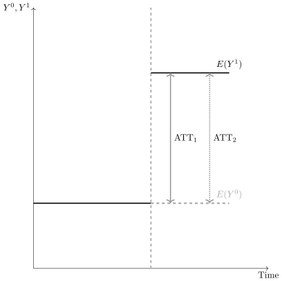
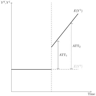
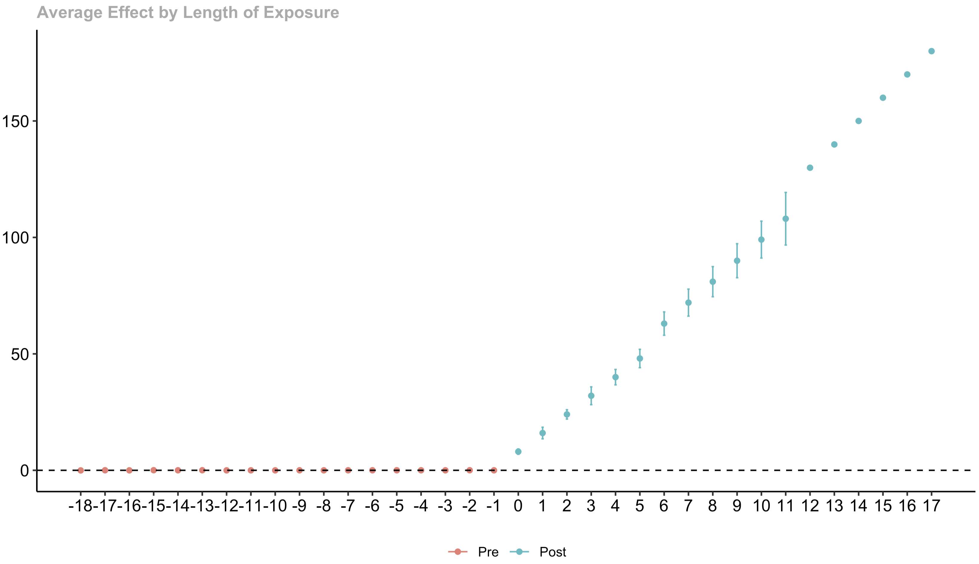
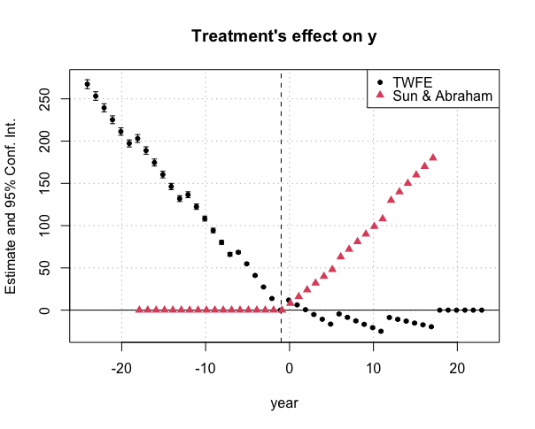
This next section might not be for everyone, but I’ve found it useful in my own work, and so have a lot of my students. I think of it as a kind of “design stage” in empirical work—the liminal space between getting the data and estimating causal effects. In practice, of course, those boundaries are fuzzy. But, it’s still worth carving out something that helps us undertake complete tasks in a slow, deliberate order.
What I’m offering here is a blueprint for researchers to consider when undertaking a difference-in-differences design. I’m not saying these stages should appear in your manuscripts—the art of writing a scientific paper is different from the craft of doing the analysis. They’re two separate skills, each requiring excellence and care, but expressed in different ways, and I am by no means an expert on either. Nevertheless, this section is designed to be a series of steps to follow when designing your project with the aim of helping researchers pay careful attention to subtle details that, left unnoticed, will cause an unwanted cascade of possible mistakes to the end.
The checklist that follows has been inspired by several people, conversations, and publications like Rubin (2008), A. Baker et al. (2025), Roth et al. (2023), informal talks by and conversations with Pedro Sant’Anna, Arkhangelsky and Imbens (2024), and, inevitably, my own take on things. If something in here seems off, odds are it’s my own take.
The point isn’t that checklists solve everything. It’s that in complex work—like surgery, aviation, or causal inference—people miss things. That’s why checklists have taken hold in medicine: when surgeons began using them for routine but critical steps, complication and mortality rates dropped sharply (Gawande 2011). They work because they are simple, they impose discipline, and they make it harder to skip steps.
Before we dive into our data exercise, let me lay out the ten steps of the checklist so you can see the full roadmap. Each step builds on the previous ones, and I’ve found it’s worth spending real time completing each one before moving to the next. The steps are:
To help illustrate the design checklist, we’ll be replicating part of a study on mental healthcare reform by Dias and Fontes (2024), which I’ll discuss below.
Diff-in-Diff Checklist
Step 1. Define Your Target Parameter: Potential Outcomes, Population, and Weighted Averages
Before you start your project, I’d like to suggest that you define your target parameter. This isn’t just a matter of saying you’re estimating “an average treatment effect” or even that you’re going after the \(\mathit{ATT}\). It’s more subtle than that. And while I could’ve opened the whole book with this discussion, I’ve saved it for now—because if you’ve made it this far, I figure your appetite for technical and nuanced stuff is probably a bit deeper than it would’ve been from the start. For this exercise, I’ll estimate the average treatment effect of CAPS introduction for the average Brazilian municipality. What do I mean by that exactly, though? Let me explain.
Recall that each individual in your dataset has two hypothetical potential outcomes: one under treatment (\(Y^1_i\)) and one under control (\(Y^0_i\)). The individual treatment effect is \(\delta_i=Y^1_i - Y^0_i\). But in causal inference, we rarely try to estimate individual effects. Instead, we estimate some average of those effects. The question is: Average over which units? Using what weights? Whatever your answer is—that’s your target parameter.
Defining a target parameter is more than a statistical exercise. It’s pragmatic, aesthetic, and maybe even ethical. There are many populations you could average over, and many ways to take an average. Your choice is a judgment call. You’re deciding that this particular average is what’s needed to help someone make a choice—that this parameter, but not another, gives a decision-maker the useful information they need to figure out whether to implement a similar mental health reform somewhere else.
Here’s why this matters: we don’t estimate treatment effects just for the sake of it. We estimate them to help people make decisions, shape better policies, resolve puzzles, understand how the world works. Even when we say we’re just “explaining the world,” we’re usually still trying to help someone avoid past mistakes or make better choices in the future.
So, your choice of target parameter is tied to use. It’s shaped by questions like: Which average treatment effect would be most useful to a decision-maker? Who is that decision-maker? What population do they have influence over? Are we talking about effects on individuals, municipalities, or entire regions?
Parameters are expressed using potential outcomes notation, averaged over a particular population, using particular weights. You don’t express parameters with regression coefficients—parameters exist outside of any model. The parameter comes first and guides model selection, not the other way around.
If you’re using difference-in-differences, you might assume your target parameter is just the \(\mathit{ATT}\). You’re right in a sense—we showed that a simple difference in two groups’ outcomes identifies the \(\mathit{ATT}\) under parallel trends. But here’s the key point: the level at which you average the outcomes for your diff-in-diff calculation dictates the level at which you’re averaging the treatment effects. Those weights depend on whether you’re estimating effects at the level of municipalities, states, or individuals—and whether you’re weighting those units equally, by population, or by something else entirely.
Let me show you why this choice isn’t as straightforward as it might seem. Table 10.18 involves six people—Alan, Betty, Chad, Daniel, Edith, and Frank—each with two potential outcomes under different mental health policy regimes. The policy is the introduction of community-based mental health centers (CAPS).
Here, \(Y^1_i\) indicates whether person \(i\) was murdered in a municipality where CAPS had been introduced, and \(Y^0_i\) represents whether the same person would have been murdered in the same setting without CAPS. So, \(Y^1_i = 1\) means that person was murdered in a municipality with CAPS, while \(Y^1_i = 0\) means they were not. Similarly, \(Y^0_i = 1\) means they would have been murdered without CAPS, while \(Y^0_i = 0\) means they would not have been. The difference, \(Y^1_i - Y^0_i\), is the causal effect of mental health reform on that individual’s homicide outcome.
If we add up the column labeled \(\delta\) and multiply by \(\frac{1}{6}\), we get \(\frac{1-1+0+0+1+1}{6}=0.33\). This means that on average, introducing CAPS causes 0.33 more murders when we use a dataset with six people. Notice the weight \(\frac{1}{6}\) is applied equally to each person.
Why is there a 6 in the denominator? Because we’re averaging over the units in our dataset. Since our dataset has six people, the ATE tells us that 0.33 additional people were murdered on average.
Now imagine that Alan, Betty, and Chad actually lived in a municipality with CAPS (not just hypothetically), so \(D_i=1\) for them only. What’s the average treatment effect for just these three people? Simple: \(\frac{1-1+0}{3}=0\). The average treatment effect for people living in CAPS municipalities is zero. This is the \(\mathit{ATT}\), where the average uses a uniform weight of \(\frac{1}{3}\).
Next, let’s look at a dataset of ten individuals shown in Table 10.19. The first eight people live in a large urban municipality (“municipality 1”) and the last two live in a small rural municipality (“municipality 2”). Each person has an individual treatment effect, and if you average over them, you get an ATE of 0.2: \(\frac{1+0+0+0+1+1+0+1-1-1}{10}=0.2\).
So, we’d say that CAPS causes 0.2 more homicides on average in this dataset of ten people. The weight is \(\frac{1}{10}\) applied equally to each person’s treatment effect. Why \(\frac{1}{10}\)? Because there are ten people in our dataset, and we’re taking a simple average over the ten treatment effects associated with each person.
But what if you didn’t have individual-level data? What if instead you had municipality-level data—just the two municipalities in Table 10.19?
The average treatment effect in municipality 1 is \(\frac{1+0+0+0+1+1+0+1}{8}=0.5\). The average treatment effect in municipality 2 is \(\frac{-1-1}{2}=-1\). So, CAPS causes 0.5 more homicide deaths on average in municipality 1, but 1 fewer homicide death on average in municipality 2.
If we average these two numbers, we get \(\frac{0.5-1}{2}=-0.25\). This gives us the average treatment effect for the “average municipality.” But remember—the average treatment effect over ten people was 0.2, which measures the effect for the “average person."
What if you only have municipality-level data but want the average treatment effect for the average person? Maybe you care about what happens to the most people. How do you get there with only municipality-level data? You weight by population \[
\begin{equation}
ATE_{\text{people}} = \frac{\sum_m ATE_m \cdot N_m}{\sum_m N_m}
\end{equation}
\tag{10.69}\]
which in our case would be: \[
\begin{eqnarray*}
ATE_p &=& \frac{(0.5 \times 8) + (-1 \times 2)}{8 + 2} \\
&=& \frac{4 - 2}{10} \\
&=& 0.2
\end{eqnarray*}
\tag{10.70}\]
So, you can move between these two averages—the average effect over people and the average effect over municipalities. But the question remains: should you weight by population?
There’s nothing wrong with the average effect over municipalities—if that’s your target parameter. But it matters because, as we just saw, the two can have different signs. That’s not just math—it reflects how treatment effects interact with population structure.
Why might they flip signs? According to Solon, Haider, and Wooldridge (2015), three ingredients drive this divergence: heterogeneous treatment effects, weights, and sorting. Let me illustrate with a simple example using my home state of Texas—though I’ll keep using the CAPS and victimization framework for consistency.
Texas has 31 million residents spread across 254 counties, but 13 million live in just five counties. That’s 41% of the population in just 1.9% of the counties.
For simplicity, imagine Texas has exactly 30 million people across 254 counties. Say 15 million live in five large counties (3 million each), and the remaining 15 million are spread equally across the other 249 counties (about 60,000 each).
For every person, we’ll generate \(Y^1\) and \(Y^0\) from a normal distribution, so that the state-level average treatment effect is exactly 2—that is, \(E[Y^1 - Y^0] = 2\). We’ll hold this constant across all simulations. The only thing we’ll vary is where people live—and wherever they live, they take their treatment effect with them.
Scenario 1: People randomly pick their county of residence
Imagine each person in Texas goes to a bingo machine with 254 balls—one for each county. They draw a ball, read the county name, and move there. After each draw, the ball goes back, so the next person samples with replacement.
Now suppose we have a dataset with both \(Y^1_i\) and \(Y^0_i\) for every person. We could compute each individual’s treatment effect, \(\delta_i = Y^1_i - Y^0_i\), and average all 30 million of those numbers. By design, the state-level ATE would be 2.
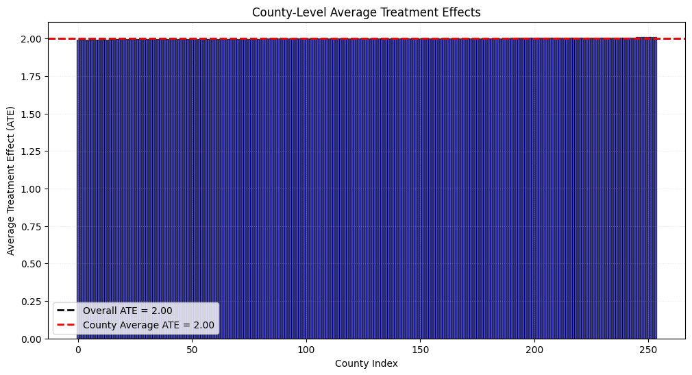
Here’s the interesting part: because residential decisions were random draws, they’re independent of both \(Y^1_i\) and \(Y^0_i\). That means they’re also independent of \(\delta_i\). So, the average treatment effect is the same in every county as it is statewide—each county’s ATE is 2. And if you average over 254 rows where each row equals 2, you get 2.
And notice: the average across all individuals is 2, and the average across all counties is also 2—even though in one case we’re averaging over 30 million people (each weighted by \(\frac{1}{30{,}000{,}000}\)), and in the other, we’re averaging over 254 counties (each weighted by \(\frac{1}{254}\)). The weighting “didn’t matter,” in the sense that you got the same answer either way. That means a researcher using individual-level data and another using county-level data would both recover the same average treatment effect regardless.
Scenario 2: People pick their county of residence based on the sign and size of their own individual treatment effects
Now imagine a different scenario. Line up all individuals in the state by their treatment effects, from lowest to highest. Starting from the right, assign the first 3 million people with the largest treatment effects to the first large urban county (say, Houston), the next 3 million to the second (Dallas), and so on—until all 15 million people with the largest treatment effects are in the five large urban counties. The remaining 15 million are distributed evenly across the 249 rural counties, about 60,000 people per county.
What have we done? We’ve assigned county residence based directly on treatment effect magnitude—putting the largest effects in cities and the smallest in rural areas.
If you average all individual treatment effects, you’ll still get \(E[Y^1 - Y^0] = 2\). The ATE is defined over individual units, which in this case is people, not places. It doesn’t matter where they live or which treatment group they’re in—as long as treatment effects are stable (SUTVA holds), the average across individuals stays the same.
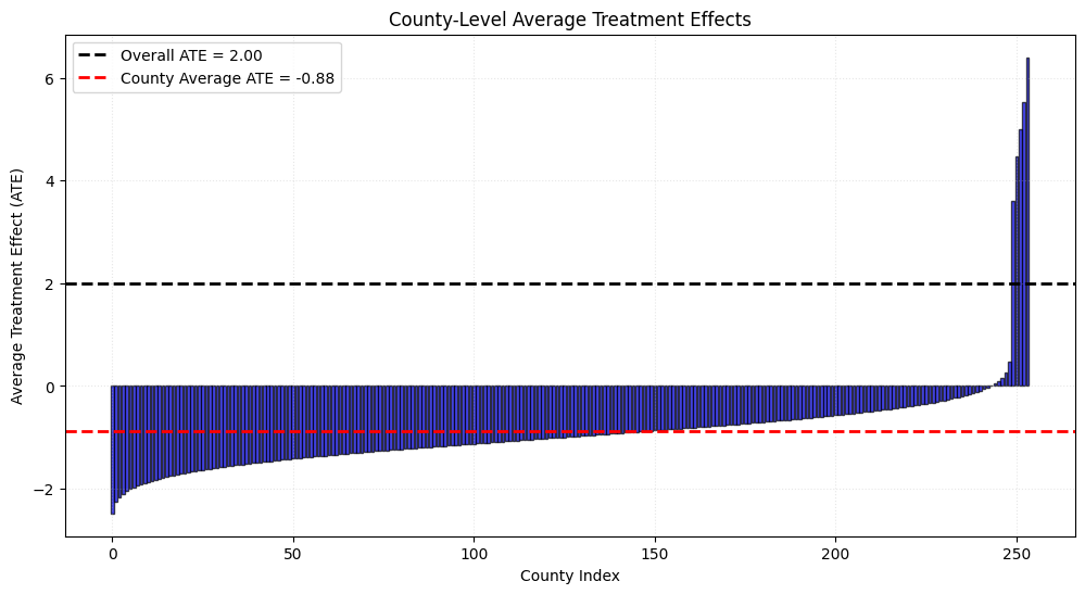
But that constancy does not carry over to county-level estimates. To illustrate this, I simulated the scenario above using “selection on \(\delta\)” assignment. First, I calculated the average treatment effect across all 30 million people. Then I aggregated outcomes to the county level, calculated the average CAPS effect per county, and averaged over all 254 counties. The results are shown in Figure 10.16.
In this scenario, the average treatment effect across counties is –0.88, but the average across all individuals in the state is still 2.0. Why? It’s the Perfect Doctor problem again: when treatment effects are heterogeneous and selection occurs on the gains from treatment, weighting matters. In the previous example, weighting didn’t matter because the effects were the same either way.
When people sort into groups based on their treatment effects—and those effects are heterogeneous—whether you weight by population will matter. The average for the state (the average effect for the average person) will generally not equal the average for the average county if there are heterogeneous treatment effects and sorting based on treatment effects. The average treatment effect across all people and the average treatment effect across all counties not only may be different—they may even have different signs.
This isn’t like TWFE, where negative weighting introduces bias. There’s nothing wrong with –0.88 versus 2. They’re both correct—just for different questions. But to someone unfamiliar with these distinctions, it’s perplexing and easy to misinterpret.
The only way to recover the same estimate across datasets is to weight by population. But first you need to figure out which parameter you want. As Solon, Haider, and Wooldridge (2015) point out, we weight in causal inference not to get representative estimates (like in surveys), but because our target parameter requires those weights. If we want to learn about the average person, we weight by population. If we want to learn about the average county, we don’t.
So, which should you use? You should weight only if weighting gets you the target parameter that you care about. We choose the target parameter, from all parameter options available to us, based on what our audience needs—usually a policymaker, because treatments help someone make better decisions. Ask yourself: Who is the decision-maker? What do they control? Which populations can they influence?
In the US, that might be the President, a governor, a legislator, a mayor, or even the local sheriff’s department. Each might care about a different parameter—for legitimate reasons.
Here’s an example: local communities in the US have considerable autonomy to set their own laws. Sometimes they enact policies that are technically illegal under federal law. Since 2019, over a dozen US cities have voted to decriminalize psychedelic plants like magic mushrooms, even though psilocybin is federally controlled. In these cities, law enforcement won’t arrest and prosecutors won’t charge.
Who predicted that cities—not states or the federal government—might lead on psychedelics? Yet it’s happened repeatedly.
So, what do you want to know? The average effect on the average person? The average school? The average hospital or neighborhood? These are different units. Depending on how treatment effects vary and how units sort, you could get different results. All might be “true.” All might be misinterpreted.
You must choose and justify that choice. Even refusing to choose is itself a choice. So, what is an argument for choosing not to weight? Consider these.
First, communities matter, and if they can control their own fate, and pass their own policies, then treating counties as the desirable unit is justifiable. Maybe local communities can choose mental health policies they believe are best for their residents—who probably didn’t pull their address out of a bingo ball machine. If municipalities have autonomy to chart their own path, then maybe the average over municipalities—not one weighted heavily toward the largest cities—is more relevant for the decisions those communities face.
Second, consider this more pragmatic reason: what if parallel trends holds for the average municipality but not for the average person? Maybe large counties and small counties have different untreated trends. Weighting by population might break parallel trends—or fix them. Your identification rides on this choice.
So, let’s go back to where we started. What is my target parameter? If I want to know the average effect of CAPS on the average person, then I have to weight my analysis by municipality population. But, what if I want to know the average effect of CAPS on the average municipality? In that case, I won’t use municipality populations as weights.
Hopefully, now you can see that both the average effect for the average person, and the average effect for the average community, are “real parameters.” They are both real, and they are not the same, and which one you want to target is your choice. If you are unsure, you might want to see if you can obtain both, but just remember, they are not the same, and they do not have therefore the same interpretation.
But for our purposes, I’m going to not weight, and I leave it to you to repeat this entire exercise if you feel the call to do it by weighting. See A. Baker et al. (2025) for a bit more about this, as well as Solon, Haider, and Wooldridge (2015).
Step 2. Count the Units in Your Cohorts
The second step is to create a table that counts the number of units treated in a given time period, the number that are never-treated, and the number that were always-treated. I have an example in Table 10.20. It contains information about each cohort’s size, measured as the number of municipalities in that group, as well as the size of the never-treated cohort and the 2002 cohort that was treated the very first year of the dataset. I call them the always-treated.
This table shows the number of municipalities that received a CAPS center in each year as well as the share of treated municipalities (2003–2016) that each timing cohort makes up. The 2002 cohort is excluded from the analysis as these are always-treated units.
I have created a third column to help you see even more about cohort size—the share of treated municipalities that are in each cohort. Having both the absolute counts, as well as the shares themselves, can help you and others see which groups are disproportionately influential in any aggregations you do later. Look at Table 10.20: the 2006 cohort is the largest at 16% of all treated units, while the 2003 cohort is the smallest at only 3%. The 2006 cohort will be much more influential in any aggregation, and that’s something we should know upfront.
Step 3. Plot Treatment Rollout
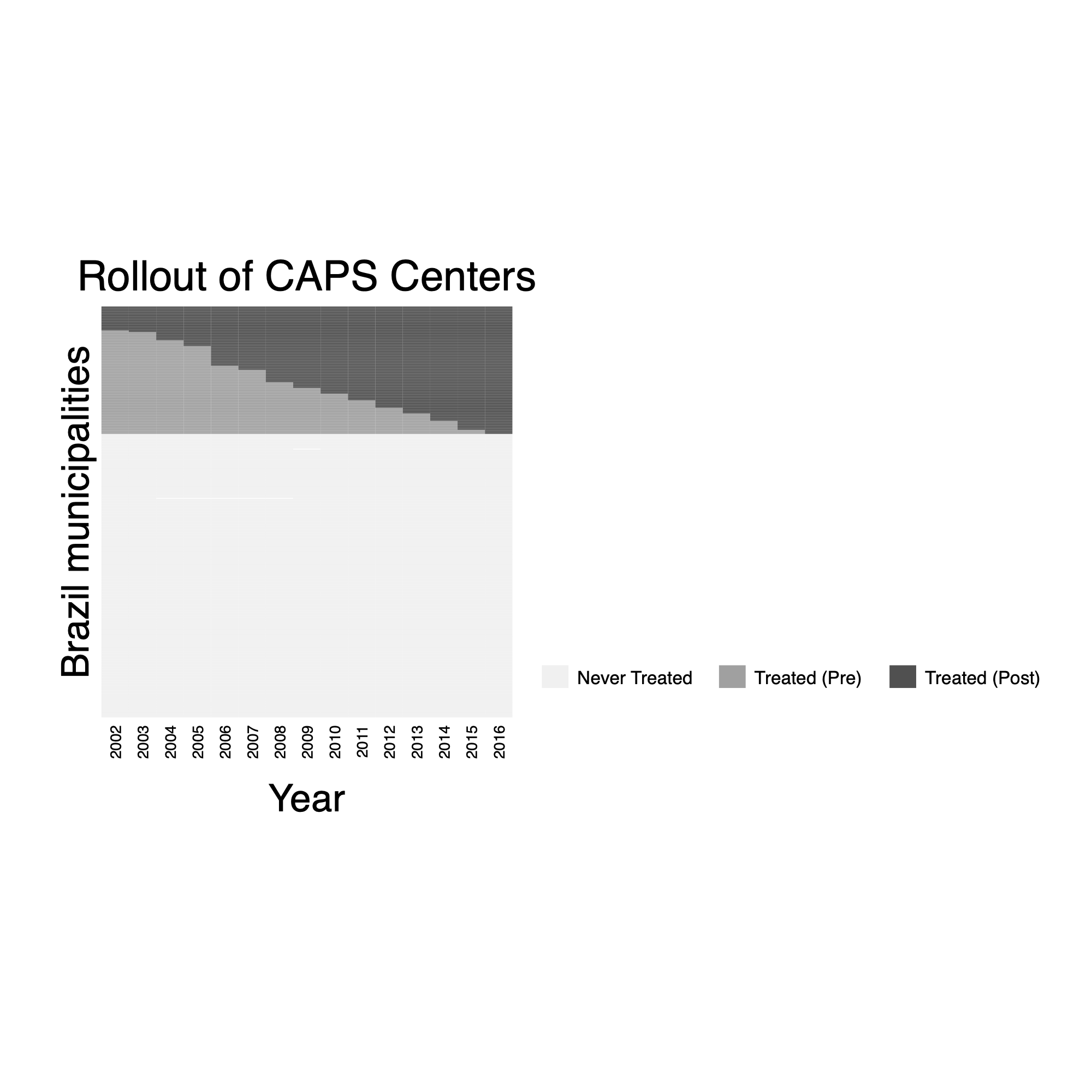
Since CAPS were introduced at different times across Brazilian municipalities, it’s essential to plot the rollout over time. This visualization allows us to track which municipalities received CAPS in which years. It will also clarify the pattern of CAPS introduction, helping us understand treatment timing across the panel, as well as visualize (for our own sake if no one else) how large the never-treated donor pool is. You can either program this yourself, or use a canned routine like panelView (Mou, Liu, and Xu 2023). I present the code below and produce the plot in Figure 10.17.
* Step 3. Plot Treatment Rollout
panelview homicide_rate ca, prepost bytiming i(cod) t(ano) type(treat) xtitle("Year") ylabel(none) ytitle("Brazil small regions") title("Rollout of Local Area Clinics") legend(label(1 ``Never Treated") label(2 ``Treated (Pre)") label(3 ``Treated(Post)"))
A graph like Figure 10.17 is very useful both to you and your audience. It’s a great way to visualize the differential timing in a way that many people can immediately understand. They can see with their own eyes when a municipality’s CAPS introduction starts, how long they were and were not treated, and also who is and is not going to be the comparison group. The top section shows municipalities that switch from pre- to post-treatment, illustrated with colors that go from light gray to darker gray. The bottom section shows the never-treated municipalities in an even lighter gray. They can see the panel dimensions directly, too. The ability to understand the idea of a not-yet-treated comparison group is extremely transparent because you can see everyone who hasn’t been treated yet at any given time.
Step 4. Choose Between Unconditional and Conditional Parallel Trends
We know that simple comparisons outside of a randomized trial are contaminated by selection bias. Interestingly, the parallel trends assumption faces exactly the same challenge—only instead of worrying about selection bias with respect to the levels of \(Y^0\), we’re worried about selection bias with respect to the trends in \(Y^0\).
Therefore, the same logic applies here: was treatment assignment random with respect to trends in the untreated potential outcome? If so, then covariates aren’t needed for identification. But that’s a strong assumption, and in most real-world settings, the selection of covariates as controls becomes crucial for making the conditional parallel trends assumption more plausible.
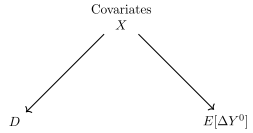
Which covariates should you control for, though? In practice, there are two types of covariates that we typically want to include when shifting from unconditional parallel trends to the conditional parallel trends assumption, and they are:
Covariates that determine the untreated potential outcome trends, \(\Delta E[Y^0]\)
Covariates that determine which units are in the treatment group versus control, \(D\)
The first requires thinking about the ordinary determinants of potential outcomes, but the latter requires knowing about your program—why it happened when it did, where it did. For our CAPS example, think about what might drive both homicide trends in Brazilian municipalities and CAPS placement decisions. Municipalities with deteriorating public safety conditions might be more likely to receive CAPS, but they might also have different underlying homicide trends. Economic conditions, population changes, or local political factors could affect both CAPS introduction timing and violence patterns. Consider the following DAG in Figure to also aid you in thinking through what to include in your model.
What I find helpful about thinking through covariates this way is that it illustrates that we need variables that do two things: they’re imbalanced between treatment and control groups (i.e., \(X \rightarrow D\)), and they cause trends in \(Y^0\).
In our CAPS case, we want covariates that experts would say were the “ordinary drivers” of municipal homicide trends during our study period. We’d probably get a list like: economic conditions, demographics, urbanization, policing resources, and social programs. From our data, we have measures of demographics, population, and economic indicators like GDP per capita and conditional cash transfer spending.
But here’s the rub: reasonable people can disagree about which covariates matter, and those disagreements can lead to significant swings in results. This is one of those areas where specification searching and \(p\)-hacking can easily sneak in, DAG or not. A researcher estimates a model with one set of controls, maybe doesn’t like the results for some reason or another, ends up trying another and another, and before they know it, they’ve been specification searching, probably without meaning to whatsoever. My hunch is that a DAG will not protect against that, even if a DAG is, in my opinion, important for reasoning through the treatment assignment mechanism and the drivers of trends.
To guard against this level of researcher subjectivity, we may want to consider adopting a data-driven approach alongside our use of common sense and domain expertise. Some researchers use machine learning methods to select covariates using only the untreated potential outcomes—in our case, dropping all treated units, so we only observe \(Y^0\). The logic is simple: if we’re trying to predict trends in untreated potential outcomes, restrict the sample accordingly, and select covariates that are highly predictive of those \(Y^0\) trends.
Selecting the covariates needed for both conditional parallel trends and common support is a thorny, but unavoidable, challenge. The key is being transparent about your choices and to make these choices well in advance of ever peeking at the results.
Step 5. Pick your control group
The plausibility of the parallel trends assumption—whether unconditional or conditional—depends critically on your choice of control group. It is entirely possible that one group may satisfy parallel trends while another may not. In some studies, using the never-treated group makes sense; in others, the “not-yet-treated” group—units that have not yet received treatment by a given year—may be more appropriate.
There is no universal rule, but here is a useful guideline:
The more random the treatment assignment is, the less consequential your control group choice tends to be.
The less random the assignment is, the more important unobserved selection factors will play in your control group choice.
This decision is closely tied to covariate imbalance, which is why it should be made at the design stage. In our case, I believe CAPS introduction was not random, which leads me to focus on covariates and select the not-yet-treated group as my primary control group.
In our sample, we work with municipality-level data from 2002 to 2016, excluding municipalities that were always treated (the 2002 cohort). That leaves us with municipalities across the treatment timing spectrum, including 3,836 that never received CAPS by 2016. These municipalities are eligible to serve as controls, either as the sole control group or as part of a larger group that includes the not-yet-treated.
So, what is the right choice? That depends on what you believe about treatment assignment and unobserved confounding. My feeling is that at least the eventually treated municipalities actually got the treatment at some point. When treatment is random, it doesn’t matter, but when it’s not, you have to think carefully about selection. I suspect the never-treated may be too dissimilar—perhaps they’re rural municipalities that lack the infrastructure or population to justify CAPS, or they have different political economies that affect both CAPS placement and violence trends.
What matters most is not whether you agree with my choice, but that you make this decision now—before looking at any results. Choosing your control group after seeing estimates can introduce researcher bias. Committing to this decision up front helps ensure that your choice is grounded in logic, design principles, and expertise—not in whether you happen to like the results.
For our analysis, I will use the not-yet-treated group as my controls. This means my control group will include both future treated municipalities (before they get CAPS) and never-treated municipalities. If you really don’t have an opinion about which is better, then you probably have no choice but to try both and see how robust your results are.
Step 6. Check Covariate Imbalance
Before we estimate treatment effects, we need to check whether municipalities that received CAPS look similar to those that didn’t on observable characteristics before treatment began. This is our “apples to apples” test. If early CAPS adopters were systematically different from nonadopters—say, wealthier, more urban, or with different demographic profiles—then any differences in outcomes we observe might reflect these pre-existing differences rather than the causal effect of CAPS.
For this analysis, I’m using the same set of covariates that Dias and Fontes carefully selected in their original study. These include economic indicators (log GDP per capita, Bolsa Família transfers), demographic composition (population shares by age and gender), geographic characteristics (rural share, municipality area, distance to capital, altitude, rainfall, temperature), and baseline social conditions (illiteracy rate, poverty share, Theil inequality index). Many of these are interacted with time trends to capture differential trajectories across municipalities with different baseline characteristics.
Why use their covariate set rather than selecting my own? It’s about transparency and avoiding the temptation to cherry-pick variables that make our analysis look better. Dias and Fontes made these choices based on theory about what drives both CAPS placement and homicide rates. By using their specification, we’re building on established research rather than hunting for the combination of controls that gives us the “best” results.
To check for imbalance, I follow A. Baker et al. (2025) and calculate the standardized difference in means between treatment and control groups: \[
\begin{equation}
\text{Std. Diff}_\omega = \frac{\overline{X}_{\omega,T} -
\overline{X}_{\omega,C}}{\sqrt{(S_{\omega,T}^2 + S_{\omega,C}^2)/2}}
\label{eq:norm_diff2}
\end{equation}
\tag{10.71}\] where \(\overline{X}_{\omega,T}\) and \(\overline{X}_{\omega,C}\) are the sample averages of covariate \(X\) for treatment and control groups, and \(S_{\omega,T}^2\) and \(S_{\omega,C}^2\) are the sample variances. Following Guide W. Imbens and Rubin (2015), standardized differences above 0.25 in absolute value suggest problematic imbalance that we’ll need to address by including the covariate in our model.
Table 10.21 shows the treatment and control group means for each cohort’s baseline year, along with the standardized differences. The key column to focus on is the standardized difference—this tells us whether treated and control municipalities look systematically different on each characteristic before CAPS arrived.
The covariate balance table reveals some concerning imbalances between municipalities that eventually received CAPS and those that never did. Several demographic variables show standardized differences well above the 0.25 threshold, particularly for older male age groups (standardized differences ranging from \(-\)0.384 to \(-\)0.757) and young women aged 20–29 (0.745). Rural municipalities were much less likely to receive CAPS (\(-\)0.603), and there are notable differences in population size (0.692) and health spending (\(-\)0.450).
Notes: Propensity scores estimated using probit regression of ever-treated status on 2002 baseline covariates. Sample excludes municipalities that received CAPS in 2002 (always-treated cohort). Treated group includes municipalities that received CAPS between 2003 and 2016; control group includes never-treated municipalities.
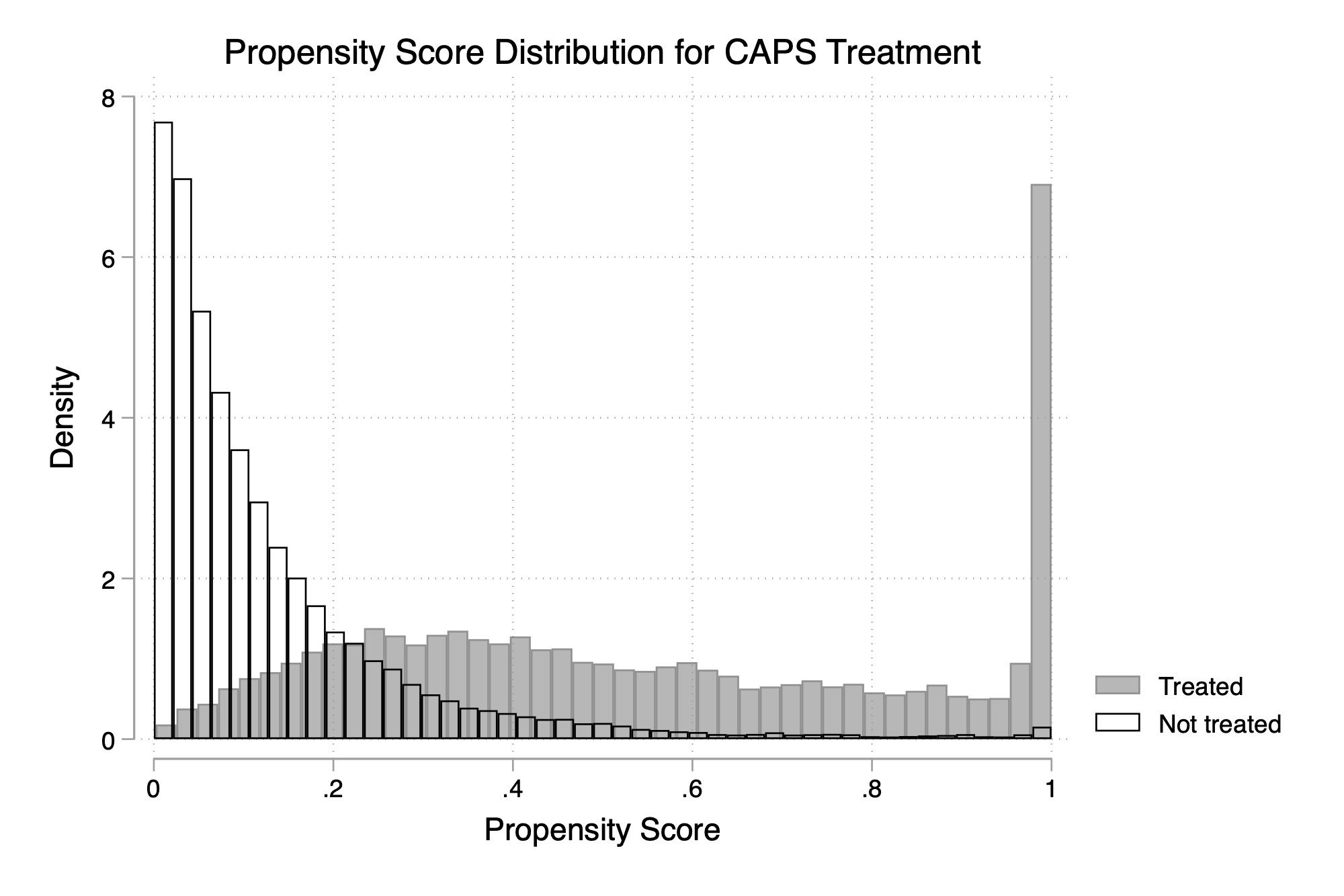
Despite these imbalances in individual covariates, I recommend estimating the propensity score to visualize the overlap in the dimensions of the covariates too (A. Baker et al. 2025). For illustrative purposes, I estimated a propensity score equation using the ever-treated as my treatment group and the never-treated as my control group, excluding the always-treated 2002 cohort. I focused only on 2002, but for differential timing cases, it would be better if you were to examine the propensity scores that would be used for estimating each \({\mathit{ATT}}(g,t)\), which means as many propensity score equations as you have treatment groups. But for the sake of illustration, I only do one.
The propensity score distributions show reasonable overlap between the ever-treated and never-treated control groups (Figure 10.19). This suggests that while municipalities differ on specific characteristics, we can still find comparable control units for most treated municipalities based on their overall probability of treatment.
It is very tempting to move on, but we shouldn’t, and the reason is because I will be reanalyzing Dias and Fontes (2024) using Callaway and Sant’Anna (2021). And recall that Callaway and Sant’Anna (2021) incorporate covariates into estimation using the propensity score, outcome regression or both with double robust. When the propensity score is used, we reweight the control group units using the inverse probability weighting formula:
\[
IPW=\frac{p(x)}{1-p(x)}
\tag{10.72}\] This formula can be a problem for extreme outliers in the control group. And, we have such outliers in my propensity score distribution from that illustrative example, which are not easily detected using a histogram plot only. It is better to also check manually, and when I did, I found several municipalities in the control group with propensity scores above 0.995. I found one in particular that had a propensity score of 0.999971. Is that large? Does that matter? Let’s calculate its inverse probability weight to see: \(\frac{0.999971}{1-0.999971} = 34,481\). What this means is that a single control group unit’s values will be weighted by over 34,000! Such extreme weights can make our estimates highly sensitive to outliers, and even flip the sign, therefore making them potentially unreliable. Which is why I encourage you to carefully review the propensity scores yourselves to verify it.
global controls pop20a29anoslino pop40a49anoslino pop50a59anoslino pop60a69anoslino pop70a79anoslino pop10a19anosnino pop20a29anosnino pop50a59anosnino pop60a69anosnino pop70a79anosnino rural theil2000trend lnsaudepctrend poptotaltrend

gen     treat=0 if g==0
replace treat=1 if g>0 & g~=2002
probit treat $controls if ano==2002
predict pscore
label variable pscore ``Propensity score"

twoway (histogram pscore if treat==1,  color(gray%70)) ///
       (histogram pscore if treat==0,  ///
       fcolor(none) lcolor(black)), ///
       legend(order(1 ``Treated'' 2 ``Not treated")) ///
       title("Propensity Score Distribution for CAPS Treatment") ///
       xtitle("Propensity Score") ///
       ytitle("Density")

su pscore if treat==0 & ano==2002
su pscore if treat==1 & ano==2002

count if pscore>0.995 & treat==0 & ano==2002 // 11 municipalities
drop if pscore>0.995 & treat==0 & ano==2002
Step 7. Plot Average Outcomes Across Cohorts
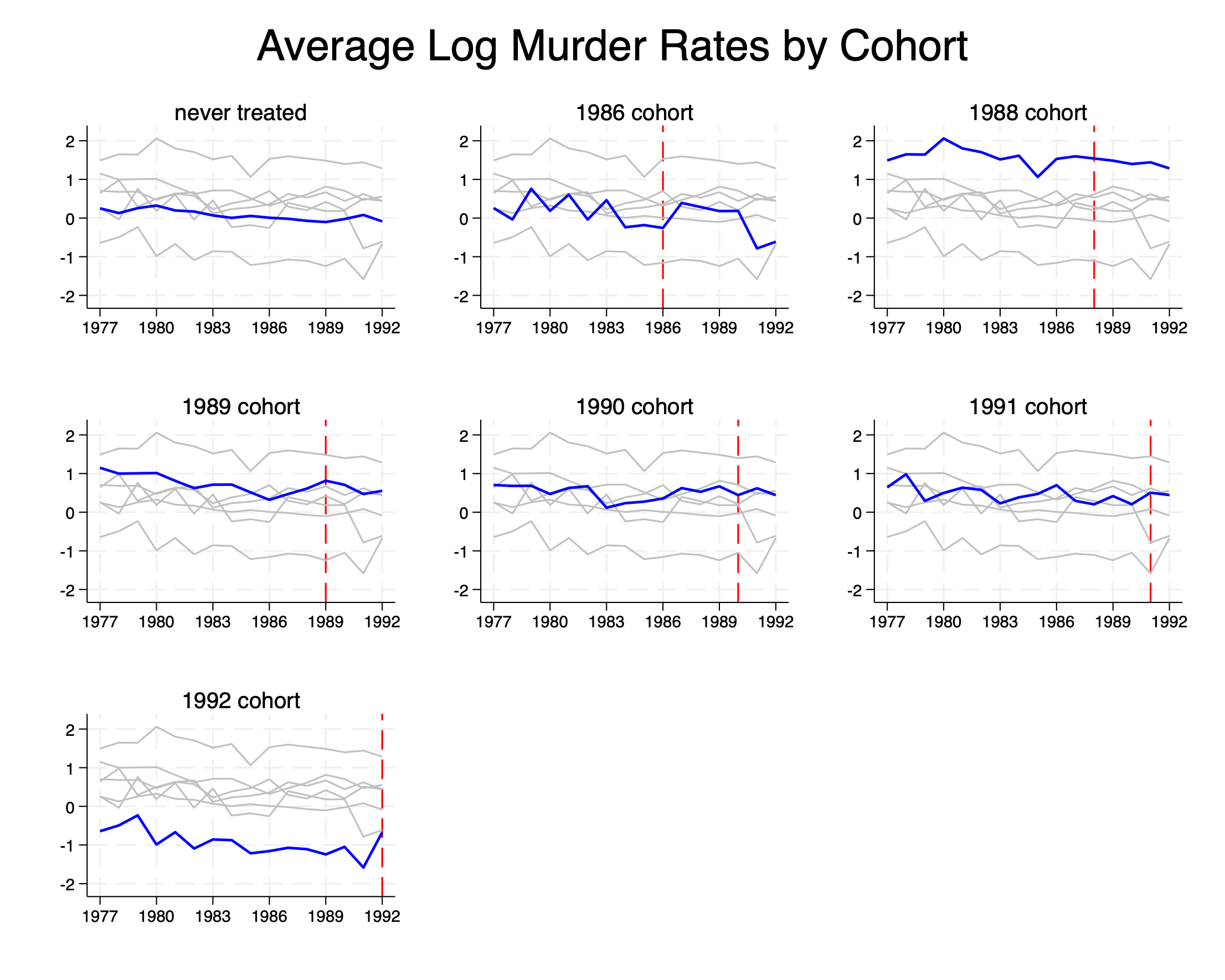
Up until now, we have gone through six steps without ever peeking at the outcomes. But now at Step 7, we turn to the outcomes. In Figure 10.20, I plot the evolution of the average homicide rate for the never-treated municipalities and each of the treatment cohorts—including the 2002 always-treated cohort, even though we will ultimately exclude them for analysis later.
What stands out are not major differences in trends, but in levels. Different treatment cohorts show notably different baseline homicide rates, with some cohorts consistently higher or lower than others throughout the pretreatment period. Most notably, the never-treated municipalities have the lowest homicide rates over this entire period. Why is that?
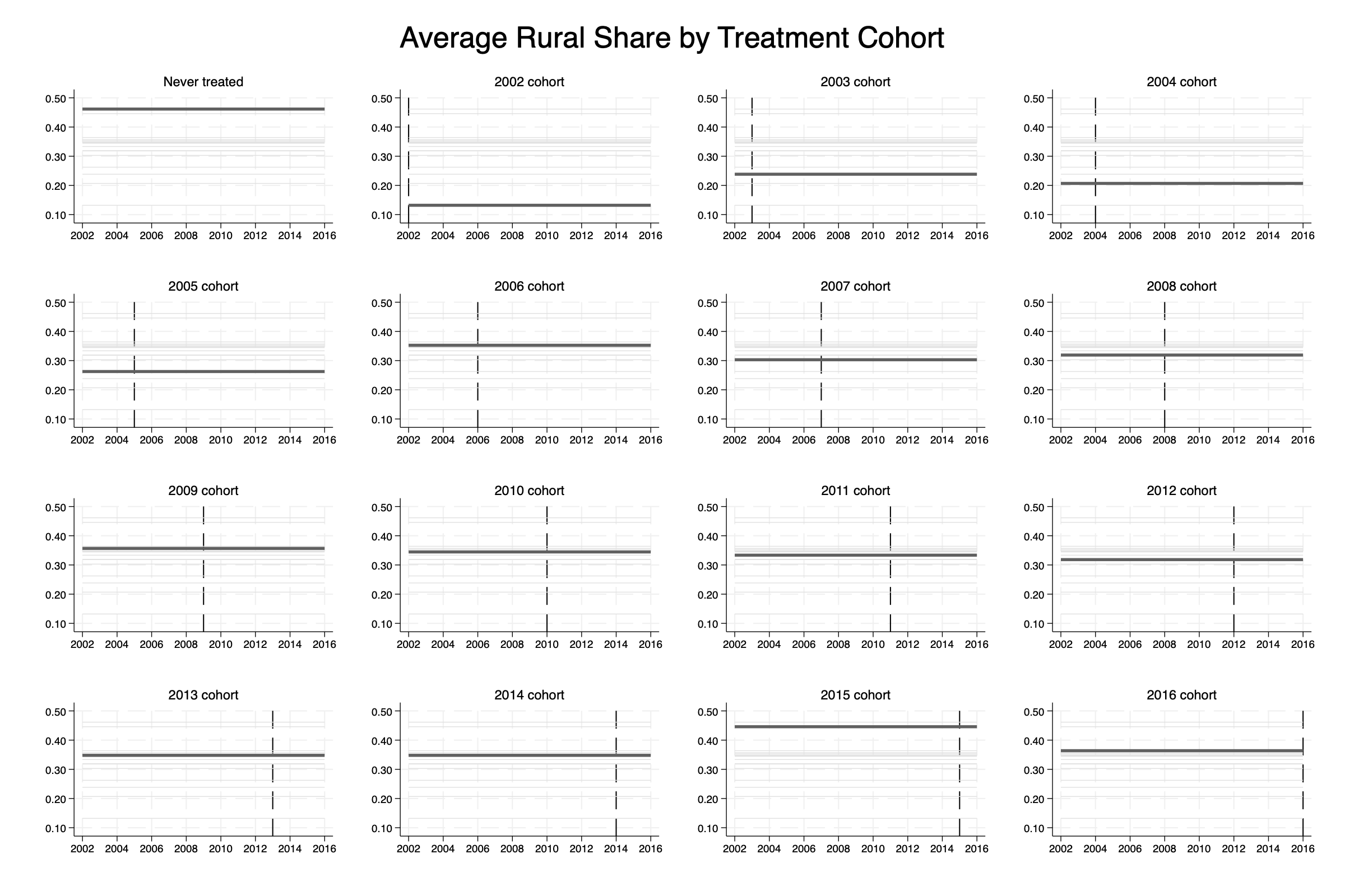
If we go back to our covariate imbalance table (Table 10.21), I think some of it becomes apparent. The never-treated municipalities are considerably smaller in population (standardized difference of 0.692), and they are much more rural (standardized difference of –0.603, meaning treated municipalities are less rural). This pattern becomes even clearer when we look at Figure 10.21, which shows the rural share across cohorts. The never-treated municipalities are predominantly rural throughout the entire period.
This matters because the geography of violence in Brazil shows a clear urban concentration. According to the Brazilian Public Security Forum, in 2020, 76% of all homicides in Brazil (37,629 out of 49,221 total) occurred in urban areas (Segurança Pública 2022). This pattern mirrors what we see in the United States, where the vast majority of homicides also occur in urban rather than rural areas. It’s not that homicide never happens in rural areas, but it happens at much lower frequency, both in absolute numbers and in rates per capita. We see exactly this pattern both in our rollout figures and in our covariate balance table.
As Kahn-Lang and Lang (2019) remind us, level differences across groups are not something to ignore or casually “difference away,” as they may indicate that the drivers of future untreated potential outcome trends—many of which are counterfactual—are also driving these level differences. This connects directly to what we saw in our covariate balance check. Our treatment cohorts differ substantially in their demographic profiles, economic conditions, and geographic characteristics. If those same covariates that predict CAPS placement also influence trends in homicide rates, they could explain both the level disparities we observe and potentially different trajectory patterns that would violate parallel trends.
And we see here how useful this disciplined approach is becoming. Here we are at the 7th step and we still haven’t run any estimation models. This 7th step was actually the first time we ever “peeked” at the outcomes (Rubin 2008), and I think that’s something to pat ourselves on the back for. We are now ready to estimate some causal effects!
Step 8. Estimator Selection and Assumptions
Assuming that we feel pretty good about the design of our study, then we’re ready to estimate some treatment effects! I’m going to use the Callaway and Sant’Anna estimator to estimate the average effect of the CAPS rollout on homicide rates. You might notice this is different from what the original authors did—Dias and Fontes used the estimator by Chaisemartin and D’Haultfoueille (2020). But this gives us a great chance to replicate their findings using a similar but distinct approach, which is always a good robustness check.
There are a couple of other methodological choices I’m making that differ slightly from the original paper, and I want to be transparent about them. The original paper estimated pretrends using what they call the “short comparison” method, where each pretreatment coefficient gets estimated as a 2×2 difference-in-differences compared to its immediate neighbor. As they note in footnote 2, this makes their method different from traditional TWFE, which can only calculate pretrends using the “long differences” approach.
I’m going to estimate every coefficient using long differences instead. Why? It’s based on my personal, somewhat philosophical, opinion that the correct specification of a falsification test is to use the same model we used for estimating treatment effects applied to placebo outcomes. Difference-in-differences estimates of treatment effects can only use long differences with the fixed baseline period, and therefore to check for pretrends, I want to do the same.
I’m also going to present two figures to make an important point about event study design. First, I’ll show you the entire set of pre- and post-treatment coefficients, which will look “imbalanced” in relative event time—we’ll have different numbers of treated units contributing to each coefficient. Then I’ll show you a more traditional event study with four periods before and four periods after treatment, and I’ll explain why this restriction matters for interpretation.
For the actual estimation, I’m including all the covariates from our earlier balance table that showed standardized differences above 0.25 in absolute value, following the guidance from A. Baker et al. (2025). These are the variables where we found concerning imbalance between our treatment and control groups, so including them should help make our treatment and control groups more comparable.
I’m going to only present the event study plots, but remember that they are weighted averages over the individual \({\mathit{ATT}}(g,t)\) for those groups that have those leads and lags.
global controls pop20a29anoslino pop40a49anoslino pop50a59anoslino pop60a69anoslino pop70a79anoslino pop10a19anosnino pop20a29anosnino pop50a59anosnino pop60a69anosnino pop70a79anosnino rural theil2000trend lnsaudepctrend poptotaltrend

* Use csdid2
csdid2 homicide_rate $controls, gvar(g) ivar(cod) time(ano) long2 method(drimp) notyet

estat event
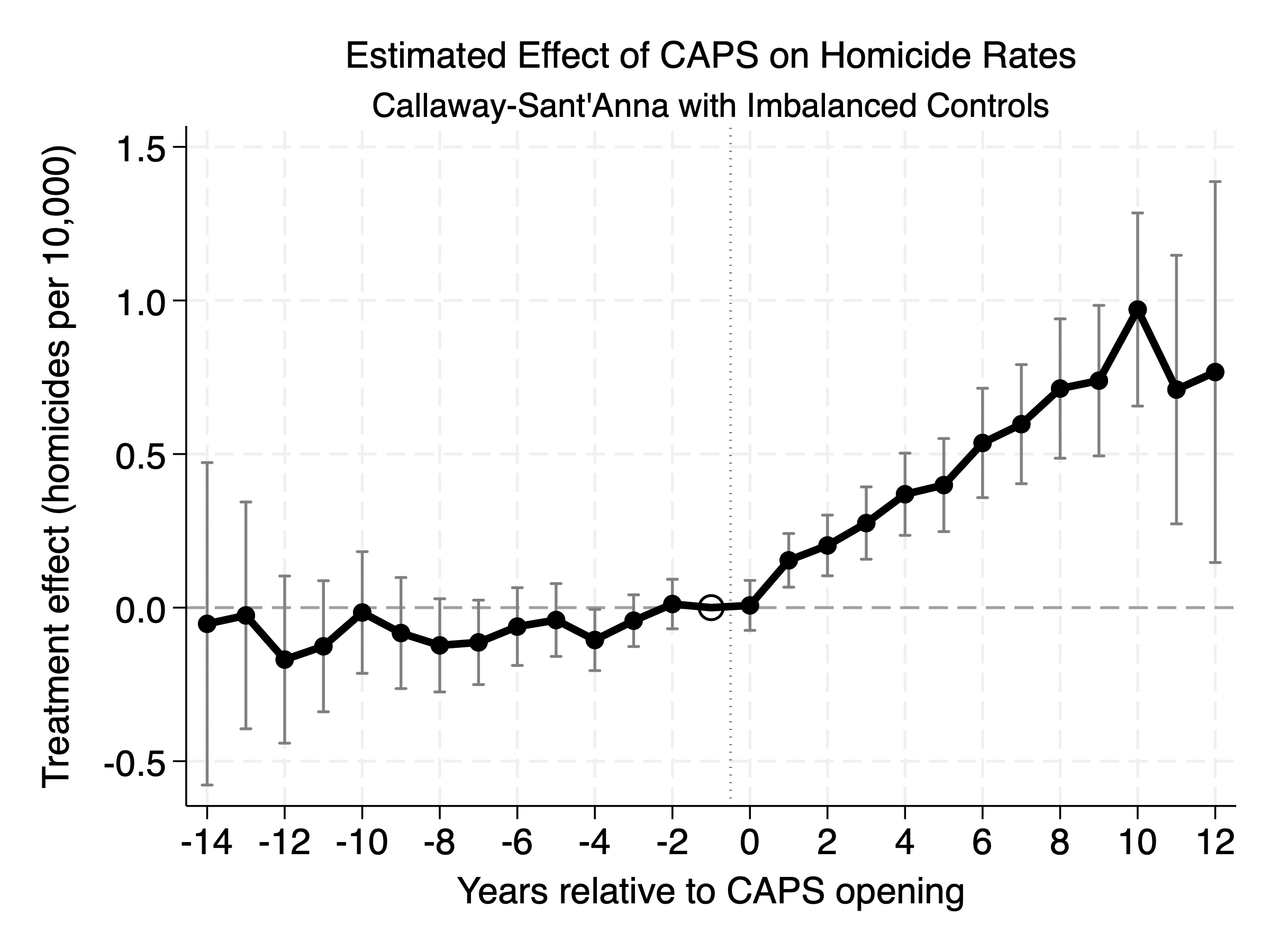
Figure 10.22 shows the Callaway-Sant’Anna estimates of the average effects of CAPS on homicide rates. I’ve plotted the entire set of coefficients here because I think it’s instructive to see what happens when we don’t restrict our event study window. Most people don’t realize they should think carefully about this choice, and frankly, I’ve made this mistake myself in the past.
Let me emphasize a few key features of these results. First, the pretreatment trends are small and not statistically significant. The average pretreatment effect is \(-0.073\) with a standard error of 0.069 (\(p =\) 0.289). As I mentioned earlier, we estimated these using long differences rather than the short comparison method used in the original paper, but the pretrends don’t look particularly worrisome.
Second, these estimates use the not-yet-treated control group, which includes both the never-treated municipalities and all future-treated cohorts that haven’t received CAPS yet at each point in time. This means a municipality that gets CAPS in 2010 serves as a control unit for municipalities treated in 2005, 2006, 2007, 2008, and 2009.
Third, and this is the important part I want you to see: the estimates at both ends of the event study are coming from very few cohorts. The far-left coefficients (distant pretreatment periods) are driven entirely by late adopters, while the far-right coefficients (distant post-treatment periods) come only from early adopters. For instance, the 11th post-treatment lag is a weighted average of the \({\mathit{ATT}}(g,t)\) estimates for groups that were treated at least 11 years prior to the end of the panel, which is 2003, 2004 and 2005.
Notes: Callaway-Sant’Anna estimates of CAPS effects on homicide rates using all available leads and lags. Pretreatment average: –0.073 (SE = 0.069), Post-treatment average: 0.495 (SE = 0.080). Control group is not-yet-treated municipalities. Estimates use long differences and include imbalanced covariates as controls.
The results do show fairly strong positive effects on homicide rates that appear almost immediately after CAPS opening. The effects grow over time, reaching about 1.0 additional homicides per 10,000 people by the 11th year post-treatment. To put this in perspective, this would represent roughly a doubling of homicide rates over a baseline of about 1.25 per 10,000 (assuming parallel trends held that long). But here’s the problem: this long-term estimate is based on very few municipalities and extends far into the future where our identification assumptions become increasingly questionable.
This is exactly why I don’t recommend plotting everything without thinking carefully about balance across event times (A. Baker et al. 2025). The long-term effects are identified off a smaller number of municipalities than the short-term effects because it can only be identified off the early adopters. Which is fine—under conditional parallel trends, those would be unbiased. It’s just that under heterogeneous treatment effects, too, the long-term trends are no longer what an intelligent layperson seeing these graphs may understand them to be.
So, let’s look at this with an eye towards having some balance across event time. Rather than showing this unbalanced view, let’s restrict ourselves to four periods before and four periods after treatment.
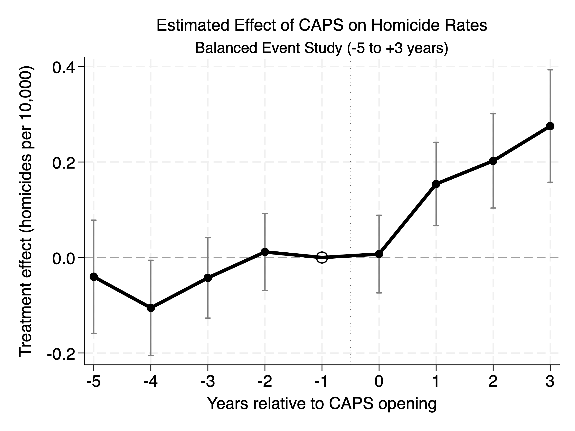
Notes: Callaway-Sant’Anna estimates restricted to –5 to +3 years around CAPS opening. This provides better balance across event times, with 10–11 cohorts contributing to most estimates. Baseline homicide rate across all cohorts is 1.38 per 10,000 people.
Figure 10.23 shows the same estimates but restricted to a more balanced window of –5 to +3 years around treatment. This restriction gives us much better balance across event times. For the 3rd post-treatment lag, we have contributions from everyone up to the 2013 cohort—that’s 11 different treatment cohorts. For the –5 pretreatment lead, we have the 2007 to 2016 cohorts contributing—that’s ten different cohorts. It’s not perfect balance, but it’s much more reasonable than relying on just 2–3 early adopters for our long-term estimates.
The story from this more balanced view is quite clear. The post-treatment effects are consistently positive, excluding the year of treatment itself (which makes sense since CAPS may take time to become fully operational and influence community dynamics). The pretreatment trends look pretty good, too, though the 4th lead is negative and statistically significant showing signs of upward trends. This is something we will investigate more carefully with Rambachan and Roth (2023) in the next step, but for now, let’s focus just on interpretation.
By the third year post-treatment, we’re seeing an effect of about 0.275 additional homicides per 10,000 people. To put this in context, the average baseline homicide rate across all our cohorts (excluding the always-treated 2002 group but including the never-treated) is 1.38 per 10,000. This represents roughly a 20% increase in homicide rates three years after CAPS implementation—a substantial and concerning effect that appears to persist over time, depending on our willingness to continue reading the event study to further and further lags based on fewer and fewer treated units (Figure 10.22). But this is a conservative approach to event study design that gives me, at least, some comfort that what we were finding in the long event study appears to be robust when using a balanced event study design.
Step 9. Checking for Parallel Trends Violations
Now we check for the sensitivity of the estimates using the Rambachan and Roth (2023) “honest DiD” approach. One reason to do this, if nothing else, is that there are some slight pretrends visible in Figure 10.23, and rather than reject or accept based on subjective grounds, we can actually use those pretrends to create bounds on our estimated treatment effects by allowing for parallel trends violations that are multiples of that pretrend violation.
This moves us away from subjective researcher discretion towards something more theoretical that is based on the ad hoc heuristic that has been used with diff-in-diff for decades—the evaluation of the pretrends for reasoning about parallel trends. Here’s the core idea in our application: if we’re going to use pretrends to evaluate the credibility of parallel trends (which is what we’ve all been doing informally), why not be principled and systematic about it. The Rambachan and Roth (2023) approach takes the worst-case violation we observe in the pretreatment period and asks: “What if parallel trends were violated by up to M times that amount in the post-treatment period?” If M=1, we’re allowing post-treatment violations as large as the worst pretreatment violation. If M=2, we’re allowing violations twice as bad.
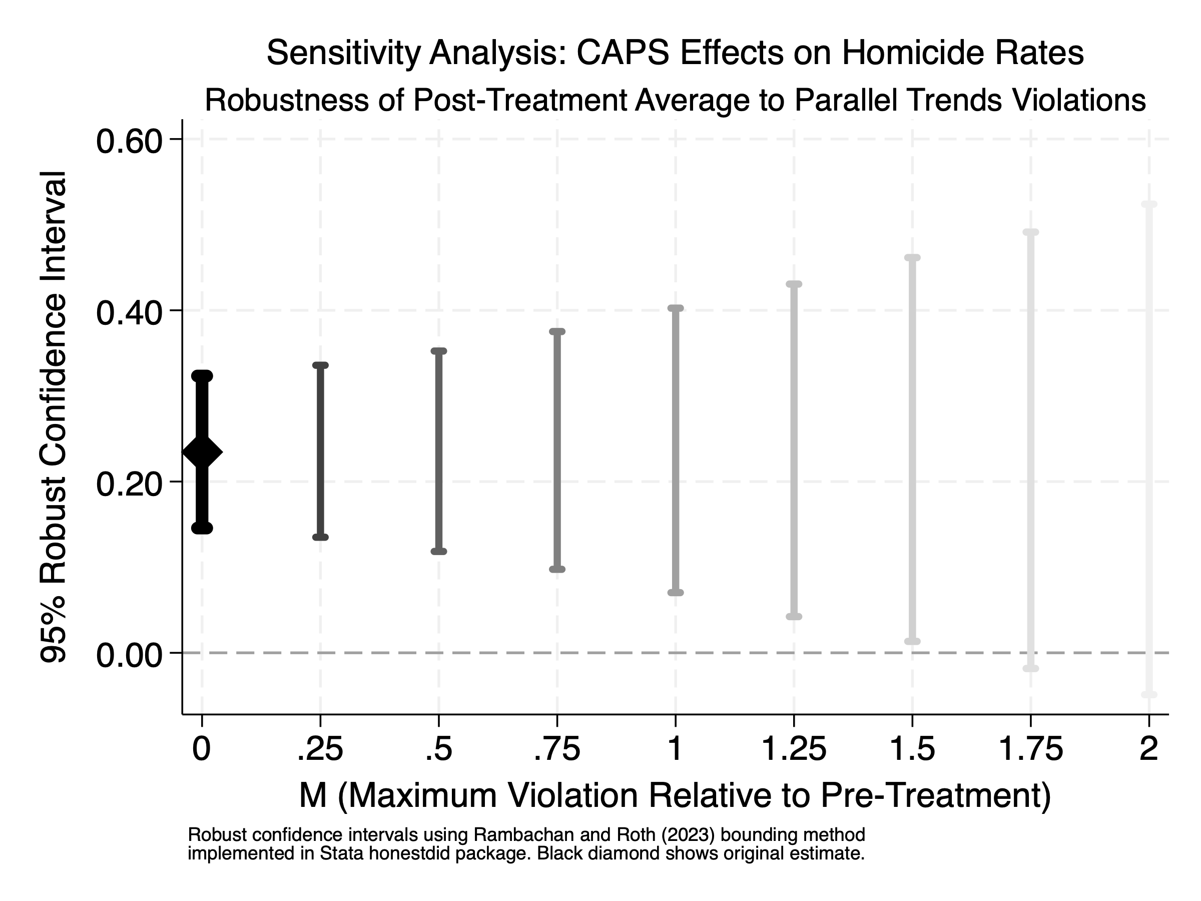
For our analysis, I’m going to take a weighted average of our four post-treatment lags and use it for the Rambachan and Roth (2023) bounds. The weighted average of those four post-treatment lags is 0.234, and it is highly significant at \(p < 0.001\). So, our question becomes: how much can we let parallel trends break down before the range of possible estimates includes a zero?
Figure 10.24 shows the answer. Each confidence interval represents a different assumption about how badly parallel trends might be violated. At M=0 (the leftmost, darkest interval), we’re assuming perfect parallel trends—this is our original estimate. As M increases, we allow for progressively worse violations, and the confidence intervals widen accordingly.
The results are striking: even if we allow parallel trends to be violated by 1.5 times the worst-case scenario we observed in our pretreatment period (M=1.5), the bounds still don’t include zero. This suggests the original Dias and Fontes (2024) homicide result is remarkably robust. CAPS really does appear to increase homicide rates, and this conclusion holds even under quite pessimistic assumptions about parallel trends violations.
This kind of sensitivity analysis is exactly what we should be doing more of in applied work. Rather than just reporting “the pretrends look fine,” we can now say “our results are robust to parallel trends violations up to X times worse than what we observe in the data.” It’s a much more transparent and informative way to discuss the credibility of our identifying assumptions.
Notes: Robust confidence intervals for the average post-treatment effect using the Rambachan and Roth (2023) bounding method. M represents the maximum allowable violation of parallel trends relative to the worst pretreatment violation observed. Original estimate (M=0) shown with black diamond. Analysis uses relative magnitudes restriction with M ranging from 0 to 2.
Step 10. Don’t Do Diff-in-Diff
Looking back at our analysis of CAPS and homicide rates, I have to admit—I’m convinced by this particular original Dias and Fontes (2024) result. I was skeptical when I first saw this result, but my mind has been changed. As I said, they estimated it using the Chaisemartin and D’Haultfoueille (2020) method, but I reestimated it using my design checklist and Callaway-Sant’Anna, and it remained. I think I have to therefore admit to myself that that result is very strong, very reliable, and it even persists with weaker and weaker assumptions about parallel trends. We know can tolerate substantial violations of parallel trends and still conclude there’s fairly strong evidence that CAPS—as people transitioned from mental health hospitals to community centers that may not have been fully equipped to handle severe mental illness—caused an increase in homicides up to a few years after treatment. This is sobering news, and it’s a result I will likely think about for a long time.
But I’d be lying if I said I haven’t put projects down and moved on to something else because I doubted parallel trends. Parallel trends is what defines the diff-in-diff design, after all. Parallel trends is under the hood of every diff-in-diff estimator, and without it, our estimates are nothing more than numbers without any causal interpretation. In those situations, we must live in reality and be okay about moving on from diff-in-diff.
This is good news, though, not bad news, because as much as we may like a particular method, the point of causal inference is not to use a method. The point in causal inference is to get good answers to good questions. And to do that, we let the data and the circumstances of the treatment assignment itself guide the choice of the tool, not the other way around. And let’s not pretend that estimators are anything other than tools. They may be beautiful, even elegant, tools, but beauty and elegance does not therefore mean they should be used to answer any and every question. Our goal is credible answers, and for diff-in-diff answers to be credible, parallel trends must be credible too.
So, when do we put it down? When we are convinced there’s absolutely no way we can believe in parallel trends, even conditional parallel trends, with a straight face. Maybe we’re simply too certain that one of the mechanisms that violates parallel trends, outlined in Ghanem, Sant’Anna, and Wüthrich (2024), is actually happening in our data. Maybe common support is impossible to achieve. Maybe the pretrends look like a roller coaster and the honest DiD sensitivity analysis shows our results disappear with even tiny violations.
In poker, one of the best decisions you can ever make is knowing when to lay down a losing hand. That is no different in causal inference. In cases like those where parallel trends is no longer credible, we need to be ready to use what Guido Imbens once called, tongue-in-cheek, the “DDDiD” estimator—“Don’t Do Diff-in-Diff.” Sometimes the most honest, scientifically responsible thing we can do is acknowledge that a particular method isn’t appropriate for our data and simply move on. The sooner the better.
The good news is we’re not stuck with diff-in-diff. There are other causal panel methods (Arkhangelsky and Imbens 2024). In the next chapter, we’ll turn to synthetic control methods, which are a whole family of panel estimators that can sometimes succeed where difference-in-differences falls short. So, the story doesn’t end here—it just gets more interesting.
Abadie, Alberto. 2005. “Semiparametric Difference-in-Differences Estimators.” Review of Economic Studies 72: 1–19.
Abadie, Alberto, Susan Athey, Guido W. Imbens, and Jeffrey M. Wooldridge. 2020. “Sampling-Based Versus Design-Based Uncertainty in Regression Analysis.” Econometrica 88 (0): 265–96.
Abadie, Alberto, and Guido W. Imbens. 2011. “Bias-Corrected Matching Estimators for Average Treatment Effects.” Journal of Business and Economic Statistics 29: 1–11.
Arkhangelsky, Dmitry, and Guido W. Imbens. 2024. “Causal Models for Longitudinal and Panel Data: A Survey.” The Econometrics Journal 27 (3): C1–61.
Athey, Susan, Mohsen Bayati, Nikolay Doudchenko, Guido W. Imbens, and Khashayar Khosravi. 2021. “Matrix Completion Methods for Causal Panel Data Models.” Journal of the American Statistical Association 116 (536): 1716–30.
Autor, David H. 2003. “Outsourcing at Will: The Contribution of Unjust Dismissal Doctrine to the Growth of Employment Outsourcing.” Journal of Labor Economics 21 (1): 1–42.
Baker, Andrew C., David F. Larcker, and Charles C. Y. Wang. 2022. “How Much Should We Trust Staggered Difference-in-Differences Estimates?” Journal of Financial Economics 144: 370–95.
Baker, Andrew, Brantly Callaway, Scott Cunningham, Andrew Goodman-Bacon, and Pedro H. C. Sant’Anna. 2025. “Difference-in-Differences Designs: A Practitioner’s Guide.” Journal of Economic Literature forthcoming.
Bartel, Ann P., Maya Rossin-Slater, Christopher J. Ruhm, Jenna Stearns, and Jane Waldfogel. 2018. “Paid Family Leave, Fathers’ Leave-Taking, and Leave-Sharing in Dual-Earner Households.” Journal of Policy Analysis and Management 37 (1): 10–37.
Bellego, Christopher, David Benatia, and Vincent Dortet-Bernadet. 2024. “The Chained Difference-in-Differences.” Journal of Econometrics Forthcoming.
Bertrand, Marianne, Esther Duflo, and Sendhil Mullainathan. 2004. “How Much Should We Trust Differences-in-Differences Estimates?” Quarterly Journal of Economics 119 (1): 249–75.
Borgschulte, Mark, and Jacob Vogler. 2020. “Did the ACA Medicaid Expansion Save Lives?” Journal of Health Economics 72 (102333).
Borusyak, Kirill, and Xavier Jaravel. 2017. “Revisiting Event Study Designs, with an Application to the Estimation of the Marginal Propensity to Consume.”
Borusyak, Kirill, Xavier Jaravel, and Jann Spiess. 2024. “Revisiting Event Study Designs: Robust and Efficient Estimation.” Review of Economic Studies 91 (6): 3253–85.
Braghieri, Luca, Ro’ee Levy, and Alexey Makarin. 2022. “Social Media and Mental Health.” American Economic Review 112 (11): 3660–93.
Callaway, Brant, and Pedro H. C. Sant’Anna. 2021. “Difference-in-Differences with Multiple Time Periods.” Journal of Econometrics 225 (2): 200–230.
Card, David, and Alan Krueger. 1994. “Minimum Wages and Employment: A Case Study of the Fast-Food Industry in New Jersey and Pennsylvania.” American Economic Review 84: 772–93.
Card, David, Davis D. Lee, and Thomas Lemieux. 2021. “Introduction: Essays in Honor of John e. DiNardo.” Journal of Labor Economics 39 (S2).
Chaisemartin, Clement de, and Xavier D’Haultfoueille. 2020. “Two-Way Fixed Effects Estimators with Heterogenous Treatment Effects.” American Economic Review 110 (9): 2964–96.
Chang, Neng-Chieh. 2020. “Double/Debiased Machine Learning for Difference-in-Differences Models.” The Econometrics Journal 23 (2): 177–91.
Cunningham, Jamein, and Andrew Goodman-Bacon. 2024. “Changes in Family Structure and Welfare Participation Since the 1960s: The Role of Legal Services.” American Economic Journal: Applied Economics Forthcoming.
Dehejia, Rajeev H., and Sadek Wahba. 2002. “Propensity Score-Matching Methods for Nonexperimental Causal Studies.” Review of Economics and Statistics 84 (1): 151–61.
Dias, Mateus, and Luiz Felipe Fontes. 2024. “The Effects of a Large-Scale Mental Health Reform: Evidence from Brazil.” American Economic Journal: Economic Policy 16 (3): 257–89.
Filoso, Valerio. 2013. “Regression Anatomy, Revealed.” The Stata Journal 13 (1): 92–106.
Frisch, Ragnar, and Frederick V. Waugh. 1933. “Partial Time Regressions as Compared with Individuals Trends.” Econometrica 1 (4): 387–401.
Gardner, John. 2021. “Two-Stage Differences-in-Differences.”
Gawande, Atul. 2011. The Checklist Manifesto: How to Get Things Right. Metropolitan Books.
Ghanem, Dalia, Pedro H. C. Sant’Anna, and Kaspar Wüthrich. 2024. “Selection and Parallel Trends.”
Goldsmith-Pinkham, Paul, Peter Hull, and Michal Kolesár. 2024. “Contamination Bias in Linear Regressions.” American Economic Review Forthcoming.
Goodman-Bacon, Andrew. 2021. “Difference-in-Differences with Variation in Treatment Timing.” Journal of Econometrics 225 (2): 254–77.
Gruber, Jonathan. 1994. “The Incidence of Mandated Maternity Benefits.” American Economic Review 84 (3): 622–41.
Heckman, James J. 1979. “Sample Selection Bias as a Specificaiton Error.” Econometrica 47 (1): 153–61.
Heckman, James J., Hidehiko Ichimura, and Petra E. Todd. 1997. “Matching as an Econometric Evaluation Estimator: Evidence from Evaluating a Job Training Programme.” Review of Economic Studies 64: 605–54.
Hong, Seung Hyun. 2013. “Measuring the Effect of Napster on Recorded Music Sales: Difference-in-Differences Estimates Under Compositional Changes.” Journal of Applied Econometrics 28 (2): 297–324.
Imbens, Guide W., and Donald B. Rubin. 2015. Causal Inference for Statistics, Social and Biomedical Sciences: An Introduction. 1st ed. Cambridge University Press.
Imbens, Guido W., and Joshua D. Angrist. 1994. “Identification and Estimation of Local Average Treatment Effects.” Econometrica 62 (2): 467–75.
Kahn-Lang, Ariella, and Kevin Lang. 2019. “The Promise and Pitfalls of Differences-in-Differences: Reflections on 16 and Pregnant and Other Applications.” Journal of Business and Economic Statistics 38 (3): 1–14.
Liebowitz, Stan J. 2006. “File-Sharing: Creative Destruction or Just Plain Destruction?” Journal of Law and Economics 49 (1): 1–28.
Lovell, Michael C. 1963. “Seasonal Adjustment of Economic Time Series and Multiple Regression Analysis.” Journal of the American Statistical Association 58 (304): 991–1010.
Meer, Jonathan, and Jeremy West. 2016. “Effects of the Minimum Wage on Employment Dynamics.” Journal of Human Resources 51 (2): 500–522.
Miller, Sarah, Norman Johnson, and Laura R. Wherry. 2021. “Medicaid and Mortality: New Evidence from Linked Survey and Administrative Data.” Quarterly Journal of Economics 136 (3): 1783–1829.
Mou, Hongyu, Licheng Liu, and Yiqing Xu. 2023. “Panel Data Visualization in r (panelView) and Stata (panelView).” Journal of Statistical Software 107 (7): 1–20.
Oberholzer-Gee, Felix, and Koleman Strumpf. 2007. “The Effect of File Sharing on Record Sales: An Empirical Analysis.” Journal of Political Economy 115 (2007): 1–42.
Olden, Andreas, and Jarle Møen. 2022. “The Triple Difference Estimator.” The Econometrics Journal 25: 531–53.
Rambachan, Ashesh, and Jonathan Roth. 2023. “A More Credible Approach to Parallel Trends.” Review of Economic Studies 90: 2555–91.
Rob, Rafael, and Joel Waldfogel. 2006. “Piracy on the High c’s: Music Downloading, Sales Displacement, and Social Welfare in a Sample of College Students.” Journal of Law and Economics 49 (1): 29–62.
Robins, James. 1986. “A New Approach to Causal Inference in Mortality Studients with a Sustained Exposure Period–Application to Control of the Healthy Worker Survivor Effect.” Mathematical Modelling 7: 1393–1512.
Rosenbaum, Paul R., and Donald B. Rubin. 1983. “The Central Role of the Propensity Score in Observational Studies for Causal Effects.” Biometrika 70 (1): 41–55.
Rossin, Maya. 2011. “The Effects of Maternity Leave on Children’s Birth and Infant Health Outcomes in the United States.” Journal of Health Economics 30 (2): 221–39.
Rossin-Slater, Maya, Christopher J. Ruhm, and Jane Waldfogel. 2013. “The Effects of California’s Paid Family Leave Program on Mothers’ Leave-Taking and Subsequent Labor Market Outcomes.” Journal of Policy Analysis and Management 32 (2): 224–45.
Roth, Jonathan. 2024. “Interpreting Event-Studies from Recent Difference-in-Differences Methods.”
Roth, Jonathan, Pedrdo H. C. Sant’Anna, Alyssa Bilinski, and John Poe. 2023. “What’s Trending in Difference-in-Differences? A Synthetic of the Recent Econometrics Literature.” Journal of Econometrics 235 (2): 2218–44.
Rubin, Donald B. 2008. “For Objective Causal Inference, Design Trumps Analysis.” The Annals of Applied Statistics 2 (3): 808–40.
Sant’Anna, Pedrdo H. C., and Qi Xu. 2023. “Difference-in-Differences with Compositional Changes.”
Sant’Anna, Pedro H. C., and Jun Zhao. 2020. “Doubly Robust Difference-in-Differences Estimators.” Journal of Econometrics 219: 101–22.
Segurança Pública, Fórum Brasileiro de. 2022. “Mapping of the Violence in the Amazon Region: Final Report.” Brazil: Fórum Brasileiro de Segurança Pública.
Słoczyński, Tymon. 2015. “The Oaxaca-Blinder Unexplained Component as a Treatment Effects Estimator.” Oxford Bulleting of Economics and Statistics 77 (4): 588–604.
———. 2022. “Interpreting OLS Estimands When Treatment Effects Are Heterogeneous: Smaller Groups Get Larger Weights.” Review of Economics and Statistics 104 (3): 501–9.
Solon, Gary, Steven J. Haider, and Jeffrey M. Wooldridge. 2015. “What Are We Weighting For?” Journal of Human Resources 50 (2): 301316.
Sun, Liyang, and Sarah Abraham. 2021. “Estimating Dynamic Treatment Effects in Event Studies with Heterogenous Treatment Effects.” Journal of Econometrics 225 (2): 175–99.
Wooldridge, Jeffrey. 2010. Econometric Analysis of Cross Section and Panel Data. 2nd ed. MIT Press.
Wooldridge, Jeffrey M. 2021. “Two-Way Fixed Effects, the Two-Way Mundlak Regression, and Difference-in-Differences Estimators.”
Zentner, Alejandro. 2006. “Measuring the Effect of File Sharing on Music Purchases.” Journal of Law and Economics 49 (1): 63–90.