
Causal Inference:
The Mixtape.
Buy the print version today:
Buy the print version today:
\[ % Define terms \newcommand{\Card}{\text{Card }} \DeclareMathOperator*{\cov}{cov} \DeclareMathOperator*{\var}{var} \DeclareMathOperator{\Var}{Var\,} \DeclareMathOperator{\Cov}{Cov\,} \DeclareMathOperator{\Prob}{Prob} \newcommand{\independent}{\perp \!\!\! \perp} \DeclareMathOperator{\Post}{Post} \DeclareMathOperator{\Pre}{Pre} \DeclareMathOperator{\Mid}{\,\vert\,} \DeclareMathOperator{\post}{post} \DeclareMathOperator{\pre}{pre} \]
Over the past twenty years, interest in the regression-discontinuity design (RDD) has increased (Figure 6.1). It was not always so popular, though. The method dates back about sixty years to Donald Campbell, an educational psychologist, who wrote several studies using it, beginning with Thistlehwaite and Campbell (1960).1 In a wonderful article on the history of thought around RDD, Cook (2008) documents its social evolution. Despite Campbell’s many efforts to advocate for its usefulness and understand its properties, RDD did not catch on beyond a few doctoral students and a handful of papers here and there. Eventually, Campbell too moved on from it.
To see its growing popularity, let’s look at counts of papers from Google Scholar by year that mentioned the phrase “regression discontinuity design” (see Figure 6.1).2 Thistlehwaite and Campbell (1960) had no influence on the broader community of scholars using his design, confirming what Cook (2008) wrote. The first time RDD appears in the economics community is with an unpublished econometrics paper (Goldberger 1972). Starting in 1976, RDD finally gets annual double-digit usage for the first time, after which it begins to slowly tick upward. But for the most part, adoption was imperceptibly slow.
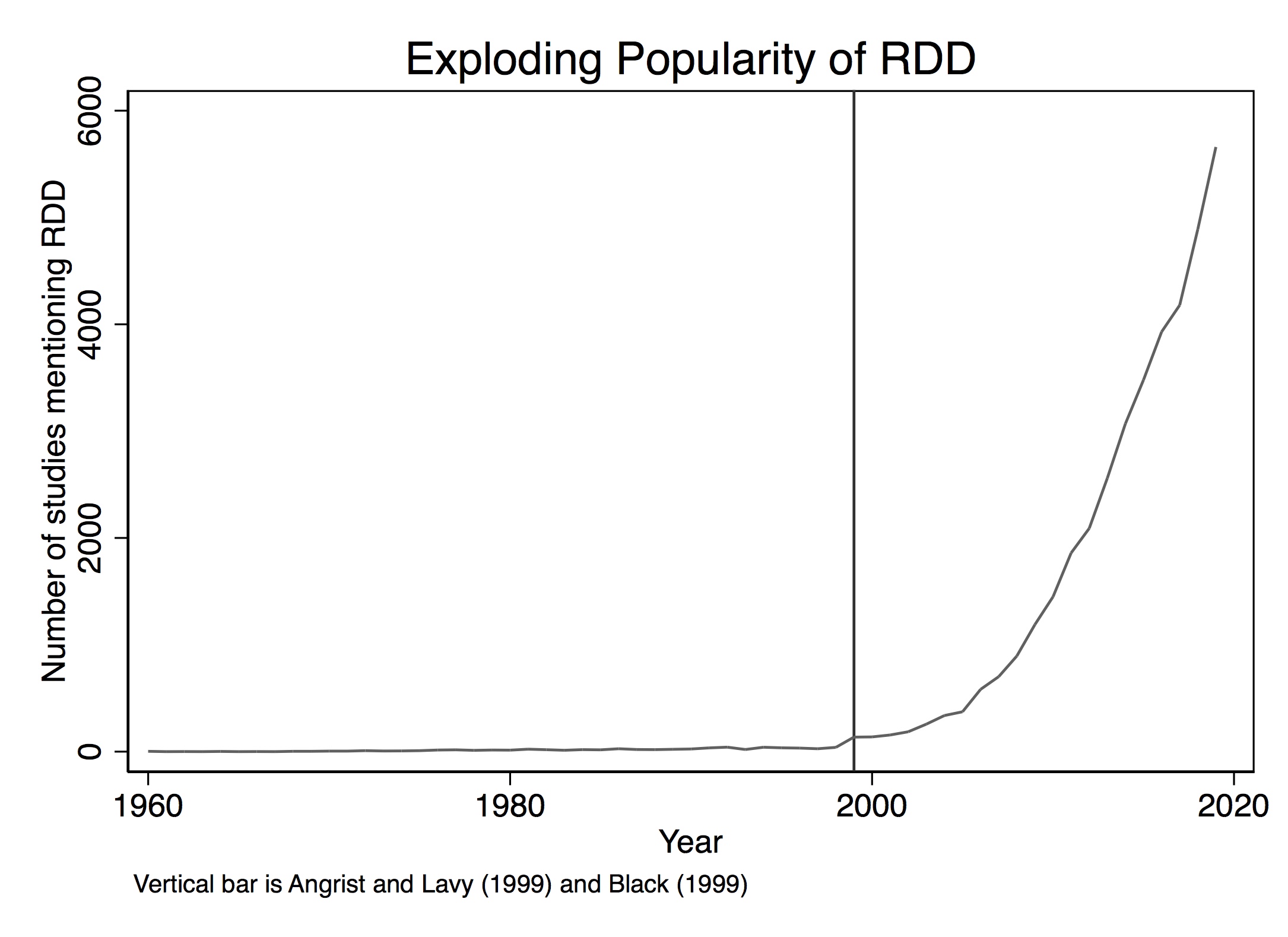
But then things change starting in 1999. That’s the year when a couple of notable papers in the prestigious Quarterly Journal of Economics resurrected the method. These papers were Angrist and Lavy (1999) and Black (1999), followed by Hahn, Todd, and Klaauw (2001) two years later. Angrist and Lavy (1999), which we discuss in detail later, studied the effect of class size on pupil achievement using an unusual feature in Israeli public schools that created smaller classes when the number of students passed a particular threshold. Black (1999) used a kind of RDD approach when she creatively exploited discontinuities at the geographical level created by school district zoning to estimate people’s willingness to pay for better schools. The year 1999 marks a watershed in the design’s widespread adoption. A 2010 Journal of Economic Literature article by Lee and Lemieux, which has nearly 4,000 cites shows up in a year with nearly 1,500 new papers mentioning the method. By 2019, RDD output would be over 5,600. The design is today incredibly popular and shows no sign of slowing down.
But 1972 to 1999 is a long time without so much as a peep for what is now considered one of the most credible research designs with observational data, so what gives? Cook (2008) says that RDD was “waiting for life” during this time. The conditions for life in empirical microeconomics were likely the growing acceptance of the potential outcomes framework among microeconomists (i.e., the so-called credibility revolution led by Josh Angrist, David Card, Alan Krueger, Steven Levitt, and many others) as well as, and perhaps even more importantly, the increased availability of large digitized the administrative data sets, many of which often captured unusual administrative rules for treatment assignments. These unusual rules, combined with the administrative data sets’ massive size, provided the much-needed necessary conditions for Campbell’s original design to bloom into thousands of flowers.
So what’s the big deal? Why is RDD so special? The reason RDD is so appealing to many is because of its ability to convincingly eliminate selection bias. This appeal is partly due to the fact that its underlying identifying assumptions are viewed by many as easier to accept and evaluate. Rendering selection bias impotent, the procedure is capable of recovering average treatment effects for a given subpopulation of units. The method is based on a simple, intuitive idea. Consider the following DAG developed by Steiner et al. (2017) that illustrates this method very well.
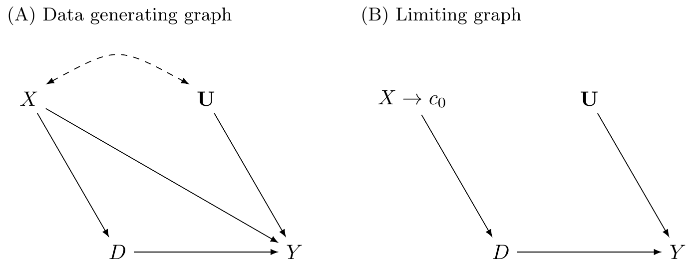
In the first graph, \(X\) is a continuous variable assigning units to treatment \(D\) (\(X \rightarrow D\)). This assignment of units to treatment is based on a “cutoff” score \(c_0\) such that any unit with a score above the cutoff gets placed into the treatment group, and units below do not. An example might be a charge of driving while intoxicated (or impaired; DWI). Individuals with a blood-alcohol content of 0.08 or higher are arrested and charged with DWI, whereas those with a blood-alcohol level below 0.08 are not (Hansen 2015). The assignment variable may itself independently affect the outcome via the \(X \rightarrow Y\) path and may even be related to a set of variables \(U\) that independently determine \(Y\). Notice for the moment that a unit’s treatment status is exclusively determined by the assignment rule. Treatment is not determined by \(U\).
This DAG clearly shows that the assignment variable \(X\)—or what is often called the “running variable”—is an observable confounder since it causes both \(D\) and \(Y\). Furthermore, because the assignment variable assigns treatment on the basis of a cutoff, we are never able to observe units in both treatment and control for the same value of \(X\). Calling back to our matching chapter, this means a situation such as this one does not satisfy the overlap condition needed to use matching methods, and therefore the backdoor criterion cannot be met.3
However, we can identify causal effects using RDD, which is illustrated in the limiting graph DAG. We can identify causal effects for those subjects whose score is in a close neighborhood around some cutoff \(c_0\). Specifically, as we will show, the average causal effect for this subpopulation is identified as \(X \rightarrow c_0\) in the limit. This is possible because the cutoff is the sole point where treatment and control subjects overlap in the limit.
There are a variety of explicit assumptions buried in this graph that must hold in order for the methods we will review later to recover any average causal effect. But the main one I discuss here is that the cutoff itself cannot be endogenous to some competing intervention occurring at precisely the same moment that the cutoff is triggering units into the \(D\) treatment category. This assumption is called continuity, and what it formally means is that the expected potential outcomes are continuous at the cutoff. If expected potential outcomes are continuous at the cutoff, then it necessarily rules out competing interventions occurring at the same time.
The continuity assumption is reflected graphically by the absence of an arrow from \(X \rightarrow Y\) in the second graph because the cutoff \(c_0\) has cut it off. At \(c_0\), the assignment variable \(X\) no longer has a direct effect on \(Y\). Understanding continuity should be one of your main goals in this chapter. It is my personal opinion that the null hypothesis should always be continuity and that any discontinuity necessarily implies some cause, because the tendency for things to change gradually is what we have come to expect in nature. Jumps are so unnatural that when we see them happen, they beg for explanation. Charles Darwin, in his On the Origin of Species, summarized this by saying Natura non facit saltum, or “nature does not make jumps.” Or to use a favorite phrase of mine from growing up in Mississippi, if you see a turtle on a fencepost, you know he didn’t get there by himself.
That’s the heart and soul of RDD. We use our knowledge about selection into treatment in order to estimate average treatment effects. Since we know the probability of treatment assignment changes discontinuously at \(c_0\), then our job is simply to compare people above and below \(c_0\) to estimate a particular kind of average treatment effect called the local average treatment effect, or LATE (Guideo W. Imbens and Angrist 1994). Because we do not have overlap, or “common support,” we must rely on extrapolation, which means we are comparing units with different values of the running variable. They only overlap in the limit as \(X\) approaches the cutoff from either direction. All methods used for RDD are ways of handling the bias from extrapolation as cleanly as possible.
As I’ve said before, and will say again and again—pictures of your main results, including your identification strategy, are absolutely essential to any study attempting to convince readers of a causal effect. And RDD is no different. In fact, pictures are the comparative advantage of RDD. RDD is, like many modern designs, a very visually intensive design. It and synthetic control are probably two of the most visually intensive designs you’ll ever encounter, in fact. So to help make RDD concrete, let’s first look at a couple of pictures. The following discussion derives from Hoekstra (2009).4
Labor economists had for decades been interested in estimating the causal effect of college on earnings. But Hoekstra wanted to crack open the black box of college’s returns a little by checking whether there were heterogeneous returns to college. He does this by estimating the causal effect of attending the state flagship university on earnings. State flagship universities are often more selective than other public universities in the same state. In Texas, the top 7% of graduating high school students can select their university in state, and the modal first choice is University of Texas at Austin. These universities are often environments of higher research, with more resources and strongly positive peer effects. So it is natural to wonder whether there are heterogeneous returns across public universities.
The challenge in this type of question should be easy to see. Let’s say that we were to compare individuals who attended the University of Florida to those who attended the University of South Florida. Insofar as there is positive selection into the state flagship school, we might expect individuals with higher observed and unobserved ability to sort into the state flagship school. And insofar as that ability increases one’s marginal product, then we expect those individuals to earn more in the workforce regardless of whether they had in fact attended the state flagship. Such basic forms of selection bias confound our ability to estimate the causal effect of attending the state flagship on earnings. But Hoekstra (2009) had an ingenious strategy to disentangle the causal effect from the selection bias using an RDD. To illustrate, let’s look at two pictures associated with this interesting study.
Before talking about the picture, I want to say something about the data. Hoekstra has data on all applications to the state flagship university. To get these data, he would’ve had to build a relationship with the admissions office. This would have involved making introductions, holding meetings to explain his project, convincing administrators the project had value for them as well as him, and ultimately winning their approval to cooperatively share the data. This likely would’ve involved the school’s general counsel, careful plans to de-identify the data, agreements on data storage, and many other assurances that students’ names and identities were never released and could not be identified. There is a lot of trust and social capital that must be created to do projects like this, and this is the secret sauce in most RDDs—your acquisition of the data requires far more soft skills, such as friendship, respect, and the building of alliances, than you may be accustomed to. This isn’t as straightforward as simply downloading the CPS from IPUMS; it’s going to take genuine smiles, hustle, and luck. Given that these agencies have considerable discretion in whom they release data to, it is likely that certain groups will have more trouble than others in acquiring the data. So it is of utmost importance that you approach these individuals with humility, genuine curiosity, and most of all, scientific integrity. They ultimately are the ones who can give you the data if it is not public use, so don’t be a jerk.5
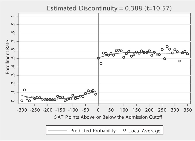
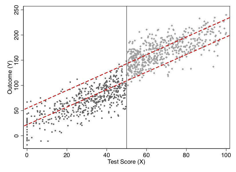
But on to the picture. Figure 6.2 has a lot going on, and it’s worth carefully unpacking each element for the reader. There are four distinct elements to this picture that I want to focus on. First, notice the horizontal axis. It ranges from a negative number to a positive number with a zero around the center of the picture. The caption reads “SAT Points Above or Below the Admission Cutoff.” Hoekstra has “recentered” the university’s admissions criteria by subtracting the admission cutoff from the students’ actual score, which is something I discuss in more detail later in this chapter. The vertical line at zero marks the “cutoff,” which was this university’s minimum SAT score for admissions. It appears it was binding, but not deterministically, for there are some students who enrolled but did not have the minimum SAT requirements. These individuals likely had other qualifications that compensated for their lower SAT scores. This recentered SAT score is in today’s parlance called the “running variable.”
Second, notice the dots. Hoekstra used hollow dots at regular intervals along the recentered SAT variable. These dots represent conditional mean enrollments per recentered SAT score. While his administrative data set contains thousands and thousands of observations, he only shows the conditional means along evenly spaced out bins of the recentered SAT score.
Third are the curvy lines fitting the data. Notice that the picture has two such lines—there is a curvy line fitted to the left of zero, and there is a separate line fit to the right. These lines are the least squares fitted values of the running variable, where the running variable was allowed to take on higher-order terms. By including higher-order terms in the regression itself, the fitted values are allowed to more flexibly track the central tendencies of the data itself. But the thing I really want to focus your attention on is that there are two lines, not one. He fit the lines separately to the left and right of the cutoff.
Finally, and probably the most vivid piece of information in this picture—the gigantic jump in the dots at zero on the recentered running variable. What is going on here? Well, I think you probably know, but let me spell it out. The probability of enrolling at the flagship state university jumps discontinuously when the student just barely hits the minimum SAT score required by the school. Let’s say that the score was 1250. That means a student with 1240 had a lower chance of getting in than a student with 1250. Ten measly points and they have to go a different path.
Imagine two students—the first student got a 1240, and the second got a 1250. Are these two students really so different from one another? Well, sure: those two individual students are likely very different. But what if we had hundreds of students who made 1240 and hundreds more who made 1250. Don’t you think those two groups are probably pretty similar to one another on observable and unobservable characteristics? After all, why would there be suddenly at 1250 a major difference in the characteristics of the students in a large sample? That’s the question you should reflect on. If the university is arbitrarily picking a reasonable cutoff, are there reasons to believe they are also picking a cutoff where the natural ability of students jumps at that exact spot?
But I said Hoekstra is evaluating the effect of attending the state flagship university on future earnings. Here’s where the study gets even more intriguing. States collect data on workers in a variety of ways. One is through unemployment insurance tax reports. Hoekstra’s partner, the state flagship university, sent the university admissions data directly to a state office in which employers submit unemployment insurance tax reports. The university had social security numbers, so the matching of student to future worker worked quite well since a social security number uniquely identifies a worker. The social security numbers were used to match quarterly earnings records from 1998 through the second quarter of 2005 to the university records. He then estimated: \[ \ln(\text{Earnings})=\psi_{\text{Year}} + \omega_{\text{Experience}} + \theta_{\text{Cohort}} + \varepsilon \] where \(\psi\) is a vector of year dummies, \(\omega\) is a dummy for years after high school that earnings were observed, and \(\theta\) is a vector of dummies controlling for the cohort in which the student applied to the university (e.g., 1988). The residuals from this regression were then averaged for each applicant, with the resulting average residual earnings measure being used to implement a partialled out future earnings variable according to the Frisch-Waugh-Lovell theorem. Hoekstra then takes each students’ residuals from the natural log of earnings regression and collapses them into conditional averages for bins along the recentered running variable. Let’s look at that in Figure 6.3.
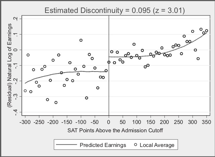
In this picture, we see many of the same elements we saw in Figure 6.2. For instance, we see the recentered running variable along the horizontal axis, the little hollow dots representing conditional means, the curvy lines which were fit left and right of the cutoff at zero, and a helpful vertical line at zero. But now we also have an interesting title: “Estimated Discontinuity = 0.095 (z = 3.01).” What is this exactly?
The visualization of a discontinuous jump at zero in earnings isn’t as compelling as the prior figure, so Hoekstra conducts hypothesis tests to determine if the mean between the groups just below and just above are the same. He finds that they are not: those just above the cutoff earn 9.5% higher wages in the long term than do those just below. In his paper, he experiments with a variety of binning of the data (what he calls the “bandwidth”), and his estimates when he does so range from 7.4% to 11.1%.
Now let’s think for a second about what Hoekstra is finding. Hoekstra is finding that at exactly the point where workers experienced a jump in the probability of enrolling at the state flagship university, there is, ten to fifteen years later, a separate jump in logged earnings of around 10%. Those individuals who just barely made it in to the state flagship university made around 10% more in long-term earnings than those individuals who just barely missed the cutoff.
This, again, is the heart and soul of the RDD. By exploiting institutional knowledge about how students were accepted (and subsequently enrolled) into the state flagship university, Hoekstra was able to craft an ingenious natural experiment. And insofar as the two groups of applicants right around the cutoff have comparable future earnings in a world where neither attended the state flagship university, then there is no selection bias confounding his comparison. And we see this result in powerful, yet simple graphs. This study was an early one to show that not only does college matter for long-term earnings, but the sort of college you attend—even among public universities—matters as well.
RDD is all about finding “jumps” in the probability of treatment as we move along some running variable \(X\). So where do we find these jumps? Where do we find these discontinuities? The answer is that humans often embed jumps into rules. And sometimes, if we are lucky, someone gives us the data that allows us to use these rules for our study.
I am convinced that firms and government agencies are unknowingly sitting atop a mountain of potential RDD-based projects. Students looking for thesis and dissertation ideas might try to find them. I encourage you to find a topic you are interested in and begin building relationships with local employers and government administrators for whom that topic is a priority. Take them out for coffee, get to know them, learn about their job, and ask them how treatment assignment works. Pay close attention to precisely how individual units get assigned to the program. Is it random? Is it via a rule? Oftentimes they will describe a process whereby a running variable is used for treatment assignment, but they won’t call it that. While I can’t promise this will yield pay dirt, my hunch, based in part on experience, is that they will end up describing to you some running variable that when it exceeds a threshold, people switch into some intervention. Building alliances with local firms and agencies can pay when trying to find good research ideas.
The validity of an RDD doesn’t require that the assignment rule be arbitrary. It only requires that it be known, precise and free of manipulation. The most effective RDD studies involve programs where \(X\) has a “hair trigger” that is not tightly related to the outcome being studied. Examples include the probability of being arrested for DWI jumping at greater than 0.08 blood-alcohol content (Hansen 2015); the probability of receiving health-care insurance jumping at age 65, (Card, Dobkin, and Maestas 2008); the probability of receiving medical attention jumping when birthweight falls below 1,500 grams (Almond et al. 2010; Barreca et al. 2011); the probability of attending summer school when grades fall below some minimum level (Jacob and Lefgen 2004), and as we just saw, the probability of attending the state flagship university jumping when the applicant’s test scores exceed some minimum requirement (Hoekstra 2009).
In all these kinds of studies, we need data. But specifically, we need a lot of data around the discontinuities, which itself implies that the data sets useful for RDD are likely very large. In fact, large sample sizes are characteristic features of the RDD. This is also because in the face of strong trends in the running variable, sample-size requirements get even larger. Researchers are typically using administrative data or settings such as birth records where there are many observations.
There are generally accepted two kinds of RDD studies. There are designs where the probability of treatment goes from 0 to 1 at the cutoff, or what is called a “sharp” design. And there are designs where the probability of treatment discontinuously increases at the cutoff. These are often called “fuzzy” designs. In all of these, though, there is some running variable \(X\) that, upon reaching a cutoff \(c_0\), the likelihood of receiving some treatment flips. Let’s look at the diagram in Figure 6.4, which illustrates the similarities and differences between the two designs.
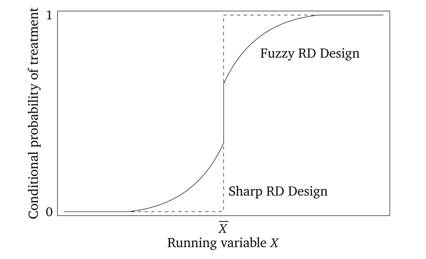
Sharp RDD is where treatment is a deterministic function of the running variable \(X\).6 An example might be Medicare enrollment, which happens sharply at age 65, excluding disability situations. A fuzzy RDD represents a discontinuous “jump” in the probability of treatment when \(X>c_0\). In these fuzzy designs, the cutoff is used as an instrumental variable for treatment, like Angrist and Lavy (1999), who instrument for class size with a class-size function they created from the rules used by Israeli schools to construct class sizes.
More formally, in a sharp RDD, treatment status is a deterministic and discontinuous function of a running variable \(X_i\), where \[ D_i = \begin{cases} 1 \text{ if } & X_i\geq{c_0} \\ 0 \text{ if } & X_i < c_0 \end{cases} \] where \(c_0\) is a known threshold or cutoff. If you know the value of \(X_i\) for unit \(i\), then you know treatment assignment for unit \(i\) with certainty. But, if for every value of \(X\) you can perfectly predict the treatment assignment, then it necessarily means that there are no overlap along the running variable.
If we assume constant treatment effects, then in potential outcomes terms, we get
\[ \begin{align} Y_i^0 & = \alpha + \beta X_i \\ Y^1_i & = Y_i^0 + \delta \end{align} \]
Using the switching equation, we get
\[ \begin{align} Y_i & =Y_i^0 + (Y_i^1 - Y_i^0) D_i \\ Y_i & =\alpha+\beta X_i + \delta D_i + \varepsilon_i \end{align} \]
where the treatment effect parameter, \(\delta\), is the discontinuity in the conditional expectation function:
\[ \begin{align} \delta & =\lim_{X_i\rightarrow{X_0}} E\big[Y^1_i\mid X_i=X_0\big] - \lim_{X_0\leftarrow{X_i}} E\big[Y^0_i\mid X_i=X_0\big] \\ & =\lim_{X_i\rightarrow{X_0}} E\big[Y_i\mid X_i=X_0\big]- \lim_{X_0\leftarrow{X_i}} E\big[Y_i\mid X_i=X_0\big] \end{align} \]
The sharp RDD estimation is interpreted as an average causal effect of the treatment as the running variable approaches the cutoff in the limit, for it is only in the limit that we have overlap. This average causal effect is the local average treatment effect (LATE). We discuss LATE in greater detail in the instrumental variables, but I will say one thing about it here. Since identification in an RDD is a limiting case, we are technically only identifying an average causal effect for those units at the cutoff. Insofar as those units have treatment effects that differ from units along the rest of the running variable, then we have only estimated an average treatment effect that is local to the range around the cutoff. We define this local average treatment effect as follows: \[ \delta_{SRD}=E\big[Y^1_i - Y_i^0\mid X_i=c_0] \] Notice the role that extrapolation plays in estimating treatment effects with sharp RDD. If unit \(i\) is just below \(c_0\), then \(D_i=0\). But if unit \(i\) is just above \(c_0\), then the \(D_i=1\). But for any value of \(X_i\), there are either units in the treatment group or the control group, but not both. Therefore, the RDD does not have common support, which is one of the reasons we rely on extrapolation for our estimation. See Figure 6.5.
Notes: Dashed lines are extrapolations
The key identifying assumption in an RDD is called the continuity assumption. It states that \(E[Y^0_i\mid X=c_0]\) and \(E[Y_i^1\mid X=c_0]\) are continuous (smooth) functions of \(X\) even across the \(c_0\) threshold. Absent the treatment, in other words, the expected potential outcomes wouldn’t have jumped; they would’ve remained smooth functions of \(X\). But think about what that means for a moment. If the expected potential outcomes are not jumping at \(c_0\), then there necessarily are no competing interventions occurring at \(c_0\). Continuity, in other words, explicitly rules out omitted variable bias at the cutoff itself. All other unobserved determinants of \(Y\) are continuously related to the running variable \(X\). Does there exist some omitted variable wherein the outcome, would jump at \(c_0\) even if we disregarded the treatment altogether? If so, then the continuity assumption is violated and our methods do not require the LATE.
I apologize if I’m beating a dead horse, but continuity is a subtle assumption and merits a little more discussion. The continuity assumption means that \(E[Y^1\mid X]\) wouldn’t have jumped at \(c_0\). If it had jumped, then it means something other than the treatment caused it to jump because \(Y^1\) is already under treatment. So an example might be a study finding a large increase in motor vehicle accidents at age 21. I’ve reproduced a figure from and interesting study on mortality rates for different types of causes (Carpenter and Dobkin 2009). I have reproduced one of the key figures in Figure 6.6. Notice the large discontinuous jump in motor vehicle death rates at age 21. The most likely explanation is that age 21 causes people to drink more, and sometimes even while they are driving.
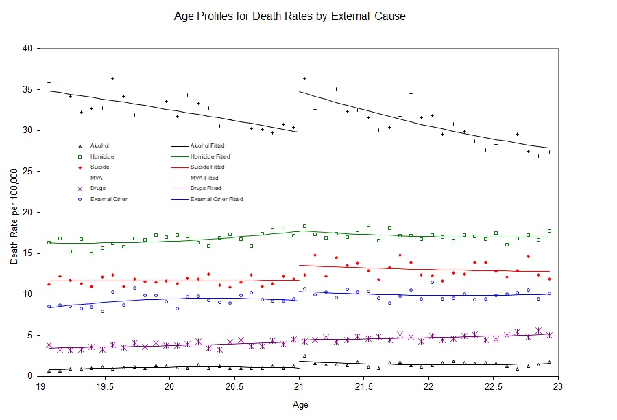
But this is only a causal effect if motor vehicle accidents don’t jump at age 21 for other reasons. Formally, this is exactly what is implied by continuity—the absence of simultaneous treatments at the cutoff. For instance, perhaps there is something biological that happens to 21-year-olds that causes them to suddenly become bad drivers. Or maybe 21-year-olds are all graduating from college at age 21, and during celebrations, they get into wrecks. To test this, we might replicate Carpenter and Dobkin (2009) using data from Uruguay, where the drinking age is 18. If we saw a jump in motor vehicle accidents at age 21 in Uruguay, then we might have reason to believe the continuity assumption does not hold in the United States. Reasonably defined placebos can help make the case that the continuity assumption holds, even if it is not a direct test per se.
Sometimes these abstract ideas become much easier to understand with data, so here is an example of what we mean using a simulation.
clear
capture log close
set obs 1000
set seed 1234567
* Generate running variable. Stata code attributed to Marcelo Perraillon.
gen x = rnormal(50, 25)
replace x=0 if x < 0
drop if x > 100
sum x, det
* Set the cutoff at X=50. Treated if X > 50
gen D = 0
replace D = 1 if x > 50
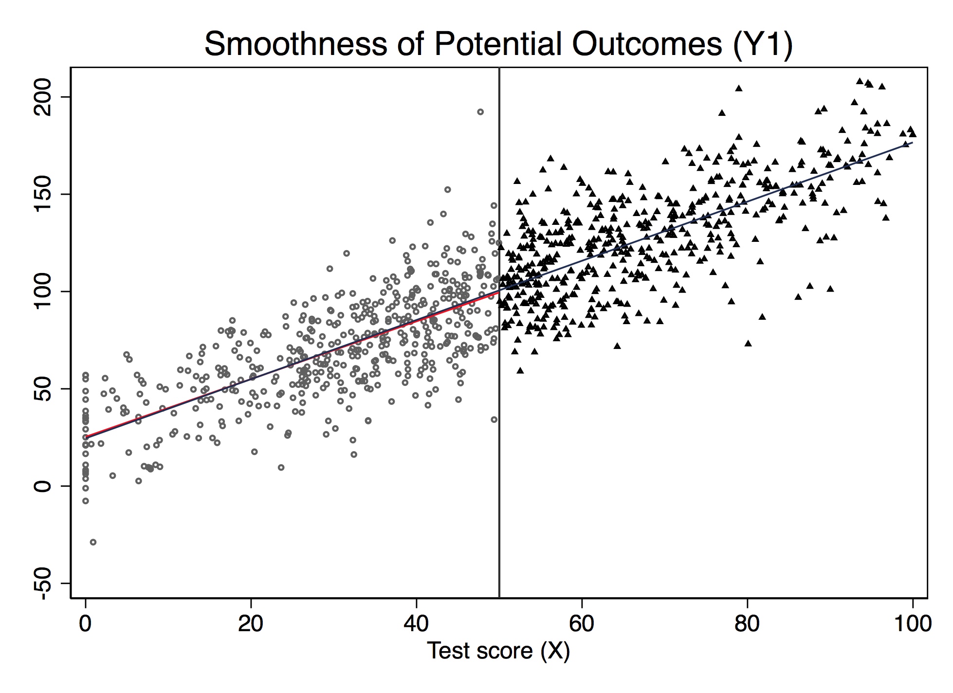
gen y1 = 25 + 0*D + 1.5*x + rnormal(0, 20)
* Potential outcome Y1 not jumping at cutoff (continuity)
twoway (scatter y1 x if D==0, msize(vsmall) msymbol(circle_hollow)) (scatter y1 x if D==1, sort mcolor(blue) msize(vsmall) msymbol(circle_hollow)) (lfit y1 x if D==0, lcolor(red) msize(small) lwidth(medthin) lpattern(solid)) (lfit y1 x, lcolor(dknavy) msize(small) lwidth(medthin) lpattern(solid)), xtitle(Test score (X)) xline(50) legend(off)library(tidyverse)
# simulate the data
dat <- tibble(
x = rnorm(1000, 50, 25)
) %>%
mutate(
x = if_else(x < 0, 0, x)
) %>%
filter(x < 100)
# cutoff at x = 50
dat <- dat %>%
mutate(
D = if_else(x > 50, 1, 0),
y1 = 25 + 0 * D + 1.5 * x + rnorm(n(), 0, 20)
)
ggplot(aes(x, y1, colour = factor(D)), data = dat) +
geom_point(alpha = 0.5) +
geom_vline(xintercept = 50, colour = "grey", linetype = 2)+
stat_smooth(method = "lm", se = F) +
labs(x = "Test score (X)", y = "Potential Outcome (Y1)")import numpy as np
import pandas as pd
import statsmodels.api as sm
import statsmodels.formula.api as smf
from itertools import combinations
import plotnine as p
# read data
import ssl
ssl._create_default_https_context = ssl._create_unverified_context
def read_data(file):
return pd.read_stata("https://github.com/scunning1975/mixtape/raw/master/" + file)
np.random.seed(12282020)
dat = pd.DataFrame({'x': np.random.normal(50, 25, 1000)})
dat.loc[dat.x<0, 'x'] = 0
dat = dat[dat.x<100]
dat['D'] = 0
dat.loc[dat.x>50, 'D'] = 1
dat['y1'] = 25 + 0*dat.D + 1.5 * dat.x + np.random.normal(0, 20, dat.shape[0])
dat['y2'] = 25 + 40*dat.D + 1.5 * dat.x + np.random.normal(0, 20, dat.shape[0])
print('"Counterfactual Potential Outcomes')
p.ggplot(dat, p.aes(x='x', y='y1', color = 'factor(D)')) + p.geom_point(alpha = 0.5) + p.geom_vline(xintercept = 50, colour = "grey") + p.stat_smooth(method = "lm", se = 'F') + p.labs(x = "Test score (X)", y = "Potential Outcome (Y1)")Figure 6.7 shows the results from this simulation. Notice that the value of \(E[Y^1\mid X]\) is changing continuously over \(X\) and through \(c_0\). This is an example of the continuity assumption. It means absent the treatment itself, the expected potential outcomes would’ve remained a smooth function of \(X\) even as passing \(c_0\). Therefore, if continuity held, then only the treatment, triggered at \(c_0\), could be responsible for discrete jumps in \(E[Y\mid X]\).
The nice thing about simulations is that we actually observe the potential outcomes since we made them ourselves. But in the real world, we don’t have data on potential outcomes. If we did, we could test the continuity assumption directly. But remember—by the switching equation, we only observe actual outcomes, never potential outcomes. Thus, since units switch from \(Y^0\) to \(Y^1\) at \(c_0\), we actually can’t directly evaluate the continuity assumption. This is where institutional knowledge goes a long way, because it can help build the case that nothing else is changing at the cutoff that would otherwise shift potential outcomes.
Let’s illustrate this using simulated data. Notice that while \(Y^1\) by construction had not jumped at 50 on the \(X\) running variable, \(Y\) will. Let’s look at the output in Figure 6.8. Notice the jump at the discontinuity in the outcome, which I’ve labeled the LATE, or local average treatment effect.
* Stata code attributed to Marcelo Perraillon.
gen y = 25 + 40*D + 1.5*x + rnormal(0, 20)
scatter y x if D==0, msize(vsmall) || scatter y x if D==1, msize(vsmall) legend(off) xline(50, lstyle(foreground)) || lfit y x if D ==0, color(red) || lfit y x if D ==1, color(red) ytitle("Outcome (Y)") xtitle("Test Score (X)") # simulate the discontinuity
dat <- dat %>%
mutate(
y2 = 25 + 40 * D + 1.5 * x + rnorm(n(), 0, 20)
)
# figure
ggplot(aes(x, y2, colour = factor(D)), data = dat) +
geom_point(alpha = 0.5) +
geom_vline(xintercept = 50, colour = "grey", linetype = 2) +
stat_smooth(method = "lm", se = F) +
labs(x = "Test score (X)", y = "Potential Outcome (Y)")import numpy as np
import pandas as pd
import statsmodels.api as sm
import statsmodels.formula.api as smf
from itertools import combinations
import plotnine as p
# read data
import ssl
ssl._create_default_https_context = ssl._create_unverified_context
def read_data(file):
return pd.read_stata("https://github.com/scunning1975/mixtape/raw/master/" + file)
np.random.seed(12282020)
dat = pd.DataFrame({'x': np.random.normal(50, 25, 1000)})
dat.loc[dat.x<0, 'x'] = 0
dat = dat[dat.x<100]
dat['D'] = 0
dat.loc[dat.x>50, 'D'] = 1
dat['y1'] = 25 + 0*dat.D + 1.5 * dat.x + np.random.normal(0, 20, dat.shape[0])
dat['y2'] = 25 + 40*dat.D + 1.5 * dat.x + np.random.normal(0, 20, dat.shape[0])
print('"Counterfactual Potential Outcomes')
print('"Counterfactual Potential Outcomes after Treatment')
p.ggplot(dat, p.aes(x='x', y='y2', color = 'factor(D)')) + p.geom_point(alpha = 0.5) + p.geom_vline(xintercept = 50, colour = "grey") + p.stat_smooth(method = "lm", se = 'F') + p.labs(x = "Test score (X)", y = "Potential Outcome (Y)")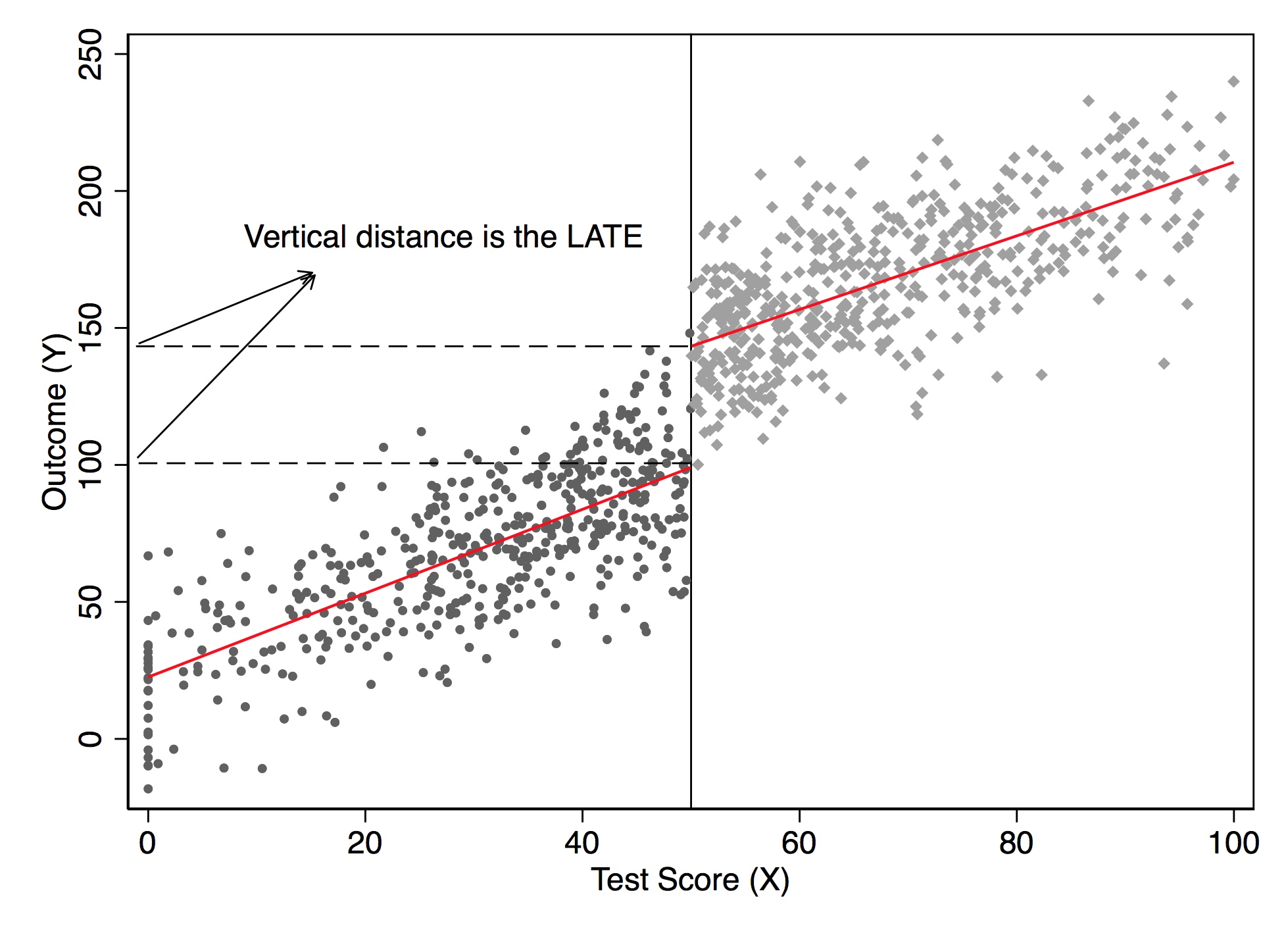
I’d like to now dig into the actual regression model you would use to estimate the LATE parameter in an RDD. We will first discuss some basic modeling choices that researchers often make—some trivial, some important. This section will focus primarily on regression-based estimation.
While not necessary, it is nonetheless quite common for authors to transform the running variable \(X\) by recentering at \(c_0\): \[ Y_i=\alpha+\beta(X_i-c_0)+\delta D_i+\varepsilon_i \] This doesn’t change the interpretation of the treatment effect—only the interpretation of the intercept. Let’s use Card, Dobkin, and Maestas (2008) as an example. Medicare is triggered when a person turns 65. So recenter the running variable (age) by subtracting 65:
\[ \begin{align} Y & =\beta_0 + \beta_1 (Age-65) + \beta_2 Edu + \varepsilon \\ & =\beta_0 + \beta_1 Age - \beta_1 65 + \beta_2 Edu+ \varepsilon \\ & =(\beta_0 - \beta_1 65) + \beta_1 Age + \beta_2 Edu + \varepsilon \\ & = \alpha + \beta_1 Age + \beta_2 Edu+ \varepsilon \end{align} \]
where \(\alpha=\beta_0 + \beta_1 65\). All other coefficients, notice, have the same interpretation except for the intercept.
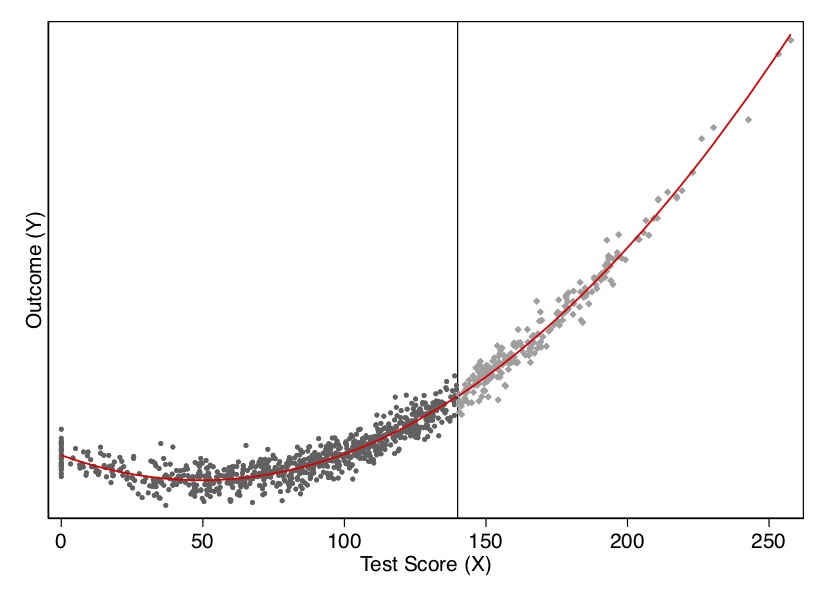
Another practical question relates to nonlinear data-generating processes. A nonlinear data-generating process could easily yield false positives if we do not handle the specification carefully. Because sometimes we are fitting local linear regressions around the cutoff, we could spuriously pick up an effect simply for no other reason than that we imposed linearity on the model. But if the underlying data-generating process is nonlinear, then it may be a spurious result due to misspecification of the model. Consider an example of this nonlinearity in Figure 6.9.
* Stata code attributed to Marcelo Perraillon.
drop y y1 x* D
set obs 1000
gen x = rnormal(100, 50)
replace x=0 if x < 0
drop if x > 280
sum x, det

* Set the cutoff at X=140. Treated if X > 140
gen D = 0
replace D = 1 if x > 140
gen x2 = x*x
gen x3 = x*x*x
gen y = 10000 + 0*D - 100*x +x2 + rnormal(0, 1000)
reg y D x

scatter y x if D==0, msize(vsmall) || scatter y x ///
  if D==1, msize(vsmall) legend(off) xline(140, ///
  lstyle(foreground)) ylabel(none) || lfit y x ///
  if D ==0, color(red) || lfit y x if D ==1, ///
  color(red) xtitle("Test Score (X)") ///
  ytitle("Outcome (Y)")

* Polynomial estimation
capture drop y
gen y = 10000 + 0*D - 100*x +x2 + rnormal(0, 1000)
reg y D x x2 x3
predict yhat

scatter y x if D==0, msize(vsmall) || scatter y x ///
  if D==1, msize(vsmall) legend(off) xline(140, ///
  lstyle(foreground)) ylabel(none) || line yhat x ///
  if D ==0, color(red) sort || line yhat x if D==1, ///
  sort color(red) xtitle("Test Score (X)") ///
ytitle("Outcome (Y)") # simultate nonlinearity
dat <- tibble(
x = rnorm(1000, 100, 50)
) %>%
mutate(
x = case_when(x < 0 ~ 0, TRUE ~ x),
D = case_when(x > 140 ~ 1, TRUE ~ 0),
x2 = x*x,
x3 = x*x*x,
y3 = 10000 + 0 * D - 100 * x + x2 + rnorm(1000, 0, 1000)
) %>%
filter(x < 280)
ggplot(aes(x, y3, colour = factor(D)), data = dat) +
geom_point(alpha = 0.2) +
geom_vline(xintercept = 140, colour = "grey", linetype = 2) +
stat_smooth(method = "lm", se = F) +
labs(x = "Test score (X)", y = "Potential Outcome (Y)")
ggplot(aes(x, y3, colour = factor(D)), data = dat) +
geom_point(alpha = 0.2) +
geom_vline(xintercept = 140, colour = "grey", linetype = 2) +
stat_smooth(method = "loess", se = F) +
labs(x = "Test score (X)", y = "Potential Outcome (Y)")import numpy as np
import pandas as pd
import statsmodels.api as sm
import statsmodels.formula.api as smf
from itertools import combinations
import plotnine as p
# read data
import ssl
ssl._create_default_https_context = ssl._create_unverified_context
def read_data(file):
return pd.read_stata("https://github.com/scunning1975/mixtape/raw/master/" + file)
np.random.seed(12282020)
dat = pd.DataFrame({'x': np.random.normal(100, 50, 1000)})
dat.loc[dat.x<0, 'x'] = 0
dat['x2'] = dat['x']**2
dat['x3'] = dat['x']**3
dat['D'] = 0
dat.loc[dat.x>140, 'D'] = 1
dat['y3'] = 10000 + 0*dat.D - 100 * dat.x + dat.x2 + np.random.normal(0, 1000, 1000)
dat = dat[dat.x < 280]
# Linear Model for conditional expectation
p.ggplot(dat, p.aes(x='x', y='y3', color = 'factor(D)')) + p.geom_point(alpha = 0.2) + p.geom_vline(xintercept = 140, colour = "grey") + p.stat_smooth(method = "lm", se = 'F') + p.labs(x = "Test score (X)", y = "Potential Outcome (Y)")
# Linear Model for conditional expectation
p.ggplot(dat, p.aes(x='x', y='y3', color = 'factor(D)')) + p.geom_point(alpha = 0.2) + p.geom_vline(xintercept = 140, colour = "grey") + p.stat_smooth(method = "lowess", se = 'F') + p.labs(x = "Test score (X)", y = "Potential Outcome (Y)")
I show this both visually and with a regression. As you can see in Figure 6.9, the data-generating process was nonlinear, but when with straight lines to the left and right of the cutoff, the trends in the running variable generate a spurious discontinuity at the cutoff. This shows up in a regression as well. When we fit the model using a least squares regression controlling for the running variable, we estimate a causal effect though there isn’t one. In Table 6.1, the estimated effect of \(D\) on \(Y\) is large and highly significant, even though the true effect is zero. In this situation, we would need some way to model the nonlinearity below and above the cutoff to check whether, even given the nonlinearity, there had been a jump in the outcome at the discontinuity.
| Dependent variable | |
|---|---|
| Treatment (D) | 6580.16\(^{**}\)\(^{*}\) |
| (305.88) |
Suppose that the nonlinear relationships is \[ E\big[Y^0_i\mid X_i\big]=f(X_i) \] for some reasonably smooth function \(f(X_i)\). In that case, we’d fit the regression model: \[ Y_i=f(X_i) + \delta D_i + \eta_i \] Since \(f(X_i)\) is counterfactual for values of \(X_i>c_0\), how will we model the nonlinearity? There are two ways of approximating \(f(X_i)\). The traditional approaches let \(f(X_Be i)\) equal a \(p{th}\)-order polynomial: \[ Y_i = \alpha + \beta_1 x_i + \beta_2 x_i^2 + \dots + \beta_p x_i^p + \delta D_i + \eta_i \] Higher-order polynomials can lead to overfitting and have been found to introduce bias (Gelman and Imbens 2019). Those authors recommend using local linear regressions with linear and quadratic forms only. Another way of approximating \(f(X_i)\) is to use a nonparametric kernel, which I discuss later.
Though Gelman and Imbens (2019) warn us about higher-order polynomials, I’d like to use an example with \(p\)th-order polynomials, mainly because it’s not uncommon to see this done today. I’d also like you to know some of the history of this method and understand better what old papers were doing. We can generate this function, \(f(X_i)\), by allowing the \(X_i\) terms to differ on both sides of the cutoff by including them both individually and interacting them with \(D_i\). In that case, we have:
\[ \begin{align} E\big[Y^0_i\mid X_i\big] & =\alpha + \beta_{01} \widetilde{X}_i + \dots + \beta_{0p}\widetilde{X}_i^p \\ E\big[Y^1_i\mid X_i\big] & =\alpha + \delta + \beta_{11} \widetilde{X}_i + \dots + \beta_{1p} \widetilde{X}_i^p \end{align} \]
where \(\widetilde{X}_i\) is the recentered running variable (i.e., \(X_i - c_0\)). Centering at \(c_0\) ensures that the treatment effect at \(X_i=X_0\) is the coefficient on \(D_i\) in a regression model with interaction terms. As Lee and Lemieux (2010) note, allowing different functions on both sides of the discontinuity should be the main results in an RDD paper.
To derive a regression model, first note that the observed values must be used in place of the potential outcomes: \[ E[Y\mid X]=E[Y^0\mid X]+\Big(E[Y^1\mid X] - E[Y^0 \mid X]\Big)D \] Your regression model then is \[ Y_i= \alpha + \beta_{01}\tilde{X}_i + \dots + \beta_{0p}\tilde{X}_i^p + \delta D_i+ \beta_1^*D_i \tilde{X}_i + \dots + \beta_p^* D_i \tilde{X}_i^p + \varepsilon_i \] where \(\beta_1^* = \beta_{11} - \beta_{01}\), and \(\beta_p^* = \beta_{1p} - \beta_{0p}\). The equation we looked at earlier was just a special case of the above equation with \(\beta_1^*=\beta_p^*=0\). The treatment effect at \(c_0\) is \(\delta\). And the treatment effect at \(X_i-c_0>0\) is \(\delta + \beta_1^*c + \dots + \beta_p^* c^p\). Let’s see this in action with another simulation.
* Stata code attributed to Marcelo Perraillon.
capture drop y
gen y = 10000 + 0*D - 100*x +x2 + rnormal(0, 1000)
reg y D##c.(x x2 x3)
predict yhat

scatter y x if D==0, msize(vsmall) || scatter y x ///
  if D==1, msize(vsmall) legend(off) xline(140, ///
  lstyle(foreground)) ylabel(none) || line yhat x ///
  if D ==0, color(red) sort || line yhat x if D==1, ///
  sort color(red) xtitle("Test Score (X)") ///
ytitle("Outcome (Y)") library(stargazer)
dat <- tibble(
x = rnorm(1000, 100, 50)
) %>%
mutate(
x = case_when(x < 0 ~ 0, TRUE ~ x),
D = case_when(x > 140 ~ 1, TRUE ~ 0),
x2 = x*x,
x3 = x*x*x,
y3 = 10000 + 0 * D - 100 * x + x2 + rnorm(1000, 0, 1000)
) %>%
filter(x < 280)
regression <- lm(y3 ~ D*., data = dat)
stargazer(regression, type = "text")
ggplot(aes(x, y3, colour = factor(D)), data = dat) +
geom_point(alpha = 0.2) +
geom_vline(xintercept = 140, colour = "grey", linetype = 2) +
stat_smooth(method = "loess", se = F) +
labs(x = "Test score (X)", y = "Potential Outcome (Y)")import numpy as np
import pandas as pd
import statsmodels.api as sm
import statsmodels.formula.api as smf
from itertools import combinations
import plotnine as p
# read data
import ssl
ssl._create_default_https_context = ssl._create_unverified_context
def read_data(file):
return pd.read_stata("https://github.com/scunning1975/mixtape/raw/master/" + file)
np.random.seed(12282020)
dat = pd.DataFrame({'x': np.random.normal(100, 50, 1000)})
dat.loc[dat.x<0, 'x'] = 0
dat['x2'] = dat['x']**2
dat['x3'] = dat['x']**3
dat['D'] = 0
dat.loc[dat.x>140, 'D'] = 1
dat['y3'] = 10000 + 0*dat.D - 100 * dat.x + dat.x2 + np.random.normal(0, 1000, 1000)
dat = dat[dat.x < 280]
# Fully interacted regression
all_columns = "+".join(dat.columns.difference(["D", 'y3']))
formula = 'y3 ~ D * ({})'.format(all_columns)
regression = sm.OLS.from_formula(formula, data = dat).fit()
regression.summary()Let’s look at the output from this exercise in Figure 6.10 and Table Table 6.2. As you can see, once we model the data using a quadratic (the cubic ultimately was unnecessary), there is no estimated treatment effect at the cutoff. There is also no effect in our least squares regression.
| Dependent variable | |
|---|---|
| Treatment (D) | -43.24 |
| (147.29) |
But, as we mentioned earlier, Gelman and Imbens (2019) have discouraged the use of higher-order polynomials when estimating local linear regressions. An alternative is to use kernel regression. The nonparametric kernel method has problems because you are trying to estimate regressions at the cutoff point, which can result in a boundary problem (see Figure 6.11). In this picture, the bias is caused by strong trends in expected potential outcomes throughout the running variable.
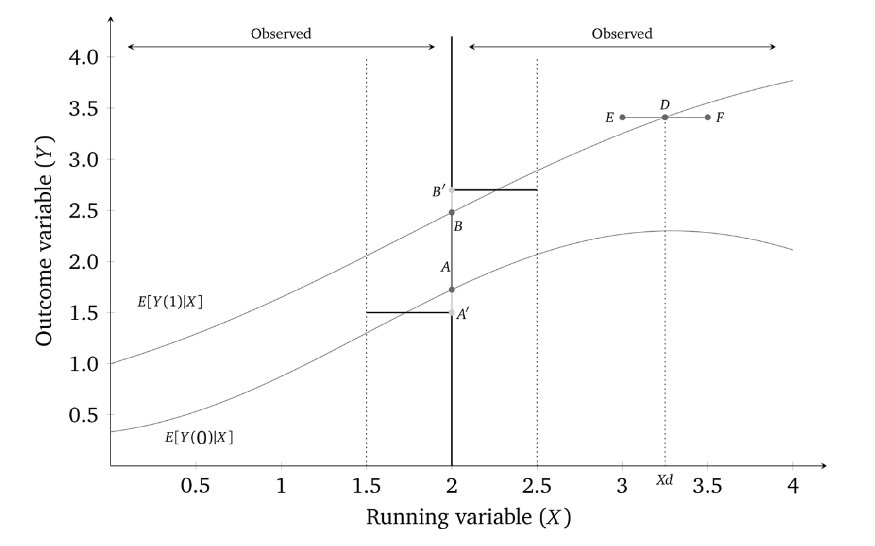
While the true effect in this diagram is \(AB\), with a certain bandwidth a rectangular kernel would estimate the effect as \(A'B'\), which is as you can see a biased estimator. There is systematic bias with the kernel method if the underlying nonlinear function, \(f(X)\), is upwards-or downwards-xsloping.
The standard solution to this problem is to run local linear nonparametric regression (Hahn, Todd, and Klaauw 2001). In the case described above, this would substantially reduce the bias. So what is that? Think of kernel regression as a weighted regression restricted to a window (hence “local”). The kernel provides the weights to that regression.7 A rectangular kernel would give the same result as taking \(E[Y]\) at a given bin on \(X\). The triangular kernel gives more importance to the observations closest to the center.
The model is some version of: \[ (\widehat{a},\widehat{b})= \text{argmin}_{a,b} \sum_{i=1}^n\Big(y_i - a -b(x_i-c_0)\Big)^2K \left(\dfrac{x_i-c_o}{h}\right)1(x_i>c_0) \] While estimating this in a given window of width \(h\) around the cutoff is straightforward, what’s not straightforward is knowing how large or small to make the bandwidth. This method is sensitive to the choice of bandwidth, but more recent work allows the researcher to estimate optimal bandwidths (G. Imbens and Kalyanaraman 2011; Calonico, Cattaneo, and Titiunik 2014). These may even allow for bandwidths to vary left and right of the cutoff.
Card, Dobkin, and Maestas (2008) is an example of a sharp RDD, because it focuses on the provision of universal health-care insurance for the elderly—Medicare at age 65. What makes this a policy-relevant question? Universal insurance has become highly relevant because of the debates surrounding the Affordable Care Act, as well as several Democratic senators supporting Medicare for All. But it is also important for its sheer size. In 2014, Medicare was 14% of the federal budget at $505 billion.
Approximately 20% of non-elderly adults in the United States lacked insurance in 2005. Most were from lower-income families, and nearly half were African American or Hispanic. Many analysts have argued that unequal insurance coverage contributes to disparities in health-care utilization and health outcomes across socioeconomic status. But, even among the policies, there is heterogeneity in the form of different copays, deductibles, and other features that affect use. Evidence that better insurance causes better health outcomes is limited because health insurance suffers from deep selection bias. Both supply and demand for insurance depend on health status, confounding observational comparisons between people with different insurance characteristics.
The situation for elderly looks very different, though. Less than 1% of the elderly population is uninsured. Most have fee-for-service Medicare coverage. And that transition to Medicare occurs sharply at age 65—the threshold for Medicare eligibility.
The authors estimate a reduced form model measuring the causal effect of health insurance status on health-care usage: \[ y_{ija} = X_{ija} \alpha + f_k(\alpha ; \beta ) + \sum_k C_{ija}^k \delta^k + u_{ija} \] where \(i\) indexes individuals, \(j\) indexes a socioeconomic group, \(a\) indexes age, \(u_{ija}\) indexes the unobserved error, \(y_{ija}\) health care usage, \(X_{ija}\) a set of covariates (e.g., gender and region), \(f_j(\alpha ; \beta )\) a smooth function representing the age profile of outcome \(y\) for group \(j\), and \(C_{ija}^k\) \((k=1,2,\dots ,K)\) are characteristics of the insurance coverage held by the individual such as copayment rates. The problem with estimating this model, though, is that insurance coverage is endogenous: \(cov(u,C) \neq 0\). So the authors use as identification of the age threshold for Medicare eligibility at 65, which they argue is credibly exogenous variation in insurance status.
Suppose health insurance coverage can be summarized by two dummy variables: \(C_{ija}^1\) (any coverage) and \(C_{ija}^2\) (generous insurance). Card, Dobkin, and Maestas (2008) estimate the following linear probability models:
\[ \begin{align} C_{ija}^1 & =X_{ija}\beta_j^1 + g_j^1(a) + D_a \pi_j^1 + v_{ija}^1 \\ C_{ija}^2 & =X_{ija} \beta_j^2 + g_j^2(a) + D_a \pi_j^2 + v_{ija}^2 \end{align} \]
where \(\beta_j^1\) and \(\beta_j^2\) are group-specific coefficients, \(g_j^1(a)\) and \(g_j^2(a)\) are smooth age profiles for group \(j\), and \(D_a\) is a dummy if the respondent is equal to or over age 65. Recall the reduced form model:
\[ \begin{align} y_{ija} = X_{ija} \alpha + f_k(\alpha ; \beta ) + \sum_k C_{ija}^k \delta^k + u_{ija} \end{align} \]
Combining the \(C_{ija}\) equations, and rewriting the reduced form model, we get:
\[ \begin{align} y_{ija}=X_{ija}\Big(\alpha_j+\beta_j^1\delta_j^1+ \beta_j^2 \delta_j^2\Big)h_j(a)+D_a\pi_j^y+ v_{ija}^y \end{align} \]
where \(h(a)=f_j(a) + \delta^1 g_j^1(a) + \delta^2 g_j^2(a)\) is the reduced form age profile for group \(j\), \(\pi_j^y=\pi_j^1\delta^1 + \pi_j^2 \delta^2\) and \(v_{ija}^y=u_{ija} + v_{ija}^1 \delta^1 + v_{ija}^2 \delta^2\) is the error term. Assuming that the profiles \(f_j(a)\), \(g_j(a)\), and \(g_j^2(a)\) are continuous at age 65 (i.e., the continuity assumption necessary for identification), then any discontinuity in \(y\) is due to insurance. The magnitudes will depend on the size of the insurance changes at age 65 (\(\pi_j^1\) and \(\pi_j^2\)) and on the associated causal effects (\(\delta^1\) and \(\delta^2\)).
For some basic health-care services, such as routine doctor visits, it may be that the only thing that matters is insurance. But, in those situations, the implied discontinuity in \(Y\) at age 65 for group \(j\) will be proportional to the change in insurance status experienced by that group. For more expensive or elective services, the generosity of the coverage may matter—for instance, if patients are unwilling to cover the required copay or if the managed care program won’t cover the service. This creates a potential identification problem in interpreting the discontinuity in \(y\) for any one group. Since \(\pi_j^y\) is a linear combination of the discontinuities in coverage and generosity, \(\delta^1\) and \(\delta^2\) can be estimated by a regression across groups: \[ \pi_j^y=\delta^0+\delta^1\pi_j^1+\delta_j^2\pi_j^2+e_j \] where \(e_j\) is an error term reflecting a combination of the sampling errors in \(\pi_j^y\), \(\pi_j^1\) and, \(\pi_j^2\).
Card, Dobkin, and Maestas (2008) use a couple of different data sets—one a standard survey and the other administrative records from hospitals in three states. First, they use the 1992–2003 National Health Interview Survey (NHIS). The NHIS reports respondents’ birth year, birth month, and calendar quarter of the interview. Authors used this to construct an estimate of age in quarters at date of interview. A person who reaches 65 in the interview quarter is coded as age 65 and 0 quarters. Assuming a uniform distribution of interview dates, one-half of these people will be 0–6 weeks younger than 65 and one-half will be 0–6 weeks older. Analysis is limited to people between 55 and 75. The final sample has 160,821 observations.
The second data set is hospital discharge records for California, Florida, and New York. These records represent a complete census of discharges from all hospitals in the three states except for federally regulated institutions. The data files include information on age in months at the time of admission. Their sample selection criteria is to drop records for people admitted as transfers from other institutions and limit people between 60 and 70 years of age at admission. Sample sizes are 4,017,325 (California), 2,793,547 (Florida), and 3,121,721 (New York).
Some institutional details about the Medicare program may be helpful. Medicare is available to people who are at least 65 and have worked forty quarters or more in covered employment or have a spouse who did. Coverage is available to younger people with severe kidney disease and recipients of Social Security Disability Insurance. Eligible individuals can obtain Medicare hospital insurance (Part A) free of charge and medical insurance (Part B) for a modest monthly premium. Individuals receive notice of their impending eligibility for Medicare shortly before they turn 65 and are informed they have to enroll in it and choose whether to accept Part B coverage. Coverage begins on the first day of the month in which they turn 65.
There are five insurance-related variables: probability of Medicare coverage, any health insurance coverage, private coverage, two or more forms of coverage, and individual’s primary health insurance is managed care. Data are drawn from the 1999–2003 NHIS, and for each characteristic, authors show the incidence rate at age 63–64 and the change at age 65 based on a version of the \(C_K\) equations that include a quadratic in age, fully interacted with a post-65 dummy as well as controls for gender, education, race/ethnicity, region, and sample year. Alternative specifications were also used, such as a parametric model fit to a narrower age window (age 63–67) and a local linear regression specification using a chosen bandwidth. Both show similar estimates of the change at age 65.
| On Medicare | Any insurance | Private coverage | 2\(+\) forms coverage | Managed care | |
|---|---|---|---|---|---|
| Overall sample | 59.7 | 9.5 | \(-2.9\) | 44.1 | \(-28.4\) |
| (4.1) | (0.6) | (1.1) | (2.8) | (2.1) | |
| White non-Hispanic | |||||
| High school dropout | 58.5 | 13.0 | \(-6.2\) | 44.5 | \(-25.0\) |
| (4.6) | (2.7) | (3.3) | (4.0) | (4.5) | |
| High school graduate | 64.7 | 7.6 | \(-1.9\) | 51.8 | \(-30.3\) |
| (5.0) | (0.7) | (1.6) | (3.8) | (2.6) | |
| Some college | 68.4 | 4.4 | \(-2.3\) | 55.1 | \(-40.1\) |
| (4.7) | (0.5) | (1.8) | (4.0) | (2.6) | |
| Minority | |||||
| High school dropout | 44.5 | 21.5 | \(-1.2\) | 19.4 | \(-8.3\) |
| (3.1) | (2.1) | (2.5) | (1.9) | (3.1) | |
| High school graduate | 44.6 | 8.9 | \(-5.8\) | 23.4 | \(-15.4\) |
| (4.7) | (2.8) | (5.1) | (4.8) | (3.5) | |
| Some college | 52.1 | 5.8 | \(-5.4\) | 38.4 | \(-22.3\) |
| (4.9) | (2.0) | (4.3) | (3.8) | (7.2) | |
| Classified by ethnicity only | |||||
| White non-Hispanic | 65.2 | 7.3 | \(-2.8\) | 51.9 | \(-33.6\) |
| (4.6) | (0.5) | (1.4) | (3.5) | (2.3) | |
| Black non-Hispanic | 48.5 | 11.9 | \(-4.2\) | 27.8 | \(-13.5\) |
| (3.6) | (2.0) | (2.8) | (3.7) | (3.7) | |
| Hispanic | 44.4 | 17.3 | \(-2.0\) | 21.7 | \(-12.1\) |
| (3.7) | (3.0) | (1.7) | (2.1) | (3.7) |
The authors present their findings in Table 6.3. The way that you read this table is each cell shows the average treatment effect for the 65-year-old population that complies with the treatment. We can see, not surprisingly, that the effect of receiving Medicare is to cause a very large increase of being on Medicare, as well as reducing coverage on private and managed care.
Formal identification in an RDD relating to some outcome (insurance coverage) to a treatment (Medicare age-eligibility) that itself depends on some running variable, age, relies on the continuity assumptions that we discussed earlier. That is, we must assume that the conditional expectation functions for both potential outcomes is continuous at age\(=65\). This means that both \(E[Y^0\mid a]\) and \(E[Y^1\mid a]\) are continuous through age of 65. If that assumption is plausible, then the average treatment effect at age 65 is identified as: \[ \lim_{65 \leftarrow a}E\big[y^1\mid a\big] - \lim_{a \rightarrow 65}E\big[y^0\mid a\big] \] The continuity assumption requires that all other factors, observed and unobserved, that affect insurance coverage are trending smoothly at the cutoff, in other words. But what else changes at age 65 other than Medicare eligibility? Employment changes. Typically, 65 is the traditional age when people retire from the labor force. Any abrupt change in employment could lead to differences in health-care utilization if nonworkers have more time to visit doctors.
The authors need to, therefore, investigate this possible confounder. They do this by testing for any potential discontinuities at age 65 for confounding variables using a third data set—the March CPS 1996–2004. And they ultimately find no evidence for discontinuities in employment at age 65 (Figure 6.12).
Next the authors investigate the impact that Medicare had on access to care and utilization using the NHIS data. Since 1997, NHIS has asked four questions. They are:
“During the past 12 months has medical care been delayed for this person because of worry about the cost?”
“During the past 12 months was there any time when this person needed medical care but did not get it because this person could not afford it?”
“Did the individual have at least one doctor visit in the past year?”
“Did the individual have one or more overnight hospital stays in the past year?”
Estimates from this analysis are presented in Table 6.4. Each cell measures the average treatment effect for the complier population
at the discontinuity. Standard errors are in parentheses. There are a few encouraging findings from this table. First, the share of the relevant population who delayed care the previous year fell 1.8 points, and similar for the share who did not get care at all in the previous year. The share who saw a doctor went up slightly, as did the share who stayed at a hospital. These are not very large effects in magnitude, it is important to note, but they are relatively precisely estimated. Note that these effects differed considerably by race and ethnicity as well as education.
| Delayed last year | Did not get care last year | Saw doctor last year | Hospital stay last year | |
|---|---|---|---|---|
| Overall sample | \(-1.8\) | \(-1.3\) | 1.3 | 1.2 |
| (0.4) | (0.3) | (0.7) | (0.4) | |
| White non-Hispanic | ||||
| High school dropout | \(-1.5\) | \(-0.2\) | 3.1 | 1.6 |
| (1.1) | (1.0) | (1.3) | (1.3) | |
| High school graduate | 0.3 | \(-1.3\) | \(-0.4\) | 0.3 |
| (2.8) | (2.8) | (1.5) | (0.7) | |
| Some college | \(-1.5\) | \(-1.4\) | 0.0 | 2.1 |
| (0.4) | (0.3) | (1.3) | (0.7) | |
| Minority | ||||
| High school dropout | \(-5.3\) | \(-4.2\) | 5.0 | 0.0 |
| (1.0) | (0.9) | (2.2) | (1.4) | |
| High school graduate | \(-3.8\) | 1.5 | 1.9 | 1.8 |
| (3.2) | (3.7) | (2.7) | (1.4) | |
| Some college | \(-0.6\) | \(-0.2\) | 3.7 | 0.7 |
| (1.1) | (0.8) | (3.9) | (2.0) | |
| Classified by ethnicity only | ||||
| White non-Hispanic | \(-1.6\) | \(-1.2\) | 0.6 | 1.3 |
| (0.4) | (0.3) | (0.8) | (0.5) | |
| Black non-Hispanic | \(-1.9\) | \(-0.3\) | 3.6 | 0.5 |
| (1.1) | (1.1) | (1.9) | (1.1) | |
| Hispanic | \(-4.9\) | \(-3.8\) | 8.2 | 11.8 |
| (0.8) | (0.7) | (0.8) | (1.6) |
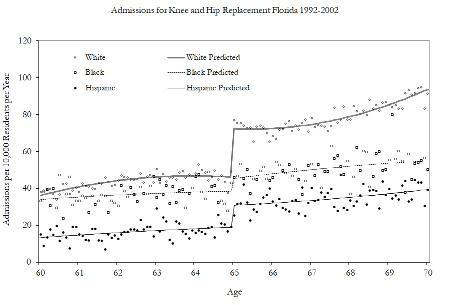
Having shown modest effects on care and utilization, the authors turn to examining the kinds of care they received by examining specific changes in hospitalizations. Figure 6.13 shows the effect of Medicare on hip and knee replacements by race. The effects are largest for whites.
In conclusion, the authors find that universal health-care coverage for the elderly increases care and utilization as well as coverage. In a subsequent study (Card, Dobkin, and Maestas 2009), the authors examined the impact of Medicare on mortality and found slight decreases in mortality rates (see Table 6.5).
| Quadratic no controls | \(-1.1\) | \(-1.0\) | \(-1.1\) | \(-1.2\) | \(-1.0\) | |
| (0.2) | (0.2) | (0.3) | (0.3) | (0.4) | (0.4) | |
| Quadratic plus controls | \(-1.0\) | \(-0.8\) | \(-0.9\) | \(-0.9\) | \(-0.8\) | \(-0.7\) |
| 0.2) | (0.2) | (0.3) | (0.3) | (0.3) | (0.4) | |
| Cubic plus controls | \(-0.7\) | \(-0.7\) | \(-0.6\) | \(-0.9\) | \(-0.9\) | \(-0.4\) |
| (0.3) | (0.2) | (0.4) | (0.4) | (0.5) | (0.5) | |
| Local OLS with ad hoc bandwidths | \(-0.8\) | \(-0.8\) | \(-0.8\) | \(-0.9\) | \(-1.1\) | \(-0.8\) |
| (0.2) | (0.2) | (0.2) | (0.2) | (0.3) | (0.3) |
Dependent variable for death within interval shown in the column heading. Regression estimates at the discontinuity of age 65 for flexible regression models. Standard errors in parenthesis.
As we’ve mentioned, it’s standard practice in the RDD to estimate causal effects using local polynomial regressions. In its simplest form, this amounts to nothing more complicated than fitting a linear specification separately on each side of the cutoff using a least squares regression. But when this is done, you are using only the observations within some pre-specified window (hence “local”). As the true conditional expectation function is probably not linear at this window, the resulting estimator likely suffers from specification bias. But if you can get the window narrow enough, then the bias of the estimator is probably small relative to its standard deviation.
But what if the window cannot be narrowed enough? This can happen if the running variable only takes on a few values, or if the gap between values closest to the cutoff are large. The result could be you simply do not have enough observations close to the cutoff for the local polynomial regression. This also can lead to the heteroskedasticity-robust confidence intervals to undercover the average causal effect because it is not centered. And here’s the really bad news—this probably is happening a lot in practice.
In a widely cited and very influential study, Lee and Card (2008) suggested that researchers should cluster their standard errors by the running variable. This advice has since become common practice in the empirical literature. Lee and Lemieux (2010), in a survey article on proper RDD methodology, recommend this practice, just to name one example. But in a recent study, Kolesár and Rothe (2018) provide extensive theoretical and simulation-based evidence that clustering on the running variable is perhaps one of the worst approaches you could take. In fact, clustering on the running variable can actually be substantially worse than heteroskedastic-robust standard errors.
As an alternative to clustering and robust standard errors, the authors propose two alternative confidence intervals that have guaranteed coverage properties under various restrictions on the conditional expectation function. Both confidence intervals are “honest,” which means they achieve correct coverage uniformly over all conditional expectation functions in large samples. These confidence intervals are currently unavailable in Stata as of the time of this writing, but they can be implemented in R with the RDHonest package.8 R users are encouraged to use these confidence intervals. Stata users are encouraged to switch (grudgingly) to R so as to use these confidence intervals. Barring that, Stata users should use the heteroskedastic robust standard errors. But whatever you do, don’t cluster on the running variable, as that is nearly an unambiguously bad idea.
A separate approach may be to use randomization inference. As we noted, Hahn, Todd, and Klaauw (2001) emphasized that the conditional expected potential outcomes must be continuous across the cutoff for a regression discontinuity design to identify the local average treatment effect. But Cattaneo, Frandsen, and Titiunik (2015) suggest an alternative assumption which has implications for inference. They ask us to consider that perhaps around the cutoff, in a short enough window, the treatment was assigned to units randomly. It was effectively a coin flip which side of the cutoff someone would be for a small enough window around the cutoff. Assuming there exists a neighborhood around the cutoff where this randomization-type condition holds, then this assumption may be viewed as an approximation of a randomized experiment around the cutoff. Assuming this is plausible, we can proceed as if only those observations closest to the discontinuity were randomly assigned, which leads naturally to randomization inference as a methodology for conducting exact or approximate p-values.
In the sharp RDD, treatment was determined when \(X_i \geq c_0\). But that kind of deterministic assignment does not always happen. Sometimes there is a discontinuity, but it’s not entirely deterministic, though it nonetheless is associated with a discontinuity in treatment assignment. When there is an increase in the probability of treatment assignment, we have a fuzzy RDD. The earlier paper by Hoekstra (2009) had this feature, as did Angrist and Lavy (1999). The formal definition of a probabilistic treatment assignment is \[ \lim_{X_i\rightarrow{c_0}} \Pr\big(D_i=1\mid X_i=c_0\big) \ne \lim_{c_0 \leftarrow X_i} \Pr\big(D_i=1\mid X_i=c_0\big) \]
In other words, the conditional probability is discontinuous as \(X\) approaches \(c_0\) in the limit. A visualization of this is presented from Guido W. Imbens and Lemieux (2008) in Figure 6.14.
The identifying assumptions are the same under fuzzy designs as they are under sharp designs: they are the continuity assumptions. For identification, we must assume that the conditional expectation of the potential outcomes (e.g., \(E[Y^0|X<c_0]\)) is changing smoothly through \(c_0\). What changes at \(c_0\) is the treatment assignment probability. An illustration of this identifying assumption is in Figure 6.15.
Estimating some average treatment effect under a fuzzy RDD is very similar to how we estimate a local average treatment effect with instrumental variables. I will cover instrumental variables in more detail later in the book, but for now let me tell you about estimation under fuzzy designs using IV. One can estimate several ways. One simple way is a type of Wald estimator, where you estimate some causal effect as the ratio of a reduced form difference in mean outcomes around the cutoff and a reduced form difference in mean treatment assignment around the cutoff. \[ \delta_{\text{Fuzzy RDD}} = \dfrac{\lim_{X \rightarrow c_0} E\big[Y\mid X = c_0\big]-\lim_{X_0 \leftarrow X} E\big[Y\mid X=c_0\big]}{\lim_{X \rightarrow c_0} E\big[D\mid X=c_0\big]-\lim_{X_0 \leftarrow X} E\big[D\mid X=c_0\big]} \] The assumptions for identification here are the same as with any instrumental variables design: all the caveats about exclusion restrictions, monotonicity, SUTVA, and the strength of the first stage.9
But one can also estimate the effect using a two-stage least squares model or similar appropriate model such as limited-information maximum likelihood. Recall that there are now two events: the first event is when the running variable exceeds the cutoff, and the second event is when a unit is placed in the treatment. Let \(Z_i\) be an indicator for when \(X\) exceeds \(c_0\). One can use both \(Z_i\) and the interaction terms as instruments for the treatment \(D_i\). If one uses only \(Z_i\) as an instrumental variable, then it is a “just identified” model, which usually has good finite sample properties.
Let’s look at a few of the regressions that are involved in this instrumental variables approach. There are three possible regressions: the first stage, the reduced form, and the second stage. Let’s look at them in order. In the just identified case (meaning only one instrument for one endogenous variable), the first stage would be: \[ D_i = \gamma_0 + \gamma_1X_i+\gamma_2X_i^2 + \dots + \gamma_pX_i^p + \pi{Z}_i + \zeta_{1i} \] where \(\pi\) is the causal effect of \(Z_i\) on the conditional probability of treatment. The fitted values from this regression would then be used in a second stage. We can also use both \(Z_i\) and the interaction terms as instruments for \(D_i\). If we used \(Z_i\) and all its interactions, the estimated first stage would be: \[ D_i= \gamma_{00} + \gamma_{01}\tilde{X}_i + \gamma_{02}\tilde{X}_i^2 + \dots + \gamma_{0p}\tilde{X}_i^p + \pi Z_i + \gamma_1^*\tilde{X}_i Z_i + \gamma_2^* \tilde{X}_i Z_i + \dots + \gamma_p^*Z_i + \zeta_{1i} \] We would also construct analogous first stages for \(\tilde{X}_iD_i, \dots, \tilde{X}_i^pD_i\).
If we wanted to forgo estimating the full IV model, we might estimate the reduced form only. You’d be surprised how many applied people prefer to simply report the reduced form and not the fully specified instrumental variables model. If you read Hoekstra (2009), for instance, he favored presenting the reduced form—that second figure, in fact, was a picture of the reduced form. The reduced form would regress the outcome \(Y\) onto the instrument and the running variable. The form of this fuzzy RDD reduced form is: \[ Y_i = \mu + \kappa_1X_i + \kappa_2X_i^2 + \dots + \kappa_pX_i^p + \delta \pi Z_i + \zeta_{2i} \] As in the sharp RDD case, one can allow the smooth function to be different on both sides of the discontinuity by interacting \(Z_i\) with the running variable. The reduced form for this regression is:
\[ \begin{align} Y_i & =\mu + \kappa_{01}X_i\tilde{X}_i + \kappa_{02}X_i{}\tilde{X}_i^2 + \dots + \kappa_{0p}X_i{}\tilde{X}_i^p \\ & + \delta \pi Z_i + \kappa_{11}\tilde{X}_iZ_i + \kappa_{12} \tilde{X}_i Z_i + \dots + \kappa_{1p}\tilde{X}_iZ_i + \zeta_{1i} \end{align} \]
But let’s say you wanted to present the estimated effect of the treatment on some outcome. That requires estimating a first stage, using fitted values from that regression, and then estimating a second stage on those fitted values. This, and only this, will identify the causal effect of the treatment on the outcome of interest. The reduced form only estimates the causal effect of the instrument on the outcome. The second-stage model with interaction terms would be the same as before:
\[ \begin{align} Y_i & =\alpha + \beta_{01}\tilde{x}_i + \beta_{02}\tilde{x}_i^2 + \dots + \beta_{0p}\tilde{x}_i^p \\ & + \delta \widehat{D_i} + \beta_1^*\widehat{D_i}\tilde{x}_i + \beta_2^*\widehat{D_i}\tilde{x}_i^2 + \dots + \beta_p^*\widehat{D_i}\tilde{x}_i^p + \eta_i \end{align} \]
Where \(\tilde{x}\) are now not only normalized with respect to \(c_0\) but are also fitted values obtained from the first-stage regressions.
As Hahn, Todd, and Klaauw (2001) point out, one needs the same assumptions for identification as one needs with IV. As with other binary instrumental variables, the fuzzy RDD is estimating the local average treatment effect (LATE) (Guideo W. Imbens and Angrist 1994), which is the average treatment effect for the compliers. In RDD, the compliers are those whose treatment status changed as we moved the value of \(x_i\) from just to the left of \(c_0\) to just to the right of \(c_0\).
The requirement for RDD to estimate a causal effect are the continuity assumptions. That is, the expected potential outcomes change smoothly as a function of the running variable through the cutoff. In words, this means that the only thing that causes the outcome to change abruptly at \(c_0\) is the treatment. But, this can be violated in practice if any of the following is true:
The assignment rule is known in advance.
Agents are interested in adjusting.
Agents have time to adjust.
The cutoff is endogenous to factors that independently cause potential outcomes to shift.
There is nonrandom heaping along the running variable.
Examples include retaking an exam, self-reporting income, and so on. But some other unobservable characteristic change could happen at the threshold, and this has a direct effect on the outcome. In other words, the cutoff is endogenous. An example would be age thresholds used for policy, such as when a person turns 18 years old and faces more severe penalties for crime. This age threshold triggers the treatment (i.e., higher penalties for crime), but is also correlated with variables that affect the outcomes, such as graduating from high school and voting rights. Let’s tackle these problems separately.
Because of these challenges to identification, a lot of work by econometricians and applied microeconomists has gone toward trying to figure out solutions to these problems. The most influential is a density test by Justin McCrary, now called the McCrary density test (McCrary 2008). The McCrary density test is used to check whether units are sorting on the running variable. Imagine that there are two rooms with patients in line for some life-saving treatment. Patients in room A will receive the life-saving treatment, and patients in room B will knowingly receive nothing. What would you do if you were in room B? Like me, you’d probably stand up, open the door, and walk across the hall to room A. There are natural incentives for the people in room B to get into room A, and the only thing that would keep people in room B from sorting into room A is if doing so were impossible.
But, let’s imagine that the people in room B had successfully sorted themselves into room A. What would that look like to an outsider? If they were successful, then room A would have more patients than room B. In fact, in the extreme, room A is crowded and room B is empty. This is the heart of the McCrary density test, and when we see such things at the cutoff, we have some suggestive evidence that people are sorting on the running variable. This is sometimes called manipulation.
Remember earlier when I said we should think of continuity as the null because nature doesn’t make jumps? If you see a turtle on a fencepost, it probably didn’t get there itself. Well, the same goes for the density. If the null is a continuous density through the cutoff, then bunching in the density at the cutoff is a sign that someone is moving over to the cutoff—probably to take advantage of the rewards that await there. Sorting on the sorting variable is a testable prediction under the null of a continuous density. Assuming a continuous distribution of units, sorting on the running variable means that units are moving just on the other side of the cutoff. Formally, if we assume a desirable treatment \(D\) and an assignment rule \(X\geq c_0\), then we expect individuals will sort into \(D\) by choosing \(X\) such that \(X\geq c_0\)—so long as they’re able. If they do, then it could imply selection bias insofar as their sorting is a function of potential outcomes.
The kind of test needed to investigate whether manipulation is occurring is a test that checks whether there is bunching of units at the cutoff. In other words, we need a density test. McCrary (2008) suggests a formal test where under the null, the density should be continuous at the cutoff point. Under the alternative hypothesis, the density should increase at the kink.10 I’ve always liked this test because it’s a really simple statistical test based on a theory that human beings are optimizing under constraints. And if they are optimizing, that makes for testable predictions—like a discontinuous jump in the density at the cutoff. Statistics built on behavioral theory can take us further.
To implement the McCrary density test, partition the assignment variable into bins and calculate frequencies (i.e., the number of observations) in each bin. Treat the frequency counts as the dependent variable in a local linear regression. If you can estimate the conditional expectations, then you have the data on the running variable, so in principle you can always do a density test. I recommend the package rddensity,11 which you can install for R as well.12 These packages are based on Cattaneo, Jansson, and Ma (2019), which is based on local polynomial regressions that have less bias in the border regions.
This is a high-powered test. You need a lot of observations at \(c_0\) to distinguish a discontinuity in the density from noise. Let me illustrate in Figure 6.16 with a picture from McCrary (2008) that shows a situation with and without manipulation.
It has become common in this literature to provide evidence for the credibility of the underlying identifying assumptions, at least to some degree. While the assumptions cannot be directly tested, indirect evidence may be persuasive. I’ve already mentioned one such test—the McCrary density test. A second test is a covariate balance test. For RDD to be valid in your study, there must not be an observable discontinuous change in the average values of reasonably chosen covariates around the cutoff. As these are pretreatment characteristics, they should be invariant to change in treatment assignment. An example of this is from Lee, Moretti, and Butler (2004), who evaluated the impact of Democratic vote share just at 50%, on various demographic factors (Figure 6.17).
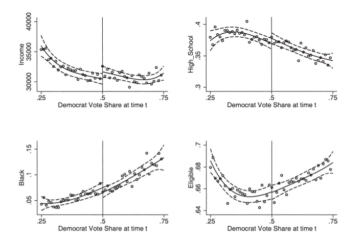
This test is basically what is sometimes called a placebo test. That is, you are looking for there to be no effects where there shouldn’t be any. So a third kind of test is an extension of that—just as there shouldn’t be effects at the cutoff on pretreatment values, there shouldn’t be effects on the outcome of interest at arbitrarily chosen cutoffs. Guido W. Imbens and Lemieux (2008) suggest looking at one side of the discontinuity, taking the median value of the running variable in that section, and pretending it was a discontinuity, \(c_0'\). Then test whether there is a discontinuity in the outcome at \(c_0'\). You do not want to find anything.
Almond et al. (2010) is a fascinating study. The authors are interested in estimating the causal effect of medical expenditures on health outcomes, in part because many medical technologies, while effective, may not justify the costs associated with their use. Determining their effectiveness is challenging given that medical resources are, we hope, optimally assigned to patients based on patient potential outcomes. To put it a different way, if the physician perceives that an intervention will have the best outcome, then that is likely a treatment that will be assigned to the patient. This violates independence, and more than likely, if the endogeneity of the treatment is deep enough, controlling for selection directly will be tough, if not impossible. As we saw with our earlier example of the perfect doctor, such nonrandom assignment of interventions can lead to confusing correlations. Counterintuitive correlations may be nothing more than selection bias.
But Almond et al. (2010) had an ingenious insight—in the United States, it is typically the case that babies with a very low birth weight receive heightened medical attention. This categorization is called the “very low birth weight” range, and such low birth weight is quite dangerous for the child. Using administrative hospital records linked to mortality data, the authors find that the 1-year infant mortality decreases by around 1 percentage point when the child’s birth weight is just below the 1,500-gram threshold compared to those born just above. Given the mean 1-year mortality of 5.5%, this estimate is sizable, suggesting that the medical interventions triggered by the very-low-birth-weight classification have benefits that far exceed their costs.
Barreca et al. (2011) and Barreca, Lindo, and Waddell (2016) highlight some of econometric issues related to what they call “heaping” on the running variable. Heaping is when there is an excess number of units at certain points along the running variable. In this case, it appeared to be at regular 100-gram intervals and was likely caused by a tendency for hospitals to round to the nearest integer. A visualization of this problem can be seen in the original Almond et al. (2010), which I reproduce here in Figure 6.18. The long black lines appearing regularly across the birth-weight distribution are excess mass of children born at those numbers. This sort of event is unlikely to occur naturally in nature, and it is almost certainly caused by either sorting or rounding. It could be due to less sophisticated scales or, more troubling, to staff rounding a child’s birth weight to 1,500 grams in order to make the child eligible for increased medical attention.
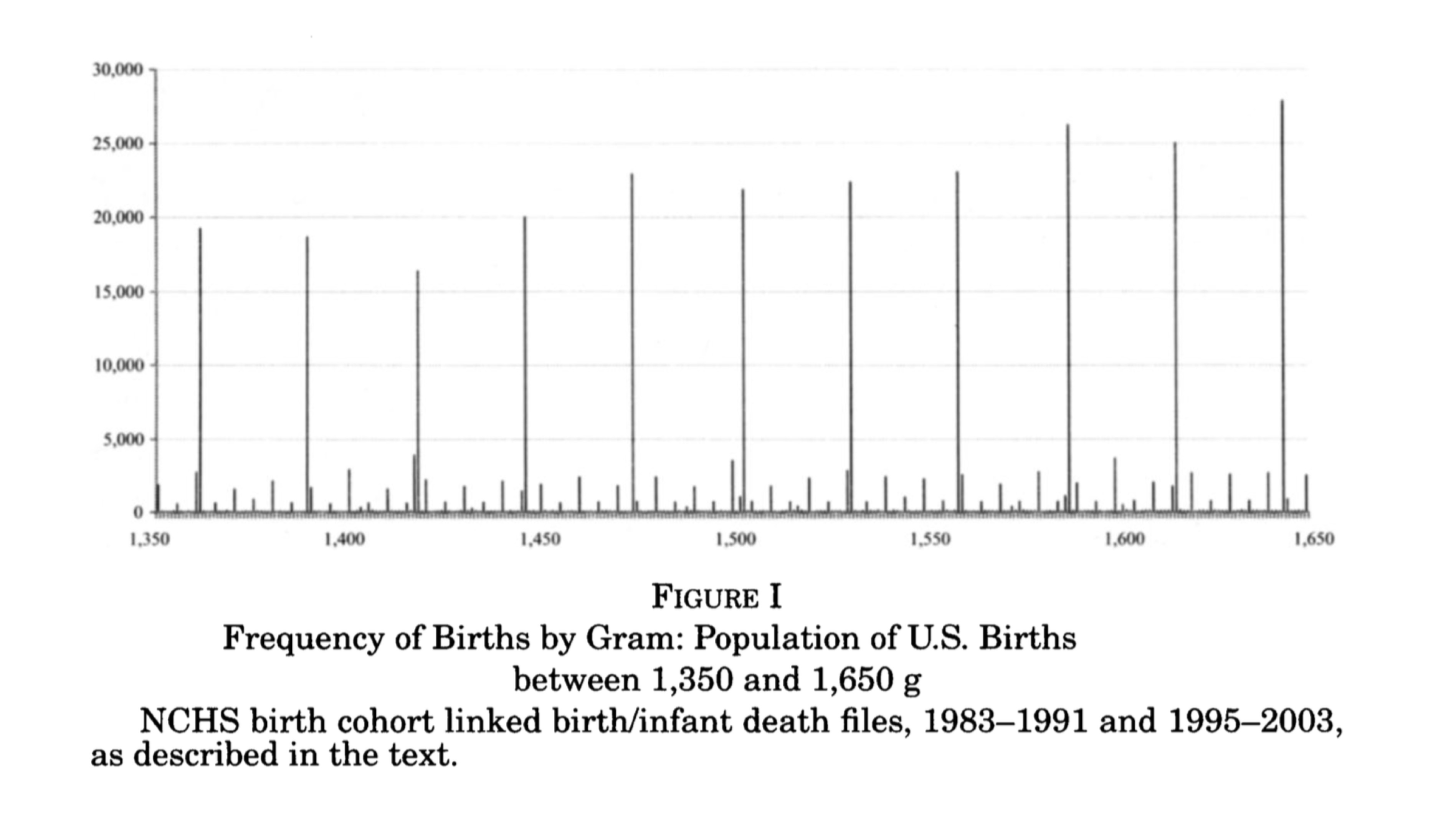
Almond et al. (2010) attempt to study this more carefully using the conventional McCrary density test and find no clear, statistically significant evidence for sorting on the running variable at the 1,500-gram cutoff. Satisfied, they conduct their main analysis, in which they find a causal effect of around a 1-percentage-point reduction in 1-year mortality.
The focus of Barreca et al. (2011) and Barreca, Lindo, and Waddell (2016) is very much on the heaping phenomenon shown in Figure Figure 6.18. Part of the strength of their work, though, is their illustration of some of the shortcomings of a conventional McCrary density test. In this case, the data heap at 1,500 grams appears to be babies whose mortality rates are unusually high. These children are outliers compared to units to both the immediate left and the immediate right. It is important to note that such events would not occur naturally; there is no reason to believe that nature would produce heaps of children born with outlier health defects every 100 grams. The authors comment on what might be going on:
This heaping at 1,500 grams may be a signal that poor-quality hospitals have relatively high propensities to round birth weights but is also consistent with manipulation of recorded birth weights by doctors, nurses, or parents to obtain favorable treatment for their children. Barreca et al. (2011) show that this nonrandom heaping leads one to conclude that it is “good” to be strictly less than any 100-g cutoff between 1,000 and 3,000 grams.
Since estimation in an RDD compares means as we approach the threshold from either side, the estimates should not be sensitive to the observations at the thresholds itself. Their solution is a so-called “donut hole” RDD, wherein they remove units in the vicinity of 1,500 grams and reestimate the model. Insofar as units are dropped, the parameter we are estimating at the cutoff has become an even more unusual type of local average treatment effect that may be even less informative about the average treatment effects that policy makers are desperate to know. But the strength of this rule is that it allows for the possibility that units at the heap differ markedly due to selection bias from those in the surrounding area. Dropping these units reduces the sample size by around 2% but has very large effects on 1-year mortality, which is approximately 50% lower than what was found by Almond et al. (2010).
These companion papers help us better understand some of the ways in which selection bias can creep into the RDD. Heaping is not the end of the world, which is good news for researchers facing such a problem. The donut hole RDD can be used to circumvent some of the problems. But ultimately this solution involves dropping observations, and insofar as your sample size is small relative to the number of heaping units, the donut hole approach could be infeasible. It also changes the parameter of interest to be estimated in ways that may be difficult to understand or explain. Caution with nonrandom heaping along the running variable is probably a good thing.
Within RDD, there is a particular kind of design that has become quite popular, the close-election design. Essentially, this design exploits a feature of American democracies wherein winners in political races are declared when a candidate gets the minimum needed share of votes. Insofar as very close races represent exogenous assignments of a party’s victory, which I’ll discuss below, then we can use these close elections to identify the causal effect of the winner on a variety of outcomes. We may also be able to test political economy theories that are otherwise nearly impossible to evaluate.
The following section has two goals. First, to discuss in detail the close election design using the classic Lee, Moretti, and Butler (2004). Second, to show how to implement the close-election design by replicating several parts of Lee, Moretti, and Butler (2004).
Do Politicians or Voters Pick Policies? The big question motivating Lee et al. (2004) has to do with whether and in which way voters affect policy. There are two fundamentally different views of the role of elections in a representative democracy: convergence theory and divergence theory.
The convergence theory states that heterogeneous voter ideology forces each candidate to moderate his or her position (e.g., similar to the median voter theorem):
Competition for votes can force even the most partisan Republicans and Democrats to moderate their policy choices. In the extreme case, competition may be so strong that it leads to “full policy convergence”: opposing parties are forced to adopt identical policies. Lee, Moretti, and Butler (2004) (p.87)
Divergence theory is a slightly more commonsense view of political actors. When partisan politicians cannot credibly commit to certain policies, then convergence is undermined and the result can be full policy “divergence.” Divergence is when the winning candidate, after taking office, simply pursues her most-preferred policy. In this extreme case, voters are unable to compel candidates to reach any kind of policy compromise, and this is expressed as two opposing candidates choosing very different policies under different counterfactual victory scenarios.
Lee, Moretti, and Butler (2004) present a model, which I’ve simplified. Let \(R\) and \(D\) be candidates in a congressional race. The policy space is a single dimension where \(D\)’s and \(R\)’s policy preferences in a period are quadratic loss functions, \(u(l)\) and \(v(l)\), and \(l\) is the policy variable. Each player has some bliss point, which is his or her most preferred location along the unidimensional policy range. For Democrats, it’s \(l^*=c(>0)\), and for Republicans it’s \(l*=0\). Here’s what this means.
Ex ante, voters expect the candidate to choose some policy and they expect the candidate to win with probability \(P(x^e,y^e)\), where \(x^e\) and \(y^e\) are the policies chosen by Democrats and Republicans, respectively. When \(x^>y^e\), then \(\dfrac{\partial P}{\partial x^e}>0, \dfrac{\partial P}{\partial y^e}<0\).
\(P^*\) represents the underlying popularity of the Democratic Party, or put differently, the probability that \(D\) would win if the policy chosen \(x\) equaled the Democrat’s bliss point \(c\).
The solution to this game has multiple Nash equilibria, which I discuss now.
Partial/complete convergence: Voters affect policies.
The key result under this equilibrium is \(\dfrac{\partial x^*}{\partial P^*}>0\).
Interpretation: If we dropped more Democrats into the district from a helicopter, it would exogenously increase \(P^*\) and this would result in candidates changing their policy positions, i.e., \(\dfrac{\partial x^*}{\partial P^*}>0\).
Complete divergence: Voters elect politicians with fixed policies who do whatever they want to do.13
Key result is that more popularity has no effect on policies. That is, \(\dfrac{\partial x^*}{\partial P^*}=0\).
An exogenous shock to \(P^*\) (i.e., dropping Democrats into the district) does nothing to equilibrium policies. Voters elect politicians who then do whatever they want because of their fixed policy preferences.
The potential roll-call voting record outcomes of the candidate following some election is \[ RC_t = D_tx_t + (1-D_t)y_t \] where \(D_t\) indicates whether a Democrat won the election. That is, only the winning candidate’s policy is observed. This expression can be transformed into regression equations:
\[ \begin{align} RC_t & = \alpha_0+\pi_0 P_t^*+\pi_1D_t+\varepsilon_t \\ RC_{t+1} & = \beta_0 + \pi_0 P^*_{t+1} + \pi_1 D_{t+1} + \varepsilon_{t+1} \end{align} \]
where \(\alpha_0\) and \(\beta_0\) are constants.
This equation can’t be directly estimated because we never observe \(P^*\). But suppose we could randomize \(D_t\). Then \(D_t\) would be independent of \(P^*_t\) and \(\varepsilon_t\). Then taking conditional expectations with respect to \(D_t\), we get:
\[ \begin{align} \small \underbrace{E\big[RC_{t+1}\mid D_t=1\big] - E\big[RC_{t+1}\mid D_t=0\big]}_{ \text{Observable}} &= \pi_0\big[P^{*D}_{t+1} - P^{*R}_{t+1}\big] \\ &+ \underbrace{\pi_1\big[P^D_{t+1}-P^R_{t+1}\big]}_{\text{Observable}} \\ &=\underbrace{\gamma}_{ \text{Total effect of initial win on future roll call votes}} \\ \end{align} \]
\[ \begin{align} \underbrace{E\big[RC_{t}\mid D_t=1\big] - E\big[RC_{t}\mid D_t=0\big]}_{ \text{Observable}} = \pi_1 \\ \underbrace{E\big[D_{t+1}\mid D_t=1\big] - E\big[D_{t+1}\mid D_t=0\big]}_{\text{Observable}} = P_{t+1}^D - P_{t+1}^R \end{align} \]
The “elect” component is \(\pi_1[P_{t+1}^D - P_{t+1}^R]\) and is estimated as the difference in mean voting records between the parties at time \(t\). The fraction of districts won by Democrats in \(t+1\) is an estimate of \([P_{t+1}^D - P_{t+1}^R]\). Because we can estimate the total effect, \(\gamma\), of a Democrat victory in \(t\) on \(RC_{t+1}\), we can net out the elect component to implicitly get the “effect” component.
But random assignment of \(D_t\) is crucial. For without it, this equation would reflect \(\pi_1\) and selection (i.e., Democratic districts have more liberal bliss points). So the authors aim to randomize \(D_t\) using a RDD, which I’ll now discuss in detail.
Buy the print version today:
There are two main data sets in this project. The first is a measure of how liberal an official voted. This is collected from the Americans for Democratic Action (ADA) linked with House of Representatives election results for 1946–1995. Authors use the ADA score for all US House representatives from 1946 to 1995 as their voting record index. For each Congress, the ADA chose about twenty-five high-profile roll-call votes and created an index varying from 0 to 100 for each representative. Higher scores correspond to a more “liberal” voting record. The running variable in this study is the vote share. That is the share of all votes that went to a Democrat. ADA scores are then linked to election returns data during that period.
Recall that we need randomization of \(D_t\). The authors have a clever solution. They will use arguably exogenous variation in Democratic wins to check whether convergence or divergence is correct. If convergence is true, then Republicans and Democrats who just barely won should vote almost identically, whereas if divergence is true, they should vote differently at the margins of a close race. This “at the margins of a close race” is crucial because the idea is that it is at the margins of a close race that the distribution of voter preferences is the same. And if voter preferences are the same, but policies diverge at the cutoff, then it suggests politicians and not voters are driving policy making.
The exogenous shock comes from the discontinuity in the running variable. At a vote share of just above 0.5, the Democratic candidate wins. They argue that just around that cutoff, random chance determined the Democratic win—hence the random assignment of \(D_t\) (Cattaneo, Frandsen, and Titiunik 2015). Table 6.6 is a reproduction of Cattaneo et al.’s main results. The effect of a Democratic victory increases liberal voting by 21 points in the next period, 48 points in the current period, and the probability of reelection by 48%. The authors find evidence for both divergence and incumbency advantage using this design. Let’s dig into the data ourselves now and see if we can find where the authors are getting these results. We will examine the results around Table 6.6 by playing around with the data and different specifications.
| Dependent variable | \(ADA_{t+1}\) | \(ADA_{t}\) | \(DEM_{t+1}\) |
|---|---|---|---|
| Estimated gap | 21.2 | 47.6 | 0.48 |
| (1.9) | (1.3) | (0.02) |
Standard errors in parentheses. The unit of observation is a district-congressional session. The sample includes only observations where the Democrat vote share at time \(t\) is strictly between 48 percent and 52 percent. The estimated gap is the difference in the average of the relevant variable for observations for which the Democrat vote share at time \(t\) is strictly between 50 percent and 52 percent and observations for which the Democrat vote share at time \(t\) is strictly between 48 percent and 50 percent. Time \(t\) and \(t+1\) refer to congressional sessions. \(ADA_t\) is the adjusted ADA voting score. Higher ADA scores correspond to more liberal roll-call voting records. Sample size is 915
* Stata code attributed to Marcelo Perraillon.
use https://github.com/scunning1975/mixtape/raw/master/lmb-data.dta, clear

* Replicating Table 1 of Lee, Moretti and Butler (2004)
reg score lagdemocrat    if lagdemvoteshare>.48 & lagdemvoteshare<.52, cluster(id)
reg score democrat       if lagdemvoteshare>.48 & lagdemvoteshare<.52, cluster(id)
reg democrat lagdemocrat if lagdemvoteshare>.48 & lagdemvoteshare<.52, cluster(id)library(tidyverse)
library(haven)
library(estimatr)
read_data <- function(df)
{
full_path <- paste("https://github.com/scunning1975/mixtape/raw/master/",
df, sep = "")
df <- read_dta(full_path)
return(df)
}
lmb_data <- read_data("lmb-data.dta")
lmb_subset <- lmb_data %>%
filter(lagdemvoteshare>.48 & lagdemvoteshare<.52)
lm_1 <- lm_robust(score ~ lagdemocrat, data = lmb_subset, clusters = id)
lm_2 <- lm_robust(score ~ democrat, data = lmb_subset, clusters = id)
lm_3 <- lm_robust(democrat ~ lagdemocrat, data = lmb_subset, clusters = id)
summary(lm_1)
summary(lm_2)
summary(lm_3)import numpy as np
import pandas as pd
import statsmodels.api as sm
import statsmodels.formula.api as smf
from itertools import combinations
import plotnine as p
# read data
import ssl
ssl._create_default_https_context = ssl._create_unverified_context
def read_data(file):
return pd.read_stata("https://github.com/scunning1975/mixtape/raw/master/" + file)
def lm_robust(formula, data):
regression = sm.OLS.from_formula(formula, data = data)
regression = regression.fit(cov_type="cluster",cov_kwds={"groups":data['id']})
return regression
lmb_data = read_data("lmb-data.dta")
lmb_data['demvoteshare_c'] = lmb_data['demvoteshare'] - 0.5
lmb_subset = lmb_data[lmb_data.lagdemvoteshare.between(.48, .52)]
lm_1 = lm_robust('score ~ lagdemocrat', data = lmb_subset)
lm_2 = lm_robust('score ~ democrat', data = lmb_subset)
lm_3 = lm_robust('democrat ~ lagdemocrat', data = lmb_subset)
print("Original results based on ADA Scores -- Close Elections Sample")
Stargazer([lm_1, lm_2, lm_3])We reproduce regression results from Lee, Moretti, and Butler in Table 6.7. While the results are close to Lee, Moretti, and Butler’s original table, they are slightly different. But ignore that for now. The main thing to see is that we used regressions limited to the window right around the cutoff to estimate the effect. These are local regressions in the sense that they use data close to the cutoff. Notice the window we chose—we are only using observations between 0.48 and 0.52 vote share. So this regression is estimating the coefficient on \(D_t\) right around the cutoff. What happens if we use all the data?
* Stata code attributed to Marcelo Perraillon.
reg score lagdemocrat, cluster(id)
reg score democrat, cluster(id)
reg democrat lagdemocrat, cluster(id)#using all data (note data used is lmb_data, not lmb_subset)
lm_1 <- lm_robust(score ~ lagdemocrat, data = lmb_data, clusters = id)
lm_2 <- lm_robust(score ~ democrat, data = lmb_data, clusters = id)
lm_3 <- lm_robust(democrat ~ lagdemocrat, data = lmb_data, clusters = id)
summary(lm_1)
summary(lm_2)
summary(lm_3)import numpy as np
import pandas as pd
import statsmodels.api as sm
import statsmodels.formula.api as smf
from itertools import combinations
import plotnine as p
# read data
import ssl
ssl._create_default_https_context = ssl._create_unverified_context
def read_data(file):
return pd.read_stata("https://github.com/scunning1975/mixtape/raw/master/" + file)
def lm_robust(formula, data):
regression = sm.OLS.from_formula(formula, data = data)
regression = regression.fit(cov_type="cluster",cov_kwds={"groups":data['id']})
return regression
lmb_data = read_data("lmb-data.dta")
lmb_data['demvoteshare_c'] = lmb_data['demvoteshare'] - 0.5
lm_1 = lm_robust('score ~ lagdemocrat', data = lmb_data)
lm_2 = lm_robust('score ~ democrat', data = lmb_data)
lm_3 = lm_robust('democrat ~ lagdemocrat', data = lmb_data)
print("Original results based on ADA Scores -- Full Sample")
Stargazer([lm_1, lm_2, lm_3])| Dependent variable | \(ADA_{t+1}\) | \(ADA_{t}\) | \(DEM_{t+1}\) |
|---|---|---|---|
| Estimated gap | 31.50\(^{***}\) | 40.76\(^{***}\) | 0.82\(^{***}\) |
| (0.48) | (0.42) | (0.01) | |
| N | 13,588 | 13,588 | 13,588 |
Cluster robust standard errors in parenthesis. \(^{*}\) p<0.10, \(^{**}\) p<0.05, \(^{***}\) p<0.01
Notice that when we use all of the data, we get somewhat different effects (Table 6.7). The effect on future ADA scores gets larger by 10 points, but the contemporaneous effect gets smaller. The effect on incumbency, though, increases considerably. So here we see that simply running the regression yields different estimates when we include data far from the cutoff itself.
Neither of these regressions included controls for the running variable though. It also doesn’t use the recentering of the running variable. So let’s do both. We will simply subtract 0.5 from the running variable so that values of 0 are where the vote share equals 0.5, negative values are Democratic vote shares less than 0.5, and positive values are Democratic vote shares above 0.5. To do this, type in the following lines:
* Stata code attributed to Marcelo Perraillon.
gen demvoteshare_c = demvoteshare - 0.5
reg score lagdemocrat demvoteshare_c, cluster(id)
reg score democrat demvoteshare_c, cluster(id)
reg democrat lagdemocrat demvoteshare_c, cluster(id)lmb_data <- lmb_data %>%
mutate(demvoteshare_c = demvoteshare - 0.5)
lm_1 <- lm_robust(score ~ lagdemocrat + demvoteshare_c, data = lmb_data, clusters = id)
lm_2 <- lm_robust(score ~ democrat + demvoteshare_c, data = lmb_data, clusters = id)
lm_3 <- lm_robust(democrat ~ lagdemocrat + demvoteshare_c, data = lmb_data, clusters = id)
summary(lm_1)
summary(lm_2)
summary(lm_3)import numpy as np
import pandas as pd
import statsmodels.api as sm
import statsmodels.formula.api as smf
from itertools import combinations
import plotnine as p
# read data
import ssl
ssl._create_default_https_context = ssl._create_unverified_context
def read_data(file):
return pd.read_stata("https://github.com/scunning1975/mixtape/raw/master/" + file)
def lm_robust(formula, data):
regression = sm.OLS.from_formula(formula, data = data)
regression = regression.fit(cov_type="cluster",cov_kwds={"groups":data['id']})
return regression
lmb_data = read_data("lmb-data.dta")
lmb_data['demvoteshare_c'] = lmb_data['demvoteshare'] - 0.5
# drop missing values
lmb_data = lmb_data[~pd.isnull(lmb_data.demvoteshare_c)]
lm_1 = lm_robust('score ~ lagdemocrat + demvoteshare_c', data = lmb_data)
lm_2 = lm_robust('score ~ democrat + demvoteshare_c', data = lmb_data)
lm_3 = lm_robust('democrat ~ lagdemocrat + demvoteshare_c', data = lmb_data)
print("Results based on ADA Scores -- Full Sample")
Stargazer([lm_1, lm_2, lm_3])| Dependent variable | \(ADA_{t+1}\) | \(ADA_{t}\) | \(DEM_{t+1}\) |
|---|---|---|---|
| Estimated gap | 33.45\(^{***}\) | 58.50\(^{***}\) | 0.55\(^{**}\) |
| (0.85) | (0.66) | (0.01) | |
| N | 13,577 | 13,577 | 13,577 |
Cluster robust standard errors in parenthesis. \(^{*}\) \(p<0.10\), \(^{**}\) \(p<0.05\), \(^{***}\) \(p<0.01\)
We report our analysis from the programming in Table Table 6.8. While the incumbency effect falls closer to what Lee, Moretti, and Butler (2004) find, the effects are still quite different.
It is common, though, to allow the running variable to vary on either side of the discontinuity, but how exactly do we implement that? Think of it—we need for a regression line to be on either side, which means necessarily that we have two lines left and right of the discontinuity. To do this, we need an interaction—specifically an interaction of the running variable with the treatment variable. To implement this in Stata, we can use the code shown in lmb_4.do.
* Stata code attributed to Marcelo Perraillon.
xi: reg score i.lagdemocrat*demvoteshare_c, cluster(id)
xi: reg score i.democrat*demvoteshare_c, cluster(id)
xi: reg democrat i.lagdemocrat*demvoteshare_c, cluster(id)lm_1 <- lm_robust(score ~ lagdemocrat*demvoteshare_c,
data = lmb_data, clusters = id)
lm_2 <- lm_robust(score ~ democrat*demvoteshare_c,
data = lmb_data, clusters = id)
lm_3 <- lm_robust(democrat ~ lagdemocrat*demvoteshare_c,
data = lmb_data, clusters = id)
summary(lm_1)
summary(lm_2)
summary(lm_3)import numpy as np
import pandas as pd
import statsmodels.api as sm
import statsmodels.formula.api as smf
from itertools import combinations
import plotnine as p
# read data
import ssl
ssl._create_default_https_context = ssl._create_unverified_context
def read_data(file):
return pd.read_stata("https://github.com/scunning1975/mixtape/raw/master/" + file)
def lm_robust(formula, data):
regression = sm.OLS.from_formula(formula, data = data)
regression = regression.fit(cov_type="cluster",cov_kwds={"groups":data['id']})
return regression
lmb_data = read_data("lmb-data.dta")
lmb_data['demvoteshare_c'] = lmb_data['demvoteshare'] - 0.5
# drop missing values
lmb_data = lmb_data[~pd.isnull(lmb_data.demvoteshare_c)]
lm_1 = lm_robust('score ~ lagdemocrat*demvoteshare_c', data = lmb_data)
lm_2 = lm_robust('score ~ democrat*demvoteshare_c', data = lmb_data)
lm_3 = lm_robust('democrat ~ lagdemocrat*demvoteshare_c', data = lmb_data)
print("Original results based on ADA Scores -- Full Sample with linear interactions")
Stargazer([lm_1, lm_2, lm_3])| Dependent variable | \(ADA_{t+1}\) | \(ADA_{t}\) | \(DEM_{t+1}\) |
|---|---|---|---|
| Estimated gap | 30.51\(^{***}\) | 55.43\(^{***}\) | 0.53\(^{***}\) |
| (0.82) | (0.64) | (0.01) | |
| N | 13,577 | 13,577 | 13,577 |
Cluster robust standard errors in parenthesis. \(^{*}\) \(p<0.10\), \(^{**}\) \(p<0.05\), \(^{***}\) \(p<0.01\)
In Table Table 6.9, we report the global regression analysis with the running variable interacted with the treatment variable. This pulled down the coefficients somewhat, but they remain larger than what was found when we used only those observations within 0.02 points of the 0.5. Finally, let’s estimate the model with a quadratic.
* Stata code attributed to Marcelo Perraillon.
gen demvoteshare_sq = demvoteshare_c^2
xi: reg score lagdemocrat##c.(demvoteshare_c demvoteshare_sq), cluster(id)
xi: reg score democrat##c.(demvoteshare_c demvoteshare_sq), cluster(id)
xi: reg democrat lagdemocrat##c.(demvoteshare_c demvoteshare_sq), cluster(id)lmb_data <- lmb_data %>%
mutate(demvoteshare_sq = demvoteshare_c^2)
lm_1 <- lm_robust(score ~ lagdemocrat*demvoteshare_c + lagdemocrat*demvoteshare_sq,
data = lmb_data, clusters = id)
lm_2 <- lm_robust(score ~ democrat*demvoteshare_c + democrat*demvoteshare_sq,
data = lmb_data, clusters = id)
lm_3 <- lm_robust(democrat ~ lagdemocrat*demvoteshare_c + lagdemocrat*demvoteshare_sq,
data = lmb_data, clusters = id)
summary(lm_1)
summary(lm_2)
summary(lm_3)import numpy as np
import pandas as pd
import statsmodels.api as sm
import statsmodels.formula.api as smf
from itertools import combinations
import plotnine as p
# read data
import ssl
ssl._create_default_https_context = ssl._create_unverified_context
def read_data(file):
return pd.read_stata("https://github.com/scunning1975/mixtape/raw/master/" + file)
def lm_robust(formula, data):
regression = sm.OLS.from_formula(formula, data = data)
regression = regression.fit(cov_type="cluster",cov_kwds={"groups":data['id']})
return regression
lmb_data = read_data("lmb-data.dta")
lmb_data['demvoteshare_c'] = lmb_data['demvoteshare'] - 0.5
# drop missing values
lmb_data = lmb_data[~pd.isnull(lmb_data.demvoteshare_c)]
lmb_data['demvoteshare_sq'] = lmb_data['demvoteshare_c']**2
lm_1 = lm_robust('score ~ lagdemocrat*demvoteshare_c + lagdemocrat*demvoteshare_sq',
data = lmb_data)
lm_2 = lm_robust('score ~ democrat*demvoteshare_c + democrat*demvoteshare_sq',
data = lmb_data)
lm_3 = lm_robust('democrat ~ lagdemocrat*demvoteshare_c + lagdemocrat*demvoteshare_sq',
data = lmb_data)
print("Original results based on ADA Scores -- Full Sample with linear and quadratic interactions")
Stargazer([lm_1, lm_2, lm_3])| Dependent variable | \(ADA_{t+1}\) | \(ADA_{t}\) | \(DEM_{t+1}\) |
|---|---|---|---|
| Estimated gap | 13.03\(^{***}\) | 44.40 \(^{***}\) | 0.32\(^{**}\) |
| (1.27) | (0.91) | (1.74) | |
| N | 13,577 | 13,577 | 13,577 |
Cluster robust standard errors in parenthesis. \(^{*}\) \(p<0.10\), \(^{**}\) \(p<0.05\), \(^{***}\) \(p<0.01\)
Including the quadratic causes the estimated effect of a democratic victory on future voting to fall considerably (see Table Table 6.10). The effect on contemporaneous voting is smaller than what Lee, Moretti, and Butler (2004) find, as is the incumbency effect. But the purpose here is simply to illustrate the standard steps using global regressions.
But notice, we are still estimating global regressions. And it is for that reason that the coefficient is larger. This suggests that there exist strong outliers in the data that are causing the distance at \(c_0\) to spread more widely. So a natural solution is to again limit our analysis to a smaller window. What this does is drop the observations far away from \(c_0\) and omit the influence of outliers from our estimation at the cutoff. Since we used \(+/-\) \(-0.02\) last time, we’ll use \(+/-\) \(-0.05\) this time just to mix things up.
* Stata code attributed to Marcelo Perraillon.
xi: reg score lagdemocrat##c.(demvoteshare_c demvoteshare_sq) if lagdemvoteshare>.45 & lagdemvoteshare<.55, cluster(id)
xi: reg score democrat##c.(demvoteshare_c demvoteshare_sq) if lagdemvoteshare>.45 & lagdemvoteshare<.55, cluster(id)
xi: reg democrat lagdemocrat##c.(demvoteshare_c demvoteshare_sq) if lagdemvoteshare>.45 & lagdemvoteshare<.55, cluster(id)lmb_data <- lmb_data %>%
filter(demvoteshare > .45 & demvoteshare < .55) %>%
mutate(demvoteshare_sq = demvoteshare_c^2)
lm_1 <- lm_robust(score ~ lagdemocrat*demvoteshare_c + lagdemocrat*demvoteshare_sq,
data = lmb_data, clusters = id)
lm_2 <- lm_robust(score ~ democrat*demvoteshare_c + democrat*demvoteshare_sq,
data = lmb_data, clusters = id)
lm_3 <- lm_robust(democrat ~ lagdemocrat*demvoteshare_c + lagdemocrat*demvoteshare_sq,
data = lmb_data, clusters = id)
summary(lm_1)
summary(lm_2)
summary(lm_3)import numpy as np
import pandas as pd
import statsmodels.api as sm
import statsmodels.formula.api as smf
from itertools import combinations
import plotnine as p
# read data
import ssl
ssl._create_default_https_context = ssl._create_unverified_context
def read_data(file):
return pd.read_stata("https://github.com/scunning1975/mixtape/raw/master/" + file)
def lm_robust(formula, data):
regression = sm.OLS.from_formula(formula, data = data)
regression = regression.fit(cov_type="cluster",cov_kwds={"groups":data['id']})
return regression
lmb_data = read_data("lmb-data.dta")
lmb_data['demvoteshare_c'] = lmb_data['demvoteshare'] - 0.5
# drop missing values
lmb_data = lmb_data[~pd.isnull(lmb_data.demvoteshare_c)]
lmb_data['demvoteshare_sq'] = lmb_data['demvoteshare_c']**2
lmb_subset = lmb_data[lmb_data.demvoteshare.between(.45, .55)]
lm_1 = lm_robust('score ~ lagdemocrat*demvoteshare_c + lagdemocrat*demvoteshare_sq',
data = lmb_subset)
lm_2 = lm_robust('score ~ democrat*demvoteshare_c + democrat*demvoteshare_sq',
data = lmb_subset)
lm_3 = lm_robust('democrat ~ lagdemocrat*demvoteshare_c + lagdemocrat*demvoteshare_sq',
data = lmb_subset)
print("Results based on ADA Scores -- Close Sample with linear and quadratic interactions")
Stargazer([lm_1, lm_2, lm_3])| Dependent variable | \(ADA_{t+1}\) | \(ADA_{t}\) | \(DEM_{t+1}\) |
|---|---|---|---|
| Estimated gap | 3.97\(^{***}\) | 46.88\(^{***}\) | 0.12\(^{**}\) |
| (1.49) | (1.54) | (0.02) | |
| N | 2,441 | 2,441 | 2,441 |
Cluster robust standard errors in parenthesis. \(^{*}\)\(p<0.10\), \(^{**}\)\(p<0.05\), \(^{**}\)\(^{*}\)\(p<0.01\)
As can be seen in Table 6.11, when we limit our analysis to \(+/-\) 0.05 around the cutoff, we are using more observations away from the cutoff than we used in our initial analysis. That’s why we only have 2,441 observations for analysis as opposed to the 915 we had in our original analysis. But we also see that including the quadratic interaction pulled the estimated size on future voting down considerably, even when using the smaller sample.
But putting that aside, let’s talk about all that we just did. First we fit a model without controlling for the running variable. But then we included the running variable, introduced in a variety of ways. For instance, we interacted the variable of Democratic vote share with the democratic dummy, as well as including a quadratic. In all this analysis, we extrapolated trends lines from the running variable beyond the support of the data to estimate local average treatment effects right at the cutoff.
But we also saw that the inclusion of the running variable in any form tended to reduce the effect of a victory for Democrats on future Democratic voting patterns, which was interesting. Lee, Moretti, and Butler (2004) original estimate of around 21 is attenuated considerably when we include controls for the running variable, even when we go back to estimating very local flexible regressions. While the effect remains significant, it is considerably smaller, whereas the immediate effect remains quite large.
But there are still other ways to explore the impact of the treatment at the cutoff. For instance, while Hahn, Todd, and Klaauw (2001) clarified assumptions about RDD—specifically, continuity of the conditional expected potential outcomes—they also framed estimation as a nonparametric problem and emphasized using local polynomial regressions. What exactly does this mean though in practice?
Nonparametric methods mean a lot of different things to different people in statistics, but in RDD contexts, the idea is to estimate a model that doesn’t assume a functional form for the relationship between the outcome variable \((Y)\) and the running variable \((X)\). The model would be something like this: \[
Y=f(X) + \varepsilon
\] A very basic method would be to calculate \(E[Y]\) for each bin on \(X\), like a histogram. And Stata has an option to do this called cmogram, created by Christopher Robert. The program has a lot of useful options, and we can re-create important figures from Lee, Moretti, and Butler (2004). Figure 6.19 shows the relationship between the Democratic win (as a function of the running variable, Democratic vote share) and the candidates, second-period ADA score.
To reproduce this, there are a few options. You could manually create this figure yourself using either the “twoway” command in Stata or “ggplot” in R. But I’m going to show you using the canned cmogram routine that was created, as it’s a quick-and-dirty way to get some information about the data.
* Stata code attributed to Marcelo Perraillon.
ssc install cmogram
cmogram score lagdemvoteshare, cut(0.5) scatter line(0.5) qfitci
cmogram score lagdemvoteshare, cut(0.5) scatter line(0.5) lfit
cmogram score lagdemvoteshare, cut(0.5) scatter line(0.5) lowess#aggregating the data
categories <- lmb_data$lagdemvoteshare
demmeans <- split(lmb_data$score, cut(lmb_data$lagdemvoteshare, 100)) %>%
lapply(mean) %>%
unlist()
agg_lmb_data <- data.frame(score = demmeans, lagdemvoteshare = seq(0.01,1, by = 0.01))
#plotting
lmb_data <- lmb_data %>%
mutate(gg_group = case_when(lagdemvoteshare > 0.5 ~ 1, TRUE ~ 0))
ggplot(lmb_data, aes(lagdemvoteshare, score)) +
geom_point(aes(x = lagdemvoteshare, y = score), data = agg_lmb_data) +
stat_smooth(aes(lagdemvoteshare, score, group = gg_group), method = "lm",
formula = y ~ x + I(x^2)) +
xlim(0,1) + ylim(0,100) +
geom_vline(xintercept = 0.5)
ggplot(lmb_data, aes(lagdemvoteshare, score)) +
geom_point(aes(x = lagdemvoteshare, y = score), data = agg_lmb_data) +
stat_smooth(aes(lagdemvoteshare, score, group = gg_group), method = "loess") +
xlim(0,1) + ylim(0,100) +
geom_vline(xintercept = 0.5)
ggplot(lmb_data, aes(lagdemvoteshare, score)) +
geom_point(aes(x = lagdemvoteshare, y = score), data = agg_lmb_data) +
stat_smooth(aes(lagdemvoteshare, score, group = gg_group), method = "lm") +
xlim(0,1) + ylim(0,100) +
geom_vline(xintercept = 0.5)import numpy as np
import pandas as pd
import statsmodels.api as sm
import statsmodels.formula.api as smf
from itertools import combinations
import plotnine as p
# read data
import ssl
ssl._create_default_https_context = ssl._create_unverified_context
def read_data(file):
return pd.read_stata("https://github.com/scunning1975/mixtape/raw/master/" + file)
def lm_robust(formula, data):
regression = sm.OLS.from_formula(formula, data = data)
regression = regression.fit(cov_type="cluster",cov_kwds={"groups":data['id']})
return regression
lmb_data = read_data("lmb-data.dta")
lmb_data['demvoteshare_c'] = lmb_data['demvoteshare'] - 0.5
# drop missing values
lmb_data = lmb_data[~pd.isnull(lmb_data.demvoteshare_c)]
lmb_data['demvoteshare_sq'] = lmb_data['demvoteshare_c']**2
#aggregating the data
lmb_data = lmb_data[lmb_data.demvoteshare.between(.45, .55)]
categories = lmb_data.lagdemvoteshare
lmb_data['lagdemvoteshare_100'] = pd.cut(lmb_data.lagdemvoteshare, 100)
agg_lmb_data = lmb_data.groupby('lagdemvoteshare_100')['score'].mean().reset_index()
lmb_data['gg_group'] = [1 if x>.5 else 0 for x in lmb_data.lagdemvoteshare]
agg_lmb_data['lagdemvoteshare'] = np.arange(0.01, 1.01, .01)
# plotting
p.ggplot(lmb_data, p.aes('lagdemvoteshare', 'score')) + p.geom_point(p.aes(x = 'lagdemvoteshare', y = 'score'), data = agg_lmb_data) + p.stat_smooth(p.aes('lagdemvoteshare', 'score', group = 'gg_group'),
data=lmb_data, method = "lm",
formula = 'y ~ x + I(x**2)') +\
p.xlim(0,1) + p.ylim(0,100) +\
p.geom_vline(xintercept = 0.5)
p.ggplot(lmb_data, p.aes('lagdemvoteshare', 'score')) + p.geom_point(p.aes(x = 'lagdemvoteshare', y = 'score'), data = agg_lmb_data) + p.stat_smooth(p.aes('lagdemvoteshare', 'score', group = 'gg_group'),
data=lmb_data, method = "lowess") +\
p.xlim(0,1) + p.ylim(0,100) +\
p.geom_vline(xintercept = 0.5)
p.ggplot(lmb_data, p.aes('lagdemvoteshare', 'score')) + p.geom_point(p.aes(x = 'lagdemvoteshare', y = 'score'), data = agg_lmb_data) + p.stat_smooth(p.aes('lagdemvoteshare', 'score', group = 'gg_group'),
data=lmb_data, method = "lm")+\
p.xlim(0,1) + p.ylim(0,100) +\
p.geom_vline(xintercept = 0.5)
cmogram with quadratic fit and confidence intervals. Reprinted from Lee, Moretti, and Butler (2004)
Figure 6.20 shows the output from this program. Notice the similarities between what we produced here and what Lee, Moretti, and Butler (2004) produced in their figure. The only differences are subtle changes in the binning used for the two figures.
We have options other than a quadratic fit, though, and it’s useful to compare this graph with one in which we only fit a linear model. Now, because there are strong trends in the running variable, we probably just want to use the quadratic, but let’s see what we get when we use simpler straight lines.
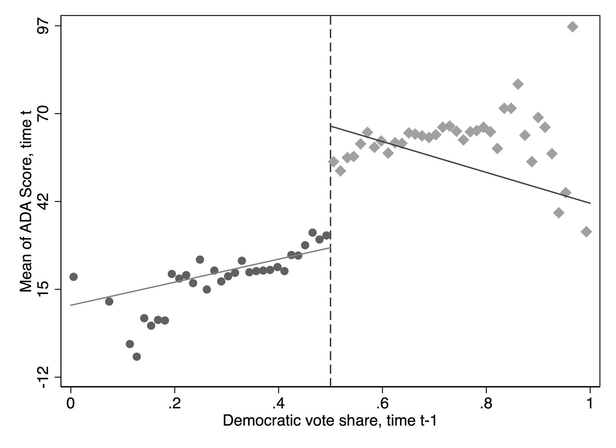
cmogram with linear fit. Reprinted from Lee, Moretti, and Butler (2004)
Figure 6.21 shows what we get when we only use a linear fit of the data left and right of the cutoff. Notice the influence that outliers far from the actual cutoff play in the estimate of the causal effect at the cutoff. Some of this would go away if we restricted the bandwidth to be shorter distances to and from the cutoff, but I leave it to you to do that.
Finally, we can use a lowess fit. A lowess fit more or less crawls through the data and runs small regression on small cuts of data. This can give the figure a zigzag appearance. We nonetheless show it in Figure 40.
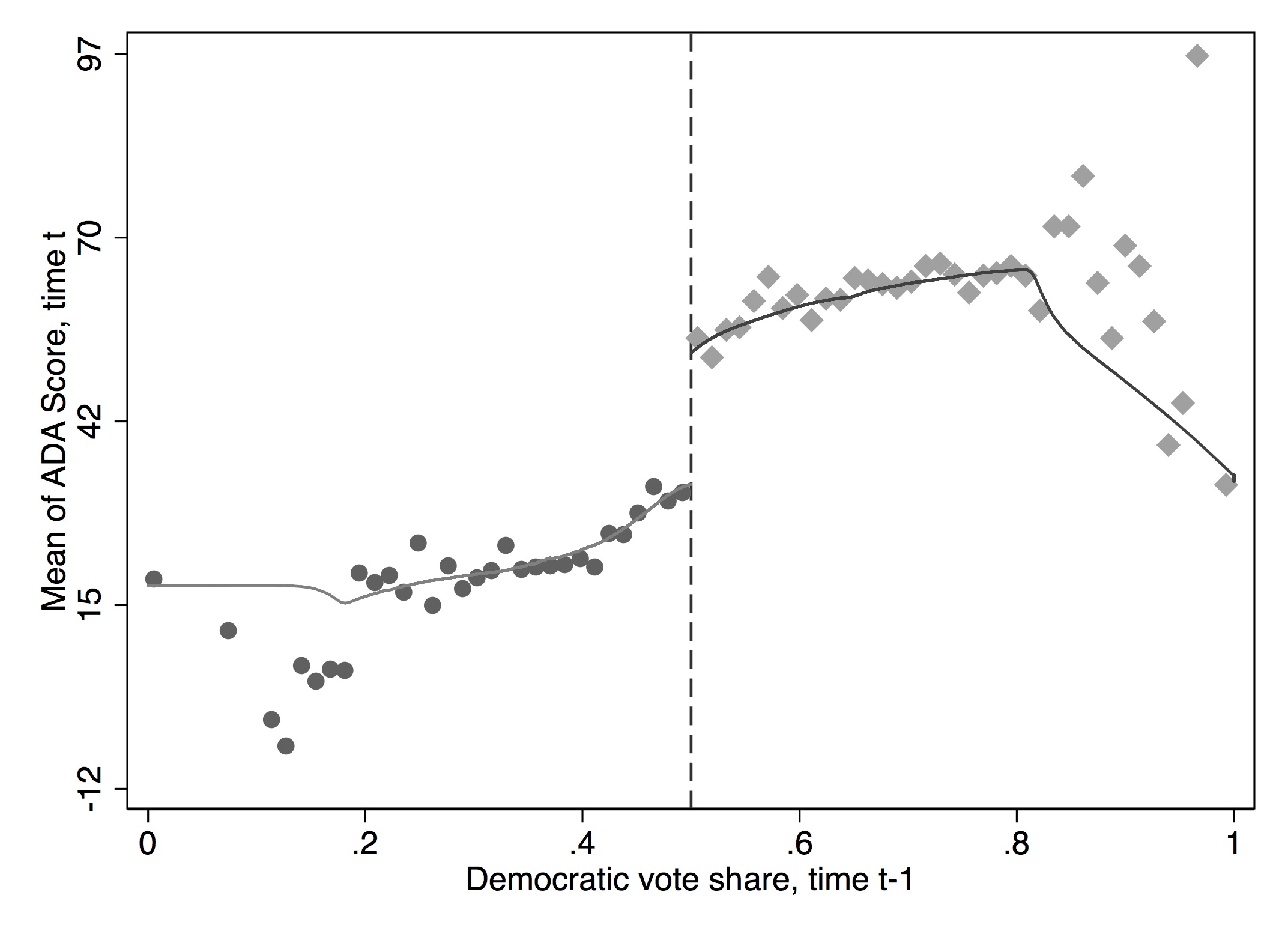
cmogram with lowess fit. Reprinted from Lee, Moretti, and Butler (2004)
If there don’t appear to be any trends in the running variable, then the polynomials aren’t going to buy you much. Some very good papers only report a linear fit because there weren’t very strong trends to begin with. For instance, consider Carrell, Hoekstra, and West (2011). Those authors are interested in the causal effect of drinking on academic test outcomes for students at the Air Force Academy. Their running variable is the precise age of the student, which they have because they know the student’s date of birth and they know the date of every exam taken at the Air Force Academy. Because the Air Force Academy restricts students’ social life, there is a starker increase in drinking at age 21 on its campus than might be the case for a more a typical university campus. They examined the causal effect of drinking age on normalized grades using RDD, but because there weren’t strong trends in the data, they presented a graph with only a linear fit. Your choice should be in large part based on what, to your eyeball, is the best fit of the data.
Hahn, Todd, and Klaauw (2001) have shown that one-sided kernel estimation such as lowess may suffer from poor properties because the point of interest is at the boundary (i.e., the discontinuity). This is called the “boundary problem.” They propose using local linear nonparametric regressions instead. In these regressions, more weight is given to the observations at the center.
You can also estimate kernel-weighted local polynomial regressions. Think of it as a weighted regression restricted to a window like we’ve been doing (hence the word “local”) where the chosen kernel provides the weights. A rectangular kernel would give the same results as \(E[Y]\) at a given bin on \(X\), but a triangular kernel would give more importance to observations closest to the center. This method will be sensitive to the size of the bandwidth chosen. But in that sense, it’s similar to what we’ve been doing. Figure 6.23 shows this visually.
* Stata code attributed to Marcelo Perraillon.
capture drop sdem* x1 x0
lpoly score demvoteshare if democrat == 0, nograph kernel(triangle) gen(x0 sdem0) bwidth(0.1)}
lpoly score demvoteshare if democrat == 1, nograph kernel(triangle) gen(x1 sdem1)  bwidth(0.1)}
scatter sdem1 x1, color(red) msize(small) || scatter sdem0 x0, msize(small) color(red) xline(0.5,lstyle(dot)) legend(off) xtitle("Democratic vote share") ytitle("ADA score")library(tidyverse)
library(stats)
smooth_dem0 <- lmb_data %>%
filter(democrat == 0) %>%
select(score, demvoteshare)
smooth_dem0 <- as_tibble(ksmooth(smooth_dem0$demvoteshare, smooth_dem0$score,
kernel = "box", bandwidth = 0.1))
smooth_dem1 <- lmb_data %>%
filter(democrat == 1) %>%
select(score, demvoteshare) %>%
na.omit()
smooth_dem1 <- as_tibble(ksmooth(smooth_dem1$demvoteshare, smooth_dem1$score,
kernel = "box", bandwidth = 0.1))
ggplot() +
geom_smooth(aes(x, y), data = smooth_dem0) +
geom_smooth(aes(x, y), data = smooth_dem1) +
geom_vline(xintercept = 0.5)# Missing Python Code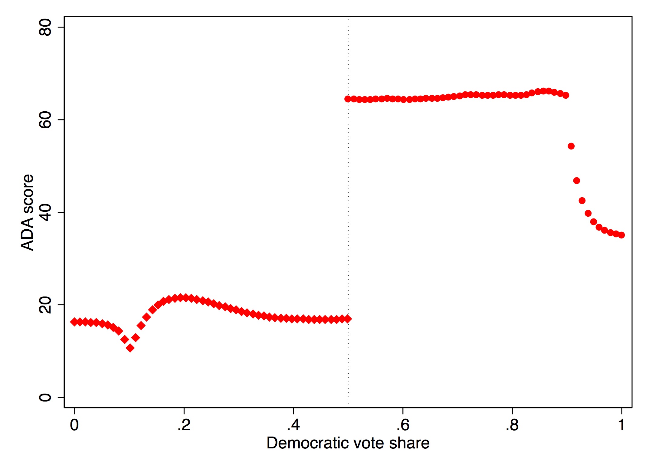
A couple of final things. First, recall the continuity assumption. Because the continuity assumption specifically involves continuous conditional expectation functions of the potential outcomes throughout the cutoff, it therefore is untestable. That’s right—it’s an untestable assumption. But, what we can do is check for whether there are changes in the conditional expectation functions for other exogenous covariates that cannot or should not be changing as a result of the cutoff. So it’s very common to look at things like race or gender around the cutoff. You can use these same methods to do that, but I do not do them here. Any RDD paper will always involve such placebos; even though they are not direct tests of the continuity assumption, they are indirect tests. Remember, when you are publishing, your readers aren’t as familiar with this thing you’re studying, so your task is explain to readers what you know. Anticipate their objections and the sources of their skepticism. Think like them. Try to put yourself in a stranger’s shoes. And then test those skepticisms to the best of your ability.
Second, we saw the importance of bandwidth selection, or window, for estimating the causal effect using this method, as well as the importance of selection of polynomial length. There’s always a trade-off when choosing the bandwidth between bias and variance—the shorter the window, the lower the bias, but because you have less data, the variance in your estimate increases. Recent work has been focused on optimal bandwidth selection, such as G. Imbens and Kalyanaraman (2011) and Calonico, Cattaneo, and Titiunik (2014). The latter can be implemented with the user-created rdrobust command. These methods ultimately choose optimal bandwidths that may differ left and right of the cutoff based on some bias-variance trade-off. Let’s repeat our analysis using this nonparametric method. The coefficient is 46.48 with a standard error of 1.24.
This method, as we’ve repeatedly said, is data-greedy because it gobbles up data at the discontinuity. So ideally these kinds of methods will be used when you have large numbers of observations in the sample so that you have a sizable number of observations at the discontinuity. When that is the case, there should be some harmony in your findings across results. If there isn’t, then you may not have sufficient power to pick up this effect.
Finally, we look at the implementation of the McCrary density test. We will implement this test using local polynomial density estimation (Cattaneo, Jansson, and Ma 2019). This requires installing two files in Stata. Visually inspecting the graph in Figure 6.24, we see no signs that there was manipulation in the running variable at the cutoff.
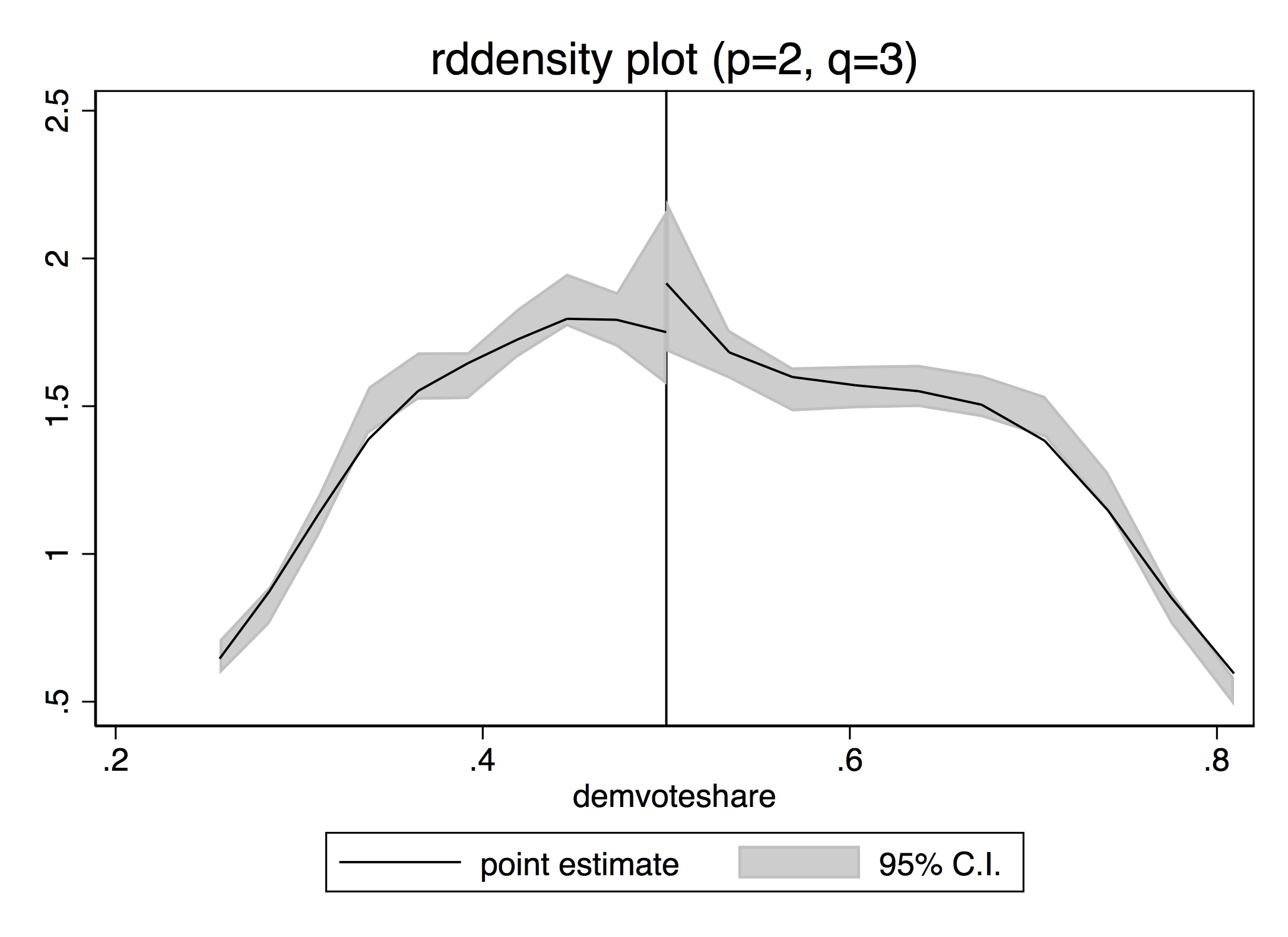
* McCrary density test. Stata code attributed to Marcelo Perraillon.
net install rddensity, from(https://sites.google.com/site/rdpackages/rddensity/stata) replace
net install lpdensity, from(https://sites.google.com/site/nppackages/lpdensity/stata) replace
rddensity demvoteshare, c(0.5) plotlibrary(tidyverse)
library(rddensity)
library(rdd)
DCdensity(lmb_data$demvoteshare, cutpoint = 0.5)
density <- rddensity(lmb_data$demvoteshare, c = 0.5)
rdplotdensity(density, lmb_data$demvoteshare)# Missing Python CodeLet’s circle back to the close-election design. The design has since become practically a cottage industry within economics and political science. It has been extended to other types of elections and outcomes. One paper I like a lot used close gubernatorial elections to examine the effect of Democratic governors on the wage gap between workers of different races (Beland 2015). There are dozens more.
But a critique from Caughey and Sekhon (2011) called into question the validity of Lee’s analysis on the House elections. They found that bare winners and bare losers in US House elections differed considerably on pretreatment covariates, which had not been formally evaluated by Lee, Moretti, and Butler (2004). And that covariate imbalance got even worse in the closest elections. Their conclusion is that the sorting problems got more severe, not less, in the closest of House races, suggesting that these races could not be used for an RDD.
At first glance, it appeared that this criticism by Caughey and Sekhon (2011) threw cold water on the entire close-election design, but we since know that is not the case. It appears that the Caughey and Sekhon (2011) criticism may have been only relevant for a subset of House races but did not characterize other time periods or other types of races. Eggers et al. (2014) evaluated 40,000 close elections, including the House in other time periods, mayoral races, and other types of races for political offices in the US and nine other countries. No other case that they encountered exhibited the type of pattern described by Caughey and Sekhon (2011). Eggers et al. (2014) conclude that the assumptions behind RDD in the close-election design are likely to be met in a wide variety of electoral settings and is perhaps one of the best RD designs we have going forward.
Many times, the concept of a running variable shifting a unit into treatment and in turn causing a jump in some outcome is sufficient. But there are some instances in which the idea of a “jump” doesn’t describe what happens. A couple of papers by David Card and coauthors have extended the regression discontinuity design in order to handle these different types of situations. The most notable is Card et al. (2015), which introduced a new method called regression kink design, or RKD. The intuition is rather simple. Rather than the cutoff causing a discontinuous jump in the treatment variable at the cutoff, it changes the first derivative, which is known as a kink. Kinks are often embedded in policy rules, and thanks to Card et al. (2015), we can use kinks to identify the causal effect of a policy by exploiting the jump in the first derivative.
Card et al. (2015) paper applies the design to answer the question of whether the level of unemployment benefits affects the length of time spent unemployed in Austria. Unemployment benefits are based on income in a base period. There is then a minimum benefit level that isn’t binding for people with low earnings. Then benefits are 55% of the earnings in the base period. There is a maximum benefit level that is then adjusted every year, which creates a discontinuity in the schedule.
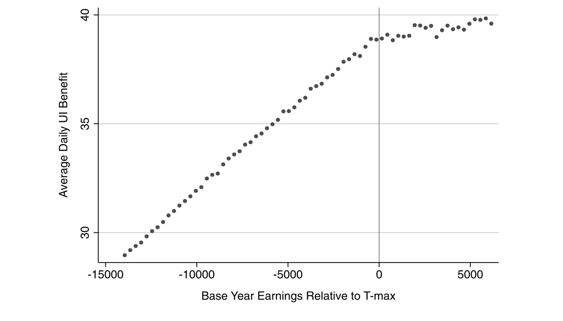
Figure 6.25 shows the relationship between base earnings and unemployment benefits around the discontinuity. There’s a visible kink in the empirical relationship between average benefits and base earnings. You can see this in the sharp decline in the slope of the function as base-year earnings pass the threshold. Figure 6.26 presents a similar picture, but this time of unemployment duration. Again, there is a clear kink as base earnings pass the threshold. The authors conclude that increases in unemployment benefits in the Austrian context exert relatively large effects on unemployment duration.
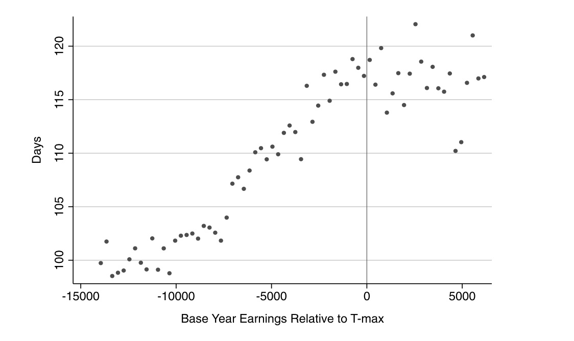
The regression discontinuity design is often considered a winning design because of its upside in credibly identifying causal effects. As with all designs, its credibility only comes from deep institutional knowledge, particularly surrounding the relationship between the running variable, the cutoff, treatment assignment, and the outcomes themselves. Insofar as one can easily find a situation in which a running variable passing some threshold leads to units being siphoned off into some treatment, then if continuity is believable, you’re probably sitting on a great opportunity, assuming you can use it to do something theoretically interesting and policy relevant to others.
Regression discontinuity design opportunities abound, particularly within firms and government agencies, for no other reason than that these organizations face scarcity problems and must use some method to ration a treatment. Randomization is a fair way to do it, and that is often the method used. But a running variable is another method. Routinely, organizations will simply use a continuous score to assign treatments by arbitrarily picking a cutoff above which everyone receives the treatment. Finding these can yield a cheap yet powerfully informative natural experiment. This chapter attempted to lay out the basics of the design. But the area continues to grow at a lightning pace. So I encourage you to see this chapter as a starting point, not an ending point.
Buy the print version today:
Thistlehwaite and Campbell (1960) studied the effect of merit awards on future academic outcomes. Merit awards were given out to students based on a score, and anyone with a score above some cutoff received the merit award, whereas everyone below that cutoff did not. Knowing the treatment assignment allowed the authors to carefully estimate the causal effect of merit awards on future academic performance.↩︎
Hat tip to John Holbein for giving me these data.↩︎
Think about it for a moment. The backdoor criterion calculates differences in expected outcomes between treatment and control for a given value of \(X\). But if the assignment variable only moves units into treatment when \(X\) passes some cutoff, then such calculations are impossible because there will not be units in treatment and control for any given value of \(X\).↩︎
Mark Hoekstra is one of the more creative microeconomists I have met when it comes to devising compelling strategies for identifying causal effects in observational data, and this is one of my favorite papers by him.↩︎
“Don’t be a jerk” applies even to situations when you aren’t seeking proprietary data.↩︎
Klaauw (2002) called the running variable the “selection variable.” This is because Klaauw (2002) is an early paper in the new literature, and the terminology hadn’t yet been hammered out. But here they mean the same thing.↩︎
Stata’s poly command estimates kernel-weighted local polynomial regression.↩︎
RDHonest is available at https://github.com/kolesarm/RDHonest.↩︎
I discuss these assumptions and diagnostics in greater detail later in the chapter on instrument variables.↩︎
In those situations, anyway, where the treatment is desirable to the units.↩︎
https://sites.google.com/site/rdpackages/rddensity.↩︎
http://cran.r-project.org/web/packages/rdd/rdd.pdf.↩︎
The honey badger doesn’t care. It takes what it wants. See https://www.youtube.com/watch?v=4r7wHMg5Yjg.↩︎