
Causal Inference:
The Mixtape.
Buy the print version today:
Buy the print version today:
\[ % Define terms \newcommand{\Card}{\text{Card }} \DeclareMathOperator*{\cov}{cov} \DeclareMathOperator*{\var}{var} \DeclareMathOperator{\Var}{Var\,} \DeclareMathOperator{\Cov}{Cov\,} \DeclareMathOperator{\Prob}{Prob} \newcommand{\independent}{\perp \!\!\! \perp} \DeclareMathOperator{\Post}{Post} \DeclareMathOperator{\Pre}{Pre} \DeclareMathOperator{\Mid}{\,\vert\,} \DeclareMathOperator{\post}{post} \DeclareMathOperator{\pre}{pre} \]
Practical questions about causation have been a preoccupation of economists for several centuries. Adam Smith wrote about the causes of the wealth of nations (Smith 2003). Karl Marx was interested in the transition of society from capitalism to socialism (Needleman and Needleman 1969). In the twentieth century the Cowles Commission sought to better understand identifying causal parameters (Heckman and Vytlacil 2007).1 Economists have been wrestling with both the big ideas around causality and the development of useful empirical tools from day one.
We can see the development of the modern concepts of causality in the writings of several philosophers. Hume (1993) described causation as a sequence of temporal events in which, had the first event not occurred, subsequent ones would not either. For example, he said:
“We may define a cause to be an object, followed by another, and where all the objects similar to the first are followed by objects similar to the second. Or in other words where, if the first object had not been, the second never had existed.”
Mill (2010) devised five methods for inferring causation. Those methods were (1) the method of agreement, (2) the method of difference, (3) the joint method, (4) the method of concomitant variation, and (5) the method of residues. The second method, the method of difference, is most similar to the idea of causation as a comparison among counterfactuals. For instance, he wrote:
“If a person eats of a particular dish, and dies in consequence, that is, would not have died if he had not eaten it, people would be apt to say that eating of that dish was the source of his death.”
A major jump in our understanding of causation occurs coincident with the development of modern statistics. Probability theory and statistics revolutionized science in the nineteenth century, beginning with the field of astronomy. Giuseppe Piazzi, an early nineteenth-century astronomer, discovered the dwarf planet Ceres, located between Jupiter and Mars, in 1801. Piazzi observed it 24 times before it was lost again. Carl Friedrich Gauss proposed a method that could successfully predict Ceres’s next location using data on its prior location. His method minimized the sum of the squared errors; in other words, the ordinary least squares method we discussed earlier. He discovered OLS at age 18 and published his derivation of OLS in 1809 at age 24 (Gauss 1809).2 Other scientists who contributed to our understanding of OLS include Pierre-Simon LaPlace and Adrien-Marie Legendre.
The statistician G. Udny Yule made early use of regression analysis in the social sciences. Yule (1899) was interested in the causes of poverty in England. Poor people depended on either poorhouses or the local authorities for financial support, and Yule wanted to know if public assistance increased the number of paupers, which is a causal question. Yule used least squares regression to estimate the partial correlation between public assistance and poverty. His data was drawn from the English censuses of 1871 and 1881, and I have made his data available at my website for Stata or the Mixtape library for R users. Here’s an example of the regression one might run using these data: \[ \text{Pauper}=\alpha+\delta \text{Outrelief}+\beta_1 \text{Old} + \beta_2 \text{Pop} + u \] Let’s run this regression using the data.
use https://github.com/scunning1975/mixtape/raw/master/yule.dta, clear
regress paup outrelief old poplibrary(tidyverse)
library(haven)
read_data <- function(df)
{
full_path <- paste("https://github.com/scunning1975/mixtape/raw/master/",
df, sep = "")
df <- read_dta(full_path)
return(df)
}
yule <- read_data("yule.dta") %>%
lm(paup ~ outrelief + old + pop, .)
summary(yule)import numpy as np
import pandas as pd
import statsmodels.api as sm
import statsmodels.formula.api as smf
from itertools import combinations
import plotnine as p
# read data
import ssl
ssl._create_default_https_context = ssl._create_unverified_context
def read_data(file):
return pd.read_stata("https://github.com/scunning1975/mixtape/raw/master/" + file)
yule = read_data('yule.dta')
res = sm.OLS.from_formula('paup ~ outrelief + old + pop', yule).fit()
res.summary()Each row in this data set is a particular location in England (e.g., Chelsea, Strand). So, since there are 32 rows, that means the data set contains 32 English locations. Each of the variables is expressed as an annual growth rate. As a result, each regression coefficient has elasticity interpretations, with one caveat—technically, as I explained at the beginning of the book, elasticities are actually causal objects, not simply correlations between two variables. And it’s unlikely that the conditions needed to interpret these as causal relationships are met in Yule’s data. Nevertheless, let’s run the regression and look at the results, which I report in Table 4.1.
| Dependent variable | |
| Covariates | Pauperism growth |
| Outrelief | 0.752 |
| (0.135) | |
| Old | 0.056 |
| (0.223) | |
| Pop | \(-0.311\) |
| (0.067) |
In words, a 10-percentage-point change in the out-relief growth rate is associated with a 7.5-percentage-point increase in the pauperism growth rate, or an elasticity of 0.75. Yule used his regression to crank out the correlation between out-relief and pauperism, from which he concluded that public assistance increased pauper growth rates.
But what might be wrong with this reasoning? How convinced are you that all backdoor paths between pauperism and out-relief are blocked once you control for two covariates in a cross-sectional database for all of England? Could there be unobserved determinants of both poverty and public assistance? After all, he does not control for any economic factors, which surely affect both poverty and the amount of resources allocated to out-relief. Likewise, he may have the causality backwards—perhaps increased poverty causes communities to increase relief, and not merely the other way around. The earliest adopters of some new methodology or technique are often the ones who get the most criticism, despite being pioneers of the methods themselves. It’s trivially easy to beat up on a researcher from one hundred years ago, working at a time when the alternative to regression was ideological make-believe. Plus he isn’t here to reply. I merely want to note that the naı̈ve use of regression to estimate correlations as a way of making causal claims that inform important policy questions has been the norm for a very long time, and it likely isn’t going away any time soon.
The notion of physical randomization as the foundation of causal inference was in the air in the nineteenth and twentieth centuries, but it was not until R. A. Fisher (1935) that it crystallized. The first historically recognized randomized experiment had occurred fifty years earlier in psychology (Peirce and Jastrow 1885). But interestingly, in that experiment, the reason for randomization was not as the basis for causal inference. Rather, the researchers proposed randomization as a way of fooling subjects in their experiments. Peirce and Jastrow (1885) used several treatments, and they used physical randomization so that participants couldn’t guess what would happen next. Unless I’m mistaken, recommending physical randomization of treatments to units as a basis for causal inference is based on Splawa-Neyman (1923) and Roland A. Fisher (1925). More specifically, Splawa-Neyman (1923) developed the powerful potential outcomes notation (which we will discuss soon), and while he proposed randomization, it was not taken to be literally necessary until Roland A. Fisher (1925). Roland A. Fisher (1925) proposed the explicit use of randomization in experimental design for causal inference.3
Physical randomization was largely the domain of agricultural experiments until the mid-1950s, when it began to be used in medical trials. Among the first major randomized experiments in medicine—in fact, ever attempted—were the Salk polio vaccine field trials. In 1954, the Public Health Service set out to determine whether the Salk vaccine prevented polio. Children in the study were assigned at random to receive the vaccine or a placebo.4 Also, the doctors making the diagnoses of polio did not know whether the child had received the vaccine or the placebo. The polio vaccine trial was called a double-blind, randomized controlled trial because neither the patient nor the administrator of the vaccine knew whether the treatment was a placebo or a vaccine. It was necessary for the field trial to be very large because the rate at which polio occurred in the population was 50 per 100,000. The treatment group, which contained 200,745 individuals, saw 33 polio cases. The control group had 201,229 individuals and saw 115 cases. The probability of seeing such a big difference in rates of polio because of chance alone is about one in a billion. The only plausible explanation, it was argued, was that the polio vaccine caused a reduction in the risk of polio.
A similar large-scale randomized experiment occurred in economics in the 1970s. Between 1971 and 1982, the RAND Corporation conducted a large-scale randomized experiment studying the causal effect of health-care insurance on health-care utilization. For the study, Rand recruited 7,700 individuals younger than age 65. The experiment was somewhat complicated, with multiple treatment arms. Participants were randomly assigned to one of five health insurance plans: free care, three plans with varying levels of cost sharing, and an HMO plan. Participants with cost sharing made fewer physician visits and had fewer hospitalizations than those with free care. Other declines in health-care utilization, such as fewer dental visits, were also found among the cost-sharing treatment groups. Overall, participants in the cost-sharing plans tended to spend less on health because they used fewer services. The reduced use of services occurred mainly because participants in the cost-sharing treatment groups were opting not to initiate care.5
But the use of randomized experiments has exploded since that health-care experiment. There have been multiple Nobel Prizes given to those who use them: Vernon Smith for his pioneering of the laboratory experiments in 2002, and more recently, Abhijit Bannerjee, Esther Duflo, and Michael Kremer in 2019 for their leveraging of field experiments at the service of alleviating global poverty.6 The experimental design has become a hallmark in applied microeconomics, political science, sociology, psychology, and more. But why is it viewed as important? Why is randomization such a key element of this design for isolating causal effects? To understand this, we need to learn more about the powerful notation that Splawa-Neyman (1923) developed, called “potential outcomes.”
While the potential outcomes notation goes back to Splawa-Neyman (1923), it got a big lift in the broader social sciences with D. Rubin (1974).7 As of this book’s writing, potential outcomes is more or less the lingua franca for thinking about and expressing causal statements, and we probably owe D. Rubin (1974) for that as much as anyone.
In the potential outcomes tradition (Splawa-Neyman 1923; D. Rubin 1974), a causal effect is defined as a comparison between two states of the world. Let me illustrate with a simple example. In the first state of the world (sometimes called the “actual” state of the world), a man takes aspirin for his headache and one hour later reports the severity of his headache. In the second state of the world (sometimes called the “counterfactual” state of the world), that same man takes nothing for his headache and one hour later reports the severity of his headache. What was the causal effect of the aspirin? According to the potential outcomes tradition, the causal effect of the aspirin is the difference in the severity of his headache between two states of the world: one where he took the aspirin (the actual state of the world) and one where he never took the aspirin (the counterfactual state of the world). The difference in headache severity between these two states of the world, measured at what is otherwise the same point in time, is the causal effect of aspirin on his headache. Sounds easy!
To even ask questions like this (let alone attempt to answer them) is to engage in storytelling. Humans have always been interested in stories exploring counterfactuals. What if Bruce Wayne’s parents had never been murdered? What if that waitress had won the lottery? What if your friend from high school had never taken that first drink? What if in The Matrix Neo had taken the blue pill? These are fun hypotheticals to entertain, but they are still ultimately storytelling. We need Doctor Strange to give us the Time Stone to answer questions like these.
You can probably see where this is going. The potential outcomes notation expresses causality in terms of counterfactuals, and since counterfactuals do not exist, confidence about causal effects must to some degree be unanswerable. To wonder how life would be different had one single event been different is to indulge in counterfactual reasoning, and counterfactuals are not realized in history because they are hypothetical states of the world. Therefore, if the answer requires data on those counterfactuals, then the question cannot be answered. History is a sequence of observable, factual events, one after another. We don’t know what would have happened had one event changed because we are missing data on the counterfactual outcome.8 Potential outcomes exist ex ante as a set of possibilities, but once a decision is made, all but one outcome disappears.9
To make this concrete, let’s introduce some notation and more specific concepts. For simplicity, we will assume a binary variable that takes on a value of 1 if a particular unit \(i\) receives the treatment and a 0 if it does not.10 Each unit will have two potential outcomes, but only one observed outcome. Potential outcomes are defined as \(Y^1_i\) if unit \(i\) received the treatment and as \(Y^0_i\) if the unit did not. Notice that both potential outcomes have the same \(i\) subscript—this indicates two separate states of the world for the exact same person in our example at the exact same moment in time. We’ll call the state of the world where no treatment occurred the control state. Each unit \(i\) has exactly two potential outcomes: a potential outcome under a state of the world where the treatment occurred (\(Y^1\)) and a potential outcome where the treatment did not occur (\(Y^0\)).
Observable or “actual” outcomes, \(Y_i\), are distinct from potential outcomes. First, notice that actual outcomes do not have a superscript. That is because they are not potential outcomes—they are the realized, actual, historical, empirical—however you want to say it—outcomes that unit \(i\) experienced. Whereas potential outcomes are hypothetical random variables that differ across the population, observable outcomes are factual random variables. How we get from potential outcomes to actual outcomes is a major philosophical move, but like any good economist, I’m going to make it seem simpler than it is with an equation. A unit’s observable outcome is a function of its potential outcomes determined according to the switching equation: \[ Y_i = D_iY^1_i + (1-D_i)Y^0_i \] where \(D_i\) equals 1 if the unit received the treatment and 0 if it did not. Notice the logic of the equation. When \(D_i=1\), then \(Y_i=Y^1_i\) because the second term zeroes out. And when \(D_i=0\), the first term zeroes out and therefore \(Y_i=Y^0_i\). Using this notation, we define the unit-specific treatment effect, or causal effect, as the difference between the two states of the world: \[ \delta_i = Y^1_i-Y^0_i \] Immediately we are confronted with a problem. If a treatment effect requires knowing two states of the world, \(Y^1_i\) and \(Y^0_i\), but by the switching equation we observe only one, then we cannot calculate the treatment effect. Herein lies the fundamental problem of causal inference—certainty around causal effects requires access to data that is and always will be missing.
From this simple definition of a treatment effect come three different parameters that are often of interest to researchers. They are all population means. The first is called the average treatment effect:
\[\begin{align} ATE & = E[\delta_i] \nonumber \\ & = E[Y^1_i - Y^0_i] \nonumber \\ & = E[Y^1_i] - E[Y^0_i] \end{align}\]
Notice, as with our definition of individual-level treatment effects, that the average treatment effect requires both potential outcomes for each \(i\) unit. Since we only know one of these by the switching equation, the average treatment effect, or the ATE, is inherently unknowable. Thus, the ATE, like the individual treatment effect, is not a quantity that can be calculated. But it can be estimated.
The second parameter of interest is the average treatment effect for the treatment group. That’s a mouthful, but let me explain. There exist two groups of people in this discussion we’ve been having: a treatment group and a control group. The average treatment effect for the treatment group, or ATT for short, is simply that population mean treatment effect for the group of units that had been assigned the treatment in the first place according to the switching equation. Insofar as \(\delta_i\) differs across the population, the ATT will likely differ from the ATE. In observational data involving human beings, it almost always will be different from the ATE, and that’s because individuals will be endogenously sorting into some treatment based on the gains they expect from it. Like the ATE, the ATT is unknowable, because like the ATE, it also requires two observations per treatment unit \(i\). Formally we write the ATT as:
\[\begin{align} ATT & = E\big[\delta_i\mid D_i=1\big] \nonumber \\ & = E\big[Y^1_i - Y^0_i \mid D_i = 1\big] \nonumber \\ & = E\big[Y^1_i\mid D_i=1\big] - E\big[Y^0_i\mid D_i=1\big] \end{align}\]
The final parameter of interest is called the average treatment effect for the control group, or untreated group. It’s shorthand is ATU, which stands for average treatment effect for the untreated. And like ATT, the ATU is simply the population mean treatment effect for those units who sorted into the control group.11 Given heterogeneous treatment effects, it’s probably the case that the \(ATT\neq ATU\), especially in an observational setting. The formula for the ATU is as follows:
\[\begin{align} ATU & = E\big[\delta_i\mid D_i = 0\big] \nonumber \\ & = E\big[Y^1_i - Y^0_i\mid D_i = 0\big] \nonumber \\ & =E\big[Y^1_i\mid D_i=0\big]-E\big[Y^0_i\mid D_i=0\big] \end{align}\]
Depending on the research question, one, or all three, of these parameters is interesting. But the two most common ones of interest are the ATE and the ATT.
This discussion has been somewhat abstract, so let’s be concrete. Let’s assume there are ten patients \(i\) who have cancer, and two medical procedures or treatments. There is a surgery intervention, \(D_i=1\), and there is a chemotherapy intervention, \(D_i=0\). Each patient has the following two potential outcomes where a potential outcome is defined as post-treatment life span in years: a potential outcome in a world where they received surgery and a potential outcome where they had instead received chemo. We use the notation \(Y^1\) and \(Y^0\), respectively, for these two states of the world.
| Patients | \(Y^1\) | \(Y^0\) | \(\delta\) |
|---|---|---|---|
| 1 | 7 | 1 | 6 |
| 2 | 5 | 6 | \(-1\) |
| 3 | 5 | 1 | 4 |
| 4 | 7 | 8 | \(-1\) |
| 5 | 4 | 2 | 2 |
| 6 | 10 | 1 | 9 |
| 7 | 1 | 10 | \(-9\) |
| 8 | 5 | 6 | \(-1\) |
| 9 | 3 | 7 | \(-4\) |
| 10 | 9 | 8 | 1 |
We can calculate the average treatment effect if we have this matrix of data, because the average treatment effect is simply the mean difference between columns 2 and 3. That is, \(E[Y^1]=5.6\), and \(E[Y^0]=5\), which means that \(ATE=0.6\). In words, the average treatment effect of surgery across these specific patients is 0.6 additional years (compared to chemo).
But that is just the average. Notice, though: not everyone benefits from surgery. Patient 7, for instance, lives only one additional year post-surgery versus ten additional years post-chemo. But the ATE is simply the average over these heterogeneous treatment effects.
To maintain this fiction, let’s assume that there exists the perfect doctor who knows each person’s potential outcomes and chooses whichever treatment that maximizes a person’s post-treatment life span.12 In other words, the doctor chooses to put a patient in surgery or chemotherapy depending on whichever treatment has the longer post-treatment life span. Once he makes that treatment assignment, the doctor observes their post-treatment actual outcome according to the switching equation mentioned earlier.
| Patients | \(Y\) | \(D\) |
|---|---|---|
| 1 | 7 | 1 |
| 2 | 6 | 0 |
| 3 | 5 | 1 |
| 4 | 8 | 0 |
| 5 | 4 | 1 |
| 6 | 10 | 1 |
| 7 | 10 | 0 |
| 8 | 6 | 0 |
| 9 | 7 | 0 |
| 10 | 9 | 1 |
Table 4.3 shows only the observed outcome for treatment and control group. Table 4.3 differs from Table 4.2, which shows each unit’s potential outcomes. Once treatment has been assigned, we can calculate the average treatment effect for the surgery group (ATT) versus the chemo group (ATU). The ATT equals 4.4, and the ATU equals \(-3.2\). That means that the average post-surgery life span for the surgery group is 4.4 additional years, whereas the average post-surgery life span for the chemotherapy group is 3.2 fewer years.13
Now the ATE is 0.6, which is just a weighted average between the ATT and the ATU.14 So we know that the overall effect of surgery is positive, although the effect for some is negative. There exist heterogeneous treatment effects, in other words, but the net effect is positive. What if we were to simply compare the average post-surgery life span for the two groups? This simplistic estimator is called the simple difference in means, and it is an estimate of the ATE equal to \[ E\big[Y^1\mid D=1\big] - E\big[Y^0\mid D=0\big] \] which can be estimated using samples of data:
\[\begin{align} SDO &=E\big[Y^1\mid D=1\big] - E\big[Y^0\mid D=0\big] \nonumber \\ &= \dfrac{1}{N_T} \sum_{i=1}^n \big(y_i\mid d_i=1\big) - \dfrac{1}{N_C} \sum_{i=1}^n \big(y_i\mid d_i=0\big) \end{align}\]
which in this situation is equal to \(7-7.4=-0.4\). That means that the treatment group lives 0.4 fewer years post-surgery than the chemo group when the perfect doctor assigned each unit to its best treatment. While the statistic is true, notice how misleading it is. This statistic without proper qualification could easily be used to claim that, on average, surgery is harmful, when we know that’s not true. It’s biased because the individuals units were optimally sorting into their best treatment option, creating fundamental differences between treatment and control group that are a direct function of the potential outcomes themselves. To make this as clear as I can make it, we will decompose the simple difference in means into three parts. Those three parts are listed below:
\[\begin{align} E\big[Y^1\mid D=1\big]-E\big[Y^0\mid D=0\big] & =ATE \nonumber \\ & + E\big[Y^0\mid D=1\big] - E\big[Y^0\mid D=0\big] \nonumber \\ & + (1-\pi)(ATT-ATU) \end{align}\]
To understand where these parts on the right-hand side originate, we need to start over and decompose the parameter of interest, \(ATE\), into its basic building blocks. ATE is equal to the weighted sum of conditional average expectations, \(ATT\) and \(ATU\).
\[\begin{align} ATE & =\pi ATT+(1-\pi)ATU \\ & =\pi E\big[Y^1\mid D=1\big]-\pi E\big[Y^0\mid D=1\big] \\ & + (1-\pi) E\big[Y^1\mid D=0\big]-(1-\pi) E\big[Y^0\mid D=0\big] \\ & = \Big\{\pi E\big[Y^1\mid D=1\big]+(1-\pi)E\big[Y^1\mid D=0\big]\Big\} \\ & -\Big\{\pi E\big[Y^0\mid D=1\big]+(1-\pi) E\big[Y^0\mid D=0\big]\Big\} \end{align}\]
where \(\pi\) is the share of patients who received surgery and \(1-\pi\) is the share of patients who received chemotherapy. Because the conditional expectation notation is a little cumbersome, let’s exchange each term on the left side, \(ATE\), and right side with some letters. This will make the proof a little less cumbersome:
\[\begin{align} E\big[Y^1\mid D=1\big] & = a \\ E\big[Y^1\mid D=0\big] & = b \\ E\big[Y^0\mid D=1\big] & = c \\ E\big[Y^0\mid D=0\big] & = d \\ ATE & = e \end{align}\]
Now that we have made these substitutions, let’s rearrange the letters by redefining ATE as a weighted average of all conditional expectations
\[\begin{align} e & =\big\{\pi{a}+(1-\pi)b\big\}-\big\{\pi{c} + (1-\pi)d\big\} \\ e & =\pi{a}+b-\pi{b}-\pi{c} - d + \pi{d} \\ e & =\pi{a}+ b-\pi{b}-\pi{c} - d + \pi{d} + (\mathbf{a} - \mathbf{a}) + (\mathbf{c} - \mathbf{c}) + (\mathbf{d} - \mathbf{d}) \\ 0 & =e-\pi{a} - b + \pi{b} + \pi{c} + d - \pi{d} - \mathbf{a} + \mathbf{a} - \mathbf{c} + \mathbf{c} - \mathbf{d} + \mathbf{d} \\ \mathbf{a}-\mathbf{d} & =e-\pi{a} - b + \pi{b} + \pi{c} + d - \pi{d} +\mathbf{a} -\mathbf{c} +\mathbf{c} - \mathbf{d} \\ \mathbf{a}-\mathbf{d} & =e + (\mathbf{c} -\mathbf{d}) + \mathbf{a}-\pi{a} - b + \pi{b} -\mathbf{c} + \pi{c} + d - \pi{d} \\ \mathbf{a}-\mathbf{d} & =e + (\mathbf{c} -\mathbf{d}) + (1-\pi)a -(1-\pi)b + (1-\pi)d - (1-\pi)c \\ \mathbf{a}-\mathbf{d} & =e + (\mathbf{c} -\mathbf{d}) + (1-\pi)(a-c) -(1-\pi)(b-d) \end{align}\]
Now, substituting our definitions, we get the following:
\[\begin{align} E\big[Y^1\mid D=1\big]-E\big[Y^0\mid D=0\big] & = ATE \nonumber \\ & + \Big(E\big[Y^0\mid D=1\big] - E\big[Y^0\mid D=0\big]\Big) \nonumber \\ & + (1-\pi)(ATT - ATU) \end{align}\]
And the decomposition ends. Now the fun part—let’s think about what we just made! The left side can be estimated with a sample of data, as both of those potential outcomes become actual outcomes under the switching equation. That’s just the simple difference in mean outcomes. It’s the right side that is more interesting because it tells us what the simple difference in mean outcomes is by definition. Let’s put some labels to it.
\[\begin{align} \underbrace{\dfrac{1}{N_T} \sum_{i=1}^n \big(y_i\mid d_i=1\big)-\dfrac{1}{N_C} \sum_{i=1}^n \big(y_i\mid d_i=0\big)}_{ \text{Simple Difference in Outcomes}} &= \underbrace{E[Y^1] - E[Y^0]}_{ \text{Average Treatment Effect}} \\ &+ \underbrace{E\big[Y^0\mid D=1\big] - E\big[Y^0\mid D=0\big]}_{ \text{Selection bias}} \\ & + \underbrace{(1-\pi)(ATT - ATU)}_{ \text{Heterogeneous treatment effect bias}} \end{align}\]
Let’s discuss each of these in turn. The left side is the simple difference in mean outcomes, and we already know it is equal to \(-0.4\). Since this is a decomposition, it must be the case that the right side also equals \(-0.4\).
The first term is the average treatment effect, which is the parameter of interest, and we know that it is equal to 0.6. Thus, the remaining two terms must be the source of the bias that is causing the simple difference in means to be negative.
The second term is called the selection bias, which merits some unpacking. In this case, the selection bias is the inherent difference between the two groups if both received chemo. Usually, though, it’s just a description of the differences between the two groups if there had never been a treatment in the first place. There are in other words two groups: a surgery group and a chemo group. How do their potential outcomes under control differ? Notice that the first is a counterfactual, whereas the second is an observed outcome according to the switching equation. We can calculate this difference here because we have the complete potential outcomes in Table 4.2. That difference is equal to \(-4.8\).
The third term is a lesser-known form of bias, but it’s interesting. Plus, if the focus is the ATE, then it is always present.15 The heterogeneous treatment effect bias is simply the different returns to surgery for the two groups multiplied by the share of the population that is in the chemotherapy group at all. This final term is \(0.5\times (4.4-(-3.2))\) or \(3.8\). Note in case it’s not obvious that the reason \(\pi=0.5\) is because 5 out of 10 units are in the chemotherapy group.
Now that we have all three parameters on the right side, we can see why the simple difference in mean outcomes is equal to \(-0.4\). \[ -0.4=0.6-4.8+3.8 \] What I find interesting—hopeful even—in this decomposition is that it shows that a contrast between treatment and control group technically “contains” the parameter of interest. I placed “contains” in quotes because while it is clearly visible in the decomposition, the simple difference in outcomes is ultimately not laid out as the sum of three parts. Rather, the simple difference in outcomes is nothing more than a number. The number is the sum of the three parts, but we cannot calculate each individual part because we do not have data on the underlying counterfactual outcomes needed to make the calculations. The problem is that that parameter of interest has been masked by two forms of bias, the selection bias and the heterogeneous treatment effect bias. If we knew those, we could just subtract them out, but ordinarily we don’t know them. We develop strategies to negate these biases, but we cannot directly calculate them any more than we can directly calculate the ATE, as these biases depend on unobservable counterfactuals.
The problem isn’t caused by assuming heterogeneity either. We can make the strong assumption that treatment effects are constant, \(\delta_i = \delta\) \(\forall i\), which will cause \(ATU=ATT\) and make \(SDO = ATE\) + selection bias. But we’d still have that nasty selection bias screwing things up. One could argue that the entire enterprise of causal inference is about developing a reasonable strategy for negating the role that selection bias is playing in estimated causal effects.
Let’s start with the most credible situation for using \(SDO\) to estimate \(ATE\): when the treatment itself (e.g., surgery) has been assigned to patients independent of their potential outcomes. But what does this word “independence” mean anyway? Well, notationally, it means:
\[\begin{align} (Y^1,Y^0) \perp D \end{align}\]
What this means is that surgery was assigned to an individual for reasons that had nothing to do with the gains to surgery.16 Now in our example, we already know that this is violated because the perfect doctor specifically chose surgery or chemo based on potential outcomes. Specifically, a patient received surgery if \(Y^1>Y^0\) and chemo if \(Y^1<Y^0\). Thus, in our case, the perfect doctor ensured that \(D\) depended on \(Y^1\ and\ Y^0\). All forms of human-based sorting—probably as a rule to be honest—violate independence, which is the main reason naı̈ve observational comparisons are almost always incapable of recovering causal effects.17
But what if he hadn’t done that? What if he had chosen surgery in such a way that did not depend on \(Y^1\) or \(Y^0\)? How does one choose surgery independent of the expected gains of the surgery? For instance, maybe he alphabetized them by last name, and the first five received surgery and the last five received chemotherapy. Or maybe he used the second hand on his watch to assign surgery to them: if it was between 1 and 30 seconds, he gave them surgery, and if it was between 31 and 60 seconds, he gave them chemotherapy.18 In other words, let’s say that he chose some method for assigning treatment that did not depend on the values of potential outcomes under either state of the world. What would that mean in this context? Well, it would mean:
\[\begin{align} E\big[Y^1\mid D=1\big] - E\big[Y^1\mid D=0\big]=0 \\ E\big[Y^0\mid D=1\big] - E\big[Y^0\mid D=0\big]=0 \end{align}\]
In other words, it would mean that the mean potential outcome for \(Y^1\) or \(Y^0\) is the same (in the population) for either the surgery group or the chemotherapy group. This kind of randomization of the treatment assignment would eliminate both the selection bias and the heterogeneous treatment effect bias. Let’s take it in order. The selection bias zeroes out as follows:
\[\begin{align} E\big[Y^0\mid D=1\big] - E\big[Y^0\mid D=0\big]=0 \end{align}\]
And thus the \(SDO\) no longer suffers from selection bias. How does randomization affect heterogeneity treatment bias from the third line? Rewrite definitions for ATT and ATU:
\[\begin{gather} ATT = E\big[Y^1\mid D=1\big] - E\big[Y^0\mid D=1\big] \\ ATU = E\big[Y^1\mid D=0\big] - E\big[Y^0\mid D=0\big] \end{gather}\]
Rewrite the third row bias after \(1-\pi\):
\[\begin{align} ATT-ATU & =\mathbf{E\big[Y^1\mid D=1\big]}-E\big[Y^0\mid D=1\big] \\ & - \mathbf{E\big[Y^1 \mid D=0\big]}+ E\big[Y^0\mid D=0\big] \\ & = 0 \end{align}\]
If treatment is independent of potential outcomes, then:
\[\begin{align} \dfrac{1}{N_T} \sum_{i=1}^n \big(y_i\mid d_i=1\big) - \dfrac{1}{N_C} \sum_{i=1}^n \big(y_i\mid d_i=0\big) & = E[Y^1] - E[Y^0] \\ SDO & = ATE \end{align}\]
What’s necessary in this situation is simply (a) data on observable outcomes, (b) data on treatment assignment, and (c) \((Y^1,Y^0) \independent D\). We call (c) the independence assumption. To illustrate that this would lead to the SDO, we use the following Monte Carlo simulation. Note that \(ATE\) in this example is equal to 0.6.
clear all
program define gap, rclass

    version 14.2
    syntax [, obs(integer 1) mu(real 0) sigma(real 1) ]
    clear
    drop _all
    set obs 10
    gen     y1 = 7 in 1
    replace y1 = 5 in 2
    replace y1 = 5 in 3
    replace y1 = 7 in 4
    replace y1 = 4 in 5
    replace y1 = 10 in 6
    replace y1 = 1 in 7
    replace y1 = 5 in 8
    replace y1 = 3 in 9
    replace y1 = 9 in 10

    gen     y0 = 1 in 1
    replace y0 = 6 in 2
    replace y0 = 1 in 3
    replace y0 = 8 in 4
    replace y0 = 2 in 5
    replace y0 = 1 in 6
    replace y0 = 10 in 7
    replace y0 = 6 in 8
    replace y0 = 7 in 9
    replace y0 = 8 in 10
    drawnorm random
    sort random

    gen     d=1 in 1/5
    replace d=0 in 6/10
    gen     y=d*y1 + (1-d)*y0
    egen sy1 = mean(y) if d==1
    egen sy0 = mean(y) if d==0
    collapse (mean) sy1 sy0
    gen sdo = sy1 - sy0
    keep sdo
    summarize sdo
    gen mean = r(mean)
    end

simulate mean, reps(10000): gap
su _sim_1 library(tidyverse)
gap <- function()
{
sdo <- tibble(
y1 = c(7,5,5,7,4,10,1,5,3,9),
y0 = c(1,6,1,8,2,1,10,6,7,8),
random = rnorm(10)
) %>%
arrange(random) %>%
mutate(
d = c(rep(1,5), rep(0,5)),
y = d * y1 + (1 - d) * y0
) %>%
pull(y)
sdo <- mean(sdo[1:5]-sdo[6:10])
return(sdo)
}
sim <- replicate(10000, gap())
mean(sim)import numpy as np
import pandas as pd
import statsmodels.api as sm
import statsmodels.formula.api as smf
from itertools import combinations
import plotnine as p
# read data
import ssl
ssl._create_default_https_context = ssl._create_unverified_context
def read_data(file):
return pd.read_stata("https://github.com/scunning1975/mixtape/raw/master/" + file)
def gap():
sdo = pd.DataFrame({
'y1': (7, 5, 5, 7, 4, 10, 1, 5, 3, 9),
'y0' : (1, 6, 1, 8, 2, 1, 10, 6, 7, 8),
'random' : np.random.normal(size=10)})
sdo.sort_values('random', inplace=True)
sdo['d'] = [1,1,1,1,1,0,0,0,0,0]
sdo['y'] = sdo['d']*sdo['y1'] + (1-sdo['d'])*sdo['y0']
sdo = np.mean(sdo.y.values[0:5] - sdo.y.values[5:10])
return sdo
sim = [gap() for x in range(1000)]
np.mean(sim)This Monte Carlo runs 10,000 times, each time calculating the average SDO under independence—which is ensured by the random number sorting that occurs. In my running of this program, the ATE is 0.6, and the SDO is on average equal to 0.59088.19
Before we move on from the SDO, let’s just emphasize something that is often lost on students first learning the independence concept and notation. Independence does not imply that \(E[Y^1\mid D=1] - E[Y^0\mid D=0]=0\). Nor does it imply that \(E[Y^1\mid D=1] - E[Y^0\mid D=1]=0\). Rather, it implies \[ E\big[Y^1\mid D=1\big] - E\big[Y^1\mid D=0\big]=0 \] in a large population.20 That is, independence implies that the two groups of units, surgery and chemo, have the same potential outcome on average in the population.
How realistic is independence in observational data? Economics—maybe more than any other science—tells us that independence is unlikely to hold observationally. Economic actors are always attempting to achieve some optima. For instance, parents are putting kids in what they perceive to be the best school for them, and that is based on potential outcomes. In other words, people are choosing their interventions, and most likely their decisions are related to the potential outcomes, which makes simple comparisons improper. Rational choice is always pushing against the independence assumption, and therefore simple comparison in means will not approximate the true causal effect. We need unit randomization for simple comparisons to help us understand the causal effects at play.
Rubin argues that there are a bundle of assumptions behind this kind of calculation, and he calls these assumptions the stable unit treatment value assumption, or SUTVA for short. That’s a mouthful, but here’s what it means: our potential outcomes framework places limits on us for calculating treatment effects. When those limits do not credibly hold in the data, we have to come up with a new solution. And those limitations are that each unit receives the same sized dose, no spillovers (“externalities”) to other units’ potential outcomes when a unit is exposed to some treatment, and no general equilibrium effects.
First, this implies that the treatment is received in homogeneous doses to all units. It’s easy to imagine violations of this, though—for instance, if some doctors are better surgeons than others. In which case, we just need to be careful what we are and are not defining as the treatment.
Second, this implies that there are no externalities, because by definition, an externality spills over to other untreated units. In other words, if unit 1 receives the treatment, and there is some externality, then unit 2 will have a different \(Y^0\) value than if unit 1 had not received the treatment. We are assuming away this kind of spillover. When there are such spillovers, though, such as when we are working with social network data, we will need to use models that can explicitly account for such SUTVA violations, such as that of Goldsmith-Pinkham and Imbens (2013).
Related to this problem of spillovers is the issue of general equilibrium. Let’s say we are estimating the causal effect of returns to schooling. The increase in college education would in general equilibrium cause a change in relative wages that is different from what happens under partial equilibrium. This kind of scaling-up issue is of common concern when one considers extrapolating from the experimental design to the large-scale implementation of an intervention in some population.
Replicating “demand for learning HIV status.” Rebecca Thornton is a prolific, creative development economist. Her research has spanned a number of topics in development and has evaluated critically important questions regarding optimal HIV policy, demand for learning, circumcision, education, and more. Some of these papers have become major accomplishments. Meticulous and careful, she has become a leading expert on HIV in sub-Saharan Africa. I’d like to discuss an ambitious project she undertook as a grad student in rural Malawi concerning whether cash incentives caused people to learn their HIV status and the cascading effect of that learning on subsequent risky sexual behavior (Thornton 2008).
Thornton’s study emerges in a policy context where people believed that HIV testing could be used to fight the epidemic. The idea was simple: if people learned their HIV status, then maybe learning they were infected would cause them to take precautions, thus slowing the rate of infection. For instance, they might seek medical treatment, thus prolonging their life and the quality of life they enjoyed. But upon learning their HIV status, maybe finding out they were HIV-positive would cause them to decrease high-risk behavior. If so, then increased testing could create frictions throughout the sexual network itself that would slow an epidemic. So commonsense was this policy that the assumptions on which it rested were not challenged until Thornton (2008) did an ingenious field experiment in rural Malawi. Her results were, like many studies, a mixture of good news and bad.
Attempting to understand the demand for HIV status, or the effect of HIV status on health behaviors, is generally impossible without an experiment. Insofar as individuals are optimally choosing to learn about their type or engaging in health behaviors, then it is unlikely that knowledge about HIV status is independent of potential outcomes. Almost certainly, it is those very potential outcomes that shape the decisions both to acquire that information and to engage in risky behaviors of any sort. Thus, a field experiment would be needed if we were to test the underlying assumptions behind this commonsense policy to use testing to fight the epidemic.
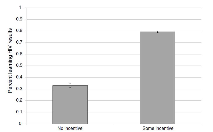
How did she do this, though? Respondents in rural Malawi were offered a free door-to-door HIV test and randomly assigned no voucher or vouchers ranging from $1–$3. These vouchers were redeemable once they visited a nearby voluntary counseling and testing center (VCT). The most encouraging news was that monetary incentives were highly effective in causing people to seek the results of tests. On average, respondents who received any cash-value voucher were two times as likely to go to the VCT center to get their test results compared to those individuals who received no compensation. How big was this incentive? Well, the average incentive in her experiment was worth about a day’s wage. But she found positive status-seeking behavior even for the smallest incentive, which was worth only one-tenth a day’s wage. Thornton showed that even small monetary nudges could be used to encourage people to learn their HIV type, which has obvious policy implications.
The second part of the experiment threw cold water on any optimism from her first results. Several months after the cash incentives were given to respondents, Thornton followed up and interviewed them about their subsequent health behaviors. Respondents were also given the opportunity to purchase condoms. Using her randomized assignment of incentives for learning HIV status, she was able to isolate the causal effect of learning itself on condom purchase her proxy for engaging in risky sex. She finds that conditional on learning one’s HIV status from the randomized incentives, HIV-positive individuals did increase their condom usage over those HIV-positive individuals who had not learned their results but only in the form of buying two additional condoms. This study suggested that some kinds of outreach, such as door-to-door testing, may cause people to learn their type—particularly when bundled with incentives—but simply having been incentivized to learn one’s HIV status may not itself lead HIV-positive individuals to reduce any engagement in high-risk sexual behaviors, such as having sex without a condom.
Thorton’s experiment was more complex than I am able to represent here, and also, I focus now on only the cash-transfer aspect of the experiment, in the form of vouchers. but I am going to focus purely on her incentive results. But before I do so, let’s take a look at what she found. Table 4.4 shows her findings.
Since her project uses randomized assignment of cash transfers for identifying causal effect on learning, she mechanically creates a treatment assignment that is independent of the potential outcomes under consideration. We know this even though we cannot directly test it (i.e., potential outcomes are unseen) because we know how the science works. Randomization, in other words, by design assigns treatment independent of potential outcomes. And as a result, simple differences in means are sufficient for getting basic estimates of causal effects.
But Thornton is going to estimate a linear regression model with controls instead of using a simple difference in means for a few reasons. One, doing so allows her to include a variety of controls that can reduce the residual variance and thus improve the precision of her estimates. This has value because in improving precision, she is able to rule out a broader range of treatment effects that are technically contained by her confidence intervals. Although probably in this case, that’s not terribly important given, as we will see, that her standard errors are miniscule.
| 1 | 2 | 3 | 4 | 5 | |
|---|---|---|---|---|---|
| Any incentive | 0.431\(^{***}\) | 0.309\(^{***}\) | 0.219\(^{***}\) | 0.220\(^{***}\) | 0.219 \(^{***}\) |
| (0.023) | (0.026) | (0.029) | (0.029) | (0.029) | |
| Amount of incentive | 0.091\(^{***}\) | 0.274\(^{***}\) | 0.274\(^{***}\) | 0.273\(^{***}\) | |
| (0.012) | (0.036) | (0.035) | (0.036) | ||
| Amount of incentive\(^2\) | \(-0.063\)\(^{***}\) | \(-0.063\)\(^{***}\) | \(-0.063\)\(^{***}\) | ||
| (0.011) | (0.011) | (0.011) | |||
| HIV | \(-0.055\)\(^{*}\) | \(-0.052\) | \(-0.05\) | \(-0.058\)\(^{*}\) | \(-0.055\)\(^{*}\) |
| (0.031) | (0.032) | (0.032) | (0.031) | (0.031) | |
| Distance (km) | \(-0.076\)\(^{***}\) | ||||
| (0.027) | |||||
| Distance\(^2\) | 0.010\(^{**}\) | ||||
| (0.005) | |||||
| Controls | Yes | Yes | Yes | Yes | Yes |
| Sample size | 2,812 | 2,812 | 2,812 | 2,812 | 2,812 |
| Average attendance | 0.69 | 0.69 | 0.69 | 0.69 | 0.69 |
Columns 1–5 represent OLS coefficients; robust standard errors clustered by village (for 119 villages) with district fixed effects in parentheses. All specifications also include a term for age-squared. “Any incentive” is an indicator if the respondent received any nonzero monetary incentive. “HIV” is an indicator of being HIV positive. “Simulated average distance” is an average distance of respondents’ households to simulated randomized locations of HIV results centers. Distance is measured as a straight-line spherical distance from a respondent’s home to a randomly assigned VCT center from geospatial coordinates and is measured in kilometers. \(^{***}\)Significantly different from zero at 99 percent confidence level. \(^{**}\) Significantly different from zero at 95 percent confidence level. \(^{*}\) Significantly different from zero at 90 percent confidence level.
But the inclusion of controls has other value. For instance, if assignment was conditional on observables, or if the assignment was done at different times, then including these controls (such as district fixed effects) is technically needed to isolate the causal effects themselves. And finally, regression generates nice standard errors, and maybe for that alone, we should give it a chance.21
So what did Thornton find? She uses least squares as her primary model, represented in columns 1–5. The effect sizes that she finds could be described as gigantic. Because only 34 percent of the control group participants went to a center to learn their HIV status, it is impressive that receiving any money caused a 43-percentage-point increase in learning one’s HIV status. Monetary incentives—even very small ones—are enough to push many people over the hump to go collect health data.
Columns 2–5 are also interesting, but I won’t belabor them here. In short, column 2 includes a control for the amount of the incentive, which ranged from US$0 to US$3. This allows us to estimate the linear impact of each additional dollar on learning, which is relatively steep. Columns 3–5 include a quadratic and as a result we see that while each additional dollar increases learning, it does so only at a decreasing rate. Columns 4 and 5 include controls for distance to the VCT center, and as with other studies, distance itself is a barrier to some types of health care (Lindo et al. 2019).
Thornton also produces a simple graphic of her results, showing box plots with mean and confidence intervals for the treatment and control group. As we will continually see throughout the book, the best papers estimating causal effects will always summarize their main results in smart and effective pictures, and this study is no exception. As this figure shows, the effects were huge.
While learning one’s own HIV status is important, particularly if it leads to medical care, the gains to policies that nudge learning are particularly higher if they lead to changes in high-risk sexual behavior among HIV-positive individuals. In fact, given the multiplier effects associated with introducing frictions into the sexual network via risk-mitigating behavior (particularly if it disrupts concurrent partnerships), such efforts may be so beneficial that they justify many types of programs that otherwise may not be cost-effective.
Thornton examines in her follow-up survey where she asked all individuals, regardless of whether they learned their HIV status, the effect of a cash transfer on condom purchases. Let’s first see her main results in Figure 4.2.
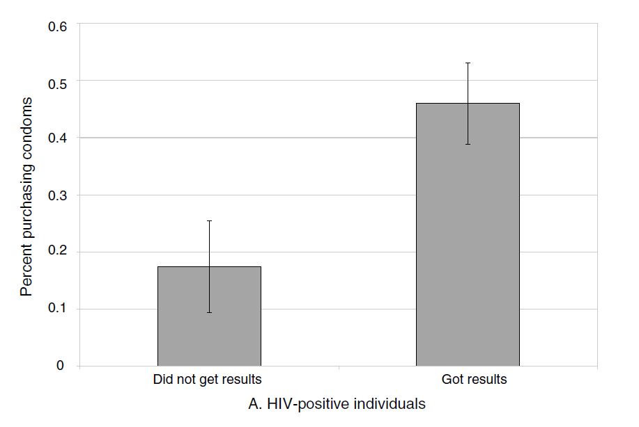
It is initially encouraging to see that the effects on condom purchases are large for the HIV-positive individuals who, as a result of the incentive, got their test results. Those who bought any condoms increases from a baseline that’s a little over 30 percent to a whopping 80 percent with any incentive. But where things get discouraging is when we examine how many additional condoms this actually entailed. In columns 3 and 4 of Table 4.5, we see the problem.
| Dependent variables: | ||||
| Got results | \(-0.022\) | \(-0.069\) | \(-0.193\) | \(-0.303\) |
| (0.025) | (0.062) | (0.148) | (0.285) | |
| Got results \(\times\) HIV | 0.418\(^{***}\) | 0.248 | 1.778\(^{***}\) | 1.689\(^{**}\) |
| (0.143) | (0.169) | (0.564) | (0.784) | |
| HIV | \(-0.175\)\(^{**}\) | \(-0.073\) | \(-0.873\) | \(-0.831\) |
| (0.085) | (0.123) | (0.275) | (0.375) | |
| Controls | Yes | Yes | Yes | Yes |
| Sample size | 1,008 | 1,008 | 1,008 | 1,008 |
| Mean | 0.26 | 0.26 | 0.95 | 0.95 |
Sample includes individuals who tested for HIV and have demographic data.
Now Thornton wisely approaches the question in two ways for the sake of the reader and for the sake of accuracy. She wants to know the effect of getting results, but the results only matter (1) for those who got their status and (2) for those who were HIV-positive. The effects shouldn’t matter if they were HIV-negative. And ultimately that is what she finds, but how is she going to answer the first? Here she examines the effect for those who got their results and who were HIV-positive using an interaction. And that’s column 1: individuals who got their HIV status and who learned they were HIV positive were 41% more likely to buy condoms several months later. This result shrinks, though, once she utilizes the randomization of the incentives in an instrumental variables framework, which we will discuss later in the book. The coefficient is almost cut in half and her confidence intervals are so large that we can’t be sure the effects are nonexistent.
But let’s say that the reason she failed to find an effect on any purchasing behavior is because the sample size is just small enough that to pick up the effect with IV is just asking too much of the data. What if we used something that had a little more information, like number of condoms bought? And that’s where things get pessimistic. Yes, Thornton does find evidence that the HIV-positive individuals were buying more condoms, but when see how many, we learn that it is only around 2 more condoms at the follow-up visit (columns 3–4). And the effect on sex itself (not shown) was negative, small (4% reduction), and not precise enough to say either way anyway.
In conclusion, Thornton’s study is one of those studies we regularly come across in causal inference, a mixture of positive and negative. It’s positive in that nudging people with small incentives leads them to collecting information about their own HIV status. But our enthusiasm is muted when we learn the effect on actual risk behaviors is not very large—a mere two additional condoms bought several months later for the HIV-positive individuals is likely not going to generate large positive externalities unless it falls on the highest-risk HIV-positive individuals.
Buy the print version today:
Athey and Imbens (2017), in their chapter on randomized experiments, note that “in randomization-based inference, uncertainty in estimates arises naturally from the random assignment of the treatments, rather than from hypothesized sampling from a large population” (73). Athey and Imbens are part of a growing trend of economists using randomization-based methods for inferring the probability that an estimated coefficient is not simply a result of change. This growing trend uses randomization-based methods to construct exact \(p\)-values that reflect the likelihood that chance could’ve produced the estimate.
Why has randomization inference become so popular now? Why not twenty years ago or more? It’s not clear why randomization-based inference has become so popular in recent years, but a few possibilities could explain the trend. It may be the rise in the randomized controlled trials within economics, the availability of large-scale administrative databases that are not samples of some larger population but rather represent “all the data,” or it may be that computational power has improved so much that randomization inference has become trivially simple to implement when working with thousands of observations. But whatever the reason, randomization inference has become a very common way to talk about the uncertainty around one’s estimates.
There are at least three reasons we might conduct randomization inference. First, it may be because we aren’t working with samples, and since standard errors are often justified on the grounds that they reflect sampling uncertainty, traditional methods may not be as meaningful. The core uncertainty within a causal study is not based on sampling uncertainty, but rather on the fact that we do not know the counterfactual (Abadie, Diamond, and Hainmueller 2010; Abadie et al. 2020). Second, it may be that we are uncomfortable appealing to the large sample properties of an estimator in a particular setting, such as when we are working with a small number of treatment units. In such situations, maybe assuming the number of units increases to infinity stretches credibility (Buchmueller, DiNardo, and Valletta 2011). This can be particularly problematic in practice. Young (2019) shows that in finite samples, it is common for some observations to experience concentrated leverage. Leverage causes standard errors and estimates to become volatile and can lead to overrejection. Randomization inference can be more robust to such outliers. Finally, there seems to be some aesthetic preference for these types of placebo-based inference, as many people find them intuitive. While this is not a sufficient reason to adopt a methodological procedure, it is nonetheless very common to hear someone say that they used randomization inference because it makes sense. I figured it was worth mentioning since you’ll likely run into comments like that as well. But before we dig into it, let’s discuss its history, which dates back to Ronald Fisher in the early twentieth century.
R. A. Fisher (1935) described a thought experiment in which a woman claims she can discern whether milk or tea was poured first into a cup of tea. While he does not give her name, we now know that the woman in the thought experiment was Muriel Bristol and that the thought experiment in fact did happen.22 Muriel Bristol was a PhD scientist back in the days when women rarely were able to become PhD scientists. One day during afternoon tea, Muriel claimed that she could tell whether the milk was added to the cup before or after the tea. Incredulous, Fisher hastily devised an experiment to test her self-proclaimed talent.
The hypothesis, properly stated, is that, given a cup of tea with milk, a woman can discern whether milk or tea was first added to the cup. To test her claim, eight cups of tea were prepared; in four the milk was added first, and in four the tea was added first. How many cups does she have to correctly identify to convince us of her uncanny ability?
R. A. Fisher (1935) proposed a kind of permutation-based inference—a method we now call the Fisher’s exact test. The woman possesses the ability probabilistically, not with certainty, if the likelihood of her guessing all four correctly was sufficiently low. There are \(8\times{7}\times{6}\times{5}=1,680\) ways to choose a first cup, a second cup, a third cup, and a fourth cup, in order. There are \(4\times{3}\times{2}\times{1}=24\) ways to order four cups. So the number of ways to choose four cups out of eight is \(\dfrac{1680}{24}=70\). Note, the woman performs the experiment by selecting four cups. The probability that she would correctly identify all four cups is \(\dfrac{1}{70}\), which is \(p=0.014\).
Maybe you would be more convinced of this method if you could see a simulation, though. So let’s conduct a simple combination exercise. You can with the following code.
clear
capture log close

* Create the data. 4 cups with tea, 4 cups with milk.

set obs 8
gen cup = _n

* Assume she guesses the first cup (1), then the second cup (2), and so forth
gen     guess = 1 in 1
replace guess = 2 in 2
replace guess = 3 in 3
replace guess = 4 in 4
replace guess = 0 in 5
replace guess = 0 in 6
replace guess = 0 in 7
replace guess = 0 in 8
label variable guess "1: she guesses tea before milk then stops"

tempfile correct
save "`correct'", replace

* ssc install percom
combin cup, k(4)
gen permutation = _n
tempfile combo
save "`combo'", replace

destring cup*, replace
cross using `correct'
sort permutation cup

gen     correct = 0
replace correct = 1 if cup_1 == 1 & cup_2 == 2 & cup_3 == 3 & cup_4 == 4

* Calculation p-value
count if correct==1
local correct `r(N)'
count
local total `r(N)'
di `correct'/`total'
gen pvalue = (`correct')/(`total')
su pvalue

* pvalue equals 0.014

capture log close
exitlibrary(tidyverse)
library(utils)
correct <- tibble(
cup = c(1:8),
guess = c(1:4,rep(0,4))
)
combo <- correct %$% as_tibble(t(combn(cup, 4))) %>%
transmute(
cup_1 = V1, cup_2 = V2,
cup_3 = V3, cup_4 = V4) %>%
mutate(permutation = 1:70) %>%
crossing(., correct) %>%
arrange(permutation, cup) %>%
mutate(correct = case_when(cup_1 == 1 & cup_2 == 2 &
cup_3 == 3 & cup_4 == 4 ~ 1,
TRUE ~ 0))
sum(combo$correct == 1)
p_value <- sum(combo$correct == 1)/nrow(combo)import numpy as np
import pandas as pd
import statsmodels.api as sm
import statsmodels.formula.api as smf
from itertools import combinations
import plotnine as p
# read data
import ssl
ssl._create_default_https_context = ssl._create_unverified_context
def read_data(file):
return pd.read_stata("https://github.com/scunning1975/mixtape/raw/master/" + file)
correct = pd.DataFrame({'cup': np.arange(1,9),
'guess':np.concatenate((range(1,5), np.repeat(0, 4)))})
combo = pd.DataFrame(np.array(list(combinations(correct['cup'], 4))),
columns=['cup_1', 'cup_2', 'cup_3', 'cup_4'])
combo['permutation'] = np.arange(70)
combo['key'] = 1
correct['key'] = 1
combo = pd.merge(correct, combo, on='key')
combo.drop('key', axis=1, inplace=True)
combo['correct'] = 0
combo.loc[(combo.cup_1==1) &
(combo.cup_2==2) &
(combo.cup_3==3) &
(combo.cup_4==4), 'correct'] = 1
combo = combo.sort_values(['permutation', 'cup'])
p_value = combo.correct.sum()/combo.shape[0]
p_valueNotice, we get the same answer either way—0.014. So, let’s return to Dr. Bristol. Either she has no ability to discriminate the order in which the tea and milk were poured, and therefore chose the correct four cups by random chance, or she (like she said) has the ability to discriminate the order in which ingredients were poured into a drink. Since choosing correctly is highly unlikely (1 chance in 70), it is reasonable to believe she has the talent that she claimed all along that she had.
So what exactly have we done? Well, what we have done is provide an exact probability value that the observed phenomenon was merely the product of chance. You can never let the fundamental problem of causal inference get away from you: we never know a causal effect. We only estimate it. And then we rely on other procedures to give us reasons to believe the number we calculated is probably a causal effect. Randomization inference, like all inference, is epistemological scaffolding for a particular kind of belief—specifically, the likelihood that chance created this observed value through a particular kind of procedure.
But this example, while it motivated Fisher to develop this method, is not an experimental design wherein causal effects are estimated. So now I’d like to move beyond it. Here, I hope, the randomization inference procedure will become a more interesting and powerful tool for making credible causal statements.
Let’s discuss more of what we mean by randomization inference in a context that is easier to understand—a literal experiment or quasi-experiment. We will conclude with code that illustrates how we might implement it. The main advantage of randomization inference is that it allows us to make probability calculations revealing whether the data are likely a draw from a truly random distribution or not.
The methodology can’t be understood without first understanding the concept of Fisher’s sharp null. Fisher’s sharp null is a claim we make wherein no unit in our data, when treated, had a causal effect. While that is a subtle concept and maybe not readily clear, it will be much clearer once we work through some examples. The value of Fisher’s sharp null is that it allows us to make an “exact” inference that does not depend on hypothesized distributions (e.g., Gaussian) or large sample approximations. In this sense, it is nonparametric.23
Some, when first confronted with the concept of randomization inference, think, “Oh, this sounds like bootstrapping,” but the two are in fact completely different. Bootstrapped p-values are random draws from the sample that are then used to conduct inference. This means that bootstrapping is primarily about uncertainty in the observations used in the sample itself. But randomization inference \(p\)-values are not about uncertainty in the sample; rather, they are based on uncertainty over which units within a sample are assigned to the treatment itself.
To help you understand randomization inference, let’s break it down into a few methodological steps. You could say that there are six steps to randomization inference: (1) the choice of the sharp null, (2) the construction of the null, (3) the picking of a different treatment vector, (4) the calculation of the corresponding test statistic for that new treatment vector, (5) the randomization over step 3 as you cycle through a number of new treatment vectors (ideally all possible combinations), and (6) the calculation the exact \(p\)-value.
Fisher and Neyman debated about this first step. Fisher’s “sharp” null was the assertion that every single unit had a treatment effect of zero, which leads to an easy statement that the ATE is also zero. Neyman, on the other hand, started at the other direction and asserted that there was no average treatment effect, not that each unit had a zero treatment effect. This is an important distinction. To see this, assume that your treatment effect is a 5, but my treatment effect is \(-5\). Then the \(ATE=0\) which was Neyman’s idea. But Fisher’s idea was to say that my treatment effect was zero, and your treatment effect was zero. This is what “sharp” means—it means literally that no single unit has a treatment effect. Let’s express this using potential outcomes notation, which can help clarify what I mean. \[ H_0: \delta_i = Y_i^1 - Y_i^0 = 0 \forall i \] Now, it may not be obvious how this is going to help us, but consider this—since we know all observed values, if there is no treatment effect, then we also know each unit’s counterfactual. Let me illustrate my point using the example in Table 4.6.
| Name | \(D\) | \(Y\) | \(Y^0\) | \(Y^1\) |
|---|---|---|---|---|
| Andy | 1 | 10 | . | 10 |
| Ben | 1 | 5 | . | 5 |
| Chad | 1 | 16 | . | 16 |
| Daniel | 1 | 3 | . | 3 |
| Edith | 0 | 5 | 5 | . |
| Frank | 0 | 7 | 7 | . |
| George | 0 | 8 | 8 | . |
| Hank | 0 | 10 | 10 | . |
If you look closely at Table 15, you will see that for each unit, we only observe one potential outcome. But under the sharp null, we can infer the other missing counterfactual. We only have information on observed outcomes based on the switching equation. So if a unit is treated, we know its \(Y^1\) but not its \(Y^0\).
The second step is the construction of what is called a “test statistic.” What is this? A test statistic \(t(D,Y)\) is simply a known, scalar quantity calculated from the treatment assignments and the observed outcomes. It is often simply nothing more than a measurement of the relationship between the \(Y\) values by \(D\). In the rest of this section, we will build out a variety of ways that people construct test statistics, but we will start with a fairly straightforward measurement—the simple difference in mean outcome.
Test statistics ultimately help us distinguish between the sharp null itself and some other hypothesis. And if you want a test statistic with high statistical power, then you need the test statistic to take on “extreme” values (i.e., large in absolute values) when the null is false, and you need for these large values to be unlikely when the null is true.24
As we said, there are a number of ways to estimate a test statistic, and we will be discussing several of them, but let’s start with the simple difference in mean outcomes. The average values for the treatment group are \(34/4\), the average values for the control group are \(30/4\), and the difference between these two averages is \(1\). So given this particular treatment assignment in our sample—the true assignment, mind you—there is a corresponding test statistic (the simple difference in mean outcomes) that is equal to 1.
Now, what is implied by Fisher’s sharp null is one of the more interesting parts of this method. While historically we do not know each unit’s counterfactual, under the sharp null we do know each unit’s counterfactual. How is that possible? Because if none of the units has nonzero treatment effects, then it must be that each counterfactual is equal to its observed outcome. This means that we can fill in those missing counterfactuals with the observed values (Table 4.7).
| Name | \(D\) | \(Y\) | \(Y^0\) | \(Y^1\) |
|---|---|---|---|---|
| Andy | 1 | 10 | 10 | 10 |
| Ben | 1 | 5 | 5 | 5 |
| Chad | 1 | 16 | 16 | 16 |
| Daniel | 1 | 3 | 3 | 3 |
| Edith | 0 | 5 | 5 | 5 |
| Frank | 0 | 7 | 7 | 7 |
| George | 0 | 8 | 8 | 8 |
| Hank | 0 | 10 | 10 | 10 |
With these missing counterfactuals replaced by the corresponding observed outcome, there’s no treatment effect at the unit level and therefore a zero ATE. So why did we find earlier a simple difference in mean outcomes of 1 if in fact there was no average treatment effect? Simple—it was just noise, pure and simple. It was simply a reflection of some arbitrary treatment assignment under Fisher’s sharp null, and through random chance it just so happens that this assignment generated a test statistic of \(1\).
So, let’s summarize. We have a particular treatment assignment and a corresponding test statistic. If we assume Fisher’s sharp null, that test statistic is simply a draw from some random process. And if that’s true, then we can shuffle the treatment assignment, calculate a new test statistic and ultimately compare this “fake” test statistic with the real one.
The key insight of randomization inference is that under the sharp null, the treatment assignment ultimately does not matter. It explicitly assumes as we go from one assignment to another that the counterfactuals aren’t changing—they are always just equal to the observed outcomes. So the randomization distribution is simply a set of all possible test statistics for each possible treatment assignment vector. The third and fourth steps extend this idea by literally shuffling the treatment assignment and calculating the unique test statistic for each assignment. And as you do this repeatedly (step 5), in the limit you will eventually cycle through all possible combinations that will yield a distribution of test statistics under the sharp null.
Once you have the entire distribution of test statistics, you can calculate the exact \(p\)-value. How? Simple—you rank these test statistics, fit the true effect into that ranking, count the number of fake test statistics that dominate the real one, and divide that number by all possible combinations. Formally, that would be this: \[ \Pr\Big(t(D',Y)\geq t(D_{observed},Y) \mid \delta_i=0, \forall i)\Big)= \dfrac{\sum_{D'\in \Omega} I(t(D',Y) \geq t(D_{observed},Y))}{K} \] Again, we see what is meant by “exact.” These \(p\)-values are exact, not approximations. And with a rejection threshold of \(\alpha\)—for instance, 0.05—then a randomization inference test will falsely reject the sharp null less than \(100 \times \alpha\) percent of the time.
I think this has been kind of abstract, and when things are abstract, it’s easy to be confused, so let’s work through an example with some new data. Imagine that you work for a homeless shelter with a cognitive behavioral therapy (CBT) program for treating mental illness and substance abuse. You have enough funding to enlist four people into the study, but you have eight residents. Therefore, there are four in treatment and four in control. After concluding the CBT, residents are interviewed to determine the severity of their mental illness symptoms. The therapist records their mental health on a scale of 0 to 20. With the following information, we can both fill in missing counterfactuals so as to satisfy Fisher’s sharp null and calculate a corresponding test statistic based on this treatment assignment. Our test statistic will be the absolute value of the simple difference in mean outcomes for simplicity. The test statistic for this particular treatment assignment is simply \(|34/4-30/4|=8.5- 7.5 = 1\), using the data in Table 4.8.
| Name | \(D_1(\$15)\) | \(Y\) | \(Y^0\) | \(Y^1\) |
|---|---|---|---|---|
| Andy | 1 | 10 | 10 | 10 |
| Ben | 1 | 5 | 5 | 5 |
| Chad | 1 | 16 | 16 | 16 |
| Daniel | 1 | 3 | 3 | 3 |
| Edith | 0 | 5 | 5 | 5 |
| Frank | 0 | 7 | 7 | 7 |
| George | 0 | 8 | 8 | 8 |
| Hank | 0 | 10 | 10 | 10 |
Now we move to the randomization stage. Let’s shuffle the treatment assignment and calculate the new test statistic for that new treatment vector. Table 4.9 shows this permutation. But first, one thing. We are going to keep the number of treatment units fixed throughout this example. But if treatment assignment had followed some random process, like the Bernoulli, then the number of treatment units would be random and the randomized treatment assignment would be larger than what we are doing here. Which is right? Neither is right in itself. Holding treatment units fixed is ultimately a reflection of whether it had been fixed in the original treatment assignment. That means that you need to know your data and the process by which units were assigned to treatment to know how to conduct the randomization inference.
| Name | \(\widetilde{D_2}\) | \(Y\) | \(Y^0\) | \(Y^1\) |
|---|---|---|---|---|
| Andy | 1 | 10 | 10 | 10 |
| Ben | 0 | 5 | 5 | 5 |
| Chad | 1 | 16 | 16 | 16 |
| Daniel | 1 | 3 | 3 | 3 |
| Edith | 0 | 5 | 5 | 5 |
| Frank | 1 | 7 | 7 | 7 |
| George | 0 | 8 | 8 | 8 |
| Hank | 0 | 10 | 10 | 10 |
With this shuffling of the treatment assignment, we can calculate a new test statistic, which is \(|36/4 - 28/4|=9-7=2\). Now before we move on, look at this test statistic: that test statistic of 2 is “fake” because it is not the true treatment assignment. But under the null, the treatment assignment, was already meaningless, since there were no nonzero treatment effects anyway. The point is that even when null of no effect holds, it can and usually will yield a nonzero effect for no other reason than finite sample properties.
Let’s write that number 2 down and do another permutation, by which I mean, let’s shuffle the treatment assignment again. Table 4.10 shows this second permutation, again holding the number of treatment units fixed at four in treatment and four in control.
| Name | \(\widetilde{D_2}\) | \(Y\) | \(Y^0\) | \(Y^1\) |
|---|---|---|---|---|
| Andy | 1 | 10 | 10 | 10 |
| Ben | 0 | 5 | 5 | 5 |
| Chad | 1 | 16 | 16 | 16 |
| Daniel | 1 | 3 | 3 | 3 |
| Edith | 0 | 5 | 5 | 5 |
| Frank | 0 | 7 | 7 | 7 |
| George | 1 | 8 | 8 | 8 |
| Hank | 0 | 10 | 10 | 10 |
The test statistic associated with this treatment assignment is \(|36/4-27/4|=9-6.75=2.25\). Again, 2.25 is a draw from a random treatment assignment where each unit has no treatment effect.
Each time you randomize the treatment assignment, you calculate a test statistic, store that test statistic somewhere, and then go onto the next combination. You repeat this over and over until you have exhausted all possible treatment assignments. Let’s look at the first iterations of this in Table 4.11.
| Assignment | \(D_1\) | \(D_2\) | \(D_3\) | \(D_4\) | \(D_5\) | \(D_6\) | \(D_7\) | \(D_8\) | \(\vert T_i \vert\) |
|---|---|---|---|---|---|---|---|---|---|
| True \(D\) | 1 | 1 | 1 | 1 | 0 | 0 | 0 | 0 | 1 |
| \(\widetilde{D_2}\) | 1 | 0 | 1 | 1 | 0 | 1 | 0 | 0 | 2 |
| \(\widetilde{D_3}\) | 1 | 0 | 1 | 1 | 0 | 0 | 1 | 0 | 2.25 |
| … |
The final step is the calculation of the exact \(p\)-value. To do this, we have a couple of options. We can either use software to do it, which is a fine way to do it, or we can manually do it ourselves. And for pedagogical reasons, I am partial to doing this manually. So let’s go.
use https://github.com/scunning1975/mixtape/raw/master/ri.dta, clear

tempfile ri
gen id = _n
save "`ri'", replace

* Create combinations
* ssc install percom
combin id, k(4)
gen permutation = _n
tempfile combo
save "`combo'", replace

forvalue i =1/4 {
    ren id_`i' treated`i'
}


destring treated*, replace
cross using `ri'
sort permutation name
replace d = 1 if id == treated1 | id == treated2 | id == treated3 | id == treated4
replace d = 0 if ~(id == treated1 | id == treated2 | id == treated3 | id == treated4)

* Calculate true effect using absolute value of SDO
egen    te1 = mean(y) if d==1, by(permutation)
egen    te0 = mean(y) if d==0, by(permutation)

collapse (mean) te1 te0, by(permutation)
gen     ate = te1 - te0
keep    ate permutation

gsort -ate
gen rank = _n
su rank if permutation==1
gen pvalue = (`r(mean)'/70)
list pvalue if permutation==1
* pvalue equals 0.6library(tidyverse)
library(magrittr)
library(haven)
read_data <- function(df)
{
full_path <- paste("https://github.com/scunning1975/mixtape/raw/master/",
df, sep = "")
df <- read_dta(full_path)
return(df)
}
ri <- read_data("ri.dta") %>%
mutate(id = c(1:8))
treated <- c(1:4)
combo <- ri %$% as_tibble(t(combn(id, 4))) %>%
transmute(
treated1 = V1, treated2 = V2,
treated3 = V3, treated4 = V4) %>%
mutate(permutation = 1:70) %>%
crossing(., ri) %>%
arrange(permutation, name) %>%
mutate(d = case_when(id == treated1 | id == treated2 |
id == treated3 | id == treated4 ~ 1,
TRUE ~ 0))
te1 <- combo %>%
group_by(permutation) %>%
filter(d == 1) %>%
summarize(te1 = mean(y, na.rm = TRUE))
te0 <- combo %>%
group_by(permutation) %>%
filter(d == 0) %>%
summarize(te0 = mean(y, na.rm = TRUE))
n <- nrow(inner_join(te1, te0, by = "permutation"))
p_value <- inner_join(te1, te0, by = "permutation") %>%
mutate(ate = te1 - te0) %>%
select(permutation, ate) %>%
arrange(desc(ate)) %>%
mutate(rank = 1:nrow(.)) %>%
filter(permutation == 1) %>%
pull(rank)/nimport numpy as np
import pandas as pd
import statsmodels.api as sm
import statsmodels.formula.api as smf
from itertools import combinations
import plotnine as p
# read data
import ssl
ssl._create_default_https_context = ssl._create_unverified_context
def read_data(file):
return pd.read_stata("https://github.com/scunning1975/mixtape/raw/master/" + file)
ri = read_data('ri.dta')
ri['id'] = range(1,9)
treated = range(1,5)
combo = pd.DataFrame(np.array(list(combinations(ri['id'], 4))),
columns=['treated1', 'treated2', 'treated3', 'treated4'])
combo['permutation'] = np.arange(1,71)
combo['key'] = 1
ri['key'] = 1
combo = pd.merge(ri, combo, on='key')
combo.drop('key', axis=1, inplace=True)
combo = combo.sort_values(['permutation', 'name'])
combo['d'] = 0
combo.loc[(combo.treated1==combo.id) |
(combo.treated2==combo.id) |
(combo.treated3==combo.id) |
(combo.treated4==combo.id), 'd'] = 1
te1 = combo[combo.d==1].groupby('permutation')['y'].mean()
te0 = combo[combo.d==0].groupby('permutation')['y'].mean()
n = pd.merge(te1, te0, how='inner', on="permutation").shape[0]
p_value = pd.merge(te1, te0, how='inner', on="permutation")
p_value.columns = ['te1', 'te0']
p_value = p_value.reset_index()
p_value['ate'] = p_value['te1'] - p_value['te0']
p_value = p_value.sort_values(by='ate', ascending=False)
p_value['rank'] = range(1, p_value.shape[0]+1)
p_value = p_value[p_value['permutation'] == 1]
p_value['rank'] / nThis program was fairly straightforward because the number of possible combinations was so small. Out of eight observations, then four choose eight equals 70. We just had to manipulate the data to get to that point, but once we did, the actual calculation was straighforward. So we can see that the estimated ATE cannot reject the null in the placebo distribution.
But often the data sets we work with will be much larger than eight observations. In those situations, we cannot use this method, as the sheer volume of combination grows very fast as \(n\) increases. We will hold off for now reviewing this inference method when \(n\) is too large until we’ve had a chance to cover more ground.
Recall that the second step in this methodology was selection of the test statistic.25 We chose the simple difference in mean outcomes (or the absolute value of such), which is fine when effects are additive and there are few outliers in the data. But outliers create problems for that test statistic because of the variation that gets introduced in the randomization distribution. So other alternative test statistics become more attractive.
One transformation that handles outliers and skewness more generally is the log transformation. Imbens and Rubin (2015) define this as the average difference on a log scale by treatment status, or \[ T_{\log} = \bigg| \dfrac{1}{N_T} \sum_{i=1}^N D_i \ln(Y_i) - \dfrac{1}{N_C} \sum_{i=1}^N (1-D_i)\ln(Y_i) \bigg | \] This makes sense when the raw data is skewed, which happens for positive values like earnings and in instances when treatment effects are multiplicative rather than additive.
Another test statistic seen is the absolute value in the difference in quantiles. This also protects against outliers and is represented as \[ T_{\text{median}}=\Big|\text{median}(Y_T) - \text{median}(Y_C)\Big| \] We could look at the median, the 25th quantile, the 75th quantile, or anything along the unit interval.
The issue of outliers also leads us to consider a test statistic that uses ranks rather than differences. This again is useful when there are large numbers of outliers, when outcomes are continuous or data sets are small. Rank statistics transform outcomes to ranks and then conduct analysis on the ranks themselves. The basic idea is to rank the outcomes and then compare the average rank of the treated and control groups. Let’s illustrate this with an example first (Table 4.12).
| Name | \(D\) | \(Y\) | \(Y^0\) | \(Y^1\) | Rank | \(R_i\) |
|---|---|---|---|---|---|---|
| Andy | 1 | 10 | 10 | 10 | 6.5 | 2 |
| Ben | 1 | 5 | 5 | 5 | 2.5 | \(-2\) |
| Chad | 1 | 16 | 16 | 16 | 8 | 3.5 |
| Daniel | 1 | 3 | 3 | 3 | 1 | \(-3.5\) |
| Edith | 0 | 5 | 5 | 5 | 2.5 | \(-1\) |
| Frank | 0 | 7 | 7 | 7 | 4 | \(-0.5\) |
| George | 0 | 8 | 8 | 8 | 5 | 0.5 |
| Hank | 0 | 10 | 10 | 10 | 6.5 | 2 |
As before, we only observe one half of the potential outcomes given the switching equation which assigns potential outcomes to actual outcomes. But under Fisher’s sharp null, we can impute the missing counterfactual so as to ensure no treatment effect. To calculate ranks, we simply count the number of units with higher values of \(Y\), including the unit in question. And in instances of ties, we simply take the average over all tied units.
For instance, consider Andy. Andy has a value of \(10\). Andy is as large as himself (1); larger than Ben (2), Daniel (3), Edith (4), Frank (5), and George (6); and tied with Hank (7). Since he is tied with Hank, we average the two, which brings his rank to 6.5. Now consider Ben. Ben has a value of 5. He is as large as himself (1), larger than Daniel (2), and tied with Edith (3). Therefore, we average Edith and himself to get 0.5, bringing us to a rank of 2.
It is common, though, to normalize the ranks to have mean 0, which is done according to the following formula: \[ \widetilde{R_i} = \widetilde{R_i}(Y_1, \dots, Y_N) = \sum_{j=1}^N I(Y_j \leq Y_i) - \dfrac{N+1}{2} \] This gives us the final column, which we will now use to calculate the test statistic. Let’s use the absolute value of the simple difference in mean outcomes on the normalized rank, which here is \[ T_{\text{rank}}=|0-1/4|=1/4 \] To calculate the exact \(p\)-value, we would simply conduct the same randomization process as earlier, only instead of calculating the simple difference in mean outcomes, we would calculate the absolute value of the simpler difference in mean rank.
But all of these test statistics we’ve been discussing have been differences in the outcomes by treatment status. We considered simple differences in averages, simple differences in log averages, differences in quantiles, and differences in ranks. Imbens and Rubin (2015) note that there are shortcomings that come from focusing solely on a few features of the data (e.g., skewness), as it can cause us to miss differences in other aspects. This specifically can be problematic if the variance in potential outcomes for the treatment group differs from that of the control group. Focusing only on the simple average differences we discussed may not generate \(p\)-values that are “extreme” enough to reject the null even when the null in fact does not hold. So we may be interested in a test statistic that can detect differences in distributions between the treatment and control units. One such test statistic is the Kolmogorov-Smirnov test statistic.
Let’s first define the empirical cumulative distribution function (CDF) as:
\[\begin{align} \widehat{F}_C(Y) & =\dfrac{1}{N_C} \sum_{i:D_i=0} 1(Y_i \leq Y) \\ \widehat{F}_T(Y) & = \dfrac{1}{N_T} \sum_{i:D_i=1} 1(Y_i \leq Y) \end{align}\]
If two distributions are the same, then their empirical CDF is the same. But note, empirical CDFs are functions, and test statistics are scalars. So how will we take differences between two functions and turn that into a single scalar quantity? Easy—we will use the maximum difference between the two empirical CDFs. Visually, it will literally be the greatest vertical distance between the two empirical CDFs. That vertical distance will be our test statistic. Formally it is:
\[ T_{KS}=\max \Big|\widehat{F}_T(Y_i) - \widehat{F}_C(Y_i)\Big| \]
clear
input  d y
0    0.22
0   -0.87
0   -2.39
0   -1.79
0    0.37
0   -1.54
0    1.28
0   -0.31
0   -0.74
0    1.72
0    0.38
0   -0.17
0   -0.62
0   -1.10
0    0.30
0    0.15
0    2.30
0    0.19
0   -0.50
0   -0.09
1   -5.13
1   -2.19
1   -2.43
1   -3.83
1    0.50
1   -3.25
1    4.32
1    1.63
1    5.18
1   -0.43
1    7.11
1    4.87
1   -3.10
1   -5.81
1    3.76
1    6.31
1    2.58
1    0.07
1    5.76
1    3.50
end

twoway (kdensity y if d==1) (kdensity y if d==0, lcolor(blue) lwidth(medium) lpattern(dash)), \\\
title(Kolmogorov-Smirnov test) legend(order(1 ``Treatment'' 2 ``Control''))library(tidyverse)
library(stats)
tb <- tibble(
d = c(rep(0, 20), rep(1, 20)),
y = c(0.22, -0.87, -2.39, -1.79, 0.37, -1.54,
1.28, -0.31, -0.74, 1.72,
0.38, -0.17, -0.62, -1.10, 0.30,
0.15, 2.30, 0.19, -0.50, -0.9,
-5.13, -2.19, 2.43, -3.83, 0.5,
-3.25, 4.32, 1.63, 5.18, -0.43,
7.11, 4.87, -3.10, -5.81, 3.76,
6.31, 2.58, 0.07, 5.76, 3.50)
)
kdensity_d1 <- tb %>%
filter(d == 1) %>%
pull(y)
kdensity_d1 <- density(kdensity_d1)
kdensity_d0 <- tb %>%
filter(d == 0) %>%
pull(y)
kdensity_d0 <- density(kdensity_d0)
kdensity_d0 <- tibble(x = kdensity_d0$x, y = kdensity_d0$y, d = 0)
kdensity_d1 <- tibble(x = kdensity_d1$x, y = kdensity_d1$y, d = 1)
kdensity <- full_join(kdensity_d1, kdensity_d0)
kdensity$d <- as_factor(kdensity$d)
ggplot(kdensity)+
geom_point(size = 0.3, aes(x,y, color = d))+
xlim(-7, 8)+
labs(title = "Kolmogorov-Smirnov Test")+
scale_color_discrete(labels = c("Control", "Treatment"))import numpy as np
import pandas as pd
import statsmodels.api as sm
import statsmodels.formula.api as smf
from itertools import combinations
import plotnine as p
# read data
import ssl
ssl._create_default_https_context = ssl._create_unverified_context
def read_data(file):
return pd.read_stata("https://github.com/scunning1975/mixtape/raw/master/" + file)
tb = pd.DataFrame({
'd' : np.concatenate((np.repeat(0, 20), np.repeat(1, 20))),
'y' : (
0.22, -0.87, -2.39, -1.79, 0.37, -1.54,
1.28, -0.31, -0.74, 1.72,
0.38, -0.17, -0.62, -1.10, 0.30,
0.15, 2.30, 0.19, -0.50, -0.9,
-5.13, -2.19, 2.43, -3.83, 0.5,
-3.25, 4.32, 1.63, 5.18, -0.43,
7.11, 4.87, -3.10, -5.81, 3.76,
6.31, 2.58, 0.07, 5.76, 3.50
)})
p.ggplot() + p.geom_density(tb, p.aes(x='y', color='factor(d)')) + p.xlim(-7, 8) + p.labs(title = "Kolmogorov-Smirnov Test") + p.scale_color_discrete(labels = ("Control", "Treatment"))And to calculate the p-value, you repeat what we did in earlier examples. Specifically, drop the treatment variable, re-sort the data, reassign new (fixed) treatment values, calculate \(T_{KS}\), save the coefficient, and repeat a thousand or more times until you have a distribution that you can use to calculate an empirical \(p\)-value.
What did we do when the number of observations is very large? For instance, Thornton’s total sample was 2,901 participants. Of those, 2,222 received any incentive at all. Wolfram Alpha is an easy to use online calculator for more complicated calculations and easy to use interface. If you go to the website and type “2901 choose 2222” you get the following truncated number of combinations:
6150566109498251513699280333307718471623795043419269261826403 18266385758921095807995693142554352679783785174154933743845244 51166052365151805051778640282428979408776709284871720118822321 8885942515735991356144283120935017438277464692155849858790123 68811156301154026764620799640507224864560706516078004093411306 55445400163121511770007503391790999621671968855397259686031228 687680364730936480933074665307…
Good luck calculating those combinations. So clearly, exact \(p\)-values using all of the combinations won’t work. So instead, we are going estimate approximate \(p\)-values. To do that, we will need to randomly assign the treatment, estimate a test statistic satisfying the sharp null for that sample, repeating that thousands of times, and then calculate the \(p\)-value associated with this treatment assignment based on its ranked position in the distribution.
use https://github.com/scunning1975/mixtape/raw/master/thornton_hiv.dta, clear

tempfile hiv
save "`hiv'", replace

* Calculate true effect using absolute value of SDO
egen    te1 = mean(got) if any==1
egen    te0 = mean(got) if any==0

collapse (mean) te1 te0
gen     ate = te1 - te0
keep    ate
gen iteration = 1

tempfile permute1
save "`permute1'", replace

* Create a hundred datasets

forvalues i = 2/1000 {

use "`hiv'", replace

drop any
set seed `i'
gen random_`i' = runiform()
sort random_`i'
gen one=_n
drop random*
sort one

gen     any = 0
replace any = 1 in 1/2222

* Calculate test statistic using absolute value of SDO
egen    te1 = mean(got) if any==1
egen    te0 = mean(got) if any==0

collapse (mean) te1 te0
gen     ate = te1 - te0
keep    ate

gen     iteration = `i'
tempfile permute`i'
save "`permute`i''", replace

}

use "`permute1'", replace
forvalues i = 2/1000 {
    append using "`permute`i''"
}

tempfile final
save "`final'", replace

* Calculate exact p-value
gsort -ate
gen rank = _n
su rank if iteration==1
gen pvalue = rank/1000
list if iteration==1library(tidyverse)
library(haven)
read_data <- function(df)
{
full_path <- paste("https://github.com/scunning1975/mixtape/raw/master/",
df, sep = "")
df <- read_dta(full_path)
return(df)
}
hiv <- read_data("thornton_hiv.dta")
# creating the permutations
tb <- NULL
permuteHIV <- function(df, random = TRUE){
tb <- df
# Number of treated in dataset
n_treated <- 2222
n_control <- nrow(tb) - n_treated
if(random == TRUE){
tb <- tb %>%
sample_frac(1) %>%
mutate(any = c(rep(1, n_treated), rep(0, n_control)))
}
te1 <- tb %>%
filter(any == 1) %>%
pull(got) %>%
mean(na.rm = TRUE)
te0 <- tb %>%
filter(any == 0) %>%
pull(got) %>%
mean(na.rm = TRUE)
ate <- te1 - te0
return(ate)
}
permuteHIV(hiv, random = FALSE)
iterations <- 1000
permutation <- tibble(
iteration = c(seq(iterations)),
ate = as.numeric(
c(permuteHIV(hiv, random = FALSE), map(seq(iterations-1), ~permuteHIV(hiv, random = TRUE)))
)
)
#calculating the p-value
permutation <- permutation %>%
arrange(-ate) %>%
mutate(rank = seq(iterations))
p_value <- permutation %>%
filter(iteration == 1) %>%
pull(rank)/iterationsimport numpy as np
import pandas as pd
import statsmodels.api as sm
import statsmodels.formula.api as smf
from itertools import combinations
import plotnine as p
# read data
import ssl
ssl._create_default_https_context = ssl._create_unverified_context
def read_data(file):
return pd.read_stata("https://github.com/scunning1975/mixtape/raw/master/" + file)
hiv = read_data("thornton_hiv.dta")
# creating the permutations
def permuteHIV(df, random = True):
tb = df.copy()
n_treated = 2222
n_control = tb.shape[0] - n_treated
if random:
tb = tb.sample(frac=1)
tb['any'] = np.concatenate((np.repeat(1, n_treated), np.repeat(0, n_control)))
te1 = tb[tb['any']==1]['got'].mean()
te0 = tb[tb['any']==0]['got'].mean()
ate = te1 - te0
return ate
print(permuteHIV(hiv, random = False))
iterations = 1000
permutation = pd.DataFrame({
'iteration': range(iterations),
'ate' : [permuteHIV(hiv, random=False),
*[permuteHIV(hiv, random=True) for x in range(iterations-1)]]}
)
# calculating the p-value
permutation = permutation.sort_values('ate', ascending=False)
permutation['rank'] = np.arange(1, iterations+1)
p_value = permutation[permutation.iteration==0]['rank'].astype(float) / iterations
print(p_value)| ATE | Iteration | Rank | \(p\) | No. trials |
|---|---|---|---|---|
| 0.45 | 1 | 1 | 0.01 | 100 |
| 0.45 | 1 | 1 | 0.002 | 500 |
| 0.45 | 1 | 1 | 0.001 | 1000 |
Quite impressive. Table 4.13 shows Thornton’s experiment under Fisher’s sharp null with between 100 and 1,000 repeated draws yields highly significant \(p\)-values. In fact, it is always the highest-ranked ATE in a one-tailed test.
So what I have done here is obtain an approximation of the \(p\)-value associated with our test statistic and the sharp null hypothesis. In practice, if the number of draws is large, the \(p\)-value based on this random sample will be fairly accurate (Imbens and Rubin 2015). I wanted to illustrate this randomization method because in reality this is exactly what you will be doing most of the time since the number of combinations with any reasonably sized data set will be computationally prohibitive.
Now, in some ways, this randomization exercise didn’t reveal a whole lot, and that’s probably because Thornton’s original findings were just so precise to begin with (0.4 with a standard error of 0.02). We could throw atom bombs at this result and it won’t go anywhere. But the purpose here is primarily to show its robustness under different ways of generating those precious p-values, as well as provide you with a map for programming this yourself and for having an arguably separate intuitive way of thinking about significance itself.
Before we conclude, I’d like to go back to something I said earlier regarding leverage. A recent provocative study by Young (2019) has woken us up to challenges we may face when using traditional inference for estimating the uncertainty of some point estimate, such as robust standard errors. He finds practical problems with our traditional forms of inference, which while previously known, had not been made as salient as they were made by his study. The problem that he highlights is one of concentrated leverage. Leverage is a measure of the degree to which a single observation on the right-hand-side variable takes on extreme values and is influential in estimating the slope of the regression line. A concentration of leverage in even a few observations can make coefficients and standard errors extremely volatile and even bias robust standard errors towards zero, leading to higher rejection rates.
To illustrate this problem, Young (2019) went through a simple exercise. He collected over fifty experimental (lab and field) articles from the American Economic Association’s flagship journals: American Economic Review, American Economic Journal: Applied, and American Economic Journal: Economic Policy. He then reanalyzed these papers, using the authors’ models, by dropping one observation or cluster and reestimating the entire model, repeatedly. What he found was shocking:
With the removal of just one observation, 35% of 0.01-significant reported results in the average paper can be rendered insignificant at that level. Conversely, 16% of 0.01-insignificant reported results can be found to be significant at that level. (567)
For evidence to be so dependent on just a few observations creates some doubt about the clarity of our work, so what are our alternatives? The randomization inference method based on Fisher’s sharp null, which will be discussed in this section, can improve upon these problems of leverage, in addition to the aforementioned reasons to consider it. In the typical paper, randomization inference found individual treatment effects that were 13 to 22 percent fewer significant results than what the authors’ own analysis had discovered. Randomization inference, it appears, is somewhat more robust to the presence of leverage in a few observations.
In conclusion, we have done a few things in this chapter. We’ve introduced the potential outcomes notation and used it to define various types of causal effects. We showed that the simple difference in mean outcomes was equal to the sum of the average treatment effect, or the selection bias, and the weighted heterogeneous treatment effect bias. Thus the simple difference-in-mean outcomes estimator is biased unless those second and third terms zero out. One situation in which they zero out is under independence of the treatment, which is when the treatment has been assigned independent of the potential outcomes. When does independence occur? The most commonly confronted situation is under physical randomization of the treatment to the units. Because physical randomization assigns the treatment for reasons that are independent of the potential outcomes, the selection bias zeroes out, as does the heterogeneous treatment effect bias. We now move to discuss a second situation where the two terms zero out: conditional independence.
Buy the print version today:
This brief history will focus on the development of the potential outcomes model. See Morgan (1991) for a more comprehensive history of econometric ideas.↩︎
Around age 20, I finally beat Tomb Raider 2 on the Sony PlayStation. So yeah, I can totally relate to Gauss’s accomplishments at such a young age.↩︎
For more on the transition from Splawa-Neyman (1923) to Roland A. Fisher (1925), see D. B. Rubin (2005).↩︎
In the placebo, children were injected with a saline solution.↩︎
More information about this fascinating experiment can be found in Newhouse (1993).↩︎
If I were a betting man—and I am—then I would bet we see at least one more experimental prize given out. The most likely candidate being John List, for his work using field experiments.↩︎
Interestingly, philosophy as a field undertakes careful consideration of counterfactuals at the same time as Rubin’s early work with the great metaphysical philosopher David Lewis (Lewis 1973). This stuff was apparently in the air, which makes tracing the causal effect of scientific ideas tough.↩︎
Counterfactual reasoning can be helpful, but it can also be harmful, particularly when it is the source of regret. There is likely a counterfactual version of the sunk-cost fallacy wherein, since we cannot know with certainty what would’ve happened had we made a different decision, we must accept a certain amount of basic uncertainty just to move on and get over it. Ultimately, no one can say that an alternative decision would’ve had a better outcome. You cannot know, and that can be difficult sometimes. It has been and will continue to be, for me at least.↩︎
As best I can tell, the philosopher I mentioned earlier, David Lewis, believed that potential outcomes were actually separate worlds—just as real as our world. That means that, according to Lewis, there is a very real, yet inaccessible, world in which Kanye released Yandhi instead of Jesus Is King, I find extremely frustrating.↩︎
A couple of things. First, this analysis can be extended to more than two potential outcomes, but as a lot of this book focuses on program evaluation, I am sticking with just two. Second, the treatment here is any particular intervention that can be manipulated, such as the taking of aspirin or not. In the potential outcomes tradition, manipulation is central to the concept of causality.↩︎
This can happen because of preferences, but it also can happen because of constraints. Utility maximization, remember, is a constrained optimization process, and therefore value and obstacles both play a role in sorting.↩︎
Think of the “perfect doctor” as like a Harry Potter–style Sorting Hat. I first learned of this “perfect doctor” illustration from Rubin himself.↩︎
The reason that the ATU is negative is because the treatment here is the surgery, which did not perform as well as chemotherapy-untreated units. But you could just as easily interpret this as 3.2 additional years of life if they had received chemo instead of surgery.↩︎
\(ATE = p\times ATT + (1-p)\times ATU = 0.5 \times 4.4 + 0.5\times -3.2 = 0.6.\)↩︎
Note that Angrist and Pischke (2009) have a slightly different decomposition where the \(SDO=ATT + \text{selection bias}\), but that is because their parameter of interest is the ATT, and therefore the third term doesn’t appear.↩︎
Why do I say “gains”? Because the gain to surgery is \(Y^1_i - Y^0_i\). Thus, if we say it’s independent of gains, we are saying it’s independent of \(Y^1\) and \(Y^0\).↩︎
This is actually where economics is helpful in my opinion. Economics emphasizes that observed values are equilibria based on agents engaging in constrained optimization and that all but guarantees that independence is violated in observational data. Rarely are human beings making important life choices by flipping coins.↩︎
In Craig (2006), a poker-playing banker used the second hand on his watch as a random number generator to randomly bluff when he had a weak hand.↩︎
Because it’s not seeded, when you run it, your answer will be close but slightly different because of the randomness of the sample drawn.↩︎
Here’s a simple way to remember what equality we get with independence. The term before the vertical bar is the same, but the term after the vertical bar is different. So independence guarantees that in the population \(Y^1\) is the same on average, for each group.↩︎
She also chose to cluster those standard errors by village for 119 villages. In doing so, she addresses the over-rejection problem that we saw earlier when discussing clustering in the probability and regression chapter.↩︎
Apparently, Bristol correctly guessed all four cups of tea.↩︎
I simply mean that the inference does not depend on asymptotics or a type of distribution in the data-generating process.↩︎
It’s kind of interesting what precisely the engine of this method is—it’s actually not designed to pick up small treatment effects because often those small values will be swamped by the randomization process. There’s no philosophical reason to believe, though, that average treatment effects have to be relatively “large.” It’s just that randomization inference does require that so as to distinguish the true effect from that of the sharp null.↩︎
For more in-depth discussion of the following issues, I highly recommend the excellent Imbens and Rubin (2015), chapter 5 in particular.↩︎