All scientists, including economists and other social scientists, have been concerned about cause and effect since the beginning. You can see it even in the founder of economics, Adam Smith, who included the word “cause” in the title of his most famous book, An Inquiry into the Nature and Causes of the Wealth of Nations(Smith 1776). Why people felt they needed to understand causality cannot be reduced to any one motivation. For some, it was likely a desire driven by a curious spirit, whereas for others it may have been more pragmatic because if you knew something caused something else, then you could potentially invent something to make money or, perhaps more altruistically, save a life. But whatever the core motivation people had for wanting to know it, separating cause and effect from coincidences and meaningless patterns became a quest, and once real progress was made, nontrivial advances began showing up in spades.1
4.1 Common and Uncommon Fallacies
Traditional Prediction versus Causal Inference
With both my personal story and that selective history of causal inference out of the way, let’s now move to the present by discussing some of the ways in which people today make errors when trying to interpret naturally occurring patterns in data as causal or not.
What is causality? And how does it differ from causal inference? For many people, those are probably the same thing, but in my book I will treat them as separate. This is not, in other words, a book about causality, which is most likely the domain of philosophy. Rather it is a book about causal inference. The differences are subtle, but over the course of the book, I hope it will be much clearer.
Causality is probably best thought of as a branch of philosophy known as metaphysics or what you might also see referred to as ontology. It’s focused on the nature of reality which would include the physical world.
But causal inference is not the same thing because causal inference includes the word “inference,” which in this context is a statement about beliefs. And beliefs come from philosophy and psychology. With regards to philosophy, causal inference would likely be more properly assigned to epistemology which has to do with the philosophical foundations for knowledge itself. What do we know? How do we know it? What criteria make our beliefs about the world warranted at all? When should we believe it, and when should we not?
The history of causal inference was originally wrapped up in both metaphysical statements and epistemological ones. For instance, John Stuart Mill, the mid-19th century moral philosopher and economist, used a strange parable-like metaphor to explain it in Mill (1843):
If a person eats of a particular dish, and dies in consequence, that is, would not have died if he had not eaten it, people would be apt to say that eating of that dish was the source of his death.
This same definition, more or less, shows up again later with the late 20th-century philosopher, David Lewis. He describes causality in Lewis (1973) like this:
Causation is something that makes a difference, and the difference it makes must be a difference from what would have happened without it.
The key idea of both of these definitions is something called the “counterfactual.” Notice that both writers are defining causality via simple comparisons between what happened when a choice was made and what would have happened had the choice not been made. The counterfactual is therefore neither the past nor the future. It’s not even the present. Rather, it is an alternative history created only in our minds as a thought experiment which we use as a framing device to describe and define causal effects. While this may seem like science fiction, and it most certainly sometimes seems that way to me, it is also fundamentally practical because if we know a causal effect, not only have we learned something about the past, but if it’s stable, we can also predict the future.
But if causal inference helps us predict the future, how does it differ from other forms of prediction, like forecasting or machine learning? The key lies in the types of questions each is designed to answer. Consider Table 4.1, illustrating a simple distinction between the types of questions you seek to answer using traditional prediction and causal inference.
Table 4.1: Comparison of Traditional Prediction and Causal Inference
Traditional Prediction
Causal Inference
Traditional prediction seeks to detect patterns in data and fit functional relationships between variables with a high degree of accuracy.
“Does this person have heart disease?” “How many books will I sell?”
It is not predictions of what effect a choice will have, though.
Causal inference is also a type of prediction, but it’s a prediction of a counterfactual associated with a particular choice taken.
“What is the effect of college education on earnings?”
It is a prediction of what would have happened to a person’s earnings had the person not gone to college and then compares it with what happened when they did.
Traditional prediction is focused on predicting unknown yet real events. It may be used to predict things that exist right now (e.g., heart disease) but which cannot be seen by the researcher, or it may be used to predict things that are coming (e.g., book sales) but which aren’t here quite yet.
But causal inference is not exactly the same as either of these because causal inference, as we will see more clearly later in this chapter, is about predicting a counterfactual outcome in which some key intervention hadn’t occurred and then comparing it to the world where it did occur to determine if that “something” made a difference (Mill 1843; Lewis 1973).
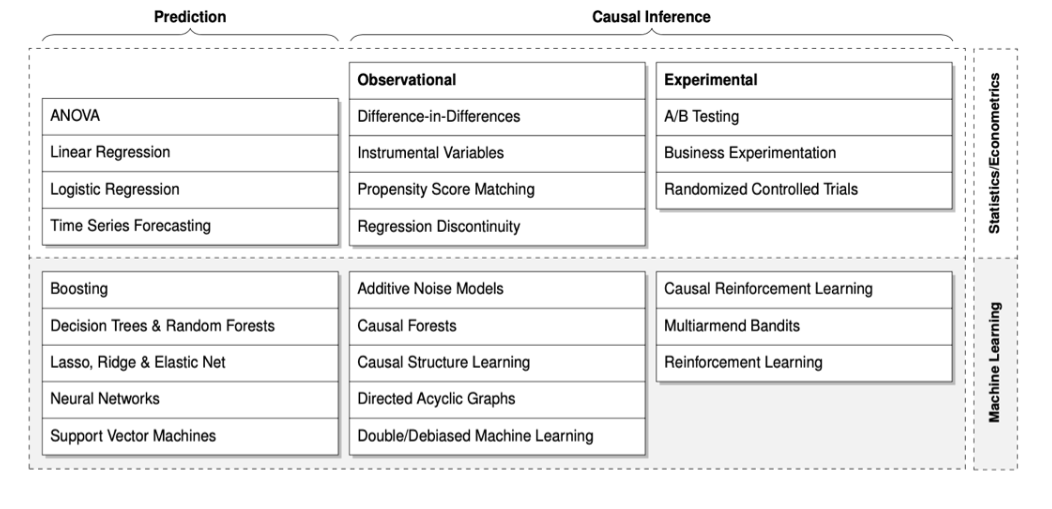
We can break down the differences between prediction and causal inference in even more helpful detail by using a simple 2x2 grid provided by Hündermund, Kaminski, and Schmitt (2021) in the taxonomy below. On the top row are methods from statistics and econometrics. On the bottom are more contemporary machine learning methods often created by statisticians, computer scientists, and data scientists. On the first column are traditional prediction techniques but on the second and third columns are causal inference techniques.
The top left quadrant of “Prediction from Statistics and Econometrics” are methods often taught traditionally in the earliest courses. Things like analysis of variance, OLS, and logistic regression or forecasting. Improvements aimed at addressing overfitting problems inherent in many traditional prediction models have come from the machine learning community and include things like random forests, neural nets, and penalized regressions (e.g., LASSO and Ridge).
These methods are important for predicting current hidden events and future events, but they are not themselves explicitly designed for causal inference. To understand those, we turn to columns 2 and 3. One could argue that my book covers the top left segment in the second column labeled “Observational.” In fact, difference-in-differences, instrumental variables, propensity score matching, and regression discontinuity are four of the designs I cover in this book. The only one missing is synthetic control. The top right segment in the third column labeled “Experimental” is briefly discussed in this chapter, though not in the level of detail needed if one was going to implement RCTs or A/B tests.2 And the second and third columns intersecting with the bottom “Machine Learning” row cover more contemporary cutting edge methods that leverage the strengths of both machine learning and econometrics/statistics such as directed acyclic graphs (discussed in this book), causal forests, and multiarmed bandits.
Still, maybe these taxonomies between traditional prediction and causal inference remain a bit vague. Let’s now move into a set of scenarios wherein we can see a little better what causal inference is by comparing it to common causality fallacies. Such mistakes are common when one confuses prediction or description with causal inference and is even easier to confuse given, as the taxonomy above shows, sometimes the same methods are used for both. Sometimes fallacies help us understand what we should be doing too.
Common Causality Fallacies
Imagine a ship full of extraterrestrials traveling to planet Earth. They hover above the planet, cloaked and invisible because of some alien technology. Staring down at Earth for months during the 2020 COVID pandemic, they make a startling observation. Their calculations show that the patients infected with COVID on ventilators inside the hospital were dying much more often than people infected with COVID outside of the hospital. Same age, same sex—it didn’t matter. If someone went into a hospital and were placed on a ventilator, they were less likely to survive than those who were infected with COVID but weren’t on ventilators. Those who stayed off the machines tended to live longer, despite the infection, causing the aliens to doubt their initial belief that the doctors were benevolent.
At some point, it became irresponsible to ignore the obvious—“the doctors are killing the patients with ventilators,” one of them whispered in a hushed tone. And so, driven by their concern and altruism, the aliens teleport to Earth, capture the staff, take the patients off the ventilators, and sit with them eager to see them improve. Only they don’t improve. They continue to die. In fact, they die even more than they had been dying prior to this planned rescue mission.
Why? What had happened? Hadn’t people on vents been dying at higher rates than those not on them? Yes. So why did removing the vents not stop it? What did they get wrong?
To those of us who have lived our lives basking in latent knowledge about hospitals, sickness, life, and death, the error was so obvious it makes us doubt the intelligence of the aliens. The patients on the ventilators had been placed on ventilators not to make them sicker, but because they were already so much sicker than everyone else. To use language I will use often throughout the book, these patients had sorted into their treatment based on the hopes that the treatment would improve their health. The aliens’ mistake sounds silly to us because we know what hospitals are and they don’t.
But let me pose to you this possibility, a somewhat frightening one. Aren’t all of us the aliens when conducting research of almost any kind? Aren’t we often working on topics about which there is no latent prior knowledge? If you are working on something about which very little is known, then you are the alien and these kinds of errors are very real possibilities. Correlations may be important, but if they are all we have to rely on, we are likely to make the same mistakes as the well meaning aliens, and people may in the process get hurt or worse.
Correlations and causal questions differ in many deep ways, but one obvious way is that causal questions can be expressed meaningfully with respect to only one observation, whereas correlational questions can only be expressed with more than one observation. Consider this question, which is a version of both Mills’ and Lewis’s statements from earlier:
If I put a patient \(i\) on a ventilator (\(D_i=1\)), will her COVID symptoms (\(Y_i\)) improve?
Notice that the question can be expressed using only one person. Now it can’t be answered (we’ll see why in a moment), but here I just want to point out that the question makes sense even when referring to only one person. But contrast that with the following—the definition of correlation. \[
\begin{equation}
\beta = \frac{C(D,Y)}{\sqrt{V_D}\sqrt{V_Y}}
\end{equation}
\tag{4.1}\] where \(C\) is the covariance of the two variables \(D\) and \(Y\), and \(V\) is the variance of each variable \(D\) and \(Y\). This quantity, \(\beta\), cannot even be calculated with only one observation. It requires several at least just to get a meaningful answer. Which means correlations can’t even be talked about with single observations, yet the idea of a causal effect can.
I contrast these because I want to first help you understand that the causal questions and the correlation questions, while we will use one to inform the other, are nonetheless distinct.
Coming First May Not Mean Causality
I live in Waco, Texas, near the Brazos river, in a neighborhood with many interesting neighbors. Some of these neighbors are people, but some of them are horses, roosters, and feral cats. Sometimes it seems like my neighborhood is like a miniature zoo brimming with what feels like dozens of feral cats wandering around. One day I was looking out the window and I spotted a grisly old tabby cat who had clearly seen a lot. He was missing half an ear and had been in quite a few scrapes from the look of it. I asked my daughter if we could name him Coach, one of my favorite characters on the television show, New Girl, and she agreed.
Well, one day Coach came on to the porch and I decided he was hungry. He looked at me with those hungry eyes cats give you sometimes. So I went to the store and got cat food—the good kind filled with tuna and whatever else justified spending an obscene amount of money on a dozen cans of wet cat food. And as such, Coach kept coming around.
Every morning my neighbor’s rooster crowed and every morning the sun comes up. So imagine if I saw those patterns repeat every day and concluded that the rooster was causing the sun to come up. After all, it always happened in that order. But consider this. One morning, before the sun came up, I made my coffee and sat on the porch, waiting for Coach and waiting for the rooster to crow. And that’s when I saw it. Coach jumped down from a tree right in front me, walked right up to that rooster, snatched it by the neck, and brought it over to the porch. He dropped it at the bottom of the steps as a gift to me. It did not crow anymore and yet minutes later the sun rose.
Before that moment, the rooster had always crowed followed by the sunrise. But on that day, the cat killed the rooster—the rooster didn’t crow but the sun came up anyway.
The Latin phrase post hoc ergo propter hoc is a logical fallacy in which a person believes that because something in a sequence of events happened first, therefore it caused the things that happened after. But the rooster died and the sun came up anyway, even though every day before then the rooster’s crowing had always happened before the sunrise.
Just because something happens first doesn’t mean it caused the thing that happened second.
Causality Can Leave Without a Trace
But now let’s consider the weirdest of examples; an example so strange it’s possible you’ve never heard it anywhere. Sometimes some things cause other things and leave no observable correlation between them. Now that one is definitely strange. How can one thing cause another thing and yet there be no discernible correlation between the two things? Consider this example which is illustrated in Figure 4.2.
A sailor is driving a boat across the lake on a windy day.3 As the wind blows, she counters by turning the rudder in such a way so as to exactly offset the force of the wind. Back and forth she moves the rudder, yet the boat follows a straight line across the lake. Our aliens, still wincing from accidentally murdering a hospital of sick people, decide to fly over to a situation where they can be all but certain to help someone. The captain of the alien’s vessel looks down at the sailor, sees her moving the rudder back and forth with no change in the direction of the ship and concludes that something must be wrong. Her rudder, he thinks, is broken. So he beams himself down to personally replace the rudder, much to her horror, tells her no thank you is necessary, and then teleports back into space. Once she calms down from her near alien abduction, she gets back to piloting her ship—moving the rudder left and right, just as before, still going straight.
This sounds like a silly example, but sometimes silly examples help us see the problems in our reasoning. Sometimes a problem is so slippery even very smart people can miss it. Take this quote from Kahneman, Sibony, and Sunstein (2022), one of whom won the Nobel Prize in economics:
While correlation does not imply causation, causation does imply correlation. Where there is a causal link, we should find a correlation.
Now, they are to a degree right, but it’s the absolutist second sentence that I’m clearly taking issue with in this silly alien–sailor example. So let’s change the story a little so that we can reconcile this section with Kahneman, Sibony, and Sunstein (2022).
What if the sailor, rather than using her skill and objectives to pilot the ship, had instead rolled dice, each number corresponding to a point where she will point the rudder. If she rolled a 12, for instance, she would point the rudder towards the port side of the ship but if she rolled a 1, she would yank the rudder in the other direction towards the starboard side. When choosing her rudder’s position using dice, the ship begins to zig and zag across the lake. But when she chose the rudder’s position using her own skill and objectives, the ship moves in a straight line across the lake.
I think maybe Kahneman, Sibony, and Sunstein (2022) might have been implicitly referring to something more like the second situation than the first, but the fact is, causal effects existed in both. It’s just that in the first case with dice, the causality would’ve been observable with correlations, but not in the second, even though in the second it was still there. The reason it’s visible in one but not the other is because the treatment assignment mechanism is different in each case. Why was it that picking the rudder’s position using chance led to an observable correlation between the rudder’s position and the direction of the craft, but not when she intentionally and expertly chose the rudder’s position?
The answer is obvious I’m sure—she chose the rudder’s position to counteract the wind. She assigned the rudder’s position intentionally, with an objective in mind, and not haphazardly. And as a result, the causal effects, while there, were empirically invisible. But, had she assigned the rudder to different positions for any other reason, using any other mechanism than her own rational intentions, then the winds would’ve pushed her around, and the causal effect of the rudder on her direction would’ve been detected. The rudder was causing the ship’s position to change, but it was a change relative to where the wind was at that moment pushing it. The rudder was causing the ship’s direction to change relative to a counterfactual position of the rudder placed anywhere else.
I love silly examples, but let’s now consider one that is plausibly less silly: the US Federal Reserve’s increasing and decreasing the nation’s money supply in response to forming output gaps. The Fed enters into open market operations by buying bonds and pumping liquidity into the economy when they believe a recessionary output gap is forming. Likewise, if they think an expansionary output gap is forming, they will sell bonds in open market operations and withdraw money from the money supply. When either of these actions are done optimally, it is like the sailor using her rudder to pilot the ship across the lake—open market operations will negate the output gaps, regardless of direction, before it ever occurred. For every recession we do see, there are likely many recessions we never experienced because of times the Fed successfully averted them with changes in the money supply.
But what if, instead of choosing actions based on pushing back against the recessionary wind, the Fed Chair chose to buy or sell bonds by flipping coins. The Chair wakes up and flips a coin: Heads, increase the money supply. Tails, reduce the money supply. Now, what effect would you expect to see on output? Like our ship zigging and zagging across the lake, a bank that randomized its monetary policy would likely see fluctuations in output as recessions and expansions formed erratically.
Randomized choice versus the type of intentional, even rational, choice that human beings, even the most flawed, aspire to make will create very different patterns in data sets. And depending on the situation, one of them will result in correlations and one of them will remove all traces of the very real, very present, causal effects.
So one of the things we see from these examples is that correlations are valuable for measuring causal effects, but are not themselves the causal effects and don’t necessarily get the answer anyway. In the first through the third examples, we saw something really subtle that the next few sections are hopefully going to make much clearer and that’s that one of the principal forces in nature that causes correlations to no longer be good markers of causal effects are rational people who make choices with respect to what they hope the choice will do to improve their lives. When choices are tied to the expected impact that the choice will have on their life, be it sorting into treatment for COVID or moving a rudder against the wind, the person chose that particular action because they thought it would help them achieve their goals. And, while causality didn’t disappear in those situations, our ability to observe it correctly does. The primary cause of bias, in other words, is usually the choices of intentional actors. Call it rational choice, or just call it hope, but when people make their selections based on expected gains, correlations cease telling us about causal effects.
But to see this, we are going to need to finally dive deep into that Neyman (1923) notation and work through the physical randomization that Fisher (1925) told us about. I think we are now ready to meet someone we mentioned earlier—Don Rubin, former chair of the Harvard statistics department.
4.2 Potential Outcomes
While the potential outcomes notation goes back to Neyman (1923), the person responsible for its widespread adoption in statistics and the social sciences is probably Don Rubin. He is so closely associated with the potential outcomes model, in fact, that Holland (1986) once termed it the “Rubin causal model.” The first time he seems to use it is in Donald Rubin (1974) where he writes: “Now define the causal effect of [one treatment] E versus [another treatment] C …as y(E)\(-\)y(C).”4
We briefly touched on this in the previous chapter, but now it’s time to dive into the notation itself. These two terms, \(y(E)\) and \(y(C)\), are pregnant with meaning, and I always worry that people will miss it if I go too fast, because it’s subtle. So pardon me if I belabor this point a bit too long, but it’s important to me that we remain on the same page as long as we can.
I tend to use my own words when trying to explain these concepts to people, and one of those I will sometimes use is “states of the world.” When I say “states of the world,” I mean multiple nearly identical clones of the same reality each of which differs in one important detail: in each cloned state of the world, a different behavioral action towards or by some unit occurred. For instance, in one state of the world a man takes aspirin for his headache. One hour later, he reports the severity of his headache pain to his doctor. But in another cloned state of the world, that same man at that same time took nothing for his headache and one hour later reported the severity of his headache pain to the same doctor. The causal effect of his aspirin on his headache is the difference in his headache pain between these two states of the world.
That previous paragraph could have been written by Mill or Lewis given how it explicitly links causality to comparison between reality and counterfactuals. But to attribute it only to philosophers I think is to overlook the massive assistance that humans got when the statisticians took those concepts, built notation around them, and analyzed causality in light of different mechanisms for selecting units to be treated or not.
So to make this concrete, let’s use Neyman and Rubin’s potential outcomes notation. For simplicity, we will assume a binary variable that takes on a value of one if a particular unit \(i\) receives the treatment and a zero if it does not.5 More formally, I’ll let the treatment be a binary variable: \[
D_{i,t} =
\begin{cases} 1 \text{ if placed on ventilator at time $t$} \\ 0
\text{ if not placed on ventilator at time $t$}
\end{cases}
\tag{4.2}\] where \(i\) indexes an individual observation, such as a person. And I’ll define the potential outcomes: \[
Y_{i,t}^j =
\begin{cases} 1 \text{ health if placed on ventilator at time $t$}
\\ 0 \text{ health if not placed on ventilator at time $t$}
\end{cases}
\tag{4.3}\] where \(j\) indexes a potential treatment status for the same \(i\) person at the same \(t\) point in time. This then means that \(Y^1_{Sue, now}\) is Sue’s health now if she is on a ventilator, and \(Y^0_{Sue,now}\) is Sue’s health if she is not on a ventilator now. They cannot coexist by the law of noncontradiction, but they can be defined, and for now, that’s all we want to do.
Realized Outcomes
Each unit will have two potential outcomes, but only one real outcome or what I’ll call the realized outcome. This distinction is subtle and people often skip over it too quickly. But let’s go slower than most. First note the difference in notation. Potential outcomes have numbers in the superscript like \(Y^1_i\). When you see a 1 or a 0 in the superscript, it refers to a person’s “potential outcome” in a world where the treatment did (1) or did not (0) occur.6 The fact that \(i\) is used for both potential outcomes, \(Y_i^1\) and \(Y^0_i\), is the paradox as it is implicitly assumed that it’s a different potential outcome for the same person at the exact same point in time. It means in these two otherwise identical worlds, some person named \(i\) exists but in one, she is on the ventilator, and in another she is not.
Potential outcomes as a modeling notation is perhaps foreign to many of us whose statistics and econometrics training was traditional. Guido W. Imbens (2014) notes that potential outcomes was ironically present in the work of the earliest econometricians, but that by the 1960s, textbooks had largely abandoned it.
If potential outcomes notation can be recognized with numbers in the superscript, realized outcomes, \(Y_i\), can be recognized because they have nothing in the superscript. They sort of look the same, because they will share a letter in common usually (e.g., \(Y\) is present in both \(Y_i\) and \(Y^1_i\)), but they are not the same thing. Their differences are far more important than their similarities for understanding causal inference.
Don Rubin (1990) describes potential outcomes as existing a priori but not known. Realized outcomes, on the other hand, exist after the treatment was selected and therefore are known. Realized outcomes are known ex post because they were the one chosen by the treatment itself, \(D_i=1\) or \(D_i=0\).7 We can represent this easily with the switching equation: \[
\begin{equation}
Y_i = D_iY^1_i + (1-D_i)Y^0_i
\end{equation}
\tag{4.4}\] where \(D_i\) is our treatment variable that takes on a value of one if the unit was assigned to the treatment and zero if it was not.
Maybe an example will help us see what the switching equation does when it takes us from potential to realized outcomes. When John took the aspirin, \(D_i=1\), we observed \(Y_i=Y^1_i\) because the second term zeroed out. But had John abstained and not taken the aspirin, then \(D_i=0\) causing the first term to zero out and setting \(Y_i=Y^0_i\).
Individual Treatment Effects
Using this notation, and following Donald Rubin (1974), we define a unit-specific causal effect, for which in most of the book we will use the more common language, treatment effect. The individual treatment effect, calling back to Mill and Lewis, is the difference between the \(Y^1_i\) and \(Y^0_i\), the two potential outcomes for person \(i\) given the treatment under consideration is binary:8\[
\begin{equation}
\delta_i = Y^1_i-Y^0_i
\end{equation}
\tag{4.5}\] Our definition of a treatment effect immediately presents us with a problem. If a treatment effect requires knowing two states of the world, \(Y^1_i\) and \(Y^0_i\), but by the switching equation we only observe one, then we cannot calculate the unit level treatment effect. This is the fundamental problem of causal inference(Holland 1986). We are missing one of the numbers we need to measure the person’s treatment effect. But if we cast the problem in that way, then we also see that the fundamental problem of causal inference is all about missing data. And we have ways to impute missing data.
But imputing this missing data is not straightforward because this missingness data problem is strange. It’s not that there are simple holes in our dataset and it’s not that we forgot to collect certain variables. It’s not that the agency forgot to ask about it. And it’s not that we simply could increase the data size to some huge number so as to overcome it. The fundamental problem of causal inference cannot be overcome, because no matter how big our dataset gets, it will always be too small by half. We will always be missing at minimum half the data we need to calculate unit level treatment effects. That’s because the data we are missing is a potential outcome that does not exist and never will.
Think of it like this: if you lost your car keys, then they are missing. But they at least exist, even if it feels like they are gone. But when the switching equation grabs one of two potential outcomes and makes it real, it destroys the other one and keeps it from ever being born. I will never know what my happiness would be like had I not gotten a PhD in economics. I only know what my happiness is like now having gotten one. Maybe I would be less happy. Maybe I would be more. And maybe I would be just as happy either way. There is no way to know. Yes, my counterfactual is technically missing, but it’s not missing the way my car keys are missing. It’s missing the way unicorns are missing—counterfactuals are missing because they don’t exist. And that’s a different kind of missing data problem.
Average Treatment Effects
Individual treatment effects are usually simple numbers. The causal effect of fertilizer on crop yields is 100 additional ears of corn.
Any collection of numbers can be averaged. If you have two plots of land, and the causal effect of fertilizer on crop yields was 100 corns in the first, but 200 in the second, then the average causal effect of fertilizer on yields is 150 additional ears of corn.
Once potential outcomes are used to define the individual treatment effect, it becomes possible to construct aggregate treatment effects by averaging over them. All aggregate treatment effect parameters are simply means of individual treatment effects. The key difference between the average treatment effect definitions in this book lies in whose treatment effects are being averaged. Let’s start with the most general of all aggregate causal parameters, the average treatment effect (\(\mathit{ATE}\)):9\[
\begin{align}
\mathit{ATE} &= E[\delta_i] \nonumber \\
&= E[Y^1_i - Y^0_i] \nonumber \\
&= E[Y^1_i] - E[Y^0_i]
\end{align}
\tag{4.6}\]
Averaging over individual treatment effects to define a parameter like the \(\mathit{ATE}\) doesn’t resolve the fundamental problem of causal inference. The same problem that prevents us from observing individual treatment effects also applies to any parameter derived from them. The value of the \(\mathit{ATE}\) lies in its conceptual clarity: it provides a target causal parameter. If we want to understand the average effect of an intervention across everyone, estimating the \(\mathit{ATE}\) becomes an interesting and relevant goal. If not, it doesn’t.
Each unit \(i\) has a treatment effect \(\delta_i\). And each unit \(i\) is assigned to either treatment (\(D_i=1\)) or control (\(D_i=0\)). So, what if we averaged \(\delta_i\), not over the entire population like we did with the \(\mathit{ATE}\), but for the treatment group and control group separately? What if, in other words, we calculated conditional averages?
Well we can. In fact it’s trivial. We just take all the \(\delta_i\) in a group and then average it. If we averaged \(\delta_i\) for only the treatment group, we’d have a new causal parameter called the average treatment effect for the treatment group or the \(\mathit{ATT}\) for short.10 What is the \(\mathit{ATT}\) you ask? The \(\mathit{ATT}\) is simply the average treatment effect for the units in the treatment group (but not in the control group). Insofar as \(\delta_i\) differs across the population, then the \(\mathit{ATT}\) might differ from the \(\mathit{ATU}\) depending on which units were allocated to treatment versus control. Formally we define the \(\mathit{ATT}\) as: \[
\begin{align}
\mathit{ATT} &= E\big[\delta_i\mid D_i=1\big] \nonumber
\\
&= E\big[Y^1_i - Y^0_i\mid D_i = 1\big] \nonumber
\\
&= E\big[Y^1_i\mid D_i=1\big] - E\big[Y^0_i\mid D_i=1\big]
\end{align}
\tag{4.7}\]
The last aggregate parameter of interest that I will introduce here is called the average treatment effect for the untreated group. Its shorthand is \(\mathit{ATU}\). It’s sort of the sibling of the \(\mathit{ATT}\) in that it is the mean of individual treatment effects \(\delta_i\) assigned to the control state of the treatment status. \[
\begin{align}
\mathit{ATU} &= E\big[\delta_i\mid D_i = 0\big] \nonumber
\\
&= E\big[Y^1_i - Y^0_i\mid D_i = 0\big] \nonumber
\\
&=E\big[Y^1_i\mid D_i=0\big]-E\big[Y^0_i\mid D_i=0\big]
\end{align}
\tag{4.8}\]
Given heterogeneous treatment effects, it’s hypothetically possible that the \(\mathit{ATT}\neq \mathit{ATU} \neq \mathit{ATE}\), but this is not required, even with heterogeneity as we will soon see. And depending on the research question, one or all three of these parameters might be interesting to a researcher. The two most common ones I have personally seen in applied research are the \(\mathit{ATE}\) and the \(\mathit{ATT}\), though quite frankly it’s not at all obvious to me why the \(\mathit{ATU}\) wouldn’t be interesting too. It ultimately depends, though, on what the researcher’s questions are, and whether understanding what would’ve happened to the control group was at all an important topic to them.
4.3 Perfect vs Bad Doctor Treatment Assignment
This has been somewhat abstract, so let’s be concrete. There are ten people infected with COVID. Some of them are on ventilators in hospitals, and some of them are not. If we place person \(i\) on a ventilator, then \(D_i=1\), and if we don’t, then \(D_i=0\). Each patient has two potential outcomes, \(Y_i^1\) and \(Y_i^0\), each of which corresponds to whether they were treated in different states of the world. Potential outcomes measure each person’s post-treatment lifespan in years. Let’s look at an example now in Table 4.2.
Table 4.2: Potential Outcomes and Treatment Effects for Ten Patients with COVID-19. Patients’ Potential Outcomes while on a Ventilator Are Represented with \(Y^1\) and if Not Then \(Y^0\)
Patients
\(Y_i^1\)
\(Y_i^0\)
\(\delta_i\)
1
7
1
6
2
5
6
\(-1\)
3
5
1
4
4
7
8
\(-1\)
5
4
2
2
6
10
1
9
7
1
10
\(-9\)
8
5
6
\(-1\)
9
3
7
\(-4\)
10
9
8
1
\(E[Y^1]=+5.6\)
\(E[Y^0]=+5\)
\(\mathit{ATE}=+0.6\)
We can calculate the average treatment effect using the data in this table in two ways. We could take the average of the \(Y^1\) and \(Y^0\) columns and then difference them. Or we could take the difference between \(Y^1_i\) and \(Y^0_i\) row by row and then average that. We’ll get the same answer either way. The first method gives us \(E[Y_i^1]=5.6\) and \(E[Y_i^0]=5\) which differenced equals the \(\mathit{ATE}=0.6\). In words, the average treatment effect of ventilators on these ten people infected with COVID-19 is 0.6 additional years (compared to receiving no ventilator).
But not everyone benefits from ventilators. Patient 7, for instance, lives 1 additional year on a vent but 10 additional years without one. When treatment effects differ across units, we say that treatment effects are “heterogeneous.” That heterogeneity is aggregated into a single because the \(\mathit{ATE}\) is nothing more than a weighted average over all individual \(i\) treatment effects \(\delta_i\) and treatment effects can differ by person.
The \(\mathit{ATT}\) and \(\mathit{ATU}\) cannot be calculated in Table 4.2 until units are assigned to treatment. But what rule will we use to assign these patients to ventilators? What treatment assignment mechanism will we use? Here we introduce a bit of fiction to accomplish this.
At this hospital is the world’s best doctor. We call her for short the “Perfect Doctor.”11 Part of what makes her perfect isn’t her bedside manners or where she went to school. Rather part of what makes her perfect is she knows within minutes of meeting a patient each of their potential outcomes! She knows a priori, with certainty, that patient 1 will live 7 additional years on a vent, but only 1 additional year off a vent. Since she knows both potential outcomes, she therefore knows each patient’s treatment effect of a ventilator relative to no ventilator, \(\delta_i\).
But the Perfect Doctor doesn’t merely know each patient’s potential outcomes. The Perfect Doctor also assigns each patient to the treatment that is best for them.12 Once she assigns her patient to that patient’s best treatment, that patient’s outcome is realized according to \(Y_i=D_iY^1_i + (1-D_i)Y^0_i\), our switching equation from earlier.
Table 4.3: Potential Outcomes and Realized Outcomes (Measured as Post-Treatment Years of Life) for Patients Assigned to Ventilators \(D_i=1\) Versus Nothing \(D_i=0\)
Patients
\(Y_i^1\)
\(Y_i^0\)
\(\delta_i\)
\(Y_i\)
\(D_i\)
1
7
1
6
7
1
2
5
6
\(-1\)
6
0
3
5
1
4
5
1
4
7
8
\(-1\)
8
0
5
4
2
2
4
1
6
10
1
9
10
1
7
1
10
\(-9\)
10
0
8
5
6
\(-1\)
6
0
9
3
7
\(-4\)
7
0
10
9
8
1
9
1
\(\mathit{ATE}=+0.6\)
\(\mathit{ATT}=+4.4\)
\(\mathit{ATU}=-3.2\)
\(SDO = -0.4\)
Table 4.3 differs from Table 4.2 because whereas Table 4.2 shows potential outcomes, Table 4.3 shows both potential and realized outcomes for all ten patients. It also includes our target parameters as well as something called the \(SDO\) which I will discuss below.
Only after the treatment has been assigned can we calculate the average treatment effect for the treatment group (\(\mathit{ATT}\)) versus the comparison group (\(\mathit{ATU}\)). The \(\mathit{ATT}\) equals 4.4 and the \(\mathit{ATU}\) equals \(-3.2\). In words, that means that the average outcome for the treatment group is 4.4 additional years, whereas the average outcome for the control group is 3.2 fewer years.13 And the \(\mathit{ATE}\) is 0.6, which is just a weighted average between the \(\mathit{ATT}\) and the \(\mathit{ATU}\) in which the weights, \(\pi\), are the share of people in the treatment group and \(1-\pi\) are the share of people in the control group:
So we know that the overall average effect of being placed on a ventilator is positive, but not for everyone because some people are better off with nothing. Treatment effects differ across individuals, in other words, but on average the causal effect is positive.
When I teach this to students, I often have them go through a table just like Table 4.2 and ask them to create the last two columns of Table 4.3 using the logic of the Perfect Doctor. And without fail, the process of actually creating the table is a real eye opener because usually that’s when people finally realize the fundamental problem of causal inference: how can we calculate the \(\mathit{ATE}\) if we need both potential outcomes but only have one because of the switching equation. And once students ask that question, I know they see it. Because the answer is you can’t.
The aggregate causal parameters, just like the individual treatment effect, cannot be measured in reality. We can do it here because we have the potential outcomes, but no one has a time machine that lets them see what people’s lives would be like on and off a ventilator. We live with the last two columns of Table 4.3, not the first potential outcome and treatment effect columns. The fundamental problem of causal inference is deep.
But let’s go back to what the aliens did when they came upon patients on and off ventilators. They apparently averaged the outcomes for the group on vents, averaged the outcomes for the group not on vents, and then differenced them. And when they saw that that simple difference in means was associated with a bad outcome, they concluded vents had caused the bad outcome. Let’s look, then, at the simple difference in mean outcomes (SDO) now ourselves.
\[
\begin{equation}
SDO = E\big[Y_i^1\mid D_i=1\big] - E\big[Y_i^0\mid D_i=0\big]
\end{equation}
\tag{4.10}\] and which can be estimated using samples of data: \[
\begin{align}
SDO = \dfrac{1}{N_T} \sum_{i=1}^n \big(y_i\mid d_i=1\big) -
\dfrac{1}{N_C} \sum_{i=1}^n \big(y_i\mid d_i=0\big)
\end{align}
\tag{4.11}\] where \(N_T\) is the number of patients on vents, \(N_C\) is the number of patients not on vents, and realized outcomes are determined by the switching equation. Surprisingly, though the \(\mathit{ATE}\) was positive (\(+0.6\)), the SDO is negative (\(-0.4\)).14 In other words, though the average treatment effect extends everybody’s life on average an additional 0.6 years, the dataset consisting only of realized outcomes and treatment status shows that the treatment group lives 0.4 fewer years than their counterparts not on a ventilator. This is a puzzle that we want to understand, so buckle up as we are about to crack open the SDO to better understand what connection it has, if any, to the \(\mathit{ATE}\).
Decomposing a Correlation into Causal Effects and Bias
To begin, I’m going to write down a simple definition of the \(\mathit{ATE}\) as a weighted average of our two conditional average treatment effects, and \[
\begin{align}
\mathit{ATE} &= \pi \times \mathit{ATT}+(1-\pi) \times \mathit{ATU}
\end{align}
\tag{4.12}\] where recall from earlier that \(\pi\) is the share of COVID-19 patients who were placed on ventilators and \(1-\pi\) is the share of patients that weren’t. In our example, since there were five people on vents out of ten patients, \(\pi=0.5\), but it doesn’t have to be. If there had been 4 people on vents out of 11 patients, then \(\pi=0.36\). The weights here are just shares associated with treatment status in other words.
Next, I will replace \(\mathit{ATT}\) and \(\mathit{ATU}\) with their conditional expectations as this is key to the decomposition.15\[
\begin{align}
\mathit{ATE} &=\pi \times \mathit{ATT}+(1-\pi) \times \mathit{ATU} \nonumber
\\
&=\pi E\big[Y^1 - Y^0 \mid D=1\big] + (1-\pi) E\big[Y^1 - Y^0 \mid
D=0\big] \nonumber
\\
&=\pi E\big[Y^1\mid D=1\big]-\pi E\big[Y^0\mid D=1\big] + (1-\pi)
E\big[Y^1\mid D=0\big]\nonumber\\
&\quad-(1-\pi) E\big[Y^0\mid D=0\big] \nonumber
\\
&= \Big\{\pi E\big[Y^1\mid D=1\big]+(1-\pi)E\big[Y^1\mid
D=0\big]\Big\}\nonumber\\
&\quad -\Big\{\pi E\big[Y^0\mid D=1\big]+(1-\pi) E\big[Y^0\mid D=0\big]\Big\}
\end{align}
\tag{4.13}\] Now before we move, notice that this equation is still just the definition of the \(\mathit{ATE}\) expressed as the weighted average of the \(\mathit{ATT}\) and the \(\mathit{ATU}\). It’s not a theorem—it’s an identity. This is what the \(\mathit{ATE}\) is equal to. We just replaced the \(\mathit{ATT}\) and \(\mathit{ATU}\) terms with their underlying conditional expectations, distributed \(\pi\) terms, and rearranged them, but otherwise it’s still just the original definition.16
These next few steps will involve adding and moving things around, and the lines will get long—too long for the dimensions of this book in fact. But I also just find working with conditional expectations easily distracting (my attention deficit disorder “primarily inattentive” issues, no doubt), so to make this easier on the eyes, I’m going to replace each conditional expectation as well as the with some letters. I’ll leave \(\pi\) though since it’s just one letter anyway. Here’s my cheat sheet.
\[
\begin{align}
E[Y^1\mid D=1] &= a \\
E[Y^1\mid D=0] &= b \\
E\big[Y^0\mid D=1\big] &= c \\
E\big[Y^0\mid D=0\big] &= d \\
\mathit{ATE} &= e
\end{align}
\tag{4.14}\]
Much better on my eyes! First, let me rewrite the definition of using these letters. \[
\begin{align}
e&=\big\{\pi{a}+(1-\pi)b\big\}-\big\{\pi{c} + (1-\pi)d\big\}
\end{align}
\tag{4.15}\] Next, let me distribute the \(\pi\) term and drop the brackets just to clean this up a little. \[
\begin{align}
e&=\pi{a}+b-\pi{b}-\pi{c} - d + \pi{d}
\end{align}
\tag{4.16}\] Now I’m going to do a simple math trick by adding a zero to the right-hand side of the equation. Now you might wonder why add zero to an equality since doing that doesn’t change the equality, but that’s actually why I’m doing it. If I add a zero to the right-hand side of this equality, then the \(\mathit{ATE}\) still equals the sum of the terms on the right-hand side. But it’s the way in which I’m adding a zero here as that will allow me to bring in some terms that once I rearrange will maintain the definition of the \(\mathit{ATE}\) but reveal things implied by it that otherwise I can’t see in its present form. I’ll go step-by-step so that you can see the progression, but I encourage you to do this yourself on a separate piece of paper, as this is an important decomposition of the \(\mathit{ATE}\) that, if you understand, will help you with the remainder of the book. \[
\begin{align}
e&=\pi{a}+ b-\pi{b}-\pi{c} - d + \pi{d} + (\mathbf{a} - \mathbf{a})
+ (\mathbf{c} - \mathbf{c}) + (\mathbf{d} - \mathbf{d}) \nonumber
\\
0&=e-\pi{a} - b + \pi{b} + \pi{c} + d - \pi{d} - \mathbf{a} +
\mathbf{a} - \mathbf{c} + \mathbf{c} - \mathbf{d} + \mathbf{d} \nonumber
\\
\mathbf{a}-\mathbf{d}&=e-\pi{a} - b + \pi{b} + \pi{c} + d - \pi{d}
+\mathbf{a} -\mathbf{c} +\mathbf{c} - \mathbf{d} \nonumber
\\
\mathbf{a}-\mathbf{d}&=e + (\mathbf{c} -\mathbf{d}) +
\mathbf{a}-\pi{a} - b + \pi{b} -\mathbf{c} + \pi{c} + d - \pi{d} \nonumber
\\
\mathbf{a}-\mathbf{d}&=e + (\mathbf{c} -\mathbf{d}) + (1-\pi)a
-(1-\pi)b + (1-\pi)d - (1-\pi)c \nonumber
\\
\mathbf{a}-\mathbf{d}&=e + (\mathbf{c} -\mathbf{d}) + (1-\pi)(a-c)
-(1-\pi)(b-d)
\end{align}
\tag{4.17}\] Use your cheat sheet from the other page and replace \(a-d\) with \(E[Y^1|D=1] - E[Y^0|D=0]\). What is this? Why it’s nothing other than the SDO expressed, not in realized outcomes, but in potential outcomes. But, since \(Y=Y^1\) if \(D=1\), we can replace potential outcomes with realized outcomes as those are in the dataset. Same for \(Y^0\). So \(a-d\) is just \(E[Y|D=1] - E[Y|D=0]\), which is what we called the SDO.
Now, I’m going to replace all the right-hand side letters with their corresponding conditional expectations. First, almost like a game of Wordle, we know that \(a-c\) and \(b-d\) are just the \(\mathit{ATT}\) and \(\mathit{ATU}\), respectively. Rearranging all these into three rows we have something sort of interesting I think, but what I find really interesting is that this is still just the definition of the \(\mathit{ATE}\)—just with stuff moved around so that we can see what the SDO (and really every correlation) really means. \[
\begin{align}
\underbrace{E [Y | D=1] - E[Y | D=0]}_{ \mathclap{\text{SDO}}}
&= \underbrace{E[Y^1] - E[Y^0]}_{ \mathclap{\text{Average Treatment
Effect}}} \nonumber
\\
&+ \underbrace{E\big[Y^0\mid D=1\big] - E\big[Y^0\mid D=0\big]}_{
\mathclap{\text{Selection bias}}} \nonumber
\\
& + \underbrace{(1-\pi)(\mathit{ATT} - \mathit{ATU})}_{
\mathclap{\text{Heterogeneous treatment effect bias}}}
\end{align}
\tag{4.18}\] The left-hand side of this equality is the SDO which is the average difference in realized outcomes between two contrasted groups. The right-hand side shows what’s “inside” the SDO, so to speak, expressed in potential outcomes. But before we get into that, using the numbers from Table 4.3, we know the SDO equals \(-0.4\). And since this is an identity, it means the sum of these three rows also equals \(-0.4\).
The first row on the right-hand side is the \(\mathit{ATE}\), which we know from earlier is equal to \(+0.6\). Insofar as a researcher was using the SDO to estimate the \(\mathit{ATE}\), they are in good luck because inside the SDO is the \(\mathit{ATE}\). Problem is, it’s masked and hidden by rows 2 and 3.
The term on the second row is called selection bias, which for some of you is a familiar phrase, but unless you’re already familiar with causal inference terminology, you may be thinking of something else. Sometimes people refer to non-representative sampling of a population as having selection bias, for instance, but that isn’t what we mean here. In this context, selection bias refers to when two groups have different distributions (e.g., mean) for a potential outcome (e.g., \(Y^0\)). In words, if the patients on ventilators and the patients not on ventilators had different average life-spans had they both been off ventilators, then the data suffers from selection bias and the SDO will not equal the \(\mathit{ATE}\).
What’s your opinion about the sign on selection bias in our ventilator example? Do you think that had no one been on vents, it’s likely that the vent group would’ve lived longer or shorter than the group that hadn’t been on them? Probably, given the Perfect Doctor put them on vents because of the treatment effects, which were based on \(Y^0\) in part, it’s entirely plausible that the selection bias term is negative—not just in our table, but in most situations like it. When the sickest people get on a treatment, it creates selection bias which people tend to call “negative selection.” And when the healthiest people get on a treatment, that also creates selection bias which people tend to call “positive selection.” But whether positive or negative, this sorting into treatment based on treatment effects tends to nearly always introduce selection bias, which is one of the main sources of bias whenever contrasting two groups of people to one another.
We can calculate this difference here because we have the complete potential outcomes in Table 4.2, but ordinarily we cannot. That difference in mean potential outcome \(Y^0\) for the ventilator and non-ventilator group is \(-4.8\). Had the ventilator group not been on ventilators, then they would’ve lived 4.8 years less than the group that had never been on ventilators in the first place. Assignment to ventilators, it seems, was directly tied to \(Y^0\).17 Our data suffers from negative selection because the people on treatment would’ve been much sicker than the ones not on treatment had neither been on the treatment.
But the last term is probably new to more of you than selection bias had been because it refers to the underlying heterogeneity in treatment effects distributed across our data, as well as the sorting into and out of the treatment instituted by our Perfect Doctor mechanism. The third row is the share of units in the control group (\(1-\pi)\) times the difference in the returns to ventilators for our ventilator group and our non-ventilator group. If the people on ventilators, in other words, benefit the same on average to those not on ventilators, then this term equals zero. But we know it isn’t true that the ventilator group benefits exactly the same from ventilators as our non-ventilator group because our Perfect Doctor literally selected the treatment based on who benefited more from the treatment. I call this the heterogeneous treatment effect bias, and it simply adds an additional wrinkle to interpreting the SDO. Since half the patients were placed on ventilators, \(\pi=0.5\). And since the \(\mathit{ATT}=4.4\) and the \(\mathit{ATU}=-3.2\), we know that the heterogeneous treatment effect bias equals \(0.5\times (4.4-(-3.2))\) or \(3.8\).
Now that we have the \(\mathit{ATE}\), selection bias, and heterogeneous treatment effects bias, we can show that our equality (based on the definition of the \(\mathit{ATE}\)) still holds: \[
-0.4=0.6-4.8+3.8 = -0.4
\tag{4.19}\] And the identity holds.
What I find interesting about this decomposition of the SDO is that the \(\mathit{ATE}\) is technically in there, which I think means that the SDO, though suffering from various biases, still has a shot at becoming the \(\mathit{ATE}\). If you knew of a situation where the second and third row both equalled zero, then even a SDO would equal the \(\mathit{ATE}\) because the SDO is by definition equal to the \(\mathit{ATE}\) plus those two bias terms. There’s no magic or tricks, no spells, in any of this at all. This decomposition of the SDO, which began with simply writing out the definition of the SDO itself, through some simple manipulation was shown to equal the \(\mathit{ATE}\) and if a situation arose where selection bias was zero and the \(\mathit{ATT}=\mathit{ATU}\), then the SDO would be an unbiased estimator of the \(\mathit{ATE}\).
The problem in our application is the Perfect Doctor—she screwed up the SDO by being so good at her job so as to assign patients to treatments based on whether the treatment was needed or not. The problem isn’t the heterogeneity itself, ironically—the problemis the Perfect Doctor. The Perfect Doctor is in fact the source of the bias in the SDO and because of her behavior, the \(\mathit{ATE}\) is completely smothered in these other two biases. If we wanted the SDO to equal the \(\mathit{ATE}\), we wouldn’t use a different estimator—we’d use a different doctor! Let me explain now by introducing physical randomization as an alternative way to assign patients to ventilators.
Meet the Bad Doctor. Unlike his colleague, the Perfect Doctor, who always puts her patients on the best treatment, the Bad Doctor could care less which treatment the patient is on. Here’s how indifferent the Bad Doctor is: the first five people who show up at his clinic get put on ventilators, regardless of whether it helps them, and the last five on nothing. Every day, day after day, the Bad Doctor assigns patients onto vents until he’s halfway done, and the rest are told to go home and rest because they are out of luck.
Both the Bad Doctor and the Perfect Doctor assign half of their patients on ventilators, but what’s different is the rule they used to make their treatment assignment to ventilators. One of them explicitly used the patients’ potential outcomes to make the treatment assignment, and the other actually ignored the patients’ potential outcomes altogether. This turns out to be critical in causal inference. It’s actually the reason why sometimes the SDO has a causal interpretation and sometimes doesn’t.
To illustrate what I mean, let’s look through some code. But instead of 10 patients, let’s liven it up and have it be 100,000 patients seen over a lifetime. What we will do here is imagine that over these people’s lifetime, they could’ve seen the Perfect Doctor. The code for this is below, but for now I’ll just walk us through the output.
Table 4.4: Perfect Doctor Versus Bad Doctor Decomposition
Perfect Doctor
Bad Doctor
Causal parameter
\(\mathit{ATE}\)
0.59
0.59
\(\mathit{ATT}\)
4.73
0.59
\(\mathit{ATU}\)
\(-4.32\)
0.59
Selection bias terms
\(E[Y^0 \mid D=1]\)
7.35
9.394
\(E[Y^0 \mid D=0]\)
11.97
9.412
Selection bias
\(-4.49\)
\(-0.023\)
Calculations
\(\pi\) (share on vents)
0.54
0.50
SDO
0.24
0.56
Decomposition
0.24
0.56
Obs
100,000
100,000
First, we are going to have it so that the two programs use the same patients. This is accomplished by using the same seed for both doctor programs, and using the same patients. The only difference between the Perfect and Bad Doctor patient outcomes is that the Perfect Doctor will assign patients to ventilators if the potential outcome associated with vents is higher than no vents, but the Bad Doctor will just assign the first 50,000 patients in his life to vents and the second half to no vents. Each patient’s potential outcome associated with a ventilator, \(Y^1_i\), is drawn from the normal distribution with mean 10 and standard deviation of 4. Their potential outcome associated with not being on a ventilator, \(Y^0_i\), is drawn from the normal distribution with a mean of 9.4 and a standard deviation of 4. We define each patient’s treatment effect as \(Y^1_i-Y^0_i\). I’ve summarized the key pieces of information from the program in Table 4.4.
Because these are the same patients, with the same potential outcomes, the \(\mathit{ATE}\) is the same for both groups: \(0.5877381\), which I’ve rounded to 0.59. But notice for the Perfect Doctor, the \(\mathit{ATT}\) is 4.72941 and the \(\mathit{ATU}\) is \(-\)4.316504. This is not surprising because recall the Perfect Doctor groups patients into treatment or control depending on whether their treatment effects were positive or less than or equal to zero. That guarantees under the Perfect Doctor that the \(\mathit{ATT}\) and \(\mathit{ATU}\) will differ and that one will be positive and one negative. You can check for yourself if you want to that the \(\mathit{ATE}=\pi \times \mathit{ATT} + (1-\pi) \times \mathit{ATU}\) by using the non-rounded values by running the code yourself.
The Perfect Doctor dataset is rife with selection bias. On average, the vent group would’ve lived 7.35 years longer had they never been on vents, compared to 11.97 years longer for the group that in fact hadn’t been placed on vents, which is a difference of \(-\)4.49. Given the selection bias term is negative, we say that vents suffer from selection bias. Then, using the share of patients on vents, \(\pi=0.54\), we calculate the SDO as approximately 0.24. Using all this information, we can show that the SDO is equal to the sum of \(\mathit{ATE}\), selection bias, and heterogeneous treatment effect bias using Equation 4.20. \[
\begin{align}
SDO_{perfect} &= 0.5877381 + -4.486844 + (1-0.54215 )\\
&\quad\times(4.72941 - -4.316504) \\
&= 0.24256582
\end{align}
\tag{4.20}\] Note that the \(\mathit{ATE}\) is 0.59, but the \(SDO_{perfect}\) is 0.24. It’s biased, as we can see, by the selection bias term and the heterogeneous treatment effect bias term. Thus we see again that even in the very large sample, the bias of SDO did not diminish, which hopefully is easy to understand if you can work through the code yourself.
But now let’s look at the Bad Doctor. As we said, the Bad Doctor assigned the first 50,000 patients to vents in his life and the last 50,000 to nothing. But imagine these are the exact same patients as the Perfect Doctor had seen—the only difference was who was assigned to vents and who wasn’t. Table 4.4 shows that like the Perfect Doctor, the \(\mathit{ATE}\) under the Bad Doctor regime remains 0.59. This is basically mechanical—the doesn’t depend on treatment assignment, and treatment assignment is the only thing the Doctors do in our example. But notice that once we introduce the Bad Doctor, what changes is the \(\mathit{ATT}\) and \(\mathit{ATU}\) parameters. Whereas the Perfect Doctor had an \(\mathit{ATT}\) of 4.73, the Bad Doctor’s \(\mathit{ATT}\) is only 0.59. It’s much, much lower. But it’s not merely that that I want to bring to your attention—the Bad Doctor’s \(\mathit{ATT}\)is the same value as the \(\mathit{ATE}\)! Both the \(\mathit{ATT}\) and the \(\mathit{ATE}\) are 0.59 in the Bad Doctor, whereas they differed considerably with the Perfect Doctor. We see the same strange pattern when comparing the Perfect and Bad Doctor’s values, too. Under the Perfect Doctor regime, the \(\mathit{ATU}\) was \(-4.32\) (because by definition, the Perfect Doctor placed her patients off vents if treatment effects on vents were negative, which is what we see here). But the Bad Doctor’s is much lower in absolute value—it’s only 0.59. Yet, weirdly enough, under the Bad Doctor, that’s the same number as we found for his \(\mathit{ATE}\) and \(\mathit{ATT}\) parameters! What in the world is going on?
Before answering that question, let’s keep going. While the Perfect Doctor had pretty bad selection bias, the Bad Doctor has none. Both the vent and non-vent groups mean \(Y^0\) is 9.4 additional years of life post-treatment. And when we calculate the SDO, we get 0.5622464, which is only slightly different from the \(\mathit{ATE}\) of 0.5877381. You can see the decomposition yourself in Equation 4.21. \[
\begin{align}
SDO_{bad} &= 0.5877381 + -0.0234346 + (1-0.5)\nonumber\\
&\quad\times(0.585681 - 0.5897952) \nonumber \\
&= 0.5622464
\end{align}
\tag{4.21}\]
***************************************************** * name: perfect_doctor.do * author: scott cunningham (baylor) * description: simulation of a perfect doctor assigning the treatment * last update: december 21, 2022 *****************************************************clearcapturelogclosesetseed 20200403 * 100 people with differing levelsof covid symptomssetobs 100000gen person = _n * Potential outcomes (Y0): life-span if no ventgen y0 = rnormal(9.4,4)replace y0=0 if y0<0 * Potential outcomes (Y1): life-span if assigned to ventsgen y1 = rnormal(10,4)replace y1=0 if y1<0 * Defined individual treatment effectgen delta = y1-y0 su delta // ATE is 0.59 * Perfect doctor assigns vents only to those who need itgen vents=0replace vents=1 if delta>0labelvariable vents "Perfect Doctor Assigns vents" * Aggregate Causal Parametersegen ate0 = mean(delta) // 0.59egen att0 = mean(delta) if vents==1 // 4.73egen atu0 = mean(delta) if vents==0 // -4.32egen ate=max(ate0)egen att=max(att0)egen atu=max(atu0) * Switching equation is Y = DY1 + (1-D)Y0 which gives us realized outcomesgeny=vents*y1 + (1-vents)*y0 * Calculate EY0 for vent group and no vent group so we can calculate selection biasegen ey0_y1 = mean(y0) if vents==1 // 7.35egen ey0_y0 = mean(y0) if vents==0 // 11.97egen ey01 = max(ey0_y1)egen ey00 = max(ey0_y0)gen selection_bias = ey01 - ey00 // -4.49 * Share of units treated with ventsegenpi = mean(vents) // 0.54215 * Two equivalent ways to calculate a simple difference inmeans: OLS and SDOregy vents, robust// 0.24 vs. ate of 0.24bysort vents: su ygen sdo = ate + selection_bias + (1-pi)*(att-atu)di .5877381 + -4.486844 + (1-.54215 )*(4.72941 - -4.316504)su
***************************************************** * name: bad_doctor.do * author: scott cunningham (baylor) * description: simulation of a bad doctor assigning the treatment * last update: december 21, 2022 *****************************************************clearcapturelogclosesetseed 20200403 * 100,000 people with differing levelsof covid symptomssetobs 100000gen person = _n * Potential outcomes (Y0): life-span if no ventgen y0 = rnormal(9.4,4)replace y0=0 if y0<0 * Potential outcomes (Y1): life-span if assigned to ventsgen y1 = rnormal(10,4)replace y1=0 if y1<0 * Defined individual treatment effectgen delta = y1-y0 su delta // ATE is 0.59 * Bad doctor assignment puts you on vents if you're the first 50000 peoplegen vents=0replace vents=1 in 1/50000labelvariable vents "Bad Doctor Assigns vents" * Aggregate Causal Parametersegen ate0 = mean(delta) // 0.59egen att0 = mean(delta) if vents==1 // 0.59egen atu0 = mean(delta) if vents==0 // 0.59egen ate=max(ate0)egen att=max(att0)egen atu=max(atu0) * Switching equation is Y = DY1 + (1-D)Y0 which gives us realized outcomesgeny=vents*y1 + (1-vents)*y0 * Calculate EY0 for vents group and no vents group so we can calculate selection biasegen ey0_y1 = mean(y0) if vents==1 // 9.394egen ey0_y0 = mean(y0) if vents==0 // 9.412egen ey01 = max(ey0_y1)egen ey00 = max(ey0_y0)gen selection_bias = ey01 - ey00 // -0.02 * Share of units treated with ventsegenpi = mean(vents) // 0.5 * Two equivalent ways to calculate a simple difference inmeans: OLS and SDOregy vents, robust// 0.56 vs. ate of 0.56bysort vents: su ygen sdo = ate + selection_bias + (1-pi)*(att-atu)display 0.5877381 + -.0234346 + (1-.5)*(0.585681 - 0.5897952) su
4.4 Randomization
What is it about Perfect Doctors that \(\mathit{ATE} \neq \mathit{ATT} \neq \mathit{ATU} \neq SDO_{perfect}\), but for Bad Doctors, \(\mathit{ATE} = \mathit{ATT} = \mathit{ATU} = SDO_{bad}\)? Both doctors are putting around half of the population on vents, but bizarrely, the Perfect Doctor dataset is severely biased, whereas the Bad Doctor dataset has almost no bias at all. Why?
The Perfect Doctor is simply a metaphor for any social process that assigns people to treatment or control based on whether the treatment will help them, what I call “sorting on treatment gains.” Sorting on treatment gains creates selection bias, which varies in magnitude depending on the heterogeneity in treatment effects across the population. It also biases many estimators including regression and the SDO. These “social processes” can be anything from a website that targets consumers with ads that they think they’ll benefit from, to doctors that give life saving equipment to those who really need it, to everyday people like you and me who have a pretty good grasp on whether something is good for them or not. These types of efficient processes, ironically, are in some ways one of our social goals—we want to treat people with ventilators if we think it’ll help them. But when we are successful doing it, the data we get out of it is biased. Optimizing processes, whether done automatically or by people, is the source of bias most of the time in our data sets.
But if the Perfect Doctor is the goal of society and when successful it automatically biases datasets, then what do Bad Doctors do? Well, from the perspective of actually helping people, the Bad Doctor was pretty bad at it. His \(\mathit{ATT}\) was a fraction of that of the Perfect Doctor. He seemed to just barely help his patients at all. But look close and you may have noticed something else about the Bad Doctor. Your Bad Doctor, by assigning people to vents for reasons that had nothing to do with treatment gains, was for all practical purposes physically randomizing people to treatment status. This was the trick that Fisher (1925) noted. When he advised scientists to do experiments, he cautioned them from simply lining them up into treatment and control. Instead, he urged them to randomize them into treatment and control. The difference, he says, was enormous, and is hopefully clearer to you having seen what good and bad doctor treatment assignment mechanisms reveal about the world.
But Fisher (1925) is not the absolute first person to emphasize randomization as the skeleton key that could unlock the fundamental problem of causal inference. It was also in the dissertation of Neyman (1923). But his proposal of randomized treatments was more like a thought experiment than a literal insistence on it in the real world. But, nonetheless, the properties of randomization were clearly worked out in Neyman (1923) and its advocacy in Fisher (1925). And since Neyman (1923) mapped the properties of randomization onto the new mathematic notation describing potential outcomes, the science of modern day causal inference in the experimental design tradition was placed on firm, solid ground. It would then be a century of work in statistics and econometrics that built on top of both that would show that physical randomization was indeed very special because it could allow us to identify average treatment effects in real datasets. We saw that when we calculated the \(SDO_{bad}\)—it was almost exactly equal to the \(\mathit{ATE}\). The only difference was minuscule amounts of selection bias and heterogeneous treatment effect bias, which was generated only because the expectations hold at the population level, and even at 100,000 observations, this was still only a finite sample.18
Randomization Balances Potential Outcomes
What I want to do now is switch back from the storytelling and dig back into the potential outcomes itself. Here we introduce the concept of “independence.” Whenever we use an assignment mechanism that places units under some treatment regime for any reason other than with respect to potential outcomes, we say that the treatment is distributed “independent of” potential outcomes. The notation used to describe that assignment process is: \[
\begin{equation}
(Y^1,Y^0) \independent D
\end{equation}
\tag{4.22}\]
The Bad Doctor, by placing the first half of his patients on vents and the second half not, was making a treatment assignment that had nothing to do with whether these patients benefited from the treatment. He was ignoring \(Y_i^0\) and he was ignoring \(Y_i^1\) when he put a patient on a vent, which means he was also ignoring \(\delta_i\). This is the opposite of the Perfect Doctor who represents “sorting on treatment gains.” There is no sorting on treatment gains when units are placed into some treatment status for reasons irrelevant to potential outcomes. It does not, to satisfy independence, have to be literally a flipping of coins, though. The assignment, to satisfy independence, must be independent of potential outcomes, however that is in the end accomplished.
People that come to the experimental design outside of the potential outcomes tradition I’ve noticed tend to talk about RCTs in terms of “balancing covariates.” They’ll say for instance that when the treatment is randomized, all covariates—both seen and unseen—are distributed more or less equally across treatment status. And that’s true—the share of people who are rich and poor will be the same in a large randomized controlled trial. As those variables are often collected, they are therefore observed, and you can check it yourself by just averaging the variable for the treatment separately from the control. But what about the unseen variables? Well, average values of those will be the same by treatment status. For instance, the average age at which people first learned to ride a bike will be the same by treatment status, and though that information likely wasn’t collected and thus from the researcher’s perspective is “unseen,” you can pretty much bank on it because that’s what independence does—it balances things.
But here’s the thing—nothing we’ve done so far has referenced a covariate, what they are, or what they have to do with bias and causality. We don’t introduce covariates, in fact, until we get to the selection on observables chapter. Some of you are in fact learning about physical randomization, not by coming to this material having done a bunch of RCTs, but because you’re reading a chapter on potential outcomes. And our definitions of treatment effects were not based on covariates, at least not yet, not in the definitions, decompositions or simulations, anyway. So our biases haven’t been due to covariates, seen or unseen.
Well, here’s the thing that may blow your mind. Physical randomization isn’t merely balancing covariates by treatment status. Physical randomization is balancing everything by treatment status: observed covariates, unobserved covariates, potential outcomes, and even treatment effects themselves. That’s why in Table 4.4 the \(\mathit{ATE}=\mathit{ATT}=\mathit{ATU}\) and selection bias was almost zero. If the treatment is assigned to units independent of their potential outcomes, then mean potential outcomes must be the same in the large sample. And if mean potential outcomes are approximately the same in the large sample, then treatment effects will be on average the same by treatment status too. And when treatment effects are the same by treatment status on average, then \(\mathit{ATE}=ATT=\mathit{ATU}\). And if selection bias is zero too, then all of the bias terms zero out and the SDO is equal to the only thing left—the \(\mathit{ATE}\).
But it’s the balancing that I want to bring your attention to. Let’s look at the implication of independence in the following two equalities: \[
\begin{align}
E\big[Y^1\mid D=1\big] - \textcolor{black}{E\big[Y^1\mid D=0\big]}=0 \\
\textcolor{black}{E\big[Y^0\mid D=1\big]} - E\big[Y^0\mid D=0\big]=0
\end{align}
\tag{4.23}\] By the switching equation, \(E[Y^1|D=1]\) is observed. But by that same switching equation, \(\textcolor{black}{E[Y^1|D=0]}\)does not exist! It isn’t merely that this term is not observed. The age that I first learned to ride my bike exists. You may not know it, but it’s real. It happened. I went from not knowing how to knowing how to ride my bike. But for the group of people not on ventilators, there is no \(Y^1\) because \(Y^1\) is a state of the world in which those people had been placed on vents—which we just said did not happen!
And yet, physical randomization sets equal two terms—the average \(Y^1\) for the treatment group and the average \(Y^1\) for the untreated group. We can’t check this equality, because as we said the latter term is counterfactual, and yet—let this mind bender crush you a little—physical randomization still sets that average to be the same as the one we do observe for the treatment group! I’ll be honest—I find it weird to even talk this way. How can physical randomization set something that exists equal to something that does not exist? It doesn’t exist! It doesn’t equal anything! It can’t because it doesn’t exist. And yet, this is the implication of physical randomization within the Neyman-Rubin world of potential outcomes. There is no selection bias under physical randomization because randomization sets equal things to one another even when some of them do not exist. This is why sometimes I find myself saying to myself that randomization is borderline magic.
In the decomposition of the SDO, the first row was the \(\mathit{ATE}\), and the second row was selection bias that we just showed was equal to zero under physical randomization: \[
\begin{eqnarray*}
\textcolor{black}{E\big[Y^0\mid D=1\big]} - E\big[Y^0\mid D=0\big]=0
\end{eqnarray*}
\tag{4.24}\] This means that the \(SDO\) is no longer masking the \(\mathit{ATE}\) with selection bias because there is no selection bias when treatment is assigned to units independent of \(Y^0\). But how does this get us out of the woods when it comes to heterogeneous treatment effects bias? We still have that thorny third row: \[
\begin{eqnarray*}
(1-\pi)(\mathit{ATT}-\mathit{ATU})
\end{eqnarray*}
\tag{4.25}\] How does independence get rid of this? Because remember, under independence, treatment was assigned to units not only independent of \(Y^0\), but also \(Y^1\), and when that’s the case, \(ATT=\mathit{ATU}\). Don’t believe? Let’s write out the full definitions for both and and make some substitutions. \[
\begin{gather*}
\text{\emph{ATT}} = E\big[Y^1\mid D=1\big] - E\big[Y^0\mid D=1\big]
\\
\text{\emph{ATU}} = E\big[Y^1\mid D=0\big] - E\big[Y^0\mid D=0\big]
\end{gather*}
\tag{4.26}\] Rewrite the third row bias after \(1-\pi\): \[
\begin{align*}
ATT-\mathit{ATU} &=\mathbf{E\big[Y^\textbf{1}\mid
D=\textbf{1}\big]}-E\big[Y^0\mid D=1\big]
\\
&\quad - \mathbf{E\big[Y^{\textbf{1}} \mid D=\textbf{0}\big]}+
E\big[Y^0\mid D=0\big]
\\
&= 0
\end{align*}
\tag{4.27}\] Thus if treatment is independent of potential outcomes, then: \[
\begin{align*}
E[Y_i | D_i=1] - E[Y_i | D_i=0] &= E[Y_i^1] - E[_iY^0]
\\
SDO &= \mathit{ATE}
\end{align*}
\tag{4.28}\]
Before we move on from the SDO, let’s just re-emphasize something that is often lost on students first learning the independence concept and notation. Independence does not imply that \(E[Y^1\mid D=1] - E[Y^0\mid D=0]=0\). Nor does it imply that \(E[Y^1\mid D=1] - E[Y^0\mid D=1]=0\). Rather, it implies \[
E\big[Y^1\mid D=1\big] - E\big[Y^1\mid D=0\big]=0
\tag{4.29}\] in a large population.19 That is, independence implies that the two groups of units have the same potential outcome on average in the population.
4.5 Stable Unit Treatment Value Assumption
Our discussion so far has gone from defining the individual treatment effect, to aggregating individual treatment effects, to estimating aggregate treatment effects with data under independence. But before we can move on to some examples, there’s one more thing that needs said and that’s the stability of individuals’ potential outcomes in the presence of treatment assignments made, not only to themselves, but to others as well.
Guide W. Imbens and Rubin (2015) note that there are some situations where a person’s behavior doesn’t affect the outcomes of anyone else other than themselves. Perhaps one person’s marriage choices cannot realistically impact another person’s earnings if they do not know one another and live in different parts of the world. When such a situation is the case where a person’s treatment status cannot affect the outcome of someone else, it is called the Stable Unit Treatment Value Assumption, or SUTVA for short. A paraphrasing of Guide W. Imbens and Rubin (2015)’s definition:
SUTVA is when the potential outcome values for any one person is based on their own treatment assignment and not someone else’s treatment assignment. This is called “no interference."
SUTVA also is when the treatment dosage is the same for each unit when specified as such. This is called “no hidden variation in treatments."
Let me take each in turn. While SUTVA is violated because of interference between treatment choices of person \(i\) and potential outcomes for person \(j\), it is typically going to be those instances that many social scientists associate with “spillovers.” This might be things like how choices on a social media platform impact other people via the cross-talk and links between them. A rough collection of situations that might violate SUTVA due to interference would be network interference, peer effects, and equilibrium effects. Let me explain with an example.
Let’s say Judy and Frank are considering getting a vaccination, but both would prefer not to get one, because they are painful. In other words, they value their health, but will only get vaccinated if the value of their health exceeds the subjective cost of the vaccine for these two individuals. I’ll define potential outcomes for each person as \(Y^1_i\) and \(Y^0_i\) measuring health, and the higher the value, the healthier the individual is. For SUTVA, we will examine for both potential outcomes for Judy twice. Once when Frank isn’t vaccinated, and then again if he is.
Assume that Frank wasn’t vaccinated. Then Judy’s potential health outcomes are \(Y^1_{\textit{Ju{d}{y}}}=10\) if vaccinated and \(Y^0_{\textit{Ju{d}{y}}}=2\) if not. And thus the causal effect of Judy getting vaccinated, when Frank didn’t, is \(Y^1_{\textit{Ju{d}{y}}} - Y^0_{\textit{Ju{d}{y}}} = 10 -2 = 8\). So long as that is larger than the cost of getting vaccinated, she’ll get vaccinated, and if it isn’t, she won’t.
Now assume Frank was vaccinated. If Judy gets vaccinated, assume her potential outcome is \(Y^1_{\textit{Ju{d}{y}}}=10\), just like before. So Frank’s vaccination had no effect on Judy’s \(Y^1\) as it’s the same value of 10 regardless of his choice. But maybe what Frank’s behavior did was impact \(Y^0_{\textit{Ju{d}{y}}}\)—that is, her health if she chooses not to get vaccinated. Maybe now it’s \(Y^0_{\textit{Ju{d}{y}}}=8\). If that’s the case, and her potential outcome, \(Y^0\), changed as a result of Frank’s treatment choices, then it represents interference and a violation of SUTVA.
A second SUTVA violation occurs when there is hidden variation in treatment dosage. This is distinct from heterogeneous treatment effects, which refer to differences in outcomes despite identical treatment doses. Hidden variation, by contrast, describes cases where units receive different treatment intensities. For example, in a clinical trial, some participants may receive 10 mg of a drug, while others receive 1000 mg. Even though it is the same drug, the dosage variation violates SUTVA because potential outcomes depend on the exact dose received. This issue is rigorously controlled in fields like medicine and agriculture, but it can easily arise in social science applications.
Consider the example of estimating returns to college. Colleges vary widely in their characteristics—private versus public, Ivy League versus state flagship—creating a form of hidden treatment variation. When we combine such colleges into a single treatment group, we implicitly assume uniformity where it does not exist. This type of violation is often unavoidable. Guide W. Imbens and Rubin (2015) suggest addressing this by modeling separate treatments for distinct subcategories, such as including separate indicators for private and public colleges in a regression model. However, as Goldsmith-Pinkham, Hull, and Kolesár (2024) note, interpreting such models can become complex, particularly when multiple treatments interact or overlap in meaningful ways.
Another form of hidden variation arises with scaling issues, where increasing the scale of a treatment introduces systematic differences in potential outcomes. This often mirrors mechanisms like dosage variation or interference but deserves separate consideration due to its unique implications for generalizability. For instance, imagine a successful early childhood intervention in Texas that improves reading scores for 4- and 5-year-olds. Congress mandates the program nationwide, but scaling up requires hiring a larger pool of instructors, inevitably including less experienced teachers. The original success might not replicate at scale because of rising costs or diminishing returns to skilled labor. This scaling problem reflects hidden variation in treatment: the treatment at the smaller scale (more experienced teachers) is not identical to the treatment at the larger scale (less experienced teachers). Similar issues can arise in general equilibrium settings, where scaling induces feedback effects that alter the environment in which treatments are delivered.
The potential outcomes framework in this book assumes SUTVA for simplicity. This means we largely abstract away from interference, hidden variation, and scaling issues. While these assumptions are useful for clarifying causal inference, they also impose practical limitations by denying phenomena like peer effects, platform dynamics, and general equilibrium changes. Efforts to address these limitations—such as the network interference methods of Eckles, Karrer, and Ugander (2017), the spillover designs of Athey, Eckles, and Imbens (2018), or the equilibrium-based approaches of Choi (2024)—are promising but remain an active area of research. For most of this book, I avoid these complexities and rely on SUTVA as a working assumption. However, when SUTVA cannot reasonably hold, it is essential to identify the violations and, where possible, enforce or explicitly model them. Addressing such violations does not weaken a study; rather, it strengthens our understanding of the causal relationships under investigation and highlights the boundaries of generalizability.
4.6 Three Randomized Experiments
I’d like to now segue ahead with a set of simple examples of studies that used large randomized controlled trials to answer thorny causal questions. In each case, the Perfect Doctor problems were so severe that the causal effects were very difficult to see in observational data. The first paper is from an RCT done at eBay that found certain forms of advertising spending may actually have been costing the firm tens of millions of dollars, given how ineffective at driving spending it appeared to be. The second paper will be an RCT that found the first ever causal evidence for one of the weirdest theorems in economics: the upward sloping demand curve where higher prices cause people to buy more of something, not less. This is called Giffen behavior, and to many economists, it is considered implausible if not outrightly impossible, despite being mathematically possible. And the last is an RCT more geared towards questions about public policy regarding whether people who learn if they’re HIV positive or negative will in turn change their sexual behavior with that information.
Blake, Nosko and Tadelis (2015), “Consumer Heterogeneity and Paid Search Effectiveness: A Large-Scale Field Experiment”
The backdrop for the first study I want to discuss first is online advertising at eBay. Blake, Nosko, and Tadelis (2015) note that in 2012, revenue from internet advertising was $36.6 billion. The largest revenue generating format is search engine marketing, which is advertisements aimed at people who use search engines with particular keywords. It accounted for $16.9 billion of 2012 revenues alone. The leading provider of paid search engines is Google, which registered $46 billion in global revenues in 2012, 95% of which was attributed to advertising.
eBay had been paying search engines, via the auctions for advertisements, for branded keyword search terms. That is, if someone typed “eBay typewriter” into the Google search engine, eBay would pay Google for an advertisement showing them typewriters and linking to their webpage.20 The question one might ask, though, is whether showing someone who typed in “eBay typewriter” in fact caused them to buy a typewriter from eBay, or that whatever they chose to do, they would’ve done that regardless of seeing the advertisement.
It’s a meaningful question to ask, and hopefully answer. First, branded keyword search was expensive and eBay was likely spending a fortune on it. But the second reason is that since they’re typing in “eBay typewriter” in the first place, it seems like they were already planning to look for typewriters at eBay. So then what effect could an advertisement targeting them even have? eBay had reason to believe that the return on buying ads for branded keyword search was as large as 1600% because the ones who saw those advertisements, after typing in “eBay typewriter,” spent so much more money than those who got to the site without having been shown an advertisement.
One day, by luck, the research team who wrote Blake, Nosko, and Tadelis (2015) learned from one of their coworkers that eBay had halted all search engine marketing for branded keywords that included the word “eBay” on two of the three search engines. They quit doing that kind of marketing on Yahoo! and Microsoft’s Bing, but continued to do so on Google. They collected data, then, on visits to the site by whether they saw an advertisement or organically on Google compared to Yahoo and Bing, as a kind of simple diff-in-diff. The figure below presents two types of findings from their internal investigations of these two “natural experiments” in which eBay quit paying for branded keyword search. The patterns are unusual.
Figure 4.3: Brand keyword click substitution. MSN and Google click-traffic counts to eBay on searches for “eBay” from two natural experiments where paid branded keyword search was suspended, from (Blake, Nosko, and Tadelis 2015).
Brand keyword click substitution. MSN and Google click-traffic counts to eBay on searches for “eBay” from two natural experiments where paid branded keyword search was suspended, from (Blake, Nosko, and Tadelis 2015).
On the left panel, there’s three separate time series: the top dashed line is clicks originating from Google’s natural search (i.e., people who got to eBay through Google, but not through an advertisement). The middle line is those who got to eBay through Microsoft’s natural search. And the bottom line is those who got to eBay using an advertisement shown to them after a keyword branded search. The purpose of Google in this graph is to function as more or less a representation of what maybe would have happened at Microsoft had they not quit bidding on branded keywords. When eBay suspended payments, people visiting eBay through paid ads fell. This was mechanical—it had to fall as they quit showing them the ads. But notice what happened at the same time—there was a mirror image increase in travel to eBay coming from the natural door. Later, eBay suspended paid search for branded keywords in Germany for Google and found nearly the same thing—a big increase during the moratorium in natural clicks. It’s almost as though the people who were coming to eBay via the paid search advertisements were intent on going to eBay whether they saw an advertisement or not. Listen to what the authors said:
The evidence strongly supports the intuitive notion that for brand keywords, natural search is close to a perfect substitute for paid search, making brand keyword SEM ineffective for short-term sales. After all, the users who type the brand keyword in the search query intend to reach the company’s website, and most likely will execute on their intent regardless of the appearance of a paid search ad (Blake, Nosko, and Tadelis 2015).
When the individual user chooses their own treatment, we should immediately think “selection bias” because rarely are people randomly choosing their actions. And the observational data showing a 1600% return on investment in light of what they found in this natural experiment was starting to look suspect. That huge correlation, in hindsight, had all the markings of selection bias, not causality. They wrote, “advertising may appear to attract these consumers, when in reality they would have found other channels to visit the company’s website.”
So the natural experiment was valuable, in the way that smoke is suggestive of fire, but eBay had the resources to run a large scale RCT, so Blake, Nosko, and Tadelis worked closely with the firm to design one. They used the findings from this natural experiment showing a nearly one-to-one substitution of paid search to natural search once eBay stopped bidding on branded keywords to field a large RCT discontinuing branded keywords. This would be definitive in ways that natural experiments aspire, but do not quite have the same power to promise, as we will see throughout the rest of the book.
The strength of physical randomization is its near guarantee that selection bias and heterogeneous treatment effect bias are eliminated. This happens, recall, because randomization causes the distribution of both potential outcomes to be the same in the treatment and control groups. In fact, anything independent of the treatment should have similar distributions in both groups. This is powerful because it means that once the physical randomization of the treatment is made, you can use the fact that \(E[Y|D=1]=E[Y^1]\) for the treatment group and \(E[Y|D=0]=E[Y^0]\) for the control group and estimate the using the means from both groups.
But the 1600% return on investment loomed large in the minds of executives at eBay. If this was a fluke, and the natural experiment was wrong about there being a null effect of paid branded keyword search on clicks, then this experiment could cost the company millions in foregone revenue. There was no doubt a lot that went into negotiating the terms of this experiment with all stakeholders to ensure that the sample size was large enough to detect even the smallest of effects. So a compromise was made. They would randomly assign 30% of eBay’s US traffic to stop bidding on targeted words for 60 days. To identify the treatment and control groups, they used geographic identifiers embedded in Google’s auction bid feature, which could accurately identify a user to a particular geographic market. Ads were suspended in 30% and not more so as to reduce the scope of the test and minimize the potential cost and impact to the business itself.
The results of their analysis are presented in Table 4.5. The authors present two forms of analysis: columns (1) and (2) show a simple ordinary least squares analysis with and without market and date fixed effects, but column (3) presents the analysis from the randomized controlled experiment. The difference between these two forms of analysis is simple: columns (1) and (2) attempt to address various problems by simply controlling for date and geographic fixed effects in a linear regression, whereas (3) is the results of the randomized experiment. Including date and market fixed effects (i.e., going from column (1) to column (2)) clearly does take a big bite out of the coefficient because the return on investment (ROI) falls from 4,173% to 1,632%. But a 1600% ROI is still obviously a hugely successful advertising campaign by any measure. Column (3) is the bad news—notice that the coefficient is 0.00659 and the standard error is 0.0056. With such tiny standard errors, and such a tiny point estimate, we call this a “precisely estimated zero” because even 95% confidence intervals would not be much different. That’s why when you look down at the ROI, it ranges from a lower bound of \(-\)124% to an upper bound of \(-\)3% (and a point estimate \(-\)63%). The reason it’s consistently negative is because ROI takes into consideration the uncertain coefficient against the certain high spending. The expected return is negative no matter how you slice it.
Table 4.5: Spending Effect on Revenue for Non-randomized Ads (Columns 1 and 2) Versus Randomized Ads (Column 3) at eBay (Blake, Nosko, and Tadelis 2015)
Not random
Not random
Random
1
2
3
Estimated coefficient
0.88500
0.12600
0.00659
(0.0143)
(0.0404)
(0.0056)
Market fixed effects
No
Yes
Yes
Date fixed effects
No
Yes
Yes
ROI
4,173%
1,632%
\(-63\)%
ROI Lower Bound
4,139%
697%
\(-124\)%
ROI Upper Bound
4,205%
2,265%
\(-3\)%
N
10,500
10,500
23,730
ROI was calculated using the estimated coefficient compared against actual spending. Model was estimated with ordinary least squares. Columns 1 and 2 used nonexperimental data but column 3 used the randomized experiment for identification. Standard errors are included in parenthesis.
But the authors did find some evidence for positive returns on targeted branded keyword advertising, but it was a narrow group of users who hadn’t purchased anything at eBay recently. Interestingly, those users did benefit from seeing the ads, which the authors think may suggest that advertising actually does serve an information purpose to help those lacking information match with vendors. But overall, given the spending on the ads, the precise null coefficients in Table 4.5 suggested the average effect was a negative ROI.
So why were these effects so widely off? Simple. The OLS coefficient is simply calculating an SDO with partialed out fixed effects. Thus if we rewrite the SDO decomposition from earlier, then we can probably tell what happened: \[
\begin{align}
E\big[Y^1\mid D=1\big]-E\big[Y^0\mid D=0\big]&= \mathit{ATE} \nonumber
\\
&+ \Big(E\big[Y^0\mid D=1\big] - E\big[Y^0\mid D=0\big]\Big) \nonumber
\\
& + (1-\pi)(\mathit{ATT} - \mathit{ATU})
\end{align}
\tag{4.30}\]
The left-hand-side is basically our regression coefficient of 0.126 (column 2). The right-hand side therefore is an \(\mathit{ATE}\) of 0.00659. As this is an RCT, and treatment is independent of potential outcomes, the \(\mathit{ATT}=\mathit{ATU}\), which means that the second row—selection bias—is all that remains. Nearly all of the SDO was selection bias. Virtually all of that estimated return was just selection bias in which those who went to eBay because of clicking on an ad they were shown after typing in a branded keyword were just far, far more likely to spend money at eBay regardless of how they got there. They weren’t using branded search for information in other words. They were using branded keyword search to navigate the internet.
Jensen and Miller (2008): “Giffen Behavior and Subsistence Consumption”
Economists often regard the “law of demand” as a near-universal rule: when prices increase, the quantity demanded falls. However, under certain rare conditions—called Giffen behavior—higher prices lead to increased consumption. Historically, economists have approached consumer behavior in two ways: one where households minimize spending to maintain a given level of “utility,” and another where they maximize utility while adhering to a fixed budget constraint. The first approach, associated with Hicksian demand (named after Sir John Richard Hicks, Nobel laureate), leads unequivocally to the conclusion that demand decreases as prices rise. The second approach, however, where households maximize utility within their budget constraints, reveals a more nuanced picture. Here, it is theoretically possible for demand to rise with prices under specific conditions.
This hinges on the interplay of two forces: the substitution effect, which pushes consumers toward relatively cheaper goods as prices rise, and the income effect, which diminishes overall purchasing power. For impoverished households reliant on a staple food with few substitutes, the income effect can outweigh the substitution effect, driving higher consumption even as prices climb. Named after Robert Giffen, this phenomenon intrigued the late 19th-century economist Alfred Marshall, who theorized that in extreme poverty, higher prices for basic staples like bread might compel poorer households to cut back on more expensive foods, ultimately consuming more of the staple. This delicate balance explains why Giffen behavior, though rare, is entirely consistent with the economic theories that also predict downward-sloping demand.
Giffen behavior has often been dismissed by economists as implausible, in part because price changes are rarely random and the conditions for its existence are uncommon. Yet, it is precisely because of these challenges that the topic fascinates me. For one, Giffen behavior represents a falsifiable prediction of economic theory, something Karl Popper famously argued was essential for any scientific endeavor (Popper 1959). It is not enough for a theory to be elegant—it must be testable. Evidence of Giffen behavior, counterintuitive as it may be, would not only validate the robustness of neoclassical economics but also underscore its relevance in explaining human behavior in even the most extreme circumstances.
This is why I hold R. T. Jensen and Miller (2008) in such high regard. Their randomized controlled trial in rural China remains, to me, one of the finest empirical papers in economics. By introducing random price subsidies for staples like rice and wheat, they overcame the usual obstacle of nonrandom price variation and created the conditions necessary to observe Giffen behavior. The study targeted subsistence households whose diets consisted of a staple food and one “luxury” item, ensuring the income effect could dominate under specific conditions. Their results provided compelling empirical evidence of Giffen behavior, demonstrating that even foundational principles like the “law of demand” can have fascinating exceptions. For me, this paper is not just an empirical triumph; it serves as a reminder of the power and versatility of economic theory when subjected to rigorous testing.
Using the following regression model, they tested whether higher effective prices would indeed increase consumption: \[
\% \Delta \text{staple}_{i,t} = \alpha + \delta \% \Delta p_{i,t} +
\sum \gamma \% \Delta Z_{i,t} + \sum_{\delta} \text{County} \times
\text{Time}_{i,t} + \Delta \epsilon_{i,t}
\tag{4.31}\] In this setup, \(\delta\) measures the elasticity of demand: a positive value indicates Giffen behavior, while a negative value reflects conventional demand patterns. Their findings provided robust evidence of Giffen behavior among households with higher shares of staple calories, highlighting a unique case where increased prices led to higher consumption. Also, and this is probably important to note for ethical reasons, the randomization was actually to lower prices, not raise them, but the predictions in Giffen are symmetric so it won’t change the sign of the estimate—Giffen would still be a negative coefficient on \(\% \Delta p_{i,t}\) whether they randomized price down or up.
Jensen and Miller’s results have meaningful policy implications. They suggest that typical food subsidies may have limited nutritional impacts on subsistence households, as these households might prioritize taste over nutritional improvement with additional income. This study not only supports a core theoretical prediction of neoclassical economics but also showcases how carefully designed experiments can reveal nuanced consumer behavior, reinforcing the broader applicability of causal inference in economic science.
Table 4.6: Consumption Response to Subsidy: Hunan
Dependent variable: Rice
ISCS
ISCS
ISCS
Full sample
\(\leq\) 0.8
\(>\) 0.8
0.6–0.8
Percent change rice price
0.235*
0.466***
\(-0.585\)**
0.640***
(0.140)
(0.160)
(0.268)
(0.194)
N
1,258
997
261
513
Mean of dependent variable
\(-0.44\)
1.47
\(-7.75\)
\(-3.16\)
Regressions include county-time fixed effects. The dependent variable is the arc percent change in household rice consumption. Standard errors are clustered at the household level. Treatment variable is the change in the subsidy, measured as a percentage of the average price of rice. Other controls include arc percent change in household income from unearned sources, arc percent change in the number of people living in the household. And the acronym, ISCS, stands for Initial Staple Calorie Share and refers to the share of calories consumed as rice in the pre-intervention period.
The coefficients in Table 4.6 represent elasticities of demand, showing the percentage change in rice consumption as a response to percentage changes in rice prices. A positive elasticity indicates Giffen behavior, where higher prices lead to increased rice consumption, while a negative elasticity reflects conventional downward-sloping demand.
Jensen and Miller’s findings support the presence of Giffen behavior in certain subpopulations. For the full sample (column 1) and households with an Initial Staple Calorie Share (ISCS) below 0.8 (columns 2 and 4), the positive, statistically significant elasticities suggest that these households respond to rising prices by consuming more rice, consistent with Giffen behavior. This group consumes some of their calories from foods other than rice and therefore can substitute towards rice from the more-expensive foods.
In contrast, households with an ISCS above 0.8 (column 3) display a negative elasticity, indicating a standard demand response. The latter group (ISCS above 0.8) tend to be ``the poorest of the poor’’ and not consume any of the luxury good. They respond in the more standard way of lowering demand (since they have nothing to substitute away from).
These results provide strong empirical evidence for a unique theoretical insight in neoclassical economics: under specific conditions, demand curves can slope upward. The study sheds light on nuanced consumer behavior in extreme poverty, offering valuable implications for policies aimed at nutrition support. Jensen and Miller suggest that food subsidies, though beneficial, may have limited nutritional impact among the poorest households, as these households may prioritize taste over nutritional quality with marginal income increases.
**************************************************************************** name: giffen.do* author: robert jensen and nolan miller (changes made by scott cunningham)* description: replicating tables and regressions from their aer on giffen behavior* last updated: december 22, 2022***************************************************************************/*.do file to replicate parts of table 3 from "Giffen Behavior and Subsistence Consumption," by Robert Jensen and Nolan Miller. See readme.pdf for data description.*/clearcapturelogcloseuse https://github.com/scunning1975/mixtape/raw/master/Giffen.dta, clear* Jensen and Miller 2008, portions of Table 3, Hunan regression, rice.* Column 1: Full sampleareg pct_ch_hh_rice pct_ch_sub_rice_arc pct_ch_hh_pay pct_ch_hh_nonwage pct_ch_hh_people if province=="Hunan" & person_id==min_p, absorb(county_time) cluster(hhid)* Column 2: Calorie share less than or equal to 0.8 areg pct_ch_hh_rice pct_ch_sub_rice_arc pct_ch_hh_pay pct_ch_hh_nonwage pct_ch_hh_people if province=="Hunan"&person_id==min_p & hh_staple_calorie_share_1<=.8, absorb(county_time) cluster(hhid)* Column 3: Calorie share more than 0.8 areg pct_ch_hh_rice pct_ch_sub_rice_arc pct_ch_hh_pay pct_ch_hh_nonwage pct_ch_hh_people if province=="Hunan"&person_id==min_p & hh_staple_calorie_share_1>.8, absorb(county_time) cluster(hhid)* Column 4: Calorie share between 0.6 and 0.8 areg pct_ch_hh_rice pct_ch_sub_rice_arc pct_ch_hh_pay pct_ch_hh_nonwage pct_ch_hh_people if province=="Hunan"&person_id==min_p & hh_staple_calorie_share_1>=.6 & hh_staple_calorie_share_1<=.8, absorb(county_time) cluster(hhid)capturelogcloseexit
# Load required librarieslibrary(fixest) # For fixed effects regressionlibrary(haven) # For loading Stata .dta fileslibrary(dplyr) # For data manipulation# Load dataurl <-"https://github.com/scunning1975/mixtape/raw/master/Giffen.dta"data <-read_dta(url)# Filter data to Hunan province and the minimum person_id (mimicking Stata's "if province=="Hunan" & person_id==min_p")data_hunan <- data %>%filter(province =="Hunan", person_id == min_p)# Column 1: Full samplemodel_full <-feols(pct_ch_hh_rice ~ pct_ch_sub_rice_arc + pct_ch_hh_pay + pct_ch_hh_nonwage + pct_ch_hh_people | county_time, data = data_hunan, cluster =~hhid)# Column 2: Calorie share <= 0.8model_cal_share_leq_08 <-feols(pct_ch_hh_rice ~ pct_ch_sub_rice_arc + pct_ch_hh_pay + pct_ch_hh_nonwage + pct_ch_hh_people | county_time, data =filter(data_hunan, hh_staple_calorie_share_1 <=0.8), cluster =~hhid)# Column 3: Calorie share > 0.8model_cal_share_gt_08 <-feols(pct_ch_hh_rice ~ pct_ch_sub_rice_arc + pct_ch_hh_pay + pct_ch_hh_nonwage + pct_ch_hh_people | county_time, data =filter(data_hunan, hh_staple_calorie_share_1 >0.8), cluster =~hhid)# Column 4: Calorie share between 0.6 and 0.8model_cal_share_06_08 <-feols(pct_ch_hh_rice ~ pct_ch_sub_rice_arc + pct_ch_hh_pay + pct_ch_hh_nonwage + pct_ch_hh_people | county_time, data =filter(data_hunan, hh_staple_calorie_share_1 >=0.6& hh_staple_calorie_share_1 <=0.8), cluster =~hhid)# Displaying resultsetable(model_full, model_cal_share_leq_08, model_cal_share_gt_08, model_cal_share_06_08,dict =c(pct_ch_hh_rice ="Percent Change in Rice Consumption",pct_ch_sub_rice_arc ="Percent Change in Subsidy on Rice",pct_ch_hh_pay ="Percent Change in Household Pay",pct_ch_hh_nonwage ="Percent Change in Non-Wage Income",pct_ch_hh_people ="Percent Change in Household Size"),headers =c("Full Sample", "Calorie Share <= 0.8", "Calorie Share > 0.8", "Calorie Share 0.6-0.8"))
I find this paper fascinating and often share it as an example of how neoclassical economics offers testable predictions, even for something as counterintuitive as Giffen behavior. R. T. Jensen and Miller (2008) illustrates how theory and experimentation can converge to reveal surprising insights. While most economic models align with everyday experience—demand falls as prices rise—this study challenges that intuition by validating a prediction under very specific conditions. It’s a rare but striking example of economic theory making a bold claim and careful experimentation bearing it out.
Beyond its theoretical implications, the study underscores the policy relevance of understanding consumer behavior in extreme poverty. Giffen behavior, driven by the interplay of income and substitution effects, emerges in conditions of calorie deficiency and limited alternatives. By testing this prediction with a rigorous randomized design, Jensen and Miller show how even the rarest outcomes can deepen our understanding of economic behavior. Their work stands as a testament to the power of theory paired with thoughtful experimentation, offering insights that are as intellectually satisfying as they are practically important.
Thornton (2008), “Demand for Learning HIV Status”
Rebecca Thornton is a highly creative and prolific development economist whose research spans an impressive range of topics—gender, health, education, reproductive health, and more—using a wide array of methodologies (R. Jensen and Thornton 2003; Kremer, Miguel, and Thornton 2009; Buhl-Wiggers et al. 2024). Her advisor, Nobel Laureate Michael Kremer, once wrote to me in personal correspondence, “I think that [Rebecca’s] work on the economics of HIV is amongst the best that I have seen.” For this final section, I could highlight any number of her RCTs, but I’ve chosen to focus on an excellent chapter from her dissertation, “The Demand for, and Impact of, Learning HIV Status,” which was later published in the American Economic Review(Thornton 2008).
Thornton (2008) conducted an RCT in rural Malawi to explore whether small cash incentives could encourage individuals to learn their HIV status and, if so, whether this knowledge influenced their behaviors in ways relevant to public health. To test the demand for HIV status, she randomized individuals to receive vouchers worth between zero and three dollars as incentives to visit local voluntary counseling and testing (VCT) centers. This design addressed two questions: (1) whether incentives could encourage people to learn their HIV status, and (2) whether knowing this status affected behaviors such as condom purchases, particularly among HIV-positive individuals.
Table 4.7: Impact of Monetary Incentives and Distance on Learning HIV Results (Thornton 2008)
1
2
3
4
5
Any incentive
0.431***
0.309***
0.219***
0.220***
0.219***
(0.023)
(0.026)
(0.029)
(0.029)
(0.029)
Amount of incentive
0.091***
0.274***
0.274***
0.273***
(0.012)
(0.036)
(0.035)
(0.036)
Amount of incentive\(^2\)
\(-0.063\)***
\(-0.063\)***
\(-0.063\)***
(0.011)
(0.011)
(0.011)
HIV
\(-0.055\)*
\(-0.052\)
\(-0.050\)
\(-0.058\)*
\(-0.055\)*
(0.031)
(0.032)
(0.032)
(0.031)
(0.031)
Distance (km)
\(-0.076\)***
(0.027)
Distance\(^2\)
0.010**
(0.005)
Controls
Yes
Yes
Yes
Yes
Yes
Sample size
2,812
2,812
2,812
2,812
2,812
Average attendance
0.69
0.69
0.69
0.69
0.69
Sample includes individuals who tested for HIV and have demographic data. Columns 1–5 represent OLS coefficients; robust standard errors clustered by village (for 119 villages) with district fixed effects in parentheses. All specifications also include a term for age-squared. “Any incentive” is an indicator if the respondent received any nonzero monetary incentive. “HIV” is an indicator of being HIV positive. “Simulated average distance” is an average distance of respondents’ households to simulated randomized locations of HIV results centers. “Distance” is measured as a straight-line spherical distance from a respondent’s home to a randomly assigned VCT center from geospatial coordinates and is measured in kilometers. *** Significantly different from zero at 99% confidence level. ** Significantly different from zero at 95% confidence level. * Significantly different from zero at 90% confidence level.
Thornton estimated the impact of these incentives using linear regression. Table 4.7 shows her main findings: even modest incentives were highly effective. On average, any cash incentive doubled the likelihood of individuals retrieving their test results. For context, the average incentive was roughly equivalent to a day’s wage, yet even a fraction of this amount had a significant effect.
Thornton’s findings were significant: any cash incentive increased learning by 43 percentage points, with diminishing marginal effects at higher incentive levels. These results underscore how even small nudges can dramatically influence health-seeking behavior.
Thornton’s study also examined the effect of learning one’s HIV-positive (HIV\(+\)) status on condom purchases. Since being HIV\(+\) is not random, she designed two layers of randomization. The first randomized vouchers to incentivize respondents to retrieve their results. The second randomized the location of VCTs, varying the distance participants traveled. These two layers allowed Thornton to disentangle the effects of learning one’s results from the behavioral response to learning one’s HIV\(+\) status.
Figure 4.4: Visual representation of cash transfers on learning HIV test results (Thornton 2008).
Thornton found that HIV\(+\) individuals who learned their status were significantly more likely to purchase condoms—rising from 30% to 80%. However, the total number of condoms purchased was modest, increasing by only about two per person. These findings highlight both the promise and limitations of information-based interventions in public health.
In summary, Thornton’s study demonstrates the power of RCTs to address complex policy questions with precision. By combining careful design and rigorous analysis, her study provided actionable insights into how small incentives can influence health behaviors while also illustrating the challenges in achieving broader behavioral change.
4.7 Randomization Inference
In their chapter on randomized experiments, Athey and Imbens (2017) describe randomization-based inference as a method where uncertainty in estimates arises directly from the random assignment of treatments, rather than hypothetical sampling from a larger population. This approach allows the researcher to construct something called “exact \(p\)-values” reflecting the likelihood that chance alone could have produced the estimate.
Randomization inference can be especially useful in cases where sampling uncertainty isn’t the main concern, such as when working with comprehensive datasets instead of samples. In these contexts, traditional standard errors—which typically reflect sampling uncertainty—might not feel meaningful. Here, the real uncertainty in causal analysis isn’t from sampling but from the fact that we don’t observe the counterfactual (Abadie, Diamond, and Hainmueller 2010; Abadie et al. 2020).
Randomization inference also has practical value in studies with a small number of treated units. Standard methods often assume large sample properties, but this can be problematic in settings where the number of treated units is limited, and assumptions about infinitely increasing sample sizes don’t hold up well (Buchmueller, DiNardo, and Valletta 2011). In fact, in finite samples, certain observations can exert disproportionate influence, leading to volatile estimates and even over-rejection of null hypotheses, as Young (2019) illustrates. Randomization inference can handle these cases more gracefully, often providing more robust assessments by reducing the risk of inflated standard errors.
Finally, there’s also an intuitive, almost aesthetic appeal to randomization inference. Many researchers find it practical to use placebo-based inference, and this appeal has contributed to its popularity. While subjective preference alone isn’t a strong justification, the approach’s transparency and simplicity have made it a valuable addition to the econometrics toolkit. But before we dig into it, let’s discuss its history, which dates back to Ronald Fisher in the early 20th century.
Methodology of Fisher’s sharp null
A key concept in randomization inference is Fisher’s sharp null hypothesis. Fisher’s sharp null asserts that, under treatment, no unit in the dataset experiences a causal effect. While this might seem abstract, it will make more sense once we work through examples. The value of Fisher’s sharp null is that it enables us to make “exact” inferences without relying on assumed distributions (like the Gaussian) or large sample sizes. In this sense, it is nonparametric.
When first encountering randomization inference, some might think, “this sounds like bootstrapping,” but while the two methods are both part of a similar family of quantifying uncertainty, their differences are more important for this section. Bootstrapped \(p\)-values are derived from resampling within the sample and therefore reflects uncertainty in the observations themselves. Randomization inference, however, generates \(p\)-values based on uncertainty over which units in the sample received the treatment, rather than over the sample’s composition.
Let’s break it down into a few methodological steps. You could say that there are six steps to randomization inference: (1) the choice of the sharp null, (2) the construction of the test statistic, (3) the picking of a different treatment assignment, (4) the calculation of the corresponding test statistic for that new treatment assignment, (5) cycling over step 3 for all possible treatment assignments, and (6) dividing the rank of the true treatment effect by the total number of trials to get the exact \(p\)-value. So let’s start with step 1.
Step 1: Choosing the Sharp Null
If a unit is treated, then \(Y=Y^1\). But then what about its counterfactual? What does it equal? We don’t know ordinarily. And the same goes for the untreated unit. Remember, the fundamental problem of causal inference is that we cannot measure treatment effects at the individual level because we are always missing one of the two potential outcomes.
But under Fisher’s sharp null, we are not missing any potential outcome, not even the counterfactual. How? Because Fisher’s sharp null says to assume that there are no individual treatment effects, and since individual treatment effects are defined as \(\delta_i = Y^1_i-Y^0_i\), then if \(\delta_i=0\), it simply means \(Y^1_i=Y^0_i\). And therefore, we always know the counterfactual under Fisher’s sharp null, because it is simply the same value for both potential outcomes. We can express then this “no treatment effect for anyone” condition as a simple nullhypothesis: \[
H_0: \delta_i = Y_i^1 - Y_i^0 = 0 \forall i
\tag{4.32}\] Moving from Fisher’s sharp null to replacing all potential outcomes with the same number turns out to be the core insight from the method. To see, consider this example in Table 4.8. We have eight people, each of whom has some measure of their own well-being, \(Y\). Higher values of \(Y\) are better measurements of their own well-being. And the intervention we will consider is a particular kind of therapy called cognitive behavioral therapy (CBT), which emphasizes skills related to tolerating distress through mindfulness and reframed ways of thinking. The first four people—Andy through Daniel—are enrolled in the CBT program, but the last four—Edith through Hank—are not.
Table 4.8: Example of Made-Up Data for Eight People with Missing Counterfactuals
Name
\(D\)
\(Y\)
\(Y^0\)
\(Y^1\)
Andy
1
10
.
10
Ben
1
5
.
5
Chad
1
16
.
16
Daniel
1
3
.
3
Edith
0
5
5
.
Frank
0
7
7
.
George
0
8
8
.
Hank
0
10
10
.
Notice how in this situation, we know our treated group’s \(Y^1\) but not their \(Y^0\). That is, we know their well-being if enrolled in CBT, but not if they hadn’t been. That’s because we are always missing the counterfactual. But then under Fisher’s sharp null, we can fill each one in Table 4.9:
Table 4.9: Example of Made-Up Data for Eight People and Filled-in Counterfactuals under Fisher’s Sharp Null
Name
\(D\)
\(Y\)
\(Y^0\)
\(Y^1\)
Andy
1
10
10
10
Ben
1
5
5
5
Chad
1
16
16
16
Daniel
1
3
3
3
Edith
0
5
5
5
Frank
0
7
7
7
George
0
8
8
8
Hank
0
10
10
10
So notice that under Fisher’s sharp null, we have information on both realized outcomes and missing potential outcomes. That’s because Fisher’s sharp null asks us to imagine a “what if” scenario where we imagine what conclusions we could draw from these data if CBT had no effect, for anyone.
Step 2: Constructing the Test Statistic
The second step in randomization inference is constructing what’s known as a “test statistic.” A test statistic, \(t(D,Y)\), is simply a number, or “scalar value,” using the treatment assignments and the observed outcomes. It’s often just the simpler difference in mean outcomes (SDO) from earlier, but there are others that I’ll discuss as well. For a test statistic to be useful in this context, it should ideally take on “extreme” values (large in absolute terms) when the sharp null is false. These extreme values should be rare when the null is true.
Let’s calculate, therefore, the test statistic associated with our people in Table 4.8. The average well-being for the treatment group is \(\frac{34}{4}\), and the average well-being for the control group is \(\frac{30}{4}\). The difference between these two averages is 1. This difference in means is the test statistic for the actual treatment assignment in our sample.
Steps 3 to 5
I’ll condense steps 3 to 5 because they are a looping process. The looping is to “pretend” that the treatment assignment had been different, calculate the test statistic with that “pretend” treatment assignment, and then do that for all possible treatment assignments. I’ll illustrate how it’s done for a few loops so that the procedure can be understood.21
In Table 4.10, I created a pretend treatment group in which I pretended Frank had been treated (even though he hadn’t been) and then Ben hadn’t (even though he had been). Using this assignment, I then calculate the average difference in well-being for my pretend treatment group and my pretend control group, which is \(|36/4 - 28/4|=9 - 7 = 2\). Thus, for this pretend treatment and control group, the test statistic was a \(2\).
Table 4.10: First Permutation Holding the Number of Treatment Units Fixed
Name
\(\tilde{D}_2\)
\(Y\)
\(Y^0\)
\(Y^1\)
Andy
1
10
10
10
Ben
0
5
5
5
Chad
1
16
16
16
Daniel
1
3
3
3
Edith
0
5
5
5
Frank
1
7
7
7
George
0
8
8
8
Hank
0
10
10
10
We hold on to the number \(2\), noting it is attached with this pretend assignment, and then move on. Table 4.11 displays this second permutation, where we again keep the number of treatment units fixed at four in treatment and four in control. The test statistic for this particular treatment assignment is \(|36/4 - 27/4| = 9 - 6.75 = 2.25\). Again, this 2.25 is not “real.” It’s a pretend test statistic associated with a pretend treatment assignment, but since the individual treatment effects are assumed to be zero, none of these assignments matter anyway.
Table 4.11: First Permutation Holding the Number of Treatment Units Fixed
Name
\(\tilde{D}_3\)
\(Y\)
\(Y^0\)
\(Y^1\)
Andy
1
10
10
10
Ben
0
5
5
5
Chad
1
16
16
16
Daniel
1
3
3
3
Edith
0
5
5
5
Frank
0
7
7
7
George
1
8
8
8
Hank
0
10
10
10
Each time we randomize the treatment assignment, we calculate a test statistic, store that statistic, and move to the next possible combination. We repeat this process until we’ve gone through all possible treatment assignments. Let’s look at the initial iterations of this process in Table 4.12.
Table 4.12: The First Few Permutations for a Randomization of Treatment Assignments
Assignment
\(D_1\)
\(D_2\)
\(D_3\)
\(D_4\)
\(D_5\)
\(D_6\)
\(D_7\)
\(D_8\)
\(|T_i|\)
True \(D\)
1
1
1
1
0
0
0
0
1
\(\tilde{D_2}\)
1
0
1
1
0
1
0
0
2
\(\tilde{D_3}\)
1
0
1
1
0
0
1
0
2.25
Steps 3 to 5 are complete when we’ve done this for every possible combination. As you can imagine, this can get very large—prohibitively large even—in which case we have to use a simulation-based approach and do it randomly 1,000 to 10,000 times. But when we do, we move from calculating exact \(p\)-values to approximate ones. These details matter if only so that you understand the steps and not how to interpret what others are doing, though I admit that the jargon can be a little tedious to master.
Step 6: Calculate the Exact \(p\)-Value
The sixth and final step is to calculate the exact \(p\)-value associated with all the trials you understood. The formula for calculating it is: \[
\Pr\Big(t(D,Y)\geq t(D,Y\mid \delta=0)\Big)=
\dfrac{\sum_{D\in \Omega} I(t(D,Y) )\geq t(D,Y)}{K}
\tag{4.33}\]
Again, we see what is meant by “exact.” These \(p\)-values are exact, not approximations. And with a rejection threshold of \(\alpha\)—for instance, 0.05—then a randomization inference test will falsely reject the sharp null less than \(100 \times \alpha \%\) of the time.
# Load necessary librarieslibrary(dplyr)library(haven)# Load the dataset directly from GitHubri_data_url <-"https://github.com/scunning1975/mixtape/raw/master/ri.dta"ri_data <-read_dta(url(ri_data_url))ri_data <- ri_data %>%mutate(id =row_number()) # Add unique ID column if not already present# Generate combinations of IDs (k = 4)combinations <-as.data.frame(t(combn(ri_data$id, 4)))colnames(combinations) <-paste0("treated", 1:4)combinations <- combinations %>%mutate(permutation =row_number())# Cross join ri_data with combinationscross_joined <-expand.grid(id = ri_data$id, permutation = combinations$permutation) %>%left_join(combinations, by ="permutation")# Create the treatment indicatorcross_joined <- cross_joined %>%mutate(d =ifelse(id == treated1 | id == treated2 | id == treated3 | id == treated4, 1, 0))# Ensure the treatment indicator (d) is correctly created in the cross_joined data frameif ("d"%in%colnames(ri_data)) { ri_data <- ri_data %>%rename(d_ri = d)}# Merge cross_joined with original data and calculate grouped meansgrouped <- cross_joined %>%left_join(ri_data, by ="id") %>%group_by(permutation, d) %>%summarize(mean_y =mean(y, na.rm =TRUE), .groups ="drop")# Calculate average treatment effect (ATE) for each permutationate_data <- grouped %>%pivot_wider(names_from = d, values_from = mean_y, names_prefix ="d_") %>%mutate(ate = d_1 - d_0) %>%arrange(ate) %>%mutate(rank =row_number())# Calculate p-value for observed permutation (permutation == 1)observed_rank <- ate_data %>%filter(permutation ==1) %>%pull(rank)p_value <- observed_rank /nrow(ate_data)# Print the observed rank and p-valueprint(paste("Observed rank:", observed_rank))print(paste("Observed p-value:", p_value))# Ensure ATE data is sorted correctlyate_data <- grouped %>%pivot_wider(names_from = d, values_from = mean_y, names_prefix ="d_") %>%mutate(ate = d_1 - d_0) %>%arrange(ate) %>%# Break ties by permutation IDmutate(rank =row_number())# Validate observed permutation rankobserved_rank <- ate_data %>%filter(permutation ==1) %>%pull(rank)# Compute p-value based on observed rankp_value <- observed_rank /nrow(ate_data)# Print resultsprint(paste("Observed rank:", observed_rank))print(paste("Observed p-value:", p_value))
This program was relatively straightforward because the number of possible combinations was so small. With eight observations, selecting four yields just 70 unique combinations. Once we manipulated the data to generate these combinations, calculating the \(p\)-value was straightforward, showing us that the estimated \(p\)-value could not reject the null within the placebo distribution.
However, as I mentioned earlier, in practice, datasets are often much larger than eight observations. As \(n\) increases, the number of combinations grows rapidly, making this method computationally impractical. We’ll revisit how to apply randomization inference for larger datasets after covering additional methods that can manage the increased complexity.
Revisiting Step 2 with Different Test Statistics
Recall that the second step in this methodology was the selection of the test statistic.22 We initially chose the SDO (or its absolute value), which works well when effects are additive and outliers are minimal. However, when outliers are present, they introduce variability into the randomization distribution, complicating inference. This makes alternative test statistics more appealing in such cases.
One transformation that effectively addresses issues with outliers and general skewness is the log transformation. Guide W. Imbens and Rubin (2015) defines this as the average difference on a log scale by treatment status, represented as: \[
T_{\log} = \bigg| \dfrac{1}{N_T} \sum_{i=1}^N D_i \ln(Y_i) -
\dfrac{1}{N_C} \sum_{i=1}^N (1-D_i)\ln(Y_i) \bigg |
\tag{4.34}\] This makes sense when the raw data is skewed, which happens for positive values like earnings, and in instances when treatment effects are multiplicative rather than additive.
Another test statistic seen is the absolute value in the difference in quantiles. This also protects against outliers and is represented as: \[
T_{\text{median}}=\Big|\text{median}(Y_T) - \text{median}(Y_C)\Big|
\tag{4.35}\] We could also consider test statistics based on various quantiles, such as the median, the 25th quantile, or the 75th quantile, or any other point along the unit interval. Each of these can provide a more robust view of treatment effects, particularly in the presence of skewed data.
Addressing outliers also invites us to explore test statistics that use ranks rather than raw differences. Rank-based statistics can be especially useful when working with small datasets, continuous outcomes, or a high number of outliers. This approach transforms outcomes into ranks and conducts the analysis on these ranks, effectively reducing the influence of extreme values. The method involves ranking all outcomes and then comparing the average ranks between treated and control groups. To see this approach in action, let’s look at a simplified example in Table 4.13.
Table 4.13: Illustrating Ranks Using the Example Data
Name
\(D\)
\(Y\)
\(Y^0\)
\(Y^1\)
Rank
\(R_i\)
Andy
1
10
10
10
6.5
2
Ben
1
5
5
5
2.5
\(-2\)
Chad
1
16
16
16
8
3.5
Daniel
1
3
3
3
1
\(-3.5\)
Edith
0
5
5
5
2.5
\(-2\)
Frank
0
7
7
7
4
\(-0.5\)
George
0
8
8
8
5
0.5
Hank
0
10
10
10
6.5
2
As with our previous examples, we observe only half of the potential outcomes due to the switching equation that assigns observed outcomes to potential outcomes. However, under Fisher’s sharp null, we can impute the missing counterfactuals, ensuring no treatment effect exists. To calculate ranks, we count the number of units with equal or higher values of \(Y\), including the unit itself. For cases with ties, we simply take the average rank across all tied units.
For example, let’s consider Andy, who has a value of \(10\). Andy has the same rank as himself (1), higher than Ben (2), Daniel (3), Edith (4), Frank (5), and George (6), and tied with Hank (7). Since he ties with Hank, we average their positions, giving Andy a rank of 6.5. Now consider Ben, who has a value of 5. He has the same rank himself (1), higher than Daniel (2), and tied with Edith (3). Averaging Ben’s and Edith’s positions yields a rank of 2.5 for Ben.
It’s also common practice to normalize ranks to have a mean of 0, using the following formula: \[
\widetilde{R}_i = \widetilde{R}_i(Y_1, \dots, Y_N) = \sum_{j=1}^N
I(Y_j \leq Y_i) - \dfrac{N+1}{2}
\tag{4.36}\] This gives us the final column that we will now use to calculate the test statistic. Let’s use the absolute value of the simple difference in mean outcomes on the normalized rank, which here is \[
T_{\text{rank}}=|0-0|=0
\tag{4.37}\] To calculate the exact \(p\)-value, we would perform the same randomization process described earlier. However, instead of calculating the simple difference in mean outcomes, we would compute the absolute value of the simple difference in mean normalized rank.
Up to this point, all the test statistics we’ve discussed have been based on differences in outcomes by treatment status. We’ve explored simple differences in means, log averages, quantiles, and ranks. Guide W. Imbens and Rubin (2015) point out a limitation in focusing solely on specific features of the data, like skewness. This narrow focus can sometimes cause us to overlook other differences, such as variance, between the potential outcomes of the treatment and control groups. Concentrating only on simple averages might fail to yield “extreme” \(p\)-values that would reject the null hypothesis, even when it’s actually false. To capture a broader range of differences, we may want a test statistic that can detect variations across the distributions of treatment and control units. A test statistic well-suited for this is the Kolmogorov-Smirnov test statistic.
Figure 4.5: Kolmogorov-Smirnov Test eCDF Plot.
To begin, let’s define the empirical cumulative distribution function (ECDF) as: \[
\begin{align*}
\widehat{F}_C(Y)&=\dfrac{1}{N_C} \sum_{i:D_i=0} 1(Y_i \leq Y) \\
\widehat{F}_T(Y)&= \dfrac{1}{N_T} \sum_{i:D_i=1} 1(Y_i \leq Y)
\end{align*}
\tag{4.38}\]
If two distributions are identical, their empirical CDFs will overlap. However, empirical CDFs are functions, whereas a test statistic must be a scalar. So, how do we measure the difference between two functions and reduce it to a single scalar value? Simple—we use the maximum vertical distance between the two empirical CDFs. Visually, this distance represents the largest gap between the two CDF curves. This maximum vertical distance serves as our test statistic. Formally, it is defined as:
And to calculate the \(p\)-value, you repeat what we did in earlier examples. Specifically, drop the treatment variable, resort the data, reassign new (fixed) treatment values, calculate \(T_{KS}\), save the coefficient, and repeat a thousand or more times until you have a distribution that you can use to calculate an empirical \(p\)-value.
Revisiting Step 5: Approximate \(p\)-Values
What did we do when the number of observations is very large? For instance, Thornton’s total sample was 2,901 participants. Of those, 2,222 received any incentive at all. Go to www.wolframalpha.com and type in “2901 choose 2222.” You get the following truncated number of combinations:
Good luck calculating those combinations. Clearly exact \(p\)-values using all of the combinations won’t work. So instead, we are going to estimate approximate \(p\)-values. To do that, we will need to randomly assign the treatment, estimate a test statistic satisfying the sharp null for that sample, repeating that thousands of times, and then calculate the \(p\)-value associated with this treatment assignment based on its ranked position in the distribution.
library(tidyverse)library(haven)# Load the HIV dataset directlyhiv <-read_dta("https://raw.github.com/scunning1975/mixtape/master/thornton_hiv.dta")# Function to calculate ATE with fixed 2,222 treated unitspermuteHIV <-function(df, random =TRUE) { tb <- dfif (random ==TRUE) {# Randomly select exactly 2,222 respondents for treatment treatment_indices <-sample(nrow(tb), 2222) tb <- tb %>%mutate(any =if_else(row_number() %in% treatment_indices, 1, 0)) }# Calculate mean outcome for treatment and control groups te1 <- tb %>%filter(any ==1) %>%pull(got) %>%mean(na.rm =TRUE) te0 <- tb %>%filter(any ==0) %>%pull(got) %>%mean(na.rm =TRUE)# Calculate ATE ate <- te1 - te0return(ate)}# Calculate observed ATE without randomizationobserved_ate <-permuteHIV(hiv, random =FALSE)# Set the number of permutationsiterations <-1000# Generate randomization distribution of ATEspermutation <-tibble(iteration =1:iterations,ate =c(observed_ate, map_dbl(2:iterations, ~permuteHIV(hiv, random =TRUE))))# Calculate the p-value by comparing observed ATE with random ATEsp_value <-mean(permutation$ate >= observed_ate)# Display resultscat("Observed ATE:", observed_ate, "\n")cat("P-value:", p_value, "\n")
Table 4.14: Estimated \(p\)-Value Using Different Number of Trials
\(\mathit{ATE}\)
Iteration
Rank
\(p\)
no. trials
0.45
1
1
0.01
100
0.45
1
1
0.002
500
0.45
1
1
0.001
1000
Table 4.14 shows Thornton’s experiment under the Fisher sharp null with between 100 and 1,000 repeated draws yields highly significant \(p\)-values. In fact, it is always the highest ranked when compared against the test statistics calculated from all the pretend treatment assignment vectors.
So what I have done here is obtain an approximation of the \(p\)-value associated with our test statistic and the sharp null hypothesis. In practice, if the number of draws is large, the \(p\)-value based on this random sample will be fairly accurate (Guide W. Imbens and Rubin 2015). I wanted to illustrate this randomization method because in reality this is exactly what you will be doing most of the time since the number of combinations with any reasonably sized dataset will be computationally prohibitive.
Now, in some ways, this randomization exercise didn’t reveal a whole lot, and that’s probably because Thornton’s original findings were just so precise to begin with (0.4 with a standard error of 0.02). But the purpose here is primarily to show its robustness under a different null hypothesis in which Thornton assumed that payments did nothing for anyone ever.
4.8 Concluding Remarks
I hope you’ve found this chapter helpful, even if it has been a bit lengthy at times. We explored some of the key ways that correlations can be mistaken for causal effects, and introduced the Neyman-Rubin causal model, also known as “potential outcomes.” This model provided us with a foundation for defining treatment effects at both the individual and aggregate levels and allowed us to break down a simple correlation into its biases and causal effects. Mastering this decomposition is, I believe, well worth your time, as it not only reveals the biases inherent in observational data but also directly points us toward solutions—most notably, through randomization.
To clarify these concepts, I introduced two metaphors that I hope you found useful: the Perfect Doctor, who assigns treatments based on individual benefit, and the Bad Doctor, who assigns treatments independent of potential outcomes or treatment gains. Through these, we learned a crucial insight: it’s often optimizing processes that create bias in data, while treatment assignments unrelated to outcomes or gains do not introduce bias. This insight set the stage for our discussion on randomization and led us to explore the foundational assumptions behind experiments. Finally, we examined three real-world randomized controlled trials and concluded with an introduction to randomization inference.
This material is both deep and powerful, in my opinion. The potential outcomes model has become essential for understanding causality and solving applied problems in this domain. It’s worth investing time to master this approach, as it has become the lingua franca in econometrics and statistics. But now we move into how we will go about handling the nonexperimental world in which the researcher can only sit and watch as treatments get made by something other than mere coin flips.
Abadie, Alberto, Susan Athey, Guido W. Imbens, and Jeffrey M. Wooldridge. 2020. “Sampling-Based Versus Design-Based Uncertainty in Regression Analysis.”Econometrica 88 (0): 265–96.
Abadie, Alberto, Alexis Diamond, and Jens Hainmueller. 2010. “Synthetic Control Methods for Comparative Case Studies: Estimating the Effect of California’s Tobacco Control Program.”Journal of the American Statistical Association 105 (490): 493–505.
Athey, Susan, Dean Eckles, and Guido W. Imbens. 2018. “Exact p-Values for Network Interference.”Journal of the American Statistical Association 113 (521).
Athey, Susan, and Guido W. Imbens. 2017. “The Econometrics of Randomized Experiments.” In, 1:73–140. Elsevier.
Blake, Thomas, Chris Nosko, and Steven Tadelis. 2015. “Consumer Heterogeneity and Paid Search Effectiveness: A Large-Scale Field Experiment.”Econometrica 83 (1): 155–74.
Buchmueller, Thomas C., John DiNardo, and Robert G. Valletta. 2011. “The Effect of an Employer Health Insurance Mandate on Health Insurance Coverage and the Demand for Labor: Evidence from Hawaii.”American Economic Journal: Economic Policy 3 (4): 25–51.
Buhl-Wiggers, Julie, Jason Kerwin, Juan Munoz-Morales, Jeffrey Smith, and Rebecca Thornton. 2024. “Some Children Left Behind: Variation in the Effects of an Educational Intervention.”Journal of Econometrics 243 (1-2).
Choi, David. 2024. “New Estimands for Experiments with Strong Interference.”Journal of the American Statistical Association Accepted for publication: 1–10.
Eckles, Dean, Brian Karrer, and Johan Ugander. 2017. “Design and Analysis of Experiments in Networks: Reducing Bias from Interference.”Journal of Causal Inference 5 (1).
Fisher, Ronald A. 1925. Statistical Methods for Research Workers. Oliver; Boyd, Edinburgh.
Glennerster, Rachel, and Kudzai Takavarasha. 2014. Running Randomized Evaluations: A Practical Guide. Princeton University Press.
Goldsmith-Pinkham, Paul, Peter Hull, and Michal Kolesár. 2024. “Contamination Bias in Linear Regressions.”American Economic Review Forthcoming.
Heckman, James J., and Edward J. Vytlacil. 2007. “Econometric Evaluation of Social Programs, Part i: Causal Models, Structural Models and Econometric Policy Evaluation.” In, 6B:4779–874. Elsevier.
Holland, Paul. 1986. “Statistics and Causal Inference.”Journal of the American Statistical Association 81 (396): 945–60.
Hündermund, Paul, Jermain Kaminski, and Carla Schmitt. 2021. “Causal Machine Learning and Business Decision Making.”
Imbens, Guide W., and Donald B. Rubin. 2015. Causal Inference for Statistics, Social and Biomedical Sciences: An Introduction. 1st ed. Cambridge University Press.
Imbens, Guido W. 2014. “Instrumental Variables: An Econometrician’s Perspective.”Statistical Science 29 (3): 323–58.
Jensen, Robert T., and Nolan H. Miller. 2008. “Giffen Behavior and Subsistence Consumption.”American Economic Review 98 (4): 1553–77.
Jensen, Robert, and Rebecca Thornton. 2003. “Early Female Marriage in the Developing World.”Gender and Development 11 (2): 9–19.
Kahneman, Daniel, Olivier Sibony, and Cass R. Sunstein. 2022. Noise: A Flaw in Human Judgment. Little, Brown; Company.
Kohavi, Ron, Diane Tang, and Ya Xu. 2020. Trustworthy Online Controlled Experiments. Cambridge University Press.
Kremer, Michael, Edward Miguel, and Rebecca Thornton. 2009. “Incentives to Learn.”Review of Economics and Statistics 91 (3): 437–56.
Lewis, David. 1973. “Causation.”The Journal of Philosophy 70 (17): 556–67.
Mesquita, Ethan Bueno de, and Anthony Fowler. 2021. Thinking Clearly with Data: A Guide to Quantitative Reasoning and Analysis. Princeton University Press.
Mill, John Stuart. 1843. A System of Logic, Ratiocinative and Inductive. University Press of the Pacific.
Morgan, Mary S. 1991. The History of Econometric Ideas. Cambridge University Press.
Neyman, Jerzy. 1923. “On the Application of Probability Theory to Agricultural Experiments. Essay on Principles.”Annals of Agricultural Sciences, 1–51.
Pearl, Judea. 2009. Causality. 2nd ed. Cambridge University Press.
Popper, Karl. 1959. The Logic of Scientific Discovery. Basic Books.
Rubin, Don. 1990. “Comment: Neyman (1923) and Causal Inference in Experiments and Observational Studies.”Statistical Science 5 (4): 472–80.
Rubin, Donald. 1974. “Estimating Causal Effects of Treatments in Randominzed and Nonrandomized Studies.”Journal of Educational Psychology 66 (5): 688–701.
Smith, Adam. 1776. An Inquiry into the Nature and Causes of the Wealth of Nations. Bantam Classics.
Thornton, Rebecca L. 2008. “The Demand for, and Impact of, Learning HIV Status.”American Economic Review 98 (5): 1829–63.
Young, Alwyn. 2019. “Chanelling Fisher: Randomization Tests and the Statistical Insignificance of Seemingly Significant Experimental Results.”Quarterly Journal of Economics 134 (2): 557–98.
One arguably major event was the Cowles Commission which plays an important role in the evolution of econometrics. Economists associated with it sought to better understand what they called “the identification problem” (Heckman and Vytlacil 2007). See Morgan (1991) for a more complete history of econometrics, though.↩︎
See Glennerster and Takavarasha (2014) and Kohavi, Tang, and Xu (2020) for examples of each.↩︎
Suspend your disbelief. I have been told by many sailors that this is not how sailing works, but I’ve never been on a sailboat, nor has Seth, and I like the story enough to use it anyway.↩︎
Interestingly, Lewis (1973) came out around this time too. There was something in the air at Harvard that wafted across campus and departments.↩︎
A couple of things. First, this analysis can be extended to more than two potential outcomes, but as a lot of this book focuses on program evaluation, I am sticking with just two. Second, the treatment here is any particular intervention that can be manipulated. In the design tradition, manipulation is central to the concept of causality, and what it means is that if you can imagine randomizing the treatment in an RCT, then it’s manipulable. This requirement is not as much seen in other areas of causal inference such as the work of Pearl (2009).↩︎
Different writers put the potential outcome numbers in different locations, though. Most of my friends like to put it in parenthesis such that \(Y^1=Y(1)\). Or some will even put it in the subscript like \(Y^1=Y_1\). But notation is like opinions; everyone seems to have a different one. I prefer this way and if I switch, I’ll usually tell you.↩︎
For the economists, consider this example. Demand curves describe many hypothetical pairs of price and quantity. We might say that these are real but are not yet known and therefore do not yet exist. We don’t observe all possible prices and quantity pairs because we never observe anything on the demand curve until a particular thing happens and that’s when supply intersects. Thus, the prices and quantities along the demand curve describe all potential outcomes, \(Q^j\), associated with all potential prices, \(P^j\), but we only observe the “equilibrium” price and quantity, \(P\) and \(Q\), when supply intersects demand. The demand curve, in other words, is the potential outcomes, but the equilibrium outcomes are the realized outcomes.↩︎
Using the supply and demand example, interestingly, the elasticity of demand is the causal effect of changing prices on quantity demanded.↩︎
In this equation, I include the \(\delta_i\) inside the expectation operator, even though technically we aren’t taking averages within each \(i\) unit but over all \(i\) units. I hope you’ll forgive this slight notational stretch. My intention is to emphasize that all average treatment effect parameters are averages of individual treatment effects, and since individual treatment effects cannot be observed or calculated directly, neither can these averages.↩︎
I’ve also seen it written out as the T. I share your frustration with so many different ways of saying the same thing, but one of the things I learned from years in therapy is that you can only control which notation you choose. You can’t control what notation other people use.↩︎
I first learned of the Perfect Doctor metaphor from Don Rubin. It suits economists’ way of thinking as we will see because the Perfect Doctor describes a process by which individuals choose treatments or not depending on whether they think it helps them or not, arguably what we mean by rational choice. Fields that do not have such strong beliefs about human behavior may not always have the same responses to what seem like small details, so I just wanted to bring that to your attention. Economists by and large think “Perfect Doctors” exist nearly everywhere in society, including inside people, and so any problems that flow from that belief when taken to data may help explain why certain methods are less attractive than others. I’ll bring this up again, as well as express my own opinions about it, but for now I’ll just leave that here.↩︎
The Perfect Doctor is like Hogwart’s sorting hat from Harry Potter—placing each student into the house that is best for them.↩︎
The reason that the \(\mathit{ATU}\) is negative is because the treatment here is being placed on a ventilator, which was the worse treatment of the two of them. But you could just as easily interpret this as 3.2 additional years of life if they had received nothing instead of being placed on a ventilator.↩︎
I’ll drop the \(\times\) symbol after the first line so it all sits on the same line.↩︎
We could’ve gotten to the same place as this last line by using the law of iterated expectations on the definition of the \(\mathit{ATE}\) too, which some of you might want to try as a follow up just to see.↩︎
In a way, this is what I was trying to express to myself in the earlier chapter when upon discovering Becker’s Nobel Prize speech, I told myself I would “never be happy if I didn’t get a PhD in economics.” Plenty of people don’t get PhDs in economics and seem to live perfectly happy lives. But I said if I didn’t, my happiness would plummet. It’s possible, therefore, that for economists, \([Y^0|D=1]\) is lower than \(E[Y^0|D=0]\). Maybe if none of us had PhDs in economics, the economists would be particularly miserable. Then again, maybe not. Counterfactuals, after all, do not exist and so we can’t be sure.↩︎
Moving from the infinitely large population to a finite sample always introduces sampling noise, but we are ignoring that so as not to cloud the causal inference issues with some of the statistical inference issues. But this is an important issue and I highly recommend Mesquita and Fowler (2021). The authors have put together an outstanding book that combines both causal and statistical inference in a cohesive way throughout. Four out of four stars.↩︎
Here’s a simple way to remember what equality we get with independence. The term before the vertical bar is the same, but the term after the vertical bar is different. So independence guarantees that in the population \(Y^1\) is the same on average for each group.↩︎
It is unclear how much of their expenditure was on these branded keyword search queries, but given the popularity of both eBay and the likely strong market power that search engine firms possessed, we can only assume it was probably a lot.↩︎
But before diving in, let’s clarify one detail: we’ll keep the number of treatment units fixed in this example. However, if the treatment assignment followed a truly random process—such as a coin flip-based assignment—then the number of treatment units could vary in each shuffle, making the randomized treatment assignment larger or smaller than what we have here. Which approach is the “right” one? Neither is inherently correct in every situation. Fixing the number of treatment units reflects an assumption that they were fixed in the original assignment, so your choice here should ultimately reflect the way the data was initially assigned. Knowing your data and how treatment was assigned is key to setting up the randomization inference accurately.↩︎
For more in-depth discussion of the following issues, I highly recommend the excellent Guide W. Imbens and Rubin (2015), Chapter 5 in particular.↩︎